Showing posts with label fighting games. Show all posts

Monday, June 8, 2026

A look at Yasmine, Filipino representation in Street Fighter 6

Hello friends, welcome back to the blog. This entry is a follow up to the one I posted on Arjun. This has to do with the new character reveals for Season 4 of Street Fighter 6. I said that the design behind Arjun was poorly executed. His appearance, and costume was essentially a copy of the concept art for Ryu in SF6. It was bland, and lackluster, and made me think that the team’s Senior Designer Yusuke Hashimoto had nothing to do with his look. I could almost argue the same thing with the other new character introduced for the game. Yasmine was the first new female added to the game since its launch. The other women introduced in the seasonal updates were pulled from older games.

Before Capcom said anything about the origin of the character, or her move set I knew where she was from, and what she represented. She appeared to be a Filipino. Making her the first Asian-Pacific islander represented in the series. The colors of her uniform were rooted in the flag of the Philippines. It was white, blue, red, and yellow. The sun icon on her shoulder was modeled very much on the sun logo on the flag. As many national flags there is tremendous meaning behind the colors, shape, and symbols featured on it. Not the least of which are the eight rays emerging from the sun, which represents the eight provinces that rebelled against the Spanish in 1898. Her top was based on the Barong Tagalog, a traditional shirt strongly rooted in national identity. It wasn’t just worn by residents in casual, or formal settings, but also by politicians in the Senate.

In her hands she had an ornamental karambit. This knife was used in the traditional fighting art Eskrima, sometimes referred to as Kali or Arnis. For many people in the USA their first exposure to this martial art was in the 2003 film The Hunted featuring Tommy Lee Jones, and Benicio Del Toro. It highlighted the lethality of the fighting art. It was made popular in recent years from The Raid movies. The Raid 2 specifically from 2014 featured Iko Uwalis as the undercover cop Rama, and Cecep Arif Rahman as the Assassin. Their karambit battle was one of the best sequences in martial arts cinema. Yasmine could have used sticks as a weapon. Most people were familiar with stick fighting with the Filipino martial arts. The staff, and sticks were already featured by Eagle, Rolento, and Falke in the series. The advantage of the karambit was a stronger national theme.

Since Yasmine’s karambit was not a blade in the traditional sense it was still a weapon that could be used for trapping, as well as striking. I think this tool was inspired by the wooden fishing hooks carved by Pacific Islanders. There was a lot of cultural influence between Malaysia, Indonesia, and the Philippines. The karambit was only part of a strong ethnic identity that united the three nations. Her martial arts belt was also accurate to her region. Karate practitioners tied their belt in the front, in the Philippines the belt was knotted at the right hip. Her name, and school were written on the belt. It was worn is very specific way for the Filipino martial arts. In some schools a sash could be used in place of a belt. 

Everything that Capcom did with the new character seemed to be the polar opposite of the last time a Filipina was used in a fighting game. If you were familiar with fighting games then you realized that Yasmine was not the first Filipino fighting game character. She wasn’t even the second. Josie Rizal debuted in Tekken 7, back in 2015. She was a time-release character that came out in April of that year. Series producer Katsuhiro Harada said that he had wanted t include a Filipino character going back to Tekken 5 in 2005. He didn’t get a chance to do so until much later. Unfortunately for him this character would be very divisive. Fighting games were big the world over, Tekken was especially popular in the Philippines. The downside was that even though Josie was proposed as an eskrima fighter, without any weapon it was hard to tell. She was voiced by Ananda Jacobs, and had no detectable Filipino accent. The other was she had the name of a national hero, and the attitude of a crybaby.

José Rizal was a writer, nationalist, and doctor whose work helped inspire the country to rise up against Spain. He was executed in Barcelona for rebellion after a brief exile in Cuba. He had no direct involvement with the resistance, but his death helped spark a revolution. The fact that Bandai Namco used the name of an icon, but put it on a crybaby girl was read as a direct insult to millions of Filipinos. The Japanese had committed many war crimes against the Philippines, China, and Korea during regional conflicts. It was not hard to imagine that they still looked down on other cultures even if this was not the intention from the developers.

To add fuel to the fire Namco put a Filipina in a fighting game much earlier, and was more culturally sensitive about it. They did this with Talim in Soulcalibur II. The game came out in 2002. It was directed by Jin Okubo, and Yoshitaka Tezuka. It was produced by Hiroaki Yotoriyama. The Soulcalibur, and Tekken teams had a friendly rivalry inside of Namco. They traded jabs with each other at gaming events, but deeply respected each other at the same time. The Soulcalibur series was a sword fighting game which pulled elements from ancient history. It was much closer to fantasy than historical to be honest. In the case of island representation Talim was a sort of amalgamation of Indonesia, Malaysia, and Philippines. Her costume was pseudo-traditional, as was her weapon. It was a hybrid karambit, and tonfa. She demonstrated that the studio was capable of better representation if they tried. Yasmine was a better design compared to Josie, but I think that Capcom was trying too hard to swing in the other direction.

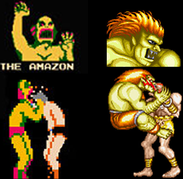
The taped shins, and hands signaled to audiences that Yasmine was clearly a fighter. The use of the Filipino national flag as primary colors on her costume, with the sun, and stars as accents let us know what region she was from. Her hair color was purple, a mix of the red, and blue from the flag as well. You would think this made her a fantastic design, and a prime example of inclusion done well. I would argue that it was sloppily done at worst, and ham-fisted at best. For starters I want you to think about which characters in the game wore their national flag as the primary colors on their uniforms. Zangief did indeed wear the old USSR colors on his shorts. Ryu was a happy accident in that his gi was white, with a splash of red on his headband. Contrary to popular belief Blanka was not green because of the Brazilian flag, but because he was modeled after the Amazon from Nintendo’s Pro Wrestling. Past that none of the World Warriors from SFII or New Generation from SFIII used their national colors as their costume.

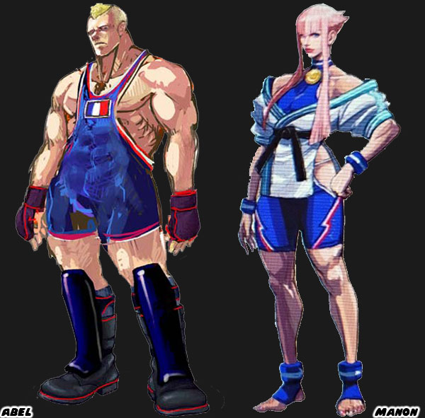
Street Fighter IV, and V started the trend of turning the colors of a national flag into costumes. We could see it with Abel from Street Fighter IV, Manon from SF6, and Laura from Street Fighter V. I argued that of all the new characters introduced into the franchise Juri Han was the best because she poached the most from Chun-Li’s design roots. I mentioned that the purple in her hair, and uniform were created by mixing the red, and blue from the South Korean flag. I would argue that the purple hair featured on Yasmine was a result of the same logic. I thought it was a cheap, and unnecessary design choice.

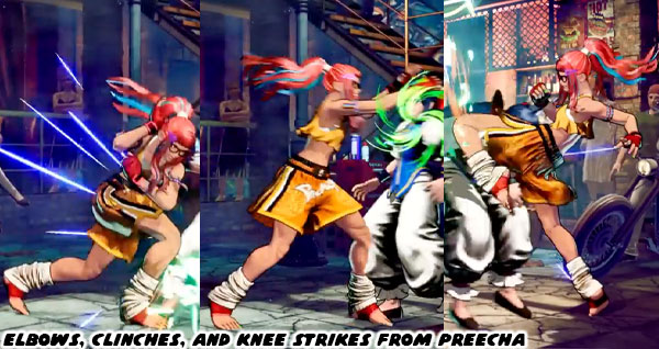
Any other color hair would have clashed Juri, and Yasmine’s costume. At the same time we had to address the Asian colored hair phenomenon. For decades Asian characters were coded with attitude thanks to colored hair streaks. Teen Vogue covered this issue, and Glamour said it was time to retire this trope. I was aware of it when I talked about how Juri Han’s design got better with time. It might seem insignificant to you, but I think that turning a flag into a costume was cheap. I think that giving colored hair to an Asian, or Pacific-Islander was sloppy. This pandering to tropes was not limited to Capcom. Even Preecha, the new female Muay-Thai fighter from SNK had colored hair with contrasting streaks.

Going with popular generalizations was not a substitute for actual research. You cannot achieve great design by pandering to the lowest common denominator. With some effort you can have a great national figure, and undo years of ugly caricatures. This was why I respected Designer Yusuke Hashimoto, and the team working on SF6. They managed to take Dhalsim, and Blanka which were the two ugliest caricatures in the franchise, and make them significantly better by changing just a few details. Not only that. I would argue that Rudra was an even better design, and a sort of way for Capcom to quietly retire Dhalsim. It seemed like an impossible task for Capcom, or any Japanese developer to do better. I knew it wasn’t impossible. A generation ago we had T. Hawk. He was originally going to be the new Zangief for Street Fighter III. Along with Cammy, Dee Jay, and Fei Long. However they were pushed into the Super SF II update before his design was refined. 

I wanted to see Mexican representation in the SF franchise, but this was not it. T. Hawk was a member of the fictional Thunderfoot Tribe from Mexico. He was about as authentic a native as Iron Eyes Cody. For those that didn’t know Iron Eyes was born Espera Oscar De Corti. He was an Italian-American that was cast for Native-American movie roles going back to the 1920’s. He spent the next 70 years convincing the USA that he was the real deal when in actuality he was perpetuating stereotypes. With his face paint, moccasins, jean vest, and feathered headband T. Hawk was doing the same thing for the fighting game crowd. I was saddened to see how little Capcom cared to present a Mexican fighter correctly, and even more disappointed with what was done with El Fuerte. When Lili / Lily was announced for SF6 she was pulled from the same tribe, and had essentially the same design elements. In any other timeline her look would have remained the same from concept to publication. Yet the SF6 team did a lot more homework, and revised her appearance several times before her debut.

The changes to Lily were subtle, but made for a much better overall design. Her physical appearance was mostly the same. But the color choices, costume, and fashion worked much better without the pandering. Capcom got rid of the face paint, and feather. Her clothes did not have to be a poncho of red, white, and green. The colors of the national flag. An oversized jaripeo shirt did just fine. Even the change in her boots from Central to Northern American worked better. I had a similar thought on Yasmine (and Arjun). It was good to see the Philippines get representation, especially with a strong female warrior. But she was version 1.0 of the character. I knew that version 2.0 was going to be much better, just as it was for Juri, and Lily. That was my belief anyhow. What did you think of this character reveal? Who were you most interested in using in the next season of Street Fighter 6? Tell me about it in the comments section. As always if you enjoyed this blog, and would like to sponsor me please visit my Patreon page and consider donating each month, even as little as $1 would help make better blogs and even podcasts!
follow the Street Writer on Patreon!

Wednesday, April 22, 2026

Bookmark This Page; the abridged history of the brawler

There would be no fighting game genre without the advent of the brawler. If you want to learn about the history of beat ‘em ups then Bookmark This Page.

The Abridged History of the Brawler, a pre-rumble...

The Abridged History of the Brawler, Part 1

The Abridged History of the Brawler, Part 2

The Abridged History of the Brawler, Part 3

The Abridged History of the Brawler, Part 4

The Abridged History of the Brawler, Part 5

The Abridged History of the Brawler, Part 6

The Abridged History of the Brawler, Part 7

The Abridged History of the Brawler, Part 8

The Abridged History of the Brawler, Part 9

The Abridged History of the Brawler, Part 10

The Abridged History of the Brawler, Part 11

The Abridged History of the Brawler, Part 12

The Abridged History of the Brawler, Part 13

The Abridged History of the Brawler, Part 14

The Abridged History of the Brawler, Part 15

The Abridged History of the Brawler, Part 16

The Abridged History of the Brawler, Part 17

The Abridged History of the Brawler, Part 18

The Abridged History of the Brawler, Part 19

The Abridged History of the Brawler, Part 20

The Abridged History of the Brawler, Part 21

The Abridged History of the Brawler, Part 22

The Abridged History of the Brawler, Part 23

The Abridged History of the Brawler, Part 24

The Abridged History of the Brawler, Part 25

The Abridged History of the Brawler, Part 26

The Abridged History of the Brawler, Part 27

The Abridged History of the Brawler, Part 28

The Abridged History of the Brawler, Part 29

The Abridged History of the Brawler, Part 30

Were you a fan of the brawler? Did you have a favorite title? Let me know about it in the comments section. As always if you enjoyed this blog, and would like to sponsor me please visit my Patreon page and consider donating each month, even as little as $1 would help make better blogs and even podcasts!

follow the Street Writer on Patreon!

Friday, March 1, 2024

What about touch-based fighting games? - A 1UP Classic from April 7, 2011

Since fighting games are on the mind right now and the GDC had recently past I was reminded of an arcade fighter that came and went. SegaNerds covered Yu Suzuki talking about a cancelled fighting game project called Psy Phi. The veteran game designer and godfather of 3D fighters was trying to bring entirely new mechanics to the arcade with a touch screen based fighter. 


I mentioned this game years ago here and was not impressed when 1UP declared it the best game of the 2005 JAMMA show. I have tremendous respect for Mr. Suzuki but the game did not have groundbreaking gameplay elements. The idea of warriors with awesome psychic powers, or at the very least fighters that could fly are nothing new in gaming. These genres were done before the Dragon Ball Z series went 3D. The two best console standouts in the genre were Bastard! on the Super Famicom and Psychic Force on the Dreamcast.


I was never sold on the concept of a fighting game using touch screen controls. Requiring gamers to move and activate special moves by sliding their hands all over the screen seemed to make the game more complex than it had to be. Yu was trying to make a fighting game more accessible to gamers but I felt his control scheme was far too cumbersome. It would be easy to lose an opponent if they moved behind an arm as it crossed the screen. Plus most fighting games require quick reflexes and reaction times, having to move by clicking the corners of the screen would have slowed down the gameplay tremendously. Who wants to play a sluggish fighter after all?


What do you think of touch based gaming? Does it work on the small screen of the DS or iPad but lose it's practicality on a larger scale? I know my wife would love a MS Surface but what types of games work best on touch-based TV-sized displays? Perhaps a strategy game, StarCraft or the like would make more sense than a fighter. I know a Dawn of War on a table-sized monitor would be mad fun. What do you think? As always if you would like to sponsor me please visit my Patreon page and consider donating each month, even as little as $1 would help make better blogs and even podcasts!
follow the Street Writer on Patreon!

Wednesday, July 6, 2022

Figuring out the changing Street Fighter style, part 1...

Over the last month I had talked a lot about the new, and returning faces in Street Fighter 6. I studied their outfits, the colors assigned to them, their nationality, and physical build. I did my best to try to figure out their roots, and fighting method, and share it with the visitors to my blog. In the end it reminded me that there was a style of character design that could be considered uniquely “Street Fighter.” By that same token there was a style of design that worked for Mortal Kombat, Tekken, King of Fighters, and Killer Instinct. The aesthetic of Capcom was distinct. This was thanks to the legacy of artists that had worked there. Akiman, Shoei, Bengus, Daigo Ikeno, Edayan, Kinu Nishimura were brilliant artists that had a hand in developing the style, and direction of the SF series.
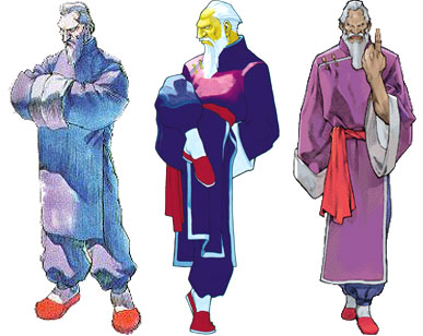
The newest designer Yusuke Hashimoto, was now putting his own unique stamp on the lineup. Yusuke had produced Bayonetta, so he was comfortable designing all manner of characters with different outfits, skin colors, builds, and body types. In short, he was the perfect person to shape the direction of this generation of fighters. With that said let’s try to figure out what made the “SF Style” distinct. The most obvious thing would be the costumes the characters wore. Could you really put a SF character in just any outfit, and would it work within the context of the game? I’m not saying that every character had to be wearing an authentic martial arts costume. That type of visual storytelling did not work great in SF. Instead there was a mix of pseudo-authentic costumes, and casual uniforms to break up the monotony. Consider for a moment what it would look like if everyone in the lineup wore casual clothing. Concept artist Xin Wang came up with fashionable makeovers for the SF cast in the Chinese mobile game Street Fighter: Duel. I would argue that Mr. Hashimoto’s designs were sort of a counter to that. He wanted to bring back the classics, but not go overboard with their costumes.
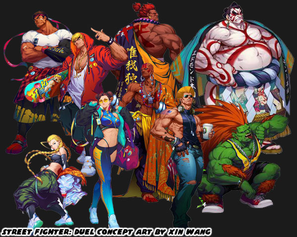
Long time fans would enjoy seeing their favorite characters in new outfits. However what did this do to new players? How did the game change by shifting just one element? Were new players able to make out the style of fighting that a character represented based on casual wear? Were they able to figure out what they could do based on the color of their skin, or their physical size? Now consider what costumes affected from a game play perspective. Was it easy to read the action on the screen if a character was covered up with long sleeves, or pants? What about vivid patterns, or clashing color choices on an outfit? Did these things make it easier to play the game, or were they distracting? I could argue similar points for excessive splashes of color, lightning, fire, smoke, etc. while the characters performed special attacks. There were many individual elements that made up the main costume choices for the SF cast. In the early days arcade cabinets, and game consoles lacked the memory, and processing power to render anything too detailed. The developers were limited to a simple outfit, and a primary color. This set the standard that was copied the world over. Now that consoles, and even mobile devices were more powerful then it became easier to create characters with highly detailed outfits, and millions of color choices. Was is then critical to take advantage of all this processing power? Or did putting too much into a costume’s detail take away from the overall presentation of the character?
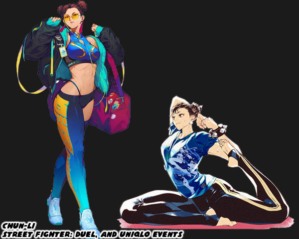
I welcomed the addition of Story, Arcade, and Battle costumes that were put into the library in SFV. I was not against a character getting an updated main costume in the series, as long as it didn’t stray too far from the original design. The importance of a primary costume still remained. This was why I had no objections to the new designs for Dhalsim or Blanka in SF6. There was even a chance for the studio to take a good idea, and make it even better. I thought this was the case for Juri’s update. I saw the studio taking a step backwards when they revealed the new look of Chun-Li. They took away the small details that added up to make her costume truly stand out not only in the lineup, but across the spectrum of fighting games. Chun-Li perfectly encapsulated the Street Fighter school of design. It didn’t matter if you were from the Middle East, South America, or Europe. It didn’t matter if you had played a million fighting games, or if this was your first. When you looked at Chun-Li for the first time you almost instantly thought “Chinese Fighter.” Why was this? 
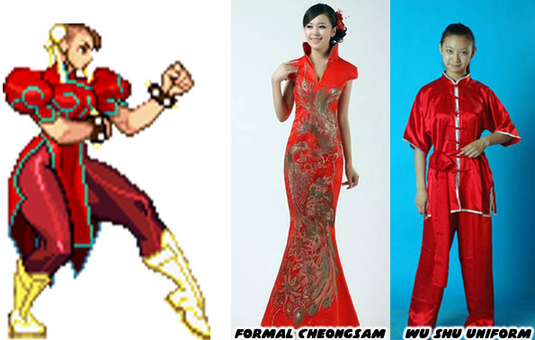
Audiences had seen Chun-Li’s prototype appear in pop culture generations before the game came out. Whether in story, film, photo, television, cartoon, or comics. The artists working at Capcom were pulling from various influences. People saw the repetition of heroic Chinese fighters, especially in Taiwanese, and Hong Kong cinema. They had seen physical Chinese representations in the form of certain hairstyles, makeup, and fashions. The cut of a dress, the use of ribbons, belts, sashes, and how they were assembled could be considered Chinese, or Mexican, or French, or American. Audiences had seen some combination of a wu shu uniform, or a traditional cheongsam at some point in the past. These were actual, traditional outfits from China. The genius of Capcom was how Akira “Akiman” Yasuda arranged certain elements when designing Chun-Li. The puffy shoulders, the pantyhose, wrestling boots, wide belt, and weighted bracelets had never been used in an actual martial arts costume, let alone any traditional Chinese dress. Audiences filled in the blanks with what they knew. They saw elements that they had seen before, and they assumed the rest was traditional Chinese. It was an absolutely brilliant trick, and set a standard that few studios could match. Yusuke Hashimoto showed that he was aware of what Akiman had done. Jaime in Street Fighter 6 followed the exact same design path of Chun-Li.
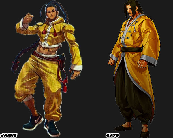
I want you to compare Jamie, and Gato who was a fighter from SNK’s Garou Mark of the Wolves. I had already highlighted Jamie’s various elements on my blog, but let me point them out again. Street Fighter 6 Director Takayuki Nakayama, Producers Kazuhiro Tsuchiya, and Shuhei Matsumoto, along with Yusuke Hashimoto spoke about the influence that Hip Hop had on SF6 in several interviews. Jamie was from Hong Kong, and at first glance it looked like he was wearing a traditional kung-fu outfit, but his costume had a decidedly urban flair to it. Just like Chun-Li it wasn’t apparent until you looked closer. The crop top, long sleeves, and wide collar were tailored to his frame, they were not baggy at all. This fit hadn’t really been worn in any traditional form of Chinese kempo, or kung-fu. The pants with one leg rolled up was a style from USA Hip Hop circles. The color of the fabric looked authentic, until you looked closer, and saw that it had a Louis Vuitton-inspired pattern on it.
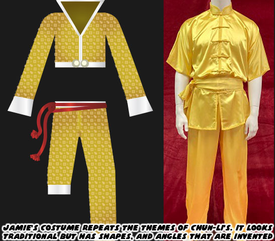
Jamie also wore sneakers with a cloud pattern at the front of what looked like the Nike swoosh design. Even his haircut wasn’t quite traditional. The long braid was supposed to make audiences think of the queue worn by men during the Qing Dynasty. Yet that hair style required the men to shave the front part of their scalp. Jamie instead had a modern fade on the sides, and back of his head. Jamie had a red rope belt with a wine gourd strapped to his hip. Many classical heroes in Chinese mythology such as Lu Zhishen, Ji Gong, and Li Tieguai carried a wine gourd as well. Capcom swore that Jamie was drinking a special juice, and not booze from the gourd. Jamie’s design really captured the SF Style, but it did not reflect the quality of the designs placed on some of the returning characters.
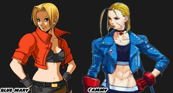
Cammy for example had an entirely new look that was much more casual than earlier looks. I felt that her short jacket, and leggings outfit betrayed the spirit of her original military-inspired uniform. My old friend DarthEnderX mentioned that she looked like a knock-off Blue Mary. That was a valid comparison. I had done a three part series on Blue Mary from the Fatal Fury series by SNK. Mary was essentially a female version of the protagonist Terry Bogard. She wasn’t a Sakura in terms to counterpart either, but more of a super cop like Chun-Li. Her look of jeans, and jacket was warranted as she was supposed to be very Western character. The casual costumes featured on the majority of SNK characters helped distinguish their lineup from Capcom’s. The Street Fighter-Style of character design relied on putting fighters in pseudo-traditional outfits. They had to be instantly recognizable to represent a certain country, school, or style. Like Ken, Ryu, Chun-Li, and Jamie. SNK had an entirely different approach. The genius of SNK’s design was that they hid the martial arts master in plain sight. They might be wearing a three-piece suit, a tuxedo, or a Hawaiian shirt, and flip flops. In every case they were unstoppable brawlers.
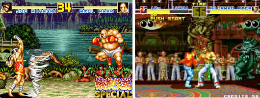
A good chunk of the Fatal Fury, Art of Fighting, and King of Fighters lineup were trained martial artists in street clothes. There were some with classical outfits sprinkled through the series, like Gato, Joe Higashi, and Kim Kaphwan. These traditional designs helped connect the audience to the well-dressed modern archetypes. If you are a budding designer, and are trying to figure out if your style works for SNK, Capcom, or other studios then practice creating fighters of common martial arts. See if you can put a karate fighter in a pseudo traditional gi. Or what that fighter would look like in a suit. How would audiences be able to tell that this person was a fighter? It’s a difficult exercise for sure. Capcom, and SNK had actually been broadcasting who their designs were targeted for in the past decade. We will explore these things in the next blog. I hope to see you back for that. If you have any thoughts on the blog please let me know in the comments section. As always if you would like to sponsor me please visit my Patreon page and consider donating each month, even as little as $1 would help make better blogs and even podcasts!
follow the Street Writer on Patreon!

Saturday, June 2, 2018

30 Years of Street Fighter, 30 Days of Characters; #29


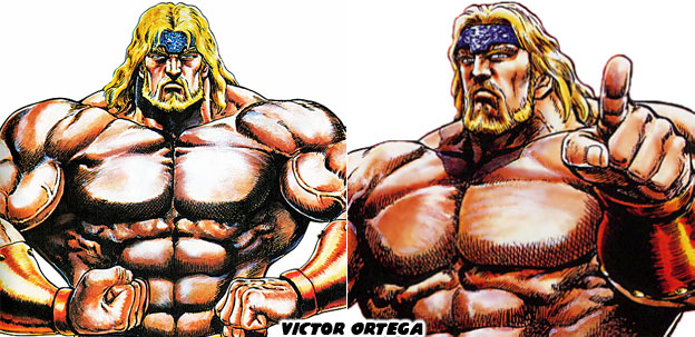
Victor Ortega is probably someone that you don't even think about when it comes to Capcom fighting games. This is probably because Ortega has never been in a numbered Street Fighter. He appears in the extended universe, in the Muscle Bomber / Saturday Night Slam Masters series to be precise. This character is important to the history of Street Fighter for a number of reasons.

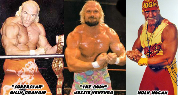
Victor represents the pinnacle of pro wrestling in the Street Fighter universe. He was the only CWA (Capcom Wrestling Association) athlete to go undefeated in his career. He retired with the belt but came back years later when a new crop of wrestlers sprang up. Victor's design was very much rooted in actual wrestling history. Going as far back as the '70s with bodybuilder-turned-wrestler Superstar Billy Graham. Graham had an amazing physique and was brilliant on the microphone. Some of the best wrestlers were memorable for their interviews rather than their in-ring ability. The Superstar was the template from which characters like Jessie Ventura and Hulk Hogan were cut.


The person that designed the majority of the pro wrestlers in the Capcom universe was Tetsuo Hara. He was the artist and half the creative team behind Hokuto No Ken / Fist of the North Star. I have already mentioned that the muscular boss with facial hair was most likely inspired by the character Toki. Mr. Hara was a big fan of pro wrestling and helped create a variation of many of the top babyfaces (good guys) and heels (bad guys) for Capcom. It stood to reason that the wrestling champion for the Capcom universe would look like an exaggerated version of a real title holder. Victor Ortega had an amazing physique, possibly the most muscular person in the Capcom universe, including Mad Gear bosses Abigail and Freddie.


Despite his age Victor Ortega is impossibly fit but thanks to his age he is also an incredibly experienced. Combining his insane strength with his striking and grappling ability makes him one of the most underrated fighters in the universe. It would be nice to see this undefeated champion make an appearance in the Street Fighter series. Who do you think was the best wrestler in the Street Fighter universe? I'd like to know. As always if you enjoyed this blog and would like to sponsor me
please visit my Patreon page and consider donating each month, even as little as $1 would help make better blogs and even podcasts!

 follow the Street Writer on Patreon!

Friday, June 1, 2018

30 Years of Street Fighter, 30 Days of Characters; #30


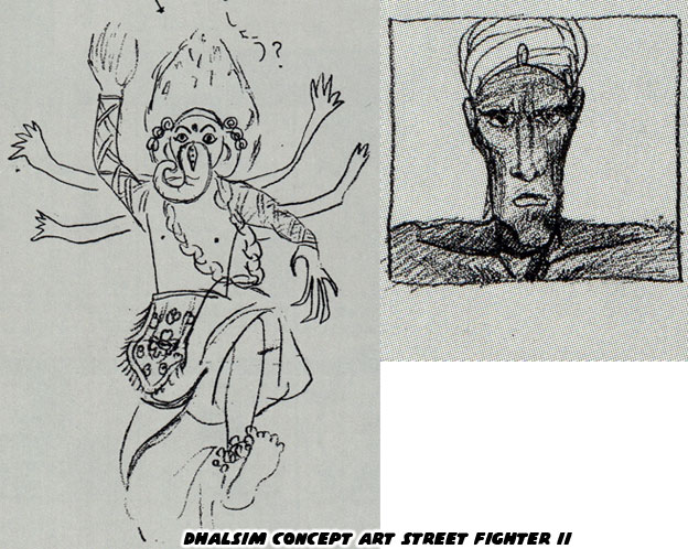
Over the next 30 days I will be celebrating 30 characters from the Street Fighter universe. This will not be a ranking of who I think is the most powerful, or who is the best in canon. Instead it will be a look at 30 influential characters and why I find them interesting. First up is one of the most unusual characters in the library. Dhalsim started off like many other Street Fighter II designs. He was a trope based on a certain nationality. In this case he represented the mystical fighter from India, originally known as the Great Tiger.


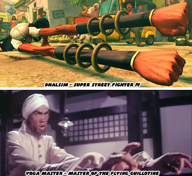
The character was alarmingly racist with his many arms and Ganesha costume. Even the name Great Tiger was a call back to an earlier trope were citizens of a certain country were identified by the local animals. Indians were sometimes identified with the animals native to South Asia; elephants, tigers, cobras, etc. The designers at Capcom went back to the drawing board. They wanted to make the character really stand out and not necessarily by relying too heavily on those caricatures. That was part of the reason they left the turban behind. One of the ways they improved on the Great Tiger was by recalling a fantastic villain from the film Master of the Flying Guillotine. In it there was an Indian character that could stretch his limbs. This film and the earlier One Armed Boxer helped shape the development of the Street Fighter cast. In pop culture some Indians were said to have had mystical powers. A few of them were the gatekeepers to ancient magics. This stereotype was repeated in film as Chinese actors wore brown face and pretended to be Indians that could teleport, stretch their limbs and even be impervious to stabs. The stereotypes about Indians were ugly but they became ingrained in pop culture.


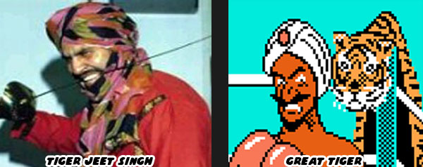
If there was a real person that helped cement the idea of a fighting Indian in pop culture it would be professional wrestler Jagjeet Singh Hans better known as Tiger Jeet Singh. The Canadian-Indian started wrestling the '60s and developed a memorable gimmick that carried him for decades. Tiger Singh was never a technical wrestler, he didn't perform power moves or take risks by leaping off the top rope. Instead Singh was known for having violent matches that ended with lots of blood. He would storm the ring while swinging a sword over his head, kicking chairs, pushing audience members around and shouting like a madman. He began wrestling in Japan in the 1970's. The developers at Capcom and other studios were incorporating elements from the things they grew up with in their games. Popular comics, cartoons, movie and television characters from the '70s influenced the designs in the '80s. The '80s influenced the '90s and so on. An example of a character that was not far removed from trope was The Great Tiger. The Indian boxer wore a tiger-skinned robe, a jeweled turban and had a magic ability that allowed him to teleport around the ring. This character was featured in the arcade version of Super Punch Out!! (1984) and the NES console version of Punch-Out!! (1987).


Capcom started with a turbaned fighter not far removed from Tiger Singh but then stripped away the unnecessary elements. They ditched the turban, the clothing and even facial hair. When they were done the character looked more like a beggar than a brawler. Dhalsim worked because he didn't look like a traditional fighter. It was easy to think the rail-thin, half-naked man didn't stand a chance in a tournament. Then you saw how far his range was and how he even breathed fire. Suddenly he became very interesting. Players wanted to find out more. Capcom decided that he was a yogi that was humbled by tragedies in the past. That was when he gave up most of his worldly possessions and shaved his head. He carries the burden of his people and fights to give them a better life. Dhalsim is far from a perfect character in terms of representation but he is certainly a memorable one. That is why I am bringing him up for the 30th Anniversary of Street Fighter. As always if you enjoyed this blog and would like to sponsor me please visit my Patreon page and consider donating each month, even as little as $1 would help make better blogs and even podcasts!

 follow the Street Writer on Patreon!

Monday, February 19, 2018

The Giant Monster Series, part 7...


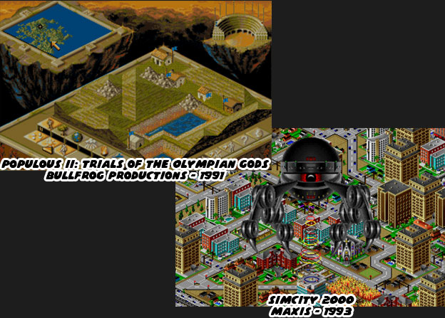
The giant monster games mentioned thus far had a common theme. They were all about fighting against the creatures or simply trying to survive against them. The draw for gamers was the fear and excitement that they felt battling them. There was a different type of emotional draw that could only be had by playing as the giant monster. In order to do this the game developers had to create new ways to experience the game. Giant monsters were not human and did not have the same limitations as them. The creatures could be as benevolent or malevolent as the designers allowed. In some genres the giant monster was considered a god simulation. Spore, Sim City and the classic Populous were examples of the god simulation or life simulation games.


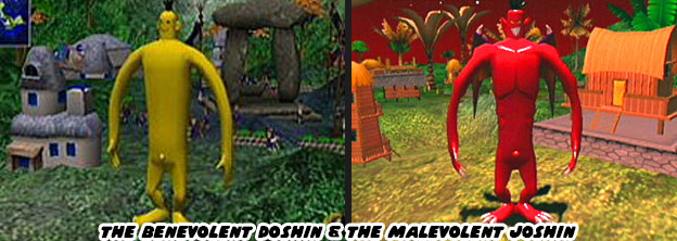
Players assumed the role of an invisible creator and could build life and architecture from the microscopic to the a global scale. To make things interesting players could trigger catastrophic events, or learn how to deal with them. Floods, alien invasions, giant lizard attacks and earthquakes were among the more unique game play elements. The invisible forces could build or destroy an entire civilization and because they could they would sometimes be worshiped by the in game characters. Such was the case for Doshin the Giant, a 1999 classic Nintendo Gamecube. Doshin was different from all the other simulation games because the character and his actions were not invisible. Players assumed the role of Doshin and tried to help the natives on the island of Barudo. The banana-colored Doshin could help shape the land for villagers, aid in the recovery from natural disasters and make their lives a little easier. As such he was asked to help unite the four tribes through his powers. The more he did for the islanders the larger and more powerful he became. Players could also turn on the villagers and become a destructive giant, Doshin would turn red and grow bat wings. He was known then as Joshin. In other simulation games players could become more powerful, only they never saw an on screen persona that represented themselves.


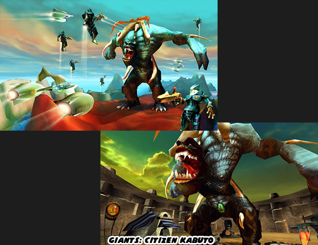
In 2001 Planet Moon Studios released a title whose plot was comparable to Doshin but whose gameplay was completely different. Giants: Citizen Kabuto was set on an island as well except this piece of land was traveling through space. On it three different races were battling for supremacy. Two of the races, the Meccaryns and Sea Reapers fought with weapons and magic respectively. Players could play as either of those races in a third-person perspective. The third race consisted of a single creature, a giant name Kabuto. Having control over Kabuto was a powerful contrast to the other races. The game played similar to other third person shooters except for Kabuto. The character towered over entire units and plowed though their ranks with ease. Kabuto did not have any weapons but instead relied on wrestling moves to damage opponents and their bases. The sense of power generated by Kabuto was great. When he ran he knocked over trees with ease. The other races could get flattened like insects every time he swung his massive arms. The game play was a stark contrast to Doshin, whose slow pace and friendly atmosphere felt more childlike and innocent. Apparently there was a difference between the video game gods.


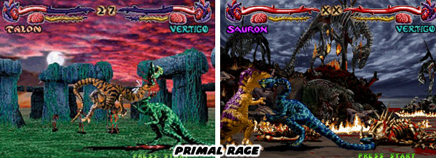
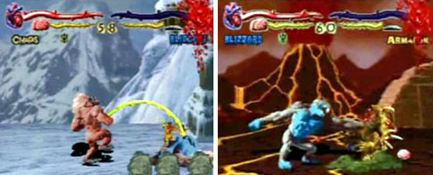
A third type of giant monster god was heating up the charts in 1994. Atari used the popularity of the fighting game as the basis for Primal Rage. The game was set in a dystopian future where giant creatures were battling for control of the planet. Each of the Primal Rage characters was worshipped as a god; the god of life, the god of virtue, the god of decay, the god insanity, etc. The monsters created for the game took a page from the oldest of the giant monster heroes. Every character featured in the game was created from a clay, rubber and fur armature just like the 1933 King Kong model. The animators used similar stop-motion techniques to create the frames for the game. Instead of posting those frames to film they were digitized to video and sprites were created for the programmers to use. Model backgrounds were composited over digital paintings to create the levels. Actors in caveman costumes were also recorded to create the people worshipping the monsters on each level. These tiny humans would follow their god from level to level, growing in number as the player progressed. The monsters could snatch a human from the background and eat them for a health bonus.


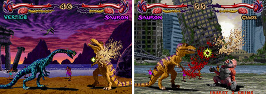
The Primal Rage monsters blew the doors off the fighting genre. Up until then fighting games featured human-sized characters with traditional or fictional martial arts moves. The Primal Rage avatars could have easily snacked on the fighters from other games. When they battled they shook the ground and created natural disasters. The developers experimented with command inputs. Like Mortal Kombat (1992) and Killer Instinct (1994), the studios were trying to create controls that differed from the six button and joystick commands that Capcom had popularized in the Street Fighter series. For Primal Rage special attacks were activated when the player released the buttons rather than when they pressed them, making for a unique learning curve. The game was also the first title that I had ever seen that allowed infinite combos, a precursor to the combos that made the Capcom VS series so popular. The fights of the Primal Rage avatars were brutal and offered players a chance to kill an opponent at the end of a match. The fatalities in Primal Rage were every bit as brutal if not more so than those in Mortal Kombat. Monsters could literally punch the brains out of opponent skulls and eat the flesh off their bones. Arcade goers winced at some of the more gross acts players could perform. Some would argue that Atari crossed the line when they introduced a character that farted, vomited and even urinated on his opponents.


Allowing gamers to play as gods had gone to the head of developers. After all, up until that point most genres tried to create the action for human-scaled characters. Racing, shooting, role-playing titles all tried to create worlds that were believable for human protagonists. All of a sudden the developers found themselves creating worlds for monsters that were the top of the food chain. No natural creature or man made weapon could have stood up to the biggest of the Primal Rage characters. They could be as gross or violent as they wanted to because there was no one that could have stopped them.


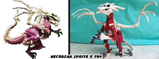
Well, the only thing that could have stopped them would have been a bigger and badder monster. Necrosan was the god of death. It was a dragon-like creature that was mostly bones but with portions of muscle and even intestine still attached to the skeleton. Players would have to defeat the creature had they wanted to claim the "Urth." Sadly the final battle was never realized. The arcade game had been published without an actual final boss. In fact it was released with unbalanced gameplay, known bugs and glitches. Patches were released over the months to arcade owners to help fix the controls and balance the fighters. Developers were hoping to introduce an actual final boss via an upgrade. Unfortunately development of that final boss and his official inclusion in a sequel was cancelled. It was proving to be too costly for Atari to continue supporting the series. The only known images of Necrosan were from concept art, sprites for the unpublished Primal Rage II, a comic book and a toy released before Atari pulled the plug. Those gods seemed to have limitations after all.


The giant monster offered unique game play opportunities for existing genres. They could enhance the sim, RPG, FPS or fighting game more than any weapon or magical attack could. Developers were finding it hard to create a niche for the giant monsters themselves. What many developers missed were lessons from their own history. Two studios showed what format worked best for the giant monster back in 1986. They created a template that would work again and again. The studios that paid attention to the model would achieve a certain level of success. The next blog will talk about the year that changed everything.


Monday, May 1, 2017

Battle Fantasia, the great fantasy fighting games, final part...

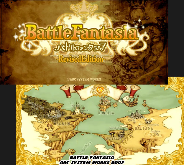
The final game in our series of fantasy fighters debuted a decade ago. Battle Fantasia was created by Arc System Works. The studio had been in business since 1988. In the early days they were contract developers for Taito, Sega, Atari, Namco and Capcom. They learned a tremendous amount from the industry by working on many major console adaptations. They had experience in racing games, brawlers, platformers and sports titles. When it came time to create their own games they were always very imaginative. Their biggest hits came from the fighting game arena. It stood to reason to, their very first project was a Sega Master System adaptation of Double Dragon in 1988. Being one of the first studios to see the popularity of brawlers first hand certainly stuck with the company. Battle Fantasia was a tribute to everything they had learned over the generations. Many gamers unfortunately slept on the title when it debuted in 2007. Looking back at it we can’t help but appreciate how innovative it was.


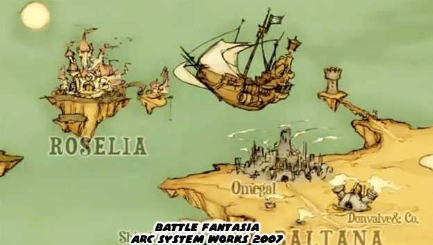
Battle Fantasia had all of the important elements that I had brought up over the course of the series. It was a Japanese take on a traditional western fantasy story. The setting, character classes, and mix of magic and medieval weaponry was something that most audiences would have expected. What no one could expect was how the Japanese were going to reinterpret the western tropes. As with other titles featured on the blog this game took us to a whole new world. This world had an origin, it had alliances, entire kingdoms, remote villages and uncharted territories. We were given a glimpse of the world in the loading screen. Each of the main characters came from a unique place on the map.


The game was meant to evoke images of classic fairy tales, as if you were looking at animated pages in a book. The soft colors, subdued lighting and animation style were very inviting, they were very family friendly. Arc System Works (ASW) tried very hard to make sure that each and every fighting game they created had its own unique style. When they worked on an IP owned by a different company they made sure that it was in the exact style of that publisher. For example the fighting game Persona 4 Arena maintained the look that Atlus director Katsura Hashino and designers Atsushi Watanabe and Azusa Kido had worked to create. When ASW developed Sengouku Basara X for Capcom they made sure that it carried the over-the-top sword-fighting mechanics that Koei had used in the original 3D brawler but with a new “Capcom-style” 2D aesthetic. When ASW developed Dragon Ball Z: Supersonic Warriors for the Game Boy Advance they maintained the look of the classic Akira Toriyama show and the familiar Super Nintendo adaptations. In many ways ASW was like a chameleon, able to adapt to the work of another studio without anyone noticing. However when they created their own IP things really stood out.


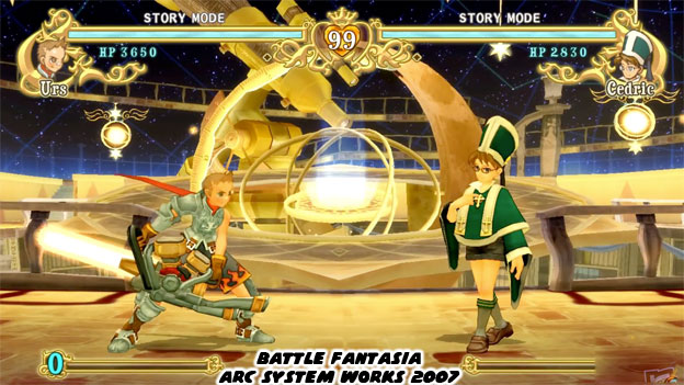
No other fighting game before or since looked like Battle Fantasia. The world created by ASW was perfect to get lost in. The characters were the types of heroes and villains we’d like to see return again and again. It was easy to fall in love with the game because of how unique this fantasy world was. It could never be mistaken for poaching the ideas of Games Workshop or any other western studio. I mean who else could have thought up of a knight carrying around a two-cylinder gas powered light saber? The title was directed by Emiko Iwasaki. She was one of the main artists behind Guilty Gear. If you know your fighting game history then you remember that in 1998 Guilty Gear was a breath of fresh air for the genre. It was completely unlike anything that SNK or Capcom had released, yet at the same time it honored their contributions to the format. Guilty Gear had the bold designs and weapons-based combat from SNK with the fluid animation and exaggerated proportions of a Capcom title. Guilty Gear and it’s spiritual successor BlazBlue were deeply rooted in an anime style but Battle Fantasia really stood apart for its storybook appearance.


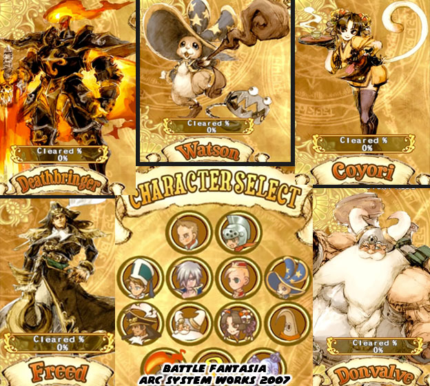
To be fair, the designs in Battle Fantasia did have a hint of the rockstar vibe that Guilty Gear was built on. Some of the men looked like feathery-haired models rather than the swollen barbarians you might expect from a western-produced RPG. Yet at the same time there were fear inducing monsters, covered in black armor occupying the same world. There were variations of the traditional classes of heroes and villains, knights, princesses, etc. Then there were maids, pirates, gunslingers and magical rabbits as well. Battle Fantasia covered a number of different classes and influences with a fresh perspective. The painted portraits on the character select screen captured the spirit that Emiko was going for.


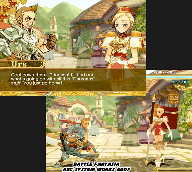
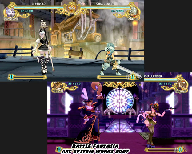
Battle Fantasia had multiple game modes as audiences had come to expect from a fighter. The story mode brought audiences in and allowed them to explore the different relationships in the game. It also allowed them to sink their teeth into a game that had more personality than most other titles. This game like several other ASW titles had a certain level of humor written into it. Characters could be sly or cheeky, their moves meant to reinforce their personality. Their in-game and cut scene animations showed a wide range of expressions. The young knight Urs carried a light sword that was equal parts magic and motor. He was brave but he could be a little bit clueless at times. Princess Olivia had a heart of gold but her daintiness did not stop her from being an exceptional fighter. Marco Van de Land, the younger brother of Urs, was among the smaller characters in the game yet deftly wielded a sword twice his size. There weren't many fighting games that I would ever call whimsical, Battle Fantasia was one of them.


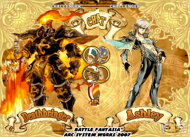
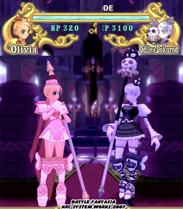
Arc System Works had been in the industry for a long while they knew the subtleties that every great fighting game needed. For example, every great fighting game had a cast of complimentary character designs. That is to say that there was a lot of symmetry when the studio was building a cast. The main characters often had a rival, sometimes a friendly rival like Ken and Ryu in Street Fighter. Sometimes they were bitter enemies, like Sub-Zero and Scorpion in Mortal Kombat. These rivals often had some sort of visual design that was a balance to the main character. Not every major studio knew about this idea or used the concept. Some studios eventually discovered the value of having new characters balance out the established fighters. They would add these characters in a sequel. Such was the case of Iori Yagami introduced as an evil rival for Kyo Kusanagi in the King of Fighters series. For Battle Fantasia it was the delicate Olivia getting balanced out with the chaotic Odile and her animated skeleton staff Dokurod. Olivia's design was rooted in "lolita" fashion rather than the traditional princess gowns in western games. Lolita clothing consisted of ruffled dresses, ornate petticoats and bright stockings worn by trendy Japanese girls. This fashion made its way overseas as did many things that young Japanese trendsetters did. Odile by comparison was clothed in "gothic lolita" fashion, substituting black and white for pastels and looking more grim in appearance.


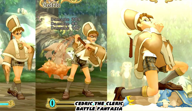
Arc System Works also knew enough about role playing game (RPG) tropes to include them in the game too. This game displayed hit points during attacks as they would have during a turn-based RPG. Each physical and magical attack did x-amount of damage. Characters that used healing spells would even recover x-amount of health. Most studios would simply whittle away at the opponents health or reward players points for long combo strings. The character classes that ASW introduced also revolved around the classic RPG tropes. Cedric for example was a cleric. He appeared bookish, sincere and very devout in his faith. He came across as a little bit snobbish and this rubbed Urs the wrong way. Yet beneath the charm of schoolboy-meets-healer was a vicious persona. When his faith was put to the test he fought with a spiked ball and chain and all manner of brutal techniques. His face twisted into an evil grimace as he flogged his opponents. Then to add insult to injury after each round he would kneel on top of his defeated opponent to offer a prayer. ASW was great at storytelling in every detail they added.


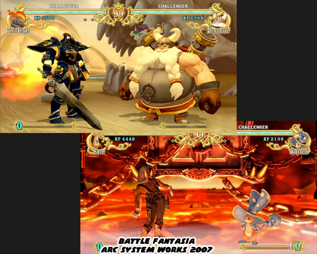
There were so many wonderful characters that I hadn't even mentioned. The cartoonish gun-toting outlaw Face, the massive inventor Donvalve, the magical rabbit Watson. These were the creative types of figures that first caught my eye. Sadly the game did not generate a lot of buzz. A reason for that had a lot to do with the decline of the arcade. There were few places to see, let alone play the game outside of Japan. Even then there were not a lot of new fighting games that would have brought in new crowd to try this out. Thankfully a year after it came out it was brought over to the Playstation 3 and Xbox 360. In 2009 it found its way onto PSN and in 2015 it was brought to Windows PCs with some additional balance. Each iteration helped shed more light onto this gem. While it did not achieve enough success to warrant a sequel it did have an impact on the development of future fighting games.


Arc System Works has always believed in the fighting game market. When many other publishers abandoned the genre they stayed with it. Through the years they demonstrated that a well designed fighting game could always generate a following. They did not always rely on licenses and established IP. They took chances and created new experiences along the way. Guilty Gear was an attempt at a new type of fighter. It was not set in any known time or place, but influenced by equal amounts hard rock and anime. Fans took notice of this game right away. Battle Fantasia was another grand experiment. Instead of using sprites, as they did with the original Guilty Gear, ASW was trying out 3D models on traditional 2D play mechanics. It was not the first but possibly most influential 2.5D fighter. They used textures, modeling and lighting effects to make the graphics appear like the concept paintings. They were able to have a game that played like a classic fighting game but with all new technology. This inspired Yoshinori Ono at Capcom to pursue development on Street Fighter IV. He revealed in a 2009 Gamasutra article that Battle Fantasia demonstrated that the formerly 2D character models wouldn't necessarily look weird in 3D. Battle Fantasia also served as a sort of introductory fighting game. It was not as difficult as some of the biggest titles had become. It was easy to pick up with no previous fighting game experience, yet with enough content to make it rewarding for veteran players.


I think that Battle Fantasia was just the start of something even greater. Arc System Works had big plans for this game just like the other fantasy fighting games I had talked about. Every studio I had mentioned was trying to build a franchise title. Those plans gave way to reality. The market was not ready, or not interested in what they were developing. This did not mean that the games were necessarily bad. Every studio big and small took a chance on a new type of fighter. They transported audiences to a new world. One which was far more interesting than the typical fighter. These worlds had histories, mythologies and heroes. These games put down a template that could be copied even today. The industry learned how magic, armor and leveling could work in a fighter. They saw how different technology would affect their graphics engines. They discovered that great storytelling could be applied even in the most action-oriented of genres. Battle Fantasia, like the games previously mentioned, deserved a second chance. I don't think of it as last great fantasy fighter, just the last one for a while. You never know where the next great fantasy fighter will come from. Soon enough a studio will decide that they are ready to tell a new story, to take another chance. Maybe it will be a free-to-play web game. Maybe it will be for a mobile device. In which ever shape or form it takes I will be eager to explore this new world. I hope that you will be willing to come along for the ride. Thank you for staying with me. Please leave a question or comment if you have enjoyed any entry in this series. As always if you enjoyed this blog and would like to sponsor me please visit my Patreon page and consider donating each month, even as little as $1 would help make better blogs and even podcasts!

 follow the Street Writer on Patreon!