Not long ago SNK released several trailers with new information for Fatal Fury City of the Wolves. This was the successor to the arcade classic Garou Mark of the Wolves.
This was a game that I talked about with every new tease. I thought it was funny that each time a game trailers came out from Capcom, or SNK that my blog would get a significant bump in views. Even though I hadn’t written anything new about Street Fighter 6, the King of Fighters, or any other of games from those studios I still managed to double, or triple my daily views whenever there was any footage released by the publishers. It was humbling more than anything thinking that people that did web searches got pointed to my blog because I had written about them on, and off for years.
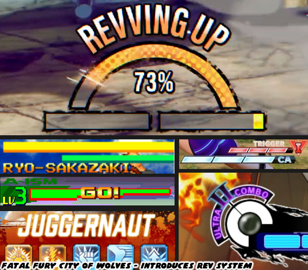
I’m going to highlight the things I was able to pull out of the two most recent trailers, those being the REV system, and the voice reveal trailer. I had no idea what the REV system was about, but according to
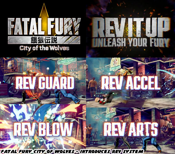
Game Informer: “The REV system serves as City of the Wolves' big new addition, giving players enhanced attacks to bolster their offense. REV Blows are powerful, near-unblockable supercharged attacks; REV Guard serves as an enhanced block; REV Arts are flashy cinematic combo attacks; and REV Accel is a speedy assault of sorts.”
It made sense that the Garou team would be looking for ways to innovate the game play in the sequel. The King of Fighters universe had the tradition of a second “Spirit” bar going back to the Art of Fighting from 1992. Remember that the characters, and game play mechanics of Fatal Fury, and the Art of Fighting were ideas that
The Godfather of fighting games Takashi Nishiyama had planned at both Capcom as something that might work in the Street Fighter franchise. Every studio since had been exploring ways to change up the game. V-ISM, Alpha Counters, Rage meters, Revenge meters, Super attacks were all variations on the spirit bar. What made the SNK games different was that you could charge this meter manually, and even drain your opponent’s by taunting them. I had a feeling that the REV system was the logical evolution of that classic mechanic.
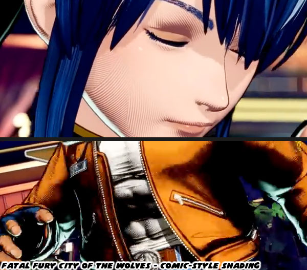
I don’t usually talk a lot about strategy, offense, defense, and attacks. There are plenty of people on YouTube that can talk about frames, counters, and strategy. I’ve always been more focused on the visuals of fighting games. The first thing that stood out to me were the stylized graphics featured in the voice actors trailer. I noticed that the characters had lines, almost crosshatches on their skin, and clothing when the camera zoomed in on them. It made them look like they were hand drawn. This level of detail was not lost on me. Having multiple fighting games developed on the Unreal engine made them all look the same. In order to stand out a lot of studios had to develop their own graphics engine. Even if they used Unreal it was still possible to make their characters stand out from their competition by modifying the light, models, and textures used on the characters. The games that used classic 2D sprite proportions, but created in a 3D model definitely stood out from the rest. This was the topic of
GuiltyGearXrd's Art Style : The X Factor Between 2D and 3D, a GDC presentation from 2015.
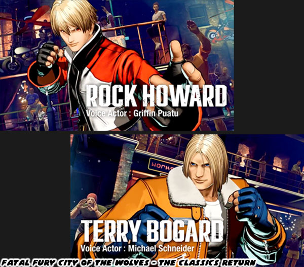
I genuinely loved what I was seeing in the Fatal Fury City of Wolves trailer. The studio managed to recreate a lot of the same stylized figures that were featured more than 20 years ago in Garou, but now in 3D. The level of care that went into creating the visuals should not be understated. It took much more than lighting a 3D model. If you looked carefully the characters didn’t necessarily have realistic shadows. The darkest parts of the figures were designed to highlight muscles, folds in clothing, and even the lines of hair. On the edges there was just a hint of a contrasting light, that caused the edges to stand out from the background. This light source did not wash out the shadows that the art team wanted to preserve on the character models. This must have taken some clever programming to achieve.
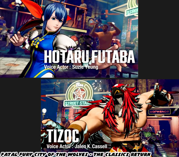
The other thing I noticed in the trailer, aside from the amazing looking bright flashes of light, and color when performing special attacks, were actually the ways in which speed was conveyed. The models were blurred when attacking, this was an old trick that I remember seeing during the development of Street Fighter IV back in 2008. What was different however were how strong the blur effect was depending on the speed of the attacks. When a character ran they were blurred a little. The same thing when they were knocked back. However if they were performing a quick special attack the blur effect was even stronger. For the people that don’t understand the distinction between graphics, and aesthetics in fighting games I wrote a three part series earlier on the blog. Here are the links.
The aesthetic versus graphics debate, part 1…,
The aesthetic versus graphics debate, part 2…,
The aesthetic versus graphics debate, part 3....
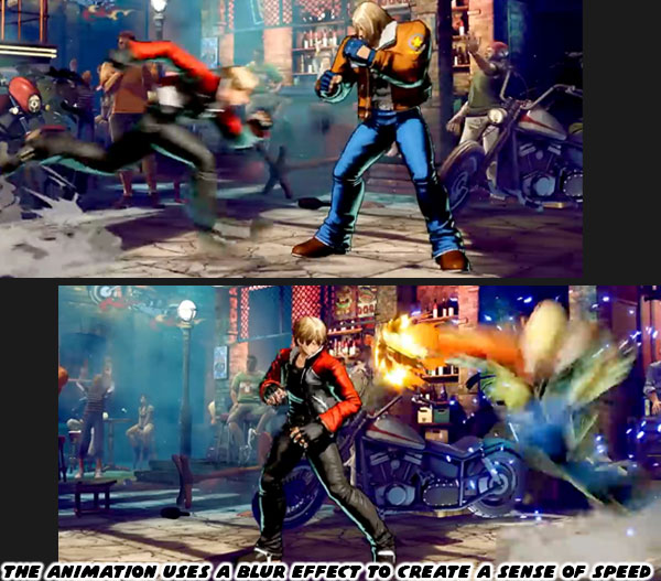
The character reveal trailer highlighted four returning faces; Terry Bogard, Rock Howard, Tizoc, and Hotaru Futaba. The new person in the lineup was named Preecha, and she appeared to be a Muay Thai specialist. SNK had a tradition of introducing girl characters out of left field in several of their fighting games. For example in the King of Fighters 2000 the studio featured Hinako Shijo. The diminutive girl with taped up fingers practiced sumo wrestling. She could manhandle the largest characters, and shove them with almost supernatural force. It certainly broke tradition, and made for an interesting shift in the way fighting game characters would be received. Before Hinako’s debut when most of us thought of sumo
we could only imagine fat men like E. Honda from Street Fighter, Taka-Arashi from Virtua Fighter, Akatsuki-Maru from Buriki One, and Ganryu from Tekken. Hinako had actually followed tradition going back decades. Female judo, Muay Thai, and boxers had been featured in SNK titles as early as the ‘90s. Also there was also a trend of featuring girls that had a unique look, and form of fighting. I discussed this in the
Odd Girl Out blog. These characters that broke tradition included Lucky Chloe, Emi, Area, and now Hinako.
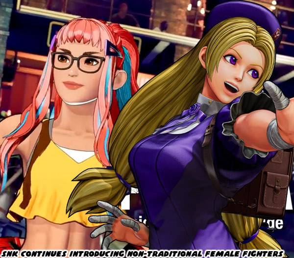
SNK was again shaking up the traditional roles with a female Muay Thai practitioner. That form of fighting was brutal in its effectiveness. It was an ancient tradition that was honed in the battlefield. It was a perfect counter to karate in manga, and anime which was seen as a refined martial art. That was one of the reasons why Sagat had that style against Ryu. The most fearsome, and earliest fighting game bosses was a Muay Thai monster.
He was the template that Fahkumram from Tekken 7 was cut from. Now we had a young lady that was capable of delivering traditional clinches, elbows, kicks, and knee strikes. If you were not familiar with the different forms of fighting I covered it previously on the blog as well. Here’s the link where I
talked about the history of Muay Thai, and Tae-Kwon Do characters in fighting games. Preecha was not the first female to use that form, that would be Chompoo from Capoeira Fighter 3. But two distinct characters in the 45+ years of fighting games let you know how rare it was to assign traditional forms to girls.
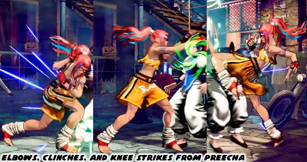
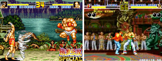
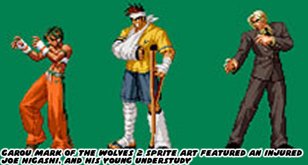
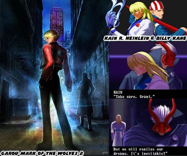
SNK had a couple of star Muay Thai practitioners going back to the birth of the series. Joe Higashi, and Hwa Jai made their debut in the original Fatal Fury. Hwa was a villain in the first game, but would return more recently as a playable character in KOF XIII. Given that Joe was a friend of Terry, and Andy Bogard I would say it was possible that he was the teacher of Preecha. There were several reasons why thought this was the case. The first was the most obvious. In the sprite art for Garou Mark of the Wolves 2 from more than 20 years ago we could see Joe Higashi was in arm, and leg casts. Clearly he was not able to fight at that point, but he was accompanying a Muay Thai, possibly kickboxing girl. This was the template that would be revisited for Preecha.
The other thing about having a younger Muay Thai fighter in the game was due to tradition. Many of the characters in the Garou series were young masters of a particular form. They were essentially the new guard, picking up where the icons left off. Even in the sister KOF series Kyo Kusanagi had already surpassed his father Saisyu. Rock Howard was the son of series villain Geese Howard. Yet Rock was mentored by Terry. This meant that his fighting style was a mix of the two, and in time would probably eclipse both of their accomplishments in his battles. The game also featured Kim Dong-Hwan, and Kim Jae-Hoon, the sons of Tae-Kwon Do master Kim Kaphwan, Hokutomaru was a very young ninja master, and understudy of Andy Bogard, the younger brother of Terry. I wouldn’t be surprising to see Lilly Kane appear in the series, the compassionate little sister of the villainous Billy Kane.
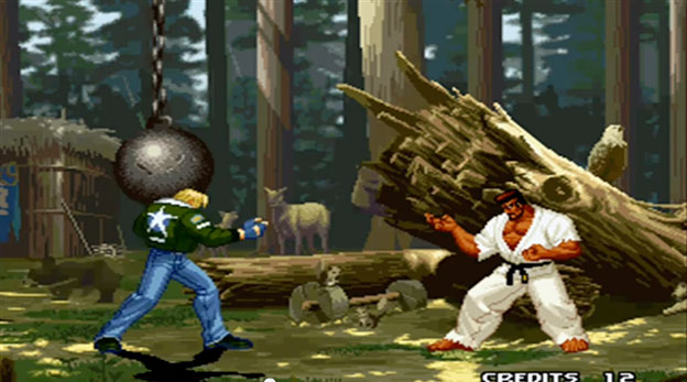
Although Marco Rodriguez was an adult, he was still
the heir apparent of Ryo Sakazaki, and the Kyokugen form of karate. Of the original three heroes of Fatal Fury only Joe was lacking representation in the Garou series. I think that was now resolved. The thing about each of the new characters was that they were still lacking the complete library of moves, strength, and stamina of their masters. In the voice trailer we saw that Preecha had a number of amazing moves. She had all of the fundamental Muay Thai strikes, and more important she was performing the moves correctly. There were no missteps, or sloppy attacks. What was noticeable was that she did not have the hurricane uppercut of Higashi, the one that caused a small whirlwind to fly across the stage. She did however have the punch portion worked out, just not the projectile.
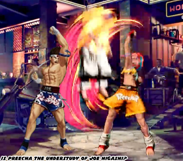
Preecha was a popular name in Thailand, it meant “wise.” But how do you tell audiences that she was wise, or smart? We got a hint of that with her glasses, which were typically presented on smart characters in popular media. To highlight her youth we got an explosion of color. Each of her fingernails were alternating pastel colors. Then there were the colorful streaks in her hair, with sensible bangs to keep her hair off her face while fighting. Did you notice her arm bands? The traditional
pra jiad arm bands were symbolic of the culture. Preecha had purple bands with orange, and sky colored links. Purple was the colors assigned to a lower-level fighter. The colors of the bands could be similar to the colors of belts in karate, or Tae-Kwon Do. In Muay Thai purple meant she was an intermediate fighter, the alternate colors were complimentary to her hair, and outfit. Traditional Muay Thai featured hands wrapped in knotted cord, which were much more damaging to opponents. We could see her hands were wrapped in cord as well, however these were actually gloves made of cord, so that she could put them on quickly. I think the most interesting detail in her outfit could easily be missed.
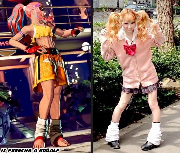
Preecha had taped ankles, however she also wore
slouch socks, which was an integral part of kogal, or gyaru fashion. According to Wikipedia “Kogal refers to the members of the Gyaru subculture who are still in high school and who incorporate their school uniforms into their dress style. These high school girls are characterized by the typical bleached hair, make-up, shortened skirts, and wearing of loose socks.” Preecha doesn’t fit the role of fashionable teen, but she does represent the same youthful energy of other characters in Garou. This was the most important part of SNK character designs, when compared to the Street Fighter cast. I did a multi-part series breaking down the approach from the studio. The links are below.
Hiding the master in plain sight, the genius of SNK's character design... part 1
I’m eager to find out more about Preecha’s story, how she plays overall as I enjoyed playing as Joe in earlier entries. I’m eager to see who else is waiting in the wings of this highly anticipated sequel. Anyhow those were the things I was able to pull from the trailer. What things did you notice? Were there any character you were waiting to be revealed? Tell me about it in the comments section please. As always if you would like to sponsor me
please visit my Patreon page and consider donating each month, even as little as $1 would help make better blogs and even podcasts!