Wednesday, August 30, 2023

Street Fighter 6: A master class in game design, part 14

The Street Fighter 6 senior team; director Takayuki Nakayama, producers Kazuhiro Tsuchiya, and Shuhei Matsumoto, and designer Yusuke Hashimoto had brought the franchise into the 21st century. This was not only from a technical standpoint, but in addressing the ugly roots of some of their characters. In the previous blog I mentioned how the studio had put progressive ideas of gender representation, and fluidity into the series through characters designs, and avatar options. As I was working through the World Tour I told my family that this game felt like it was fixing a lot of old issues. That the franchise was no longer going to perpetuate some old stereotypes, even if the fans expected them to. Let’s go back in time, and look at how the Street Fighter II designers approached the original lineup.

I had written a lot about the concept characters previously on the blog. Including the actual fighters like Yoshiji Soeno who influenced the creation of Sakurada Gashou. Sakurada was actually going to be the focus of SFII instead of Ryu. Thankfully the team did a lot of revision after the initial lineup. Of course if you didn’t know about the rough draft you were probably looking at the dark-skinned characters posted above. If you had time you could read about Anabebe, and the roots of Blanka’s racist origins. You could also read about the kung-fu cinema origins of Dhalsim on an earlier blog. Thankfully the designers knew that these characters might be racist, or at the very least misinformed stereotypical in their origins. They went back to the drawing board, and created what could arguably be seen as the greatest fighting game lineup of all time.

The majority of the cast represented an actual fighting art, such as karate, kung fu, military special ops, and wrestling. Then there were two characters as sort of oddballs. They were designed to add figurative, and literal color to the lineup. In the earliest drafts Blanka was easily the ugliest racist design you could think of. He was a dark skinned, big lipped, collar-wearing wild man. He had been captured by a hunter, and was going to be taken from battle to battle. This was instead changed to a green skinned wild man from the jungle. The entire roots of that change were because AKIMAN, the designer that gave us Chun-Li, always remembered how The Amazon would bite his wrestler’s face in the old Nintendo Pro Wrestling game. He wanted Blanka to be that same green skinned savage monster in this game. Both Dhalsim, and Blanka became popular with the fans, thanks to how they balanced out the cast, as well as how unique they were to play as. Capcom pretty much didn’t make too many changes to the characters over the next 30 years.

Blanka, and Dhalsim were rooted in some ugly history. People from the jungle, or natives that aided colonizers created the Myth of the Noble Savage. Native dress was often parodied in popular media. I’m talking about costumes made of fur, and feathers with a bone through the actor's nose. These caricatures were seen as harmless like Bumbo the wild man from Borneo, from a 1933 Little Rascal’s film the Kid from Borneo. Bumbo was a cannibal whose only line was "Yum, Yum Eat-Em-Up!" That ugly stereotype was used for decades in TV, and animation. Now I want you to imagine that you’re a Brown kid, or a Black kid that loves fighting games. At the same time you can’t help but notice that the only colored characters in your favorite games were either weirdos, or villains (M. Bison/Boxer). The community told you no, these characters were positive stereotypes, not negative stereotypes. Blanka, the only Brazilian in the series at the time couldn’t even speak. His game voice was nothing but screeches, and roars. Then Dhalsim’s only lines were “Yoga Fire, Yoga Flame, Yoga, Yoga, Yoga.” It’s fair to say that these characters might as well have been saying "Yum, Yum Eat-Em-Up!"

The Street Fighter 6 team took a hard look at these designs, at their roots, and decided that they would no longer pursue those tropes. The studio had essentially two choices when it came to redesigning the oddball characters. They could double-down on their origins, or they could try to soften, and fix the character. Let’s look at Blanka for example. In the early SF6 concept art the team was thinking of making him even more of a monster. He would be covered with even more orange fur, looking like a long haired ape, instead of a man. This would have essentially turned him into a lab experiment like Hanuman from the game Ken-Ju. The other would be to have him look, and dress more like a human. He would remain a person with a sort of mutation that had to learn to survive in the jungle. He was aware that he was different from regular people, but was eager to make them see past that, and embrace the jungle for its beauty. The SF6 art team went with the second choice, and turned Blanka into a budding tour guide filled with childlike wonder.

It was a good start, they did a number of similar things with Dhalsim. The first thing I noticed was his updated stage. In SFII the Dhalsimer Temple was a brightly painted stage with a mural of Ganesha in the background, and elephants in the wings. The updated version in SF6 had essentially recreated the temple, but presented it as how it might look if it actually existed. The colors were much more subdued. There was a statue of Ganesha now at one end of the temple. The tapestries, lanterns, carpets, column reliefs, and elephants looked much more authentic. The art team did not just study graffiti, and tattoo art for the game. They were being mindful of trying to understand, and reproduce the small details from other cultures. This was especially true of places that had a less than positive origin.

As for Dhalsim the changes applied to the character were more subtle. He was still a stretchy guy that breathed fire. However in every interaction with him, and the NPC visitors in the temple all carefully explained the purpose of yoga. They talked in reverence about the power of mediation, of being mindful, and the search for inner peace. The character hadn’t gone through many redesigns in over 30 years. He looked pretty much unchanged through SFII, SFZero, SFEX, and SFIV. In Street Fighter V his biggest change was his white beard. He was also playable with a turban. He actually wore the head wrap in his intro in SFZero, but would pull it off before the match started. Not all Hindus wore a turban, but at the same time it was a little disrespectful to have him toss it aside. In SF6 Dhalsim had a longer beard, and the turban was gone.

While I had spoken a lot in the past about how Dhalsim was essentially pulled from a villain in the Master of the Flying Guillotine, that only had to do with his stretchy powers. As for how the character came to have a bald head, and red paint. I would point to the character of Mola Ram. The villain of 1984’s most successful film; Indiana Jones and the Temple of Doom. The character was a cult leader, looking to usurp a young maharajah. He lead a group of Thuggee warriors, and was determined to bring his cult to prominence with the power of three sacred lingam stones. He didn’t have any stretchy powers, but he could rip the still beating heart out of a person’s chest, predating the Mortal Kombat fatalities even!

I believe that Capcom took design cues from the previously mentioned films. and managed to make a hero out of them. Unfortunately one of the ugliest elements in his design was the necklace that he wore through the past 30 years. There were three small skulls on a simple rope necklace. Dhalsim wore this in a form of penance. These were pulled from children that died in a famine. It was a barbaric design, and somehow it seemed okay for decades. The SF6 team thought that it was time to move past that. The skulls were ditched, and replaced with metal jewelry. There were two hands forming the jnana mudra. The mudra were almost 400 possible hand positions that you could hold during meditation. For example had the hands been inverted it would have been the chin mudra. Each of these hand positions had a purpose, and could have various health benefits. Dhalsim was a teacher, and thus it made sense that the specific mudra was related to knowledge. It could be used to invoke wisdom, peace and clear communication.

Getting rid of the skulls was a small gesture, an attempt by the designers to make up for past mistakes. Possibly earn the respect of their audience. It was the least they could do, but definitely a welcome change. The developers were also demonstrating that they were paying attention to the smallest details of the international community. Some might consider it another throwaway detail, but how many of you noticed that when Dhalsim spoke in the World Tour he would perform an Indian head wobble? I would contend that this was another deliberate choice. It was meant to rectify an earlier mistake. In the Street Fighter II anime movie there was a three second shot of Dhalsim performing a head shake while fighting E. Honda. Those three seconds were actually my favorite shot in the entire movie.

As nice as it was the head shake was not correct for the character. The way he moved his head from side to side in the anime was based on traditional Balinese dance. There was some cultural cross pollination between India, and Bali, however their customary dances were quite unique. It looked like the SF6 team bothered to study the differences, and make sure that they approached Dhalsim with much more respect this time around. Could the same thing be said of the other dark-skinned characters returning in SF6? We will look at how in the next blog. I hope to see you back for the next entry. If you are a long time fan of Final Fight, or Street Fighter then I would like to hear your impressions of SF6. If you have never played any game previously then tell me your experiences in the comments section please. As always if you would like to sponsor me please visit my Patreon page and consider donating each month, even as little as $1 would help make better blogs and even podcasts!
follow the Street Writer on Patreon!

Monday, August 28, 2023

Street Fighter 6: A master class in game design, part 13

In the previous blog I talked about how Capcom learned how to create graffiti, and tattoo art for their games. In the ‘80s it was simply emulating the art style for the sake of pandering to the west. Years later it became an art form that they understood, and used to make their titles feel more authentic. I also talked about how important it was to have representation carry the elements of Hip Hop into the series. Kimberly was an amazing graffiti artist, and Jamie was an incredible b-boy. The studio had been trying to get a breakdance fighter into the series going back to the development of Street Fighter III, circa 1995-1996. In the earliest concept art this character literally stayed on their head the entire time. This dance type fighter would be dusted off, and revisited during the development of SFIV more than a decade later. It would be refined in some early designs for King Cobra. Then dropped for the sake of pursuing a funny fatty. It wouldn’t be brought up again until Jamie.

A breakdancer becoming an actual Street Fighter was an absurd idea, until it happened. It took a lot of time in development, and a team that understood the culture in order to make it fit within the context of the SF universe. There was another concept character in SFIII that seemed absurd at first, but again would require a team to figure out how this person would work. Moreover how this fighter would compliment the rest of the cast. The nude fighter was put on the back burner, but not the form of fighting. Pankration was among the oldest forms of mixed martial arts. The studio needed someone to bring the ancient art form into the modern world. That was essentially the role given to a strong woman. The team had just a rough idea for Marisa, make her a big, strong woman. Her form of fighting, her look, everything else would be filled in.

The studio had a solid template to work from when it came to big characters. Zangief was absolutely passionate about wrestling. It was something that Capcom could learn from, just as they took Chun-Li, and made an evil version out of her with Juri. Marisa was not evil, but would be equally passionate about pankration. She would give players a history lesson on the art in World Tour mode. She explained that fighters originally battled in the nude, and what a rush that must have felt like. She idolized everything about it to the point that she worshipped her ancestors, dressed like a modern gladiator, and wanted to share this passion with the world. Capcom was aware that to many players this type of ideation, and even character design seemed absurd. They countered it by making her absolutely sincere about her motivation.

Despite her height, and muscular frame, she was still presented very feminine. She wore light makeup, along with a manicure, and pedicure into battle. She was even assigned a heart motif. Audiences that paid attention could see the heart symbol on the palms of her gloves, and also that when she did two-handed attacks she would make a heart symbol. Her taunt had her snapping her fingers, and making the popular South Korean finger heart gesture.. Marisa was also a sensual character, reveling in the power of her femininity. In the arcade story mode she was even looking for a romantic partner. She kissed her invitations to do battle before posting them in various cities.

Capcom went all in on the progressive ideas in SF6. Marisa signaled in the game that she was bisexual. This was not done for the sake of a gag. She was not played up for laughs like Rufus, or Hakan. She signaled that the studio was joining the modern world. Old tropes, biases, and bigoted ideas would no longer be part of the SF universe. It was clearly spelled out in Marisa’s dialogue in the World Tour, and what NPCs said about her. Both men, and women were swooning over her, and she reveled in the affection. This attitude could be seen in the design of other characters like Eternity. It was also apparent in the costumes that you give to your avatar. There was no distinction between male, and female clothing. Avatars could wear anything. Men could wear dresses, and have makeup, and women could be muscular, or fat, wear construction uniforms, tattoos, and have chain wrapped gloves. Not only that you could make your character look like a teenager, or an elderly person. There were no limitations to how you wanted to present yourself. The world had evolved greatly in 35 years. It was apparent at every step of the game.

The SF6 developers were correcting past mistakes, and making their character designs more inclusive. A generation ago Poison Kiss was one of the most controversial characters in gaming. Her sexualized design of hot pants, high heels, and cropped tank top was deemed too risqué. It didn’t help that she showed underboob each time she was punched. This would be changed in home adaptations. First by replacing Poison with a punk named Sid, secondly by making her shirt, and shorts longer. The other thing that Capcom skirted the controversy was by saying that Poison was trans, he was a man, and therefore it was okay to punch a man. Capcom did this tongue in cheek because they saw how absurd USA censorship could be. Western studios seemed to love putting graphic violence in gaming, but drew the line at skin. It was sort of the opposite social approach in Japan where they were mostly okay with skimpy costumes, but didn’t want to depict blood, and guts violence. That attitude still persisted in Japanese society (and many other countries), however the SF6 development team was being more progressive with the story they wanted to tell.

It was no more apparent that the new SF developers were turning the page on history with the dialogue from a Poison lookalike. The NPC Tehya said; “Huh? You’re wondering if I’m a man or a woman? Well, here’s your answer - who gives a flip what I am? I got a newsflash for ya, pal - it ain’t the 90s anymore. Progress has been made. Look into it, why don’tcha.” No notes, bravo writing from the localization team. The studio actually went above, and beyond in trying to correct past mistakes. We will look at how in the next blog. I hope to see you back for the next entry. If you are a long time fan of Final Fight, or Street Fighter then I would like to hear your impressions of SF6. If you have never played any game previously then tell me your experiences in the comments section please. As always if you would like to sponsor me please visit my Patreon page and consider donating each month, even as little as $1 would help make better blogs and even podcasts!
follow the Street Writer on Patreon!

Saturday, August 26, 2023

Chosun Musa, the 2D Korean Fighting game that almost was.

The down side to being a fighting game aficionado is having vague memories of games that could-have-been or were never published. I remembered there was a fan project for a game called Chosun Musa back in 2007. It was a 2D sprite-based fighting game set in the Joseon era. It was the last great dynasty in ancient Korea, you know the period that was the backdrop of many TV dramas. The game was originally slated for the PC but was cancelled. It was later rumored to be ported to the PSP as long as the developers were interested in the Sony handheld. The developer was Wildcat, they had created Mortal Kombat Zero; a game that I can’t seem to find any information on. I even checked to see if they had worked on Mortal Kombat Mythologies Sub-Zero, but that was Midway Games, and Avalanche Software.

The team working on Chosun Musa was just two people if I remember correctly. They used to have a blog where they shared their progress, but that disappeared ages ago. I checked the Internet Archive Wayback Machine but it doesn’t look like anything was cached. It was a damn shame too. I was interested in a Samurai Spirits-style fighting game featuring Korean archetypes. I’m glad that I saved a couple of screenshots so that other fans could see what might have been. I’ll dig through my other 1UP, and Capcom-Unity backups to see if there were any other gems that I could recover.

Were there any fighting games in development that you wanted to see published. I’ll always lament that we never got Capcom Fighting All Stars. Let me know about the ones you wished had come out in the comments section please. As always if you would like to sponsor me please visit my Patreon page and consider donating each month, even as little as $1 would help make better blogs and even podcasts!
follow the Street Writer on Patreon!

Friday, August 25, 2023

Street Fighter 6: A master class in game design, part 12

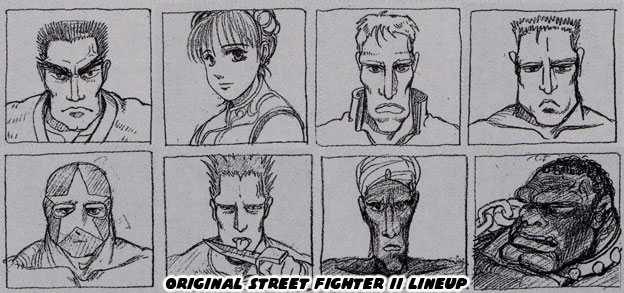
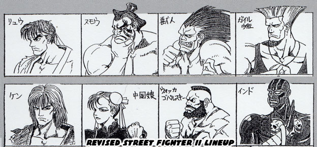
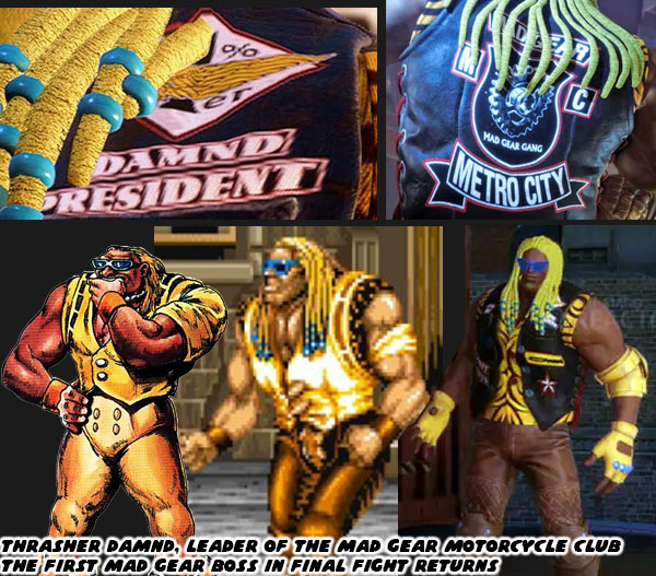
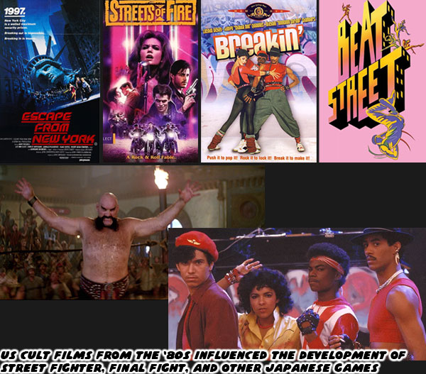
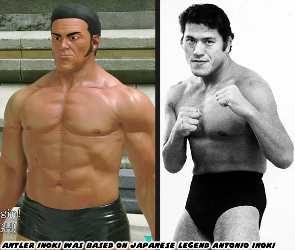
Many Japanese studios set their games in the west, particularly in major cities like New York. No genre had featured this more than the brawlers. The loudest, most colorful gangs would take on all sorts of tough guys on the most dangerous streets on the planet. I had mentioned in the previous blog that the designs for these worlds were pulled from cult Hollywood films. Some of my absolute favorite games were developed by Capcom’s perennial rival Konami. The two studios essentially took the genre over after Tatio’s Double Dragon II: The Revenge failed to recreate the success of the previous game. Final Fight of course was everything that Double Dragon II failed to be. The only title that I would even argue topped some things in Final Fight was Vendetta. Konami’s previous game Crime Wave was sorely lacking by comparison.

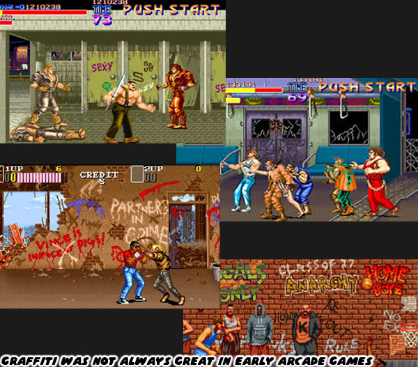
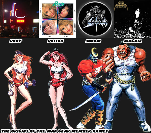
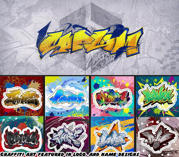
The thing that all of the Japanese studios would do in order to create the look, and feel of the west was the use of graffiti. It instantly transported arcade visitors into the world that the designers were creating. This extended beyond brawlers, it included fighting games, sports games, action shooters, and adventure games. Graffiti in pop culture was a sort of shorthand for gang territory, for dangerous neighborhoods. The thing was that if you had grown up in a big city, if you were familiar with actual graffiti art, with actual gang neighborhoods you would notice how amateur the graffiti was in gaming. It actually looked convincing, so long as you didn’t take too close of a look at the art. Capcom was aware of how to use graffiti going back to the original Street Fighter.

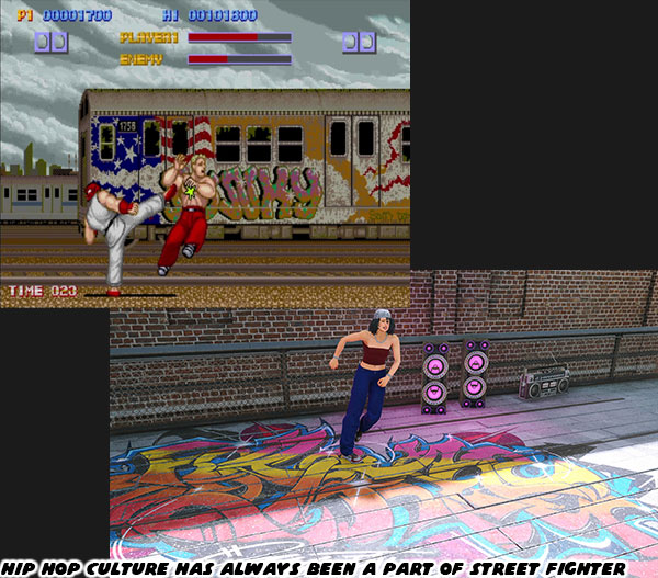
I don’t think modern audiences understand what a groundbreaking visual language Capcom was pushing with the first SF title screen. A brick wall was covered in tags of their previous hits; Section Z, Avengers, Trojan, and Commando. The massive company logo was right in the center. It oozed style, and attitude. Suddenly a fist punched through the wall, the unknown character turned his back, and we could see Street Fighter was embroidered on his jacket. It instantly grabbed your attention, and made you think that this would be the hardest title ever. Well at least I thought so. As I mentioned previously I played the original SF with the giant foam buttons. The intro screen was burned deeply into my memories. When I saw Capcom had recreated, and hidden the logo in SF6 I lost my mind. Every callout in Metro City was making me freak out. Capcom had learned to do something with graffiti culture that many other Japanese studios missed. Let’s talk about something that ran parallel with graffiti art.

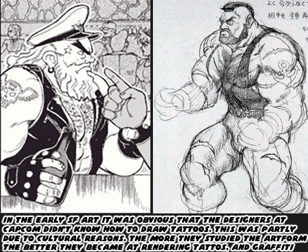
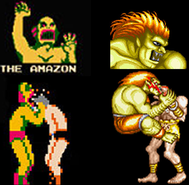
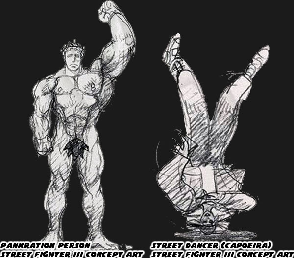
Drawing a character with a tattoo was another form of shorthand. In comics, cartoons, and manga people with tattoos were instantly seen as criminals, gangsters, or tough guys. The thing was that tattoos in Japan had a completely different connotation, and style from tattoos in the west. Intricate tattoo work in Japan was mostly associated with the yakuza. Not only that but the majority of the markings were covered up. They were only seen if a gangster visited a bath house for example. This was opposed to tattoos from the west where they could be seen out in the open. Perhaps on a shoulder, bicep, or forearm. When Capcom artists would create concept art for SF, and FF, they would try to draw a character with tattoos, but you could tell they didn’t know how, or what to draw. I remembered one biker/captain looking guy arguing with M. Bison (Boxer) he had a skull with wings, and a star on his temple. Or the early Zangief had a tattoo on his shoulder. Even the finished art had some yikes designs, like Birdie having a bright heart tattoo on the side of his head. It certainly wasn’t a very punk look.

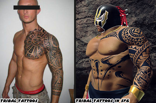
The thing was that the artists working at Capcom, and other Japanese studios, started studying up on tattoos. They saw the rich tapestry of styles from artists all over the world. They saw how classic Western Norman “Sailor Jerry” Collins helped shape a timeless aesthetic. It turned out that he was actually inspired by what he saw in Japanese tattoo art. This meant that the art form was cross pollinating across the Pacific pre, and post WWII. Society’s attitudes towards tattoo art had changed tremendously in the past few generations. It was the responsibility for the designers working at game studios to understand how to create authentic looking tattoos for their game characters. More than 30 years after the debut of SF Capcom was capable of creating passable tattoo designs that could be seen on gang members, and even used for avatar characters.

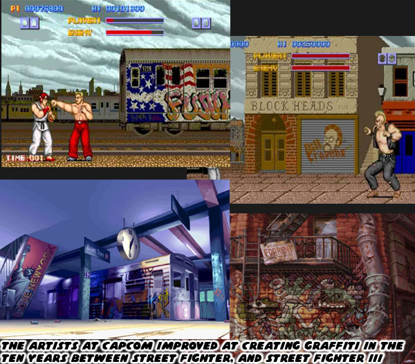
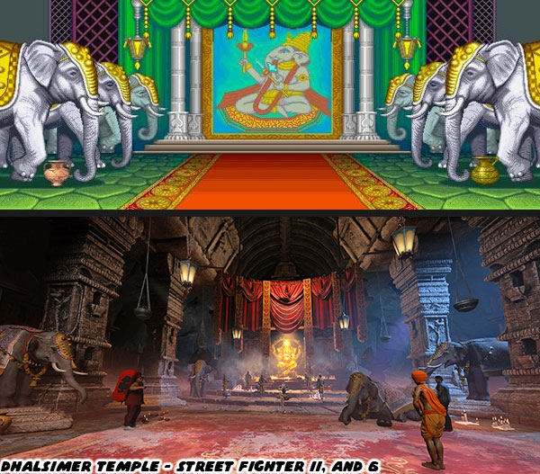
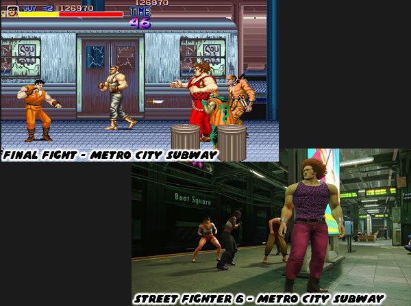
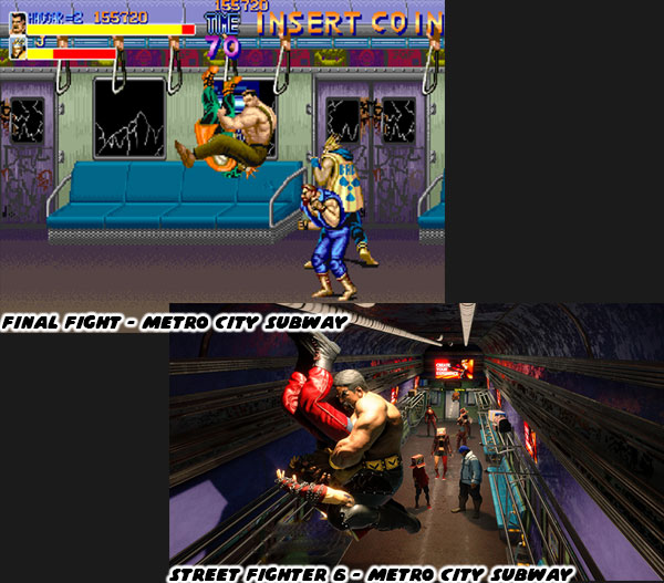
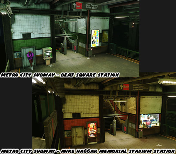
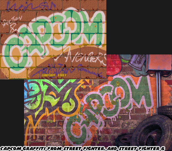
It was obvious that the more the artists studied a school of art the better they became at it. The graffiti used in the first SF was sometimes passable, and sometimes primitive. There were a lot of basic tags in Final Fight, but not really any good pieces. There was no graffiti art in SFII, and the only tattoo was Guile’s USA Flag. A decade after the first SF several stages in SFIII showed that the Capcom staff had grown by leaps, and bounds. The quality of the art, and animation, had grown as quickly as the skills of the programmers. There were several realistic tags, big productions, murals, and throw ups. Essentially the studio was showing that they knew not only the language of graffiti, but how, and where to present it on the stages. Some of these designs were recreated in SF6 for Metro City.

Fast forward almost 25 years after SFIII and Capcom was producing some peak graffiti art. It was displayed proudly on the SF6 intro screen, character logos, and all over the stages. It was apparent that Street Fighter 6 Director Takayuki Nakayama, and Producer Shuhei Matsumoto were not only fans of Hip Hop culture, but wanted to remind audiences that it had always been a part of the history of SF. In the early days the studio didn’t really know what they were doing. They were sort of emulating what they saw in movies, and on TV. Sometimes they missed the mark, but more often than not they got it right. Mr. Nakayama, and Mr. Matsumoto connected that history through the visuals, stage designs, NPCs, animations, and new characters. They also shared with audiences that graffiti was only one element of Hip Hop culture.

For decades game developers used only parts of the culture, rather than the whole. They might use graffiti, or rap music, or the dance in their game. These things were often disjointed, and poorly presented without context. The SF6 developers eased new players into how to play Street Fighter through the World Tour. They taught them the hundreds of little lessons through the pedestrian fights, gangs, and side missions. Something similar happened with Hip Hop in SF6. Metro City had some brilliant graffiti scattered throughout. They weren’t all freshly painted masterpieces, in rougher parts of town they were tagged up, and aged accordingly. There was a sense of realism with the use of the art. There were also b-boys (breakdancers) performing in the street, battling each other with their footwork. In the Battle Hub you could even put together some music on a turntable. Hip Hop had four major elements. Graffiti was the visual language, the dance was b-boying, and the music had two components, the dee jay, and the emcee. Rap was just one tiny part of a bigger cultural movement. In the ‘80s the Japanese developers were trying to emulate a culture they didn’t understand, or practice in their video games. By 2023 Hip Hop was understood universally as street culture.

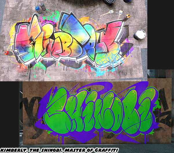
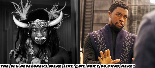
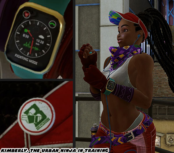
Mr. Nakayama, and Mr. Matsumoto were not only aware of the four elements of Hip Hop, but they wanted to make sure it felt authentic in SF6. One of the ways they did this was through who was representing the culture in the game. Kimberly had embraced ninjitsu, her goal was to be a shinobi, the understudy of Guy. At the same time she wanted to infuse the secretive Bushin art with her own style as a graffiti artist. She had a sketchbook, she carried paint cans with her, and fought with them. Her hangout on top of the Metro City Police Department was covered in some amazing pieces. Every detail in her design told a story, and was supported by her environment. Just as I had mentioned that Luke’s stage design reflected his personality. Every SF character featured in the game received the same treatment. Capcom wanted to make sure that Kimberly’s representation mattered. She was not a washed up womanizing boxer, a struggling protégée for Ken, or an African tribal princess. She was a multi talented black teen. A student, artist and ninja star that would be influencing a whole new generation that looked just like her.

Hip Hop culture started in NYC back in the ‘70s. In one generation it became a global phenomenon. It did not belong to one race, or people, or country. With that said it was girls that looked just like Kimberly had been there since day one. They didn’t get any representation in fighting games until now. A similar thing could be applied to Jamie. The protector of Chinatown was a b-boy. Some of the best dancers in recent years had come from Korea, Japan, and China. Seeing the Asian community represent, if not win in high level competitions demonstrated how powerful the culture was in attracting new audiences. Jamie had a foot in two cultures, the classic kung-fu practitioner, and the Hip Hop dancer. He was exceeding in both. It was the same amount of understanding, and respect that the developers used when creating Kimberly.

Jamie had the smoothest blend of martial art, and Hip Hop dance the world had ever seen. I had done 
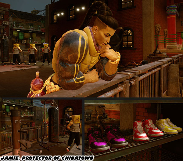
a deep dive on his design, and origins back in June 2022. There was not really too much to add to his look, and personality that I didn’t pull from his teaser video. The game did frame his personality in his stage design. He hung out on a Chinatown rooftop at night. Up there he had everything a young man would need; a weight set, punching bag, wing chun dummy, tiles for breaking, boombox, and collection of sneakers. The cultures, and representation that went into SF6 were handled much better than in the previous two games. It wasn’t the only progress the studio had made in this game. I’ll dig deeper in the next entry. Before I wrap up this blog if you want to find out more about the roots of Hip Hop culture here are three documentaries I would highly recommend. For graffiti art check out the classic Style Wars. As far as dee jay music went I couldn’t think of a better film than Scratch. One of the finest b-boy documentaries was called The Freshest Kids. Thankfully they were all available for free on YouTube. I hope to see you back for the next entry. If you are a long time fan of Final Fight, or Street Fighter then I would like to hear your impressions of SF6. If you have never played any game previously then tell me your experiences in the comments section please. As always if you would like to sponsor me please visit my Patreon page and consider donating each month, even as little as $1 would help make better blogs and even podcasts!
follow the Street Writer on Patreon!

Wednesday, August 23, 2023

Street Fighter 6: A master class in game design, part 11

Street Fighter 6 was bringing back classic characters, but not solely as the main roster in the Fighting Ground, better known as the Arcade Mode. Characters that hadn’t been seen in decades were being introduced to a new generation of game players. The first of which, that had me really excited was actually the very first opponent from the original Street Fighter. He was a Japanese monk named Retsu. The angry-looking bald fighter battled Ken, or Ryu in front of a Japanese temple. He looked like the type of villain that might pop up in a kung-fu film. He was notable for being the first to utter the phrase "What strength!! But don't forget there are many guys like you all over the world.” After completing a few sub missions, and sparring against the character he repeated the line. Seeing that dialogue filled me with so much joy.

Retsu was literally the oldest character returning to the franchise, but wasn’t the only rare character to be brought back. Despite the success of Final Fight the game never got a sequel in the arcades. This was undoubtedly due to the success of Street Fighter II. Capcom still saw a lot of potential in the game, and worked on exclusive sequels for the Super Nintendo. Each one extended the adventure of Haggar, with some new faces accompanying him on his war against the Mad Gear gang. Final Fight 2 introduced us to Maki, a female ninja, and Carlos Miyamoto, a South American sword master. Maki was the sister of Guy’s fiancé Rena. She was also an understudy to Genryusai, the Bushin Ninja Grandmaster that had taught Zeku, and Guy. Maki started a long-running feud with Guy after he was made the 39th Grandmaster following the death of Genryusai. She thought she deserved leadership of the clan given her ability.

Carlos on the other hand was training with Haggar. The long-haired Miyamoto was a master of Iaido, essentially the samurai’s uncanny ability to draw his sword, and fight with immediate reaction. This was a skill done without conscious thought. Centuries ago the samurai were already well versed in muscle memory. They drilled situations with small groups over, and over until they could handle any close range situation without hesitation. Carlos was a modern world samurai, and seeing his return was a surprise. I didn’t care much for his design in FF2, his open vest, cowboy boots, and long hair were simply clashing looks. None of those elements really complimented each other. He did however have a considerable “glow up” in SF6. A tailored suit, sunglasses, and slim sword holster all worked well together. Even the tiny detail of putting his cowboy boots under his pants helped tie the look together.

I think that SF6 Designer Yusuke Hashimoto was doing some absolutely inspired work. Retsu was sort of the opposite of what you think a monk should be like. He was hot tempered, enjoyed fighting, and the finer things in life. You would think that Retsu was absolutely identical as he appeared in the original SF, however there were a handful of things that set him apart, and made the design much stronger. Mr. Hashimoto added sandals, a gold necklace, fancy watch, and smart device in the pocket of his robe. Each of these small details told a story about the his personality. Mr. Hashimoto managed to redo the look of Carlos without betraying the roots of the character as well. He even made sure to preserve his long hair, the jean color of his suit, black belt, and cream boots. The updates he did to the other characters could be very subtle. To be completely fair I wasn’t a fan of Cammy’s casual new look. Yet could say in all honesty that Juri’s updated look in SF6 was the best the character had ever been presented. Similar to Retsu the very first boss that you fought in FF had returned, with his trademark whistle intact!

The updated look for Damnd was handled so well that it deserved a closer look. The original character, and design was meant to be loud. The character was brash, and annoying. Having yellow braids, a yellow vest, bright blue sunglasses, and brown leather pants were all clashing choices that reflected his personality. The SF6 version maintained those details, and added more context to his modern design. His top was actually reversed to yellow undershirt, with a black vest over. It was a look that could almost be passable for a real world flamboyant gang leader. The Mad Gear Gang was a motorcycle club patch on his vest. It stood to reason as the name Mad Gear actually came from an arcade game released a year before FF. It was about a futuristic race, where you could jump over opponents, and knock them off the road. On his vest he wore a patch that said President. I could see him leading the Motorcycle Club, but not the whole Mad Gear organization. He also had another patch that read 1%er on his left shoulder. This was a detail easy to overlook. The term 1%er was coined in 1947 by the American Motorcyclist Association. They stated that 99% of motorcycle riders were law abiding citizens, it was actually only 1% that were violent criminals. The various gangs that road bikes would eventually start wearing those patches on their vests starting in the 1960’s.

A good chunk of the design work that went into Final Fight, and brawling games for that matter, were rooted in US gang culture. In particular that representation in cult films. In the late '70s, and early '80s the Japanese designers at Capcom were absorbing this media, synthesizing it, and trying to recreate it in their games in order to appeal to western audiences. It was most apparent when they were coming up with the names for the individual Mad Gear members. Those from Gen-X knew instantly where the majority of those names came from. Previously on this blog I talked about the origins of Mad Gear character names like Axl, Slash, Sodom, and Abigail as well as lesser known characters like Caine.

Hair metal, the glamorous offshoot of heavy metal was wildly popular in the ‘80s. Poison was a successful band, and one of the popular clubs they performed at was the Roxy. Those names would be applied to the first female gang members in the game. The fashion, colors, music, and visuals seen in movies, and music videos would become the basis for Metro City. It’s quite possible that Beat Square, and Beat Street in SF6 was named after the cult b-boy film Beat Street, which also was shot in part at the Roxy. Yet when it came to capturing US street culture it wasn’t always lighting in a bottle. Sometimes you could tell the Japanese designers had no idea what they were doing. We will explore how Capcom evolved in their understanding of Western culture in the next blog. I hope to see you back for that. If you are a long time fan of Final Fight, or Street Fighter then I would like to hear your impressions of SF6. If you have never played any game previously then tell me your experiences in the comments section please. As always if you would like to sponsor me please visit my Patreon page and consider donating each month, even as little as $1 would help make better blogs and even podcasts!
follow the Street Writer on Patreon!

Monday, August 21, 2023

Street Fighter 6: A master class in game design, part 10

The Street Fighter 6 developers were easing audiences into the World Tour for multiple reasons. They wanted players to learn the controls, and moreover get comfortable with them. They also wanted audiences to level up, and learn new techniques from different masters. This would get them used to the controls, special attacks, and effective ranges for the main SF cast. It would also help audiences build strong avatars with more health. This would increase the odds that they could survive more difficult encounters later on. In order to do this players needed repetition of fights against different styles, and abilities from the residents, and gangs of Metro City. By creating side missions scattered across Metro City the developers were able to deliver all of the above. Early on in the World Tour you were only able to explore half of the city. After reaching a certain part of the game you earned a Metro City Pass, and could now travel via subway to the other side of town.

The subway stage was the second level that players went through in the original Final Fight. It provided one of the most memorable stages, and encounters in the history of video games. When I descended the stairs from the Beat Square station into the subway I got literal goosebumps. Once again the developers had managed to recreate the look, and feel of that classic stage but this time in 3D. You could talk, and then challenge individual lower level Mad Gear members hanging out on the platform. Or you could get on the train, and travel to the other side of town.

The art team poured through every detail from the original Final Fight, looking for what they could pull. The signage, architecture, and scale of the platform were spot on. Even more impressive were the details placed into the subway cars. The colors of the seats, and doors, the placement of the stanchions, the types of handrails, and even colors of the floors, and roof were spot-on.  The well-worn linoleum, and matte-finish seats were the chef's kiss of details. Many would consider these “throw away” details, but they helped convey how dangerous this town was. There was a subtle difference in the updated subway, and that was a part of the storytelling. Mike Haggar was trying to clean up Metro City in the first FF. This meant that most of the city looked run-down, dirty, and covered in graffiti. This was especially true for the subway cars. Previously the cars had broken glass, and lots of graffiti. The newer cars had much less graffiti, no broken glass, and despite their age seemed to be fairly well maintained.

You could actually run from the Beat Square Station to the Urban Park Station faster than the subway could travel between the locations. So what was the purpose of the train? The subway cars actually forced gang encounters onto the player. Almost every rail car had a different number, and type of gang member. Advancing between the cars was like a scene in an action film. You almost expected there to be a Mad Gear boss waiting for you at the head of the train. The number of nonstop battles was a way to make sure players got the necessary experience in order to level up. In fact if you needed more experience, or gear for your avatar then there was no better way than by traveling back, and forth on the subway. Once you reached your destination you discovered another group of Mad Gear members hanging out on the platform. There was a subtle difference in this new station. The tile work on the Urban Park / Mike Haggar Memorial Stadium Station was a different color. Red tiles compared to the Beat Square’s green tiles. These were those small storytelling details that were pulled from real world stations.

Once players climbed the stairs they were introduced to the Urban Park. In the center of this park was a massive statue dedicated to Mike Haggar. There was a large placard at the base of the statue citing that the citizens of Metro City had this statue built in his honor. During his tenure he managed to turn around a city that was overrun with gangs, crime, and corruption. He didn’t accomplish this solely with policy changes, but by literally taking the fight to the streets. When his daughter was kidnapped by Mad Gear he went block, by block, through the city. He cleaned out the gang, its generals, and leader with his bare hands. With the help of Cody, and Guy of course! When this location was previewed earlier in 2023 many fans of FF were worried that the statue meant that Mike Haggar was dead. I was worried as well, thankfully Street Fighter 6 Director Takayuki Nakayama confirmed on Twitter that he was alive, and well. I could only hope that a future SF6 update revealed that he was now the Governor of the State, or perhaps a Senator.

As I had been saying through this series, the team at Capcom was putting in all sorts of details. These Easter Eggs were nods to their legacy. Many fans assumed that the Mike Haggar statue was a new touch. It had actually appeared in an earlier title, specifically Final Fight Revenge developed by Capcom USA, and published by Capcom in 1999. The same statue, albeit much smaller could be seen in the middle of Urban Park. A daytime, and nighttime version of the stage was created for that game. The statue could clearly be both times. FF Revenge was set just after the events of the first game. As such most of Metro City was still in rough shape, but it was starting to get better.

I would argue that the graffiti-covered walls for the stages for Poison, and Edi. E in FF Revenge inspired the development of the Mad Gear, and Crows turf in SF6. A more specific detail pulled from FF Revenge was the claw crane from Abigail’s Scrap Yard. Andore’s stage took place in the middle of a junkyard. In the background you could see the massive crane with the long claw attachment. It was easy to see how this location evolved, and would become the property of Abigail, one of the lieutenants of the Mad Gear gang. Let’s get back to the park however.

In every major city there were usually a handful of unique parks. New York having arguably the most popular one. Central Park was like a small town to itself, complete with a zoo, museum, and small lake. Urban Park wasn’t as massive but it did have a number of unique features, and also unique characters. There were visitors from overseas visiting the park. Armored warriors reminiscent of Marisa’s guard, and a young bull enjoying the shade. There was also an Indian with a decorated elephant. These characters brought with them the fashion, traditions, and animals that were known to their cultures. They were in town for a fighting tournament in the newly built Haggar Stadium.

They weren’t the only unique fighters to appear in the park. There was a pro wrestler flexing at the base of the Haggar statue. This was a character that had been written about, but not seen in the games. Antler Inoki was a retired Japanese pro wrestler. He was from the same era of Mike Haggar when he was a pro wrestler, and Meteorito Jr. the trainer of El Stinger, and El Fuerte. The wrestlers featured in Muscle Bomber / Saturday Night Slam Masters were developed in part by Tetsuo Hara, the co-creator of Hokuto No Ken / Fist of the North Star. Mr. Hara was passionate about pro wrestling, and caricatured a few real world grapplers into his designs. Although the last game in the series came out in 1994 it was still a part of the SF universe.

The SF6 developers were also keenly aware of pro wrestling, especially Japanese pro wrestling. They made sure that Antler Inoki looked like Antonio Inoki (RIP) the legend he was based on. Inoki was an iconic personality, with a powerful chin that had been caricatured in anime, and manga titles over the past 40+ years. That wasn’t the only nod to pro wrestling they got into the game. The designs of wrestling NPCs, the gang members that looked like pro wrestlers, luchadores (Mexican wrestlers), and masked wrestlers were influenced from the real world. Even a poster that Zangief asked you to track down as part of a side mission featured a mask character that was a nod to pro wrestler Shark Boy, as well as the pro wrestling manga Agnes Kamen.

Other rare characters made an appearance in Metro City. They were used to great effect in the World Tour story. I’m going to dig into them in the next blog. I hope to see you back for that. If you are a long time fan of Final Fight, or Street Fighter then I would like to hear your impressions of SF6. If you have never played any game previously then tell me your experiences in the comments section please. As always if you would like to sponsor me please visit my Patreon page and consider donating each month, even as little as $1 would help make better blogs and even podcasts!
follow the Street Writer on Patreon!