Monday, June 8, 2026

A look at Yasmine, Filipino representation in Street Fighter 6

Hello friends, welcome back to the blog. This entry is a follow up to the one I posted on Arjun. This has to do with the new character reveals for Season 4 of Street Fighter 6. I said that the design behind Arjun was poorly executed. His appearance, and costume was essentially a copy of the concept art for Ryu in SF6. It was bland, and lackluster, and made me think that the team’s Senior Designer Yusuke Hashimoto had nothing to do with his look. I could almost argue the same thing with the other new character introduced for the game. Yasmine was the first new female added to the game since its launch. The other women introduced in the seasonal updates were pulled from older games.

Before Capcom said anything about the origin of the character, or her move set I knew where she was from, and what she represented. She appeared to be a Filipino. Making her the first Asian-Pacific islander represented in the series. The colors of her uniform were rooted in the flag of the Philippines. It was white, blue, red, and yellow. The sun icon on her shoulder was modeled very much on the sun logo on the flag. As many national flags there is tremendous meaning behind the colors, shape, and symbols featured on it. Not the least of which are the eight rays emerging from the sun, which represents the eight provinces that rebelled against the Spanish in 1898. Her top was based on the Barong Tagalog, a traditional shirt strongly rooted in national identity. It wasn’t just worn by residents in casual, or formal settings, but also by politicians in the Senate.

In her hands she had an ornamental karambit. This knife was used in the traditional fighting art Eskrima, sometimes referred to as Kali or Arnis. For many people in the USA their first exposure to this martial art was in the 2003 film The Hunted featuring Tommy Lee Jones, and Benicio Del Toro. It highlighted the lethality of the fighting art. It was made popular in recent years from The Raid movies. The Raid 2 specifically from 2014 featured Iko Uwalis as the undercover cop Rama, and Cecep Arif Rahman as the Assassin. Their karambit battle was one of the best sequences in martial arts cinema. Yasmine could have used sticks as a weapon. Most people were familiar with stick fighting with the Filipino martial arts. The staff, and sticks were already featured by Eagle, Rolento, and Falke in the series. The advantage of the karambit was a stronger national theme.

Since Yasmine’s karambit was not a blade in the traditional sense it was still a weapon that could be used for trapping, as well as striking. I think this tool was inspired by the wooden fishing hooks carved by Pacific Islanders. There was a lot of cultural influence between Malaysia, Indonesia, and the Philippines. The karambit was only part of a strong ethnic identity that united the three nations. Her martial arts belt was also accurate to her region. Karate practitioners tied their belt in the front, in the Philippines the belt was knotted at the right hip. Her name, and school were written on the belt. It was worn is very specific way for the Filipino martial arts. In some schools a sash could be used in place of a belt. 

Everything that Capcom did with the new character seemed to be the polar opposite of the last time a Filipina was used in a fighting game. If you were familiar with fighting games then you realized that Yasmine was not the first Filipino fighting game character. She wasn’t even the second. Josie Rizal debuted in Tekken 7, back in 2015. She was a time-release character that came out in April of that year. Series producer Katsuhiro Harada said that he had wanted t include a Filipino character going back to Tekken 5 in 2005. He didn’t get a chance to do so until much later. Unfortunately for him this character would be very divisive. Fighting games were big the world over, Tekken was especially popular in the Philippines. The downside was that even though Josie was proposed as an eskrima fighter, without any weapon it was hard to tell. She was voiced by Ananda Jacobs, and had no detectable Filipino accent. The other was she had the name of a national hero, and the attitude of a crybaby.

José Rizal was a writer, nationalist, and doctor whose work helped inspire the country to rise up against Spain. He was executed in Barcelona for rebellion after a brief exile in Cuba. He had no direct involvement with the resistance, but his death helped spark a revolution. The fact that Bandai Namco used the name of an icon, but put it on a crybaby girl was read as a direct insult to millions of Filipinos. The Japanese had committed many war crimes against the Philippines, China, and Korea during regional conflicts. It was not hard to imagine that they still looked down on other cultures even if this was not the intention from the developers.

To add fuel to the fire Namco put a Filipina in a fighting game much earlier, and was more culturally sensitive about it. They did this with Talim in Soulcalibur II. The game came out in 2002. It was directed by Jin Okubo, and Yoshitaka Tezuka. It was produced by Hiroaki Yotoriyama. The Soulcalibur, and Tekken teams had a friendly rivalry inside of Namco. They traded jabs with each other at gaming events, but deeply respected each other at the same time. The Soulcalibur series was a sword fighting game which pulled elements from ancient history. It was much closer to fantasy than historical to be honest. In the case of island representation Talim was a sort of amalgamation of Indonesia, Malaysia, and Philippines. Her costume was pseudo-traditional, as was her weapon. It was a hybrid karambit, and tonfa. She demonstrated that the studio was capable of better representation if they tried. Yasmine was a better design compared to Josie, but I think that Capcom was trying too hard to swing in the other direction.

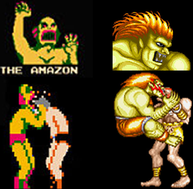
The taped shins, and hands signaled to audiences that Yasmine was clearly a fighter. The use of the Filipino national flag as primary colors on her costume, with the sun, and stars as accents let us know what region she was from. Her hair color was purple, a mix of the red, and blue from the flag as well. You would think this made her a fantastic design, and a prime example of inclusion done well. I would argue that it was sloppily done at worst, and ham-fisted at best. For starters I want you to think about which characters in the game wore their national flag as the primary colors on their uniforms. Zangief did indeed wear the old USSR colors on his shorts. Ryu was a happy accident in that his gi was white, with a splash of red on his headband. Contrary to popular belief Blanka was not green because of the Brazilian flag, but because he was modeled after the Amazon from Nintendo’s Pro Wrestling. Past that none of the World Warriors from SFII or New Generation from SFIII used their national colors as their costume.

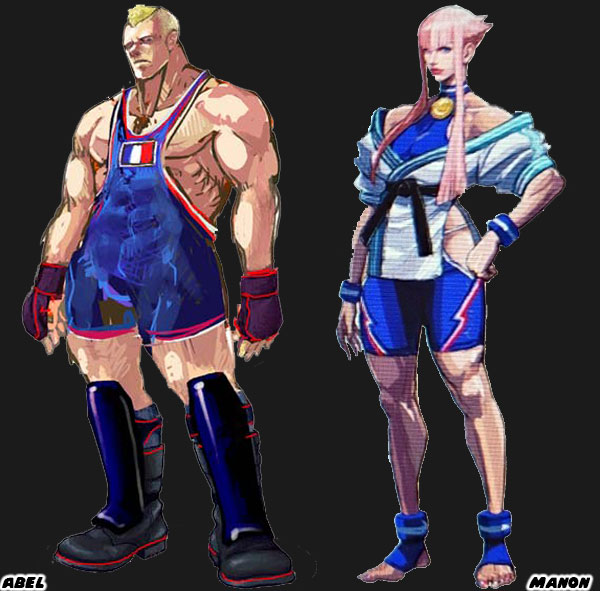
Street Fighter IV, and V started the trend of turning the colors of a national flag into costumes. We could see it with Abel from Street Fighter IV, Manon from SF6, and Laura from Street Fighter V. I argued that of all the new characters introduced into the franchise Juri Han was the best because she poached the most from Chun-Li’s design roots. I mentioned that the purple in her hair, and uniform were created by mixing the red, and blue from the South Korean flag. I would argue that the purple hair featured on Yasmine was a result of the same logic. I thought it was a cheap, and unnecessary design choice.

Any other color hair would have clashed Juri, and Yasmine’s costume. At the same time we had to address the Asian colored hair phenomenon. For decades Asian characters were coded with attitude thanks to colored hair streaks. Teen Vogue covered this issue, and Glamour said it was time to retire this trope. I was aware of it when 
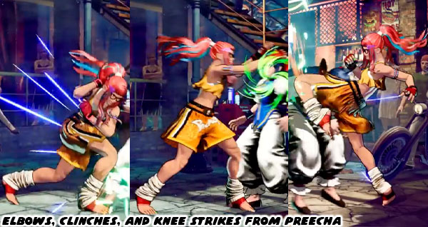
I talked about how Juri Han’s design got better with time. It might seem insignificant to you, but I think that turning a flag into a costume was cheap. I think that giving colored hair to an Asian, or Pacific-Islander was sloppy. This pandering to tropes was not limited to Capcom. Even Preecha, the new female Muay-Thai fighter from SNK had colored hair with contrasting streaks.

Going with popular generalizations was not a substitute for actual research. You cannot achieve great design by pandering to the lowest common denominator. With some effort you can have a great national figure, and undo years of ugly caricatures. This was why I respected Designer Yusuke Hashimoto, and the team working on SF6. They managed to take Dhalsim, and Blanka which were the two ugliest caricatures in the franchise, and make them significantly better by changing just a few details. Not only that. I would argue that Rudra was an even better design, and a sort of way for Capcom to quietly retire Dhalsim. It seemed like an impossible task for Capcom, or any Japanese developer to do better. I knew it wasn’t impossible. A generation ago we had T. Hawk. He was originally going to be the new Zangief for Street Fighter III. Along with Cammy, Dee Jay, and Fei Long. However they were pushed into the Super SF II update before his design was refined. 

I wanted to see Mexican representation in the SF franchise, but this was not it. T. Hawk was a member of the fictional Thunderfoot Tribe from Mexico. He was about as authentic a native as Iron Eyes Cody. For those that didn’t know Iron Eyes was born Espera Oscar De Corti. He was an Italian-American that was cast for Native-American movie roles going back to the 1920’s. He spent the next 70 years convincing the USA that he was the real deal when in actuality he was perpetuating stereotypes. With his face paint, moccasins, jean vest, and feathered headband T. Hawk was doing the same thing for the fighting game crowd. I was saddened to see how little Capcom cared to present a Mexican fighter correctly, and even more disappointed with what was done with El Fuerte. When Lili / Lily was announced for SF6 she was pulled from the same tribe, and had essentially the same design elements. In any other timeline her look would have remained the same from concept to publication. Yet the SF6 team did a lot more homework, and revised her appearance several times before her debut.

The changes to Lily were subtle, but made for a much better overall design. Her physical appearance was mostly the same. But the color choices, costume, and fashion worked much better without the pandering. Capcom got rid of the face paint, and feather. Her clothes did not have to be a poncho of red, white, and green. The colors of the national flag. An oversized jaripeo shirt did just fine. Even the change in her boots from Central to Northern American worked better. I had a similar thought on Yasmine (and Arjun). It was good to see the Philippines get representation, especially with a strong female warrior. But she was version 1.0 of the character. I knew that version 2.0 was going to be much better, just as it was for Juri, and Lily. That was my belief anyhow. What did you think of this character reveal? Who were you most interested in using in the next season of Street Fighter 6? Tell me about it in the comments section. As always if you enjoyed this blog, and would like to sponsor me please visit my Patreon page and consider donating each month, even as little as $1 would help make better blogs and even podcasts!
follow the Street Writer on Patreon!

Sunday, June 7, 2026

Arjun in Street Fighter 6, a great warrior with a mediocre design

Hello friends, it’s been a few years since I’ve talked about Street Fighter 6. I was happy with everything that went into the game, and saw little reason to discuss the seasonal updates. Either you played them, or you didn’t. In the past three years I didn’t talk about the SNK characters that turned up in the game. I didn’t talk about the return of Elena, Crimson Viper, Ed, Sagat, or Alex. I didn’t even talk about the introduction of Ingrid from the cancelled project Capcom Fighting All-Stars or Tifa from Final Fantasy VII. I didn’t even talk about the resurrection of Bosch either. Yet with the Season 4 trailer that was played during the 2026 Summer Games Fest we have some new faces that I did want to talk about.

The first that caught my eye was Arjun. It was mainly due to the fact that he looked like Ryu with wild hair, and a long beard. As it was Ryu had taken on more of a monk-like appearance in the game. He already had a short beard, and wore a Kāṣāya, or traditional brown colored Buddhist monk robe over his gi. It showed growth for the character, and helped visually signal his story arc had concluded. He was not the young warrior traveling the globe as he was in the original Street Fighter. Nor was he the wandering champion post Street Fighter II. He had finally become a master, and had settled his life in a temple. He was essentially a philosophical, and visual opposite of Gouki / Akuma at this point. The thing I wondered was why the designers at Capcom would reuse the overall look. In fact Arjun appeared very much like some of the earlier concept art for Ryu. I honestly think this was a poor design choice from an otherwise great art team.

Street Fighter 6 Designer Yusuke Hashimoto was an absolute master of his craft. I had already sung his praises on this blog. He knew the importance of character art, and fashion design from his work on PlatinumGames Bayonetta, and Bayonetta 2. He helped redesign the iconic uniforms worn by all the classic SFII World Warriors, the New Generation from SFIII, and some of the faces introduced in SF IV, and V. If there was a person that I trusted to help create a new SF 6 character it would be Mr. Hashimoto. With that said I think Arjun fell flat. Some people online theorise that this design was from somebody else on the team, because he might be busy helping with a SF 7 roster, or major SF 6 update. In either case I appreciated that Capcom was putting in a distinct warrior to represent Nayshall in the game. Previous to Season 4 Bosch was the iconic fighter from the region. He had a great look, a great origin story, and his arc was crucial to the plot of the World Tour mode. Unfortunately he was an unplayable character. This was similar to the other important characters from the region, including Nayshall freedom fighter Rewancha, Fou-Lu the dragon of Nayshall, and Kalima the leader of the Nayshall Resistance.

These were all fantastic designs, but sadly all the Nayshall figures were NPCs as well. It’s great that we would finally be able to play as Bosch in Season 4, however we would be getting a completely new representative too. I believe that Arjun was a good guy. Not only that but I think this person created to take down JP once and for all. The name Arjun was based on Arjuna from the Mahabharata. He was a mighty warrior in the story, and regarded for his bravery, strength, but also for his talents in the arts. The name itself represented several things such as white, clear or silver. He could see those things in the color of his pants, and the silver chains on his belt. Arjuna can can also go by other names such as Vijaya (विजय) – always victorious, invincible and undefeatable, Jiṣṇu (जिष्णु) – triumphant, conqueror of enemies, and Bībhatsu (बीभत्सु) – one who always fights wars in a fair, stylish and terrific manner and never does anything horrible in the war. All of these things might be true of the character. If so then he is the opposite of JP. He would be fighting to undo his silent coup against the people of Nayshall.

Capcom did tremendous world building around the fictional Nayshall. This region, its language, and NPC designs borrow heavily from Nepal. The actual border country sits between China, and India. Nepal itself pulls elements from multiple cultures, while also creating its own identity. Nayshall was as unique in the Street Fighter universe. There was a tremendous love, and respect that the team at Capcom had for the people they were reflecting. You could tell in the look of this place, in the plot of the game, the language on the billboards as well as the graffiti in the lowlands, not to mention the thousands of supporting details. Nayshall was easily one of my favorite places to visit in any modern game. In fact I said that this place had more life, and personality than any of the regions in the Norse God of War titles. I stood by my statement then, and still think that way today.

With that said I still think Arjun is a poor design. I haven’t even seen his move set, or know his exact role in SF6. From a visual perspective however I think he has one of the weakest looks in the franchise. It is very plain, and poorly thought out. Several of the NPC characters had a better look. I get that the concept art for Ryu was worth revisiting. Yet I do not think that it was strong enough to support an entirely new character. I don’t know what the studio was thinking with Arjun aside from someone to carry the plot forward. There was another new character announced for Season 4 that I thought had stronger design elements. I’d like to talk about that in the next blog. Until then I would like to know what you thought about the SF6 announcement this year. Tell me about it in the comments section. As always if you enjoyed this blog, and would like to sponsor me please visit my Patreon page and consider donating each month, even as little as $1 would help make better blogs and even podcasts!
follow the Street Writer on Patreon!

Friday, June 5, 2026

The skeleton skateboard art from my sketchbook

Hello friends, I hope that you are doing well. I am still working on getting out of the artist slump. It’s tough when you want to be creative, but you are also your own worst critic. In the meantime I’d like to share some skeleton skateboard art with you that I did from a few years back. When I was a kid I saw my first Vernon Courtlandt Johnson illustration for Powell Peralta skateboards. My mind was forever warped by it in a good way. Ever since then I’m always at peace when I draw skeletons skateboarding. You can see a bigger collection on my gallery of surf, and skateboard art.


Did you have a favorite skeleton piece that I did? Would you like to see me do more skate art? Tell me about it in the comments section. As always if you enjoyed this blog, and would like to sponsor me please visit my Patreon page and consider donating each month, even as little as $1 would help make better blogs and even podcasts!
follow the Street Writer on Patreon!

Wednesday, June 3, 2026

Bookmark This Page; Becoming a Sonic Team fan, and playing some rare Sonic games

I am a huge fan of the classic Sonic Team games. If you want a deep dive on some rare Sega titles then Bookmark This Page.

Making a Sonic Team fan, part 1…

Making a Sonic Team fan, part 2…

Making a Sonic Team fan, part 3…

Making a Sonic Team fan, part 4…

Making a Sonic Team fan, final part…

Sonic Superstars and beyond. Sega makes up for lost time, part 1…

Sonic Superstars and beyond. Sega makes up for lost time, part 2…

Sonic Superstars and beyond. Sega makes up for lost time, part 3…

Sonic Superstars and beyond. Sega makes up for lost time, part 4…

Sonic Superstars and beyond. Sega makes up for lost time, part 5…

Sonic Superstars and beyond. Sega makes up for lost time, part 6…

Sonic Superstars and beyond. Sega makes up for lost time, part 7…

Sonic Superstars and beyond. Sega makes up for lost time, final part

A rare Sonic Team items pops up, plus showing my favorite game character some love

Do you have a favorite Sonic Team game? Tell me about it in the comments section. As always if you enjoyed this blog, and would like to sponsor me please visit my Patreon page and consider donating each month, even as little as $1 would help make better blogs and even podcasts!

follow the Street Writer on Patreon!

Monday, June 1, 2026

Bookmark This Page; The best Incredible Hulk villains, writers, and artists

My favorite Marvel Comics character is the Incredible Hulk. I did a series talking about his greatest enemies, as well as my favorite storytellers, and artists. If you want to find out more then Bookmark This Page.

A symmetry of villainy, part 1…

A symmetry of villainy, part 2…

A symmetry of villainy, part 3…

A symmetry of villainy, part 4…

A symmetry of villainy, final part

Generations of Hulk creators, part 1…

Generations of Hulk creators, part 2…

Generations of Hulk creators, part 3…

Generations of Hulk creators, part 4…

Generations of Hulk creators, part 5…

Generations of Hulk creators, part 6…

Generations of Hulk creators, final part…

Who is your favorite Marvel Comics character? Tell me about it in the comments section. As always if you enjoyed this blog, and would like to sponsor me please visit my Patreon page and consider donating each month, even as little as $1 would help make better blogs and even podcasts!

follow the Street Writer on Patreon!

Friday, May 29, 2026

Warhammer drawings from my sketchbook

Hello friends, I hope that you are doing well. Today I’m posting again to help snap me out of my art block. I am sharing some art from the past. Like last time I would be looking at some fantasy, and sci-fi art. You could find all of these and more on my Warhammer & Warhammer 40,000 Gallery.

These were done when I was on an ink series while on my lunch break at work. There was something that I missed about working in an office, and that was having a break room with a drawing table. It allowed me the space to really explore my creativity. Here’s a dwarf and war pony. Also a Female Dwarf Warrior - I think there aren’t more female dwarf miniatures because the sculptors don’t want to create some glorious hair. This piece was dedicated to all the shorties fighting their fights.

I had an idea for a video game featuring this Skaven Warrior. I wanted to see Cyanide Studios, the creators of Styx: Master of Shadows to create a new stealth combat game featuring a Skaven hunting down vampires in the Warhammer Fantasy universe. I would replace one of his eyes (under the patch) with a warp stone shrapnel so that he could see in the dark, and detect magic. Would you play a game like that?

Nurgle had some of the best art, and miniatures in the Warhammer universe. I had to come up with my idea of a Nurgle Champion. This was part of my ink sketch series, starting in October (Inktober) 2016 and going on almost every weekday until March 2017. This was a very creative period where I drew mostly things that interested me. Lots of skateboarding, cars, games and people.

Noise Marine Terminator - I've got lots of ideas for Noise Marines. In the perfect world where time, and money were no object I would have an entire until made of of Noise Marines that I converted to have fantastic weapons, and armor. For example I want to see an organ-playing Noise Marine that wears the pipes on the back of his Terminator armor. I'm sure somebody could convert the organ on the Sister's of Battle Exorcist tank to get the needed parts.

Here was another example of a custom Noise Marine that I would love to do. The Noise Marine Dreadnought - How about a Dreadnought that looks like a walking mausoleum-meets-boom box? Complete with iron fencing.

The Titan Sketch was the largest Warhammer 40K illustration I ever made. I would sometimes write massive letters on 18x24-inch sketch paper. On one side I would write a letter to a friend, or family member, then on the back I would do a drawing. I wrote to Games Workshop one day, and did of the Imperator along with the internal workings. The letter went to game creator, and editor at White Dwarf Magazine Jervis Johnson. He replied to me, and said he appreciated the letter. He also added that creative director, and legendary artist John Blanche enjoyed the titan sketch. John Blanche was like if Alan Moore was a painter rather than a writer. As far as compliments went I couldn't ask for a greater endorsement. Did you have a favorite drawing, or idea that should be turned into a model? Tell me about it in the comments section. As always if you enjoyed this blog, and would like to sponsor me please visit my Patreon page and consider donating each month, even as little as $1 would help make better blogs and even podcasts!
follow the Street Writer on Patreon!

Monday, May 25, 2026

Bookmark This Page; All about the Marvel Contest of Champions

Did you know that Marvel had a free fighting game available on mobile devices for over a decade? If you want to find out about the Marvel Contest of Champions then Bookmark This Page.

The Marvel Contest of Champions Legacy, part 1…

The Marvel Contest of Champions Legacy, part 2…

The Marvel Contest of Champions Legacy, part 3…

The Marvel Contest of Champions Legacy, part 4…

The Marvel Contest of Champions Legacy, part 5…

The Marvel Contest of Champions Legacy, final part.

Do you play mobile fighting games? Have you ever played the Marvel Contest of Champions? Tell me about it in the comments section. As always if you enjoyed this blog, and would like to sponsor me please visit my Patreon page and consider donating each month, even as little as $1 would help make better blogs and even podcasts!

follow the Street Writer on Patreon!

Friday, May 22, 2026

Illustrating the Warhammer 40,000 Primarchs

Hello friends, you might, or might not know that I was an illustrator. Like many artists I had been drawing since I could first hold a crayon. In the past few years I drew mostly using Adobe Illustrator on my computer. I hadn’t done much drawing in my sketchbook, but I was hoping to turn that around in 2026. It’s a slow going so far. I was very critical of my pencil, or ink drawings because if they didn’t come out exactly as I imagined them then I would be disappointed. This pressure that I placed on myself was something that I had been dealing with all of my life. It was something I had to work through, and was only getting worse with age. I had to make time to draw because it was good for my mental health. Also because in times of darkness creating was the greatest source of light. Over the weeks I would like to share some of the pieces I created when I was a little bit more active. It might inspire me to pick up the sketchbook. Today I would like to feature what was arguably my most active month in creating illustrations. This batch went back almost 20 years. You could find all of these and more on my Warhammer & Warhammer 40,000 Gallery.

Games Day was a traveling convention put together by Games Workshop. For a few years they held it in the LA County Fairplex. I would go with my brothers on those days. When I heard that Games Day was coming to Los Angeles I decided to enter an illustration into the art contest. Naturally I thought of doing an illustration of the Emperor from Warhammer 40,000. But he had to be unique so I sketched out what I thought he must have looked like when he was young and full of wonder. All of the art in books features a stern man that looks very down. Not at all like the look I gave this guy. It took me about three days to get this look right. Then I figured since I have time I might as well do Horus. After finishing Horus I wondered if I could do a version of every primarch pre-heresy. I'm not a prolific artist so doing 20 illustrations in one month seemed impossible. But here they were, ready for Games Day LA 2007. It also took me a while to get the armor right for Horus. What was funny was that I printed full page color versions of everything to take with me to the convention, however the Games Workshop organizers didn’t want to display them because they were digital, and because they didn’t think I had created them.

Lion El'Jonson - This was one of the last Primarch illustrations I did. I was so sick and tired of drawing by then that I really didn't care. Still I had to make sure that the first Primarch had the proper respect he deserved so his armor came off very priestly. In a previous version I even gave his armor a white collar. Unknown Primarch I - There were 20 Primarchs in canon but two of them were deleted from Imperial records. I wonder what they would have looked like, or how they would be remembered. The shroud design I actually wanted to use on a Lamenters Captain... I might still do that.

Fulgrim - Fulgrim had actually been painted a few times so I tried not to deviate too far from the character but still put my spin on him. What do you think? Peturabo - This primarch was described as the master of siege warfare. I really wish there had been a fight between him and Ferrus Manus, who was the master of fortification. It would settle who was the toughest of all the primarchs.

Jaghatai Khan - I didn't want the armor to look too samurai since it is supposed to be more Mongolian than anything. I did some research and came up with this look. Leman Russ - This guy was possibly the most popular primarch. At least he's the easiest to remember since there is a tank named after him. Like all the other primarchs I illustrated I wanted to show him young and before the heresy. The hair took a while to draw, take a close look at that.

Rogal Dorn - While I'm not a big fan of the Imperial Fists I do like the loyalty they have shown in Warhammer legend and that they were the founders of the Black Templars. Konrad Curze the Night Haunter - Again, look at this guy... how did the Emperor not know he was going to side with Chaos?

Sanguinius - I made him look young by adding freckles and the warm smile. I want people to feel sorry for this guy because he knows not what the future holds for him. Ferrus Manus - This primarch killed a monster made of living metal by drowning it in lava with his bare hands. If that doesn't make him a complete bad-ass then I don't know what does.

Unknown Primarch II - I went for memorial statue here. Missing a head and ravaged by time... what could this primarch have become? Angron - Fans think Horus was the first to turn against the Emperor. Take a look at Angron and you'll know that he was actually the first to turn to chaos. Heck with a legion called the "World Eaters" why should it come as a surprise?

Roboute Guilliman - I wanted to go Julius Caesar with Roboute but it just didn't come out that way. Oh well... Mortarion - The guy had an obsession with death plus his health was not always that great. How can the Emperor not know he would turn to Nurgle?

Magnus the Red - Magnus and his legion the Thousand Sons are easily the best-looking squad pre and post-heresy in 40k. My brother really likes the way this one came out. I kept the cyclops look even though more recently Games Workshop says he was missing an eye, not a real cyclops. Lorgar - Thanks to a eagle-eyed reader. He corrected my mistake. It's Word Bearer legion, not World Bearer... I feel like such a dope but the new version it up.

Vulkan - Not many gamers know that some of the Space Marines are colored. One of the strongest was Vulkan. He's the Primarch of the Salamanders from 40k. Corax - Here's the Primarch of the Raven Guard. According to Games Workshop text (and inside jokes) Corax is supposed to be somber and melancholy like Edgar Allen Poe. Instead I illustrated a Native-inspired Corax rather than a pasty white guy to take with me to Games Day. Alpharius - Here's the Primarch of the Alpha Legion. The last of the Primarch illustrations I'm doing for Games Day 2007. A bit of a surfer vibe? Did you have a favorite primarch, or a favorite unit of Warhammer 40,000? If you create art do you ever find yourself fighting with yourself on how to start? Tell me about it in the comments section. As always if you enjoyed this blog, and would like to sponsor me please visit my Patreon page and consider donating each month, even as little as $1 would help make better blogs and even podcasts!
follow the Street Writer on Patreon!