Monday, April 29, 2024

Disney, the Italian Legacy, part 4 - A 1UP classic from July 13, 2011

Each figure released with the De Agostini Disney Collection came with a dozen-page magazine. This magazine highlighted the character and gave all sorts of information about them including first appearance and notable stories they were featured in. My favorite in the collection was surprisingly not Scrooge McDuck but instead his oldest rival in canon. The Italians called him Nonno Bassotto, to English speakers it was Grandpa Beagle, the patriarch of the notorious Beagle Boy clan.

The Collection magazine featured an interview with the superb artist Giorgio Cavazzano as well as his insights to the long running character. Some of his best moments in comic history were featured as well as a comparison article to how the character was presented around the world. The Collection made the distinction that the eldest member of the Beagle clan made his debut as Blackheart Beagle in the 1957 story The Fantastic River Race. In later appearances in US comics, most drawn by Don Rosa he would return not with a long thin mustache but with a full white beard. This character would still be known as Blackheart rather than Grandpa. Blackheart Beagle and the pipe-smoking Nonno Bassotto were one and the same person, each was just presented differently in each country.

The collection magazine also noted that in the animated series Duck Tales the role of Blackheart Beagle was played instead by his wife Ma Beagle. Blackheart Beagle was only sparsely used in the US. His offspring made far more appearances and even had their own comic series for a while in the US. By comparison Nonno Bassotto was a main player in the pages of Topolino. He would constantly play the foil against Scrooge, Donald, Mickey and even Paperinik. And just like Scrooge, he was still somewhat animated despite his age. His appearances were often marked by bits of comedic writing as he had little patience for his children.

In Italy the Beagle Boys were headquartered out of a little yellow trailer on the outskirts of town. The trailer became as identifiable in the comics as the Money Bin or Donald Duck’s 313 car. As the decades progressed the shape of the trailer changed slightly but the Beagles never moved out. They would try to devise plans on getting into Scrooge’s Money Bin. All the while Nonno would train his kin on all sorts of criminal activities and expound the virtues of larceny. As with the other De Agostini figures in the Disney Parade and Disney Collection series the sculpt for Nonno Bassotto had to tell a story. The figure had to convince audiences that he was based on a living character. Behind the mask collectors had to see a villain thinking up a grand scheme. When I look at the statue I think De Agostini got him completely right. His stance leaning to one side, one hand in pocket and the other cradling his pipe, looking over his shoulder, Nonno was certainly up to something.

The figure reminded me of what had been lacking for collectors in the USA. As Topolino magazine constantly reminded audiences what was so great and memorable about the Disney universe, so too did De Agostini create figures and collectibles that were relevant to the universe. Compare this to how the Disney characters were marketed and distributed in the USA. While visiting the toy section of various stores and even the ones at the theme parks I kept a mental count of what Disney figures I could find that were comparable to the De Agostini ones. Many of the iconic characters appeared on children’s toys, plush figures and clothing. Older kids could find figures based on Disney / Pixar’s Toy Story and Cars. But when it came to figures based on the library of characters featured in Topolino magazine they were nearly impossible to find. I’m not talking about obscure characters either; I mean Mickey, Minnie, Donald, Goofy and Pluto. In the parks themselves there were expensive high-end statues featuring some of the characters, play sets based on theme park attractions and Vinylmation figures with images stamped onto a generic bear shape but not simple figures of the characters for sale.

When it came to actual dedicated figures of the mascots and the extended universe there was nothing available in or outside of the parks. The next time you go to a big retail store look at the toy section and see if you can find anything remotely close to what De Agostini was producing, or for that matter, anything comparable to the Topolino gadget sets. What was Disney doing or not doing in the USA to make these characters relevant to newer generations? Disney had not produced a 2D animated series featuring the mascots in years. The only series they seemed to have going was a 3D show for toddlers called the Mickey Mouse Clubhouse. The Disney Channel rarely showed any classic animation, and the Disney XD channel showed cartoons from Marvel and live-action shows instead of any classic material. The merchandise available in stores and parks placed iconic figures alongside characters barely a season old. Disney seemed to be doing the bare minimum to create, market and sell products in the US. The more “collectable” they could make an item appear, by simply changing a color scheme for example, the easier they could control the market. The US Disney consumer goods team seemed to be doing the bare minimum to create products. Some would argue that they were being lazy and too focused on the bottom line.

Consider the amount of work that went into creating a monthly series of comics, developing gadget toys for subscribers and sculpting a series of figures for collectors. From a business standpoint the overhead must have been tremendous but the end result was definitely worth it. Fans in Italy could still walk into a store and find clothing with the mascots on them, or into any toy store and buy items from the latest Pixar film. Disney in Italy was doing a lot to give consumers choices. They kept the mascots alive and well in print even if they could not do so on television. Part of the success of the mascots in Italy had to do with the Disney Academy.

The coalition of artists in Italy, now several generations deep, had a hand in design for consumer products and advertising. When they weren’t working on comics they were helping to produce figures and toys with great attention to detail. The USA seemingly had nothing comparable. They did not have a market or use a media outlet to promote the icons in any format, especially not within the pages of a family friendly comic. Disney USA chose instead to license whatever they could not manufacture or develop themselves. The next blog will challenge the idea of licensing Disney characters rather than developing products in house. Were there any rare Disney characters that you were a fan of? I'd like to hear about it in the comments section. As always if you would like to sponsor me please visit my Patreon page and consider donating each month, even as little as $1 would help make better blogs and even podcasts!
follow the Street Writer on Patreon!

Sunday, April 28, 2024

The return of a wrestling icon in Fatal Fury City of Wolves

Yesterday the blog looked at some concept art from Garou Mark of the Wolves (1999) thanks to some scans that my friend Zero shared with me. We saw how some character designs evolved. Some characters were dropped, and some ended up being the blueprints for brawlers that would turn up in the King of Fighters series. One of the returning faces in the Garou 2 / Fatal Fury City of Wolves was a masked wrestler that went by the name of Griffon Mask / Tizoc. He was easily one of my favorite pro wrestling characters in a video game. He captured the essence of lucha libre better than 90% of the masked wrestlers in any other title.

There were layers to his design that were important to fans of the sport. Even if you knew nothing about pro wrestling you could tell he was an interesting character, with a unique move set, and his own personal reason for fighting. For die-hard fans of lucha libre his design, and inclusion was profound. There were a lot of differences between the pro wrestling featured in the USA, and in Mexico. I’m going to give you a light overview today, but if you want a deep dive I wrote a comprehensive history of lucha libre on the blog many years ago. Wrestling in Mexico is called lucha libre, literally “free fight” or “freestyle fighting.” Not every luchador or wrestler wore a mask. That was a misnomer. A masked wrestler in Mexico was called an enmascarado.

The good guys were referred to as técnicos, literally technical wrestlers. They obeyed the rules of the sport, and practiced good sportsmanship. The villains were called rudos, literally rude, rough, or rugged fighters. They were expected to use dirty tactics, and cheat at every opportunity. It was up to the técnico to beat them fair, and square. It was a challenge never to stoop to their level. There were both good guy, and bad guy enmascarados. They represented a literal battle between good, and evil. In the King of Fighters universe Griffon Mask was among the best of the técnicos. He had no intention of entering the KOF tournament but was recruited by a boxer named Vanessa. Griffon was on the opposite end of the spectrum of Raiden, the heel, or evil masked wrestler that appeared in the original Fatal Fury from 1991. Raiden was based on Leon White aka Big Van Vader. Mr. White (R.I.P) was hugely popular in Japan in the ‘80s, and ‘90s. He influenced the creation of Raiden, as well as Sheep the Royal / Alexander the Grater from the Muscle Bomber / Saturday Night Slam Masters (1993) series by Capcom.

Griffon Mask was the definition of a babyface, or face for short. These were the good guys. He was a noble wrestler, and he fought for all the right reasons. He was actually a mentor to young poor kids, and using his winnings to help orphans. This was a trait shared by King from the Tekken (1994) series. The stories of masked wrestlers fighting for orphans was based on the true story of Fray Tormenta (Friar Storm). He was a monk that would wrestle while masked in order to raise money for the orphanage he ran. His legend changed the perception that Japanese fans had of masked wrestling. He would inspire the creation of some great fighters. The teams at Namco, and SNK seemed to have a profound respect for the sport. By comparison I was not happy with how the developer at Capcom took away the elements of lucha libre, and replaced them with cooking gimmicks for El Fuerte in Street Fighter IV (2008).

In the King of Fighters XIV (2016) Team Mexico featured a new character. Joining fellow pro wrestler Ramon, and Angel was a new enmascarado named King of Dinosaurs. This guy had a similar build, and move set to Griffon Mask. He was however a rudo. Ramon, Angel, and several other competitors in the tournament knew he was actually Griffon but played along in order to preserve “kayfabe” or keep audiences from discovering the truth. The reason for his change in demeanor was because he had been beaten by a young boxer named Nelson. In order to get even he was willing to fight dirty in the tournament. He didn’t want to let any of his fans down so he created a new persona, and mask by extension. I had written about Nelson, the boxing phenom with vitiligo previously on the blog.

I’m glad that Griffon was back to his good guy identity. I wondered if Vanessa had something to do with this, or if it would be addressed during the story mode. I was eager to see if he was going to have a new rival in Fatal Fury the City of Wolves. It would be great if Raiden, or a new rudo debuted in the sequel. What do you think of this character? Were you ever a fan of pro wrestling, or lucha libre? I’d like to hear about it on the comments section. As always if you would like to sponsor me please visit my Patreon page and consider donating each month, even as little as $1 would help make better blogs and even podcasts!
follow the Street Writer on Patreon!

Saturday, April 27, 2024

Garou Mark of the Wolves, how some characters evolved from concept art

At the EVO 2024 tournament in Japan SNK showed off a playable build of Fatal Fury City of Wolves, this was the sequel to the 1999 fan favorite Garou Mark of the Wolves. I had written about the original title, and updates on the sequel a few times on the blog. Most recently I talked about Preecha the Muay Thai genius. The entire character lineup hadn’t been revealed yet. There was a lot of speculation as to who was next to be unveiled. I wondered if the concept art of the original game might give us a hint as to how some of the cast evolved. Thanks to Zero an Italian friend of the blog (Grazie!) I was able to put together this quick writeup. 

Preecha was not in the original game, however a sprite sheet of the Garou 2 cast had been revealed a few years ago. In the lineup there was a Muay Thai girl that was an understudy of Joe Higashi. If we looked at the original concept art we could see there had been a few girls in the planning stages. One of them had shorts, and padded feet, and hands. She might have been the prototype design for Preecha from 25 years ago. There was also a girl with a briefcase. I think this might have been one of the conceptss for the pirate princess B. Jenet.

In the official canon B. Jenet came from a rich family, however she was bored with her lifestyle. She rebelled by forming a pirate crew, and going on treasure hunts. I think the girl with the briefcase might have been how Jenet would have looked when she was running away from home. An actual pirate girl would pop up in the concept art as well. The character had a sword, had a classic skull, and crossbones tattoo on her shoulder, and wore tattered clothing. She looked much more aggressive, and mysterious than the final design for Jenet. The character’s hair would get longer, and much softer in revised drawings. Eventually setting the template that would become the sassy blonde pirate queen herself.

I’m a firm believer that no good idea goes to waste. There were a few character designs that didn’t seem to work for the original Garou, however they would be revisited in other titles by SNK. One of the early concepts was a bald fighter with an oversized coat. He seemed to have sharpened nails. At a quick glance he might have been confused for Mr. Big, one of the South Town bosses that had first appeared in the Art of Fighting. So this character was redesigned a few more times. The coat was made more stylized, not unlike Jedah from the Vampire/Darkstalkers series.

His costume, and overall look would continue to evolve. Eventually he appeared like some sort of martial arts assassin. This character seemed to be one of the poison fist fighters like Duo Lon, A.K.I., Kurow, and Red Snake. Although this character wouldn’t appear in Garou in 1999, the design seemed to be the prototype for Lin. He would debut a year later in the King of Fighters 2000.

This wasn’t the only character destined to appear in a related game. Another concept character looked like a wild bruiser with a metallic arm, or brace. This arm was a weapon, a sort of cannon that could be used to fire projectiles. Long time fans of the SNK universe could remember that there was another fighter that had a similar mechanic who debuted in 1999. Maxima was a soldier that underwent a cybernetic transformation to make him bigger, stronger, with a false arm that could shoot projectiles. The weird thing was that this character had actually been in the planning stages from the team much earlier than that.

I argued that the designs for K’, Maxima, and Kryzalid from the KOF games were pulled from Daraku Tenshi: the Fallen Angels. The design for a large fighter with an arm cannon was seen in 1998 with the US soldier Harry Ness. The Steel Hearts team that developed the Fallen Angels for Psykio was credited for designing KOF 2001, and 2002, I would argue that their designs were influencing SNK as early as 1999. There was simply too much crossover with what would appear in the SNK games for it to be a coincidence.

There were two concept characters in Garou that only needed a little bit of polish in order to get them ready for the game. There was a classic martial arts villain, and a mysterious warrior in the planning stages. These designs could have been revised again, and again until the best elements of each ended up creating a single character. Instead the team saw that there was enough to make two distinct warriors out of them.

One of the designs was fairly straightforward. What if there were a fighter that was stylized on classic Chinese villains. Someone with a long ponytail, long pants, and wushu sash belt. He would appear similar to Feng Wei who debuted in Tekken 5 in 2004. In the earliest draft this character had massive black tattoos on his hands, and forearms. Perhaps they were tattoos, or they were to signify that he had some sort of poison fist. It was also possible that this marker was transferred to Lin for the King of Fighters game instead.

The look of this character was refined so that he looked more classic, and distinct from the other fighters they were working on. Gato ended up being one of the main villains in the Garou manhua (Chinese comics). His look was a little too traditional in my book. There weren’t any elements in his design that could have connected him to the modern era. He could have fit right into the feudal era of Samurai Spirits, or the Last Blade rather than the modern world. It didn’t take a lot to make the difference either. Something subtle like giving him sneakers (as Capcom did with Yan, Yang, and Jamie) could bring him into our time, while still allowing him to represent classic kung-fu forms.

The other villain that SNK was working on was supposed to be more mysterious. One of the ways they did this was by making his costume more stylized. Perhaps he would have only one arm in a sleeve, or even have him wearing a cape, and mask. These things were rarely seen in fighting games, and usually only appeared on bad guys. This rough idea would be the basis for the masked Grant. He would become the enforcer for Kain R. Heinlein, the main villain in Garou Mark of the Wolves.

Not every concept piece had potential. Some ideas were scrapped, some ideas would be revisited in sprite form for the proposed Garou sequel. There were some rough ideas that I was glad were changed early on. One of which was for the Black karate master Marco Rodriguez. This was a character that I had celebrated a decade ago in my second blog entry. In his original design he had an afro, rather than a pompadour. The afro was a trope that I had talked about previously as well. It was a bit lazy from Japanese developers to stick Black characters with a basketball, or afro because they simply couldn’t be bothered to have better representation.

There were some other ideas in the drafting process that I’ll talk about more in the future. How other popular characters evolved from concept art to the screen. Until then I’d like to hear your thoughts on the comments section. Were there ever any concept characters that you wish had appeared in your favorite games? Tell me about it. As always if you would like to sponsor me please visit my Patreon page and consider donating each month, even as little as $1 would help make better blogs and even podcasts!
follow the Street Writer on Patreon!

Friday, April 26, 2024

Remix Culture, how Asian designers changed the game, part 1

Have you ever thought about the things you love, and how they were made? Have you ever thought about how those things changed you as a person? I’m very much a fan of the fighting game genre. If you’re a regular on my blog you probably know that. If you are new here then welcome! My name is Noe aka BigMex, and I believe that playing fighting games, writing about them, doing the occasional podcast, and even drawing them has made me a better person. I love sharing my takes on the genre, and I hope you like them too. This year I went back through the things that I loved as I cleaned up the apartment I live in, and brought in some of the items I had been sitting on for decades.

Gaming magazines, and books from Japan, comics from Hong Kong, and even rare sneakers had been moved from my leaky garage into my makeshift library in the hallway cabinet. One of the things that I used to enjoy doing was drawing in my sketchbook. I hadn’t done that in a long while. In fact, I don’t think I’ve drawn using pencil, or pen in more than a year. However I have still done art by using Adobe Illustrator for multiple projects in that time. There’s a reason I don’t sketch too much. That’s because I’m very hard on myself as an artist. If the drawing doesn’t come out the way I imagine it in my head then I get disappointed in myself, and I want to draw even less. The other thing is that I do not draw random things in my sketchbooks. I focus on something, and try to create finished pieces on every page. Sometimes monster trucks, or race cars, or wrestlers. One of my favorite subjects is basketball, and especially streetball, sometimes called playground basketball. 

I’ve filled hundreds of pages of basketball art across several thick sketchbooks over the past 25+ years. Doing this had actually forced me to learn anatomy, proportion, color theory, and even fashion. Being a mediocre basketball artist, eventually made me a halfway decent illustrator. When I want to get good at drawing a subject then I study it extensively. To get good at drawing monster trucks I would pour over pictures in some of the oldest magazines in my collection. Then I would try creating trucks that were an amalgamation of the things I liked in classic, and modern trucks. That was one approach that worked for me, but when drawing people I would look at the work of my artistic heroes. I would try to get in their head space, and ask myself how would they draw this? 

For example if I want to draw the Incredible Hulk I would look at the art of Dale Keown, who drew on the books in the early ‘90s, and still does the occasional cover. I consider him to be the best Hulk artist of all time, with people like Arthur Adams, and Ed McGuinness coming in very closely behind. Mr. Keown’s eye for scale, and power was awe-inspiring. When I want to draw a fighting game character then I think of Bengus, one of the senior designers at Capcom. He was, and remains one of the greatest gaming artists that has ever lived. When I want to draw skateboarders I look at the designs of Vernon Courtlandt Johnson, the artist that designed the iconic graphics for Powell Peralta. When it came to basketball art there was Kadir Nelson. He was the G.O.A.T. of lanky, but athletic figures in his paintings.

I wrote about Vernon Coutlandt Johnson, and Kadir Nelson previously. I do my best to channel those artists when I draw. I feel sorry for people that use AI prompts to create pieces, they will never know how it feels to develop their own style. The thing about my basketball art was that all of my other influences would creep into the piece, and end up shaping my style. A basketball sketch might include the proportions of Bengus, mixed with the rock solid musculature of Keown, plus the cartoonish lines of Steve Nazar. When I would recreate my sketch in Adobe Illustrator, and add color then the pieces would really pop. Of the hundreds of pages of sketches, there were over 70 that I felt were good enough for me to redo in Illustrator. I eventually printed a massive seven foot long poster with my best work. I would use this poster to advertise my art.

In the early 2000’s I got well known by the streetball community for my pieces. The image below was based on a poster I designed and took to the AND 1 Mixtape Tour 2003. A photograph of the poster appeared on the 2003 AND 1 Mixtape Tour photo gallery. The actual player, Philip "Hot Sauce" Champion liked the poster so much he commissioned me to design a poster and other related items for his 2004 and 2005 Killer Crossover Tour, featuring the Legends of the Blacktop. Around this time the people at AND 1 reached out to me to see about creating art for their tee shirts.

I remember getting the call while I was working at the college computer lab. They wanted to send me shoes, and clothing, hoping to win my favor. I was eager to work with them, as the Mixtape Tour was the hottest thing happening in basketball at the time. Plus they were taking creative chances that were ahead of anything Nike was working on. This fell through however. When I spoke to one of their art directors on the phone they said they absolutely loved my style, and wanted to see about getting my art on tees. I asked about compensation, and if artists got royalties. He mentioned that they wanted to buy the rights to all the characters I created in perpetuity.

I declined selling my characters to the company, especially as I was just getting started as an illustrator. These would be drawings that I’d like to have in my portfolio, or perhaps put on my own tees. The person I was speaking with actually got mad at me, somehow feeling disrespected. He asked if I had any idea how many professional artists were knocking down their door wanting to work with them. I said I had no idea, but I didn’t appreciate the tactics they were using. I reminded them that they called me, I didn’t call them. It was the Mixtape Tour players that wanted me to design for the company. It would be an honor to work there, but not if it meant that every basketball drawing I ever did from that point forward belonged to them. Needless to say they never called back, and I never got a box of free products. Although history could have been different for me as an illustrator I’m glad I stuck to my guns.

I still got to design some tour posters, as well as art for other independent streetball tournaments. I still managed to work with some of my streetball heroes. I had interactions that fans would have killed for. Best of all I got a few memories that I would cherish for the rest of my days. Artists were often expected to make all sorts of concessions when looking for work. This was especially true with the rise of AI art. I was grateful that I was working for a college at the time, and didn’t need to sell my characters to make ends meet. I understood that it was okay for an artist to turn down work, even with a high profile client. I learned this lesson from Michael Lau, the “Godfather of “Urban Vinyl,” I shared a write-up on Michael Lau not too long ago. Although the specific person in the story was never named it was rumored that a Nike Executive asked Michael if he could buy one of his original gardener figures. This person did not want one of his smaller figures normally sold in the gallery, or even one of the original figures that Michael sold at the CSBooth Toy Fair before he became famous. 

I would speculate that the person that asked was Nike founder, and former CEO Phil Knight, or one of his proxies. The reason why I think it was him was because Mr. Knight’s son was Travis Knight, the former animator and now CEO of Laika studio. Phil Knight supported his son when he tried his hand at rapping, and then animation. He bought out Will Vinton Studios, and put his son on the board. Based on his artistic leanings I think Phil was trying to score something rare for his kid. That was just my speculation. The thing was that Lau did say he had turned down multiple requests from very rich, and powerful people to buy the gardeners. He viewed them as his children. It would be a hole in his heart, not to mention in the presentation if one of his original creations was missing from future exhibitions. That was why I knew I shouldn’t sell the rights to my basketball art. Even if I never became a famous artist, at least I would still legally own my own creations.

Mr. Lau helped start an art movement almost 30 years ago. It was picked up by companies like Funko, and Disney in the west, but they didn’t quite understand the format. They thought the trend was something that could be sold on the mass market without any organic growth. As such the pricey limited run figures didn’t quite hit with the general public. They didn’t understand the appeal of these squat figures. Not that it mattered because Michael’s influence was still rippling through the creative community. I’ll try to connect the dots between urban vinyl art, collectors, and the culture in the next blog. For now I’d like to hear your story. Do you write, draw, sing, paint, dance, or do some other creative work? Would you ever sell your work to a massive company if you could? Tell me your takes it in the comments section. As always if you would like to sponsor me please visit my Patreon page and consider donating each month, even as little as $1 would help make better blogs and even podcasts!
follow the Street Writer on Patreon!

Wednesday, April 24, 2024

Disney, the Italian Legacy, part 3 - A 1UP classic from July 12, 2011

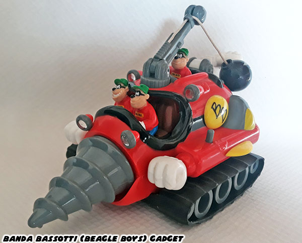
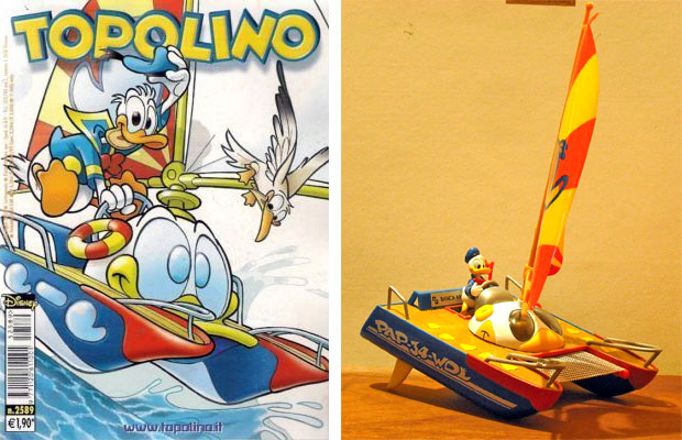
In the previous blogs I had mentioned how some issues of Topolino came with gadgets, or toys for subscribers. Subscribers had to assemble the larger toys. The scale and attention to detail in some of the gadgets were amazing For example a catamaran for Paperino was about 8-inches long, actually floated and had a tiny electric motor to propel it forward. It had sails, a tiny canvas net and figure of Paperino could be removed. The on / off switch for the motor was activated by the steering wheel of the ship.

Topolino gadgets included firetrucks, snowmobiles, space ships, motorcycles, castles, dragons, pirate ships and even buildings. Each set was finely produced and was layered with detail and hidden surprises. Even the car gadgets were anything but typical.

The Phantom Blot was the major villain for Mickey Mouse in both US and Italian comics. He often was seen driving around in a mysterious black convertible with a dark blot over the license plate. The car (the Blackmobile or Blotmobile depending on the writer) that could be assembled with the issues of Topolino was a work of art.

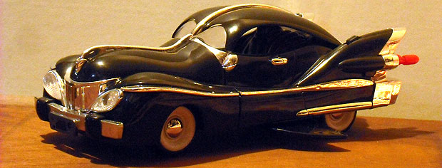
The top of the car could be removed as well as the Phantom Blot figure that came with it. The gear shifter on the car triggered wings on the underside of the car to pop out. A button behind each tail fin of the car shot out red plastic taillight missiles. A button behind the driver dropped plastic oil slick cutouts from the trunk.

These gadgets were unavailable in toy stores, they could only be gotten through subscriptions to Topolino magazine. They helped build fans of the Disney name but also helped build a collectable market. One of the other publishers aware of this trend was De Agostini, also based in Italy. De Agostini held several publishing licenses in Italy, including those for Hokuto No Ken / Fist of the North Star and Dragon Ball. They released DVD sets and collectable plastic figures for many of their licenses.

For Disney fans De Agostini released the Disney Parade series. These were hard plastic figures based on characters featured in film and comic books. Figures that would be considered rare in the USA appeared in the lineup, such as a young Scrooge McDuck in his Klondike outfit, or Jose Carioca from Brazil.

The detail in each sculpt was amazing. The coloring and poses were spot on, as if the heroes and villains were taken right from the pages of the comics.

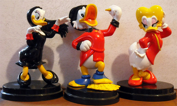
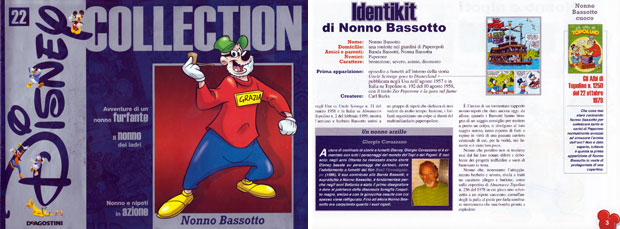
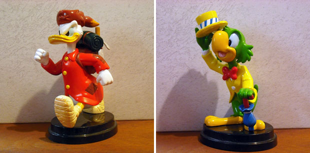
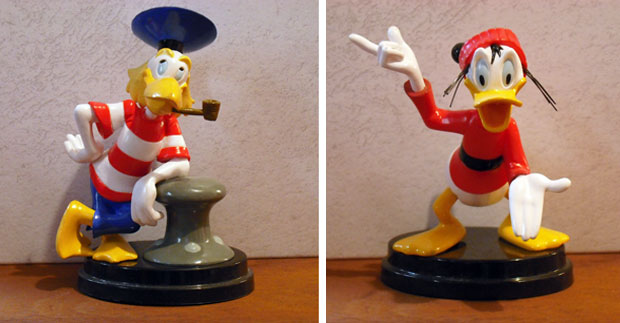
Look at how Magica DeSpell was ready to cast a hex on Scrooge or the flirty look from Brigitta MacBridge. Of course Scrooge seemed fixated on his true love. These figures were not available in stores or online. Collectors had to go to De Agostini kiosks in local malls to collect the figures, two of which were released every week over the course of several months. Imagine how patient fans were that collected a complete set of the 60 figures! Goofy or Pippo as he was known in Italy was given a werewolf alter-ego in the X Mickey comic series. De Agostini was catering the collection to Disney fans that were familiar with storylines featured within the pages of Topolino magazine and the offshoot publications. The white-furred Pipwolf was given the colors and proportions based on the comic but was still kept in scale with the icon that inspired him

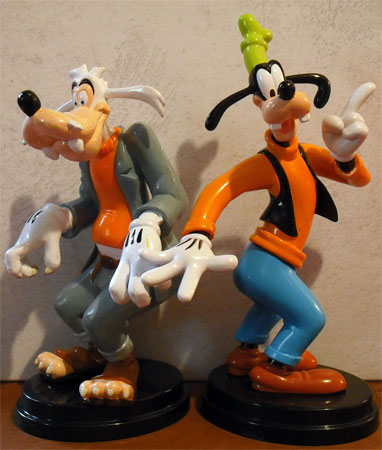
The figures were about 4.5 inches on average and each one released was to scale with the rest of the series. Taller characters like Goofy or Mortimer Mouse were pushing 7 inches while shorter characters like Louie or Paperotto (young Donald) were just over 3 inches.

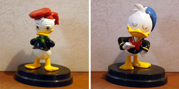
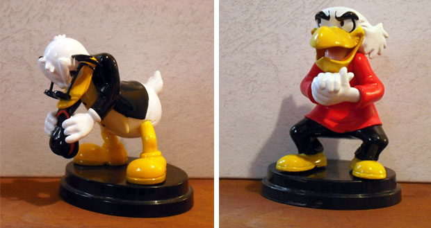
The Disney Parade figures were not all heroes however. Even villains like Rockerduck and the mad scientist Emil Eagle were presented in the set.

Legendary Disney animator Marc Davis would teach his students that a great character designs did not feature characters with blank stares, instead the artist would make it clear that they were living, thinking figures. In the case of the De Agostini sculpts audiences could clearly see that the characters were thinking. The frustration that Rockerduck held while he was chewing on his hat, or that Emil was in the middle of hatching a diabolical plan were apparent.

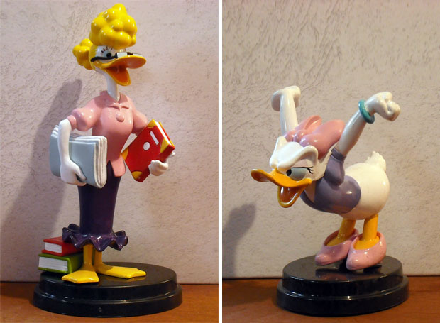
The female leads were not ignored in the collection either. Emily Quackfaster, the secretary for Scrooge and Daisy Duck also made for very interesting figures and poses.

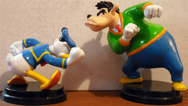
Not many Disney fans in the US were familiar with Donald Duck’s neighbor Mr. Jones. Unless audiences had kept pace with the comics they would have missed out on some of Carl Barks most hilarious short stories. Donald and Neighbor Jones had been the worst of neighbors for almost 70 years, always trying to put the other person in their place. The two characters turned out to be evenly matched despite their size difference.

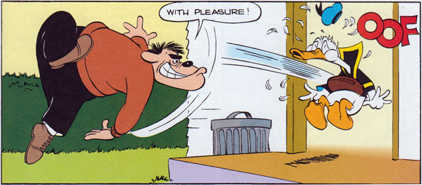
De Agostini allowed the long running feud to finally be recreated in 3D. The figure of Jones was practically daring Donald to take his best shot. Of course one of the Donald figures created by De Agostini was posed ready for a fight as well.

Even after Carl Barks retired the talented Don Rosa kept the two battling in comics. Don ensured that new generations of Disney comic fans would never forget the bitter rivalry. Neighbor Jones did not come up as often in the pages of Topolino but De Agostini knew that collectors throughout Europe would be happy to see and pick up the figure.

It seemed that almost every character that had appeared in a Disney animated short or on the comic book pages got the Disney Parade treatment. Moby Duck and Fethry Duck made for two very whimsical figures and fit very well with the rest of the collection.

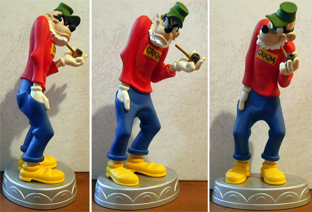
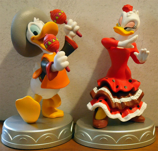
The Disney Parade set was so popular among collectors that De Agostini decided to follow up with a sort of deluxe edition of their figures. The newer ones would be in a larger scale, ceramic and painted with greater detail and fidelity.

The new edition of figures was dubbed the Disney Collection and the sizes now averaged around 6 inches. To distinguish them from the Disney Parade series the new figures were much heavier and placed on larger silver stands. These figures were also made with a smaller run, making them more collectable.

Not all of the characters featured in the Disney Parade made it into the Disney Collection. Those figures that did were given new poses and additional material. Some figures created for the Collection were not featured in the Parade series. The next blog will highlight my favorite figure and try to explain why these collectables were important to the community. As always if you would like to sponsor me please visit my Patreon page and consider donating each month, even as little as $1 would help make better blogs and even podcasts!

follow the Street Writer on Patreon!