Showing posts with label design. Show all posts

Monday, June 8, 2026

A look at Yasmine, Filipino representation in Street Fighter 6

Hello friends, welcome back to the blog. This entry is a follow up to the one I posted on Arjun. This has to do with the new character reveals for Season 4 of Street Fighter 6. I said that the design behind Arjun was poorly executed. His appearance, and costume was essentially a copy of the concept art for Ryu in SF6. It was bland, and lackluster, and made me think that the team’s Senior Designer Yusuke Hashimoto had nothing to do with his look. I could almost argue the same thing with the other new character introduced for the game. Yasmine was the first new female added to the game since its launch. The other women introduced in the seasonal updates were pulled from older games.

Before Capcom said anything about the origin of the character, or her move set I knew where she was from, and what she represented. She appeared to be a Filipino. Making her the first Asian-Pacific islander represented in the series. The colors of her uniform were rooted in the flag of the Philippines. It was white, blue, red, and yellow. The sun icon on her shoulder was modeled very much on the sun logo on the flag. As many national flags there is tremendous meaning behind the colors, shape, and symbols featured on it. Not the least of which are the eight rays emerging from the sun, which represents the eight provinces that rebelled against the Spanish in 1898. Her top was based on the Barong Tagalog, a traditional shirt strongly rooted in national identity. It wasn’t just worn by residents in casual, or formal settings, but also by politicians in the Senate.

In her hands she had an ornamental karambit. This knife was used in the traditional fighting art Eskrima, sometimes referred to as Kali or Arnis. For many people in the USA their first exposure to this martial art was in the 2003 film The Hunted featuring Tommy Lee Jones, and Benicio Del Toro. It highlighted the lethality of the fighting art. It was made popular in recent years from The Raid movies. The Raid 2 specifically from 2014 featured Iko Uwalis as the undercover cop Rama, and Cecep Arif Rahman as the Assassin. Their karambit battle was one of the best sequences in martial arts cinema. Yasmine could have used sticks as a weapon. Most people were familiar with stick fighting with the Filipino martial arts. The staff, and sticks were already featured by Eagle, Rolento, and Falke in the series. The advantage of the karambit was a stronger national theme.

Since Yasmine’s karambit was not a blade in the traditional sense it was still a weapon that could be used for trapping, as well as striking. I think this tool was inspired by the wooden fishing hooks carved by Pacific Islanders. There was a lot of cultural influence between Malaysia, Indonesia, and the Philippines. The karambit was only part of a strong ethnic identity that united the three nations. Her martial arts belt was also accurate to her region. Karate practitioners tied their belt in the front, in the Philippines the belt was knotted at the right hip. Her name, and school were written on the belt. It was worn is very specific way for the Filipino martial arts. In some schools a sash could be used in place of a belt. 

Everything that Capcom did with the new character seemed to be the polar opposite of the last time a Filipina was used in a fighting game. If you were familiar with fighting games then you realized that Yasmine was not the first Filipino fighting game character. She wasn’t even the second. Josie Rizal debuted in Tekken 7, back in 2015. She was a time-release character that came out in April of that year. Series producer Katsuhiro Harada said that he had wanted t include a Filipino character going back to Tekken 5 in 2005. He didn’t get a chance to do so until much later. Unfortunately for him this character would be very divisive. Fighting games were big the world over, Tekken was especially popular in the Philippines. The downside was that even though Josie was proposed as an eskrima fighter, without any weapon it was hard to tell. She was voiced by Ananda Jacobs, and had no detectable Filipino accent. The other was she had the name of a national hero, and the attitude of a crybaby.

José Rizal was a writer, nationalist, and doctor whose work helped inspire the country to rise up against Spain. He was executed in Barcelona for rebellion after a brief exile in Cuba. He had no direct involvement with the resistance, but his death helped spark a revolution. The fact that Bandai Namco used the name of an icon, but put it on a crybaby girl was read as a direct insult to millions of Filipinos. The Japanese had committed many war crimes against the Philippines, China, and Korea during regional conflicts. It was not hard to imagine that they still looked down on other cultures even if this was not the intention from the developers.

To add fuel to the fire Namco put a Filipina in a fighting game much earlier, and was more culturally sensitive about it. They did this with Talim in Soulcalibur II. The game came out in 2002. It was directed by Jin Okubo, and Yoshitaka Tezuka. It was produced by Hiroaki Yotoriyama. The Soulcalibur, and Tekken teams had a friendly rivalry inside of Namco. They traded jabs with each other at gaming events, but deeply respected each other at the same time. The Soulcalibur series was a sword fighting game which pulled elements from ancient history. It was much closer to fantasy than historical to be honest. In the case of island representation Talim was a sort of amalgamation of Indonesia, Malaysia, and Philippines. Her costume was pseudo-traditional, as was her weapon. It was a hybrid karambit, and tonfa. She demonstrated that the studio was capable of better representation if they tried. Yasmine was a better design compared to Josie, but I think that Capcom was trying too hard to swing in the other direction.

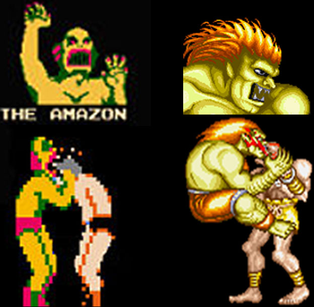
The taped shins, and hands signaled to audiences that Yasmine was clearly a fighter. The use of the Filipino national flag as primary colors on her costume, with the sun, and stars as accents let us know what region she was from. Her hair color was purple, a mix of the red, and blue from the flag as well. You would think this made her a fantastic design, and a prime example of inclusion done well. I would argue that it was sloppily done at worst, and ham-fisted at best. For starters I want you to think about which characters in the game wore their national flag as the primary colors on their uniforms. Zangief did indeed wear the old USSR colors on his shorts. Ryu was a happy accident in that his gi was white, with a splash of red on his headband. Contrary to popular belief Blanka was not green because of the Brazilian flag, but because he was modeled after the Amazon from Nintendo’s Pro Wrestling. Past that none of the World Warriors from SFII or New Generation from SFIII used their national colors as their costume.

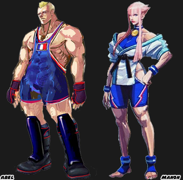
Street Fighter IV, and V started the trend of turning the colors of a national flag into costumes. We could see it with Abel from Street Fighter IV, Manon from SF6, and Laura from Street Fighter V. I argued that of all the new characters introduced into the franchise Juri Han was the best because she poached the most from Chun-Li’s design roots. I mentioned that the purple in her hair, and uniform were created by mixing the red, and blue from the South Korean flag. I would argue that the purple hair featured on Yasmine was a result of the same logic. I thought it was a cheap, and unnecessary design choice.

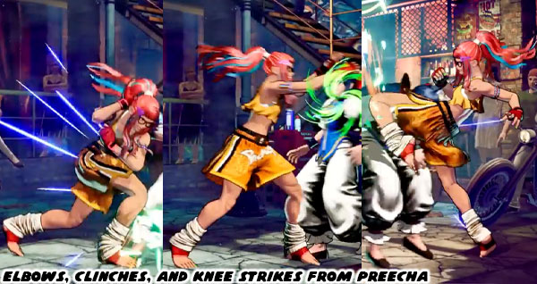
Any other color hair would have clashed Juri, and Yasmine’s costume. At the same time we had to address the Asian colored hair phenomenon. For decades Asian characters were coded with attitude thanks to colored hair streaks. Teen Vogue covered this issue, and Glamour said it was time to retire this trope. I was aware of it when I talked about how Juri Han’s design got better with time. It might seem insignificant to you, but I think that turning a flag into a costume was cheap. I think that giving colored hair to an Asian, or Pacific-Islander was sloppy. This pandering to tropes was not limited to Capcom. Even Preecha, the new female Muay-Thai fighter from SNK had colored hair with contrasting streaks.

Going with popular generalizations was not a substitute for actual research. You cannot achieve great design by pandering to the lowest common denominator. With some effort you can have a great national figure, and undo years of ugly caricatures. This was why I respected Designer Yusuke Hashimoto, and the team working on SF6. They managed to take Dhalsim, and Blanka which were the two ugliest caricatures in the franchise, and make them significantly better by changing just a few details. Not only that. I would argue that Rudra was an even better design, and a sort of way for Capcom to quietly retire Dhalsim. It seemed like an impossible task for Capcom, or any Japanese developer to do better. I knew it wasn’t impossible. A generation ago we had T. Hawk. He was originally going to be the new Zangief for Street Fighter III. Along with Cammy, Dee Jay, and Fei Long. However they were pushed into the Super SF II update before his design was refined. 

I wanted to see Mexican representation in the SF franchise, but this was not it. T. Hawk was a member of the fictional Thunderfoot Tribe from Mexico. He was about as authentic a native as Iron Eyes Cody. For those that didn’t know Iron Eyes was born Espera Oscar De Corti. He was an Italian-American that was cast for Native-American movie roles going back to the 1920’s. He spent the next 70 years convincing the USA that he was the real deal when in actuality he was perpetuating stereotypes. With his face paint, moccasins, jean vest, and feathered headband T. Hawk was doing the same thing for the fighting game crowd. I was saddened to see how little Capcom cared to present a Mexican fighter correctly, and even more disappointed with what was done with El Fuerte. When Lili / Lily was announced for SF6 she was pulled from the same tribe, and had essentially the same design elements. In any other timeline her look would have remained the same from concept to publication. Yet the SF6 team did a lot more homework, and revised her appearance several times before her debut.

The changes to Lily were subtle, but made for a much better overall design. Her physical appearance was mostly the same. But the color choices, costume, and fashion worked much better without the pandering. Capcom got rid of the face paint, and feather. Her clothes did not have to be a poncho of red, white, and green. The colors of the national flag. An oversized jaripeo shirt did just fine. Even the change in her boots from Central to Northern American worked better. I had a similar thought on Yasmine (and Arjun). It was good to see the Philippines get representation, especially with a strong female warrior. But she was version 1.0 of the character. I knew that version 2.0 was going to be much better, just as it was for Juri, and Lily. That was my belief anyhow. What did you think of this character reveal? Who were you most interested in using in the next season of Street Fighter 6? Tell me about it in the comments section. As always if you enjoyed this blog, and would like to sponsor me please visit my Patreon page and consider donating each month, even as little as $1 would help make better blogs and even podcasts!
follow the Street Writer on Patreon!

Monday, April 14, 2025

Making a Sonic Team fan, part 4...

Sonic Team had always gone above and beyond when creating new titles. Sonic, Burning Rangers, NiGHTS into dreams, and Billy Hatcher were all fantastic with unique game play elements. Like many AAA developers there were volumes of unused assets that remained on the cutting room floor as the games were each finalized. In some cases the remains of a beta stage, character, or even music could be found in the game data itself, waiting to be discovered by the community. The Sonic games had several examples of beta material being left on the Genesis cartridges. Similar things were expected for the Saturn disks, the only problem was getting to that data was hard. It took decades for home-brew programmers to get to the info, and compile it into a workable format.

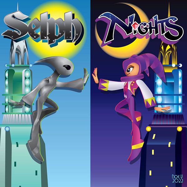
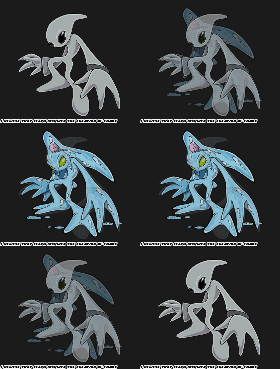
In the previous blog I mentioned that Mecha NiGHTS had been uncovered during a data mine. Even more shocking was the possibility that there was a cut boss named Selph planned for the game. While combing through the data files people found all sorts of models, animations, and unused game assets, but nothing about another boss. In the logs they discovered the file names, and unused icons for the bosses. Gillwing, Clawz, Gulpo, Puffy, Jackie, Reala, and the final boss named Wizeman. For a while the only mention of an eight boss was text only. Self, sometimes spelled Selph would have appeared before the final boss. Yet there had never been any sort of concept art, or model that could be found. Until one day a single icon was isolated.

The community was split over what we were looking at. Even when there was an update to Selph following the datamine To me, and many others it was a pointy headed alien-like creature with dark eyes. Others saw a giant claw, or pincer. I began wondering how the character would have looked, and more important how this character would have fit into the game. Up until that point NiGHTS had faced many of the boss battles in head-on fights. Some bosses, like Clawz, and Gulpo required more strategy. Two other bosses, Jackie, and Reala also wore a hat similar to NiGHTS, and they could fly. If Selph were to appear just before the final boss, or even as a hidden boss, then it must have been a special encounter.

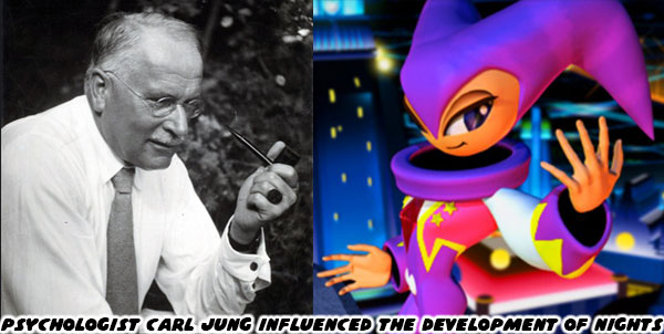
The name Selph was very significant for Sonic Team. In order to build the game the studio had to become well versed in the psychology behind dreams, and their meanings. One of the most influential psychologists that they often cited in interviews was Carl Jung. His theory of analytical psychology was very profound. He developed the idea of ways people present themselves, or mask their intents. The idea of a collective conscious, and unconscious as well as the concept of Self. Naoto Ohshima, Yuji Naka, and the Sonic Team crew became adapt at interpreting the dreams of their coworkers. They were so good at being amateur psychologists that many in the company shared a lot of personal information. Years later they realized that that they knew much more about their Sega counterparts than they should have. Talk about an HR nightmare! But I digress... I was inspired to create how I think Selph would have appeared in the game. 

The original release of the game was not necessarily understood by audiences when it came out. It became something special to those that figured out what Sonic Team accomplished. It was all the more important because the game conveyed a message without one word of dialogue, or anything to translate. NiGHTS into dreams… was more than a story of boy meets girl. It dealt with anxiety, especially anxiety in kids in a way that no other game or media had ever attempted. The question that many in the community had was how would a battle agains the “Self” have played out?

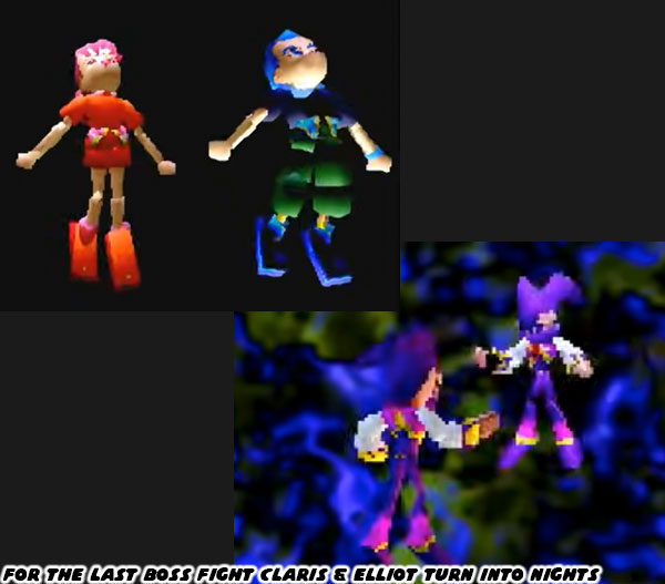
I would argue that the boss battle would have worked out to more of a chase sequence. There wouldn’t have been actual punching, kicking, or tackling involved. As this was something that NiGHTS already did with every other boss battle. Instead I think the battle would have been a series of encounters. A way for the main characters to chase after their true selves. I believe that Elliot, and Claris, the human stars of the game would have each turned into their own version of NiGHTS at the end of the sequence. Then they would then have had the power to confront the big boss Wizeman in the dream world without having to rely entirely on NiGHTS.

I think this scenario made sense for a number of reasons. In the final shared stage of the game both Elliot, and Claris had to work together to free NiGHTS from a prison. After doing so they would merge, or “Dualize” with the main character. This would give each of them the powers of NiGHTS, and the ability to take down the gigantic villain themselves. In essence they needed the courage to face their own fears. I believe that Selph was going to be a distinct boy, and girl version of NiGHTS, with their own identifying colors that matched Claris, and Elliot. It made a lot more sense to me than seeing two versions of the dream jester at the end of the game.

This was the way I interpreted Self based on the game icon, but also because I had played through every Sonic Team game ever made. I understood the way the studio framed the levels, and approached their battles. Not only that but I had studied Carl Jung in my anthropology classes, it gave me an additional insight into dream personas. So what happened with Selph? Why was the boss cut? Sonic Team had a tight deadline. They needed to have a killer app ready for the launch of the 32-bit Sega Saturn console in 1995. Sadly the game wouldn’t be ready until a year after the console’s launch. Pressed for time they began seeing what they could cut. This boss, a new battle, a new 3D model were put on the chopping block. The only thing they forgot to scrub from the game data was the name, and icon.

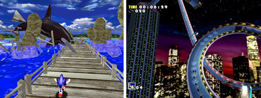
Sega was working on the Dreamcast console, while the Saturn was still finding its legs. To many, myself included, this was the death knell for the console division, and the company as a whole. At the same time this would be a chance for Sonic Team to return to the blue blur, and bring the hedgehog into fully realized 3D. NiGHTS came out in 1996, and Sonic Adventure in 1998. Ask any AAA studio what an absurdly short turnaround time that was, especially for completely new hardware. The studio acknowledged that the Nightopians were the prototype A-Life characters that inspired the development of the Chao in Sonic Adventure. I don’t think that was the only thing the team brought over from their previous work. Selph was a great concept that deserved a second look. Sonic Team. Sonic would fight Eggman in his new adventure, but he needed a bigger opponent as whell. Perhaps a shape shifting creature that started off small, but became progressively bigger, and more dangerous as the game went on. I would argue that the studio took another look at Selph, and with a few changes turned the design into Chaos.

This was all conjecture on my part, based on a single file name, and a single game icon. I’m sticking with it though until I hear otherwise from Sonic Team members. There was more art that I had done recently based on NiGHTS, but it was not quite what you might imagine. I’ll share more of it on the next blog. Until then I want to hear about the unused content, stages, bosses, or heroes that you wish you would have gotten to see. Tell me about it in the comments section. As always if you enjoyed this blog, and would like to sponsor me please visit my Patreon page and consider donating each month, even as little as $1 would help make better blogs and even podcasts!
follow the Street Writer on Patreon!

Friday, October 11, 2024

A symmetry of villainy, final part

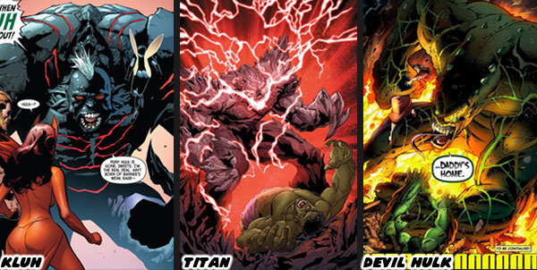
Over the past week I gave examples of building symmetric, and asymmetric villains in comics. I used the strongest characters in DC, and Marvel as an example. Superman, and the Incredible Hulk had faced a number of powerful beings over the decades. The ones that gave them the greatest challenge were sometimes absurdly powerful physical beings. In the previous blog I talked about Doomsday, and Onslaught. In other cases the heroes fought evil versions of themselves from another timeline, or another dimension. Superman faced off against Ultraman in several stories. This was essentially a Superman who lacked the morals instilled to him from Martha and Jonathan Kent. The Hulk battled the Maestro, an evil version of himself from the far future. Bruce Banner suffered from multiple personality disorder. Each one of the figures trapped in his mind could manifest as a version of the Hulk. He fought to keep his identity as the dominant one. The traditional "Savage" Hulk was the best known of his alternate personalities. There was also the street savvy Gray Hulk aka Joe Fixit. There were demons that Banner kept locked away in the furthest recesses of his fragile psyche. These included Kluh, Titan, and the Devil Hulk. Believe it or not they were each potentially more dangerous than the Maestro.
These types of villains were fantastic for a short arc, however their impact would be diminished if writers kept trying to revisit them again, and again. The best rivalries for both Superman, and the Hulk happened with foes much weaker than either of them. It took a lot of effort to create a memorable villain, let alone a recurring threat in the Marvel stories. A bad guy that could challenge the universe, somebody like Onslaught had to have the powers of multiple characters like Professor X, and Magneto combined in order to bring the Hulk to the edge of defeat. This was the kind of impact that the Leader held in Hulk continuity. He didn't challenge the Hulk with one ability, but with a barrage instead. How Marvel created this character, and what made him tick was an important lesson in rival design. When it came to which version of the Leader I thought worked best, which one explained his abilities, and threat level then I would actually point to video games. 
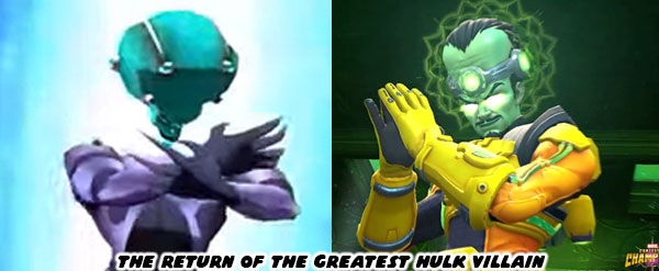
From a visual standpoint I believe the Leader looked best in video games rather than in comics. The designers at Radical Entertainment created a decent Hulk game in 2003. It was a follow-up to the Ang Lee live action film featuring Eric Bana in the role of Bruce Banner. Eric even voiced the character in the game. Despite amazing visual effects the movie was a flop. It probably explained the lukewarm reception the game received. Thankfully it took place after the film, and was set in a more comic book environment. It featured a collection of some of the Hulk’s greatest comic opponents. They were pulled from a number of different writers, stories, and arcs. The gamma-powered lineup included Half-Life (Anthony Masterson), Madman (Philip Sterns), Flux (Private Benjamin Tibbits), Ravage (Professor Geoffrey Crawford), and the Leader (Samuel Sterns). The story was an amalgamation of different plots, and locations from the movie, and comics that worked well together. The use of cel-shading, and even dramatic angles helped make it look like a graphic novel brought to life.
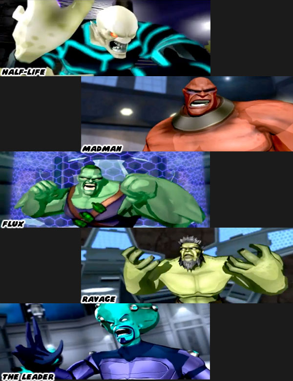
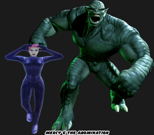
The Hulk game was good, but their follow up title The Incredible Hulk Ultimate Destruction was absolutely amazing. Released in 2005 it didn’t only raise the bar for Hulk games, but forever raised the standard by which all comic book games would be measured. The story, design, animation, control, and combat were unparalleled for years to follow. Its influence would be felt across the industry. In fact the locomotion of the Hulk had a direct influence on how Spider-Man would move in the award-winning games by Insomniac some 12 years later. I considered it one of my favorite games of all time, and even mentioned that on the blog. The game didn’t feature as many rivals as the previous Hulk title by Radical, but the handful they had were memorable. These included the powerful psychic Abigail “Mercy” Wright, the Hulk’s latent rage persona known as the Devil Hulk, General Ross, and The Abomination.
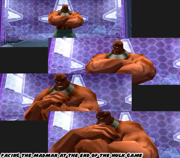
The earlier game was notable because it featured not only the Leader, but his brother Philip as well. Peter David, and artist Jeff Purves created an opponent that brought the Hulk to the brink of death in the Incredible Hulk issue #363. The Madman did this through subterfuge, and gamma poisoning. Philip Sterns followed in the footsteps of Banner, and became obsessed with him to the point of developing a toxic love. Once his brother mutated into the Leader he blamed Banner, and the Hulk for taking him away. Philip became a nuclear scientist. He wanted to gain powers as well so he experimented on himself repeatedly with gamma radiation. He effectively scrambled his own brain in the process. He developed multiple personalities, which determined how his powers manifested. For the Madman it resulted in having abilities different than his brother. The Madman could actually make himself appear like any other person. His ability was on par with Mystique, an X-Men villain that could shapeshift into other people. That was only part of what made him dangerous. He was still an accomplished scientist, perhaps not on par with his brother, but still smart enough to figure out a way to destroy gamma mutations. At will he could also “Hulk-out” as well. When he changed he had red clay-colored skin rather than green. He was also taller, denser, and stronger than the Hulk, but he could only maintain this form for short bursts of time.
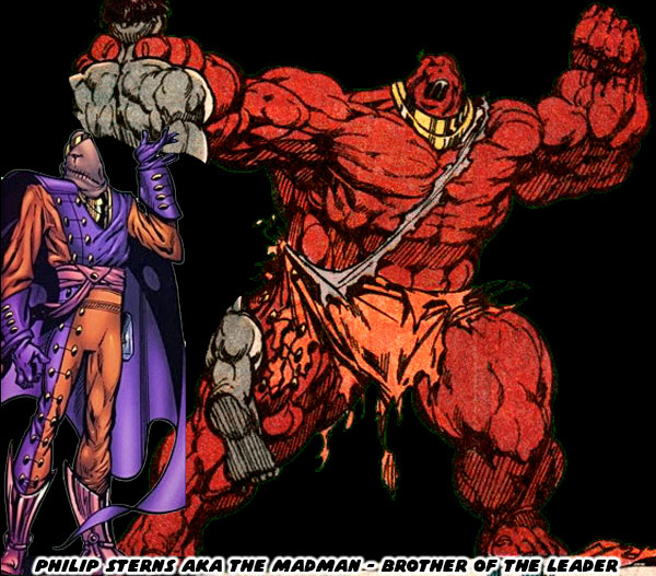
The Madman debuted in the four-part “Countdown” arc in 1989.  If I were to describe his mental state he melded the personalities of an agent of chaos, with a raging beast. To put it in context I would compare him to two iconic DC villains; as if the Joker, and Bizarro had an offspring that was obsessed with Banner. The Madman had created a virus that was destroying the Hulk's gamma mutation. The gray "Joe Fixit" version of the Hulk was wasting away in each panel of the series. If he transformed back into Banner he would deteriorate even faster. It broke my heart seeing the most powerful mortal on Earth reduced to skin, and bones. I saw the race to cure Mr. Fixit as an allegory for the AIDS crisis. The epidemic was on our collective minds through the late '80s, and early '90s. In fact it wouldn't be the first time that Peter David faced the issue of HIV in the series. I thought the Countdown arc did much more to establish a legitimate threat the Hulk more than Doomsday did for Superman. The Madman was regarded as being too dangerous for his own good. He was so dangerous that the Leader even teamed up with the Hulk to track him down. He asked the Hulk to stop him because he couldn’t bring himself to hurt his own brother. The Leader was afraid that Philip’s mind had completely lost to the Madman persona. If any part of him remained it would better for the Hulk to put him out of his misery. It was brilliant storytelling, and fantastic reveal. It was pulled off much better than the introduction of the Red Hulk, that's for certain! 

The closest that a game had come at recreating the power burst that the Madman exploited in the comics could be seen in the multiplayer game Marvel Rivals. Banner was a playable character, and when he transformed he became the "Hero Hulk." If the player managed to raise his energy levels in the middle of a skirmish then he could power up even further, and turn into the "Monster Hulk." This gave him different attacks, and a higher amount of health points. This version of the Hulk was much stronger, denser, and bigger than the regular Hulk. It was exactly how I imagined the Madman would jump from human scale to monster scale, bypassing the traditional Hulk, but again only in short bursts. By comparison the size of the Hulk, Ravage, Flux, and the Madman were more or less the same in the older Radical Ent. game. In the comics there were notable differences in their frames. They were all hyper-muscular, but some were leaner, shredded, distorted or bulky compared to the Hulk in the comics. Given his powers, and unpredictable nature I think it proved difficult to write scenarios featuring the Madman. Hence he was used very sparingly by Mr. David, and future writers. I was grateful at least that he appeared in several encounters in the Hulk game, under the orders of the Leader.
The Leader would show up in animated form, and various comic arcs over the years. He would not appear again in a prominent gaming role for more than two decades. The Marvel Contest of Champions (MCOC) was a mobile game with a massive following, and deep library of characters. It debuted in December 2014, and had generated millions in revenue for the developers at Kabam, and of course Marvel. It gave global audiences the ability to fight as, or against 275 popular, and rare characters. It was a fantastic introduction to the universe for Generation Alpha. It was also an accessible, and balanced fighting game for all audiences. I wrote about the title, and its comic book origins in a blog series. It was linked below if you haven’t read it. I enjoyed having multiple versions of the Hulk as playable characters, and even featuring the Maestro as one of the major villains. Even with the Rhino, Abomination, Juggernaut, and Onslaught to battle against it still felt like someone was missing. The Leader was finally announced for 2024, and I could barely contain my enthusiasm.
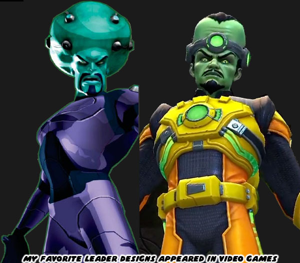
I was a huge fan of the aesthetic Kabam used with the character art. This was fortunate side effect of optimizing the game. The graphics capabilities of mobile devices determined how far the studio could push the visuals. Not every device was the latest iPhone or Android, so the studio had to make it playable on older devices as well. Many had limited memory, limited processing power, and limited 3D rendering capabilities. In order to keep the game running smoothly across multiple platforms the studio had to optimize their engine in every possible way. For example the fighters featured simpler shapes, fewer frames of animation, and limited polygon counts when compared to console, or PC characters from the same era. These figures nonetheless worked from a style standpoint. The art team at Kabam did their homework. Each champion was pulled right from the comics, films, and television shows. From largest to smallest, the library of fighters were all easy to read, and looked brilliant. I wished that there was a MCOC toy line for how great a job the studio did. Kabam gave the Leader a somewhat classic look in his reveal. The shape of his head was vertical rather than Jiffy-pop. He even sported his familiar mustache, and Van Dyke beard. The orange, and yellow colors of his uniform went back to his earliest appearance. Despite the retro touches he still worked within the Contest of Champions.
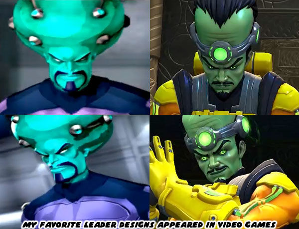
The team at Kabam updated his look by adding a psychic band on his forehead, and a number of gadgets to his costume. These touches explained his ability to float, generate a shield, deflect attacks, and project beams of energy. They were exactly the sorts of things he might use in a comic book battle. By comparison the designers at Radical Entertainment had a completely different take on the Leader much earlier. They gave him an armored metallic purple uniform, and a round head shape. He had electrical nodes on his skull, and shoulders, these allowed him to project beams of psychic energy directly from his forehead, or channel them through his hands. He was able to float, create barriers, project multiple versions of himself, and throw the Hulk with his mental powers. There had never been a version quite like this in the comics, but in game form it made absolute sense.
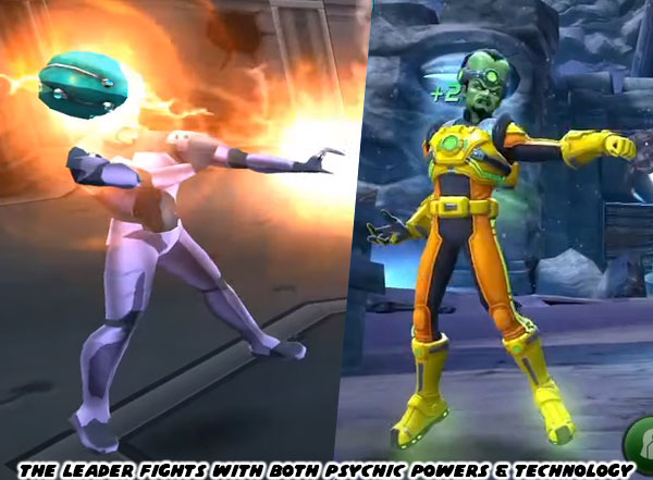
Despite these awesome psychic attacks the game was still filled with clues to his inventing prowess. The Leader had created a Gamma Orb which was a compact tool that he used to syphon Banner’s power. It was a fraction of the size of the Gamma Sphere that caused his mutation in the film. The Leader built an entire underground base called Freehold. It was populated with his mutations, and weapons. He had teleports, and even a transport system running underground. The majority of the game was essentially fighting through his defenses in an attempt to reach the mastermind. I was glad to see that the villain was getting a new chance to show off his powers in the Marvel Contest of Champions. I hoped that someone working at one of the AAA publishers was working on a pitch for a new Hulk game. Something that could build on the work of Radical Entertainment, Insomniac, and the other great comic game developers. It would hopefully make Incredible Hulk, and especially the Leader relevant again. If you want to find out more about the Contest of Champions please check the links below. 


Did you have a favorite Hulk villain that I did not mention? Or another rare character you want to talk about? What were the elements that you thought made for a great villain design, or a great villain reveal? Tell me about it on the comments section. As always if you would like to sponsor me please visit my Patreon page and consider donating each month, even as little as $1 would help make better blogs and even podcasts!
follow the Street Writer on Patreon!

Friday, August 30, 2024

The story of the Mickey Mouse sneakers...

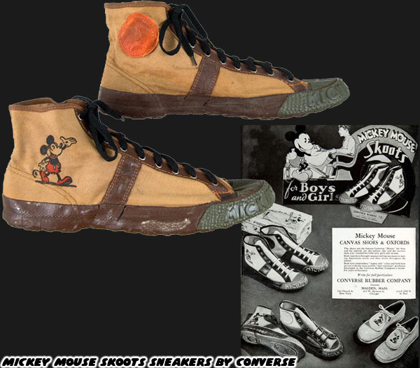
I found out a little bit of trivia the other day that blew my mind. I’m a fan of sneakers as you probably know. I also like all things Disney, and specifically the classic cartoon characters. I picked up a Converse sneaker magazine from the Japanese bookstore the other day. It was a history of the company, and most of their iconic sneakers. In the early days they actually had the first licensed cartoon shoes. They were called Skoots, and they featured Mickey Mouse.

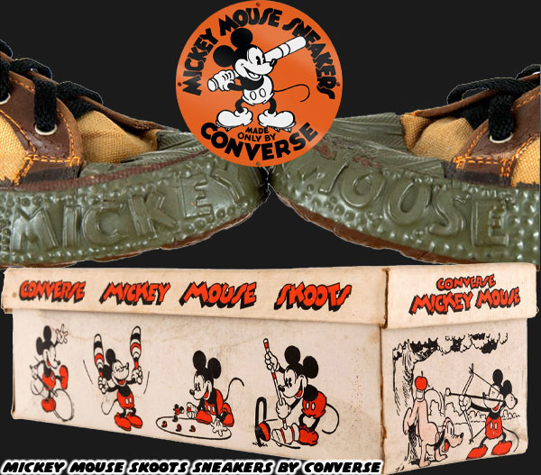
I had to look up these sneakers online, and I found they were released in the ‘30s, following the runaway success of Mickey, and his friends. They would have come out around the time of the famous Ingersoll watches. Which was one of the genius business moves of Walt to license his character on all sorts of products. The Skoots were canvas, and rubber like traditional Converse shoes. Instead of the star, or Chuck Taylor logo on the ankle there was a Mickey graphic. His name also appeared on the toe cap.

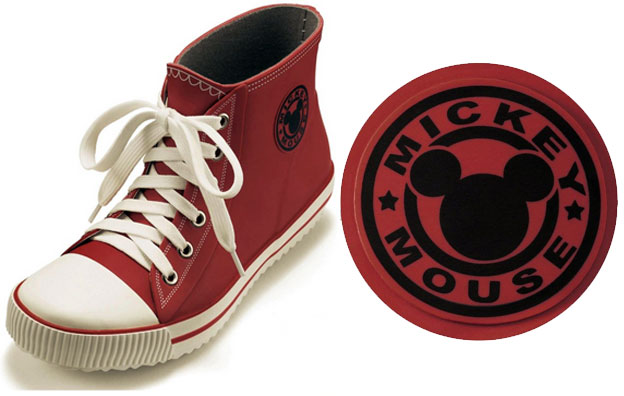
It might be hard to imagine that some of the rarest, and most expensive sneakers of all time had nothing to do with Michael Jordan. Finding out about these shoes reminded me of one of the gems I got for the missus in our early days. I’ve been collecting Disney Fan magazine from Japan for years. I saw what looked like Mickey sneakers in one issue and had to check them out online. Belle Maison’s Fantasy Shop offers a number of household, and fashion items featuring the Disney characters. I’ve no doubt that if we lived in Japan then most of our apartment would be Belle Maison products.

Anyhow as I was looking up the sneakers I found out that they were actually rain boots. They were designed to look like canvas sneakers. They even went to the trouble of adding functional laces to complete the illusion. The hard part for me was figuring out how I would be able to order these, and get them to the US. There weren’t a lot of companies that offered international shipping. Thankfully I was able to find a third-party vendor that offered purchase, and shipping for overseas customers.

The other thing I had to figure out were the international sizes. I knew that the Japanese sizes were going to be smaller than US sizes, but I didn’t realize by how much. My wife doesn’t have big feet so I thought that it would be easy to get these rain boots. The opposite was the case. Our relatively small size turned out to be the XXL size in Japan. Also the majority of the boots had already sold out. The only ones that were available were the olive green, or leopard print ones. Thankfully the missus loved leopard print designs so that would be her choice. A few weeks later we got a shipment from Japan.

The funny thing was that we went almost a decade without heavy rain in Southern California. Suddenly in the past couple of years we’d gotten more rain than we had in a decade. Of course her Mickey rain boots were buried somewhere in the garage. I would eventually clear out enough space, and find them. Hopefully before we get more rain. Anyhow that’s the story of the Mickey Mouse sneakers. Did you ever own any cartoon character shoes? I’d like to hear about it on the comments section. As always if you would like to sponsor me please visit my Patreon page and consider donating each month, even as little as $1 would help make better blogs and even podcasts!
follow the Street Writer on Patreon!

Friday, July 19, 2024

Remix Culture, how Asian designers changed the game, part 13

Earlier in this series I talked about changing the conversation. Most of us in the west would always associate China with counterfeit products, even though they also produced most of the authentic goods the world consumed. It was a heck of a thing to have praise for the product, but disdain for the country producing it. Michael Lau was raised in Hong Kong, a nation with one foot in the East, and West. Because of this distinction he absorbed, and remixed western culture in a new, and exciting format; the vinyl figure. When his contemporaries followed suit I didn’t have much respect for what they were doing because they were retreading the same idea. But I took a step back, and acknowledged that they were not all cash grabs, many of these creators were also celebrating the new art form.

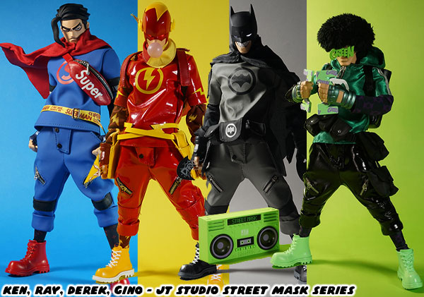
In the early days artists followed along with what Lau was doing, essentially making street fashion character toys, whether they were stylized 12-inch figures or squat 6-inch collectables. They were almost all universally variations on a skater kid, or a Hip Hop kid. Then other studios like Brothersfree demonstrated that figures could be made out of industrial workers, robbers, or even clowns. The doors had been blown open. The best designers like Jei Tseng Studio were able to remix cartoon stars, video game characters, mythological heroes, basketball players, and even superheroes into something new, and unique. Comic book fans would be able to identify right away who some of the Street Mask series figures were just by looking at them. The four characters Ken, Ray, Derek, and Gino were inspired by the DC Justice League characters Superman, Flash, Batman, and the Green Lantern respectively. 

Yet these figures weren’t licensed from DC, nor were any of their fashion accessories licensed from similar manufacturers. The red crossbody bag on Ken was based on the SUPREME bag, but the matching font said SUPER instead. The studio was able to create something unique by layering multiple levels of detail, and meaning on their figures. This was whether they were using genuine branding, or a remixed logo. JT Studio understood the assignment. This trend had been happening for generations, not just in figure art, but all of the creative arts. In the 20th century millions of musicians jumped on the rock, punk, new wave, and Hip Hop sound after they first heard the music. We wouldn’t have had the Bauhaus, Modern Classical, Art Nouveau, or Art Deco movements unless it the form had also been embraced by millions of creators. Yes there were some derivative artists, but there were many fresh voices that helped propel the various formats forward.

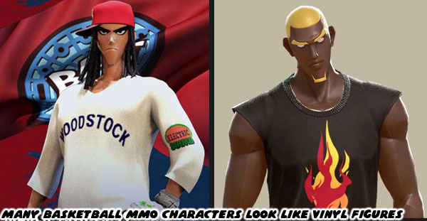
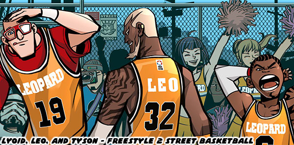
The creators from Hong Kong, and China were remixing culture in real time. They were mashing together fashion, movies, music, cartoons, comics, and toys. Taking the elements that worked from different formats, and seeing how it would look in a figure, or game, or model. It was something that they had been accelerating at all through the ‘90s. In fact they were remixing, a remix before it even got a chance to catch on. This allowed the designs of urban vinyl figures to influence game character designs, and vice versa. I had talked about many of the biggest streetball MMO’s in previous entries of the series. JC Entertainment released FreeStyle Street Basketball, Freestyle2 Street Basketball, and 3on3 Freestyle Basketball. Beijing Halcyon Network Technology Co., LDT released Dunk Nation 3x3. All9Fun released Basketrio: Allstar Streetball. 

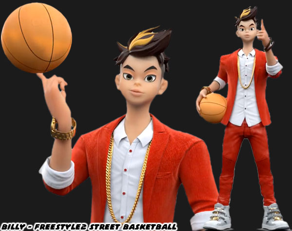
The designs in each basketball MMO were fairly well done. They pulled heavily from the stylized proportions of urban vinyl figures. Billy for example, the character pictured above looked like a vinyl figure I would have collected. The proportions of the 3D model, the style of his hair, gold jewelry, and designer sneakers certainly told a story. Streetball players in the real world all had their own distinct personalities. Some were flashy, some were powerful, some were tricksters. Their look, and their style of play reflected those personalities. The games from JC Ent. made sure that the library of characters they created represented a broad cross section of society. It was something that JC did better than a lot of other studios.

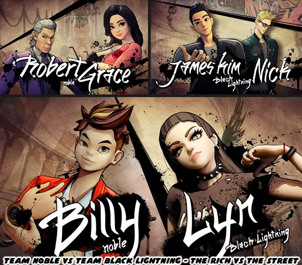
The games they had been developing since 2004 did feature a number of traditional looking male, and female basketball players. We’re talking about matching jerseys, knee gaskets, sneakers, etc. However they also had characters wearing regular street clothes, and people from all walks of life. Working professionals, inventors, mechanics, gang members, robots, and the wealthy elite. This with the case of Billy, and his rich mentors Robert, and Grace. Just because they came from wealth didn’t mean they knew nothing about the game of basketball. They were every bit as dangerous on the court as they were on the boardroom.

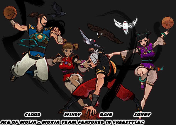
There was a tremendous amount of storytelling in Freestyle2, 3on3 Freestyle Basketball, and the other games. This came through in seasonal events, and even through the designs of the characters. When Billy made his debut so too did Team Black Lightning. The street kids were ready to take the game right to the one-percenters, and you were free to choose a side. While audiences became familiar with Saru, Jack, and Joey over the years there were technically no heroes, or villains in the universe, just different clashing personalities. The majority of the cast represented a particular subculture. Over time new teams would pop out of the woodwork. If there was something cool out there in the universe it would eventually end up in the game. For example people on both sides of the Pacific thought wuxia heroes were cool. What if there was a modern team that pulled elements from the ancient kung-fu masters? That was essentially the inspiration behind the Ace of Wulin team. 

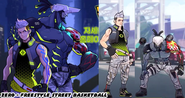
The Wulin team's special moves on offense, and defense were inspired by their martial training. The name wulin was derived from “martial forest;” the secret society of wuxia heroes from fiction. Rich people, goths, and kung-fu masters, were just some of the teams that broke up the classic pro, or even Hip Hop designs going back to NBA Street from 2001. The studios weren’t afraid of coming up with designs that might work in a stand-alone science fiction adventure. Some characters like the cyberpunk mascot named Zero could transform into his armored alter ego with boosted stats. This sci-fi monster had no connection to basketball. I’d be lying if I said that the design didn’t go hard, and wasn’t someone that fans were eager to try.

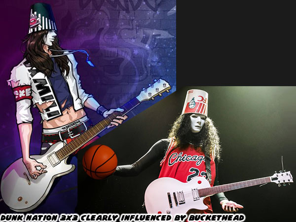
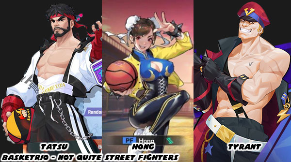
Not every entry had some level of forethought. Sometimes the studios would just fit pop culture characters, or celeb look-alikes into the game. Not that it made sense to just give the Jared Leto version of the Joker from the Zack Snyder DC universe movies a basketball. Or say give the enigmatic guitarist Buckethead a basketball. Yet those characters, or rather ballers inspired by those characters ended up in Dunk Nation 3x3. Fans of pop culture that understood the reference appreciated these weird designs getting inserted into their favorite game. It was certainly an easy way to fill out a roster of recognizable faces without paying for a license. Speaking of putting in non-traditional, high-profile characters in a streetball game… what if the developers put fighting game icons into their titles? The designers at All9Fun placed several characters that were heavily inspired by Capcom, and SNK’s biggest stars in Basketrio. Of course they got away with it by changing the names, and details just enough so they wouldn’t get a cease and desist letter.

These were examples of the remix culture that I was talking about. After adding all sorts of traditional basketball, and streetball archetypes, the studios then started populating their worlds with unique figures. When they couldn’t think up new designs they instead starting asking “what if?” and found ways to incorporate musicians, actors, comic book characters, sci-fi, or fantasy heroes. The designers at all of the studios didn’t bother to ask for permission to use a character, or likeness in their game. They just went ahead and did it. Like the old saying goes “It’s easier to ask for forgiveness, than to ask for permission.” I didn’t think it was a good look to poach the designs of Street Fighter, or King of Fighters characters. I appreciated the hustle, but at least JC Entertainment bothered to create an original wuxia team without just copying from a Japanese developer.

Of all the remix figures that I enjoyed, at least for this genre, were the ones based on actual basketball players. After all they made more sense than comic book superheroes in a streetball game. The way these icons were remixed was what amazed me as an artist. I’d like to explore it a little bit more in the next blog. Until then I’d like to know if there was a character in an MMO that you thought looked cool enough to be featured in a stand alone game. Or if you knew of a character that was such a blatant rip off that you couldn’t believe the publisher wasn’t sued. As always if you would like to sponsor me please visit my Patreon page and consider donating each month, even as little as $1 would help make better blogs and even podcasts!
follow the Street Writer on Patreon!