Thursday, June 30, 2022

Ryu becoming the master in Street Fighter 6, a look at his new path

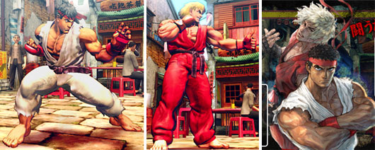
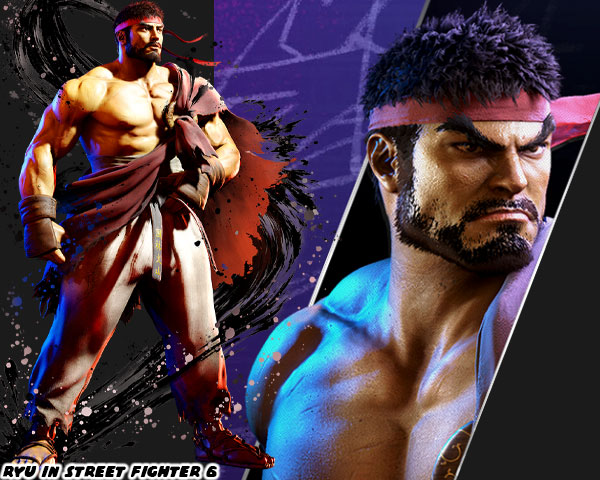
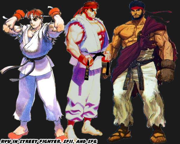
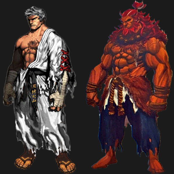
Today we are going to look at the evolution of Ryu in Street Fighter 6. In case you didn’t see him recently, he was presented a little older than any other appearance, plus he had a beard now. The biggest change for the character came with the look of his uniform. For the longest time Ryu wore a traditional, albeit torn, karate gi. Now he was without his top. In SF6 Designer Yusuke Hashimoto now had him wearing a kasaya or Buddhist robe over his shoulder. The design was very interesting. I’m not quite sure it worked in its current form, but let’s take a look at where the tradition came from.
The custom of having marital arts masters wearing classical costumes went back to the birth of the genre. Karate Champ by Data East in 1984 gave us the white, versus red uniform karate guys. A year later Yie Ar Kung Fu by Taito gave audiences multiple opponents, representing different styles. Aside from the way they fought, these characters had costumes that players would have seen in kung-fu cinema. You didn’t have to be an expert on the various styles, and their histories, as long as you had seen at least a few movies. The seeds for Street Fighter were planted then.
The martial arts spread thanks to Buddhist monks. I had documented it previously in the blogs. The monks traveled all throughout Asia, bringing with them the fighting arts. They didn’t learn to fight as a way to seek out opponents, but rather as a way to defend themselves from bandits. The Shaolin developed in China was a form of Buddhism known as Chan, or meditative Buddhism. The school fostered a Northern, and Southern version of their martial arts studies. These various forms would be influential in shaping kung-fu, and karate as well. The interesting thing was while there were many classically styled Chinese fighters throughout game history there were actually few Shaolin characters in the genre. The look was rare, but had been seen in Street Fighter.
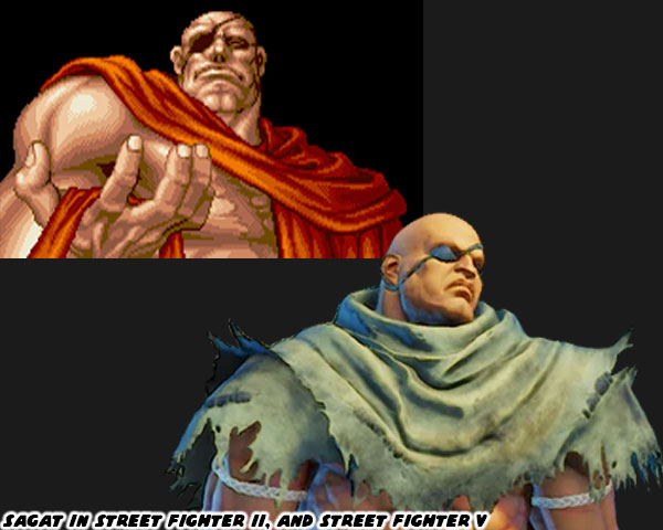
Ryu’s main rival in the original Street Fighter was actually the first in the series to be presented with a kasaya. Sagat was satisfied that he had indeed beaten the best in the world. He had achieved a level of peace with the victory that seemed transformative. He appeared in the ending of Street Fighter II with the robe while meditating on Ryu. That look made sense for Sagat. Years later the alternate costumes of Sagat in Street Fighter IV worked incredibly well. Especially the ones where he wore a tattered wrap. Part of the reason for this was because in pop culture we had seen people from Asia, and South Asia wearing the robes. In my home town of Long Beach we had a large Cambodian, and Vietnamese community, and I had grown up seeing lots of people wearing the robes. Japanese martial artists were rarely, if ever shown in the same way. Instead of the familiar orange robes we would see the elder Japanese master wearing a uniform with one bare arm.
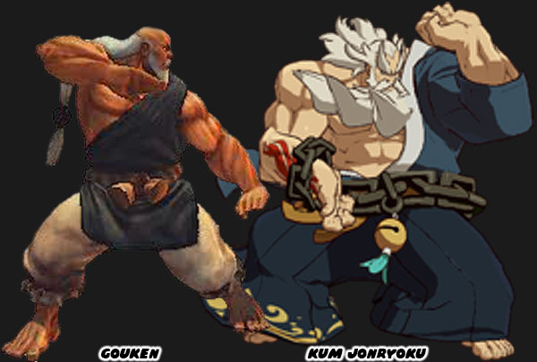
Gouken in the earliest concept art actually wore a gi like Ken, and Ryu. The only difference was that he had a rope belt, instead of a black belt. It was only in later revisions, and his playable debut in Street Fighter IV, when he was given a robe. A similar character appeared in the Guilty Gear series. Kum Jonryoku was a robot made to look like an elder master. He was created, and piloted by Kum Haehyun,a young, and talented scientist. Both fighters represented the peak of the martial arts. They had been studying a specific technique all their lives, if they didn’t invent their own style. These types of people were physically, and mentally stronger than any other person on the planet. Very rarely were they ever seen in mid-life. Gouken was seen in middle-age in Street Fighter manga, and comics books when he took on a young Ken, and Ryu as students. At that time he was not at the peak of his abilities. He was still studying under his master, the elderly Goutetsu. Prior to Ryu’s makeover in Street Fighter 6 there had been at least one young master with a similar look.
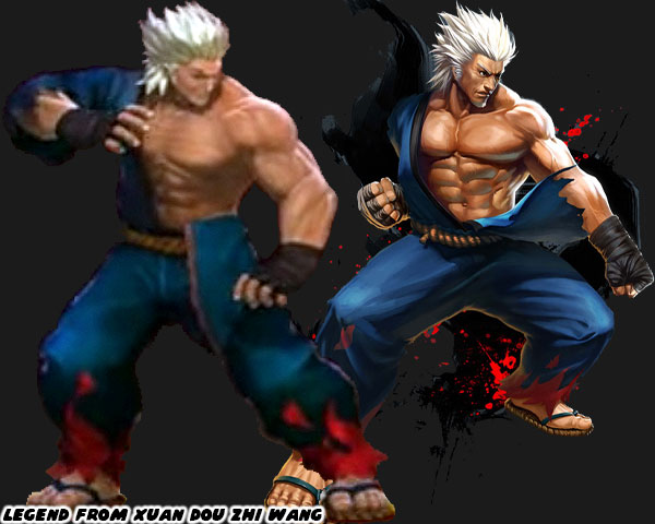
Xuan Dou Zhi Wang aka King of Combat was a Chinese-developed game first published in 2011. It had updates over the following years that patched the control, added levels, and characters. It had characters whose looks, and styles were sampled from various other fighting games. The title already had a Ken / Ryu clone named King. What they lacked was a Gouki / Akuma. That was until they updated the roster, and added a guy called Legend. This person was not much older than King, but more advanced in power, and ability. This person had white hair, no beard, but didn’t look elderly at all. The white hair might have been an aesthetic choice, or to signify that he had some sort of divine revelation. In any case there had been precedent for a young master in fighting games. Not only that, but many artists had been creating their own concept art for Ryu if the series ever did a time jump.
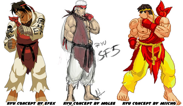
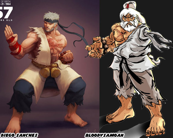
A few designers had a variation of the robe over one shoulder as a nod to Oro becoming his new master. A couple of artists pushed the idea of having the robe be made of Ken’s old gi. This idea had been circulating in the SF community for a long time. One of the older one-armed Ryu illustrations was by the artist BloodySamoan in 2010. In it he also gave Ryu one eye, his red headband now held up a ponytail, and he wore the beads of his master around his wrist. It was a unique take on the fighter for certain. In 2020 the Brazilian illustrator Diego Sanches did a series on older SF characters. He put Ryu in the colors, and costume of Gouken. He also gave him a beard, and gray hair. It also worked well.  
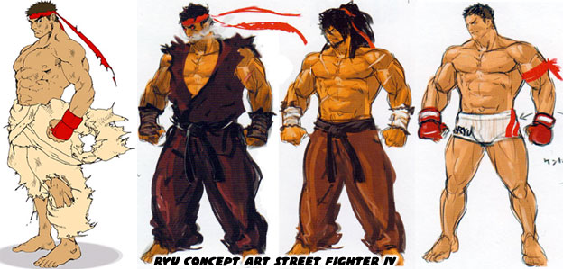
It is highly possible that the creative team working on SF6 was aware of all of the fan art that had come out pre, and post SFIV. They must have been especially aware of the tastes of Western artists as the game had historically sold very will in North, and South America. I’m almost certain that Designer Yusuke Hashimoto, and Director Takayuki Nakayama were aware of these illustrations, and it had a hand in influencing the new look of Ryu. The reason I can say this was because the official concept art for Street Fighter IV, and V coming out of Capcom did not have Ryu wearing a Buddhist robe. Instead they had him with long hair, or with a tattered gi, or in MMA gear. They even had several versions of Evil Ryu, and the stronger Kage variation. But none of Ryu as a Buddhist. Sure it could have been because SF IV, and V were set before he studied under Oro, but even then Oro was added as a DLC character as well.
Mr. Nakayama said the new look was to honor his mentor Gouken, but I’m not sold on that idea. From SFII to today it had been established in the game endings that Ryu was not interested in trophies, or accolades. He was the opposite of Ken in this regard. The only thing that pushed Ryu forward was finding the next challenge. To continue developing as fighters both Ken, and Ryu had to prove that their form of Ansatsuken was the best. Why Ryu would suddenly decide to dress up like his mentor didn’t make much sense. He was walking his own path, and not his master’s path. Visually I don’t think the look works. Wearing a brown kasaya across his torso contrasted with the solid white of his original costume. Perhaps if Ryu wore all brown it might work better, but then his colors would be too close to Ken’s.
I’m interested in seeing Ryu continue his path. I want to see what the studio has planned for him. But I’m also interested in seeing a classic uniform DLC because right now I don’t think his new look works. The costume changes for several of the returning characters aren’t as strong as their original look. That’s what I think anyhow. I’m sure Capcom will continue tweaking the look right until the games release date. They did many visual changes to previous games when they were first previewed versus when they were published. Street Fighter 6 should be no different. Maybe Ryu’s outfit would still get updated. I’d like to read your takes in the comments section. Do you like Ryu's updated look? Would you have done anything different? Tell me about it! As always if you would like to sponsor me please visit my Patreon page and consider donating each month, even as little as $1 would help make better blogs and even podcasts!
follow the Street Writer on Patreon!

Wednesday, June 29, 2022

Meet Kimberly, is she the Urban ninja of Street Fighter 6?

Hello friends, today we are going to look at another new character in Street Fighter 6. Kimberly may be the most anticipated of the new members in the lineup. She was first teased at the end of the Street Fighter 6 announce trailer. Her picture came up in the background of the Battle Arena. Leading many to believe she would be the next character to get a full reveal. Her look is actually layered with tons of elements. Let’s dig in to the colors, costume, and origins of Kimberly. First off the team working on SF6 is going full Hip Hop in the music, art, and aesthetic of the game. We saw that with the graffiti version of the Capcom logo in the first trailer, but it went much deeper. SF6 Producer Shuhei Matsumoto explained the Hip Hop connection to the series to Rolling Stone magazine. I had also called out the multiple Hip Hop elements applied to Jamie. Kimberly is no exception to the rule.

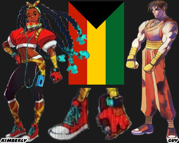
As a Black character Kimberly had a number of “urban” elements put on her. It wasn't the first time. In 1989 Guy broke the mold by being a modern ninja, with just the use of Nike Air Force 1's on his costume. With Kimberly there were a lot more modern details. She was sporting long braids with turquoise colored tips. She was wearing sneakers, a smart watch, listening to her Walkman, and holding a spray can. She had ribbon on her forearms, leggings, and wrapped around her ankles. I believe it is inferred that she is also a trained dancer. Capcom seemed to go all-in on her Black roots. Her color scheme seemed busy, but was very pro-Black, especially if she had been planned in the ‘90s. The colors of her outfit were very intentional. The Pan-African movement started over a century ago as a way to create a brotherhood among Black peoples in every nation. The colors of their flag were black, red, yellow, and green. Black represents the peoples of Africa, Red represents African bloodshed during the years of European occupation, Yellow represents the African riches plundered under occupation, and Green represents the fertility of the land. We get these details all over Kimberly’s costume. If I didn’t know better I’d say the studio was intentionally creating a femme version of Miles Morales.

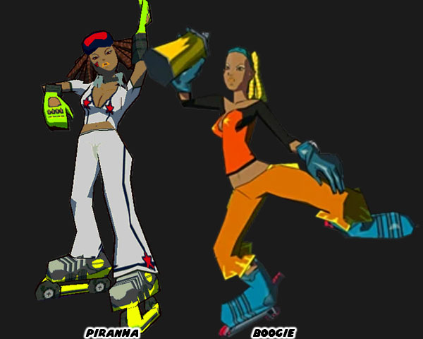
Prior to Kimberly there were two characters created in Japan that were Black, and very Hip Hop in gaming. Piranha from Jet Set Radio (2000), and Boogie from Jet Set Radio Future (2002). Technically I think both were meant to be the same character, but I digress. Smilebit was a Sega developer that created what I would argue to be the greatest Hip Hop games ever published. Both Jet Set games featured all four elements of Hip Hop. The characters could breakdance, and spray painting graffiti was part of the game play. Lastly the music, and plot was pushed forward by the emcee, and DJ Professor K. The kids of Tokyo-To were fighting for freedom of expression under an oppressive police state, and their corporate overlords. Every group of inline skating “Rudies” reflected different gangs in the series. The heroic GG’s were made up of positive figures of all colors, and Nationalities. The Jet Set series had a profound influence on art, gaming, music, and design for several generations. I wouldn’t put it above the Capcom developers to have grown up on this game. I’m not the only one that had this opinion. Kotaku said Ryu’s new theme belonged in Jet Set Radio.

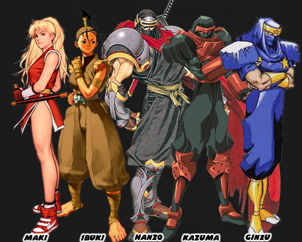
The color, and cut of Kimberly’s top was a familiar red, and white. We had seen the sneakers, and martial arts outfit combination originally placed on Guy from 1989’s Final Fight. I had Guy as #11 on my 30 most important Street Fighter characters. As you may know Guy was a Bushinryu Ninja, that was originally created to replace Ryu as the star of the franchise. With Cody replacing Ken. Street Fighter 6 was set to take place mostly in Metro City, where Final Fight took place. Anyhow the early take was that Kimberly was the first Black female ninja in the series. There were many ninjas in the Street Fighter universe. Geki was a NPC from the original SF. Then there was Maki, another sneaker-wearing member of Guy’s ninja clan in Final Fight 2. Final Fight 2 was a Super Nintendo exclusive. The first playable ninja in a numbered SF game was Ibuki, she debuted in SFIII. If Kimberly is a ninja as well then Capcom has done a good job of masking her costume in what appears to be plain clothing. The oversized shoulder pads was a classic ninja costume choice that had appeared in manga, anime, and other games. For example I talked about Kazuma, and Ginzu on my Galaxy Fight blog. Ninjas in pop culture also often wore face coverings, or sashes. Kimberly had a headwrap, and scarf with the Pan-African colors. I’m curious to see what moves, attacks, and specials she will be given. There is still a long way to go until the game was released, but I was eagerly watching each development. What about you? What do you think of Kimberly, or are you waiting to see how the other characters turn out? Please let me know in the comments section. As always if you would like to sponsor me please visit my Patreon page and consider donating each month, even as little as $1 would help make better blogs and even podcasts!
follow the Street Writer on Patreon!

Tuesday, June 28, 2022

Let's talk about A.K.I., the Dragon Lady of Street Fighter 6

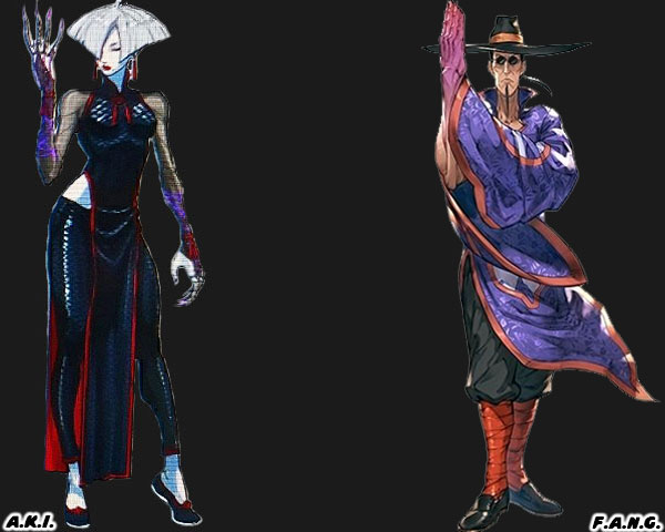
Today we are going to look at a new character slated for Street Fighter 6. A.K.I. is listed from China, and I mentioned previously on the Symmetry blog that she seems to be a new rival to Chun-Li. Maybe she is a leader of a Triad organization, maybe she's an assassin, or maybe she's just a fashion model mixed up in a fighting tournament. In my previous post I summed up their look this way. Both A.K.I, and Chun-Li hail from China, but they seem to be set as polar opposites. Chun-Li represents a classical fighting tradition. Her kicks are legendary in the series, as is her sense of duty to the police. A.K.I. by contrast looks like a villain right out of a comic book, or possibly action movie. She might be being set up as the ultimate rival. Her porcelain-white skin is eerie, making her appear almost supernatural. She wears flats like Chun-Li, but the similarities end there. Her costume is black, a sinister shade, and form fitting. She has pant leggings, and tulle-sleeves over her pale arms. She lacks the muscle definition of Chun-Li, but has claw-like jewelry. She's signaling that she is not a kicker, but a slasher. Just like Han, the villain from Bruce Lee's Enter the Dragon. I almost wonder if her claws have poison, similar to the nails of another Street Fighter villain.

When I look at A.K.I. I get the same feeling that I have from other Street Fighter 6 characters. Namely that she is an attempt to improve on an idea that was used in Street Fighter V. I think the moves of Jamie, and rivalry to Luke were originally going to apply to King Cobra. I also think that JP, was an attempt to redo the character of G. A.K.I. appears to be designed to replace the Shadowlaw general F.A.N.G. I know that I am not the only person in the fighting game community that has these same thoughts. Other people think that Manon is an attempt to redo the character of Abel. I’ve said that no good idea really dies, but perhaps some tropes need to be retired. I’m not sure what the abbreviation A.K.I. stands for, but in Japanese the name Aki can mean bright, brilliant, radiance. Aki itself is not a Chinese name. There were a lot of design elements behind F.A.N.G., but the character seemed like a giant troll. He was silly, goofy, and just plain stupid in the lineup. I think he reflected Yoshinori Ono’s sense of humor perfectly. Along with Rufus, and Hakan, these were gag characters that really didn’t belong in the series. The other reason the character didn’t work was because part of his design was based on the evil Chinese mastermind trope. When I look at A.K.I. there are hints of stereotypical elements to her look as well.

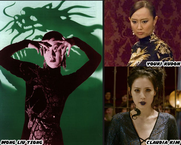
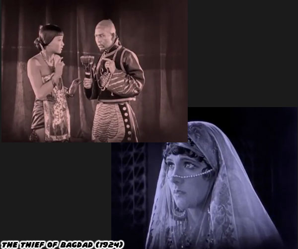
In a nutshell A.K.I. seems to be cut out of the Dragon Lady trope. There were several heavy-handed ethnic stereotypes created in the earliest days of Hollywood. One of the oldest was the dangerous “exotic” femme fatale, better known as the Dragon Lady. Wong Liu Tsong aka Anna May Wong was a gorgeous silent film star that fought for better roles all her life. She was a villain in the 1924 film the Thief of Baghdad, but went on to push for less stereotypical portrayals. The trend continued for decades. When they weren’t presented as dangerous assassins, like Rush Hour 3’s Jasmine played by Youki Kudoh, they were literally written as snakes. This was the case in Fantastic Beasts 2 Nagini played by Claudia Kim. Her character name was based on the Naga, which was a divine race of snake-human hybrids from South Asian mythology. Claudia was a Korean actress, but representing creatures from a completely different culture. The lack of ethnic understanding was something that the Harry Potter author JK Rowling had been criticized for in the past. Remember that she named the only Asian character in the Harry Potter series “Cho Chang”? The other characters Parvati Patil, and Padma Patil were South Asian.

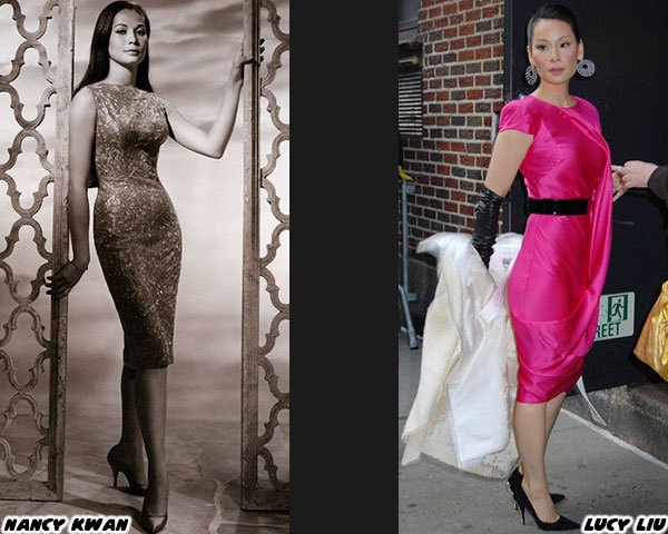
The Dragon Lady trope had multiple angles. These women could use their charm to spy, or seduce the heroes. They didn’t always have to be expert martial artists. In almost every regard an Asian female in a Hollywood movie was a fetish object. Anna May pushed for better roles, and many years later Nancy Kwan did the same for actresses in the ‘60s. Nancy’s break-out role was in the film The World of Suzie Wong, based on a novel of the same name. Instantly she became a sex object. Her dress in the film, a traditional cheongsam started being called the “Suzie Wong dress.” I’m almost certain that a bit of Chun-Li’s design, and international appeal comes from the seeds planted by Nancy Kwan. But as all things entertainment go, there was always a cycle. Decades after Nancy there was Lucy Liu, who was often cast as a cold-hearted Dragon Lady in film, and television. Lucy also pushed for better roles, and representation, but Hollywood was slow to change.

With A.K.I. I am reminded that the video game industry can also be slow to change. When she makes her debut in Street Fighter 6 it will be almost 100 years since Anna May Wong first appeared on screen. Maybe A.K.I. can rise above the Dragon Lady trope. She might actually be the surprise star of the game. Or she might be and ugly over-the-top character like F.A.N.G. Only time will tell. What do you think of this character? Are you eager to see a new rival to Chun-Li in the game? Someone that represents the Chinese underground? Or perhaps is a double agent in disguise? I want to find out more, that’s for certain. Let me know your thoughts in the comments section. As always if you would like to sponsor me please visit my Patreon page and consider donating each month, even as little as $1 would help make better blogs and even podcasts!
follow the Street Writer on Patreon!

Monday, June 27, 2022

The greatest fighting game boss returns to Street Fighter 6, a look at Gouki

Gouki / Akuma is slated to return in Street Fighter 6. Of the countless fighting games that have come out over the past 40+ years there is one boss character that I consider the greatest of all time. I’m certain that many would agree that Gouki is the bar by which all fighting game bosses are measured. There have been many great boss characters throughout history. Revenge against Geese Howard drove the plot in the Fatal Fury series. Then there was the villainous Heihachi Mishima, and his attempts to kill his own son in the Tekken tournament. Plus Bilstein set the galaxy on fire in Star Gladiator, and his ghost came back to continue his path of destruction in Plasma Sword. Despite all those great titles Gouki was still head, and shoulders above the competition.

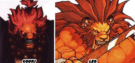
I’ve written a lot about the origins of this character, and his impact in the series. I considered Gouki the third most important character in the franchise. If you are new to the Street Fighter franchise Gouki is a master of Ansatsuken a fictional fighting art known as “Murder Fist.” He killed his brother Gouken, and their master Goutetsu to claim the title as the best in the world. Ken, and Ryu, the stars of the game, were trained by Gouken. So you can guess that his appearance helped motivate the lead characters. Gouki’s look was based on the mythological Nio, the guardians of heaven, and hell. Their statues can be seen at entrances to Buddhist temples. Not only that but he was created using the features of a lion. The flat nose, the sharp teeth, and red clay skin was all done to make him look like a supernatural being, while still being a plausible real person.

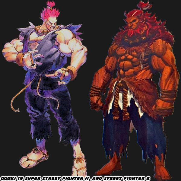
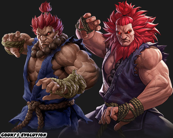
This animal look was expanded in Street Fighter V. The studio went ahead and grew out his hair, and gave him a beard in order to make it look like a full fledged lion’s mane. He was still wearing a rope belt, rather than a traditional black belt. His hands were wrapped in cord, rather than punching gloves. Plus he wore the beads of his master around his neck. Every design element placed on the character meant something, including the type of knot used on the belt. These were all very important details whether the audience knew it or not. For Street Fighter 6 the designers at Capcom decided to remove his top, and give him a cape of animal fur instead. I can almost imagine him training in the mountains of Japan, surviving in the harshest of conditions with this new getup. He looks less like a spiritual being, and more like a caveman now. Not that this was necessarily a bad thing. He is still has a physically imposing presence, and looks like he could break any returning character in half.

The latest version of Gouki looks amazing, but diffuses all of the design elements that made him iconic in the first place. If the newest version of Gouki were the one that first appeared in Super Street Fighter II Turbo, then I don’t think his impact would have been as big as it originally was. Gouki’s black gi was the opposite of Ryu’s white gi. His hair was red, and fiery. He wore a rope belt, and oversized prayer beads. This was a karate master that was as close to demon as we could get. Once the character was established the studio could adjust his appearance. Previously it was simple things, like streaks of white hair in Street Fighter III. Then it became a beard, and longer hair. Now it’s the mane, and streaks of white hair. I think by moving away from the karate uniform it breaks the best elements of his original design. Not to mention that the animal fur was almost the same shade as his skin. Thus muddying his primary colors. I’m not completely on board with the new design team at Capcom steering all the original World Warriors away from their original costume designs, and colors. Some appear better, like Zangief, Dhalsim, and Blanka. But changes to Ken, and Gouki seem to diffuse the impact that they used to have. That’s what I think anyhow, what are your thoughts on the newest look of Gouki? Do you care how the characters appear at all? Or are you more concerned with the game play? Let me know in the comments section please. If you would like to sponsor me please visit my Patreon page and consider donating each month, even as little as $1 would help make better blogs and even podcasts!
follow the Street Writer on Patreon!

Saturday, June 25, 2022

Cammy gets an entirely new look for Street Fighter 6, let's see how

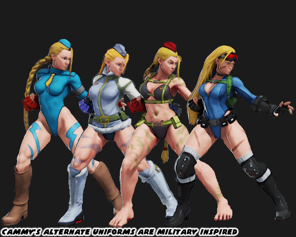
In the previous blog I mentioned that Street Fighter 6 Director Takayuki Nakayama, Producer Kazuhiro Tsuchiya, and Designer Yusuke Hashimoto had decided to redo the costumes of every returning character in the franchise. Some of the designs are obvious, but work in the context of the fighter, like Zangief having red pants, instead of red wrestling trunks. Even the ones that look the same, like Juri, and Rashid, are actually new fits. The changes to the cut, and color for their uniform that I think makes for better overall designs. However I cannot say the same for every returning character. The more casual designs I think hurt the impact of a classic fighter. This was the case with Ken, as his tee shirt, jacket, and boots seemed out of place from his previous red karate gi. I think the same argument could be made for Cammy White.

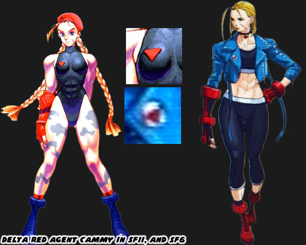
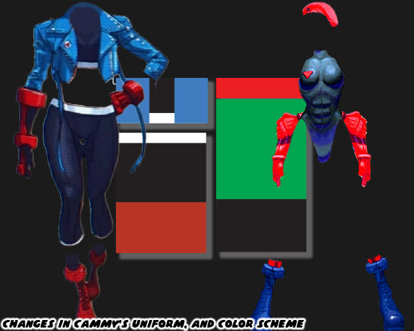
Cammy as you may know is a member of Delta Red. A super secret British military strike force. Despite her diminutive size, she is actually quite strong, and exceedingly fast. Her uniform consisted of a green leotard, red beret, red gauntlets, red socks, and combat boots. Also she wore camouflage paint on her legs. Like the other women in the cast she also had a unique hair style. Hers were two long blonde braids ran the length of her back. This was usually her outfit when she was on missions with her team. The new design of Cammy has her wearing something closer to modern street wear. She has what appears to be workout leggings, and a sports bra. Over which she wears a cropped blue jacket, with a long belt. She also has one full-arm gauntlet, and one red glove, with red combat boots. Her trademark hair has been cut short. Her somewhat military inspired look has pretty much been stripped away. The only connection to her training goes to a small Delta Red pin on her jacket. Many fighting game fans said there was little setting her apart from the more recent design of Sonya Blade in Mortal Kombat.

If you remove the character, and just look at the costume you’ll see a stark contrast in her design. I argue that color is one of the most important things you can assign any fighting game character. The ones that had solid colors, and a complimentary second color withstood the test of time. I said that this was a sort of happy mistake. Because game consoles in the ‘80s couldn’t have too many colors on the screen, then sprites were assigned bright primary colors so they could stand out from the backgrounds, and their opponents. This started a trend that at least Capcom stayed with through most of the ‘90s. The artists stayed with solid primary colors for each fighter even when they had hardware capable of presenting thousands of colors on screen at the same time. The original design for Cammy was no exception. She had a lime green associated with her uniform, this was a lighter shade than the green assigned to Blanka. Plus her red, and black accent colors were different than the rest of the Super SFII cast. Some of the returning characters in SF6 have perhaps a new accent color assigned to their outfits, while others have entirely new color pallets assigned to them. Cammy falls into the latter category.

Cammy has had different variations of her uniform through Street Fighter Zero / Alpha, Street Fighter IV, and V. In every instance it was military inspired, even if it was a “sexy” version of spy gear. Without her long hair, red beret, and military look is she still Cammy? I think it’s fair to ask what the SF6 designers think defines the character? For that matter, what do you think makes Cammy unique? I think the changes they made were counter to the spirit of her original design, similar to their approach to Ken Masters. Also why were most of the blonde characters (Ed, Ken, and Cammy) all given jackets? Was Mr. Hashimoto even aware that he did this? I suppose as long as Cammy still plays in a similar fashion that she used to then she will be well received. I’d like to hear your thoughts on hew new look in the comments section. If you would like to sponsor me please visit my Patreon page and consider donating each month, even as little as $1 would help make better blogs and even podcasts!
follow the Street Writer on Patreon!

Friday, June 24, 2022

The Red Tornado returns in Street Fighter 6, a look at Zangief.

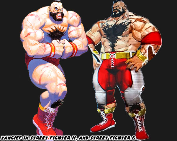
Today we’re going to look at Zangief, and his updated look in Street Fighter 6. For the most part very little was done with the character. He doesn’t seem to have aged much, if at all. There is no gray in his hair, or beard. Also he remains as massive as ever. The primary color associated with him remains red. In Street Fighter II he wore red trunks, and boots with gold trim. This time he is wearing red pants with white, and gold accents. Given his size these aren’t normal pro wrestler pants, but instead the kind worn by USA football players. They do incorporate kneepads as well. The only other changes made to him are the addition of red elbow pads, and the tape on his wrists have been replaced with gold bracelets. I’m kind of surprised at this stage in his career he isn’t presented with the Capcom Wrestling Association championship belt. Similar to the way Darun Mister wore his belts in Street Fighter EX, and Fighting EX Layer. All in all I think this redesign maintains the classic look that we’ve come to expect from the Red Tornado.

By now you should have noticed that not one returning character in the series is wearing their same costume. They may have similar color choices, like Zangief, or go with a different color scheme like Ken, but in either case nothing is exactly the same in this sequel. These are bold directions from Street Fighter 6 Director Takayuki Nakayama, Producer Kazuhiro Tsuchiya, and Designer Yusuke Hashimoto. Previously the studio did their best to incorporate as many details from the sprite-based versions featured in SFII when being adapted for 3D. Even “minor” details like Ryu having ragged edges on his gi, while Ken had hemmed edges were not overlooked by Yoshinori Ono, and the team working on Street Fighter IV. I am not on board with all of the changes that they have made, but I do appreciate the tweaks that they made to designs to make them stronger. Changing the cut of Rashid’s uniform, as well as the cut, and color choices for Juri were well done. Completely revising Luke helped make him look less like a nationalist.

What do you think of the decision to completely redo the costumes for everyone revealed so far? Was this a good idea? Are you eager to get DLC of the classic costumes if Capcom offers them? My friends, and family know that I love playing as Zangief in the game. I can't wait to see how the studio has updated his move set, and special attacks. Did you ever play any of the wrestling characters in the franchise? I’d like to read your thoughts in the comments section. If you would like to sponsor me please visit my Patreon page and consider donating each month, even as little as $1 would help make better blogs and even podcasts!
follow the Street Writer on Patreon!

Thursday, June 23, 2022

Dhalsim, and Blanka, the return of the strange characters in Street Fighter 6

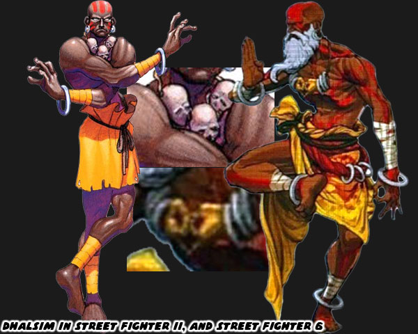
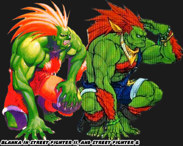
Yesterday we talked about JP the new character in Street Fighter 6. I mentioned that his design was odd on purpose. Normally fighting game characters look like they represent a certain martial art. Whether it's Ryu wearing a karate gi, or Zangief wearing wrestling trunks, it's very easy to see what form they reflect. JP was wearing an orange suit, and white cape. These were not things that defined any named style. The Street Fighter franchise has always relied on some non-mainstream styles, and characters. Even in the original Street Fighter the first two characters that Ken, and Ryu fought were a monk, and a ninja. This concept became more extreme in SFII, especially through the characters of Dhalsim, and Blanka. Dhalsim was based on a stretchy yoga master from the film The Master of the Flying Guillotine. Blanka was a wild man inspired by the green-skinned "Amazon" from Nintendo Pro Wrestling. The two outliers helped create a memorable game. Often times I think that studios forget that fighting games work best when they feature at least one cast member that is an oddball. Dhalsim, and Blanka's look has changed a little through the years, and when it did I think it was for the better. Dhalsim went from wearing rags, a necklace laced with the skulls of children, and a rope belt to portray his humility, and penance. Now he is wearing a necklace showing the Gyan Mudra, or meditating hand positions. He also has the robes of a holy man, or mystic. Dhalsim even went from a freshly shaven bald man, to a bearded man, sporting a turban. Clearly time had passed for the character, and Capcom was interested in capturing details from Indian culture rather than make stuff up.

The studio created both fighters from stereotypes, but it was good to see them move away from adding more problematic choices. More important, they started stripping away elements without betraying the spirit of the character. The fact that they were trying to be more inclusive by adding more women, and minority characters in SF6 could be seen as proof that they had learned from the past. There were new people in charge of the franchise, and they were bringing it into the new millennium. The changes applied to Blanka were subtle, but just as important. His original design saw him in orange shorts, and shackles. This was a holdover from the time where he was literally a fighting slave. The beast man from Brazil was reunited with his mother at the end of SFII, and was reintroduced to society. He now wears jean overalls, and a bandana. Clearly he still prefers the outdoors, but no longer looks like he escaped from the circus. I’m not sure why Blanka would keep the ankle shackles, even if they were a gift from his mother. But that’s a minor complaint. These were small changes to the characters, but added much more dimension to them at the same time.

I am eager to see how the duo of odd characters have grown. What are their moves, and special abilities like now? What is their purpose in the latest story? I have plenty of questions, but no answers from Capcom. In the next few months I’m sure a lot more will be revealed. What do you think about the updated looks of Dhalsim, and Blanka? Is Capcom going in the right direction, or would you rather them try something different? Please let me know in the comments section. If you would like to sponsor me please visit my Patreon page and consider donating each month, even as little as $1 would help make better blogs and even podcasts!
follow the Street Writer on Patreon!

Wednesday, June 22, 2022

A look at JP in Street Fighter 6, is this old money personified?

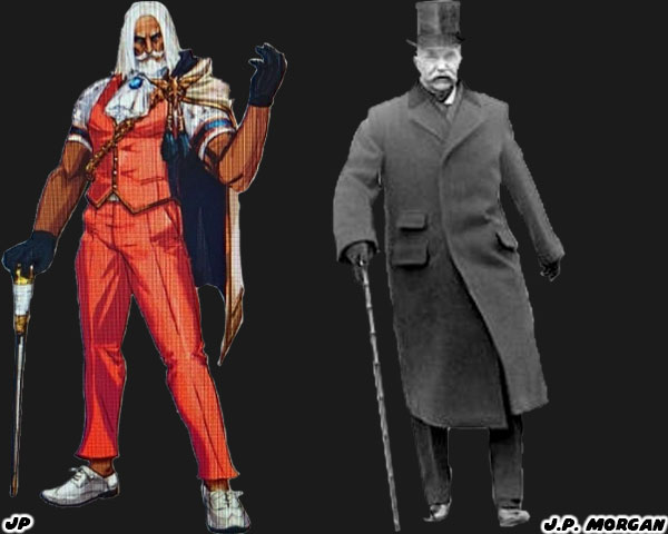
Today we are looking at another new character slated for Street Fighter 6. JP seems to be an odd choice for the lineup. The Russian appears to be an older, well-dressed man, and not a fighter at all. Of course in a universe where British teens are actually deadly spies then it’s fair to say looks can be deceiving. Let’s try to figure out this character, and his inspiration. We’ll begin with the name itself. JP is a Russian, given his choice of clothing, cape, cane, and trim, it’s fair to say he might be an oligarch. In recent news we are aware of the influence of Russian Oligarchs in international politics. The name itself may be a nod to an older tycoon. John Pierpont “J.P.” Morgan was an investment banker, and finance executive from the late 1800’s / early 1900’s. He inherited wealth from his family, along with connections. This allowed him to help form the companies General Electric, International Harvester, and U.S. Steel to name just a few. So far was his business, and political pull that economists feared he owned the country. To this day several of the monopolies he created are still around, and his company merged with Chase Manhattan as one of the premier banks in the nation. It would be interesting to see if JP is supposed to be a magnate with that kind of influence in the SF universe. The other thing that draws us to his design is the color choice. I've long said that solid color choices have historically gone over well on the main characters. JP is wearing a nice shade of orange on his suit, with white, and gold trim. These are all complimentary colors, including the white in his hair, and beard. Plus we have already covered that there are fighters in the series that use weapons. JP would be joining Lili in that regard.

I think the reason that Capcom put him into the game was twofold. First was that every Street Fighter game from SFII to today featured at least one odd character. Figures like Blanka, and Dhalsim were on the extreme end of what worked in the series. Having an older gentleman, and a big woman like Marisa in the game might be balancing out the cast. The other reason I think that he was included was because the team wasn’t happy with how G turned out in Street Fighter V. I had done a lengthy post on G, and other power-hungry characters in the genre. JP might be a second chance to get the power broker trope right. He might be a despot looking to either hire, or eliminate the best fighters in the world. We can only know for certain when Capcom officially unveils the character, and his motivation.

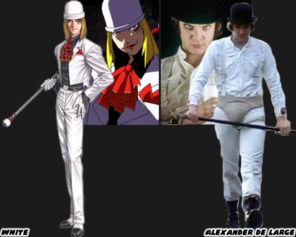
The sneaky-type characters, pulling the strings have been in other fighting games. Real Bout Garou Densetsu Special: Dominated Mind, was a 1998 Playstation version of the 1997 arcade game by SNK. That series was a sequel of the popular Fatal Fury line. The games usually revolved the Bogard family against Geese Howard. This time SNK added a new villain. White showed up in a white suit, bowler hat, and cane. He fought with a series of sneaky attacks, and used his cane to help extend his range. The odd-looking character was based on Alexander de Large (Malcom McDowell) from the 1971 film A Clockwork Orange. I don't think JP is a nod to any specific film character, but I'm betting his cane hides a sword. Again, we won't know all of the details until Capcom releases them. I'm interested in seeing what becomes of this character. Already I think he looks better than G. What about you? Are you interested in these type of character designs, or would you rather see Capcom pushing for something more extreme? I'd like to hear your thoughts in the comments section. If you would like to sponsor me please visit my Patreon page and consider donating each month, even as little as $1 would help make better blogs and even podcasts!
follow the Street Writer on Patreon!

Tuesday, June 21, 2022

Dee Jay is back in Street Fighter 6, is he better than we remember?

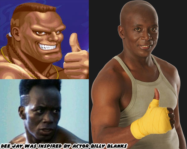
Today we're going to talk about a returning character to Street Fighter 6. Dee Jay made his first appearance in Super Street Fighter II: The New Challengers in 1993. The new challengers the title referred to were T. Hawk, Fei Long, Cammy, and Dee Jay. Capcom was in the planning stages of Street Fighter III, and those four were the earliest characters slated to be inserted into the series. Several of the fighters in the SF series were inspired by pop culture, whether they were film characters, or actual martial artists. Dee Jay was no different. The character was created by James Goddard. The Capcom employee was Co-Lead Designer for Street Fighter II: Champion Edition. The studio had long sought to add a kickboxer to the game. The last time a fighter of that style was featured was with the non-playable Joe in the original SF from 1987.

For inspiration Mr. Goddard looked at Billy Blanks who is an actual martial arts practitioner, and fitness guru. Billy's first major role was as the villain Khan the Great in The King of Kickboxers. The film came out in 1990, after Final Fight, but before SFII was released. Billy's next starring role was in TC 2000. In that film he played Jason Storm. The film debuted in August 1993, Super SFII would come out a month later. Many people mistake TC 2000 as the film that inspired Dee Jay, but there's no way a studio could create a character, and their move set in less than a month. Blanks had a great physique, and a trademark fade that was made for game characters. Although there were a few notable Black martial arts film stars in the late '70s like Ron Van Clief, and Jim Kelly, there weren't too many in the late '80s/early '90s. Blanks (and Wesley Snipes) helped spark a new trend for actors like Michael Jai White, Marrese Crump, and Lateef Crowder. As for the character I think his new design was a bit better than his original.

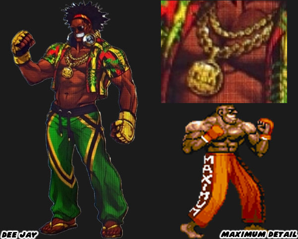
Dee Jay had ditched the fade, and braids for natural hair. This was a nice touch. He was also wearing the colors of the Jamaican flag (green, yellow, and black) on his pants, and the Pan-African colors on his shirt. You know by now that I believe that the most memorable characters were assigned solid colors. Wrapping a character in a multi-colored national flag might be pandering, or a good substitute depending on your perspective. The reason I think for Dee Jay’s multicolored costume in this game was because yellow with black accents were already assigned to Sean in Street Fighter III, and green with yellow trim was assigned to his sister Laura in Street Fighter V. The updated look also includes gold jewelry around his neck, along with a medallion that reads MAXIMUM. This was a nod to his original costume. The studio had originally wanted to put MANTIS on the side of his pants, as in praying mantis. The problem with this was sprite mirroring, the N, and S would have been flipped on the screen. Maximum reads the same when mirrored vertically. The sticking point for me with the character was his stupid grin. It harkened back to an uglier time in US history, and I'm not talking about the '90s.

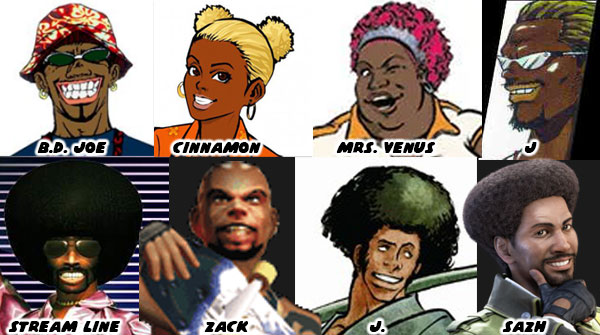
I am for more minority representation in the series. With that said I would like to see it in a positive light. I did not appreciate the gimmicks, and racial overtones applied to El Fuerte, Birdie, T. Hawk, and Hakan. Also I thought that there could be fat representation without it being used for the sake of comedy like Rufus. I had talked about the perpetually grinning Dee Jay, and the stereotypes behind black characters in Japanese games earlier on the blog. Younger readers may not be aware of it, especially out-of-touch Japanese developers, but the grinning black character was a trope from the days of Jim Crow. In short, to make a Black character more appealing (less threatening) to audiences he often had to be presented as a grinning entertainer. Even if Dee Jay now wore the colors of the Jamaican flag, and sported natural hair, he also wore a lot of jewelry, and never lost that wide grin. I’ve no doubt he would be fun to play with in the game. I also have no doubt that the new developers meant no harm in his return. I just hope that if the studio takes more careful consideration when adding minorities into the franchise. What do you think of Dee Jay? Are you eager to see his return, or would you rather have seen a different, or new character instead? I’d like to hear about it in the comments section. If you would like to sponsor me please visit my Patreon page and consider donating each month, even as little as $1 would help make better blogs and even podcasts!
follow the Street Writer on Patreon!

Monday, June 20, 2022

Manon in Street Fighter 6, representing a style over 200 years in the making

Today we’re going to look at Manon (originally listed as Mimi in the leaked concept art), a new character in Street Fighter 6. She hasn’t been officially announced, like some of the other ones I have previewed so far. So everything I’m going to talk about it just to place her in context. I think that understanding the roots of a character, their design, and especially their fighting art can help you appreciate them a little bit more. Manon is a leggy female fighter, she seems to be kick based. I mentioned her briefly on my symmetry blog. I said she looked like a balance to Juri. She was a sort of “good” version of the evil striker. It’s her implied form of fighting that I think is long overdue for the series. Manon hails from France, and based on the cut of her uniform it is likely that she represents a form of kickboxing known as Savate.

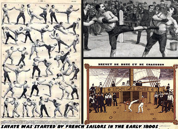
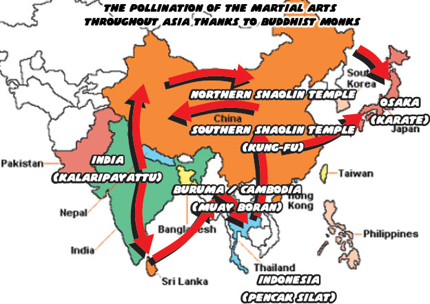
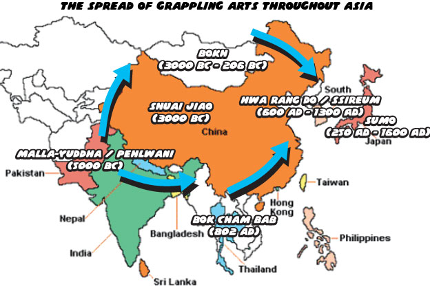
Savate translates to “old shoe” in French. The style of fighting is a few centuries old, and was created by French sailors. I do not believe for one second that the sailors just happened to invent a new form of fighting on their own. Quite the contrary, I think they picked up a number of lessons from various older forms of combat. In my history of the martial arts I mentioned that Buddhism started in India, and moved east. The monks helped pollenate the fighting arts throughout Asia. What I never talked about in the blog was how the fighting arts did not solely pollenate in one direction. Grappling was the oldest of fighting arts, with striking arts evolving from them. The differences between Muay Thai, and Karate were very distinct. One form was considered older, more lethal, while the other was more scientific in approach. Those nuances were applied to characters like Sagat, and Ryu, and in the process made them icons. They represented a pure style of their respective art.

The thing about the fighting arts, and their practitioners, is that many fighters throughout history were not content studying one style alone. The best fought against, and learned from different schools. In the process becoming MMA practitioners a few centuries before the term mixed martial arts was coined. These fighters in turn created new schools of fighting. Perhaps they taught a form of karate that included the kicks of kung-fu, the punches of boxing, with the knee, and elbow strikes of Muay Thai. Perhaps they taught the grappling techniques of Mongolia, with the throws of judo, and the joint locks of ju-jitsu. Masters of the fighting arts went back, and forth between different provinces, as well as continents. They dissected different forms, and found what worked for their method. I have no doubt that Savate was born from French involvement in global trade.

The “Silk Road” made famous by Marco Polo was only the beginning of Europe’s fascination with the East. Seafaring nations including England, Portugal, Spain, and France looked to set up trading routes all throughout the Indian Ocean. France specifically had been trading in Asia since the early 1500’s. Like many of the other nations of Europe they too looked to expand their empire. France colonized parts of Laos, Cambodia, and Vietnam, and created French Indochina in 1887. I have no doubt that the French sailors that had been traveling through the ports of Thailand, Malaysia, and Burma were exposed first-hand to the ancient fighting arts of Muay Thai, as well as silat, and Muay Boran. Almost three hundred years of picking up techniques from port, to port, and refining them while on a ship helped make savate a distinct fighting style.

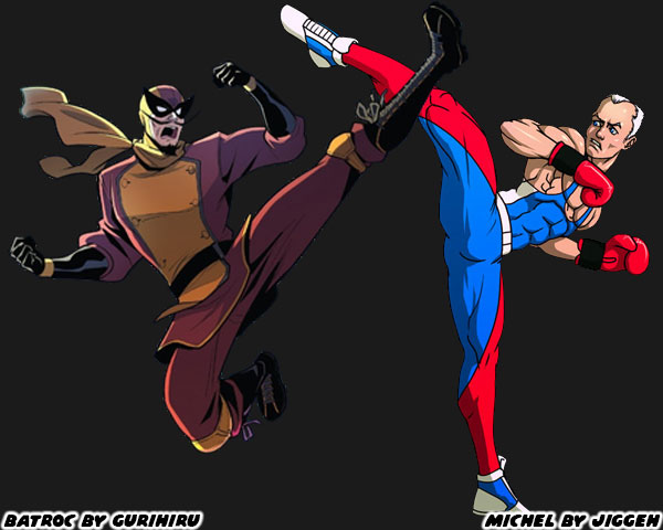
Savate is more akin to kickboxing than Muay Thai. The emphasis is on controlling distance, leaving space for kicks, and punches. In Muay Thai the fighters try to close the distance and kill an opponent with knees, and elbows. The uniform of the practitioners is also distinct. We picture a white gi, and black belt when we think of karate. We think of shorts, and corded wraps for Muay Thai boxers. In savate practitioners wear very light shoes, boxing gloves, and tights. I’m sure that the tights are part of the reason why it isn’t more popular with the men in the US. At the same time I’m surprised that Manon does not wear tight pants, shoes, or gloves. However part of what makes a Street Fighter design unique is that they only try to caricature the fighting art, not make it completely accurate. Manon’s uniform has about as much in common with Savate, as Juri’s does to Tae Kwon-Do. While you may not be aware of savate in US pop culture, its influence has been here for generations. The villain Georges Batroc the Leaper debuted in Marvel comics in 1966. This mercenary was played more recently in the Marvel films, and television shows by MMA legend Georges St-Pierre.

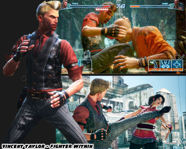
As far as video game adaptations there aren’t many notable savate heroes. Remy in Street Fighter III: 3rd Strike was the first savate fighter in SF history. However most of his moves were poached on the techniques employed by Guile in SFII. Aside from that Ubisoft tried to represent the style in 2013. The Fighter Within debuted for Xbox One Kinect. The character Vincent “Vince” Taylor was a kickboxer, and savate practitioner. The Brit had a gentlemanly look about him. It helped capture the “proper” spirit of the French art. Sadly this game was a miserable experience. Character designs aside, there wasn’t a saving grace to it. The control, and game play left many wondering if Ubisoft just published a game that was still in beta. That’s why few people ever talk about it, or what the studio was going for. I am hoping that Manon sets a new standard. Already I love her design.

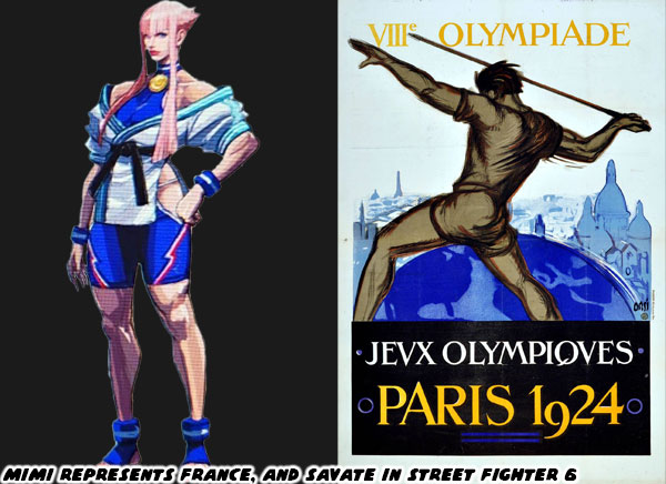
As I mentioned at the top of the blog she seems to be a balance to Juri. Like the other female stars her hair has a unique color, and shape. Her long legs, and exposed thighs were made for some fancy kicks. How those kicks will be different from Elena, Chun-Li, Cammy, and Juri remains to be seen. Either way the tireuse (female Savate practitioner) looks heroic. She wears the colors of her nation right on her costume. Look for the blue, white, and red dashes along her shorts. She also seems to be wearing a gold medal, with a ribbon also made in the national flag colors. A bit of trivia for you Savate was an exhibition event in the 1924 Olympics. I don’t think Manon is supposed to be 100-years-old. Instead Capcom is showing us that she’s the best in the sport, and a match for the World Warriors. I am eager to find out more about this character, and her special moves as the release date gets closer. What do you think of the character? Are you a fan of the striking arts? Is there a form of fighting you wish was in the series? I’d like to read your takes in the comments section. If you would like to sponsor me please visit my Patreon page and consider donating each month, even as little as $1 would help make better blogs and even podcasts!
follow the Street Writer on Patreon!

Saturday, June 18, 2022

Juri in Street Fighter 6, how her design got better with time

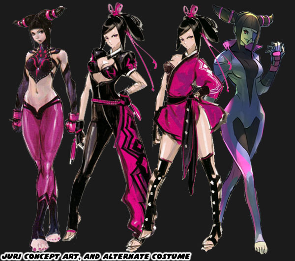
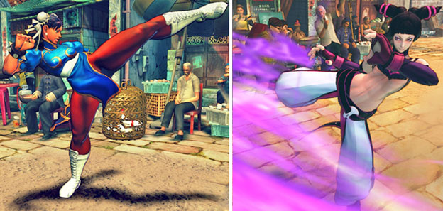
Today we talk about the best character introduced to the Street Fighter universe in the past 10+ years. Juri Han first appeared in Super Street Fighter IV in 2010. Can you believe the game came out that long ago? When she debuted the fan response was almost immediate. Abel, C. Viper, Rufus, Hakan, and El Fuerte took a back seat to the new femme fatale. A lot of people online think my ideas on character design posts are garbage because they think I hate Juri. That couldn’t be further from the truth. I was hyper critical of her design, and said that Capcom could have done better. From a story perspective she seemed overpowered. She was hyper sadistic in the game animations, and written to be god-like compared to Cammy, and Chun-Li. I thought that was a bit much, and disrespectful to established fighters. The biggest gripe I had was because Juri’s final design was closely based on Chun-Li. I was sure that the studio could have introduced a Tae Kwon-Do villain, without poaching Chun-Li’s design almost point for point. As time went on it was rumored that the studio had created some 400+ designs, and costumes for the character before settling on the one that appeared in the game. Several of her earlier concept designs, especially the tight skin suits, eventually became alternate costume DLC for the character.

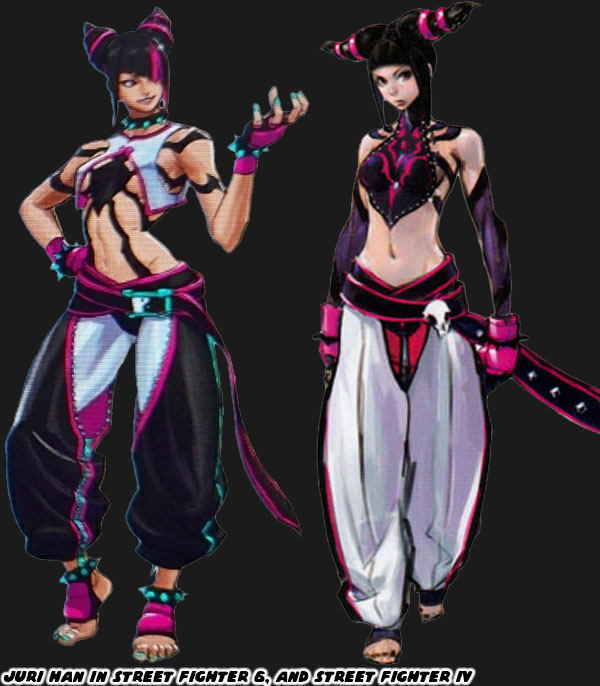
I think that the most recent version of Juri is much better than her debut. Her look, and costume look similar to her first appearance, but the changes made to them were subtle, but numerous. Let’s start with her dobok, the uniform worn by tae kwon-do practitioners. The colors are almost reversed from the original. Her leggings were white, and her pants were black, with fuchsia, and aqua accents. Not only that but they were shorter so we could see the contrasting colors on her feet, and ankles. The zipper on the inside leg makes the cut look very fashionable. White pants work okay for Ryu, but by going with much darker primary colors it really helps Juri stand out in the lineup.  Also a bit of trivia for you. Some of the costume colors assigned to the cast were based on the flags of their respective nations. Juri represented South Korea, their flag is colored red, blue, white, and black. So if you mix the colors blue, and red you end up with purple, the primary color of Juri. It would have been in poor taste for a Japanese studio to outright paint a villain with the flag of South Korea. The two nations have a lot of bad blood, especially for the numerous war crimes the Japanese perpetuated in Asia.  

The skull on Juri's belt was replaced with a yin yang symbol. This detail could be related to her chi abilities, or Tanden engine-accelerated powers. Her top reflects her evil origins. When Daigo Ikeno was working on the character the team nicknamed her the Spider. She was like a poisonous black widow that killed her mates. The spider logo appeared on the back of her top in her debut. This time it was put front, and center, like a sexy Spider-Man outfit. Although one of the spider legs covers her nipple Street Fighter designer Yusuke Hashimoto knew better than just leave most of her boobs dangling there. He covered her breasts with a split-open hanbok. He took the shape, and color of what would have been a traditional dress, and turned it basically into a lingerie top. Also her spiked bracelet was finally given some contrasting colors. The aqua on her pants was reflected on her fingernails, toenails, belt buckle, and more importantly, the spikes themselves. By adding the spiked bracelet to her ankles it was the type of nod to Chun-Li without just poaching the look. I think this addition may be the most inspired update to her costume.

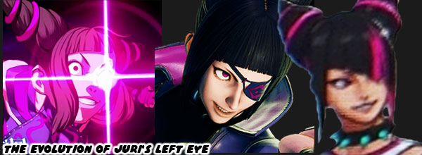
The next major change to Juri would be the cut of her hair. Her conical braids made a quick impression with fans, and became her trademark style. The studio observed the unique hair styles of other SF females. Chun-Li had buns, Cammy had braids, C. Viper had a pompadour with ponytail, Rose had purple hair, etc. Juri still had the cones, but now they were curved upwards in a more obvious devil horn fashion. Her bangs also changed shape, they were diagonal now, and extended over part of her face. Not only that but she had a fuchsia streak that lined up over her left eye. Juri had an artificial left eye fitted with the powerful Tanden, or Feng Shuei engine. When she is at full power the eye glows, in one of her alternate costumes she wore a patch over it. This new haircut keeps her face slightly obscured, and mysterious like C. Jack, but it also helps mask the eye. It was a very smart update to her look. Sadly I don’t think that Mr. Hashimoto realized that the colored hair streak was considered an Asian stereotype in the US. Glamour magazine said it best “It's Time to Retire the 'Hairstreak Asian' Trope”. I think the hair streak makes sense in context, but I understand why people are over designing Asian leads with similar hairstyles.

All in all I think that Juri’s redesign for Street Fighter 6 is her strongest look yet. I’m still more partial to her skin suit, but if you were to design an evil Chun-Li then you couldn’t do anything better. I don’t think I would have been as critical of the character if she looked more like this when she debuted in SFIV. Capcom may have created some 400+ looks for her in the early days, and they were very close to perfection. It took and additional 12 years, and a handful of changes to get her just right. What do you think about the updated look for Juri? Are you eager to try the returning characters, or the new characters? I’d like to hear your thoughts in the comments section. If you would like to sponsor me please visit my Patreon page and consider donating each month, even as little as $1 would help make better blogs and even podcasts!
follow the Street Writer on Patreon!