This entry is written with fighting game fans, and budding game designers in mind. If you take away anything today I want you to remember that the use of color may be the most important thing when designing fighting game characters. To expand on the idea, the stronger the color scheme, the bigger the impact it will have on audiences. This goes back to the birth of the genre. In the late ‘70s, and early ‘80s game designers fought the limitations of hardware, and software to bring their ideas to life. Studios like Atari, and Namco created animation through the use of sprites, instead of paint, on cells. Simple shapes, and two, or three frames of data were all they could apply on characters, and enemies. Despite the memory constraints the limited animation brought games to life. Look at a character like Pac-Man. While the game was not the first breakout hit, the character could be considered the original gaming mascot. The character was fairly three dimensional in the eyes of creator Toru Iwatani. You could see this in the official character art, cabinet, and marquee art. The actual sprite of Pac-Man was another story.
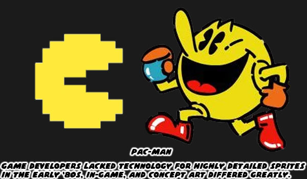
Toru plotted out the proportions of Pac-Man in the game on graph paper. Figuring that he could contain the open, and closed mouth animation across 28x36 tiles, and three frames of data. As the character moved left, right, up, and down across the maze it was a simple task of flipping the sprite to save on excess turning animations. The hardware limited the number of sprites, sizes, and frames of animation. It also limited the colors the game could exploit. Iwatani used a bright yellow for Pac-Man, and other solid colors to represent the ghosts Pinky (pink), Blinky (red), Inky (sky blue), and Clyde (orange). Solid color characters, and sprite mirroring would be used by other studios to create the illusion of movement in their games. The limitations of hardware turned out to be a blessing in disguise.
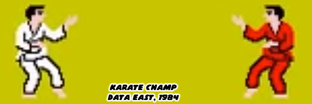
In the earliest days of the fighting genre sprite mirroring allowed characters to face left, or right. Karate Champ was different from action games because two players could go against each other. The white, and red karate uniforms were pallet swaps. In this way it would be easy for players to see who was who on screen. It was easy to track punches, and kicks because players had a clear view at the arms, and legs of the characters. Sprite mirroring ensured that characters always faced the player. A fighter would never have their back turned, and their strikes hidden from view. This came in handy when presenting different styles. A developer could focus on making a boxer look, and move like a boxer, or a ninja look, and move like a ninja. They were secure in the knowledge with sprite mirroring they would move the same whether facing left or right. From an artistic standpoint this was a problem. Characters couldn’t really have text, or graphics on one side of their costumes, because they would be reversed when facing the opposite direction. Most studios in the East, and West understood this limitation so they created characters, and costumes that didn’t have details, or text that wouldn’t make sense if flipped.
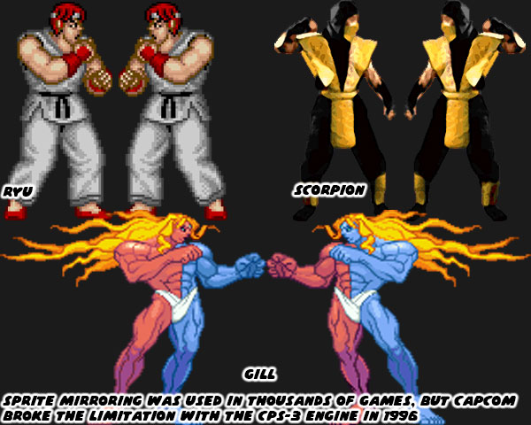
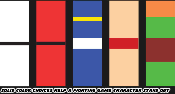
Capcom had become exceptionally good at developing sprites thanks to their extensive fighting game, and side-scrolling library. They created one of the most powerful sprite-based engines in 1996. The CPS-3 was capable of rendering switched colors on a sprite. For example, this meant that the Street Fighter III villain Gill could have one blue, and one red side toward the player depending on which way he was facing. It was revolutionary technology, but it proved too hard to develop for so only a few CPS-3 titles were ever released compared to the dozens of CPS-2 games. The thing that limited sprite technology in the past worked in favor of the SF designers. A decade after Pac-Man 2D engines allowed teams to have bigger sprites, more frames of animation, and more colors on screen at the same time. Even with this in mind the SF designers tended to place solid primary colors, and bright complimentary colors onto their characters. They kept the designs clean, and simple. No complex patterns, stripes, or filigree were fitted to their costumes. No matter how frenzied the action became it was easy to pick out the fighters, their moves, and special attacks on the screen.
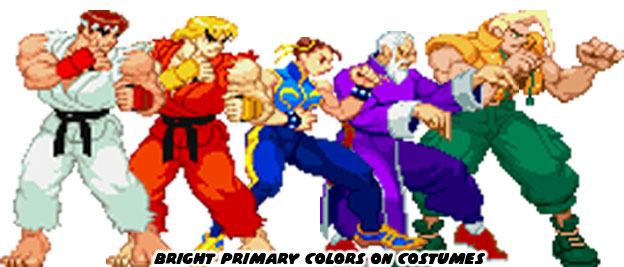
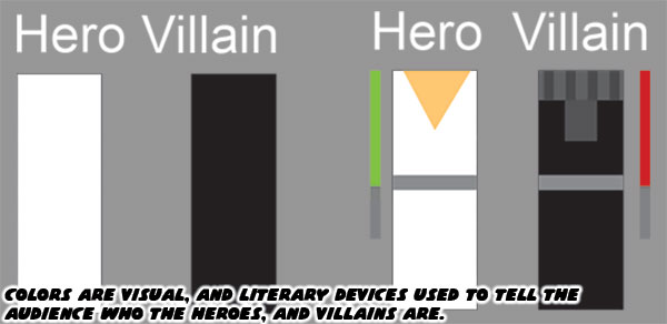
Street Fighter II, Super Street Fighter II, Street Fighter Zero / Alpha, and Street Fighter III more or less kept that tradition alive. The colors that the studio used set a template that would be repeated across the industry. You’ll get clear examples in the next blog. For now I want you to think about what colors your favorite character wears. What color comes to mind if you think about the Incredible Hulk? What about the Flash? How about Batman, or Superman? Even though the characters have been around for decades, and have had several revisions, you can perfectly imagine the colors associated with them. When you are watching a film for the first time, or reading a work of fiction, what colors are associated with the hero, and which are associated with the villain?
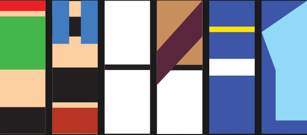
I want you to think about the colors associated with the Street Fighter II cast. I think it’s fair to call them the most iconic fighters ever assembled. I want you to strip down the characters to their most basic elements. If you had a coloring book, and could only use two, or three colors per character, which ones would you pick? There have been plenty of fighting games with karate leads, what was it that made Ken, and Ryu unique? I want you to think about Chun-Li, Zangief, and Blanka. If I were to ask you to name the details applied to the characters where would you begin? Would you talk about the chains on Blanka’s ankles, or would you mention the character had green skin? Would you talk about Chun-Li wearing light makeup, or would you say she wore a blue dress? Zangief didn’t wear much, but you all know his trunks were red.
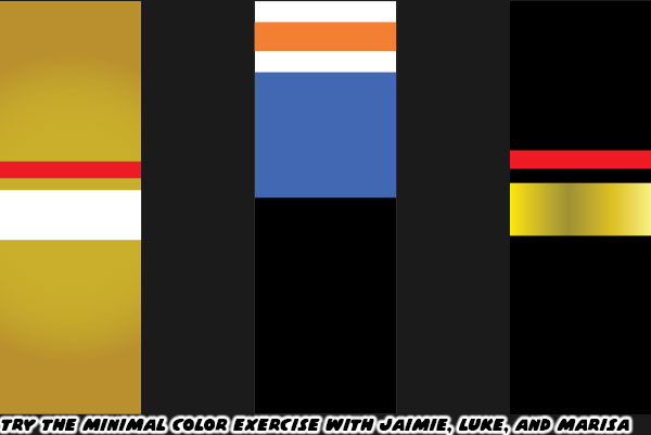
I have talked about three of the new characters in SF 6. Luke, Jamie, and Marisa. Jamie, and Marisa have just a few solid colors assigned to them. It is easy to simplify their details in your mind. Gold, and white for Jamie, and black, gold, and red for Marisa. Luke is a little bit different. He’s wearing layers. A white shirt, with orange print on it, a blue vest over that. Black training pants, and orange boxing gloves. The colors do not necessarily compliment each other very well. His earlier iteration of gold, and blue trunks made more sense. At the very least the colors reflected the Capcom logo. Previous SF characters rarely wore multiple layers, let alone colors that didn’t really blend well together.
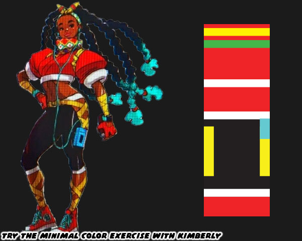
Now I want you to try and pair down the colors associated with Kimberly. Mind you, I haven’t yet posted a full write up on her. I don’t want you to think I’m against her inclusion. She may turn out to be my favorite new fighter once I get to play as her. What I am arguing about is from a color, and costume angle I think her design is too complex. Look at the number of colors, and clothing details put on her. I’m certain that SF 6 designer Yusuke Hashimoto gave careful consideration to his color choices.
Red, yellow, and green are colors that are associated with the Pan-Africa movement. It’s fantastic that she is a proud Black lead, with big natural locks. Then there are the turquoise tips at the end of her braids, light blue music player, and aqua laces on her sneakers. Those garnish colors don’t really work with her look, and I would argue throw the scheme off.
If you have seen the costume changes to Cammy, Ryu, and Chun-Li I’m sure you are aware that the community is split on some of the changes. Cammy has gotten the strongest response so far. Her leotard, boots, and beret were all swapped out for more civilian clothes. Without the iconic beret, and green bodysuit some gamers liken her look to Sonya Blade from the Mortal Kombat series. To be fair Sonya was influenced by Cammy. Ryu has a kasaya or Buddhist robe over his torso. Many fans had speculated that he was wearing the rags of his former mentor Oro. The Buddhist robe had been given to his rival Sagat as one of his last alternate costumes. I’m not sure if it was wise to repeat the same thing for Ryu. Then there was Chun-Li. The changes to her costume were distinct as well. The cut of her dress was even more traditional than her original costume. Also her top was two tones of blue; dark, and light. Her dark tights were replaced by blue leggings. Her wrestling boots were swapped out for more traditional flats. Even her trademark spiked bracelets were traded for a smoother weighted bracelet. The look is
taking the character back to her earliest concept sketches. I don’t think that is the best thing necessarily.
The community knows, and loves each of the characters regardless of what they wear. As long as they play in the style that fans are used to then I don’t imagine any real problems. Except for the kooks that think Cammy has been forever ruined because she’s wearing pants. I’ll never understand the people that scream censorship when the studio takes a costume in a new direction. I’m pretty sure there will be a classic costume DLC pack announced shortly after the game launches in 2023. Anyhow long time players will accept the new look of Cammy, Ryu, Chun-Li, and the other returning characters. I just caution budding designers not to go overboard with excessive details. Just because we now live in a time where home consoles are powerful enough to render individual teeth on a zipper, plastic caps at the end of shoelaces, and individual eye lashes. It doesn’t mean the game is made better by layering too much onto a character. Even in a world where people can throw fireballs it’s better to keep things simple. If you don’t believe me just think about two Muay Thai fighters.
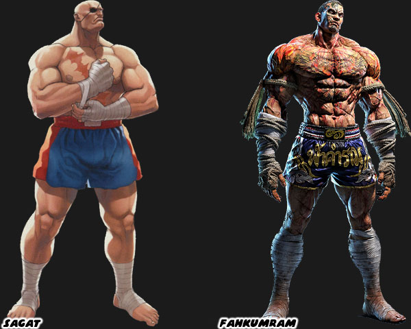
Sagat was the boss in the original Street Fighter.
His rivalry with Ryu became the stuff of legend. He had a couple of unique features, a patch over his eye, and scar across his chest. Because of the limitations of hardware his shorts were solid colors with no fancy patterns. Sprite mirroring meant that the patch on his eye would swap sides, but it was a minor detail. For 35+ years he became the standard for Muay Thai in fighting games. In 2020 Namco added their own gigantic Muay Thai fighter as well. Fahkumram was roughly the same height, and weight as Sagat. Yet to set the two apart Fahkumram was covered in tattoos, including half his face, as well as scars all over his body from a lightning strike. The cords on his hand wraps (representing the older Muay Boran) were covered in blood, and his shorts had Thai lettering, and national colors. To say it was design overkill would be fair. There was so many elements placed on him that it became a jumbled mess. The character would have worked well in a manga like Baki the grappler, where you could appreciate the look, but not so much in a fighting game. Where the action is fluid, and details are missed in the movement. Clean, simple designs, and especially colors go a lot further for a fighting game. That’s what I think anyway. Feel free to disagree in the comments section.
If you would like to sponsor me
please visit my Patreon page and consider donating each month, even as little as $1 would help make better blogs and even podcasts!

No comments:
Post a Comment