Showing posts with label ryu. Show all posts

Sunday, June 7, 2026

Arjun in Street Fighter 6, a great warrior with a mediocre design

Hello friends, it’s been a few years since I’ve talked about Street Fighter 6. I was happy with everything that went into the game, and saw little reason to discuss the seasonal updates. Either you played them, or you didn’t. In the past three years I didn’t talk about the SNK characters that turned up in the game. I didn’t talk about the return of Elena, Crimson Viper, Ed, Sagat, or Alex. I didn’t even talk about the introduction of Ingrid from the cancelled project Capcom Fighting All-Stars or Tifa from Final Fantasy VII. I didn’t even talk about the resurrection of Bosch either. Yet with the Season 4 trailer that was played during the 2026 Summer Games Fest we have some new faces that I did want to talk about.

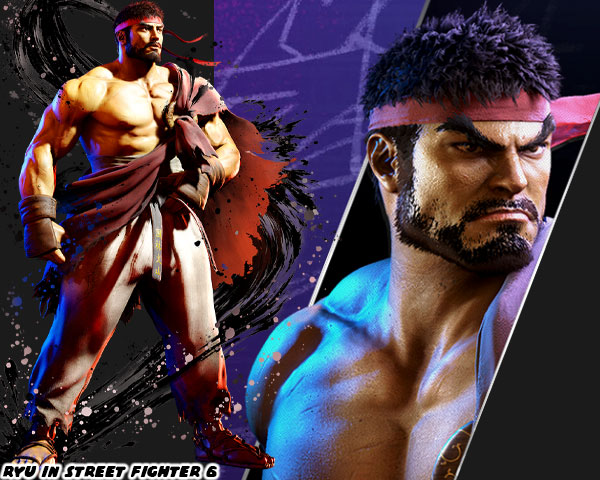
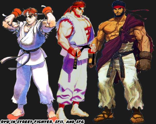
The first that caught my eye was Arjun. It was mainly due to the fact that he looked like Ryu with wild hair, and a long beard. As it was Ryu had taken on more of a monk-like appearance in the game. He already had a short beard, and wore a Kāṣāya, or traditional brown colored Buddhist monk robe over his gi. It showed growth for the character, and helped visually signal his story arc had concluded. He was not the young warrior traveling the globe as he was in the original Street Fighter. Nor was he the wandering champion post Street Fighter II. He had finally become a master, and had settled his life in a temple. He was essentially a philosophical, and visual opposite of Gouki / Akuma at this point. The thing I wondered was why the designers at Capcom would reuse the overall look. In fact Arjun appeared very much like some of the earlier concept art for Ryu. I honestly think this was a poor design choice from an otherwise great art team.

Street Fighter 6 Designer Yusuke Hashimoto was an absolute master of his craft. I had already sung his praises on this blog. He knew the importance of character art, and fashion design from his work on PlatinumGames Bayonetta, and Bayonetta 2. He helped redesign the iconic uniforms worn by all the classic SFII World Warriors, the New Generation from SFIII, and some of the faces introduced in SF IV, and V. If there was a person that I trusted to help create a new SF 6 character it would be Mr. Hashimoto. With that said I think Arjun fell flat. Some people online theorise that this design was from somebody else on the team, because he might be busy helping with a SF 7 roster, or major SF 6 update. In either case I appreciated that Capcom was putting in a distinct warrior to represent Nayshall in the game. Previous to Season 4 Bosch was the iconic fighter from the region. He had a great look, a great origin story, and his arc was crucial to the plot of the World Tour mode. Unfortunately he was an unplayable character. This was similar to the other important characters from the region, including Nayshall freedom fighter Rewancha, Fou-Lu the dragon of Nayshall, and Kalima the leader of the Nayshall Resistance.

These were all fantastic designs, but sadly all the Nayshall figures were NPCs as well. It’s great that we would finally be able to play as Bosch in Season 4, however we would be getting a completely new representative too. I believe that Arjun was a good guy. Not only that but I think this person created to take down JP once and for all. The name Arjun was based on Arjuna from the Mahabharata. He was a mighty warrior in the story, and regarded for his bravery, strength, but also for his talents in the arts. The name itself represented several things such as white, clear or silver. He could see those things in the color of his pants, and the silver chains on his belt. Arjuna can can also go by other names such as Vijaya (विजय) – always victorious, invincible and undefeatable, Jiṣṇu (जिष्णु) – triumphant, conqueror of enemies, and Bībhatsu (बीभत्सु) – one who always fights wars in a fair, stylish and terrific manner and never does anything horrible in the war. All of these things might be true of the character. If so then he is the opposite of JP. He would be fighting to undo his silent coup against the people of Nayshall.

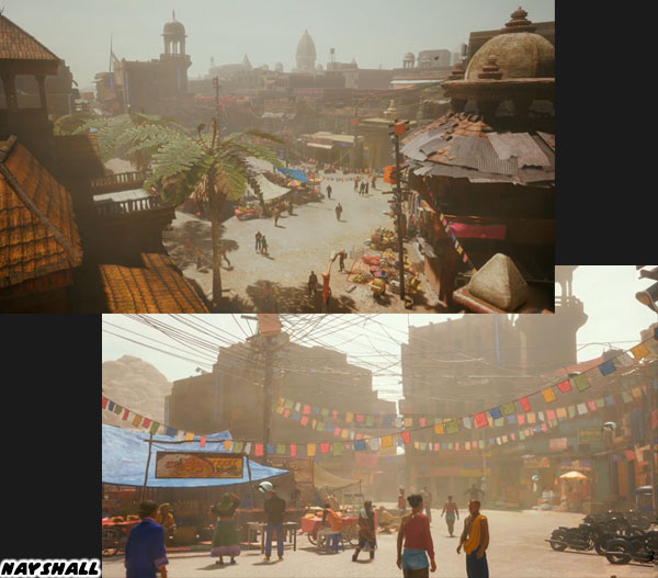
Capcom did tremendous world building around the fictional Nayshall. This region, its language, and NPC designs borrow heavily from Nepal. The actual border country sits between China, and India. Nepal itself pulls elements from multiple cultures, while also creating its own identity. Nayshall was as unique in the Street Fighter universe. There was a tremendous love, and respect that the team at Capcom had for the people they were reflecting. You could tell in the look of this place, in the plot of the game, the language on the billboards as well as the graffiti in the lowlands, not to mention the thousands of supporting details. Nayshall was easily one of my favorite places to visit in any modern game. In fact I said that this place had more life, and personality than any of the regions in the Norse God of War titles. I stood by my statement then, and still think that way today.

With that said I still think Arjun is a poor design. I haven’t even seen his move set, or know his exact role in SF6. From a visual perspective however I think he has one of the weakest looks in the franchise. It is very plain, and poorly thought out. Several of the NPC characters had a better look. I get that the concept art for Ryu was worth revisiting. Yet I do not think that it was strong enough to support an entirely new character. I don’t know what the studio was thinking with Arjun aside from someone to carry the plot forward. There was another new character announced for Season 4 that I thought had stronger design elements. I’d like to talk about that in the next blog. Until then I would like to know what you thought about the SF6 announcement this year. Tell me about it in the comments section. As always if you enjoyed this blog, and would like to sponsor me please visit my Patreon page and consider donating each month, even as little as $1 would help make better blogs and even podcasts!
follow the Street Writer on Patreon!

Thursday, June 30, 2022

Ryu becoming the master in Street Fighter 6, a look at his new path

Today we are going to look at the evolution of Ryu in Street Fighter 6. In case you didn’t see him recently, he was presented a little older than any other appearance, plus he had a beard now. The biggest change for the character came with the look of his uniform. For the longest time Ryu wore a traditional, albeit torn, karate gi. Now he was without his top. In SF6 Designer Yusuke Hashimoto now had him wearing a kasaya or Buddhist robe over his shoulder. The design was very interesting. I’m not quite sure it worked in its current form, but let’s take a look at where the tradition came from.

The custom of having marital arts masters wearing classical costumes went back to the birth of the genre. Karate Champ by Data East in 1984 gave us the white, versus red uniform karate guys. A year later Yie Ar Kung Fu by Taito gave audiences multiple opponents, representing different styles. Aside from the way they fought, these characters had costumes that players would have seen in kung-fu cinema. You didn’t have to be an expert on the various styles, and their histories, as long as you had seen at least a few movies. The seeds for Street Fighter were planted then.

The martial arts spread thanks to Buddhist monks. I had documented it previously in the blogs. The monks traveled all throughout Asia, bringing with them the fighting arts. They didn’t learn to fight as a way to seek out opponents, but rather as a way to defend themselves from bandits. The Shaolin developed in China was a form of Buddhism known as Chan, or meditative Buddhism. The school fostered a Northern, and Southern version of their martial arts studies. These various forms would be influential in shaping kung-fu, and karate as well. The interesting thing was while there were many classically styled Chinese fighters throughout game history there were actually few Shaolin characters in the genre. The look was rare, but had been seen in Street Fighter.

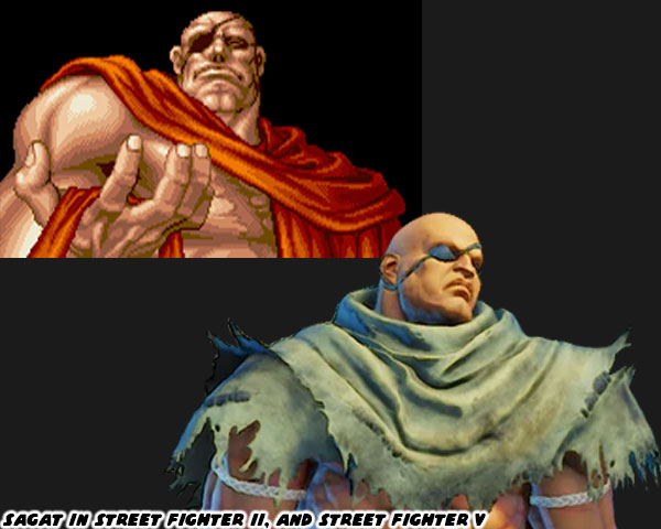
Ryu’s main rival in the original Street Fighter was actually the first in the series to be presented with a kasaya. Sagat was satisfied that he had indeed beaten the best in the world. He had achieved a level of peace with the victory that seemed transformative. He appeared in the ending of Street Fighter II with the robe while meditating on Ryu. That look made sense for Sagat. Years later the alternate costumes of Sagat in Street Fighter IV worked incredibly well. Especially the ones where he wore a tattered wrap. Part of the reason for this was because in pop culture we had seen people from Asia, and South Asia wearing the robes. In my home town of Long Beach we had a large Cambodian, and Vietnamese community, and I had grown up seeing lots of people wearing the robes. Japanese martial artists were rarely, if ever shown in the same way. Instead of the familiar orange robes we would see the elder Japanese master wearing a uniform with one bare arm.

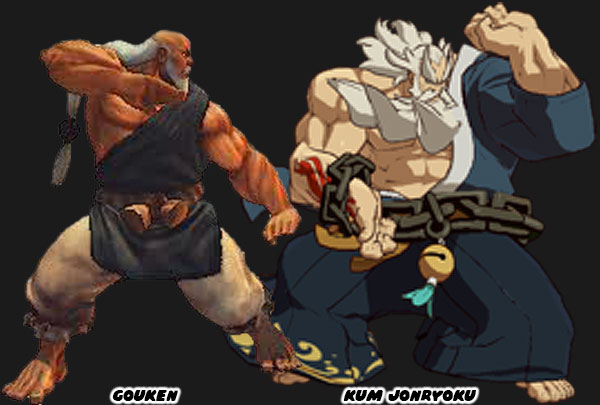
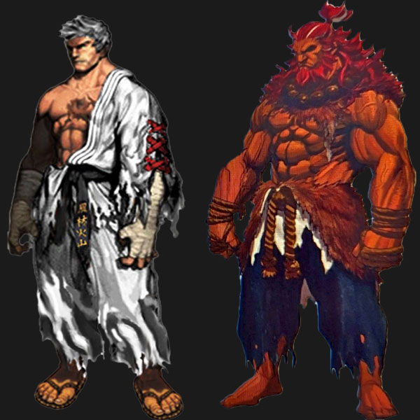
Gouken in the earliest concept art actually wore a gi like Ken, and Ryu. The only difference was that he had a rope belt, instead of a black belt. It was only in later revisions, and his playable debut in Street Fighter IV, when he was given a robe. A similar character appeared in the Guilty Gear series. Kum Jonryoku was a robot made to look like an elder master. He was created, and piloted by Kum Haehyun,a young, and talented scientist. Both fighters represented the peak of the martial arts. They had been studying a specific technique all their lives, if they didn’t invent their own style. These types of people were physically, and mentally stronger than any other person on the planet. Very rarely were they ever seen in mid-life. Gouken was seen in middle-age in Street Fighter manga, and comics books when he took on a young Ken, and Ryu as students. At that time he was not at the peak of his abilities. He was still studying under his master, the elderly Goutetsu. Prior to Ryu’s makeover in Street Fighter 6 there had been at least one young master with a similar look.

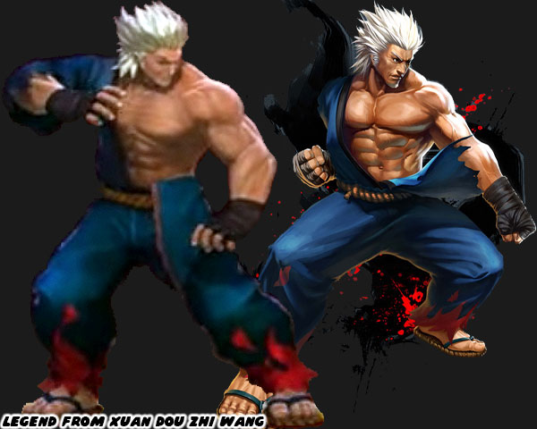
Xuan Dou Zhi Wang aka King of Combat was a Chinese-developed game first published in 2011. It had updates over the following years that patched the control, added levels, and characters. It had characters whose looks, and styles were sampled from various other fighting games. The title already had a Ken / Ryu clone named King. What they lacked was a Gouki / Akuma. That was until they updated the roster, and added a guy called Legend. This person was not much older than King, but more advanced in power, and ability. This person had white hair, no beard, but didn’t look elderly at all. The white hair might have been an aesthetic choice, or to signify that he had some sort of divine revelation. In any case there had been precedent for a young master in fighting games. Not only that, but many artists had been creating their own concept art for Ryu if the series ever did a time jump.

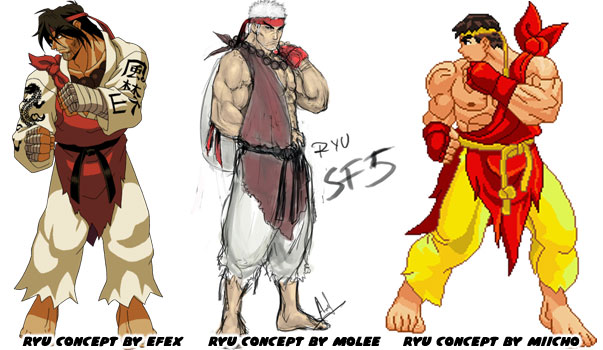
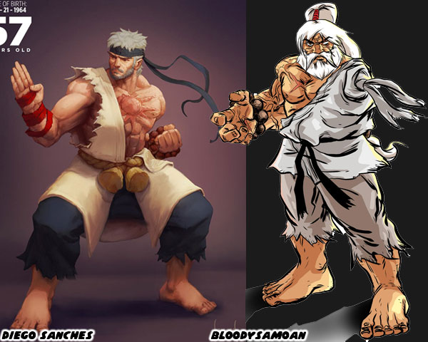
A few designers had a variation of the robe over one shoulder as a nod to Oro becoming his new master. A couple of artists pushed the idea of having the robe be made of Ken’s old gi. This idea had been circulating in the SF community for a long time. One of the older one-armed Ryu illustrations was by the artist BloodySamoan in 2010. In it he also gave Ryu one eye, his red headband now held up a ponytail, and he wore the beads of his master around his wrist. It was a unique take on the fighter for certain. In 2020 the Brazilian illustrator Diego Sanches did a series on older SF characters. He put Ryu in the colors, and costume of Gouken. He also gave him a beard, and gray hair. It also worked well.  

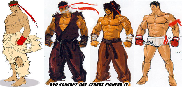
It is highly possible that the creative team working on SF6 was aware of all of the fan art that had come out pre, and post SFIV. They must have been especially aware of the tastes of Western artists as the game had historically sold very will in North, and South America. I’m almost certain that Designer Yusuke Hashimoto, and Director Takayuki Nakayama were aware of these illustrations, and it had a hand in influencing the new look of Ryu. The reason I can say this was because the official concept art for Street Fighter IV, and V coming out of Capcom did not have Ryu wearing a Buddhist robe. Instead they had him with long hair, or with a tattered gi, or in MMA gear. They even had several versions of Evil Ryu, and the stronger Kage variation. But none of Ryu as a Buddhist. Sure it could have been because SF IV, and V were set before he studied under Oro, but even then Oro was added as a DLC character as well.

Mr. Nakayama said the new look was to honor his mentor Gouken, but I’m not sold on that idea. From SFII to today it had been established in the game endings that Ryu was not interested in trophies, or accolades. He was the opposite of Ken in this regard. The only thing that pushed Ryu forward was finding the next challenge. To continue developing as fighters both Ken, and Ryu had to prove that their form of Ansatsuken was the best. Why Ryu would suddenly decide to dress up like his mentor didn’t make much sense. He was walking his own path, and not his master’s path. Visually I don’t think the look works. Wearing a brown kasaya across his torso contrasted with the solid white of his original costume. Perhaps if Ryu wore all brown it might work better, but then his colors would be too close to Ken’s.

I’m interested in seeing Ryu continue his path. I want to see what the studio has planned for him. But I’m also interested in seeing a classic uniform DLC because right now I don’t think his new look works. The costume changes for several of the returning characters aren’t as strong as their original look. That’s what I think anyhow. I’m sure Capcom will continue tweaking the look right until the games release date. They did many visual changes to previous games when they were first previewed versus when they were published. Street Fighter 6 should be no different. Maybe Ryu’s outfit would still get updated. I’d like to read your takes in the comments section. Do you like Ryu's updated look? Would you have done anything different? Tell me about it! As always if you would like to sponsor me please visit my Patreon page and consider donating each month, even as little as $1 would help make better blogs and even podcasts!
follow the Street Writer on Patreon!

Wednesday, June 8, 2022

Coloring the action, how color impacted the development of fighting games

This entry is written with fighting game fans, and budding game designers in mind. If you take away anything today I want you to remember that the use of color may be the most important thing when designing fighting game characters. To expand on the idea, the stronger the color scheme, the bigger the impact it will have on audiences. This goes back to the birth of the genre. In the late ‘70s, and early ‘80s game designers fought the limitations of hardware, and software to bring their ideas to life. Studios like Atari, and Namco created animation through the use of sprites, instead of paint, on cells. Simple shapes, and two, or three frames of data were all they could apply on characters, and enemies. Despite the memory constraints the limited animation brought games to life. Look at a character like Pac-Man. While the game was not the first breakout hit, the character could be considered the original gaming mascot. The character was fairly three dimensional in the eyes of creator Toru Iwatani. You could see this in the official character art, cabinet, and marquee art. The actual sprite of Pac-Man was another story.
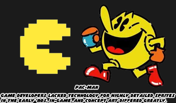
Toru plotted out the proportions of Pac-Man in the game on graph paper. Figuring that he could contain the open, and closed mouth animation across 28x36 tiles, and three frames of data. As the character moved left, right, up, and down across the maze it was a simple task of flipping the sprite to save on excess turning animations. The hardware limited the number of sprites, sizes, and frames of animation. It also limited the colors the game could exploit. Iwatani used a bright yellow for Pac-Man, and other solid colors to represent the ghosts Pinky (pink), Blinky (red), Inky (sky blue), and Clyde (orange). Solid color characters, and sprite mirroring would be used by other studios to create the illusion of movement in their games. The limitations of hardware turned out to be a blessing in disguise.
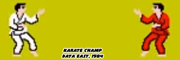
In the earliest days of the fighting genre sprite mirroring allowed characters to face left, or right. Karate Champ was different from action games because two players could go against each other. The white, and red karate uniforms were pallet swaps. In this way it would be easy for players to see who was who on screen. It was easy to track punches, and kicks because players had a clear view at the arms, and legs of the characters. Sprite mirroring ensured that characters always faced the player. A fighter would never have their back turned, and their strikes hidden from view. This came in handy when presenting different styles. A developer could focus on making a boxer look, and move like a boxer, or a ninja look, and move like a ninja. They were secure in the knowledge with sprite mirroring they would move the same whether facing left or right. From an artistic standpoint this was a problem. Characters couldn’t really have text, or graphics on one side of their costumes, because they would be reversed when facing the opposite direction. Most studios in the East, and West understood this limitation so they created characters, and costumes that didn’t have details, or text that wouldn’t make sense if flipped.
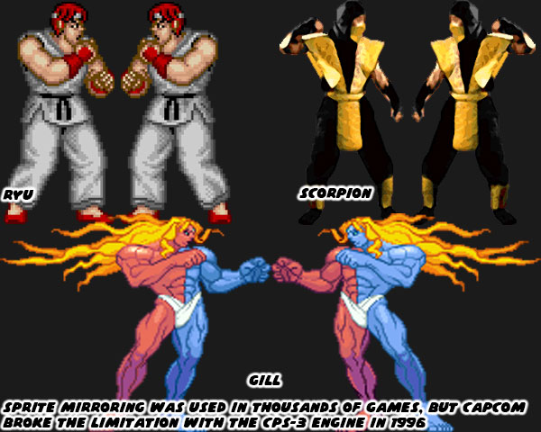
Capcom had become exceptionally good at developing sprites thanks to their extensive fighting game, and side-scrolling library. They created one of the most powerful sprite-based engines in 1996. The CPS-3 was capable of rendering switched colors on a sprite. For example, this meant that the Street Fighter III villain Gill could have one blue, and one red side toward the player depending on which way he was facing. It was revolutionary technology, but it proved too hard to develop for so only a few CPS-3 titles were ever released compared to the dozens of CPS-2 games. The thing that limited sprite technology in the past worked in favor of the SF designers. A decade after Pac-Man 2D engines allowed teams to have bigger sprites, more frames of animation, and more colors on screen at the same time. Even with this in mind the SF designers tended to place solid primary colors, and bright complimentary colors onto their characters. They kept the designs clean, and simple. No complex patterns, stripes, or filigree were fitted to their costumes. No matter how frenzied the action became it was easy to pick out the fighters, their moves, and special attacks on the screen.
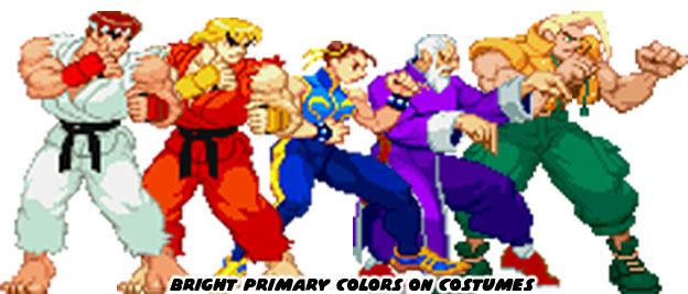
Street Fighter II, Super Street Fighter II, Street Fighter Zero / Alpha, and Street Fighter III more or less kept that tradition alive. The colors that the studio used set a template that would be repeated across the industry. You’ll get clear examples in the next blog. For now I want you to think about what colors your favorite character wears. What color comes to mind if you think about the Incredible Hulk? What about the Flash? How about Batman, or Superman? Even though the characters have been around for decades, and have had several revisions, you can perfectly imagine the colors associated with them. When you are watching a film for the first time, or reading a work of fiction, what colors are associated with the hero, and which are associated with the villain?
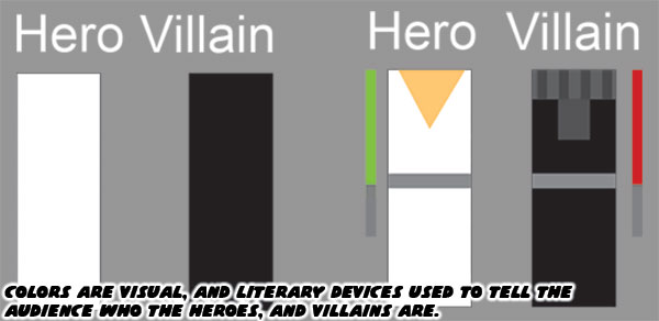
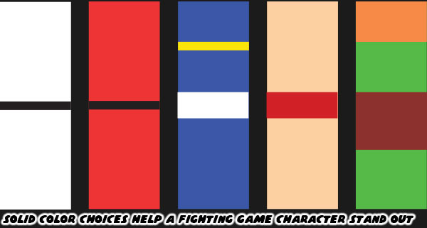
I want you to think about the colors associated with the Street Fighter II cast. I think it’s fair to call them the most iconic fighters ever assembled. I want you to strip down the characters to their most basic elements. If you had a coloring book, and could only use two, or three colors per character, which ones would you pick? There have been plenty of fighting games with karate leads, what was it that made Ken, and Ryu unique? I want you to think about Chun-Li, Zangief, and Blanka. If I were to ask you to name the details applied to the characters where would you begin? Would you talk about the chains on Blanka’s ankles, or would you mention the character had green skin? Would you talk about Chun-Li wearing light makeup, or would you say she wore a blue dress? Zangief didn’t wear much, but you all know his trunks were red.
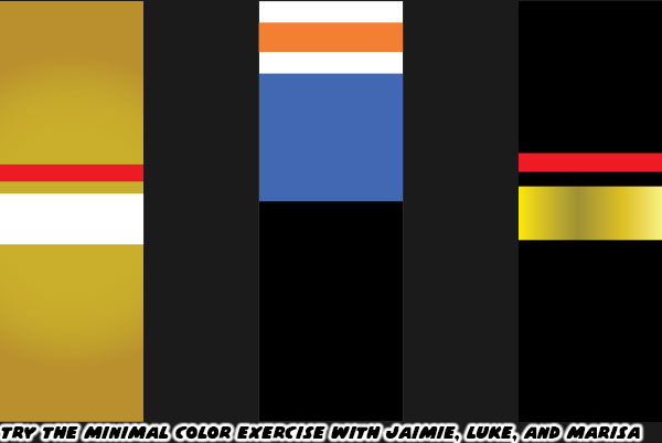
I have talked about three of the new characters in SF 6. Luke, Jamie, and Marisa. Jamie, and Marisa have just a few solid colors assigned to them. It is easy to simplify their details in your mind. Gold, and white for Jamie, and black, gold, and red for Marisa. Luke is a little bit different. He’s wearing layers. A white shirt, with orange print on it, a blue vest over that. Black training pants, and orange boxing gloves. The colors do not necessarily compliment each other very well. His earlier iteration of gold, and blue trunks made more sense. At the very least the colors reflected the Capcom logo. Previous SF characters rarely wore multiple layers, let alone colors that didn’t really blend well together.
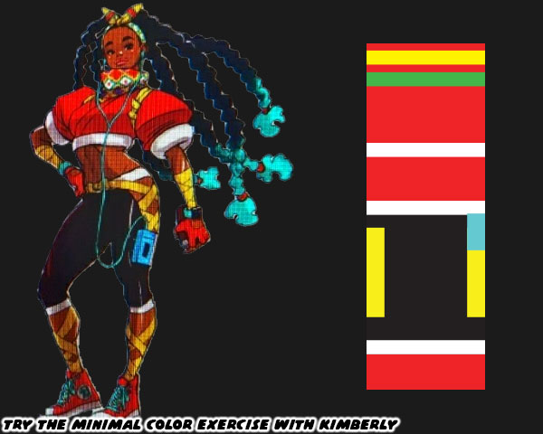
Now I want you to try and pair down the colors associated with Kimberly. Mind you, I haven’t yet posted a full write up on her. I don’t want you to think I’m against her inclusion. She may turn out to be my favorite new fighter once I get to play as her. What I am arguing about is from a color, and costume angle I think her design is too complex. Look at the number of colors, and clothing details put on her. I’m certain that SF 6 designer Yusuke Hashimoto gave careful consideration to his color choices. Red, yellow, and green are colors that are associated with the Pan-Africa movement. It’s fantastic that she is a proud Black lead, with big natural locks. Then there are the turquoise tips at the end of her braids, light blue music player, and aqua laces on her sneakers. Those garnish colors don’t really work with her look, and I would argue throw the scheme off.
If you have seen the costume changes to Cammy, Ryu, and Chun-Li I’m sure you are aware that the community is split on some of the changes. Cammy has gotten the strongest response so far. Her leotard, boots, and beret were all swapped out for more civilian clothes. Without the iconic beret, and green bodysuit some gamers liken her look to Sonya Blade from the Mortal Kombat series. To be fair Sonya was influenced by Cammy. Ryu has a kasaya or Buddhist robe over his torso. Many fans had speculated that he was wearing the rags of his former mentor Oro. The Buddhist robe had been given to his rival Sagat as one of his last alternate costumes. I’m not sure if it was wise to repeat the same thing for Ryu. Then there was Chun-Li. The changes to her costume were distinct as well. The cut of her dress was even more traditional than her original costume. Also her top was two tones of blue; dark, and light. Her dark tights were replaced by blue leggings. Her wrestling boots were swapped out for more traditional flats. Even her trademark spiked bracelets were traded for a smoother weighted bracelet. The look is taking the character back to her earliest concept sketches. I don’t think that is the best thing necessarily.
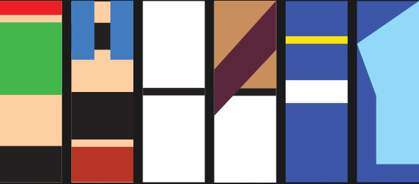
The community knows, and loves each of the characters regardless of what they wear. As long as they play in the style that fans are used to then I don’t imagine any real problems. Except for the kooks that think Cammy has been forever ruined because she’s wearing pants. I’ll never understand the people that scream censorship when the studio takes a costume in a new direction. I’m pretty sure there will be a classic costume DLC pack announced shortly after the game launches in 2023. Anyhow long time players will accept the new look of Cammy, Ryu, Chun-Li, and the other returning characters. I just caution budding designers not to go overboard with excessive details. Just because we now live in a time where home consoles are powerful enough to render individual teeth on a zipper, plastic caps at the end of shoelaces, and individual eye lashes. It doesn’t mean the game is made better by layering too much onto a character. Even in a world where people can throw fireballs it’s better to keep things simple. If you don’t believe me just think about two Muay Thai fighters.
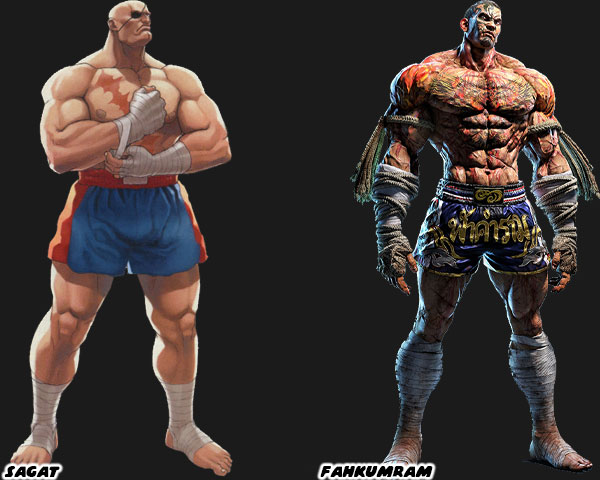
Sagat was the boss in the original Street Fighter. His rivalry with Ryu became the stuff of legend. He had a couple of unique features, a patch over his eye, and scar across his chest. Because of the limitations of hardware his shorts were solid colors with no fancy patterns. Sprite mirroring meant that the patch on his eye would swap sides, but it was a minor detail. For 35+ years he became the standard for Muay Thai in fighting games. In 2020 Namco added their own gigantic Muay Thai fighter as well. Fahkumram was roughly the same height, and weight as Sagat. Yet to set the two apart Fahkumram was covered in tattoos, including half his face, as well as scars all over his body from a lightning strike. The cords on his hand wraps (representing the older Muay Boran) were covered in blood, and his shorts had Thai lettering, and national colors. To say it was design overkill would be fair. There was so many elements placed on him that it became a jumbled mess. The character would have worked well in a manga like Baki the grappler, where you could appreciate the look, but not so much in a fighting game. Where the action is fluid, and details are missed in the movement. Clean, simple designs, and especially colors go a lot further for a fighting game. That’s what I think anyway. Feel free to disagree in the comments section. If you would like to sponsor me please visit my Patreon page and consider donating each month, even as little as $1 would help make better blogs and even podcasts!
follow the Street Writer on Patreon!

Friday, June 3, 2022

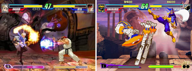
Capcom Fighting All Stars, the fighting game that never was. A reprint from 1UP / Capcom-Unity.

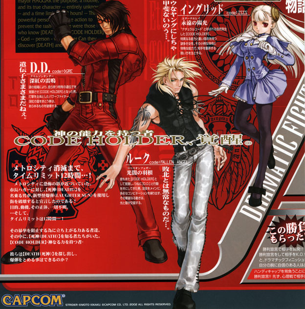
Since I've been on a fighting game kick I've decided to keep things rolling along by looking at a game that never got published. The title was Capcom Fighting All Stars: Code Holder (CFAS).

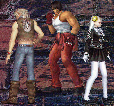
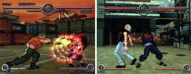
The 2003 title was an early exercise by Capcom in trying the crossover experience with the 3D fighting game featuring their own cast. The game tested poorly while it was being developed and the producer left Capcom to pursue other projects. The game served as an example of the errors with early 3D fighting game attempts from Capcom. As I had mentioned on previous blogs, the 3D figures could appear stiff and robotic, especially when they were programmed by studios that had more experience in 2D. Characters from early SNK and Capcom 3D fighters appeared boxy and lacked the fluidity of characters from Sega or Namco 3D titles. Despite not being well know there was actually a lot of information and material regarding CFAS. First off the cast was made up of Capcom veteran fighting game characters.

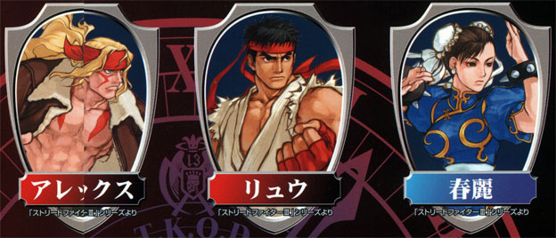
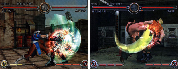
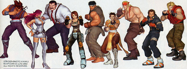
There were representatives of the major fighting games including Alex from Street Fighter III, Ryu from every numbered SF game and Chun-Li from SF II.

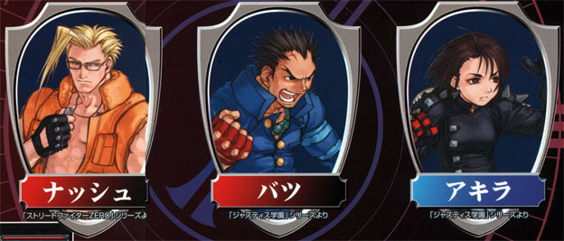
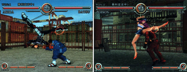
Charlie Nash from SF Alpha / Zero was in as were Rival School heroes Batsu and Akira.

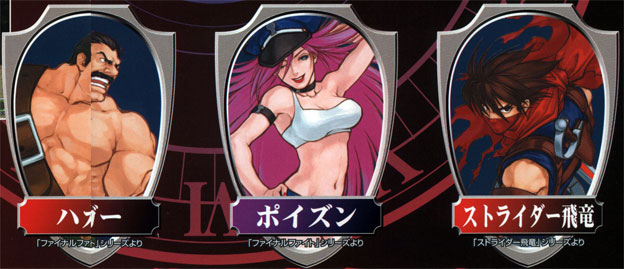
Mike Haggar and Poison from the Final Fight series appeared because the game was set in Metro City. Strider was added to fill the cool character quota.

The title was interesting for a number of reasons. This was the first 3D fighting game featuring Street Fighter characters that was not produced by ARIKA. It would be five years after this title was cancelled before SF IV would be published.

The game was also interesting because the game was heavily integrated into a dramatic story, featuring three new characters that Capcom had meant to be the next generation of fighting game archetypes.

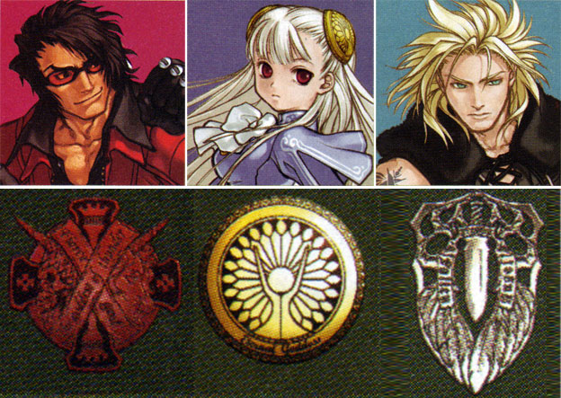
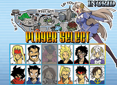
The three new characters were stylistically more like the designs that would have been used in a King of Fighters game rather than a SF title. There was D.D. whose code was Ogre, Rook (Luke) whose code was Fallen Angel and the blonde girl Ingrid whose code was Isis. Each of the three new characters was assigned a code that worked itself into the plot.

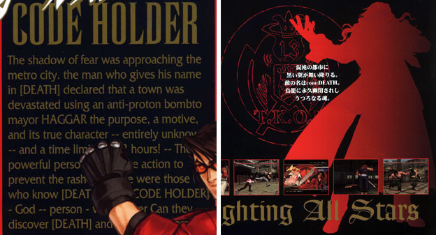
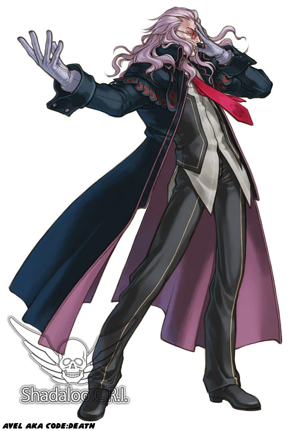
There was a villain nicknamed Death. The only known art of the figure is actually a silhouette of a man with long hair and a long coat on the information pamphlet sent out to arcade owners. 2022 EDIT: In 2017 Capcom dug up some rare art, and actually gave us a look at the boss.

This Death character had planted an explosive device somewhere in Metro City dubbed the Laughter Bomb. Players had less than a day to find and defuse the bomb with the help of the code holders. The plot was very esoteric, again, not unlike something that would have been used in a KOF game.

The designers went overboard with the details. Every code holder had their own iconography and logos including Death. Why these were important was beyond me. None of the classic Capcom characters were given icons as well.

The designers even made the Player-2 costumes very distinct. They did this for all of the characters in the game, not solely the code holders.

Some of the costume choices and colors made sense, but Strider without his trademark red mask? That was sacrilegious! I was surprised that the owners of the design signed off on this.

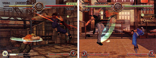
The game did seem to have a faster pace than earlier 3D titles.

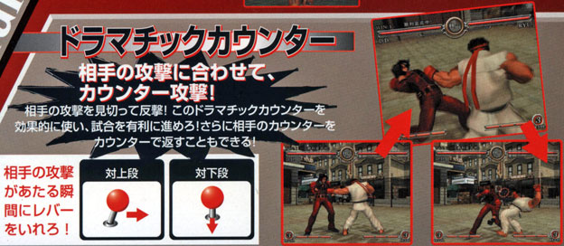
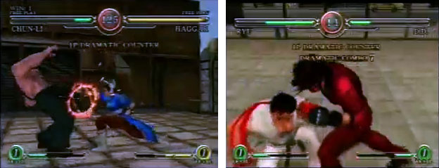
Capcom did develop a new control element for the game. Dubbed the "Dramatic Counter" it was a way for players to engage in a sort of live parry.

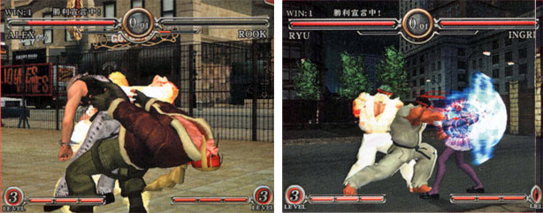
The parry system allowed players to block strikes once they had been initiated in SF III. The dramatic counter was different in that players could use the joystick to dodge and attack and then respond with a strike without losing health. Dodging attacks was nothing new in a fighting game however the dramatic counter allowed players that were fast enough to counter, dodge and counter a long string of attacks. In the preview footage a fight between Ryu and D.D. was shown to have seven consecutive Dramatic Counters, then dubbed "Dramatic Combo" because neither player could easily get an attack in.

Whether the mechanic was intuitive, worked with the control scheme improved or ruined the feel of the game was unknown. In the heat of a battle only top-level players could hope to make use of the mechanic, not unlike those that became adept at parrying in SF III.

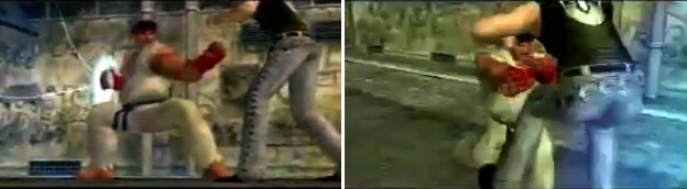
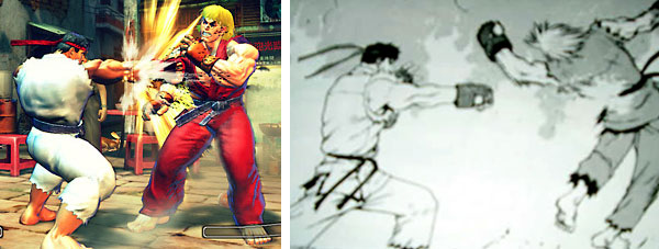
The next item that the game exploited were new supers and unblockable attacks, something that was carried over into SF IV. Ryu's "Fist of the Wind" for example appeared in CFAS first.

This move was inspired originally in the Ryu Final manga.

The game was eventually scrapped by Capcom. From its ashes Yoshinori Ono was tagged to put together Capcom Fighting Jam. A sprite-based title featuring more cameos than Fighting All-Stars.

As you may know Yoshinori was coming off of a cancelled War of the Grail when this project was assigned to him. After which he went on to push for the creation of Street Fighter IV. So if you ever wonder why SF IV looks or plays a certain way, just remember that the road leading up to it was paved with two cancelled arcade fighters and one sub-par fighter.

What was more interesting than a cancelled 3D fighting game by Capcom would be one developed by Sammy which was cancelled about a year later, it paralleled CFAS in a few ways. The next blog will explore this game. If you would like to sponsor me please visit my Patreon page and consider donating each month, even as little as $1 would help make better blogs and even podcasts!


follow the Street Writer on Patreon!


Wednesday, May 15, 2019

The new Evil Ryu, a look at Kage

Hello friends, I hope that the year has been going well for you. I just wanted to be completely transparent with the slow update schedule. Since fall of last year I've been changing my habits. For health reasons I'm putting myself on a better path. I've also been focusing on my art and less on my writing. I'm still 100% passionate about fighting games, but I've got to make sure I'm healthy for the long run. Thanks for being patient in the meantime. Today I want to talk about Kage, a new character revealed for Street Fighter V at the end of 2018. On the surface level this character is reminiscent of Evil Ryu, because in essence he is Evil Ryu. If you didn't know Evil Ryu had his breakout appearance in the Street Fighter Zero / Alpha series in the mid '90s. For budding game designers that read my blog I mentioned that the transformation of a hero to a villain was a very powerful storytelling tool.


Evil Ryu is a version of the hero of the Street Fighter series that wants to prove he is the greatest warrior. Even if this means killing his opponents in a fight. He is often presented with a tan, and even red eyes in some official art to signify that he is possessed by evil forces. Kage in Street Fighter V is presented in a different light. Instead of simply being Ryu fighting with the evil forces inside of him, this character is the physical embodiment of the Satsui No Hadou. He has neon horns sticking out of his head and elongated teeth. The red headband is broken and rests on his shoulders to signify that his mind is not his own. His head and face are distorted so that it looks more like an ogre and less like a person. The animal traits applied to a human were originally featured on Gouki / Akuma. To make him appear less than human the designers flattened his nose and gave him a crown of blazing red hair. He was meant to conjure images of a lion.


The earlier Street Fighter designs, especially those from the late '80s and early '90s Street Fighter II and Street Fighter EX era were well done. The characters had an easy to identify theme, perhaps they were a soldier, wrestler, or kung fu master. You could tell right away based on their look what archetype they were. Some clues were obvious and some were more subtle. When you added all of the details together they turned a typical fighting game character into an icon. I believe that the the designs in Street Fighter IV and V are lacking. They lack subtlety. They lack an understanding of what made the original World Warriors so memorable. Instead of letting audiences discover that Gouki has lion-like features, the studio now presents him with a literal lion mane. Fans call this version Akuma-matata, a play on the African word hakuna matata.


Capcom is hitting audiences over the head with their latest designs. It's the fastest way to tell a story, but it doesn't make it the right way to tell a story. The look of the Street Fighters are loud and boorish, they are the characters that a teenage fan could have pitched. The look of Gouki and Kage are prefect examples of what is wrong with Capcom's current design culture. The majority of new characters, such as Rufus, Hakan, Abel, F.A.N.G., and Rashid introduced in Street Fighter IV and V are forgettable because they subscribe to the same design philosophy. There is nothing wrong with having characters in the franchise that have some animal-like traits. Blanka is an example of that, but he is on the extreme end of what works in the franchise. Characters like Blanka are few and far between. Not to mention that there was already an Evil Ryu. When you start to fill the roster with similar outlandish characters it dilutes those that are really unique. Having literal demons in the series is changing the narrative. This series was founded on martial arts archetypes. As Capcom expands the design circle to include demons and comic book villains then it is going down a path that is hard to return from.


Turning the main character into a monster, and keeping him that way has been explored in other fighting games. Devil Kazuya is possibly the best example of this. Tekken has a number of main characters that have demonic alter-egos. Jin Kazama has a Devil Jin persona, his great grandfather Jinpachi Mishima becomes a demon, and Jin's grandmother Kazumi Mishima also becomes a demon. The series is well known because of the number of fantastic archetypes. The series has monsters, cyborgs, robots and even panda bears. That lineup, that presentation is not in the same vein as Street Fighter. I'm worried that the people designing the next generation of Street Fighter can't make the distinction.


The arc that would have had Ryu fighting his inner demon and facing off against the man that killed his master was considered for Street Fighter III. A lot happened to Capcom in the early and mid-90s during the gold rush of the fighting game genre. As members of the Street Fighter team left Capcom to other companies they took some of those ideas meant for Ryu and Gouki. Having a main character that becomes overpowered and destroys a demon was explored in Street Fighter EX, and later on in the Fighting EX Layer series. Kairi was the surrogate for Ryu and Garuda was the stand-in for Gouki. In ARIKA's franchise it was established that there were supernatural elements in the universe, however the majority of the cast was still rooted in martial arts archetypes. So having some mysticism was welcome in their take of the franchise. The fighting game market imploded at the end of the '90s, and wouldn't recover for about a decade. In that time Capcom had new faces making bold decisions with established characters. In the history of fighting games I consider Gouki the greatest villain ever designed. In the history of the Street Fighter franchise however I only said he was the third most important.


Capcom established that Gouki had a "stronger" form called Shin Gouki, or true Gouki. This was the unleashed, no-holds-barred boss in Street Fighter Zero. More than 12 years later the character was revisited for Super Street Fighter IV: Arcade Edition. The new developers decided that they wanted to make him even more overpowered. Oni debuted, and Gouki went from having subtle lion cues to being an outright DragonBall Z villain. The blue skin, demonic features, and abilities made little to no sense for the character. This was the same type of thinking that went into the look of Kage. Evil Ryu was already a great design, especially with a smoldering crater in his chest from when Gouki tried to kill him. The look of Kage didn't really have enough elements to make him stand apart from Evil Ryu. Some people in the community even likened his glowing horns to cat ear headphones. This was hardly as intimidating as he was supposed to be. To be fair however, Capcom had been pursuing a redesign of Evil Ryu since Street Fighter IV.


Evil Ryu and Violent Ken were on the drawing board for Street Fighter IV, and each more or less looked like their traditional designs. There was nothing unrealistic or supernatural about their appearance. No wings, fangs, or horns smacking audiences in the face. Instead they each had attacks that were more aggressive or powerful than normal. They had just enough going for them to make them unique. The majority of their appearances were in the sprite-based games of the '90s. This look did not really deviate much until the introduction of Kage. In at least one draft of Kage he was so far removed from Ryu that he didn't even look like a Street Fighter character. If anything he looked like a monster that would have been featured in the manga and anime series Mob Psycho 100. In case you are not familiar with the series, the main character is named Shigeo Kageyama. He is a very plain-looking kid. He is so plain in fact that he is called Mob, a reference to the nobody background characters in most shows. Ryu could be considered similar to Mob, in that he looks like a plain "vanilla" karate fighter. Of course that perception changes when they use their awesome powers. Mob however also has a dark side that manifests from time to time.


If Mob loses control of his emotions he becomes a being made up of raging psychic energy. He no longer looks human in this form. He can be cruel and unstoppable in this form. In the story this makes sense, as series creator ONE has established that all sorts of psychic and metaphysical things are possible in his universe. Capcom doesn't have that luxury. The Street Fighter gang is not made up of ghost hunters. They are not exorcists but instead warriors. Dropping in a demon made of cracking energy would have been way out of left field. So much so that audiences would have pushed back on the design. As it is, they are lukewarm to the idea of Kage. What do you think of the character? Am I reading too much into it? I'd like to hear about it in the comments section. If you would like to sponsor me please visit my Patreon page and consider donating each month, even as little as $1 would help make better blogs and even podcasts!
follow the Street Writer on Patreon!