Showing posts with label kum jonryoku. Show all posts

Thursday, June 30, 2022

Ryu becoming the master in Street Fighter 6, a look at his new path

Today we are going to look at the evolution of Ryu in Street Fighter 6. In case you didn’t see him recently, he was presented a little older than any other appearance, plus he had a beard now. The biggest change for the character came with the look of his uniform. For the longest time Ryu wore a traditional, albeit torn, karate gi. Now he was without his top. In SF6 Designer Yusuke Hashimoto now had him wearing a kasaya or Buddhist robe over his shoulder. The design was very interesting. I’m not quite sure it worked in its current form, but let’s take a look at where the tradition came from.
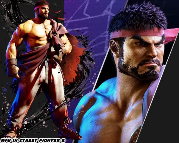
The custom of having marital arts masters wearing classical costumes went back to the birth of the genre. Karate Champ by Data East in 1984 gave us the white, versus red uniform karate guys. A year later Yie Ar Kung Fu by Taito gave audiences multiple opponents, representing different styles. Aside from the way they fought, these characters had costumes that players would have seen in kung-fu cinema. You didn’t have to be an expert on the various styles, and their histories, as long as you had seen at least a few movies. The seeds for Street Fighter were planted then.
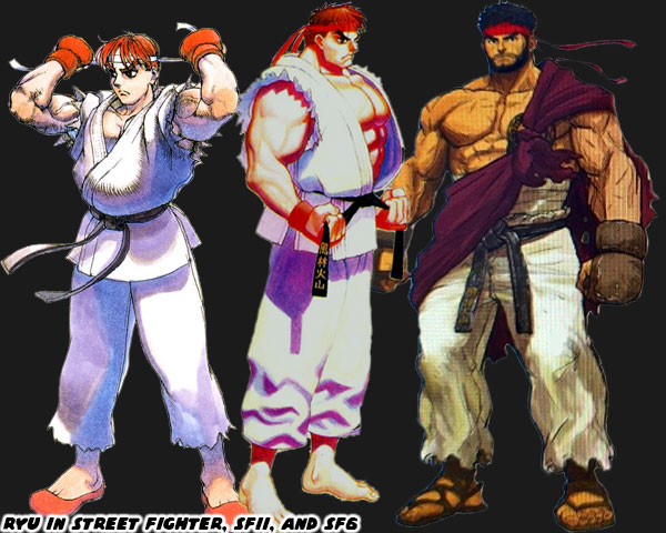
The martial arts spread thanks to Buddhist monks. I had documented it previously in the blogs. The monks traveled all throughout Asia, bringing with them the fighting arts. They didn’t learn to fight as a way to seek out opponents, but rather as a way to defend themselves from bandits. The Shaolin developed in China was a form of Buddhism known as Chan, or meditative Buddhism. The school fostered a Northern, and Southern version of their martial arts studies. These various forms would be influential in shaping kung-fu, and karate as well. The interesting thing was while there were many classically styled Chinese fighters throughout game history there were actually few Shaolin characters in the genre. The look was rare, but had been seen in Street Fighter.
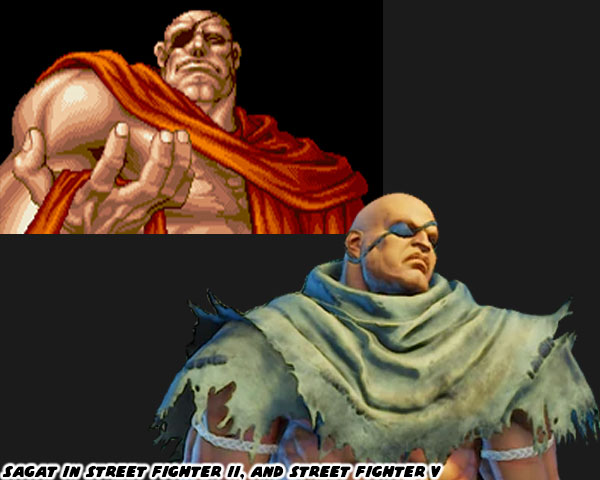
Ryu’s main rival in the original Street Fighter was actually the first in the series to be presented with a kasaya. Sagat was satisfied that he had indeed beaten the best in the world. He had achieved a level of peace with the victory that seemed transformative. He appeared in the ending of Street Fighter II with the robe while meditating on Ryu. That look made sense for Sagat. Years later the alternate costumes of Sagat in Street Fighter IV worked incredibly well. Especially the ones where he wore a tattered wrap. Part of the reason for this was because in pop culture we had seen people from Asia, and South Asia wearing the robes. In my home town of Long Beach we had a large Cambodian, and Vietnamese community, and I had grown up seeing lots of people wearing the robes. Japanese martial artists were rarely, if ever shown in the same way. Instead of the familiar orange robes we would see the elder Japanese master wearing a uniform with one bare arm.
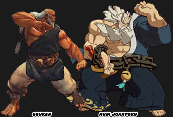
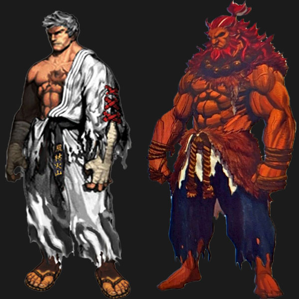
Gouken in the earliest concept art actually wore a gi like Ken, and Ryu. The only difference was that he had a rope belt, instead of a black belt. It was only in later revisions, and his playable debut in Street Fighter IV, when he was given a robe. A similar character appeared in the Guilty Gear series. Kum Jonryoku was a robot made to look like an elder master. He was created, and piloted by Kum Haehyun,a young, and talented scientist. Both fighters represented the peak of the martial arts. They had been studying a specific technique all their lives, if they didn’t invent their own style. These types of people were physically, and mentally stronger than any other person on the planet. Very rarely were they ever seen in mid-life. Gouken was seen in middle-age in Street Fighter manga, and comics books when he took on a young Ken, and Ryu as students. At that time he was not at the peak of his abilities. He was still studying under his master, the elderly Goutetsu. Prior to Ryu’s makeover in Street Fighter 6 there had been at least one young master with a similar look.
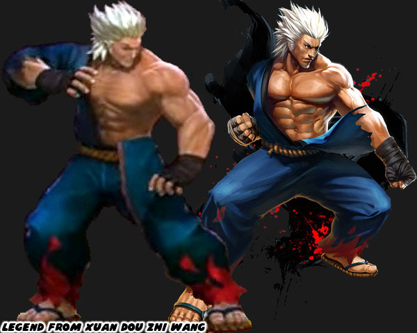
Xuan Dou Zhi Wang aka King of Combat was a Chinese-developed game first published in 2011. It had updates over the following years that patched the control, added levels, and characters. It had characters whose looks, and styles were sampled from various other fighting games. The title already had a Ken / Ryu clone named King. What they lacked was a Gouki / Akuma. That was until they updated the roster, and added a guy called Legend. This person was not much older than King, but more advanced in power, and ability. This person had white hair, no beard, but didn’t look elderly at all. The white hair might have been an aesthetic choice, or to signify that he had some sort of divine revelation. In any case there had been precedent for a young master in fighting games. Not only that, but many artists had been creating their own concept art for Ryu if the series ever did a time jump.
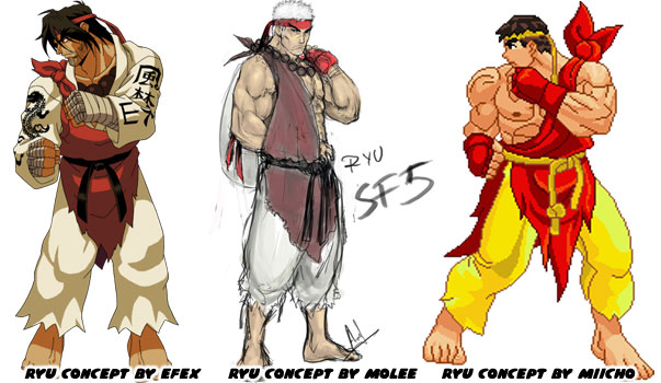
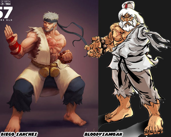
A few designers had a variation of the robe over one shoulder as a nod to Oro becoming his new master. A couple of artists pushed the idea of having the robe be made of Ken’s old gi. This idea had been circulating in the SF community for a long time. One of the older one-armed Ryu illustrations was by the artist BloodySamoan in 2010. In it he also gave Ryu one eye, his red headband now held up a ponytail, and he wore the beads of his master around his wrist. It was a unique take on the fighter for certain. In 2020 the Brazilian illustrator Diego Sanches did a series on older SF characters. He put Ryu in the colors, and costume of Gouken. He also gave him a beard, and gray hair. It also worked well.  
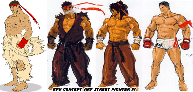
It is highly possible that the creative team working on SF6 was aware of all of the fan art that had come out pre, and post SFIV. They must have been especially aware of the tastes of Western artists as the game had historically sold very will in North, and South America. I’m almost certain that Designer Yusuke Hashimoto, and Director Takayuki Nakayama were aware of these illustrations, and it had a hand in influencing the new look of Ryu. The reason I can say this was because the official concept art for Street Fighter IV, and V coming out of Capcom did not have Ryu wearing a Buddhist robe. Instead they had him with long hair, or with a tattered gi, or in MMA gear. They even had several versions of Evil Ryu, and the stronger Kage variation. But none of Ryu as a Buddhist. Sure it could have been because SF IV, and V were set before he studied under Oro, but even then Oro was added as a DLC character as well.
Mr. Nakayama said the new look was to honor his mentor Gouken, but I’m not sold on that idea. From SFII to today it had been established in the game endings that Ryu was not interested in trophies, or accolades. He was the opposite of Ken in this regard. The only thing that pushed Ryu forward was finding the next challenge. To continue developing as fighters both Ken, and Ryu had to prove that their form of Ansatsuken was the best. Why Ryu would suddenly decide to dress up like his mentor didn’t make much sense. He was walking his own path, and not his master’s path. Visually I don’t think the look works. Wearing a brown kasaya across his torso contrasted with the solid white of his original costume. Perhaps if Ryu wore all brown it might work better, but then his colors would be too close to Ken’s.
I’m interested in seeing Ryu continue his path. I want to see what the studio has planned for him. But I’m also interested in seeing a classic uniform DLC because right now I don’t think his new look works. The costume changes for several of the returning characters aren’t as strong as their original look. That’s what I think anyhow. I’m sure Capcom will continue tweaking the look right until the games release date. They did many visual changes to previous games when they were first previewed versus when they were published. Street Fighter 6 should be no different. Maybe Ryu’s outfit would still get updated. I’d like to read your takes in the comments section. Do you like Ryu's updated look? Would you have done anything different? Tell me about it! As always if you would like to sponsor me please visit my Patreon page and consider donating each month, even as little as $1 would help make better blogs and even podcasts!
follow the Street Writer on Patreon!

Monday, May 15, 2017

The aesthetic versus graphics debate, part 3...

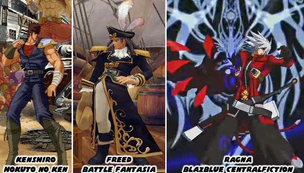
When it came to creating innovative fighting games with a strong aesthetic style you didn’t have to look any further than Arc System Works. Known best for creating Guilty Gear in 1998, the studio had released some very innovative titles over the past three decades. Some of the games were licensed and some were original titles. Each one had its own unique visual style. I had mentioned one of their gems previously, Battle Fantasia, a sleeper from 2007. Some of their other unique releases were Hokuto No Ken (Fist of the North Star) in 2005 and BlazBlue Centralfiction in 2015. Hokuto No Ken recreated the style of the classic 1980’s animé. The manga was drawn by Tetsuo Hara but the anime series was directed by Toyoo Ashida. Mr. Ashida was a character designer and animator that had started working in the ‘60s. By the time he worked on Hokuto No Ken he had studied under multiple different artists. It was this experience that allowed him to capture the essence of the violent comics while retaining the designs that Mr. Hara was known for. The team at Arc System Works did their homework and were able to capture the Hara and Ashida influences in the game.


Battle Fantasia had a much softer feel to it. It was designed to look like a storybook painting come to life. The director Emiko Iwasaki was one of the lead artists on Guilty Gear. When she helmed her own title she wanted to present a visual language that was different than what fighting game fans were used to. She succeeded and showed that 3D games could retain a strong 2D aesthetic. Not only that but female directors were just as innovative as their male peers. The BlazBlue series was a sort of complimentary game to the Guilty Gear franchise. The co-directors Toshimichi Mori and Yūki Katō wanted to create a world that was heavily influenced by bright, colorful anime shows and lay into it heavy doses of the supernatural. Guilty Gear was rooted more in animé-meets-heavy metal. Perhaps it was their work on the Persona 4 fighting game that sparked the interest in humans and demons? 

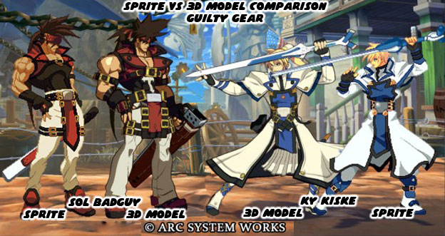
When Arc System Works (ASW) was founded in 1988 they developed their games and adaptations using the same technology and the same techniques as their peers. As the industry changed they also evolved. In the late ‘90s they saw that fighting games were starting to become stagnant. Sprites were being reused in games by Capcom and SNK. This made a lot of the sequels to the Street Fighter Zero, King of Fighters and Vampire games look redundant. They decided to create a whole new game but using high resolution sprites. This way they could create characters with a lot of style and fidelity. It would be as if an animé show had come to life as a fighting game. Guilty Gear was a treat to the eyes. Players hadn’t seen that level of style in a fighting game in a long while. Arc System Works did not stop there. As 3D technology became more powerful, and started appearing in home consoles, the studio knew that they would have to leave sprites behind as well. They didn’t give up on sprites right away but slowly weaned themselves off. Every game, fighter or not, that they developed gave them more experience in 3D. It forced the studio to see how the change in graphics formats would affect their fighting library. Battle Fantasia and Hokuto No Ken were proving grounds. They were showing that they could use 3D graphics to reproduce 2D aesthetics. Their biggest advancement happened when they created an entirely new engine for Guilty Gear Xrd - SIGN (2014) and REVELATOR (2015).


Many games prior to the Xrd title had used a technique called cel-shading to make their graphics appear more hand-drawn. What cel-shading did was filter the colors and shadows into a bold contrast and create an outline on the figures. It was a way to visually flatten out 3D objects and preserve a strong 2D aesthetic. One of the earliest games to popularize the format was the Jet Set Radio series by Sega. What ASW did was study what worked and what didn’t over the past decade and to reconstruct the graphical approach. They weren’t stingy with their findings either but freely gave a presentation at the Game Developer's Conference on the Guilty Gear Xrd graphics format. The studio demonstrated how they bridged the 2D/3D divide and shared those with the industry. They hoped to inspire other developers to create graphics that stood out. The company knew that no matter how well sprites looked in HD, the budgets for most companies would no longer allow them to develop hand-drawn graphics. These companies would have to find ways of preserving the hand-drawn style without betraying the visual style that audiences were used to. This also applied to the way the game moved and played. Everything from frame-skipping to hit box data would now be written using new software.

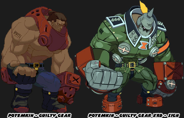
 The studio showed off examples of how character designs evolved for the new technology. Some of the changes were subtle, the length of a coat, the shape of a hairline, other things were more profound, like the redesign of the massive Potemkin. In every example the game managed to retain its unique aesthetic. They could stay on budget, develop innovative titles and appease their fans. The challenge was laid out to other studios. They could keep doing what they were doing. Using the Unreal Engine 3 or 4 their games could all look the same. Or, they could approach graphics from a different angle and give audiences a new experience. It took some effort and fine-tuning in order to achieve the desired results but ASW was not hiding anything from the industry. They learned from their mistakes and wanted to show other companies what they did. The question was whether or not Namco, Microsoft, Capcom, SNK or the other publishers would take these lessons to heart.


Some people might not think there was much of a difference between graphical styles. After all, as long as a fighting game has good balance, control and animation then what do the graphics matter? Well the graphics matter because the industry thinks that the graphics matter. It is often the first thing that audiences and reviewers talk about. It is the thing that draws our eyes to the screen. It is what makes a game visualy appealing. Yet as we know is what they mean to say is that they are attracted to the the aesthetics of the game. The style is more important than the technical numbers powering the graphics engine. The best example of how much of a difference it is to have a 3D game with similar aesthetics could be seen in Guilty Gear Xrd and its contemporaries. Take a close look at the character Kum Haehyun. She was a master of the martial arts and knew how to harness the power of chi / ki. She could use her powers to heal or strengthen not only herself but other people. She could have been introduced into the lineup with an arsenal of moves that fit within the series. In the game she actually pilots a robot body that looks like an elder fighting master called Kum Jonryoku.


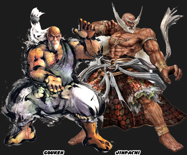
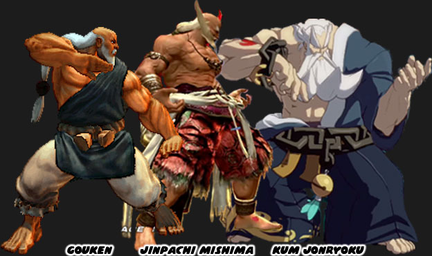
Arc Systems Work introduced Jonryoku as a jab at the recent trend of putting overly-muscular, aged, masters in their games. Specifically the robot was a parody of Gouken, the master of Ken and Ryu, from Street Fighter IV, and Jinpachi Mishima, the father of Heihachi Mishima from Tekken 5. In each of those games a character had literally returned from the dead even stronger and more massive than they ever were in life. They were presented among the biggest and strongest characters in their respective series. They made audiences wonder how people so big and powerful could have ever been killed in the first place. They also made people wonder why it was that they were big and strong while the other elderly martial arts masters looked old and feeble. Jonryoku was the culmination of both Gouken and Jinpachi’s school of design. He sported a long white beard, and ponytail. He had enormous chains instead of a belt and fought against weapons with his bare hands. He was both absurd and awe-inspiring as the previous characters were. The funny thing however that underneath the facade was a girl doing all the actual fighting.


When you looked at the characters side-by-side there wasn’t much of a difference between Gouken and Jinpachi. But when you compared them to Jonryoku the choice of aesthetics was striking. All three games used 3D graphics. All three games kept the majority of the game play on a 2D plane. But only one game managed to recreate the exact aesthetic that the lead designer and director wanted. In a sea of similar-looking fighting games why blend in when you could stand out? These were the things that the best studios did to set themselves apart in the’90s. It was something that the industry forgot how to do following the success of Street Fighter IV. Hopefully other studios would rediscover the importance of aesthetics and try harder in the next round of fighting games. At least I hope that they do. What about you, what were some of your favorite fighting games and why? I’d like to hear about it in the comments section. As always if you enjoyed this blog and would like to sponsor me please visit my Patreon page and consider donating each month, even as little as $1 would help make better blogs and even podcasts!

 follow the Street Writer on Patreon!