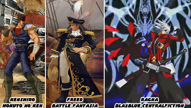
Battle Fantasia had a much softer feel to it. It was designed to look like a storybook painting come to life. The director Emiko Iwasaki was one of the lead artists on Guilty Gear. When she helmed her own title she wanted to present a visual language that was different than what fighting game fans were used to. She succeeded and showed that 3D games could retain a strong 2D aesthetic. Not only that but female directors were just as innovative as their male peers. The BlazBlue series was a sort of complimentary game to the Guilty Gear franchise. The co-directors Toshimichi Mori and Yūki Katō wanted to create a world that was heavily influenced by bright, colorful anime shows and lay into it heavy doses of the supernatural. Guilty Gear was rooted more in animé-meets-heavy metal. Perhaps it was their work on the Persona 4 fighting game that sparked the interest in humans and demons?
When Arc System Works (ASW) was founded in 1988 they developed their games and adaptations using the same technology and the same techniques as their peers. As the industry changed they also evolved. In the late ‘90s they saw that fighting games were starting to become stagnant. Sprites were being reused in games by Capcom and SNK. This made a lot of the sequels to the Street Fighter Zero, King of Fighters and Vampire games look redundant. They decided to create a whole new game but using high resolution sprites. This way they could create characters with a lot of style and fidelity. It would be as if an animé show had come to life as a fighting game. Guilty Gear was a treat to the eyes. Players hadn’t seen that level of style in a fighting game in a long while. Arc System Works did not stop there. As 3D technology became more powerful, and started appearing in home consoles, the studio knew that they would have to leave sprites behind as well. They didn’t give up on sprites right away but slowly weaned themselves off. Every game, fighter or not, that they developed gave them more experience in 3D. It forced the studio to see how the change in graphics formats would affect their fighting library. Battle Fantasia and Hokuto No Ken were proving grounds. They were showing that they could use 3D graphics to reproduce 2D aesthetics. Their biggest advancement happened when they created an entirely new engine for Guilty Gear Xrd - SIGN (2014) and REVELATOR (2015).
Many games prior to the Xrd title had used a technique called cel-shading to make their graphics appear more hand-drawn. What cel-shading did was filter the colors and shadows into a bold contrast and create an outline on the figures. It was a way to visually flatten out 3D objects and preserve a strong 2D aesthetic. One of the earliest games to popularize the format was the Jet Set Radio series by Sega. What ASW did was study what worked and what didn’t over the past decade and to reconstruct the graphical approach. They weren’t stingy with their findings either but freely gave a presentation at the Game Developer's Conference on the Guilty Gear Xrd graphics format. The studio demonstrated how they bridged the 2D/3D divide and shared those with the industry. They hoped to inspire other developers to create graphics that stood out. The company knew that no matter how well sprites looked in HD, the budgets for most companies would no longer allow them to develop hand-drawn graphics. These companies would have to find ways of preserving the hand-drawn style without betraying the visual style that audiences were used to. This also applied to the way the game moved and played. Everything from frame-skipping to hit box data would now be written using new software.
The studio showed off examples of how character designs evolved for the new technology. Some of the changes were subtle, the length of a coat, the shape of a hairline, other things were more profound, like the redesign of the massive Potemkin. In every example the game managed to retain its unique aesthetic. They could stay on budget, develop innovative titles and appease their fans. The challenge was laid out to other studios. They could keep doing what they were doing. Using the Unreal Engine 3 or 4 their games could all look the same. Or, they could approach graphics from a different angle and give audiences a new experience. It took some effort and fine-tuning in order to achieve the desired results but ASW was not hiding anything from the industry. They learned from their mistakes and wanted to show other companies what they did. The question was whether or not Namco, Microsoft, Capcom, SNK or the other publishers would take these lessons to heart.
Some people might not think there was much of a difference between graphical styles. After all, as long as a fighting game has good balance, control and animation then what do the graphics matter? Well the graphics matter because the industry thinks that the graphics matter. It is often the first thing that audiences and reviewers talk about. It is the thing that draws our eyes to the screen. It is what makes a game visualy appealing. Yet as we know is what they mean to say is that they are attracted to the the aesthetics of the game. The style is more important than the technical numbers powering the graphics engine. The best example of how much of a difference it is to have a 3D game with similar aesthetics could be seen in Guilty Gear Xrd and its contemporaries. Take a close look at the character Kum Haehyun. She was a master of the martial arts and knew how to harness the power of chi / ki. She could use her powers to heal or strengthen not only herself but other people. She could have been introduced into the lineup with an arsenal of moves that fit within the series. In the game she actually pilots a robot body that looks like an elder fighting master called Kum Jonryoku.
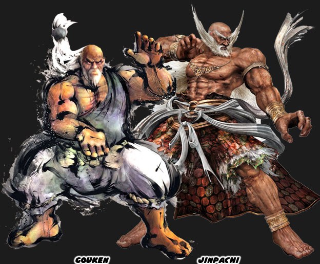
Arc Systems Work introduced Jonryoku as a jab at the recent trend of putting overly-muscular, aged, masters in their games. Specifically the robot was a parody of Gouken, the master of Ken and Ryu, from Street Fighter IV, and Jinpachi Mishima, the father of Heihachi Mishima from Tekken 5. In each of those games a character had literally returned from the dead even stronger and more massive than they ever were in life. They were presented among the biggest and strongest characters in their respective series. They made audiences wonder how people so big and powerful could have ever been killed in the first place. They also made people wonder why it was that they were big and strong while the other elderly martial arts masters looked old and feeble. Jonryoku was the culmination of both Gouken and Jinpachi’s school of design. He sported a long white beard, and ponytail. He had enormous chains instead of a belt and fought against weapons with his bare hands. He was both absurd and awe-inspiring as the previous characters were. The funny thing however that underneath the facade was a girl doing all the actual fighting.
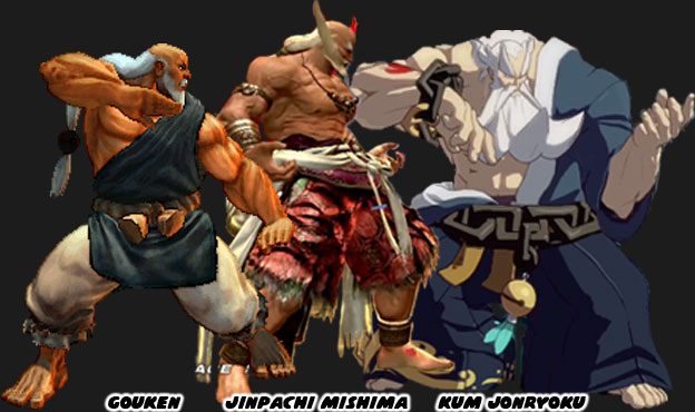
When you looked at the characters side-by-side there wasn’t much of a difference between Gouken and Jinpachi. But when you compared them to Jonryoku the choice of aesthetics was striking. All three games used 3D graphics. All three games kept the majority of the game play on a 2D plane. But only one game managed to recreate the exact aesthetic that the lead designer and director wanted. In a sea of similar-looking fighting games why blend in when you could stand out? These were the things that the best studios did to set themselves apart in the’90s. It was something that the industry forgot how to do following the success of Street Fighter IV. Hopefully other studios would rediscover the importance of aesthetics and try harder in the next round of fighting games. At least I hope that they do. What about you, what were some of your favorite fighting games and why? I’d like to hear about it in the comments section. As always if you enjoyed this blog and would like to sponsor me please visit my Patreon page and consider donating each month, even as little as $1 would help make better blogs and even podcasts!
No comments:
Post a Comment