Showing posts with label potemkin. Show all posts

Monday, May 15, 2017

The aesthetic versus graphics debate, part 3...

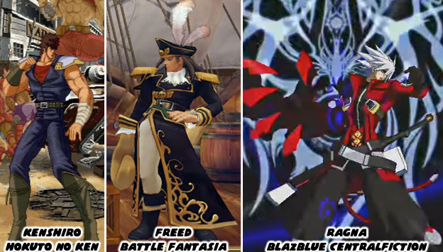
When it came to creating innovative fighting games with a strong aesthetic style you didn’t have to look any further than Arc System Works. Known best for creating Guilty Gear in 1998, the studio had released some very innovative titles over the past three decades. Some of the games were licensed and some were original titles. Each one had its own unique visual style. I had mentioned one of their gems previously, Battle Fantasia, a sleeper from 2007. Some of their other unique releases were Hokuto No Ken (Fist of the North Star) in 2005 and BlazBlue Centralfiction in 2015. Hokuto No Ken recreated the style of the classic 1980’s animé. The manga was drawn by Tetsuo Hara but the anime series was directed by Toyoo Ashida. Mr. Ashida was a character designer and animator that had started working in the ‘60s. By the time he worked on Hokuto No Ken he had studied under multiple different artists. It was this experience that allowed him to capture the essence of the violent comics while retaining the designs that Mr. Hara was known for. The team at Arc System Works did their homework and were able to capture the Hara and Ashida influences in the game.


Battle Fantasia had a much softer feel to it. It was designed to look like a storybook painting come to life. The director Emiko Iwasaki was one of the lead artists on Guilty Gear. When she helmed her own title she wanted to present a visual language that was different than what fighting game fans were used to. She succeeded and showed that 3D games could retain a strong 2D aesthetic. Not only that but female directors were just as innovative as their male peers. The BlazBlue series was a sort of complimentary game to the Guilty Gear franchise. The co-directors Toshimichi Mori and Yūki Katō wanted to create a world that was heavily influenced by bright, colorful anime shows and lay into it heavy doses of the supernatural. Guilty Gear was rooted more in animé-meets-heavy metal. Perhaps it was their work on the Persona 4 fighting game that sparked the interest in humans and demons? 

When Arc System Works (ASW) was founded in 1988 they developed their games and adaptations using the same technology and the same techniques as their peers. As the industry changed they also evolved. In the late ‘90s they saw that fighting games were starting to become stagnant. Sprites were being reused in games by Capcom and SNK. This made a lot of the sequels to the Street Fighter Zero, King of Fighters and Vampire games look redundant. They decided to create a whole new game but using high resolution sprites. This way they could create characters with a lot of style and fidelity. It would be as if an animé show had come to life as a fighting game. Guilty Gear was a treat to the eyes. Players hadn’t seen that level of style in a fighting game in a long while. Arc System Works did not stop there. As 3D technology became more powerful, and started appearing in home consoles, the studio knew that they would have to leave sprites behind as well. They didn’t give up on sprites right away but slowly weaned themselves off. Every game, fighter or not, that they developed gave them more experience in 3D. It forced the studio to see how the change in graphics formats would affect their fighting library. Battle Fantasia and Hokuto No Ken were proving grounds. They were showing that they could use 3D graphics to reproduce 2D aesthetics. Their biggest advancement happened when they created an entirely new engine for Guilty Gear Xrd - SIGN (2014) and REVELATOR (2015).
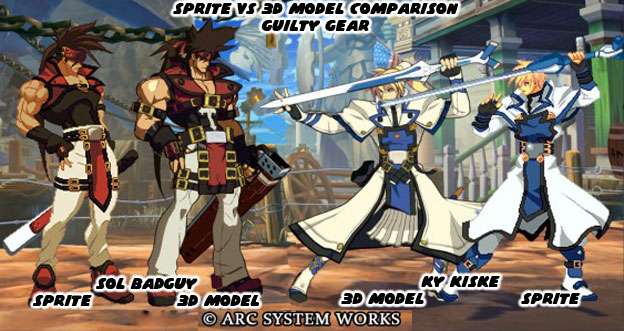
   

Many games prior to the Xrd title had used a technique called cel-shading to make their graphics appear more hand-drawn. What cel-shading did was filter the colors and shadows into a bold contrast and create an outline on the figures. It was a way to visually flatten out 3D objects and preserve a strong 2D aesthetic. One of the earliest games to popularize the format was the Jet Set Radio series by Sega. What ASW did was study what worked and what didn’t over the past decade and to reconstruct the graphical approach. They weren’t stingy with their findings either but freely gave a presentation at the Game Developer's Conference on the Guilty Gear Xrd graphics format. The studio demonstrated how they bridged the 2D/3D divide and shared those with the industry. They hoped to inspire other developers to create graphics that stood out. The company knew that no matter how well sprites looked in HD, the budgets for most companies would no longer allow them to develop hand-drawn graphics. These companies would have to find ways of preserving the hand-drawn style without betraying the visual style that audiences were used to. This also applied to the way the game moved and played. Everything from frame-skipping to hit box data would now be written using new software.

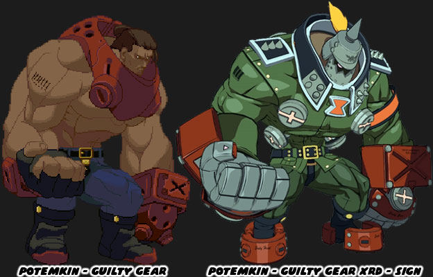
 The studio showed off examples of how character designs evolved for the new technology. Some of the changes were subtle, the length of a coat, the shape of a hairline, other things were more profound, like the redesign of the massive Potemkin. In every example the game managed to retain its unique aesthetic. They could stay on budget, develop innovative titles and appease their fans. The challenge was laid out to other studios. They could keep doing what they were doing. Using the Unreal Engine 3 or 4 their games could all look the same. Or, they could approach graphics from a different angle and give audiences a new experience. It took some effort and fine-tuning in order to achieve the desired results but ASW was not hiding anything from the industry. They learned from their mistakes and wanted to show other companies what they did. The question was whether or not Namco, Microsoft, Capcom, SNK or the other publishers would take these lessons to heart.
   

Some people might not think there was much of a difference between graphical styles. After all, as long as a fighting game has good balance, control and animation then what do the graphics matter? Well the graphics matter because the industry thinks that the graphics matter. It is often the first thing that audiences and reviewers talk about. It is the thing that draws our eyes to the screen. It is what makes a game visualy appealing. Yet as we know is what they mean to say is that they are attracted to the the aesthetics of the game. The style is more important than the technical numbers powering the graphics engine. The best example of how much of a difference it is to have a 3D game with similar aesthetics could be seen in Guilty Gear Xrd and its contemporaries. Take a close look at the character Kum Haehyun. She was a master of the martial arts and knew how to harness the power of chi / ki. She could use her powers to heal or strengthen not only herself but other people. She could have been introduced into the lineup with an arsenal of moves that fit within the series. In the game she actually pilots a robot body that looks like an elder fighting master called Kum Jonryoku.
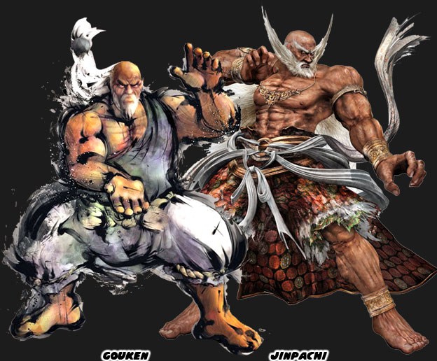
   

Arc Systems Work introduced Jonryoku as a jab at the recent trend of putting overly-muscular, aged, masters in their games. Specifically the robot was a parody of Gouken, the master of Ken and Ryu, from Street Fighter IV, and Jinpachi Mishima, the father of Heihachi Mishima from Tekken 5. In each of those games a character had literally returned from the dead even stronger and more massive than they ever were in life. They were presented among the biggest and strongest characters in their respective series. They made audiences wonder how people so big and powerful could have ever been killed in the first place. They also made people wonder why it was that they were big and strong while the other elderly martial arts masters looked old and feeble. Jonryoku was the culmination of both Gouken and Jinpachi’s school of design. He sported a long white beard, and ponytail. He had enormous chains instead of a belt and fought against weapons with his bare hands. He was both absurd and awe-inspiring as the previous characters were. The funny thing however that underneath the facade was a girl doing all the actual fighting.
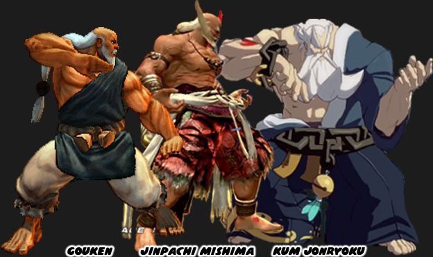
   

When you looked at the characters side-by-side there wasn’t much of a difference between Gouken and Jinpachi. But when you compared them to Jonryoku the choice of aesthetics was striking. All three games used 3D graphics. All three games kept the majority of the game play on a 2D plane. But only one game managed to recreate the exact aesthetic that the lead designer and director wanted. In a sea of similar-looking fighting games why blend in when you could stand out? These were the things that the best studios did to set themselves apart in the’90s. It was something that the industry forgot how to do following the success of Street Fighter IV. Hopefully other studios would rediscover the importance of aesthetics and try harder in the next round of fighting games. At least I hope that they do. What about you, what were some of your favorite fighting games and why? I’d like to hear about it in the comments section. As always if you enjoyed this blog and would like to sponsor me please visit my Patreon page and consider donating each month, even as little as $1 would help make better blogs and even podcasts!

 follow the Street Writer on Patreon!

Sunday, May 10, 2015

Introducing Gigas, an original idea or more of the same? Let's take a look!

Fighting game fans were in for a shock when the fighters for Tekken 7 were unveiled. Familiar faces had returned along with a new young girl and handsome man which were part of the long-running Namco themes. What caught fans off guard was a massive bruiser that looked completely unlike anything featured previously in the series. The massive red humanoid, known only as Gigas, seemingly came out of nowhere and was poised to topple the most powerful fighters in the series.


Fans from the west were certain that the Japanese developers were catering to Western tastes. It seemed that many heroes and villains from Western video games, comics and movies were massive, muscle-bound monsters. It didn't take long for the comparisons between Gigas and his influences were being pointed out in online forums. An obvious similarity between Gigas and US designs could be seen with the Red Hulk, a villain from the popular Marvel Hulk comics and the mysterious Big Daddy from the BioShock series.


Yet there was several design cues that came from a different property also from the West. The Batman: Arkham series of games has featured several versions of the character known as Bane. The one featured specifically in Arkham Origins seemed the one directly responsible for the appearance of Gigas. There was the massive torso, large arms and tubes connected to the various major muscle groups on both characters. Yet there was much more to Bane than simply being a genetically-enhanced monster. When the character was introduced decades ago he was created to be the ultimate rival of the Batman. The man was a former prisoner-turned-assassin. He was subjected to various surgeries and treatments which enhanced his natural abilities. Batman was considered to be the supreme human physical specimen in DC comics. He was the perfect fighter and Bane was trained to match him in every mental and physical arena. The advantage that Bane had over Batman would be a drug called Venom which gave him a temporary increase in muscle mass, speed and dexterity. He used this to defeat Batman in unarmed combat and even break his back.


Sadly for Bane the writers and artists working at DC could not find a way to improve the character so they began changing his purpose as a worthy rival to the Bat. The character became over-reliant on Venom and in just about every subsequent appearance Batman would either cut off Bane's supply of Venom or cause him to overdose on it. Bane went from a cold, calculating villain to a musclebound stooge over a matter of years. The Joker would return to prominence as the main rival to Batman and Bane would be a supporting character in comic story arcs. The changes for the character were easy to see in animated form. When he first appeared in the Batman Animated Series he was very much rooted in his original comic book design. When he returned a few years later in the new Batman shows he would become more and more exaggerated and dark in his designs. One of his last designs made the character look more alien than human. Part of the reason for that was because the team of artists working on the character designs had previously worked on the Ben10 animated series. Ben10 if you may know was based on a kid that could change from a human into an alien host. The muscle on the new Bane were far larger than ever before, his strength increased tenfold and ability to withstand punishment increased. His skin had even been turned red. If these were not the roots of Gigas then I don't know what else to tell you.


The changes in the appearance of Bane were only part of the equation. Over the past few years many artists had been experimenting with how far they could push the designs of fan-favorite characters. The Joker had been a staple in the Batman comics for decades. His look had changed only slightly over the years but DC shook the community with a recent redesign. The character had cut off his own face and wore it as a mask to add a certain level of grotesque to his already macabre appearance. Many of the Batman villains received the same make-over. In order to give Bane a new look the artists working at DC and even at video game publisher Rocksteady had to push the envelope. As with any design the question remained; how far could the character be pushed and still retain the core elements? How would this character be identified by fans? It seemed that Bane could be made very grotesque and audiences would still recognize the character.


Yet even Bane was not an original idea. The man-becoming-a-monster was a staple of classical storytelling. It was not always a physical transformation to show a person becoming man, such as with Ahab in the story of Moby Dick. Other times a monster represented the mistakes of man, such as the creature created by Dr. Frankenstein. More than a century before Bane was created there was a character called Mr. Hyde. Robert Louis Stevenson (author of Treasure Island) wrote a novel on a scientist named Dr. Henry Jeckyll that used a chemical mixture to become a powerful monster known as Edward Hyde. The monster was more beast than man and terrorized the citizens of Victorian England. The characters of Jeckyll and Hyde would become synonymous with extreme personality changes and not necessarily physical changes.


The Hyde character would be revisited by Alan Moore in his graphic novel the League of Extraordinary Gentlemen. The story would be turned to film and Hyde would get yet another on-screen interpretation. In order to create a monster even more terrifying than Hyde the movie introduced Dante, a soldier that overdosed on the secret formula. The end result was an extremely grotesque and disproportionate man. He hardly looked human at all and could be considered one of the first 3D representations of the extreme comic book proportions that artists were placing on their figures. Yet to say that Hyde begat Bane begat Gigas in Tekken would be an insult to the Japanese designers.

Game designers in Japan as well as artists and illustrators had been creating monstrous characters for decades. They had been working on absurdly disproportionate muscled figures for as long, if not longer, than Western artists had. In fighting games there were many presidencies set by Japanese studios before Gigas had even been dreamed of. Capcom, SNK, Arc System works and various developers had been pushing the envelope on the "strong man" character trope. To help the characters stand out the artists often gave them large shoulders and thick arms while keeping their legs thin and heads small. This visual made many of the bruisers memorable.


The proportions featured on Gigas were not as extreme as they were on characters like Potemkin or Abubo but they were close. What Gigas had going in his favor was that he was one of the few Japanese characters designed in 3D with the exaggerated aesthetic. Because Bane had been presented in 3D previously most audiences simply assumed that the designers at Namco had simply poached the style. This was far from the truth. Both 2D and 3D fighting games from Japan had characters like Gigas for decades. Monsters and demons of the Gigas scale had already prepared audiences for what was to come. One of the first 3D monsters that predated Gigas was also from Japanese designers. Gandara appeared in Samurai Showdown / Samurai Spirits 64. The title from 1997 was not well received by audiences. It lacked polished control and featured crude graphics. Something that was well done however were the character designs, especially the demonic Gandara.


Gandara lacked the tubes and mad science theme of Bane, but was still bound in service. It was not technology but rather magic that kept Gandara enslaved. The tortured appearance was a bold artistic statement and made Gandara one of the most memorable fighting game designs of all time. Shifting the focus back on Gigas though we should note that Namco had actually set a precedence for massive fighters ever since the very first Tekken was released in 1994. The "strong" type fighter in the original game was a cyborg named Jack. The character looked like an army soldier, with a square blonde mohawk and a massive torso. As the series evolved so too did the designs for Jack. The skin would be replaced by metal and even hexagonal armor. Although the character developed a personality the Jack models would become disposable within the canon of the Tekken series. The character was bound in servitude to the Mishima Zaibatsu. The private military conglomerate run by Heihachi Mishima. Any version of Jack that demonstrated self consciousness would be destroyed by the company. It made Jack a likable cyborg especially as he became a pacifist. There was an earlier build of Jack that was also in the original Tekken tournament, known as P-Jack or Prototype Jack. This all-metal version of Jack wore sunglasses and was absolutely loyal to his programming. It made the character more dangerous in canon.


The robots of Tekken continuity were considered some of the strongest fighters in the series. The proportions of each version of Jack were similar to those of Gigas. But there was a missing-link of sorts. An MMA brute named Craig Marduk was introduced in Tekken 4. The seven-foot Australian was a champion fighter and an absolute genetic freak. He could out-muscle his opponents easily but was also a well-rounded technician in the ring. He was as close to being a Bane-type character minus the Venom. Marduk could go toe-to-toe with the Jack robots and just about any other character in the series. I would argue that Gigas was a mix in between Jack and Marduk. Whomever invented this fighter wanted the best of the physical abilities of Marduk but with the programmable loyalty of P-Jack. I believe Gigas is an entirely new weapon being developed by the Mishima Zaibatsu. The company has undoubtedly learned from their genetic experimentations. Many of the Tekken Tournaments are a front for the company. The plot of the games involve genetic manipulation, stolen DNA and cybernetic enhancements to soldiers and assassins. The characters Yoshimitsu, Anna and Nina Williams and Brian Fury have a mix of genetic manipulation if not all-out cybernetic enhancements. These figures were created to lead robots into battle, if not to act as a fail-safe in shutting down the machines. As impressive as Jack and P-Jack are they are far from being the biggest robot bruisers in the series. That honor would belong to NANCY-MI847J, a robot as large as a trailer truck.


Gigas could be deployed where the Robot NANCY would be a target to missile launchers. With the ability of some reasoning Gigas could also replace the faulty logic of the Jack models. It is the science-fiction that the Tekken series adheres to that I find most interesting. The teams working at Namco are intimately aware of how each game connects to a bigger storyline. They also know that the continuity of one series often marries into the canon of a different title. The Ridge Racer racing game, Tekken fighting game and Ace Combat fighter jet titles are all part of the same universe. The technology developed by one fictional conglomerate in the universe will turn up again and again and even become refined in different games. One of the more interesting features of Gigas is the helmet.


Cybernetic eyes and helmets had been featured in the design of the cyborg ninja Yoshimitsu. The multiple cameras where the eyes should be act almost like spider-eyes. They allow Yoshimitsu and in this case Gigas to have a greater view range than regular human eyes. The helmet worn by Gigas is a bit different than the ninja however. The hexagonal series of cameras are reminiscent of the COFFIN interface from the Ace Combat series. In the most advanced fighter jets in the series the pilot can see a full 360 degrees around the plane without ever having to turn their head. Cameras replace the open canopy of traditional fighter jets and feed the visuals directly to the mind of the pilot. In the case of Gigas he can see above, to the side and even almost all the way behind without having to turn his head. This makes the genetic creation impossible to sneak up on and even more dangerous in unarmed combat. Tekken is an amazing series from a design standpoint because it has humans fighting robots, but it doesn't end there. Monsters and even Angels and Devils could be seen as genetic anomalies rather than supernatural creatures thanks to the science in the series. I can't wait to see how Gigas develops and what his role will be in the greater scheme of things. What do you think about his design? If you would like to sponsor me please visit my Patreon page and consider donating each month, even as little as $1 would help make better blogs and even podcasts!
follow the Street Writer on Patreon!