
Showing posts with label batman. Show all posts

Wednesday, October 2, 2024

A symmetry of villainy, part 1...

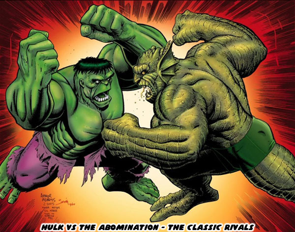
Hello friends, I hope you are doing well. Today I want to talk about great comic book rivalries. How they are put together, and what I think makes the best ones work. This topic was actually inspired by the return of one of my favorite Incredible Hulk villains. I’ll talk about who that is in a moment. Right now I want to focus on my theory of great rival design. It is a sort of follow-up to a blog I wrote ages ago regarding The Frightful Symmetry of Street Fighter. I argued that all great fighting game designs worked because there was a lot of symmetry in the development of their cast. In the early days of fighting games the main characters had a rival or balance. They were often presented as the Asian versus Western master of the fighting arts. Think of Ken, and Ryu from Street Fighter, or Paul, and Kazuya from Tekken. Then later on the library was expanded to make female counterparts to lead characters. I talked about this on The Legend of Blue Mary. If you were a budding comic book, video game, or storyteller then you might find it hard to come up with a great recurring villain. The easiest way to approach this was by creating an opponent that was a mirror rival to the hero. For example long-time comic book fans might argue that The Abomination was the greatest enemy of the Incredible Hulk. They might be right.

The Abomination was a gamma-irradiated villain that was bigger, and stronger than the Hulk. He was also intelligent, sadistic, and cruel. Whereas the Hulk was filled with a blinding rage, he was still a moral character that just wanted to be left alone. When they battled the Earth literally trembled. There were few forces in the Marvel Universe that could come between them, let alone try to stop them. Unless you had read a lot of comic books then you might not realize how the power scale worked between different comic books. The villains on a street level hero / anti-hero like the Daredevil, or the Punisher, were nowhere near as dangerous as the villains the Hulk comics. The Hulk had single-handedly taken on characters that the entire X-Men, or Avengers rosters were unable to stop. When the Hulk, and Abomination fought it was the western equivalent of a daikaiju battle, like Godzilla vs King Ghidorah. The best course of action was to evacuate the nearest city, and let them fight. Good or evil would triumph, and the survivors would have to deal with the fallout. The Hulk, and Abomination were an example of symmetrical design. Think about your favorite comic book rivalries, and try to recall how many were symmetrical in nature.

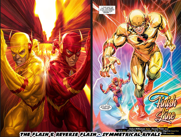
My favorite DC hero was the Flash, it was debatable if I liked Barry Allen, or Wally West as the Flash more. Their greatest rival was also symmetrical in nature. The Reverse Flash was among the most dangerous opponents in all of DC canon. Eobard Thawne hailed from the far future. He had made it his mission to travel through time, and destroy the life, and legacy of the Flash. In several continuities he had succeeded in this, wiping out the Flash, and all of his allies. Having a compulsion to destroy entire generations of characters was a scary thought. Knowing that few in the DC universe could stop the Reverse Flash including Batman or Superman, made having the Flash there to protect the universe essential. For comic books, and most pop culture storytelling making a rival be a perfect balance just made sense. However I would argue that the most interesting rivalries were when the opponents were not perfectly balanced. Let’s talk about asymmetrical rivals.

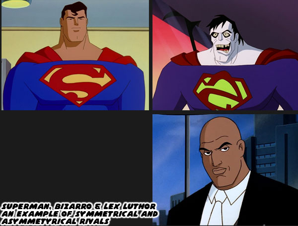
Superman was arguably the most popular hero in DC, if not all of comics history. When he debuted in 1938 he fought mostly low level villains. The gangsters, and petty criminals that most people saw in media. Through the years different creators starting making villains more unique, and powered as well. Once the atomic bomb had been used in WWII the power scaling in comic books jumped exponentially. This was especially true for Superman, and lead to the creation of the Incredible Hulk. One of Superman’s greatest opponents was a freakish mirror version with all the same powers known as Bizarro. While Bizarro had many memorable encounters with the Man of Steel there was one villain who was a perpetual thorn in his side. Lex Luthor was seen by most as his greatest rival. He was intelligent, rich, and calculating. Using his money, and influence to gain as much power as possible he was aware that Superman was the only person that could stop his ambitions. Despite not having any super powers he had brought Superman to brink of death time, and time again. Although Bizarro was a great opponent, it turned out that Luthor was the one that gave Superman the most trouble.

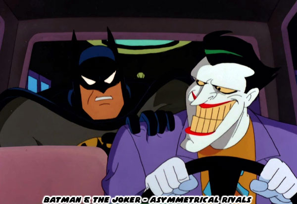
Batman was similar to Superman in that they fought opponents with comparable abilities. Whether it was strength, and martial prowess (like Bane), intelligence (like the Riddler), or fear (the Scarecrow) then Batman had an opponent that could challenge his individual abilities. It was a literal wild card that gave Batman the most trouble. The Joker was pure chaos. He was unpredictable, and nothing the Batman did could prepare him for the next encounter. The Joker did not have the fighting ability of the Batman, nor the ability to calculate his next move. He would often surprise himself with his random schemes, and thus ensure that Batman would be caught off guard as well. This type of character design, the ability to fill a world with both symmetrical, and asymmetrical opponents was critical to pop culture. It made the best comic book, tv, movie, and video game battles work. I would argue that with a few exceptions it was the asymmetrical foes that were the most important for the hero to overcome. This lesson was especially true in team settings. 

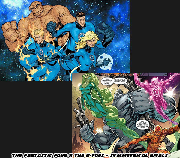
Think about the greatest evil organizations in comic book history. DC had the Legion of Doom which was created to battle the Justice League. The evil organizations were made up of rivals with symmetrical powers to the heroes. This type of design was also featured in a number of Marvel books. The X-Men fought the Brotherhood of Evil Mutants, the Morlocks, and the Reavers to name just a few. They were often composed of opponents that had asymmetrical designs as the heroes, but similar powers. This sort of balance went for a few other teams in the Marvel Universe as well. Most people were familiar with the Fantastic Four, but unless you were familiar with the comics you might have never heard of the U-Foes. This team recreated the same space flight that gave the Fantastic Four their powers through cosmic radiation. They even had brother and sister; Jimmy, and Ann Darnell. The duo of X-Ray, and Vapor mirrored Sue, and Johnny Storm. The respective Invisible Girl, and Human Torch. Yet again, unless you were a long time comic book fan then you might have never heard of these villains. By the same token if you were to poll casual fans, and comic book fans as to who was the greatest enemy of the Fantastic Four were they would often point to Doctor Doom.

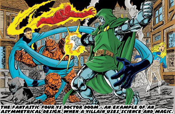
Victor Von Doom was an individual gifted with absurd levels intelligence, a creative mind, and an affinity for the magical arts. He combined the sciences, with the dark magics, and made for one of the most powerful villains in all of Marvel history. It was his unique blend of magic, and technology that allowed him to counter anything the Richards family could throw at him. It was this sort of asymmetrical design that made him a standout character, and able to be placed in a story that would work across the spectrum of Marvel heroes, and villains. He could one day be fighting against Dr. Strange, and the next be teaming up with him in order to save the Earth from a demonic invasion. The complexity of his design, and absolute resolve in his purpose allowed writers to put him in stories that were as fascinating for the villain, as they were for the hero. The creators at Marvel understood that the most memorable villains had nothing in common with the heroes.

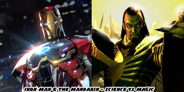
I was lucky enough to have brothers that also read comic books, and we collected titles across the spectrum. We were well versed in the happenings all over the Marvel universe, and the DC universe to a lesser extent. One of the most fascinating rivalries was that of Iron Man. He was possibly my little brother’s favorite Marvel hero, next to Dr. Strange. While Iron Man did fight other armored warriors like Titanium Man, the Iron Monger, and the Crimson Dynamo none were as big a nemesis as the Mandarin. The magic rings that the Mandarin wore allowed him to fight Iron Man on a physical level, but also Tony Stark on a psychological level. People that were only familiar with the characters thanks to the Marvel live action films had no idea how many amazing battles the duo had. As the years went on I realized that being able to create asymmetrical rivals meant a lot to the longevity of a title. It also made me realize that when new creators were placed on a book they did not always understand the characters that they were writing for. I will talk about this more on the next blog. For now I would like to know if there were any great rivalries that you enjoyed. Whether in a movie, game, or comic book. I’d like to hear about it on the comments section. As always if you would like to sponsor me please visit my Patreon page and consider donating each month, even as little as $1 would help make better blogs and even podcasts!
follow the Street Writer on Patreon!

Monday, October 16, 2023

Tony Wong, Andy Seto, the Story of the Four Constables. A 1UP classic from Mar 29, 2012

Tony Wong was not the first manhua writer or artist. He was undoubtedly the most influential though. When he started off his work as a teenager in the 1960's there was not much to look at. He was a terrible artist that relied on shock value to move comics. Once he outgrew his teen phase and began developing memorable characters and improved his drawing techniques there would be no stopping him.
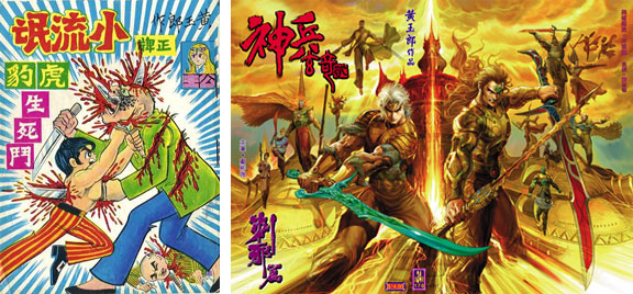
His contributions to the comics medium were hard to ignore. He just about single-handedly modernized the Hong Kong comics industry, and created a publishing empire filled with former rivals as well as new talent. The painted art of the manhua was more influential than Japanese manga art to the growing wave of Korean comic artists and designers. This shaping of styles would never have happened without Tony Wong. Tony was eventually tapped to produce a story featuring Batman for DC. The story was well put together as most of Wong’s best work. The master storyteller was great at hiding plot twists in plain sight and revealing them at the most opportune moments. In the story Batman inspired the creation of a Chinese vigilante named Night Dragon. Both were on the trail of a crime lord that was filming the murders of people and putting them online for profit.
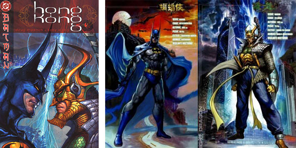
Those interested in studying the nuances between manhua and comic books, especially the difference in the art, should pick up the title Batman: Hong Kong.
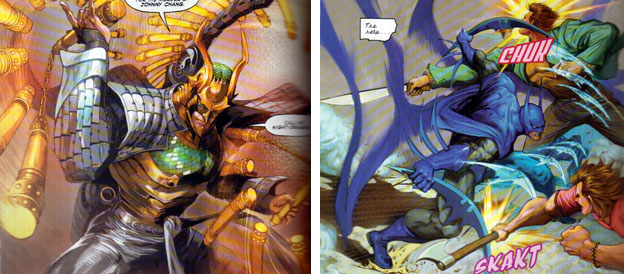
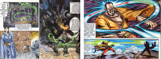
Wong’s most popular series, Weapons of the Gods, inspired the development of both a tabletop and MMO game. This game would influence the character designs and art direction for South Korean MMO’s as much as any manhua title produced by Wong did. 

Tony was an exceptional character designer. This went for the humans, animals and monsters that went into his books. He knew how to stage battles between these characters and present them in the best possible way. He was also one of the early artists to draw different forms of chi energy attacks and magical attacks that predated Hokuto no Ken. For example, in the Weapons of the Gods one of the characters had musical instruments that allowed him to hypnotize or even kill his opponents with sounds.
Tony’s greatest strength was not his art as much as it was his writing. Mr. Wong had a way of creating very personable characters. He made them emotive, able to enter into some witty banter when they weren’t beating up on each other. Arguably the best title ever created by Tony did not feature his art.
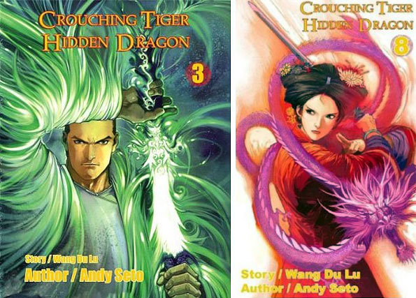
Andy Seto was one of the best manhua artists in the business. He handled many high profile adaptations of Hong Kong films, including Shaolin Soccer and Crouching Tiger Hidden Dragon. His work in paint was sublime. I would rank him among the best western comic illustrators like Alex Ross and Bruce Timm. When Andy’s talents were combined with Tony Wong’s writing then there was no stopping him.

Andy was the artist behind the Four Constables books. These books featured the staples of manhua design and coloring. They broke the mold however in that they were digitally painted. By going digital Andy was able to achieve the same bright colors that had been a staple in US comics since the 1990’s. He was able to take the comic medium to new levels though by combining his training in the traditional manhua format with new technology. This included using amazing poses and perspectives in fighting sequences that were usually never seen in the US.

The painted panels could be vibrant or muted depending on the effect he was trying to achieve. These things would have been all but impossible to reproduce on canvas or using older printing techniques.

Each battle in the Four Constables was the equivalent of a great action sequence in a film or even a dramatic videogame encounter. The poses and strikes were framed for the best visual impact and the characters actually named their stances (special moves) as they were performing them. Those interested in learning how to present a fight between two martial arts masters with fantastic powers should dissect Seto’s work. It was almost lamentable that he was never tapped to produce a Street Fighter manhua other than the occasional Street Fighter comic cover.

Seto was a master of design. Helping bring the characters that Tony wrote to life. He was able to design beautiful and graceful characters as easily as he could present powerful ones.
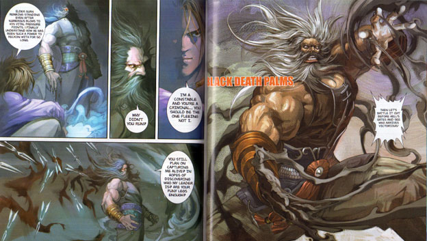
The Four Constables could be considered the closest to a western-inspired superhero team while still preserving the manhua conventions. The characters were all martial arts masters that had a specialty. The fourth constable was nicknamed Cold Blooded, he was a master of swordplay. The third was a master of the light foot technique. Few could match the powerful kicks of the Life Snatcher. The second was Iron Hands and had been mentioned previously in this series. The leader of the four was nicknamed Emotionless. He was actually paralyzed from the waist down and moved on a golden “Cloud” wheelchair. He studied the hidden weapons techniques. He knew how to interrupt the chi meridians and could kill with a single attack. Every inch of his robe was lined with weapons and his wheelchair was as well. He used the light foot techniques with his hands and could propel himself and his chair over any obstacle.
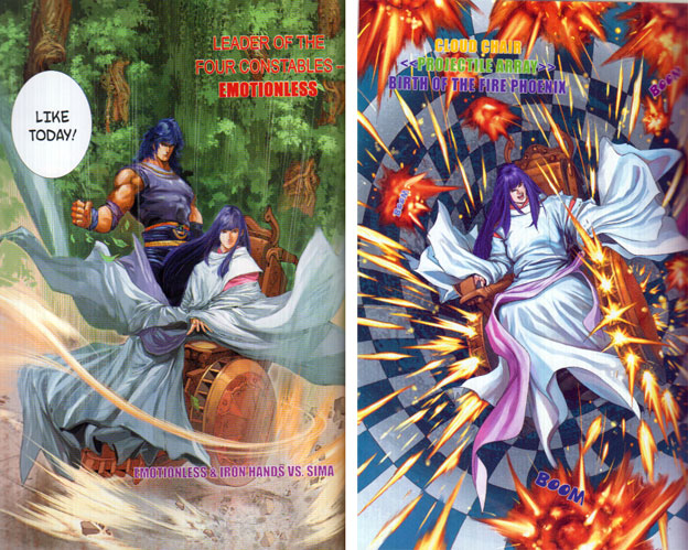
The Four Constables were usually working cases independently. Whenever they were called together it was because there was something that could potentially topple the kingdom. Fans of great writing, fantastic art and memorable battles should try and track down a copy of the books.

Tony and Andy were the pinnacle of the manhua craft. They knew how to entertain audiences with original material as much as with licensed work. The Chinese that contributed some of the largest inspirational points for the SF series often got the least amount of credit. This was possibly due to a tradition that appropriated (stole) almost as much design and IP as they had created in the past half century. When Hong Kong began producing manhua based on fighting games they tended to poach the best designs and art from those working at Capcom and the Japanese artists publishing licensed manga. This tradition would hurt the reputation of the format and even some of the most talented creators in the industry. The next blog will explore these rarely discussed issues. Were there any manhua books that you collected? Let me know in the comments section please. As always if you would like to sponsor me please visit my Patreon page and consider donating each month, even as little as $1 would help make better blogs and even podcasts!
follow the Street Writer on Patreon!

Friday, May 12, 2017

The aesthetic versus graphics debate, part 2...

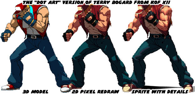
A good portion of our entertainment media is visually based. Video games succeed when they have a strong visual style to go with a solid control scheme and innovative game play. In the previous blogs I have talked about the importance of having a good aesthetic. It was essentially more important than having great graphics. The demo for Fighting EX Layer reminded audiences how similar the graphics in most fighting games were today. When Street Fighter EX debuted almost 20 years ago it was visually much different than the sprite-based fighting games from Capcom. This helped set it apart from the traditional fighters. The challenge for modern game developers was whether or not they could the match the aesthetic of a lead artist or if indeed all of the aesthetics had to look the same because of the modern hardware. When graphics technology was sprite-based it was easy to draw characters in the styles of a particular artist. Once the graphics engines moved to 3D it became harder to preserve the aesthetic of hand-drawn art. SNK made a very ambitious go at it when the created Dot Art graphics for the King of Fighters XII in 2009. The studio created 3D models of each character and then used cel-shading technology to outline the figure and create general points of light and shadow. Artists then went in and redrew the models and painted in the gradients.


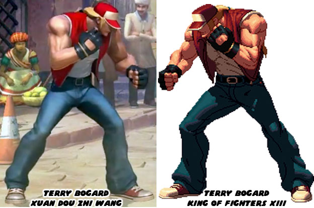
The end result was brilliant but most studios could not afford to spend a good chunk of their budget creating sprites. The Dot Art process was a slow, expensive and time-consuming process. Studios had to balance the game and fine tune the controls as well. There was only so much money to go around, especially for a genre that many considered had peaked in the ‘90s. One of the largest Chinese developers, Tencent, licensed a few of the SNK characters for their game Xuan Dot Zhi Wang in 2015. They created 3D models and used textures and lighting effects to make them appear as close to the Dot Art versions as possible. The end result was amazing. The Chinese studio demonstrated that 3D games could not only play like their 2D counterparts, they could also look like them as well.


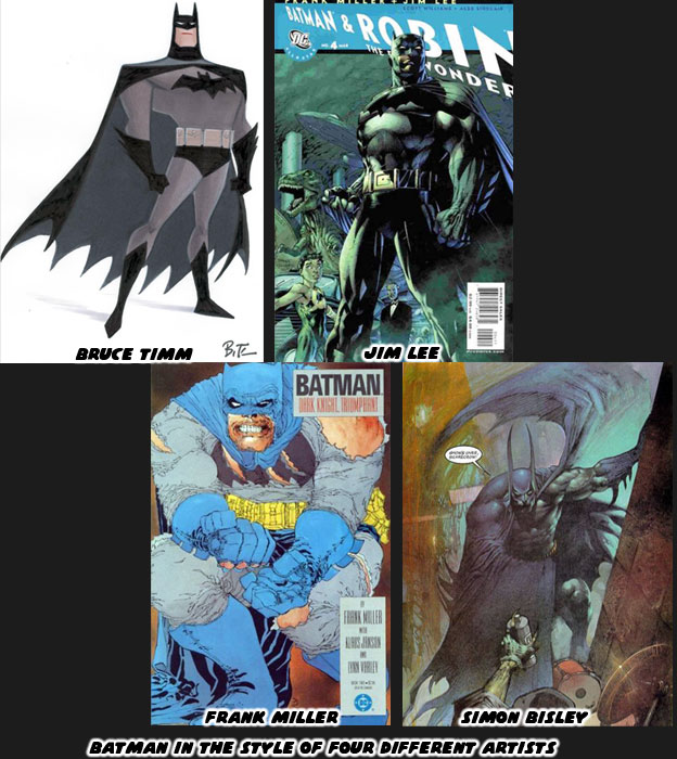
Directors working on fighting games, or any game in general have to find a visual balance between what the art director wants and what the audience expects. Each artist after all has their own way of illustrating. They each have their own sense of shape, scale, proportion and movement. How they frame the action, how they color the world. All of these things are done in concept art even before the first line of code is written. The best directors for animation have historically been people that understand the visual language. Stop for a moment and consider how different artists interpret Batman from the DC comics.


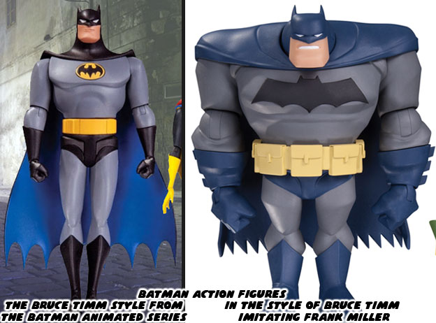
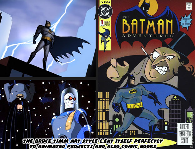
Bruce Timm for example has an extensive amount of history with character design and animation. He reduces the lines in his illustrations to the bare minimum. His shapes are clean and easy to read and perfect for cartoons. Jim Lee on the other hand is from the world of comic books. He had a unique style that made him a breakout artist on the X-Men comics in the ‘90s. Now he is in charge of comics at DC. His trademark style, made up of tight lines is easy to identify. Frank Miller is a screenwriter and artist that has experience in storyboarding. His style is unique. His lines are jagged and thick, they make his characters look like they are wearing crumpled paper bags. He likes to create panels with very strong shapes and poses when he works on Batman. Simon Bisley is in his own world. He paints his panels and uses very exaggerated shapes and proportions. His panels bleed into each other and come off as dream-like. It is easy to identify each of the artists based on their own style. It is important for the comic book industry to have a diversity of styles. After all who would like to read a comic book if they were all written alike and drawn alike? Of these artists the one that has proven to be the most influential for the industry has been Bruce Timm.


Bruce and writer Paul Dini were responsible for the popular Batman the Animated Series, which debuted in 1992. The duo went on to help shape the DC animated universe for over the next 20 years. The Timm-style of art was very flexible. It worked well in animation and in comic books. Not every comic book artist was allowed to show off their trademark style. Some were hired for their ability to draw in the style of another artist. Ty Templeton for example did a number of the Batman Adventures comic books and was able to capture the style of the animated show. Imagine Templeton as a member of the DC art team. They each had their own style but when called upon could help fill in for their lead artist or designer. Similar things applied to the artists and freelancers working at Capcom, SNK or other studios. The Bengus and Akiman styles were very different but whichever person set the style guide for a particular Street Fighter everyone else in the team followed it to the letter. This ensured consistency throughout the project. The magic of having an animation director like Bruce Timm was how well his style adapted across platforms. His shape and proportion worked as well in 3D as they did in 2D.


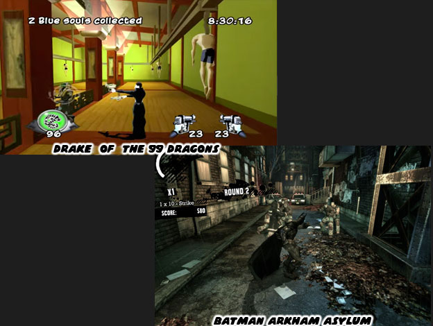
Here was the thing, a studio didn’t even have to work on a Batman game in order to take advantage of Mr. Timm’s aesthetic. Take the game Drake of the 99 Dragons for example. Developed by Idol FX in 2003, the studio created a 3rd person action game featuring an immortal yakuza hitman. The company made use of cel-shading technology to make the graphics appear more two-dimensional. The game was remembered mostly because it was bad. The control was bad, the animation less than stellar, the game play a bit redundant and the overall experience was poor. The reason it stood out were because of the aesthetics. It looked like an episode of the Batman Adventures come to life. It was and remains the best example of how the Bruce Timm aesthetic really compliments the look of an action project. Yet the Timm style didn’t always have to apply. For example in Batman: Arkham Asylum (2009) the developers at Rocksteady Studios were trying to create a world that had pulled its inspiration from the realism of the Chris Nolan Batman film, as well as the serious Jim Lee reboot of the Batman comics. That game succeeded not so much for its graphics, the Unreal Engine 3 that it was using were comparable to the graphics in just about every other 3D game. It was the control, animation and ease of play that really put audiences in the role of the Batman. I’m certain that if Drake of the 99 Dragons had the control of Arkham Asylum it would have become a franchise title. 

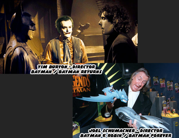
Bruce Timm was also gifted in the fact that he could direct in the style of a different artist. In the episode “Legends of the Dark Knight” from the New Batman Adventures he actually directed in three different styles. That of himself, that of Frank Miller from the Dark Knight Returns and of Richard Sprang who inspired the opening credits of the 1966 live action series. In the episode three kids, Matt, Carrie and Nick take turns telling a story about Batman. Each story is unique and matched perfectly with a particular art style. The sequences capture an era in the history of Batman. The boys are actually based on a young Bruce Timm and Paul Dini. They come across a fourth kid named Joel who happens to be trying out pink feather boa in front of a store called Shoemaker. He says some thinly-veiled homoerotic things about Batman. This was a jab at the live action movie director Joel Schumacher for his overly camp, overly glam and somewhat homosexual take in the Batman and Robin and Batman Forever films. Schumacher had never read the comics, had no knowledge of the character outside of the television series but was hired to make the films more mainstream. The studio was looking for a reason to increase licensing, where the real money of a film was made. He was asked to cram in as many gadgets and characters as possible because toys=sales. It was Schumacher’s decision to give the costumes of Batman and Robin nipples. To turn Bane into a brainless slave of Poison Ivy. To add wacky sound effects and visuals at every turn. He wanted to cast as many big-name actors as he could into the film. It didn’t matter if they were right for the part or if their characters were even remotely true to the comics.


There was a strong contrast with how well the Warner Bros. animated films were compared to the live action features (with the exception of the Chris Nolan Dark Knight Trilogy). The people working in animation knew the universe of the DC characters, respected the source material and were able to adapt individual comics, graphic novels and original screenplays into award winning cartoons. The people working in live action, for the most part, had little to no respect for the source material and tried to follow the popular trends when making decisions about a property. Warner Bros. animation would have been at a loss without Bruce Timm. He knew the importance of visual storytelling. He knew how to frame his scenes, how to choreograph his fights and how to design original heroes and villains when the time required. In art, in animation, you need a director that knows the importance of visual storytelling. Having a unique art style is not enough.


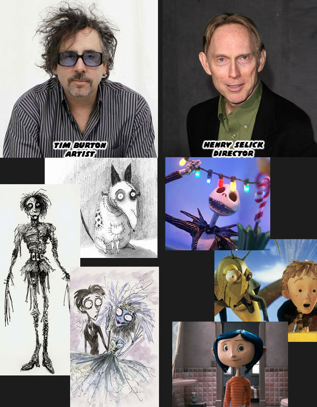
Think of the artist Tim Burton. He has a very strong aesthetic. His style, like those of the aforementioned Batman artists, is very unique. Like Bruce Timm he also came from an animation background. Burton loved to film his own stop-motion and live action projects. They all carried his own unique aesthetic. He designed and directed for the first and second live action Batman features in 1989 and 1992. They all had a strong vision and put forward unique takes on Batman and the villains, including the first black Harvey Dent (Two-Face) as played by Billy Dee William. Burton was familiar with the comics and characters and was able to adapt them to live action with his own unique spin. Warner Bros felt that they could make more money by hiring a big-name director and that was when they went after Schumacher. Burton went on to great commercial and critical success while the Schumacher films were panned by audiences and critics. Burton’s work on Edward Scissorhands, the cult film-turned stop-motion feature Frankenweenie, and the Corpse Bride were all memorable. Some would argue that his crown jewel was the film the Nightmare Before Christmas. Yet not many people realize that while Burton wrote the story and did the design work, it was actually directed by Henry Selick. Mr. Selick was also a master of visual storytelling. He was a director on par with Timm. He knew how to work with different types of artists, and different visual languages. He knew how to best frame the scenes and bring the artists intention to life. His directing on James and the Giant Peach for Disney and Coraline for Laika demonstrated his range.


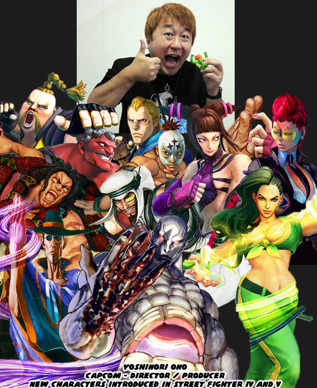
The reason that I bring up the importance of visual storytelling and directors is because they choose a lot of what ends up in the project. The same rules apply for fighting games. If you have a fighting game like Street Fighter IV and V where the new female characters were fairly well received but the majority of the new male characters seemed a little bit outlandish you might look at the director for answers. Yoshinori Ono, the most accessible and entertaining senior person at Capcom, has a unique background. His first eight credits with the studio in chronological order are: Sound Manager, Sound Producer, Opening FMV Sound Manager, Sound Producer, Publicist, Sound Design Coordinator, Sound Manager and Sound Producer. Mr. Ono has tremendous experience with sound but you start to wonder if an audio person rather than a visual arts person should be spearheading a game. He graduated to Assistant Producer and Producer on his next projects. In the next two games he is credited for visual work; CG Modeling and Character Design Director. The first fighting game he was a Producer for was Capcom Fighting Jam in 2004. Salvaging what was left of Capcom Fighting All Stars. Mr. Ono was the one that decided to turn a powerful young black fighter into a big fat white guy with Rufus. The other odd characters like Hakan, Necalli, and F.A.N.G. were his to approve to ask for a redesign. He couldn’t even manage to put a masked lucha libra character in the game without giving his moves silly Spanish names. Understanding the visual language was something that I think Mr. Ono lacked. He was passionate about the projects but made a few bad decisions because he didn’t truly understand all of the subtleties that went into the visual appeal of Street Fighter. That’s however my opinion. 


This is not a new observation. I’ve been against the tone of the new series while it was in development. I’ve been arguing about the direction of the game since 2008. I do it to remind Capcom that they could try harder that they could do more. They have made great characters out of questionable source material. They’ve also made some bad calls in the past 30 years. I’ve always been against the silly characters that Mr. Ono saw fit to introduce into the universe. I did give him credit for bringing back the series, for traveling the world promoting it, for getting the game outlets to start talking about it. He had faith in Street Fighter and the fighting game community when Capcom had given up. Mr. Ono has been a great ambassador for the brand. For that I am grateful. But remember that Rufus, Hakan and F.A.N.G. were put into the game on his watch, and often, at his insistence. I appreciate the man but I will never be content with his vision. It was possible to create a game on a property, in 3D, while still preserving the aesthetic of the designer. We’ll explore how in the next entry. As always if you enjoyed this blog and would like to sponsor me please visit my Patreon page and consider donating each month, even as little as $1 would help make better blogs and even podcasts!
follow the Street Writer on Patreon!

Sunday, November 13, 2016

Did Warner Bros Animation just give a nod to Street Fighter?

The good thing about being raised on a steady diet of comic books and cartoons is that you learn appreciate the best things in life. Those of us who remember the late '80s and '90s experienced the fighting game revolution as well. Kids that got a chance to live through that era were influenced by a lot of different things. Those kids eventually grew up to become artists, animators and producers in their own right. It looks like they did not forget the things that meant the most to them.


Warner Bros Animation has come up with a spiritual successor to The Justice League and Justice League Unlimited series. The new series is called Justice League Action and has a style that falls somewhere in between the original Teen Titans and JLU shows. A lot of classic voice actors have returned as well as rare DC heroes and villains. I'm glad that Plastic Man finally has a chance to shine but even more happy that they are keeping things light with the pop culture references.


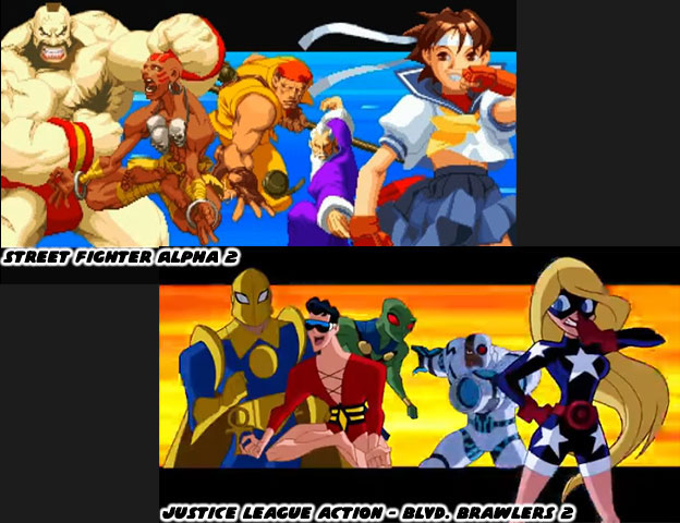
In one of the new episodes the Toy Man makes the Justice League fight against each other in a game called Blvd. Brawlers 2. It is beat-for-beat identical to the introduction of my personal favorite Street Fighter Alpha 2.


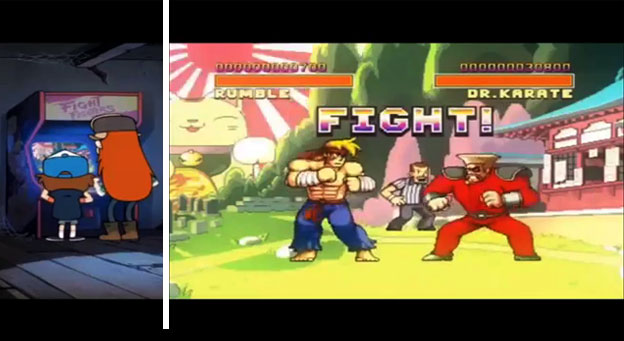
Warner Bros isn't the only studio that gets a shout out for the Street Fighter love. Remember that Disney's Gravity Falls had an episode that centered around "Fight Fighters" a Street Fighter II knock-off?


Are you happy that the JL series is giving the nod to Street Fighter instead of the Injustice games? What are your favorite pop culture Street Fighter nods? I'd like to read about them in the comments section. As always if you enjoyed this blog and would like to sponsor me please visit my Patreon page and consider donating each month, even as little as $1 would help make better blogs and even podcasts!
 follow the Street Writer on Patreon!

Sunday, May 10, 2015

Introducing Gigas, an original idea or more of the same? Let's take a look!

Fighting game fans were in for a shock when the fighters for Tekken 7 were unveiled. Familiar faces had returned along with a new young girl and handsome man which were part of the long-running Namco themes. What caught fans off guard was a massive bruiser that looked completely unlike anything featured previously in the series. The massive red humanoid, known only as Gigas, seemingly came out of nowhere and was poised to topple the most powerful fighters in the series.


Fans from the west were certain that the Japanese developers were catering to Western tastes. It seemed that many heroes and villains from Western video games, comics and movies were massive, muscle-bound monsters. It didn't take long for the comparisons between Gigas and his influences were being pointed out in online forums. An obvious similarity between Gigas and US designs could be seen with the Red Hulk, a villain from the popular Marvel Hulk comics and the mysterious Big Daddy from the BioShock series.


Yet there was several design cues that came from a different property also from the West. The Batman: Arkham series of games has featured several versions of the character known as Bane. The one featured specifically in Arkham Origins seemed the one directly responsible for the appearance of Gigas. There was the massive torso, large arms and tubes connected to the various major muscle groups on both characters. Yet there was much more to Bane than simply being a genetically-enhanced monster. When the character was introduced decades ago he was created to be the ultimate rival of the Batman. The man was a former prisoner-turned-assassin. He was subjected to various surgeries and treatments which enhanced his natural abilities. Batman was considered to be the supreme human physical specimen in DC comics. He was the perfect fighter and Bane was trained to match him in every mental and physical arena. The advantage that Bane had over Batman would be a drug called Venom which gave him a temporary increase in muscle mass, speed and dexterity. He used this to defeat Batman in unarmed combat and even break his back.


Sadly for Bane the writers and artists working at DC could not find a way to improve the character so they began changing his purpose as a worthy rival to the Bat. The character became over-reliant on Venom and in just about every subsequent appearance Batman would either cut off Bane's supply of Venom or cause him to overdose on it. Bane went from a cold, calculating villain to a musclebound stooge over a matter of years. The Joker would return to prominence as the main rival to Batman and Bane would be a supporting character in comic story arcs. The changes for the character were easy to see in animated form. When he first appeared in the Batman Animated Series he was very much rooted in his original comic book design. When he returned a few years later in the new Batman shows he would become more and more exaggerated and dark in his designs. One of his last designs made the character look more alien than human. Part of the reason for that was because the team of artists working on the character designs had previously worked on the Ben10 animated series. Ben10 if you may know was based on a kid that could change from a human into an alien host. The muscle on the new Bane were far larger than ever before, his strength increased tenfold and ability to withstand punishment increased. His skin had even been turned red. If these were not the roots of Gigas then I don't know what else to tell you.


The changes in the appearance of Bane were only part of the equation. Over the past few years many artists had been experimenting with how far they could push the designs of fan-favorite characters. The Joker had been a staple in the Batman comics for decades. His look had changed only slightly over the years but DC shook the community with a recent redesign. The character had cut off his own face and wore it as a mask to add a certain level of grotesque to his already macabre appearance. Many of the Batman villains received the same make-over. In order to give Bane a new look the artists working at DC and even at video game publisher Rocksteady had to push the envelope. As with any design the question remained; how far could the character be pushed and still retain the core elements? How would this character be identified by fans? It seemed that Bane could be made very grotesque and audiences would still recognize the character.


Yet even Bane was not an original idea. The man-becoming-a-monster was a staple of classical storytelling. It was not always a physical transformation to show a person becoming man, such as with Ahab in the story of Moby Dick. Other times a monster represented the mistakes of man, such as the creature created by Dr. Frankenstein. More than a century before Bane was created there was a character called Mr. Hyde. Robert Louis Stevenson (author of Treasure Island) wrote a novel on a scientist named Dr. Henry Jeckyll that used a chemical mixture to become a powerful monster known as Edward Hyde. The monster was more beast than man and terrorized the citizens of Victorian England. The characters of Jeckyll and Hyde would become synonymous with extreme personality changes and not necessarily physical changes.


The Hyde character would be revisited by Alan Moore in his graphic novel the League of Extraordinary Gentlemen. The story would be turned to film and Hyde would get yet another on-screen interpretation. In order to create a monster even more terrifying than Hyde the movie introduced Dante, a soldier that overdosed on the secret formula. The end result was an extremely grotesque and disproportionate man. He hardly looked human at all and could be considered one of the first 3D representations of the extreme comic book proportions that artists were placing on their figures. Yet to say that Hyde begat Bane begat Gigas in Tekken would be an insult to the Japanese designers.

Game designers in Japan as well as artists and illustrators had been creating monstrous characters for decades. They had been working on absurdly disproportionate muscled figures for as long, if not longer, than Western artists had. In fighting games there were many presidencies set by Japanese studios before Gigas had even been dreamed of. Capcom, SNK, Arc System works and various developers had been pushing the envelope on the "strong man" character trope. To help the characters stand out the artists often gave them large shoulders and thick arms while keeping their legs thin and heads small. This visual made many of the bruisers memorable.


The proportions featured on Gigas were not as extreme as they were on characters like Potemkin or Abubo but they were close. What Gigas had going in his favor was that he was one of the few Japanese characters designed in 3D with the exaggerated aesthetic. Because Bane had been presented in 3D previously most audiences simply assumed that the designers at Namco had simply poached the style. This was far from the truth. Both 2D and 3D fighting games from Japan had characters like Gigas for decades. Monsters and demons of the Gigas scale had already prepared audiences for what was to come. One of the first 3D monsters that predated Gigas was also from Japanese designers. Gandara appeared in Samurai Showdown / Samurai Spirits 64. The title from 1997 was not well received by audiences. It lacked polished control and featured crude graphics. Something that was well done however were the character designs, especially the demonic Gandara.


Gandara lacked the tubes and mad science theme of Bane, but was still bound in service. It was not technology but rather magic that kept Gandara enslaved. The tortured appearance was a bold artistic statement and made Gandara one of the most memorable fighting game designs of all time. Shifting the focus back on Gigas though we should note that Namco had actually set a precedence for massive fighters ever since the very first Tekken was released in 1994. The "strong" type fighter in the original game was a cyborg named Jack. The character looked like an army soldier, with a square blonde mohawk and a massive torso. As the series evolved so too did the designs for Jack. The skin would be replaced by metal and even hexagonal armor. Although the character developed a personality the Jack models would become disposable within the canon of the Tekken series. The character was bound in servitude to the Mishima Zaibatsu. The private military conglomerate run by Heihachi Mishima. Any version of Jack that demonstrated self consciousness would be destroyed by the company. It made Jack a likable cyborg especially as he became a pacifist. There was an earlier build of Jack that was also in the original Tekken tournament, known as P-Jack or Prototype Jack. This all-metal version of Jack wore sunglasses and was absolutely loyal to his programming. It made the character more dangerous in canon.


The robots of Tekken continuity were considered some of the strongest fighters in the series. The proportions of each version of Jack were similar to those of Gigas. But there was a missing-link of sorts. An MMA brute named Craig Marduk was introduced in Tekken 4. The seven-foot Australian was a champion fighter and an absolute genetic freak. He could out-muscle his opponents easily but was also a well-rounded technician in the ring. He was as close to being a Bane-type character minus the Venom. Marduk could go toe-to-toe with the Jack robots and just about any other character in the series. I would argue that Gigas was a mix in between Jack and Marduk. Whomever invented this fighter wanted the best of the physical abilities of Marduk but with the programmable loyalty of P-Jack. I believe Gigas is an entirely new weapon being developed by the Mishima Zaibatsu. The company has undoubtedly learned from their genetic experimentations. Many of the Tekken Tournaments are a front for the company. The plot of the games involve genetic manipulation, stolen DNA and cybernetic enhancements to soldiers and assassins. The characters Yoshimitsu, Anna and Nina Williams and Brian Fury have a mix of genetic manipulation if not all-out cybernetic enhancements. These figures were created to lead robots into battle, if not to act as a fail-safe in shutting down the machines. As impressive as Jack and P-Jack are they are far from being the biggest robot bruisers in the series. That honor would belong to NANCY-MI847J, a robot as large as a trailer truck.


Gigas could be deployed where the Robot NANCY would be a target to missile launchers. With the ability of some reasoning Gigas could also replace the faulty logic of the Jack models. It is the science-fiction that the Tekken series adheres to that I find most interesting. The teams working at Namco are intimately aware of how each game connects to a bigger storyline. They also know that the continuity of one series often marries into the canon of a different title. The Ridge Racer racing game, Tekken fighting game and Ace Combat fighter jet titles are all part of the same universe. The technology developed by one fictional conglomerate in the universe will turn up again and again and even become refined in different games. One of the more interesting features of Gigas is the helmet.


Cybernetic eyes and helmets had been featured in the design of the cyborg ninja Yoshimitsu. The multiple cameras where the eyes should be act almost like spider-eyes. They allow Yoshimitsu and in this case Gigas to have a greater view range than regular human eyes. The helmet worn by Gigas is a bit different than the ninja however. The hexagonal series of cameras are reminiscent of the COFFIN interface from the Ace Combat series. In the most advanced fighter jets in the series the pilot can see a full 360 degrees around the plane without ever having to turn their head. Cameras replace the open canopy of traditional fighter jets and feed the visuals directly to the mind of the pilot. In the case of Gigas he can see above, to the side and even almost all the way behind without having to turn his head. This makes the genetic creation impossible to sneak up on and even more dangerous in unarmed combat. Tekken is an amazing series from a design standpoint because it has humans fighting robots, but it doesn't end there. Monsters and even Angels and Devils could be seen as genetic anomalies rather than supernatural creatures thanks to the science in the series. I can't wait to see how Gigas develops and what his role will be in the greater scheme of things. What do you think about his design? If you would like to sponsor me please visit my Patreon page and consider donating each month, even as little as $1 would help make better blogs and even podcasts!
follow the Street Writer on Patreon!