Showing posts with label sprites. Show all posts

Friday, January 12, 2024

Korean fantasy fighting game Chosun Musa is not cancelled!

Friends in the fighting game community, I have wonderful news! If you are a fan of fantasy, historical or sword fighting games then you might remember I wrote about Chosun Musa previously. I had been keeping tabs on the Korean game since 2007, and couldn’t find any news on it recently. As it turns out the game was not cancelled. As it is a small independent studio working on it the game was simply delayed. But don’t take my word for it. Please read below from the game creator.

“Hello, I am Iron Witch, the person who created the fighting game Chosun Musa (2008) based on my fan project Mortal Kombat Zero in 2007. It's an honor that you still remember the game title I'm working on! 

To be brief, unlike the content of your article, I am still working on the Chosun Musa project. I recently revealed details on two characters that can be found in Chosun Musa (Refined) on ChosunMusa_US in 2022 for testing purposes. As stated in "The Document of Chosun Musa" on that Twitter page, Chosun Musa (Refined) is based on HD sprites, and the character accessories and weaponry will be pre-rendered as detailed 3D models. 

Also, I recently purchased the trademark Chosun Musa, and domain name (chosunmusa.com) for Chosun Musa in Korea. Although the development process will take a long time because the game's production direction is focused on high-resolution pixel art and quality, I have preemptively purchased the game's IP name and domain name to minimize disputes from others. 

Unfortunately, at present, I am working on a side project for Chosun Musa, a fan-created project called Darkstalkers Re-Creation. In this project, I aim to create two illustrations: the original costumes of the characters and alternative costumes that I created myself. I believe that Darkstalkers Re-Creation will have a positive impact on improving my creative skills as I am currently producing Chosun Musa.”

This is wonderful news for the fighting game community, both for the Chosun Musa, and also for Darkstalkers Re-Creation. I can’t wait to see more news as both get closer to publication. A big thank you to Iron Witch for reaching out, and letting us know that the game is still in development. If you are just getting into fantasy sword fighters I wrote a bit about them on the blog. Please check it out. Golden Axe the Duel Dragon's Heaven Warzard Asura Blade Sword of Dynasty Asura Buster Eternal Warriors Chaos Breaker - Dark Awake Battle Fantasia As always if you would like to sponsor me please visit my Patreon page and consider donating each month, even as little as $1 would help make better blogs and even podcasts!
follow the Street Writer on Patreon!

Friday, May 12, 2017

The aesthetic versus graphics debate, part 2...

A good portion of our entertainment media is visually based. Video games succeed when they have a strong visual style to go with a solid control scheme and innovative game play. In the previous blogs I have talked about the importance of having a good aesthetic. It was essentially more important than having great graphics. The demo for Fighting EX Layer reminded audiences how similar the graphics in most fighting games were today. When Street Fighter EX debuted almost 20 years ago it was visually much different than the sprite-based fighting games from Capcom. This helped set it apart from the traditional fighters. The challenge for modern game developers was whether or not they could the match the aesthetic of a lead artist or if indeed all of the aesthetics had to look the same because of the modern hardware. When graphics technology was sprite-based it was easy to draw characters in the styles of a particular artist. Once the graphics engines moved to 3D it became harder to preserve the aesthetic of hand-drawn art. SNK made a very ambitious go at it when the created Dot Art graphics for the King of Fighters XII in 2009. The studio created 3D models of each character and then used cel-shading technology to outline the figure and create general points of light and shadow. Artists then went in and redrew the models and painted in the gradients.
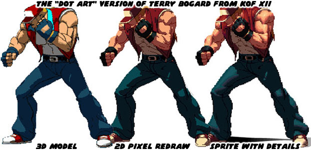

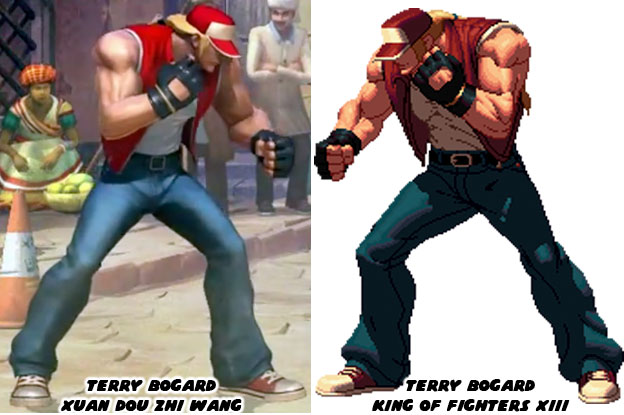
The end result was brilliant but most studios could not afford to spend a good chunk of their budget creating sprites. The Dot Art process was a slow, expensive and time-consuming process. Studios had to balance the game and fine tune the controls as well. There was only so much money to go around, especially for a genre that many considered had peaked in the ‘90s. One of the largest Chinese developers, Tencent, licensed a few of the SNK characters for their game Xuan Dot Zhi Wang in 2015. They created 3D models and used textures and lighting effects to make them appear as close to the Dot Art versions as possible. The end result was amazing. The Chinese studio demonstrated that 3D games could not only play like their 2D counterparts, they could also look like them as well.
 

Directors working on fighting games, or any game in general have to find a visual balance between what the art director wants and what the audience expects. Each artist after all has their own way of illustrating. They each have their own sense of shape, scale, proportion and movement. How they frame the action, how they color the world. All of these things are done in concept art even before the first line of code is written. The best directors for animation have historically been people that understand the visual language. Stop for a moment and consider how different artists interpret Batman from the DC comics.
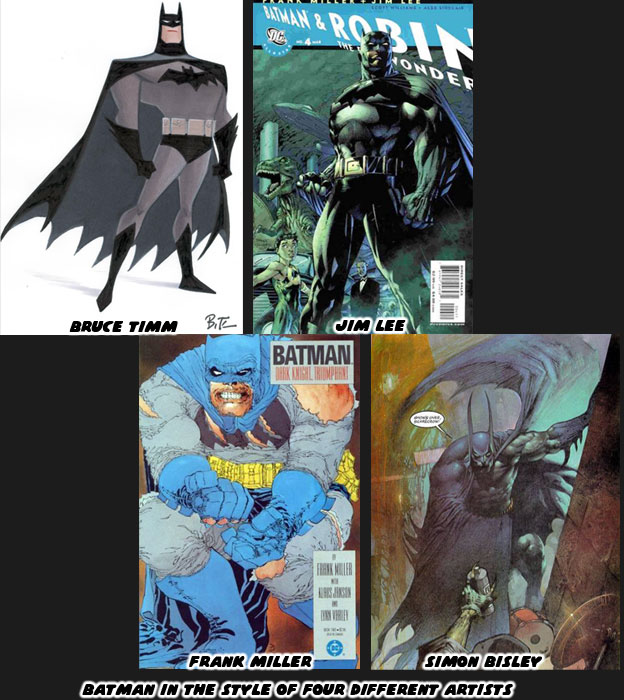
 

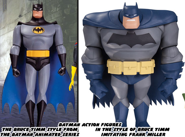
Bruce Timm for example has an extensive amount of history with character design and animation. He reduces the lines in his illustrations to the bare minimum. His shapes are clean and easy to read and perfect for cartoons. Jim Lee on the other hand is from the world of comic books. He had a unique style that made him a breakout artist on the X-Men comics in the ‘90s. Now he is in charge of comics at DC. His trademark style, made up of tight lines is easy to identify. Frank Miller is a screenwriter and artist that has experience in storyboarding. His style is unique. His lines are jagged and thick, they make his characters look like they are wearing crumpled paper bags. He likes to create panels with very strong shapes and poses when he works on Batman. Simon Bisley is in his own world. He paints his panels and uses very exaggerated shapes and proportions. His panels bleed into each other and come off as dream-like. It is easy to identify each of the artists based on their own style. It is important for the comic book industry to have a diversity of styles. After all who would like to read a comic book if they were all written alike and drawn alike? Of these artists the one that has proven to be the most influential for the industry has been Bruce Timm.
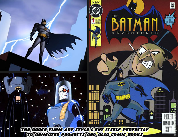
   

Bruce and writer Paul Dini were responsible for the popular Batman the Animated Series, which debuted in 1992. The duo went on to help shape the DC animated universe for over the next 20 years. The Timm-style of art was very flexible. It worked well in animation and in comic books. Not every comic book artist was allowed to show off their trademark style. Some were hired for their ability to draw in the style of another artist. Ty Templeton for example did a number of the Batman Adventures comic books and was able to capture the style of the animated show. Imagine Templeton as a member of the DC art team. They each had their own style but when called upon could help fill in for their lead artist or designer. Similar things applied to the artists and freelancers working at Capcom, SNK or other studios. The Bengus and Akiman styles were very different but whichever person set the style guide for a particular Street Fighter everyone else in the team followed it to the letter. This ensured consistency throughout the project. The magic of having an animation director like Bruce Timm was how well his style adapted across platforms. His shape and proportion worked as well in 3D as they did in 2D.
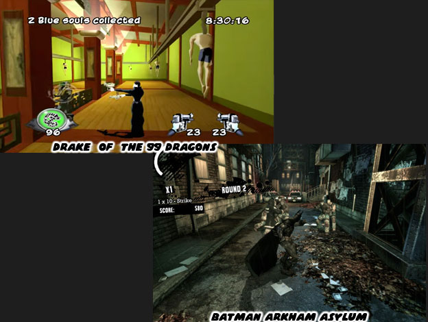
   

Here was the thing, a studio didn’t even have to work on a Batman game in order to take advantage of Mr. Timm’s aesthetic. Take the game Drake of the 99 Dragons for example. Developed by Idol FX in 2003, the studio created a 3rd person action game featuring an immortal yakuza hitman. The company made use of cel-shading technology to make the graphics appear more two-dimensional. The game was remembered mostly because it was bad. The control was bad, the animation less than stellar, the game play a bit redundant and the overall experience was poor. The reason it stood out were because of the aesthetics. It looked like an episode of the Batman Adventures come to life. It was and remains the best example of how the Bruce Timm aesthetic really compliments the look of an action project. Yet the Timm style didn’t always have to apply. For example in Batman: Arkham Asylum (2009) the developers at Rocksteady Studios were trying to create a world that had pulled its inspiration from the realism of the Chris Nolan Batman film, as well as the serious Jim Lee reboot of the Batman comics. That game succeeded not so much for its graphics, the Unreal Engine 3 that it was using were comparable to the graphics in just about every other 3D game. It was the control, animation and ease of play that really put audiences in the role of the Batman. I’m certain that if Drake of the 99 Dragons had the control of Arkham Asylum it would have become a franchise title. 

Bruce Timm was also gifted in the fact that he could direct in the style of a different artist. In the episode “Legends of the Dark Knight” from the New Batman Adventures he actually directed in three different styles. That of himself, that of Frank Miller from the Dark Knight Returns and of Richard Sprang who inspired the opening credits of the 1966 live action series. In the episode three kids, Matt, Carrie and Nick take turns telling a story about Batman. Each story is unique and matched perfectly with a particular art style. The sequences capture an era in the history of Batman. The boys are actually based on a young Bruce Timm and Paul Dini. They come across a fourth kid named Joel who happens to be trying out pink feather boa in front of a store called Shoemaker. He says some thinly-veiled homoerotic things about Batman. This was a jab at the live action movie director Joel Schumacher for his overly camp, overly glam and somewhat homosexual take in the Batman and Robin and Batman Forever films. Schumacher had never read the comics, had no knowledge of the character outside of the television series but was hired to make the films more mainstream. The studio was looking for a reason to increase licensing, where the real money of a film was made. He was asked to cram in as many gadgets and characters as possible because toys=sales. It was Schumacher’s decision to give the costumes of Batman and Robin nipples. To turn Bane into a brainless slave of Poison Ivy. To add wacky sound effects and visuals at every turn. He wanted to cast as many big-name actors as he could into the film. It didn’t matter if they were right for the part or if their characters were even remotely true to the comics.
 

There was a strong contrast with how well the Warner Bros. animated films were compared to the live action features (with the exception of the Chris Nolan Dark Knight Trilogy). The people working in animation knew the universe of the DC characters, respected the source material and were able to adapt individual comics, graphic novels and original screenplays into award winning cartoons. The people working in live action, for the most part, had little to no respect for the source material and tried to follow the popular trends when making decisions about a property. Warner Bros. animation would have been at a loss without Bruce Timm. He knew the importance of visual storytelling. He knew how to frame his scenes, how to choreograph his fights and how to design original heroes and villains when the time required. In art, in animation, you need a director that knows the importance of visual storytelling. Having a unique art style is not enough.
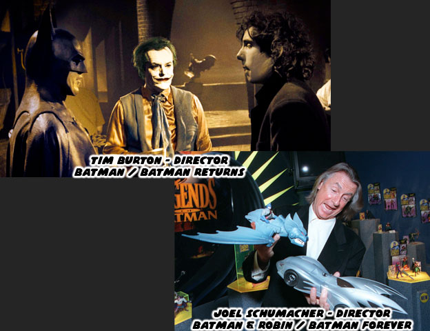
 

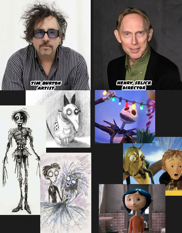
Think of the artist Tim Burton. He has a very strong aesthetic. His style, like those of the aforementioned Batman artists, is very unique. Like Bruce Timm he also came from an animation background. Burton loved to film his own stop-motion and live action projects. They all carried his own unique aesthetic. He designed and directed for the first and second live action Batman features in 1989 and 1992. They all had a strong vision and put forward unique takes on Batman and the villains, including the first black Harvey Dent (Two-Face) as played by Billy Dee William. Burton was familiar with the comics and characters and was able to adapt them to live action with his own unique spin. Warner Bros felt that they could make more money by hiring a big-name director and that was when they went after Schumacher. Burton went on to great commercial and critical success while the Schumacher films were panned by audiences and critics. Burton’s work on Edward Scissorhands, the cult film-turned stop-motion feature Frankenweenie, and the Corpse Bride were all memorable. Some would argue that his crown jewel was the film the Nightmare Before Christmas. Yet not many people realize that while Burton wrote the story and did the design work, it was actually directed by Henry Selick. Mr. Selick was also a master of visual storytelling. He was a director on par with Timm. He knew how to work with different types of artists, and different visual languages. He knew how to best frame the scenes and bring the artists intention to life. His directing on James and the Giant Peach for Disney and Coraline for Laika demonstrated his range.
   

The reason that I bring up the importance of visual storytelling and directors is because they choose a lot of what ends up in the project. The same rules apply for fighting games. If you have a fighting game like Street Fighter IV and V where the new female characters were fairly well received but the majority of the new male characters seemed a little bit outlandish you might look at the director for answers. Yoshinori Ono, the most accessible and entertaining senior person at Capcom, has a unique background. His first eight credits with the studio in chronological order are: Sound Manager, Sound Producer, Opening FMV Sound Manager, Sound Producer, Publicist, Sound Design Coordinator, Sound Manager and Sound Producer. Mr. Ono has tremendous experience with sound but you start to wonder if an audio person rather than a visual arts person should be spearheading a game. He graduated to Assistant Producer and Producer on his next projects. In the next two games he is credited for visual work; CG Modeling and Character Design Director. The first fighting game he was a Producer for was Capcom Fighting Jam in 2004. Salvaging what was left of Capcom Fighting All Stars. Mr. Ono was the one that decided to turn a powerful young black fighter into a big fat white guy with Rufus. The other odd characters like Hakan, Necalli, and F.A.N.G. were his to approve to ask for a redesign. He couldn’t even manage to put a masked lucha libra character in the game without giving his moves silly Spanish names. Understanding the visual language was something that I think Mr. Ono lacked. He was passionate about the projects but made a few bad decisions because he didn’t truly understand all of the subtleties that went into the visual appeal of Street Fighter. That’s however my opinion. 
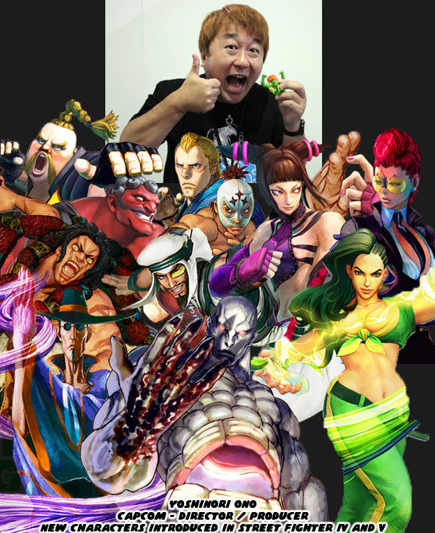
 

This is not a new observation. I’ve been against the tone of the new series while it was in development. I’ve been arguing about the direction of the game since 2008. I do it to remind Capcom that they could try harder that they could do more. They have made great characters out of questionable source material. They’ve also made some bad calls in the past 30 years. I’ve always been against the silly characters that Mr. Ono saw fit to introduce into the universe. I did give him credit for bringing back the series, for traveling the world promoting it, for getting the game outlets to start talking about it. He had faith in Street Fighter and the fighting game community when Capcom had given up. Mr. Ono has been a great ambassador for the brand. For that I am grateful. But remember that Rufus, Hakan and F.A.N.G. were put into the game on his watch, and often, at his insistence. I appreciate the man but I will never be content with his vision. It was possible to create a game on a property, in 3D, while still preserving the aesthetic of the designer. We’ll explore how in the next entry. As always if you enjoyed this blog and would like to sponsor me please visit my Patreon page and consider donating each month, even as little as $1 would help make better blogs and even podcasts!


follow the Street Writer on Patreon!

Wednesday, May 10, 2017

The aesthetic versus graphics debate, part 1...

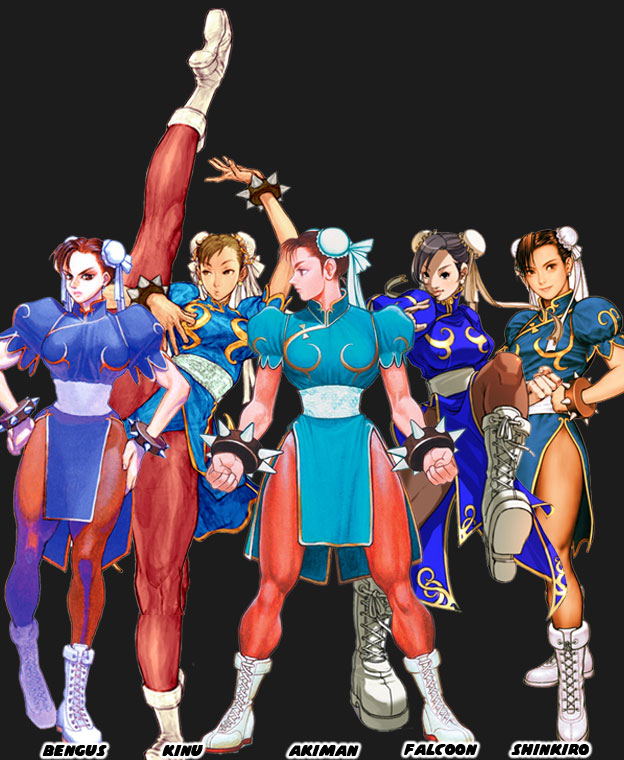
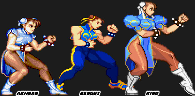
Aesthetics were critically important in fighting games. They were the visual cues that set each company apart. In the previous blog I showed that a number of games and studios were developing on the same graphics engine. This made the titles all look eerily similar whether they were made in Japan, the US or the UK. A great fighting game had to set itself apart from the competition. The longest surviving studios knew this. It was the reason why many companies hired teams of unique artists. Look very carefully at the way different artists, from within Capcom and outsiders, presented Chun-Li.


The costume was the same but the style varied widely from artist to artist. Perhaps one artist drew her make up and the other with none. Style also trickled down to the details. Things like how big the spikes on the bracelet should be, how tall her boots were, how slender Chun-Li’s waist was or how wide her thighs should be. All of these things depended on the artist. Once the artist finalized the designs they created turnarounds so they could see the character from all sides. These turnarounds were used for the official character guides. In this way every other artist and animator at the studio could be consistent. Back when fighting games were in 2D is was very easy to capture an artists’ individual style.


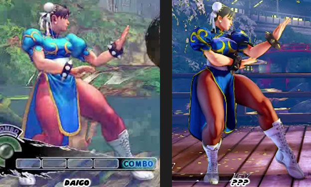
Once the game engines started going into 3D then things got much harder. The proportions used in 2D wouldn’t necessarily work in 3D without making the characters appear grossly disproportionate. This became more obvious as the entire Street Fighter cast was more swollen in SF IV. Suddenly Chun-Li looked like a tank. She was almost as wide as she was tall. This mass made sense for the burly Zangief but not for Chun-Li. Her increase in size didn’t really go with her lighting quick moves and it broke the player’s suspension of disbelief. This was especially obvious with the character Rufus, a man that was extremely fat yet moved as fast as Chun-Li. Capcom tried to pay more attention to aesthetics in Street Fighter V. They listened to the feedback that they got from the community and they slimmed down the cast. There was a difference in how Daigo Ikeno’s Chun-Li looked in SFIV and how the new version looked in SFV. Sorry but the name of the new lead artist escapes me. Capcom was moving in the right direction but I was surprised that they didn’t learn from the past a little bit sooner.


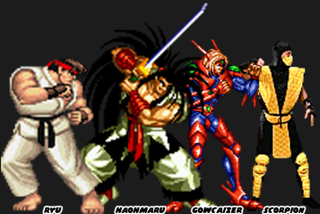
In the first wave of fighting games, during the early to mid-1990s, each studio had their own unique style. The games that were lost to time, titles like Fighters History and Martial Masters, copied the Street Fighter II aesthetic but failed to innovate the format. They didn’t do much in terms of new control schemes, moves or even character origins. Other studios like SNK and Midway learned that in order to stand out each game had to have a distinct visual style. All of the studios were using similar sprite technology but their aesthetics varied widely. Compare how different the lead characters were in Street Fighter II, Samurai Showdown, Voltage Fighter Gowcaizer and Mortal Kombat. The games were released within five years yet were vastly different in terms of aesthetics. Many fans simply commented on how great the graphics looked between games even if they were all built with comparable hardware and software.


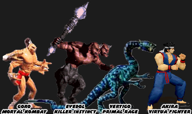
As technology evolved so too did the techniques used to build a fighter. Midway and Atari experimented with stop motion figures to create the monsters featured in Mortal Kombad and Primal Rage respectively. Rare began creating sprites out of high-end CGI workstations for Killer Instinct. Aesthetically speaking all of these games were very diverse too. Then Sega planted the seeds for the future of the genre, and the industry itself. They used a polygon-based graphics engine. It didn’t have the detailed backgrounds or high speed game play of the 2D titles but it did have an entirely new aesthetic. Clean, simple shapes, creating actual 3D objects that had weight, dimension and shape.


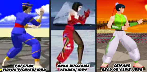
In the mid-90s other studios saw the potential of 3D engines. The technology could be applied in multiple formats and genres. Space shooters, racing games, RPGs, action titles and even platformers could all be done in 3D. When the studios began developing 3D fighting games it was as if they had reset the clock on aesthetics. Every studio was so focused on learning the new technology that they did not bother to push the envelope on aesthetics. The original 2D fighting games all stuck to the tropes. A karate master, a kung fu practitioner, a boxer and wrestler could all be guaranteed to appear in the early games. They were all drawn in a style that fell somewhere in between a Japanese animé or manga. The exact same tropes happened in 3D. There were some minor differences but think about how Chun-Li set the standard for the Chinese fighter. Pai Chan (and her father Lau Chan) was the first Chinese polygon star in Sega’s Virtua Fighter (1993). Her color scheme of blue with gold trim was very much based on Chun-Li. This set the template for the Chinese dress on Tekken’s Anna Williams (Namco 1994) and Dead or Alive’s Leifang (Tecmo 1996). The graphics were cutting edge at the time yet the aesthetics in the games were almost universal.


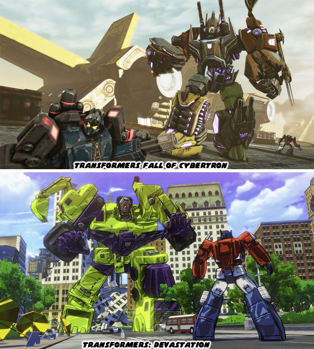
Think about how the majority of the fighting games today are built on the same graphics engine. Think about how the majority are using the same aesthetic. From Street Fighter IV to Injustice, every modern title was dark and gritty. It was as if the studios forgot everything they had learned in the ‘90s. How they forgot the importance of having a strong aesthetic. It stands to reason however, many of the new designers and developers were kids when the first fighting game boom happened. They are now programmers, artists and animators in their own right. They are recreating all the things they loved about their favorite games. This is where I present a challenge to them. Do not recreate what was great. Do not settle for what the graphics standards are now but instead carve out an entirely new path. Take a creative risk. Change up the format without erasing the original formula. Fighting games, and video games in general, are very much a visually based form of storytelling. Just because you are given the same tools as your contemporaries it doesn’t mean your games have to all look the same. Think about what makes an animé unique when compared to a CGI film. Think about the Transformer’s series of the ‘80s and the live action Transformers film of today. The reason that fans remembered the original was because of how unique it looked when compared to the western cartoons. Thirty years later when a western and eastern studio developed a 3D version of the franchise there was a striking difference between the aesthetic styles. One managed to capture the look of the animated series while the other looked like every other 3rd person shooter.


Be bold with your designs! Regardless of what surveys tell you simply know that the fans are there. They are waiting for something to change their perception. The market will follow those that take a chance. Street Fighter II was only the beginning of the revolution. Mortal Kombat, Samurai Shodown, Primal Rage, King of Fighters and Killer Instinct were some of the biggest risk takers. Their gambles didn’t always pay off but they gave audiences a reason to return. In doing so the market grew and grew. More people were playing fighting games because of the diversity in subjects and aesthetics. A good director knows when to push the envelope, when to challenge their designers. They know what things the audience expects and doesn’t. In the next blog we will look at the impact a good director and a strong aesthetic can have on the industry. As always if you enjoyed this blog and would like to sponsor me please visit my Patreon page and consider donating each month, even as little as $1 would help make better blogs and even podcasts!

 follow the Street Writer on Patreon!

Thursday, September 11, 2014

Copycat Culture, part 4...

Last year Tencent turned the fighting game community upside down. Benimaru Nikaido and Terry Bogard, two star characters from the King of Fighters series appeared in Xuan Dou Zhi Wang / King of Combat. Up until that point the game was considered a wholesale rip-off of the KOF franchise by the fighting game community. Many of the characters looked and played like those from SNK games. Even the visual style, the aesthetics of the game, looked more like a KOF title than any other fighting game franchise. Whether Tencent paid an outrageous amount to get the two characters to appear in their game or whether SNK was building bridges to adapt King of Combat to Japan or see an exclusive KOF title made for China was not known. The developers at Tencent had done an amazing job of creating 3D models of Terry and Benimaru based on their sprites featured in KOF XIII. Whether this was because SNK shared 3D assets with the Chinese studio or whether they had done this from scratch was not known. Of course based on the accuracy of the models I would lean towards SNK sharing those characters with the Chinese. The look of the sprites in KOF XII and KOF XIII was very distinct. They were some of the highest quality figures ever featured in any 2D fighting game.


SNK wanted the visuals on their series to set a standard that could not be topped by their rivals. They had been rehashing sprites through most of the '90s. There was little progress made with the technology from the first KOF game in 1994 all the way through KOX XI in 2005. The majority of those games simply added an extra frame of animation to the sprites and added more intricate backgrounds to the stages. Players could tell that the graphics were getting very stale. When the company began planning out KOF XII they knew their graphics system was in dire need of an overhaul. So they started from scratch using a patented Dot Art technique. The system of creating the sprites and animations that had been employed by SNK, Capcom and their peers was outdated. It took a long time to correct errors in the game, especially during the crucial balancing process and redrawing sprites was slow and time consuming. For KOF XII the studio built a 3D engine to help with balancing the fighting engine and 3D models of many of the main characters for artists to work from. The programmers could balance the game on the fly and decide which animations needed to be recreated in sprite form. The studio then rotoscoped or traced the 3D models by hand and created an entirely new sprite library. The end result were sprites that were more colorful, more detailed and leagues ahead of the competition.


Tencent had managed to do a very good job at recreating the visual style of the Dot Art characters. Through careful use of textures, lighting and modeling the company was able to preserve the 2D aesthetic that SNK had worked so hard to achieve. The game community wondered who was ultimately responsible for creating the thousands of frames of animation required for the characters post KOF XII. The level of quality that SNK achieved was amazing but how was the company able to turn around those games while working on other titles at the same time? The hours that would be required to draw each and every character was astonishing. There seemed no way that the company could keep the franchise on any sort of timetable without help. Many wondered if the studio had outsourced their workload to another studio, perhaps another company in Japan or even China which would have been more cost effective.


Each character in KOF XII and XIII had hundreds of frames of animation associated with them. This was much greater than any other fighting game ever released. Most studios pushed a few dozen frames of animation for any special attack, SNK surpassed that count just having a character perform a standing animation. This achievement was not the only thing that SNK could show off. The sprites in their engines could be customized somewhat by players. The clothing, skin and hair colors could all be adjusted. The hue, saturation and brightness of the characters could be changed making each character look very different than the base model. SNK also had a rendering engine that illuminated sprites differently between levels. It could make the sprites appear as if they were fighting in the shade, direct sunlight or even at dusk. These were some of the rendering effects that Shanda was trying to achieve in KOF World before it was cancelled. Many wondered if Shanda was the studio that SNK had outsourced their sprite creation to. All of the features in KOF World seemed to be based on an engine that was more advanced than that used in the fighting games. Of course once the project was cancelled few outside of the company knew what became of the developers or assets they had been working with. That was of course until Tencent announced that Xuan Dou Zhi Wang would feature one of SNK's biggest stars.


SNK World began development in 2009 with Shanda and SNK Playmore as partners. The game was cancelled in 2011 much to the chagrin on the fighting community. Xuan Dou Zhi Wang appeared at the end of 2013 and was developed by Jade studio, one of the four main developers under Tencent. The space of time between the end of KOF World and the beta of King of Combat was enough to develop a solid fighting game. Especially one that had all of the insight and nuances from a King of Fighters release. It Tencent was not using talent they had poached from Shanda then they certainly did a good job of copying everything they were working on. The lack of originality from Tencent would be called out again and again by the gaming community. Yet it would also serve to show how selective that community was when it came to calling out western studios for doing the same thing. It can all be boiled down to a fighting panda bear. The next blog will show why. If you would like to sponsor me please visit my Patreon page and consider donating each month, even as little as $1 would help make better blogs and even podcasts!
follow the Street Writer on Patreon!