Monday, February 19, 2018
The Giant Monster Series, part 7...

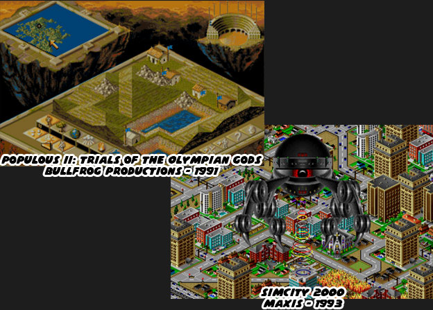
The giant monster games mentioned thus far had a common theme. They were all about fighting against the creatures or simply trying to survive against them. The draw for gamers was the fear and excitement that they felt battling them. There was a different type of emotional draw that could only be had by playing as the giant monster. In order to do this the game developers had to create new ways to experience the game. Giant monsters were not human and did not have the same limitations as them. The creatures could be as benevolent or malevolent as the designers allowed. In some genres the giant monster was considered a god simulation. Spore, Sim City and the classic Populous were examples of the god simulation or life simulation games.

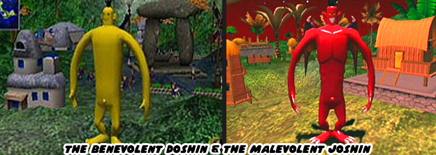
Players assumed the role of an invisible creator and could build life and architecture from the microscopic to the a global scale. To make things interesting players could trigger catastrophic events, or learn how to deal with them. Floods, alien invasions, giant lizard attacks and earthquakes were among the more unique game play elements. The invisible forces could build or destroy an entire civilization and because they could they would sometimes be worshiped by the in game characters. Such was the case for Doshin the Giant, a 1999 classic Nintendo Gamecube. Doshin was different from all the other simulation games because the character and his actions were not invisible. Players assumed the role of Doshin and tried to help the natives on the island of Barudo. The banana-colored Doshin could help shape the land for villagers, aid in the recovery from natural disasters and make their lives a little easier. As such he was asked to help unite the four tribes through his powers. The more he did for the islanders the larger and more powerful he became. Players could also turn on the villagers and become a destructive giant, Doshin would turn red and grow bat wings. He was known then as Joshin. In other simulation games players could become more powerful, only they never saw an on screen persona that represented themselves.

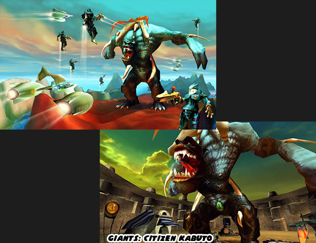
In 2001 Planet Moon Studios released a title whose plot was comparable to Doshin but whose gameplay was completely different. Giants: Citizen Kabuto was set on an island as well except this piece of land was traveling through space. On it three different races were battling for supremacy. Two of the races, the Meccaryns and Sea Reapers fought with weapons and magic respectively. Players could play as either of those races in a third-person perspective. The third race consisted of a single creature, a giant name Kabuto. Having control over Kabuto was a powerful contrast to the other races. The game played similar to other third person shooters except for Kabuto. The character towered over entire units and plowed though their ranks with ease. Kabuto did not have any weapons but instead relied on wrestling moves to damage opponents and their bases. The sense of power generated by Kabuto was great. When he ran he knocked over trees with ease. The other races could get flattened like insects every time he swung his massive arms. The game play was a stark contrast to Doshin, whose slow pace and friendly atmosphere felt more childlike and innocent. Apparently there was a difference between the video game gods.

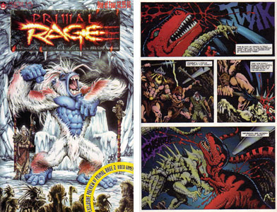
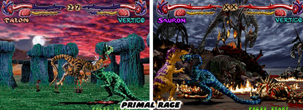
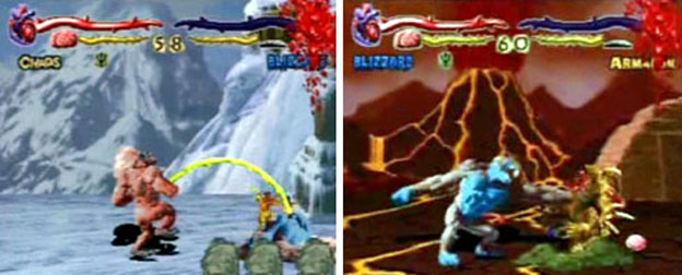
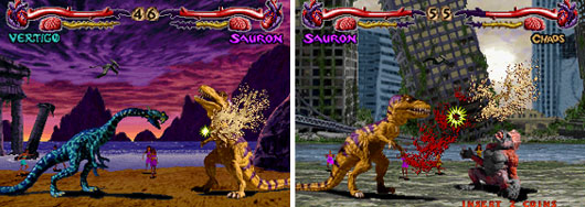
A third type of giant monster god was heating up the charts in 1994. Atari used the popularity of the fighting game as the basis for Primal Rage. The game was set in a dystopian future where giant creatures were battling for control of the planet. Each of the Primal Rage characters was worshipped as a god; the god of life, the god of virtue, the god of decay, the god insanity, etc. The monsters created for the game took a page from the oldest of the giant monster heroes. Every character featured in the game was created from a clay, rubber and fur armature just like the 1933 King Kong model. The animators used similar stop-motion techniques to create the frames for the game. Instead of posting those frames to film they were digitized to video and sprites were created for the programmers to use. Model backgrounds were composited over digital paintings to create the levels. Actors in caveman costumes were also recorded to create the people worshipping the monsters on each level. These tiny humans would follow their god from level to level, growing in number as the player progressed. The monsters could snatch a human from the background and eat them for a health bonus.

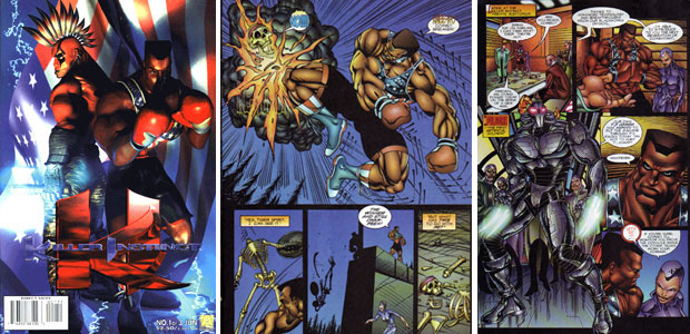
The Primal Rage monsters blew the doors off the fighting genre. Up until then fighting games featured human-sized characters with traditional or fictional martial arts moves. The Primal Rage avatars could have easily snacked on the fighters from other games. When they battled they shook the ground and created natural disasters. The developers experimented with command inputs. Like Mortal Kombat (1992) and Killer Instinct (1994), the studios were trying to create controls that differed from the six button and joystick commands that Capcom had popularized in the Street Fighter series. For Primal Rage special attacks were activated when the player released the buttons rather than when they pressed them, making for a unique learning curve. The game was also the first title that I had ever seen that allowed infinite combos, a precursor to the combos that made the Capcom VS series so popular. The fights of the Primal Rage avatars were brutal and offered players a chance to kill an opponent at the end of a match. The fatalities in Primal Rage were every bit as brutal if not more so than those in Mortal Kombat. Monsters could literally punch the brains out of opponent skulls and eat the flesh off their bones. Arcade goers winced at some of the more gross acts players could perform. Some would argue that Atari crossed the line when they introduced a character that farted, vomited and even urinated on his opponents.

Allowing gamers to play as gods had gone to the head of developers. After all, up until that point most genres tried to create the action for human-scaled characters. Racing, shooting, role-playing titles all tried to create worlds that were believable for human protagonists. All of a sudden the developers found themselves creating worlds for monsters that were the top of the food chain. No natural creature or man made weapon could have stood up to the biggest of the Primal Rage characters. They could be as gross or violent as they wanted to because there was no one that could have stopped them.

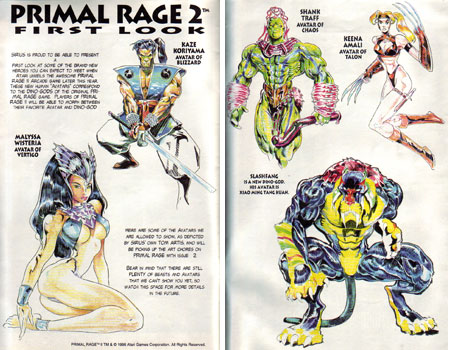
Well, the only thing that could have stopped them would have been a bigger and badder monster. Necrosan was the god of death. It was a dragon-like creature that was mostly bones but with portions of muscle and even intestine still attached to the skeleton. Players would have to defeat the creature had they wanted to claim the "Urth." Sadly the final battle was never realized. The arcade game had been published without an actual final boss. In fact it was released with unbalanced gameplay, known bugs and glitches. Patches were released over the months to arcade owners to help fix the controls and balance the fighters. Developers were hoping to introduce an actual final boss via an upgrade. Unfortunately development of that final boss and his official inclusion in a sequel was cancelled. It was proving to be too costly for Atari to continue supporting the series. The only known images of Necrosan were from concept art, sprites for the unpublished Primal Rage II, a comic book and a toy released before Atari pulled the plug. Those gods seemed to have limitations after all.

The giant monster offered unique game play opportunities for existing genres. They could enhance the sim, RPG, FPS or fighting game more than any weapon or magical attack could. Developers were finding it hard to create a niche for the giant monsters themselves. What many developers missed were lessons from their own history. Two studios showed what format worked best for the giant monster back in 1986. They created a template that would work again and again. The studios that paid attention to the model would achieve a certain level of success. The next blog will talk about the year that changed everything.

Wednesday, May 10, 2017
The aesthetic versus graphics debate, part 1...
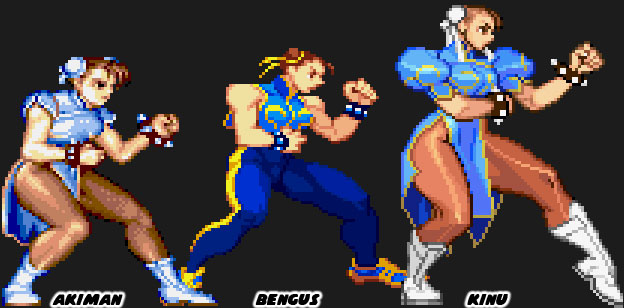
Aesthetics were critically important in fighting games. They were the visual cues that set each company apart. In the previous blog I showed that a number of games and studios were developing on the same graphics engine. This made the titles all look eerily similar whether they were made in Japan, the US or the UK. A great fighting game had to set itself apart from the competition. The longest surviving studios knew this. It was the reason why many companies hired teams of unique artists. Look very carefully at the way different artists, from within Capcom and outsiders, presented Chun-Li.
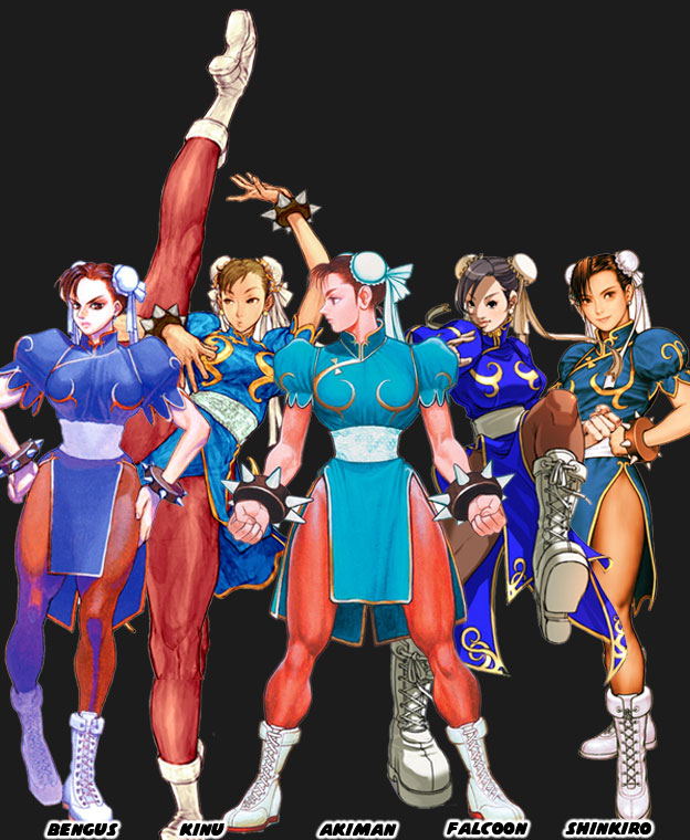
The costume was the same but the style varied widely from artist to artist. Perhaps one artist drew her make up and the other with none. Style also trickled down to the details. Things like how big the spikes on the bracelet should be, how tall her boots were, how slender Chun-Li’s waist was or how wide her thighs should be. All of these things depended on the artist. Once the artist finalized the designs they created turnarounds so they could see the character from all sides. These turnarounds were used for the official character guides. In this way every other artist and animator at the studio could be consistent. Back when fighting games were in 2D is was very easy to capture an artists’ individual style.
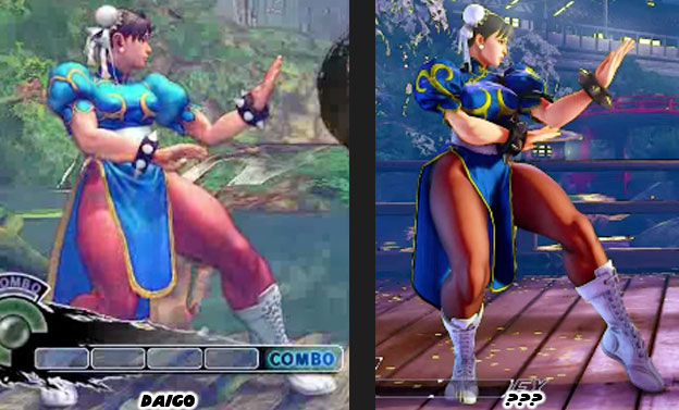
Once the game engines started going into 3D then things got much harder. The proportions used in 2D wouldn’t necessarily work in 3D without making the characters appear grossly disproportionate. This became more obvious as the entire Street Fighter cast was more swollen in SF IV. Suddenly Chun-Li looked like a tank. She was almost as wide as she was tall. This mass made sense for the burly Zangief but not for Chun-Li. Her increase in size didn’t really go with her lighting quick moves and it broke the player’s suspension of disbelief. This was especially obvious with the character Rufus, a man that was extremely fat yet moved as fast as Chun-Li. Capcom tried to pay more attention to aesthetics in Street Fighter V. They listened to the feedback that they got from the community and they slimmed down the cast. There was a difference in how Daigo Ikeno’s Chun-Li looked in SFIV and how the new version looked in SFV. Sorry but the name of the new lead artist escapes me. Capcom was moving in the right direction but I was surprised that they didn’t learn from the past a little bit sooner.
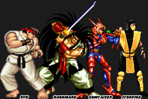
In the first wave of fighting games, during the early to mid-1990s, each studio had their own unique style. The games that were lost to time, titles like Fighters History and Martial Masters, copied the Street Fighter II aesthetic but failed to innovate the format. They didn’t do much in terms of new control schemes, moves or even character origins. Other studios like SNK and Midway learned that in order to stand out each game had to have a distinct visual style. All of the studios were using similar sprite technology but their aesthetics varied widely. Compare how different the lead characters were in Street Fighter II, Samurai Showdown, Voltage Fighter Gowcaizer and Mortal Kombat. The games were released within five years yet were vastly different in terms of aesthetics. Many fans simply commented on how great the graphics looked between games even if they were all built with comparable hardware and software.
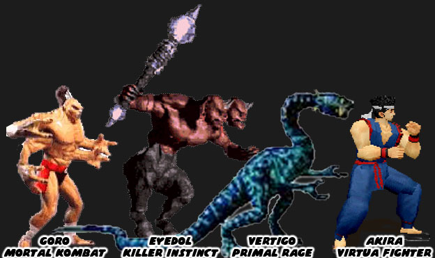
As technology evolved so too did the techniques used to build a fighter. Midway and Atari experimented with stop motion figures to create the monsters featured in Mortal Kombad and Primal Rage respectively. Rare began creating sprites out of high-end CGI workstations for Killer Instinct. Aesthetically speaking all of these games were very diverse too. Then Sega planted the seeds for the future of the genre, and the industry itself. They used a polygon-based graphics engine. It didn’t have the detailed backgrounds or high speed game play of the 2D titles but it did have an entirely new aesthetic. Clean, simple shapes, creating actual 3D objects that had weight, dimension and shape.
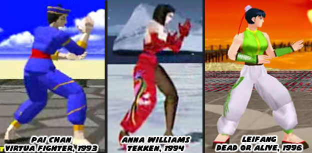
In the mid-90s other studios saw the potential of 3D engines. The technology could be applied in multiple formats and genres. Space shooters, racing games, RPGs, action titles and even platformers could all be done in 3D. When the studios began developing 3D fighting games it was as if they had reset the clock on aesthetics. Every studio was so focused on learning the new technology that they did not bother to push the envelope on aesthetics. The original 2D fighting games all stuck to the tropes. A karate master, a kung fu practitioner, a boxer and wrestler could all be guaranteed to appear in the early games. They were all drawn in a style that fell somewhere in between a Japanese animé or manga. The exact same tropes happened in 3D. There were some minor differences but think about how Chun-Li set the standard for the Chinese fighter. Pai Chan (and her father Lau Chan) was the first Chinese polygon star in Sega’s Virtua Fighter (1993). Her color scheme of blue with gold trim was very much based on Chun-Li. This set the template for the Chinese dress on Tekken’s Anna Williams (Namco 1994) and Dead or Alive’s Leifang (Tecmo 1996). The graphics were cutting edge at the time yet the aesthetics in the games were almost universal.
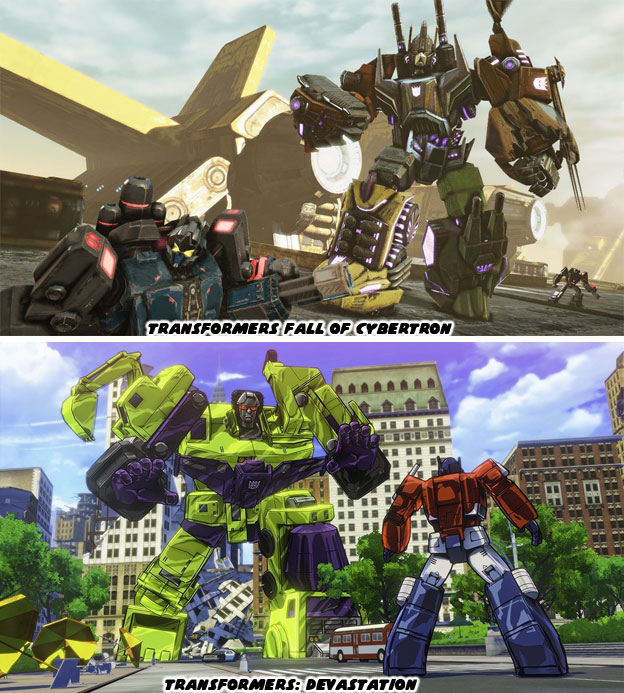
Think about how the majority of the fighting games today are built on the same graphics engine. Think about how the majority are using the same aesthetic. From Street Fighter IV to Injustice, every modern title was dark and gritty. It was as if the studios forgot everything they had learned in the ‘90s. How they forgot the importance of having a strong aesthetic. It stands to reason however, many of the new designers and developers were kids when the first fighting game boom happened. They are now programmers, artists and animators in their own right. They are recreating all the things they loved about their favorite games. This is where I present a challenge to them. Do not recreate what was great. Do not settle for what the graphics standards are now but instead carve out an entirely new path. Take a creative risk. Change up the format without erasing the original formula. Fighting games, and video games in general, are very much a visually based form of storytelling. Just because you are given the same tools as your contemporaries it doesn’t mean your games have to all look the same. Think about what makes an animé unique when compared to a CGI film. Think about the Transformer’s series of the ‘80s and the live action Transformers film of today. The reason that fans remembered the original was because of how unique it looked when compared to the western cartoons. Thirty years later when a western and eastern studio developed a 3D version of the franchise there was a striking difference between the aesthetic styles. One managed to capture the look of the animated series while the other looked like every other 3rd person shooter.
Be bold with your designs! Regardless of what surveys tell you simply know that the fans are there. They are waiting for something to change their perception. The market will follow those that take a chance. Street Fighter II was only the beginning of the revolution. Mortal Kombat, Samurai Shodown, Primal Rage, King of Fighters and Killer Instinct were some of the biggest risk takers. Their gambles didn’t always pay off but they gave audiences a reason to return. In doing so the market grew and grew. More people were playing fighting games because of the diversity in subjects and aesthetics. A good director knows when to push the envelope, when to challenge their designers. They know what things the audience expects and doesn’t. In the next blog we will look at the impact a good director and a strong aesthetic can have on the industry. As always if you enjoyed this blog and would like to sponsor me please visit my Patreon page and consider donating each month, even as little as $1 would help make better blogs and even podcasts!
The costume was the same but the style varied widely from artist to artist. Perhaps one artist drew her make up and the other with none. Style also trickled down to the details. Things like how big the spikes on the bracelet should be, how tall her boots were, how slender Chun-Li’s waist was or how wide her thighs should be. All of these things depended on the artist. Once the artist finalized the designs they created turnarounds so they could see the character from all sides. These turnarounds were used for the official character guides. In this way every other artist and animator at the studio could be consistent. Back when fighting games were in 2D is was very easy to capture an artists’ individual style.
Once the game engines started going into 3D then things got much harder. The proportions used in 2D wouldn’t necessarily work in 3D without making the characters appear grossly disproportionate. This became more obvious as the entire Street Fighter cast was more swollen in SF IV. Suddenly Chun-Li looked like a tank. She was almost as wide as she was tall. This mass made sense for the burly Zangief but not for Chun-Li. Her increase in size didn’t really go with her lighting quick moves and it broke the player’s suspension of disbelief. This was especially obvious with the character Rufus, a man that was extremely fat yet moved as fast as Chun-Li. Capcom tried to pay more attention to aesthetics in Street Fighter V. They listened to the feedback that they got from the community and they slimmed down the cast. There was a difference in how Daigo Ikeno’s Chun-Li looked in SFIV and how the new version looked in SFV. Sorry but the name of the new lead artist escapes me. Capcom was moving in the right direction but I was surprised that they didn’t learn from the past a little bit sooner.
In the first wave of fighting games, during the early to mid-1990s, each studio had their own unique style. The games that were lost to time, titles like Fighters History and Martial Masters, copied the Street Fighter II aesthetic but failed to innovate the format. They didn’t do much in terms of new control schemes, moves or even character origins. Other studios like SNK and Midway learned that in order to stand out each game had to have a distinct visual style. All of the studios were using similar sprite technology but their aesthetics varied widely. Compare how different the lead characters were in Street Fighter II, Samurai Showdown, Voltage Fighter Gowcaizer and Mortal Kombat. The games were released within five years yet were vastly different in terms of aesthetics. Many fans simply commented on how great the graphics looked between games even if they were all built with comparable hardware and software.
As technology evolved so too did the techniques used to build a fighter. Midway and Atari experimented with stop motion figures to create the monsters featured in Mortal Kombad and Primal Rage respectively. Rare began creating sprites out of high-end CGI workstations for Killer Instinct. Aesthetically speaking all of these games were very diverse too. Then Sega planted the seeds for the future of the genre, and the industry itself. They used a polygon-based graphics engine. It didn’t have the detailed backgrounds or high speed game play of the 2D titles but it did have an entirely new aesthetic. Clean, simple shapes, creating actual 3D objects that had weight, dimension and shape.
In the mid-90s other studios saw the potential of 3D engines. The technology could be applied in multiple formats and genres. Space shooters, racing games, RPGs, action titles and even platformers could all be done in 3D. When the studios began developing 3D fighting games it was as if they had reset the clock on aesthetics. Every studio was so focused on learning the new technology that they did not bother to push the envelope on aesthetics. The original 2D fighting games all stuck to the tropes. A karate master, a kung fu practitioner, a boxer and wrestler could all be guaranteed to appear in the early games. They were all drawn in a style that fell somewhere in between a Japanese animé or manga. The exact same tropes happened in 3D. There were some minor differences but think about how Chun-Li set the standard for the Chinese fighter. Pai Chan (and her father Lau Chan) was the first Chinese polygon star in Sega’s Virtua Fighter (1993). Her color scheme of blue with gold trim was very much based on Chun-Li. This set the template for the Chinese dress on Tekken’s Anna Williams (Namco 1994) and Dead or Alive’s Leifang (Tecmo 1996). The graphics were cutting edge at the time yet the aesthetics in the games were almost universal.
Think about how the majority of the fighting games today are built on the same graphics engine. Think about how the majority are using the same aesthetic. From Street Fighter IV to Injustice, every modern title was dark and gritty. It was as if the studios forgot everything they had learned in the ‘90s. How they forgot the importance of having a strong aesthetic. It stands to reason however, many of the new designers and developers were kids when the first fighting game boom happened. They are now programmers, artists and animators in their own right. They are recreating all the things they loved about their favorite games. This is where I present a challenge to them. Do not recreate what was great. Do not settle for what the graphics standards are now but instead carve out an entirely new path. Take a creative risk. Change up the format without erasing the original formula. Fighting games, and video games in general, are very much a visually based form of storytelling. Just because you are given the same tools as your contemporaries it doesn’t mean your games have to all look the same. Think about what makes an animé unique when compared to a CGI film. Think about the Transformer’s series of the ‘80s and the live action Transformers film of today. The reason that fans remembered the original was because of how unique it looked when compared to the western cartoons. Thirty years later when a western and eastern studio developed a 3D version of the franchise there was a striking difference between the aesthetic styles. One managed to capture the look of the animated series while the other looked like every other 3rd person shooter.
Be bold with your designs! Regardless of what surveys tell you simply know that the fans are there. They are waiting for something to change their perception. The market will follow those that take a chance. Street Fighter II was only the beginning of the revolution. Mortal Kombat, Samurai Shodown, Primal Rage, King of Fighters and Killer Instinct were some of the biggest risk takers. Their gambles didn’t always pay off but they gave audiences a reason to return. In doing so the market grew and grew. More people were playing fighting games because of the diversity in subjects and aesthetics. A good director knows when to push the envelope, when to challenge their designers. They know what things the audience expects and doesn’t. In the next blog we will look at the impact a good director and a strong aesthetic can have on the industry. As always if you enjoyed this blog and would like to sponsor me please visit my Patreon page and consider donating each month, even as little as $1 would help make better blogs and even podcasts!

Subscribe to:
Posts (Atom)