Showing posts with label akiman. Show all posts

Friday, December 20, 2024

Freeze frame, my poster collection part 23...

I had so many posters in my Capcom collection that I had to break them over several separate blogs. Here's a reminder for any Street Fighter, or fighting game fans in general. If you want to get into collecting the posters then try to track down the game guides from Japan. The gems in my collection came from Gamest. It was the premier arcade magazine through the '90s. When they published guides, which they called MOOKS after Magazine-Book they often included a poster.

My Marvel Super Heroes poster was actually autographed by AKIMAN, the father of Chun-Li. It was at the San Diego Comic Con at the UDON Booth. The booth did not want to honor their commitment to one autograph per person who purchased one of the Capcom hardcovers. I said I didn't want the autograph on the book, but instead the poster. They pushed back until I talked to the managers, then they told the staff that it was okay, in fact that I could get the autograph on my book too for the hassle.

There are two Muscle Bomber posters that I know of. The first is the same as the main art that most people are familiar with. This version I had no idea existed until I saw it pop up in a Japanese auction site. I was super happy with it, and was one of the official drawings by Tetsuo Hara where I could see the details on the CWA belt that I used as reference for the actual belt I commissioned.

I don't believe in wall scrolls since they usually steal licensed art. I bought this Marvel vs Capcom 3 poster under false pretenses, I was told it was an official poster, and was sent a scroll instead. You just can't trust people online.

The Pocket Fighter is too cute, as is this classic illustration of Sakura.

Do you have a favorite game, or character that you wish you had a poster of? I’d like to read about them in the comments section. As always if you would like to sponsor me please visit my Patreon page and consider donating each month, even as little as $1 would help make better blogs and even podcasts!
follow the Street Writer on Patreon!

Sunday, July 30, 2017

A look at the big man, where did the Capcom giants come from? Part 1...

It is a great time to be a fighting game fan. That's a sentence I never thought I would be writing at my age. After fighting games fell by the wayside at the end of the '90s I didn't think they would come roaring back. Thanks to Capcom, Namco, SNK, Arc System Works, NetherRealm Studios and Double Helix Games for keeping the genre alive. An extra special thanks to the community for supporting the wide spectrum of titles. I never thought that Street Fighter would live to see 30, or that King of Fighters, Tekken, Mortal Kombat and Killer Instinct would still be going strong as well. Sega might never release another Virtua Fighter but considering that even ARIKA is getting back into the mix gives me hope for the future. Nostalgia is a good reason why many of the titles are still being developed. The games are improving as a whole but fans also want to see familiar characters return. At the 2017 EVO Championships in Las Vegas we were reminded of this. Several major studios held back some details from the E3 in Los Angeles. They waited until they had a dedicated gathering at EVO to announce these major reveals. The biggest announcements were actually for some very old characters.


Trunks, a warrior from the future, was announced for Dragon Ball FighterZ. The character first appeared in the Dragon Ball manga in 1991. Geese Howard was the surprise guest announced for Tekken 7. He also debuted in 1991 for the SNK hit Fatal Fury: King of Fighters. Both of these character reveals sent shock-waves through the fighting game community. It was Capcom's announcement that was met with mixed emotions. The studio dug up a character that debuted in the 1989 cult hit Final Fight. Abigail was gigantic in proportion, had a few silly mannerisms and some awe-inspiring attacks. Long time fans of Capcom noticed that he had changed a bit from his original appearance. Some online commentators said that his design was too swollen and disproportionate when compared to his original look. Others thought that he fit right in with the already super-buff Street Fighter lineup. Who was this character? Where did he come from and did he really fit into the Street Fighter universe? In order to understand the significance of Abigail we have to travel back in time.


Capcom had marginal success when Street Fighter (SF) debuted in 1987. You might already know that Final Fight was designed to be the sequel to the original Street Fighter. It was originally called Street Fighter '89. In 1987 Technos had a smash hit arcade game called Double Dragon. I chronicled the importance of this game in my Brawling series. Double Dragon was essentially a more polished version of Renegade, a title the same publisher released in 1986. Instead of fighting on a fixed two-dimensional plane characters were free to move around the foreground and background and fight wave after wave of different opponents. This game was far more popular than the original SF and had been ported over to multiple systems. Capcom knew that they could probably make a superior version of the game with their own hardware. Producer Yoshiki Okamoto worked closely with designer Akira Nishitani (founder of ARIKA) and Akira Yasuda (designer better known as AKIMAN) to improve on everything in Double Dragon. They had bigger sprites, better graphics, more stages, more opponents and far more moves. They even created a story for audiences to follow. Among these were some enormous villains, one which was called Abigail.


 The story of Abigail and the designs behind the villains was very unique. The Mad Gear gang was inspired by Western pop culture, and in particular heavy metal music. A number of the characters were modeled after popular acts of the '70s and '80s. These included Billy Idol, Sid Vicious and Guns 'N Roses. The character of Abigail was considered a boss. He was very high up in the chain of command. Second only to Rolento, the military leader and right hand man of Belger, the organizer behind Mad Gear. Because of his status Abigail had to visually be different from his contemporaries. His uniform was white, which made him stand out from the darker colors assigned to the other Mad Gear characters. He was also the largest of the gang members, at 8 feet tall and over 580 lbs. he was the biggest character ever in the Street Fighter universe. Hugo Andore was no slouch though, at 7' 10" and 440 lbs. he was the second-largest Street Fighter character ever. Abigail sported some unique face paint. This makeup hearkened to an earlier era in metal music. Alice Cooper was a shock rocker that started the trend in the mid-1960s. He employed magic tricks in his performances, with some of his best illusions created by the Amazing Randi. Cooper's work set the foundation for the makeup and character-driven acts like KISS and King Diamond from the mid-1970s. Abigail in fact was the name of King Diamond’s second album from 1987. Abigail represented the foundation of hard rock while the rest of the Mad Gear members reflected the newer generation of metal stars.


From a design standpoint Abigail was somewhat unique but not wholly original. The character in the game was a different colored version of the Andore sprite, with a slightly different head. The Andore family; (Hugo) Andore, G. Andore, U. Andore, F. Andore and Andore Jr., were inspired by Andre the Giant. The Andore family hearkened back to actual wrestling dynasties like the Von Erichs, the Harts and the Guerreros. They were unfortunately large oafish wrestlers who relied on sheer force rather than technique to win fights. The family was among the middle ranks of the Mad Gear organization. In canon wrestling was a way to recruit Mad Gear members and the format that they used in underground tournaments. Sodom for example was another famous Mad Gear wrestler and a boss in the organization. Abigail was designed to be much different than the Andore's in fighting ability as well as in temper. His white uniform, buzz cut and makeup stood out compared to the shaggy-haired Andore's.


In the game Abigail was prone to fits of rage and would actually turn red and charge the heroes with his tree trunk-sized arms. Some of these details made it into Street Fighter V while others did not. As unique as he looked Abigail was far from an original idea. One of the major villains in the Double Dragon series was a giant bodybuilder named Abobo. If you go back through the early arcade hits you can draw a number of parallels between the story and characters in Double Dragon and Final Fight. Abigail was the Final Fight equivalent to Abobo. When Abobo first appeared he had the familiar face paint and spiked wrist guards. His size wasn't officially given by Technos in the original game. All players knew was that he was much taller than Billy and Jimmy Lee and about twice as wide. When Technos made a Double Dragon fighting game in 1995 and revisited the character he was described as being 7' 2" tall and weighing some 336 lbs. He was simply massive and at the time was among the largest sprite ever created for a fighting game. More surprising was that he could actually get more muscular with the use of his special move. How Capcom adapted his look and the theme for Final Fight was an important part in the history of the genre.


There was a game that predated Double Dragon that was designed by Takashi Nishiyama. When it came to fighting games very few people could be considered the godfather of the genre. My. Nishiyama was definitely one of them. His tenure at Irem was important to the industry. He worked on Moon Patrol, the 1982 science fiction game that introduced parallax scrolling to the arcade. This graphic technique allowed layers to move at different speeds on screen, creating the illusion of depth in 2-dimensions. Double Dragon and Final Fight used parallax scrolling to good effect. Take a close look at the floors in most brawlers and fighting games and see how bricks, tiles and even wood seem to stay in perspective as the characters advance. Then look in the distance, especially if the stage has water or an ocean in the background. You'll notice that the layered effect gives a good sense of depth to a 2D world. As fun as Moon Patrol was, it was Mr. Nishiyama's following game that was even more important. The 1984 game Kung-Fu Master was revolutionary. It was one of the first fighting games and also set the standard for brawling games as well.


There was another game from 1984 that could be considered the father of the modern fighting game. Karate Champ developed by Technos was the first player-versus-player, side-profile martial arts game. Kung-Fu Master expanded on that idea and introduced many new elements to the genre. It had a narrative, the hero Thomas fought wave after wave of bad guys in order to save his girlfriend. Predating the same plot used in both Double Dragon and Final Fight. The enemies came in different shapes and sizes and there was even a final boss. The only other influential fighter from this period that I should name was Konami's Yie Ar Kung Fu from 1985. Yie Ar Kung Fu also featured characters of different sizes and abilities. Mr. Nishiyama left Irem to go work for Capcom in the mid '80s. He took his ideas about featuring characters with unique martial arts, adding a narrative and different boss characters when he directed the original Street Fighter.


Mr. Nishiyama and the team at Capcom were heavily influenced by Japanese pop culture. The developers grew up on a steady diet of comics and cartoons and they reflected these things with every game they released. At that time most Japanese audiences would have gotten their points of reference. The fireball thrown by Ryu for example was inspired by the energy attack from the Space Battleship Yamato, a popular animé show from the mid '70s. The story of Ryu travelling around the world fighting masters of different styles was inspired by the '70s manga series Karate Backa Ichidai. The visual language, heroes and villains in western-style costumes in both Final Fight and Street Fighter were based on the '80s manga Hokuto No Ken / Fist of the North Star (HNK) series. The post-apocalyptic setting featured in the HNK stories by Buronson and Tetsuo Hara colored a lot of the work coming out of Capcom in the '80s and '90s.


One of the earliest games to reflect a warrior fighting through a dystopian world was called Trojan. The arcade and NES console title was a sleeper from 1986 but it featured some very unique character designs. The villains, Armadillon, Mamushi and Iron Arm were a mix of mutants and soldiers wearing piecemeal armor. They looked like the roving gang members that inhabited the HNK wastelands. The dark future timeline was used again and again in both console and arcade releases. Bionic Commando (1987), Strider (1989), and Street Fighter 2010: The Final Fight (1990) each had their own take on a future corrupted by villainy and greed. The HNK manga shaped the world of Double Dragon as well, especially when it came to character design. The manga had many memorable villains. Some were covered in tattoos and face paint. Some wore armor, others were simply giants that couldn't be hurt by conventional weapons. These were all perfect for gaming.


It wasn't just Japanese pop culture that shaped the look and feel of the early Capcom hits. Western pop culture was just as influential. Hokuto No Ken was itself inspired by the films of Bruce Lee, but also by movies like the Terminator (1984), Cobra (1986) and the Mad Max series. The gangs in Mad Max (1979) and the Road Warrior (1981) were poached by Tetsuo Hara for HNK. Characters had very radical designs in these films. They wore armor that was made up of leather, football pads, hockey gear and car tires. Some gang members wore face paint with Mohawks, others were deformed by radiation and hid behind masks. Director George Miller had a very strong visual style. He often worked directly from storyboards that he created while he was finalizing a script. His approach ended up influencing games, comics and other films for over 30 years. One of the lesser known Capcom arcade games themed after Mad Max was called Speed Rumbler, in which the hero drove an armed car and shot up bad guys. Some were in trucks, others in buggies or tanks. Mr. Nishiyama worked on a different type of vehicle combat game after Street Fighter. This new game was set in a science fiction road race. The future looked much more promising than it did in the Speed Rumbler. The new game was called Mad Gear in Japan and Led Storm in the rest of the world. In the planning stages for a Street Fighter sequel Mr. Nishiyama left Capcom to work at rival studio SNK.


Arcade operators had their pulse on the trends and would push developers into certain formats. Many of them were interested in a new fighting game following the success of Double Dragon and they let Capcom know. That was when Mr. Okamoto, Nishitani and Yasuda decided to create their take on the brawler. To do this they needed to create an enormous western metropolis that felt more realistic than the world that Technos had established. They needed reference material for everything audiences might see. How were the buildings laid out, what architecture was used, how did alleys and street corners look? They needed to present convincing subway systems, neighborhoods and boroughs that had a distinct "USA" feel to them. Even things like police uniforms, gang colors and street fashion needed to be recreated. These things were all very different than how cities, advertising, pedestrians and gangs looked in Japan or Europe after all. The designers at Capcom studied a number of cult films while trying to create the fictional Metro City. Among these films were the Wanderers, Escape from New York, and Streets of Fire. The films from 1979, 1981 and 1984 respectively had over-the-top characters and settings. Watching the three films you could easily to spot where Mike Haggar, Cody, Jessica and the various Mad Gear gang members came from.


Metro City needed to have all of the elements that might be found in New York but without being bound by an actual site. In this way Capcom could take players to the most interesting landmarks within the span of a day, or rather a single play-through. Each location could tell a story, and every stage could be more unique than the last. The new virtual city was created on an island on the North Eastern Seaboard of the USA, right on the Atlantic Ocean. One of the most memorable stages was near the end of the game. Players had fought their way from the slums, through the subway and all the way to the Bay Side. At this point it was dusk and off in the distance players could see the Statue of Liberty. It was the perfect "American" point of reference and one that international audiences could recognize. When Capcom designed a stage for Abigail in Street Fighter V they made sure to recreate that slice of Metro City.


The interesting thing about Metro City was how the layout and planning were very similar to the design of South Town. This other virtual city would appear in the SNK fighting game Fatal Fury, almost two years after Final Fight debuted and just as Street Fighter II came out. South Town was set in the southern coast of the USA, closer to Florida but it retained many of the same big city themes as Metro City. I believe that Mr. Nishiyama was putting out ideas for his next fighting game while still with at Capcom. He would have been discussing these ideas with Mr. Okamoto and Nishitani. If you look at the stage progression in both Final Fight and Fatal Fury they were very similar. The final battle in both games took place on the penthouse of the crime boss' skyscraper, and both games ending with the villain getting knocked from the top.

Mr. Nishiyama was thinking about creating three main heroes for the series. They may have been Ken, Ryu and a third fighter, or they may have been three completely new characters. The trio eventually became Andy Bogard, Terry Bogard and Joe Higashi. Mr. Nishiyama also recognized that audiences wanted to see some visual depth to the game. Fatal Fury introduced a system where players could jump to the foreground or background and launch an attack. It wasn't the free-roaming environment of Double Dragon or Final Fight but it was something that had not been tried before in a fighting game. I believe that Mr. Okamoto and Nishitani ran with some of these ideas when they created Final Fight. In honor of their old colleague they named the bad guys Mad Gear gang members. With the return of Abigail we should explore the limits on character scale in a fighting game. How big is too big? What did Capcom get right or wrong with him? We'll look at these things in the next blog. As always if you enjoyed this blog and would like to sponsor me please visit my Patreon page and consider donating each month, even as little as $1 would help make better blogs and even podcasts!

 follow the Street Writer on Patreon!

Wednesday, May 10, 2017

The aesthetic versus graphics debate, part 1...

Aesthetics were critically important in fighting games. They were the visual cues that set each company apart. In the previous blog I showed that a number of games and studios were developing on the same graphics engine. This made the titles all look eerily similar whether they were made in Japan, the US or the UK. A great fighting game had to set itself apart from the competition. The longest surviving studios knew this. It was the reason why many companies hired teams of unique artists. Look very carefully at the way different artists, from within Capcom and outsiders, presented Chun-Li.


The costume was the same but the style varied widely from artist to artist. Perhaps one artist drew her make up and the other with none. Style also trickled down to the details. Things like how big the spikes on the bracelet should be, how tall her boots were, how slender Chun-Li’s waist was or how wide her thighs should be. All of these things depended on the artist. Once the artist finalized the designs they created turnarounds so they could see the character from all sides. These turnarounds were used for the official character guides. In this way every other artist and animator at the studio could be consistent. Back when fighting games were in 2D is was very easy to capture an artists’ individual style.


Once the game engines started going into 3D then things got much harder. The proportions used in 2D wouldn’t necessarily work in 3D without making the characters appear grossly disproportionate. This became more obvious as the entire Street Fighter cast was more swollen in SF IV. Suddenly Chun-Li looked like a tank. She was almost as wide as she was tall. This mass made sense for the burly Zangief but not for Chun-Li. Her increase in size didn’t really go with her lighting quick moves and it broke the player’s suspension of disbelief. This was especially obvious with the character Rufus, a man that was extremely fat yet moved as fast as Chun-Li. Capcom tried to pay more attention to aesthetics in Street Fighter V. They listened to the feedback that they got from the community and they slimmed down the cast. There was a difference in how Daigo Ikeno’s Chun-Li looked in SFIV and how the new version looked in SFV. Sorry but the name of the new lead artist escapes me. Capcom was moving in the right direction but I was surprised that they didn’t learn from the past a little bit sooner.


In the first wave of fighting games, during the early to mid-1990s, each studio had their own unique style. The games that were lost to time, titles like Fighters History and Martial Masters, copied the Street Fighter II aesthetic but failed to innovate the format. They didn’t do much in terms of new control schemes, moves or even character origins. Other studios like SNK and Midway learned that in order to stand out each game had to have a distinct visual style. All of the studios were using similar sprite technology but their aesthetics varied widely. Compare how different the lead characters were in Street Fighter II, Samurai Showdown, Voltage Fighter Gowcaizer and Mortal Kombat. The games were released within five years yet were vastly different in terms of aesthetics. Many fans simply commented on how great the graphics looked between games even if they were all built with comparable hardware and software.


As technology evolved so too did the techniques used to build a fighter. Midway and Atari experimented with stop motion figures to create the monsters featured in Mortal Kombad and Primal Rage respectively. Rare began creating sprites out of high-end CGI workstations for Killer Instinct. Aesthetically speaking all of these games were very diverse too. Then Sega planted the seeds for the future of the genre, and the industry itself. They used a polygon-based graphics engine. It didn’t have the detailed backgrounds or high speed game play of the 2D titles but it did have an entirely new aesthetic. Clean, simple shapes, creating actual 3D objects that had weight, dimension and shape.


In the mid-90s other studios saw the potential of 3D engines. The technology could be applied in multiple formats and genres. Space shooters, racing games, RPGs, action titles and even platformers could all be done in 3D. When the studios began developing 3D fighting games it was as if they had reset the clock on aesthetics. Every studio was so focused on learning the new technology that they did not bother to push the envelope on aesthetics. The original 2D fighting games all stuck to the tropes. A karate master, a kung fu practitioner, a boxer and wrestler could all be guaranteed to appear in the early games. They were all drawn in a style that fell somewhere in between a Japanese animé or manga. The exact same tropes happened in 3D. There were some minor differences but think about how Chun-Li set the standard for the Chinese fighter. Pai Chan (and her father Lau Chan) was the first Chinese polygon star in Sega’s Virtua Fighter (1993). Her color scheme of blue with gold trim was very much based on Chun-Li. This set the template for the Chinese dress on Tekken’s Anna Williams (Namco 1994) and Dead or Alive’s Leifang (Tecmo 1996). The graphics were cutting edge at the time yet the aesthetics in the games were almost universal.


Think about how the majority of the fighting games today are built on the same graphics engine. Think about how the majority are using the same aesthetic. From Street Fighter IV to Injustice, every modern title was dark and gritty. It was as if the studios forgot everything they had learned in the ‘90s. How they forgot the importance of having a strong aesthetic. It stands to reason however, many of the new designers and developers were kids when the first fighting game boom happened. They are now programmers, artists and animators in their own right. They are recreating all the things they loved about their favorite games. This is where I present a challenge to them. Do not recreate what was great. Do not settle for what the graphics standards are now but instead carve out an entirely new path. Take a creative risk. Change up the format without erasing the original formula. Fighting games, and video games in general, are very much a visually based form of storytelling. Just because you are given the same tools as your contemporaries it doesn’t mean your games have to all look the same. Think about what makes an animé unique when compared to a CGI film. Think about the Transformer’s series of the ‘80s and the live action Transformers film of today. The reason that fans remembered the original was because of how unique it looked when compared to the western cartoons. Thirty years later when a western and eastern studio developed a 3D version of the franchise there was a striking difference between the aesthetic styles. One managed to capture the look of the animated series while the other looked like every other 3rd person shooter.


Be bold with your designs! Regardless of what surveys tell you simply know that the fans are there. They are waiting for something to change their perception. The market will follow those that take a chance. Street Fighter II was only the beginning of the revolution. Mortal Kombat, Samurai Shodown, Primal Rage, King of Fighters and Killer Instinct were some of the biggest risk takers. Their gambles didn’t always pay off but they gave audiences a reason to return. In doing so the market grew and grew. More people were playing fighting games because of the diversity in subjects and aesthetics. A good director knows when to push the envelope, when to challenge their designers. They know what things the audience expects and doesn’t. In the next blog we will look at the impact a good director and a strong aesthetic can have on the industry. As always if you enjoyed this blog and would like to sponsor me please visit my Patreon page and consider donating each month, even as little as $1 would help make better blogs and even podcasts!

 follow the Street Writer on Patreon!

Friday, April 21, 2017

Warzard, the great fantasy fighting games part 3...

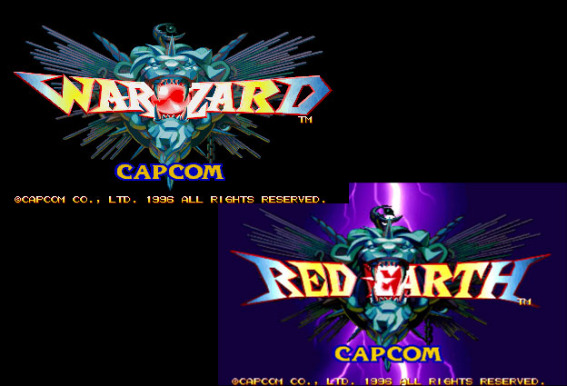
So far in this series we have looked at the pioneer fantasy fighting game and a fantasy fighting game that was never published. Today we will look at one of the greatest fantasy games ever made. Sadly this is a title that most in the game community have never heard of, let alone played. Warzard in Japan / Red Earth in the USA was released by Capcom in 1996. It featured one of the most colorful casts of playable characters and villains ever to appear in any fighter. It was the first title to be developed for the CPS-III system. The sprite-based engine was at the time the most powerful engine Capcom had ever created for arcade games. It was leagues more powerful than the CPS-II, which was what Super Street Fighter II had used.


Capcom had found tremendous success with their arcade unit in the '80s. They had published more than 2-dozen hits with the original CP System (CPS - arcade board), including 1941, Ghouls'n Ghosts, Strider, Final Fight, Street Fighter and Street Fighter II. The original CPS had a long shelf life and been used from 1988 to 1995. The CPS-II was an even bigger success, having more than 40 games published for it between 1993 and 2003. Based on the success of the fighting game genre Capcom thought that they should bank on new hardware to carry them for the next decade. In the mid '90s arcade games were moving to 3D graphics and even home consoles were migrating to 3D so sprite-based 2D engines were being dropped for the most part. The Tekken and Virtua Fighter series debuted after Street Fighter II and both looked a little rough around the edges. They were improving visually by leaps and bounds with each release and would soon look better than the rehashed graphics that Capcom was using. The CPS-III would be a return to form and a chance to show that sprites were still vital to the genre. Sadly it would become the swansong for hand-drawn graphics and Capcom's reliance on 2D technology. The hardware was much more expensive to work with than earlier CP Systems. Not to mention that the genre had a lot more competition that Capcom had anticipated. Development on the CPS-III would be cut short. The engine was only used for 6 games between 1996 and 1999. Three of those games were Street Fighter III and its sequels, two were for JoJo's Bizarre Adventure and one was for Warzard.


Warzard had some of the most brilliant graphics ever seen in an arcade game. The stages, animations, effects and design were light years ahead of anything the competition was working on or would ever release. It was obvious that the publisher had gambled on this game becoming the next big franchise. Expansions were planned if not outright sequels if it became as successful as Street Fighter II. It was apparent in every detail that made it into the game. An entire world was mapped out for the audience. They were given a tour of this wondrous fantasy world in every encounter. No two locations looked the same and that was a good thing. Warzard was layered with so much detail that players were encouraged to keep playing and explore the stories of each hero.


Players explored a world filled men and monsters. Technology was a mixed bag of progress and superstition; gunpowder existed alongside magic, demons consorted with nobles and humanity was at the brink of all out war. Most of the warriors fought with swords and shields but the most powerful relied on spells. Designing a visual language that was equal parts Western and Eastern fantasy required the talents of the senior designers at Capcom. They created a world where flying ships and floating islands appeared as the actual stages. I will be highlighting these people individually later on in the blog.


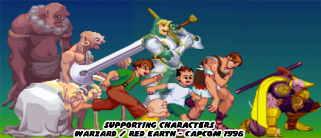
Every menu, on the level map, stage backgrounds and even in the title screen, were some of the most stylized graphics that had ever been seen. Capcom did not overlook any detail, even the supporting characters which may have turned up multiple times or even just one in the progression of the story had their own unique look and purpose.


These designs also applied to the villains in the game, which also came with their own cast and back story.


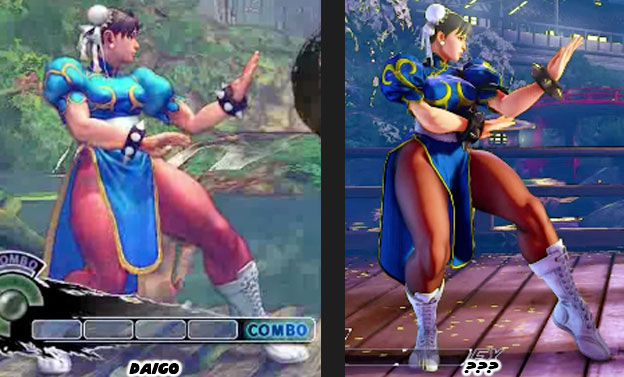
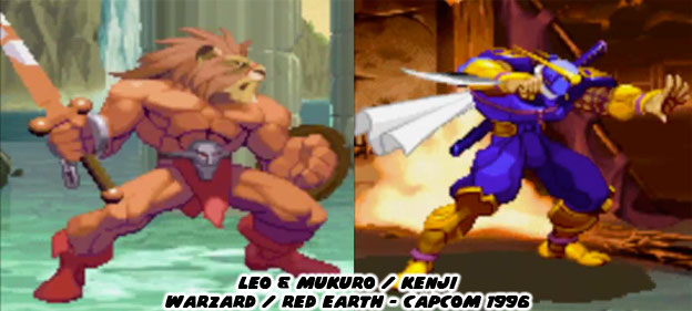
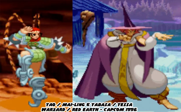
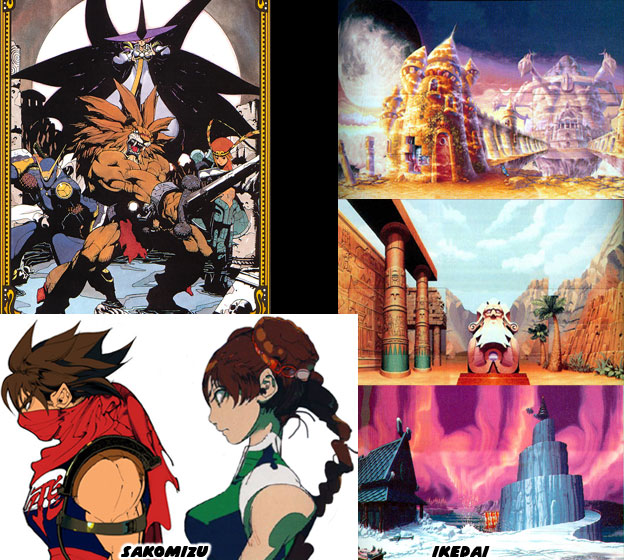
The stars of the game were four playable characters; a lion-warrior named Leo, a ninja named Kenji / Mukuro, a sorceress named Tabasa / Tessa and a young martial arts master named Tao / Mai-Ling. They each had their own strengths and weaknesses. Leo was a lion-turned-warrior. He fought with a sword and shield yet could also perform grapple moves ala Mike Haggar or Zangief. Leo lacked strong magical attacks early on in the game. Kenji had brazenly fast attacks, he had curved blades along his forearm gauntlets, a straight sword and even a cannon with an enormous gunpowder discharge. Like Leo, he was equipped to take out even the largest monster with a weapon rather than magic. Tabasa was a sorceress and had some great magical attacks. She had a magical staff that floated and she could use as a projectile. She even had a few unique physical strikes as well. Tao was a martial arts master and fought with her bare hands. She was very powerful despite her size, perhaps she was a demigod. Her kicking attacks allowed her to set fire to her opponents and throw even the largest villain across the screen. It was as if she was the ancestor that Few Long and Chun-Li were descended from.


I know that it's hard to imagine a fighting game with only 4 playable characters. It was in fact half the number of playable characters than the original Street Fighter II. Yet the quality of the sprites was unsurpassed. The size of the new characters were much larger than ever before, with a wider color palette and many more frames of animation. The animation was very fluid, better even than that featured in Vampire/Darkstalkers. The sprites were superior to the older CPS-II games. All of the extra work required for completing each character meant that less and less time could be used on filling out a bigger cast. Capcom also made sure to use design elements exploited by rival studios. This game was the first and possibly only fighter by Capcom that featured a "fatality" for opponents. If Leo finished his opponent with a strong sword attack you could actually see the villain cut in half. This includes a cartoonish representation of their brains, spinal cord and guts. It was never as gruesome as a fatality in Mortal Kombat but it was nonetheless a surprise.


Like Street Fighter II there were multiple villains and boss characters making up the lack of playable characters. Unlike Street Fighter II the developers were not required to create human opponents. They could dream up just about any type of fantastic beast to fight with. Moreover, each villain reflected the cultural that they originated from.


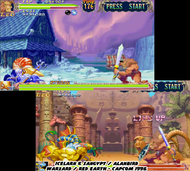
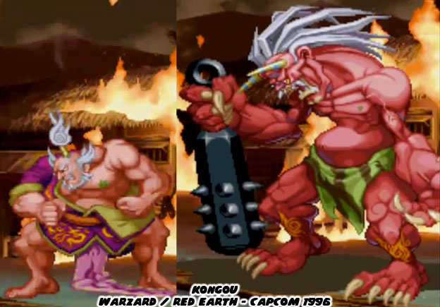
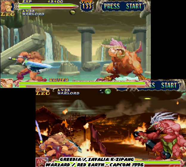
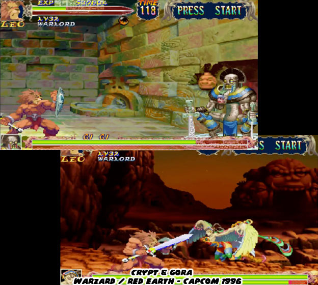
Take the demon Kongou for example. He was from the region of Zipang, a nod to feudal-era Japan. The stage he occupied looked very much like a traditional Japanese town, except of course that it was on fire. It was under attack from a rival army and their flying ships. Kongou was a warlord with a terrible secret. He turned into an enormous monster before the battle. With his spiked mace, red skin color and horns Kongou looked like a classic Japanese oni or demon from storytelling tradition.


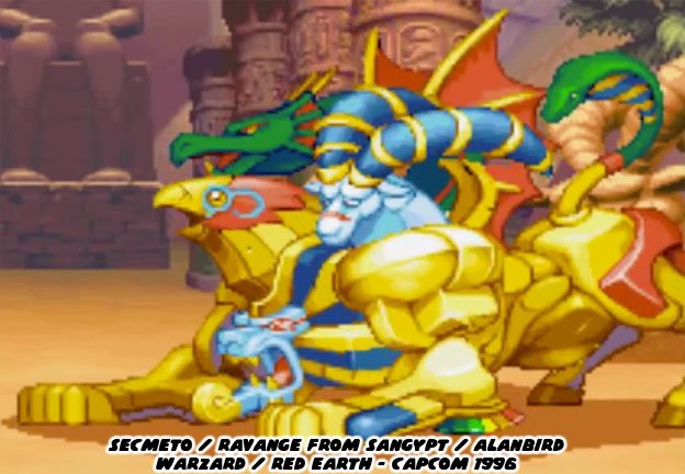
Look at the multi-headed Secmeto / Ravange. This four-legged creature was a mix of Egyptian Sphinx and Chimera from Green mythology. It hailed from Sangypt / Alanbird, a desert kingdom in this fantasy world. There hadn’t been any beast as colorful in any edition of Dungeons & Dragons yet it seemed so familiar to both Western and Eastern fantasy fans. The ability to project different poisons from each head made sense and the raw strength associated with the monster was impressive, but not as impressive as the gigantic monster from Greedia / Savalia.


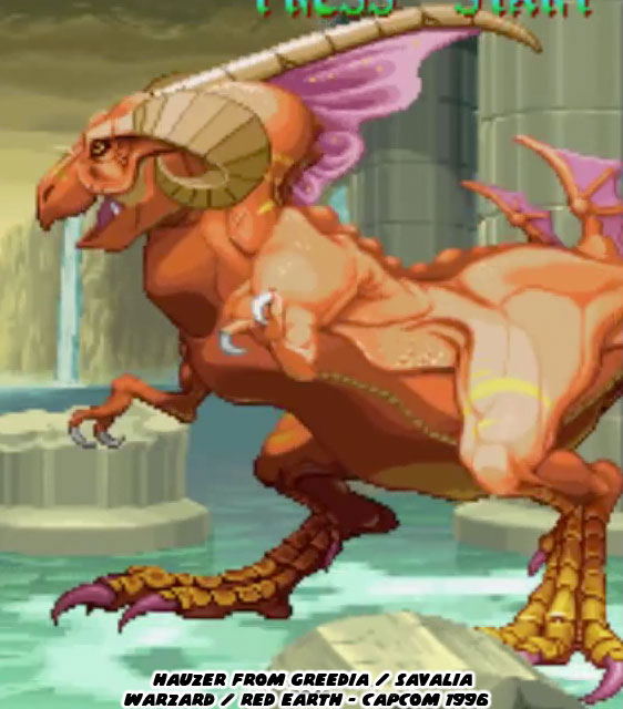
Hauzer was an enormous dinosaur-like monster from the home nation of Leo. It was a lost kingdom, one which had fallen into ruin many generations ago. Hauzer was a beast from antiquity, heralding a time before man ruled the Earth. The sprite created for Hauzer was one of the largest ever featured in any fighting game. He covered almost a third of the screen and his attacks could reach clear across the display. Capcom wanted to let audiences know that this game was compeltely unlike any fighting game before. Hauzer was a showcase for the CPS-III system. More impressive was that each villain was unique, with no sprites rehashed to create secondary characters.


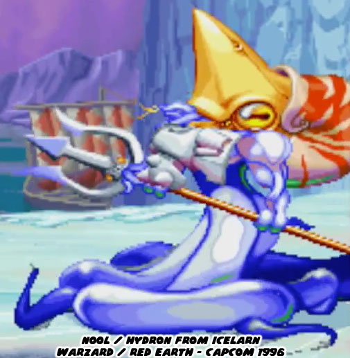
In the frozen north there was an aquatic baddie who moved unlike any other game character. Part walking octopus, part nautilus and armed with a trident Nool was by far one of the strangest fighters ever featured in any game. He was slippery and quite fast despite his square appearance. The figure was so unique that he was placed in Capcom Fighting Jam a few years later along with Hauzer.


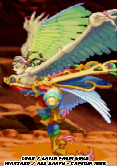
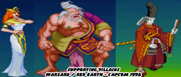
Luan was one of the two female villains in the game, Secmeto was summoned by a sorceress. Luan was a harpy but not the one you might remember from Greek tradition. Luan was not naked, she wore armor and had costume elements pulled from ancient China and Mongolia. She hailed from the same region as Tao, and thus shared many similar central-Asian traits. Capcom had gone above-and-beyond when it came to the color palette applied to each character. The stages were all breathtaking but seeing the quality of the animation and the size of these new sprites was light-years ahead of what other studios were doing.


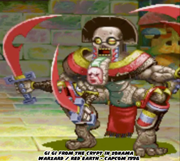
Of all the villains possibly the most unique was GiGi, an animated four-armed statue. It was made of stone and had cues pulled from Pre-Columbian Central America. There was no doubt that the team at Capcom had been inspired greatly by the statue of Kali featured in the film the Golden Voyage of Sinbad. GiGi actually had a left and right side, where its main colors and even sword went from red to blue depending on which way it faced the opponent. Mind you, this was before Gill debuted in Street Fighter III.


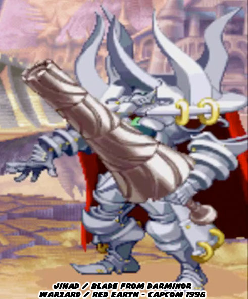
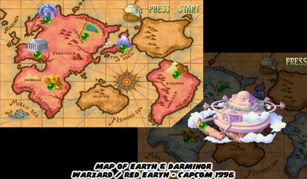
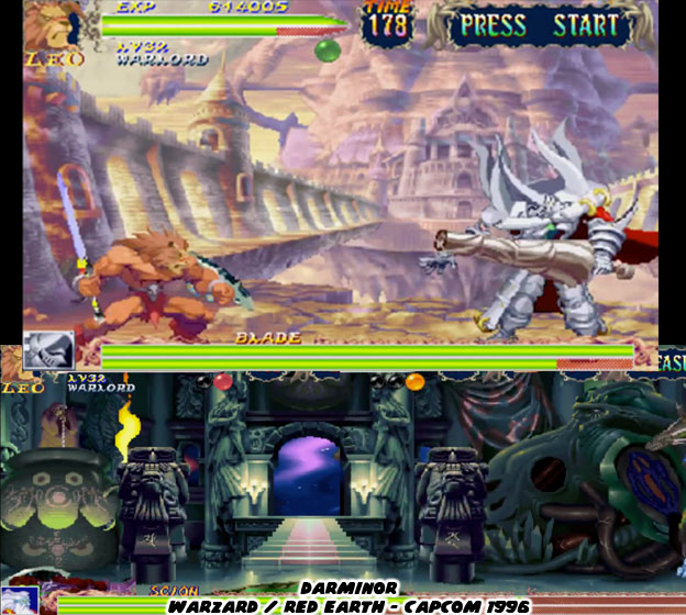
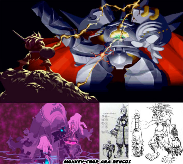
The sub-boss of the game was an animated suit of armor called Jihad / Blade. His lance, which looked like a spinning turret, could extend across the width of the screen. In addition to being genuinely hard he had both physical and magical attacks. He could freeze opponents in a mirror and then smash them into pieces. He could also expand his armor and unleash a blast of energy from his core, a magical crystal. Blade was in charge of all the other villains in the game and was the guardian of the floating island of Darminor.


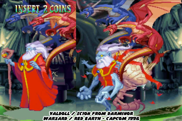
In the center of the floating island was a castle. The inner chamber had strange totems made of dark stone. Some sort of dark ceremony was taking place as the level progressed. The main villain of the game, a War-Wizard named Valdolll / Scion, was waiting for our heroes. The blue-skinned wizard wore a red robe, had long white hair and a beard. He fought with a magical staff and was flanked by two small dragons. He was immensely powerful even without the dragons at his side. When most people think of a fantasy villain a wizard doesn’t usually come to mind but this one was different. He didn’t walk but instead floated across the arena. If a player were able to defeat him once then he would resurrect himself into a more powerful form. His body turned into a grotesque shape. His head became larger, an enormous brain and spinal cord popped out of his back, multiple tiny arms sprang from his shoulders while his atrophied legs dangled from his torso. With his true form revealed it was obvious that the heroes of the game needed to destroy the monster before he could enslave the planet.


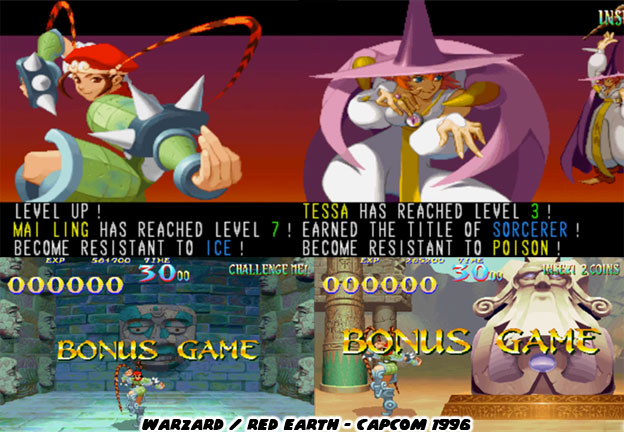
Capcom wanted audiences to understand that this was far from a traditional fighting game. It did have elements from the best fighters they had made up until that point. It needed to have the elements from the RPG titles audiences were used to. Aside from fantasy heroes and villains the game also allowed players to collect treasure from their rivals as well as in bonus stages. The characters also had a level system. The better they fought in each stage the faster they were rewarded with a new level. The levels allowed them to gain new attacks and stronger defenses.


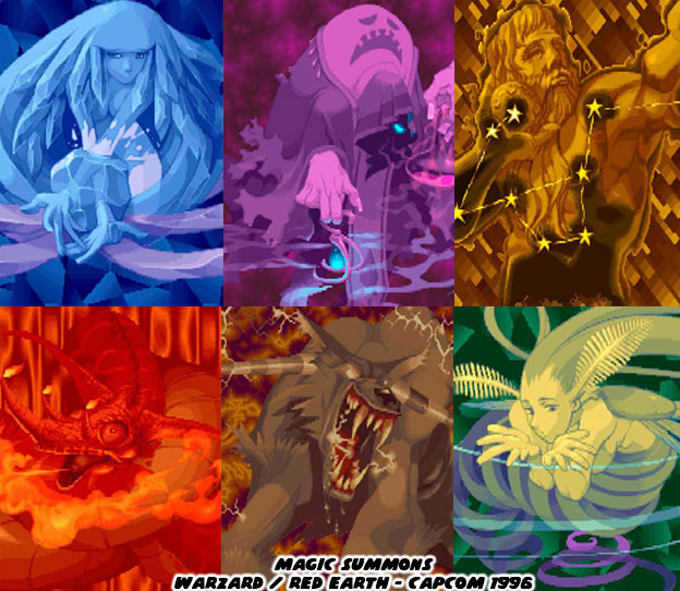
Audiences rightfully expected magic to be an internal part of the experience since this was a fantasy game. Golden Axe had started that tradition for brawlers many years earlier and Capcom was honoring the tradition. Players could collect magical orbs and summon powerful strikes. Using the orbs resulted in a brilliant background to be displayed, showing off the mystical or elemental gods being called upon. The graphics on the summons were some of the most beautiful pieces of art ever featured in a Capcom title.


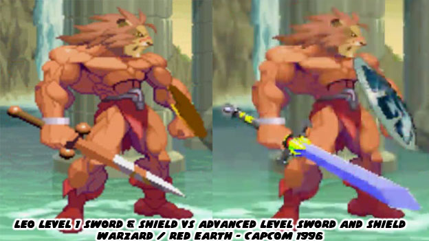
Not only did the attacks become more impressive as the game progressed but heroes such as Leo gained a new sword and shield as he leveled up. Imagine how difficult it would have been to show a Street Fighter’s costume getting better gear each time they fought. The amount of memory and programming talent required to do that would have been insane. Warzard would save each player’s progress locally and they would put in a button command so they could continue leveling up each time they started a new game.


The locations of each encounter left audiences wanting more. These were not the typical backgrounds in a fighting game, the middle of a street with random pedestrians, some back alley or the top of a building. They were instead levels that told a story. Some were in wide open plains and others inside mysterious castles. Each civilization on this planet had had a history, they reflected an indigenous culture. The art team at Capcom was sure to present it with rich colors and layers of details.


It wasn’t hard to imagine that Capcom had great plans for the world they had created. The places in Warzard were meant to be revisited. They were the types of locations that the greatest RPG developers had been crafting over the past decade. There was one advantage to them being placed in a fighting game. The fixed perspective meant that the artists had a greater liberty with color, texture and even scale and proportions that would have been difficult to recreate in 3D. The artists could make the stages appear like the pages of a fantasy storybook and not necessarily a real location.


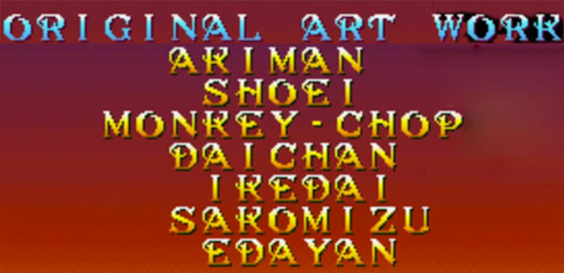
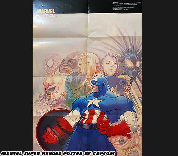
Chief among the background artists was Ikedai, whose design of Darminor looked like a watercolor painting come to live. Ikedai was one of the newer artists at Capcom, as was Sakomizu. The strong contrast of the Sakomizu illustrations, the bright colors and solid ink blacks had been seen earlier in the Strider 2 art. This style was a standout and was featured prominently on much of the official Wizard poster art. All of the senior Capcom artists working on the game would get highlighted in the credits.


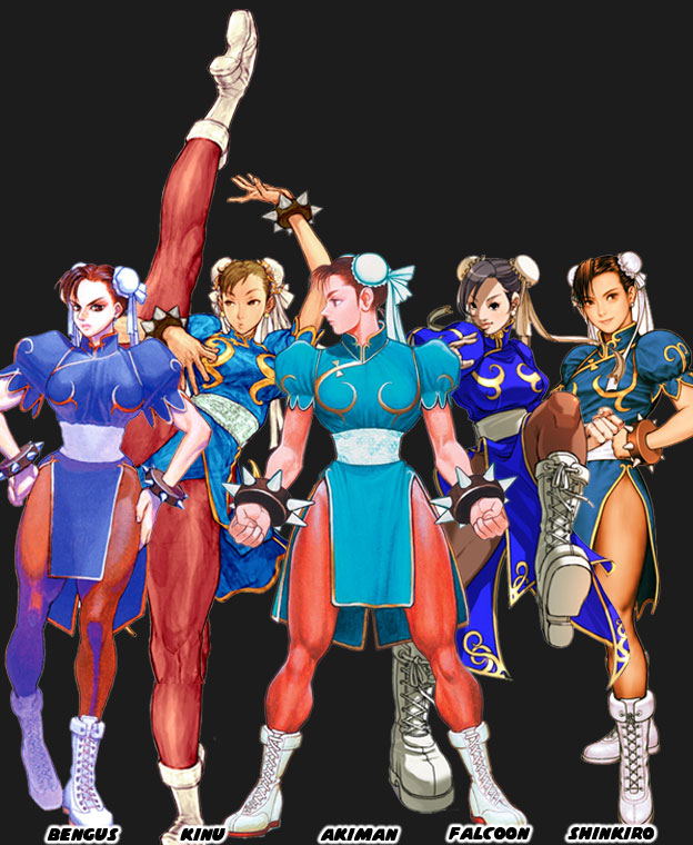
The credits featured a list of seven artists for creating the original art. They were a handful of the most influential designers of all time and were actually listed by seniority within the studio. I sometimes get asked how to tell them apart in my blogs. It is easier if you place a couple of examples side by side, so here’s a short summary for things to look at while studying the drawings. At the top of the Warzard credits were Akiman and Shoei. Their work defined the official, cabinet and sprite art on the CPS-I and CPS-II hits. The paintings of Shoei were done in paint and markers. His best worked was comparable to oil paintings. He captured the personality of the various fighters in Street Fighter canon and were very much the foundation for all the character models in Street Fighter II. Akiman should need no introduction, as a character designer he brought a lot to the table. He had a very strong manga style and created most of the early black and white Street Fighter II designs. His poster work saw much lighter color blends than any other artist on the team. Despite the lightness of his colors the figures still conveyed weight and movement. Of course if you remember one thing it’s that he created Chun-Li.


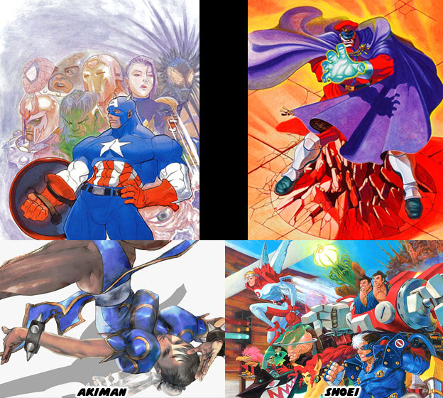
The third artist credited in Warzard was Bengus aka Gouda Cheese aka CRMK. In this game he was listed as Monkey Chop. His unique style was featured prominently on the development of the Street Fighter Alpha / Zero series and the Vampire / Darkstalker games. His proportions were very exaggerated. Zangief for example was so muscular that he was about as wide as he was tall. Dhalsim on the other hand was very thin and angular, almost alien-like in appearance. His work in these games also went on to influence countless artists and animators, not only in Japan but in the USA. Bengus’ preliminary pencil work might be colored by another Capcom artist or vice versa. His fingerprints were very much in Warzard, specifically in the opening animation and summons. Shoei and Akiman sketched out the concepts for the various monsters in the game, traditional demons and giants in armor, and Bengus went in right after to give them a completely fresh take.


Two of the younger members of the art team, Daichan and Edayan had cut their teeth working on the art for the Street Fighter Zero, Street Fighter EX and Rival Schools titles. The style of Bengus had certainly rubbed off on them, however fans of Capcom should take note at the preferred media that each worked in. Edayan filled his pieces with bold colors, a mix of anime influences and digital techniques were his calling card. He blended reflections and multiple sources of lighting seamlessly on the clothing and skin of his figures. The style of characters were very angular, their muscles were not as exaggerated as those of Bengus, yet not as flowing as those of Akiman. Instead the art was somewhere in between.


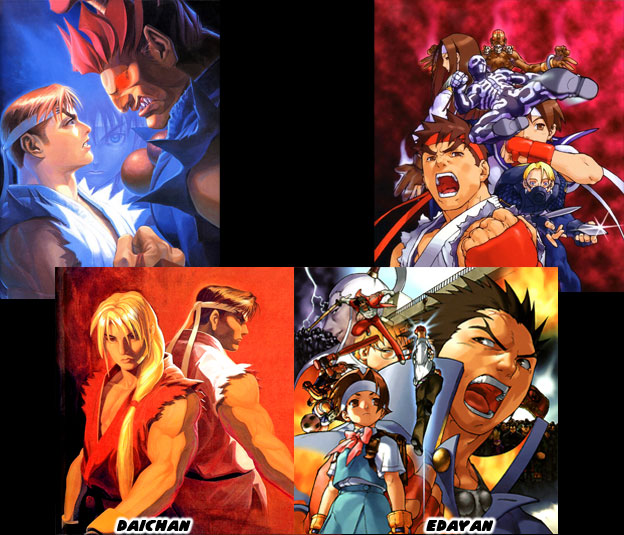
Daichan was an accomplished traditional and digital artist. He was great at painting on canvas. He did a number of large panels that were reproduced as arcade posters. His painting of Ryu and Gouki staring at each other from Street Fighter Zero 2 was legendary. It would be revisited in comics and would be copied by manga artists in Japan and China. Daichan and Edayan had art on the cabinet, in the official guide book as well as in the Capcom Secret File (an arcade flyer) for Warzard. Their strong sense of color most likely influenced the color choices on the costumes of the villains and even stages themselves.


The game was simply breathtaking. It was leaps and bounds above Super Street Fighter II. In fact it was far ahead of what the competition was doing. Other studios were fixated on adding more and more characters to their lineup, some of them with many of the same moves of other characters in the series, Capcom went the opposite direction and created a small number of memorable heroes and villains. This was of course in part to the time that it actually took to create higher-resolution sprites and higher-quality sprites as well. From a game play perspective it had a number of unique elements, the ability to save your progress and level up the main characters. Capcom was so certain that the game had a bright future that they even teased what changes were in store for a sequel.


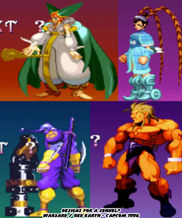
Leo was created by several shaman from a primitive tribe, a lion was chosen to defend them from Valdolll. The transformation into a man was halfway complete in the original game. Leo was meant to become a human and eventually a king to his people. Once peace had returned to the land Leo was turned back into a lion. It was a bittersweet ending for the character. The “true” version of Leo was teased, along with evolved versions of all the other characters. The armor of Kenji had changed slightly and looked more beetle-like. Tabasa had a double-horn hat and Tao had gained some more costume details that appeared pulled from the Chinese opera. What sorts of new moves would they have added? I doubt that Capcom would have simply brought back the same villains in a sequel. It wouldn't have made any sense if they did. Given the development time and cost to produce Warzard it stood to reason that Capcom had to kill the sequel. With Street Fighter III they could keep adding new characters, they could add new stages and new upgrades and keep existing characters around as well. Warzard would have to be redesigned with every sequel. It was not practical from a development standpoint however the bold experiment was something that the fighting game genre sorely needed. Warzard was a perfect example of using a fantasy theme within a fighting game. Neither Eastern nor Western in setting it built universally recognized heroes and villains. Do you think that this game deserves another chance? If so I'd like to hear about it. As always if you enjoyed this blog and would like to sponsor me please visit my Patreon page and consider donating each month, even as little as $1 would help make better blogs and even podcasts!

 follow the Street Writer on Patreon!