Friday, December 1, 2017

Coco. Why we need to talk about other cultures in film...

Dear Pixar, Disney and the animation industry in general. We need to have a conversation. It has to be soon. This has been something that's been bugging me for several years. When Disney tried to copyright the name of the Dia de los Muertos and it caused a tremendous backlash from the Latinx community. People were up in arms because it sounded like the corporation was trying to appropriate a holiday. Disney was doing this on behalf of Pixar which was working on a film about the holiday. Animation fans were concerned for a number of reasons, but mainly that Pixar was trying to steal the thunder from The Book of Life, one of the first and most important animated features about the holiday. Pixar had to work overtime trying to fix the public perception. This was not going to be a cash grab, they wanted to assure the community that they would be true to the holiday. Part of the way they did this was by reaching out and soliciting feedback on their story, characters and presentation. Cartoonist Lalo Alcarez went from one of the most outspoken critics to one of the consultants on the project.


The problem that I saw was not in whether or not Pixar could pull it off. I knew that they could. They had an amazing track record. They would be willing to invest the time, energy and resources into making sure the film hit all of the right notes. If they could make people cry over toys and monsters then a story about deceased family members would be a given. What I saw as a problem was the cultural element. There were thousands upon thousands of things that people think about when it comes to reflecting a culture. Having advisers was a good start but for just about every studio that was also where their cultural immersion ended. When the worlds were fictional, say Monsters Inc. or Cars, then people weren't really up in arms about it. Pixar could make up anything they wanted about these worlds and nobody would protest. But as soon as they took on a real holiday with layers of religious and cultural overtones then people (especially minorities) were right to have their concerns.


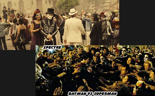
The Christian observation All Souls Day did not really conjure up any specific images in pop culture. If you hear the words El Dia de los Muertos however, then the visions of candy skulls, painted skeletons and colorful altars immediately come to mind. Some people mistakenly liken this to Mexican Halloween. It is actually a celebration of family ancestors that is quite humble and solemn. Most didn't realize that the holiday was centuries old and the skeletal imagery was pulled from ancient traditions. There were ceremonies in the Pre-columbian world to honor the dead, two versions of these native holidays were combined by Catholic missionaries when All Souls Day was introduced in Mexico. The colors and symbols used no international artist could ignore. In small chunks the holiday had been appropriated by directors that had little to no understanding of its roots. Dia de los Muertos was used as set dressing for the films Spectre (2015) and Batman v Superman (2016). In which the Mexicans were voiceless actors parading around in a not-quite-right version of the holiday. In more pandering ways it had been stripped of its true meaning and used as a way to sell lottery tickets.


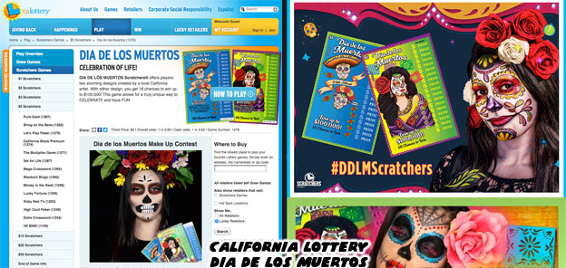
When I first saw the California lottery tickets earlier this year it felt like a slap in the face. It was as if the lottery commission was saying to me "Hey stupid, this is your culture and we are selling it back to you $1 at a time." It felt as if our holiday had been appropriated by the USA. The people with the power were taking something that wasn't theirs and repackaging and selling it for mass consumption. It was how I felt when I heard that Pixar wanted to make a Dia de los Muertos film. I wondered how an animation studio that wasn't based in a Latin community, that had never created a short, show or film about the Latin community and was not lead by any Latin directors could take on such a project. It was great that they were interested in the holiday but there was so much nuance to it that I feared that Dia de los Muertos was becoming the new "Tiki."


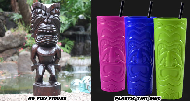
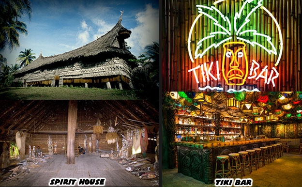
When soldiers came back from the Pacific Islands post WWII they created a caricature of the Oceanic Arts. One in which the mythology, art, architecture, design and landscape of the islands, minus the people, were idealized. Ancient symbols, community gathering places and ancestry worship were stripped of their identity. Ornate carvings in koa wood were made squiggly lines in drink coasters, handmade tapa cloth gave way to plastic grass skirts and ceremonial totems became bottle openers. The spirit house became the bar within a generation. Ask somebody from New Zealand, from Papua New Guinea, from Samoa or Hawai'i what they think about tiki culture. They'd say it had as much to do with their people as Taco Bell had to do with authentic Mexican food. To the mainstream US however, there was no difference between the two.


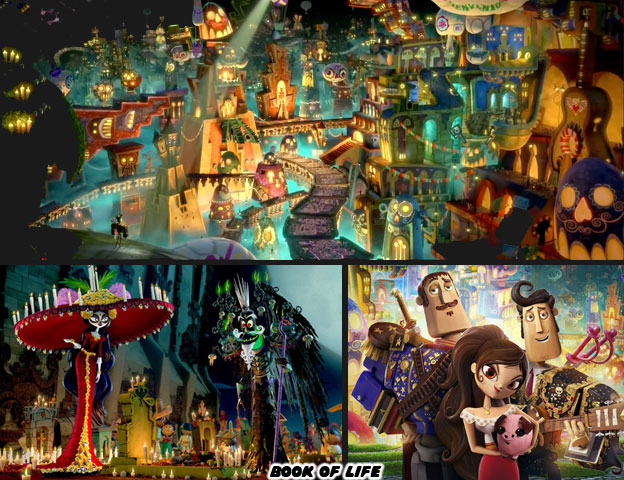
Little by little the symbolism behind Dia de los Muertos had come up more in mainstream culture. It had been incorporated in bite-size pieces. A costume or mask for Halloween. A coloring book and a sticker sheet found in the grocery store. A label on a beer bottle. They were small, innocuous at first. But as more artists, designers and art directors learned about the culture the more they began to "tiki-fy" it, to mass produce the cultural icons and slap them on all sorts of products. Before you knew it there was an entire section in the World Market dedicated to Dia de los Muertos. There were invites at Party City, sweaters in Target and of course lottery tickets all featuring the same sugar skulls and papel picado. I had little to no faith in Hollywood would ever get this right but then The Book of Life came along.


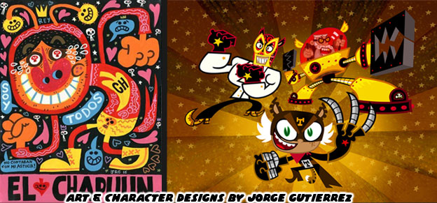
The film from 2014 was not only a breath of fresh air. It was also a validation of our people and our culture. It didn't appear overnight. The writer and director, Jorge. R. Gutierrez, had been building a name in the animation industry for years. He had spent at least a decade, along with his talented wife Sandra Equihua fine tuning the story and characters featured in the Book of Life. His artistic style, incorporating elements of Mexican pop culture and art was established early on. His characters didn't look or sound like anything on Western television. His voice was unique in the industry and could be counted on to add an element of authenticity on animation featuring or about Latin culture. Jorge had built a following with shows like ¡Mucha Lucha! (2004), Maya & Miguel (2006) and El Tigre: The Adventures of Manny Rivera (2007). As a native Mexican Jorge had an insight and appreciation of the culture that the vast majority in Hollywood would never understand. His (and his wife's) brilliant designs aside, his comedic timing, his pacing, the ability to insert subtle details about masked wrestling, dramatic supervillains and the occasional churro nobody else in Hollywood could reproduce.


Everyone that I knew, Mexican or not, loved the Book of Life. When Disney and Pixar announced that they too were working on a Dia de los Muertos animated feature many fans were up in arms. An amazing film had just come out celebrating our culture, written and directed by "one of us" and we couldn't own it for longer than a minute. It was frustrating. Jorge had spent half his professional career on getting it off the ground. He had poured his heart and soul into this project only to see the biggest animation company in the world come along and cash in on the momentum. It was something that stood out when Coco Director Lee Unkrich asked why people felt threatened by Coco: It was obvious to fans that he simply didn't "get it." On paper the plot of both films was very similar, a boy longed to be a musician and his family forbade it, then he reconciled this with the help of his deceased relatives Yet that was only one level to the frustration.


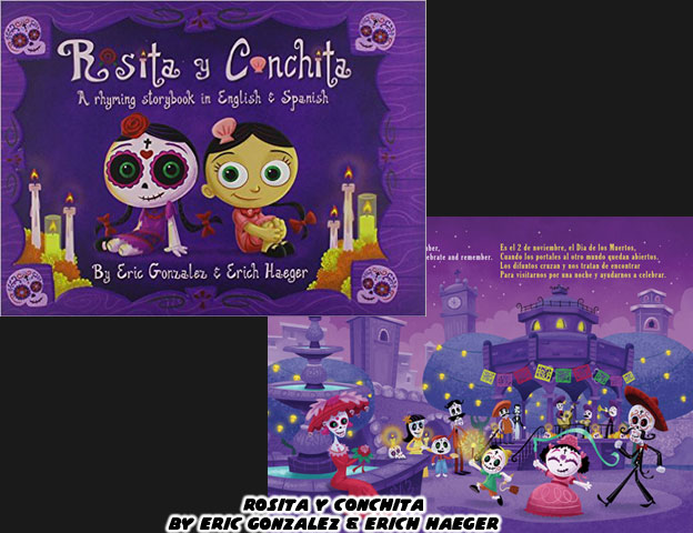
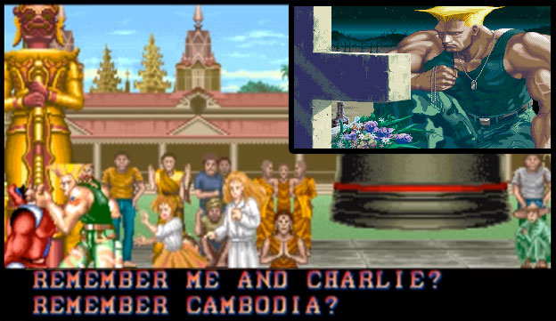
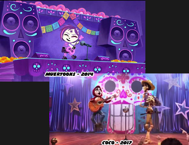
Visual stories featuring el Dia de los Muertos had been around for a while. One of the best was Rosita y Conchita (2010) By Eric Gonzalez and Erich Haeger. Eric was similar to Jorge in that he was known for his fantastic illustrations and 3D pieces featuring styles and themes reminiscent of traditional Mexico. Gonzalez was a staple on the comic convention circuit and pop art shows. He went on to create Muertoons (2014), featuring Rosita and her friends. The animated skeletons went on adventures and learned timeless lessons about family and friendship. This was something that was the crux of both Book of Life and Coco. Family that was not forgotten lived on forever in the land of the dead. In Book of Life the Apology Song (If you can forgive) was sung by Manolo. He begged forgiveness for the countless forgotten bulls that were slaughtered by his family. He also had to return to the land of the living before his town was wiped out and no one would be left to remember them. In Coco the song "Remember Me" had a similar effect. Being remembered was the most important thing for those that had passed on. You would have thought that Pixar had created something new if you didn't know that the Muertoons title song "Not Forgotten" was sung by a rebellious young guitarist named Bibi.


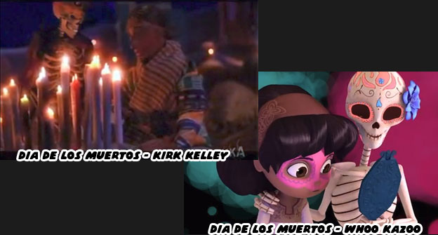
Not only was Pixar coming into the culture late, but they were riding on the coattails of other filmmakers already developing and producing films about the holiday. When Disney applied for the copyright on Dia de los Muertos they didn't realize there was another animation studio already working on a similar project with a similar name. Dia De Muertos, the Mexican directed and produced animated feature by Metacube that was in production before Coco. It wouldn't be released before Coco came out but that didn't stop the small studio from battling, and defeating Disney in court. There was also a computer-generated film about a girl reuniting with her mother during Dia de los Muertos. The 2013 short by Ringling College of Art and Design students Ashley Graham, Kate Reynolds, and Lindsey St. Pierre won a Gold Medal at the Student Academy Awards. In 2006 Laika animator and Texas native Kirk Kelley produced a stop-motion short on the holiday as well. Pixar would certainly gain the lions share of the attention, critical acclaim and profits from their film but they were far from being the first studio to tell a story set in the culture.


The blowback that Disney and Pixar generated when they originally announced their film made their approach more cautious. They began doing things for the film that they had never done on previous projects. Not only did they hire consultants and take trips to Mexico but they also began screening scenes to these outsiders to gauge if they were being sincere, authentic and respectful of the culture. The Latin community represented almost 39% of California's population and 17% of the US population. In an age where the President of the USA said that Mexicans were sending rapists and murderers across the border the pressure for Pixar to get Coco right was tremendous. People were very critical of every real or perceived misstep from the studio. When Central Mexico had an earthquake on September 20th the nation didn't expect any condolences from the North. On September 22 Lee Unkrich shared a picture on Twitter featuring Miguel and Hector from his film. The drawing was credited to story lead Dean Kelly. There was just one problem.


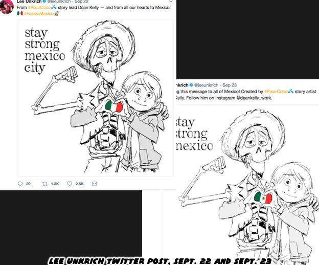
The tiny flag in between the hands of Miguel and Hector was not Mexico’s. The colors were right but it was missing something very important. The eagle and serpent, a story from native legend stretching back more than 600 years was supposed to be at the heart of the flag. Fans called out Unkrich on Twitter and they said the Italian flag was a nice touch, but maybe next time there was a disaster the studio might bother to get the flag right. Unkrich updated the drawing a day later with the new detail. It wasn’t drawn in but looked more like a rushed photo edit. Dean Kelly was then credited as a story artist instead of a story lead. Also in the original post it was about Mexico City but the earthquake had affected many more towns than that, so the repost was changed to read just Mexico. It made many wonder how a studio that had supposedly spent years and years on a project, had brought in outside consultants and had actually traveled to Mexico forgot about the places they went and even the details on the national flag.


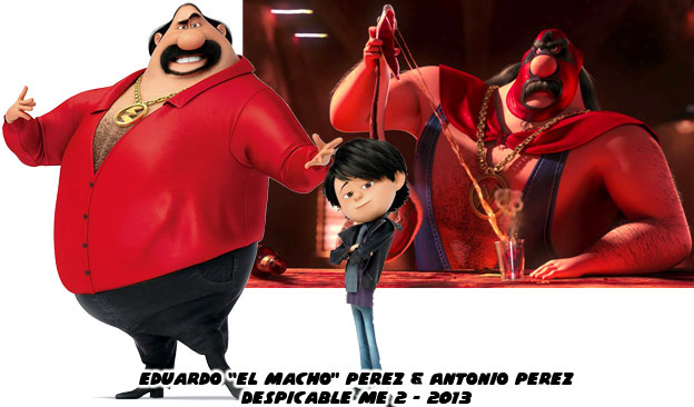
It was these things and more missteps from Hollywood that were under my skin before Coco ever came out. Mexico was presented with a surface level understanding by most animation studios. When Coco was announced and the plot revealed my mom asked if all Mexican boys wanted to be guitarists. I responded that there were only three stories that the studios could tell. They could make a film about Dia de los Muertos, mariachi music or masked wrestling. Choose any two and make a movie about it. Anything past those three occupations was unrealistic. Heaven forbid there would be a movie about a Mexican girl that wanted to be an astronaut. When some studios created a Latino character they almost always went with the ugliest caricatures of the culture. One of the worst things I ever saw in film was El Macho in the film Despicable Me 2 (2013). The villain, whose real name was Eduardo Perez was the owner of the Salsa & Salsa restaurant. Not only was he an excellent dancer, but he was also very macho you see. He was as absurd as was his son Antonio, the stereotypical latin lover. The audience laughed but I winced as the same tired jokes about Latinos were used over and over again.


Mexico had a complex identity and it was hard to capture that on film. Spain and France helped the US defeat Britain in the Revolutionary war, they were thought of very highly in US history books. At the same time those two nations had also carved up and colonized Mexico and Central America. The people in Mexico did not necessarily favor the way they were treated by the Europeans. There was a tremendous Pre-Columbian identity in Mexico that was almost wiped out when Spanish Catholicism was introduced. The native culture did not mix easily with the European. There was a sharp contrast in the old and new if you were to look at art from 500 or 600 years ago. One minute there was a thriving indigenous population, worshiping ancient gods and the next there were oil paintings of Christ suffering on the cross. There was no transitional period, nothing to bridge the two worlds. That came later, when holidays like Dia de los Muertos evolved.


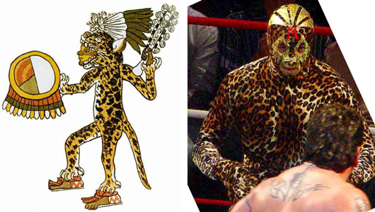
Even masked wrestling had roots in the ancient world as well. Back when war heroes and generals wore animal skins and headdresses that made them appear like eagles or jaguars. The popularization of masked wrestling, some 80 years ago helped bridge ancient and modern traditions. The character El Macho was created out of ignorance. He was just one of several abrasive parodies of Mexico's fascination with masked wrestling.


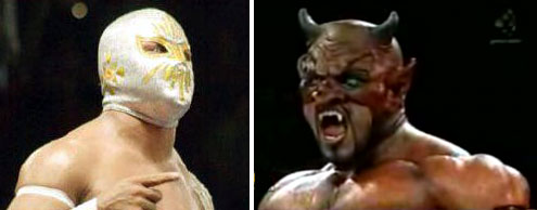
I knew that Unkrich and probably most everyone in Pixar didn't know or understand how something like masked wrestling took over Mexico. How it became part of the national identity. Sure it was easy to present in a film. It could even be used for a quick, throw-away gag. But masked wrestlers, enmascarados, represented good and evil. Every match was a morality play. The good guys, the technicos, played by the rules and were held to a high standard. The heels, or rudos, could only win by deceiving their opponents or colluding with a referee. If you looked at the top heroes and villains you could actually identify who was who. The angels were the good guys and the devils were the bad. There was nothing ambiguous about it. There were no anti-heroes that skirted the line. It was easy for crowds to cheer for the good guys and jeer the bad. Kids knew who they wanted to be. They emulated their heroes, they played with their action figures and watched their films. Putting on the mask was akin to a comic book fan putting on a cape. It was transformative.


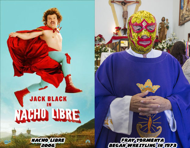
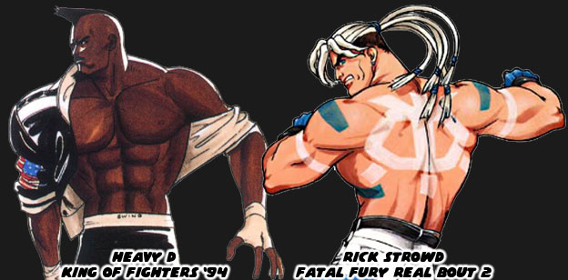
Once there was a drug addict that was saved thanks to wrestling. He became a priest and fought to stay sober. He used the gimmick of a wrestling friar to help raise money for his parish and orphanage. Fray Tormenta (Father Storm) became a cult hero and later national hero for his dedication to the craft. He went so far as to actually perform his priestly duties while in character. There was nothing more than an awkward comedy of the man, of the culture and of rural Mexico by the time Napoleon Dynamite director Jared Hess was done filming Nacho Libre. El Macho was cut very much from the same ignorance about Mexican wrestling. It was open for debate if Pixar, Dreamworks, Blue Sky or any other animation studio understood how much of Mexico's national identity was tied into lucha libre. The Latin community kept the same skeptical eye when anything Mexican, and not just Dia de los Muertos was being appropriated for a film.


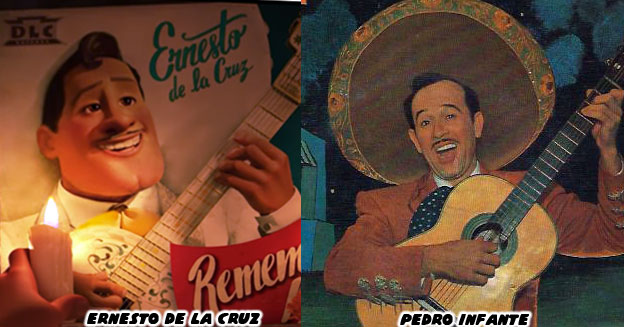
One of the main characters in Coco, Ernesto de la Cruz, was a celebrated musician and film star. Without reading a press release I could tell that he was based in part on the singer Pedro Infante (1917-1957). Infante had a velvety smooth voice and played a number of different characters on film. He was very charming by all accounts and insanely popular in his day. Most that grew up in Mexico were familiar with his films and even generations Mexican-Americans born in the USA had seen the films on television. Infante died in a plane crash at the height of his career. Like many stars that passed before their time it was a wound that never quite healed. Seeing a character design in Coco that reflected the man and the era of "Ranchera" films that he appeared in was something authentic. But the man, his music and films was only part of the story.


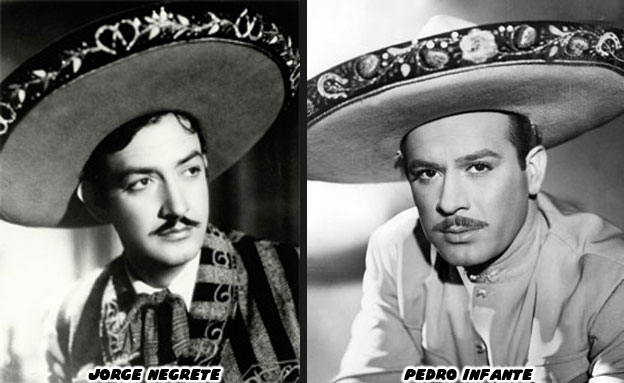
Most of the films Infante and his predecessor Jorge Negrete (1911-1953) appeared in were love stories. Often a love triangle between two suitors and a strong-willed woman. This was a tradition that the Book of Life understood and was able to recreate. The films often featured several popular songs. The highlight of each were the Couplas de retache. These were couplet duels, often between the suitors. The singers would trade witty jabs at each other. There were many well worded passages filled with double entendres. At some point one of the men would snap and the two would almost inevitably start throwing punches. When Negrete and Infante appeared on film some argued that there were triple entendres in the couplas. There was the literal meaning behind the words, the subtext to the lyrics and then there was the third meaning on how the personal and professional lives of the actors were always in competition. The two men were friends in real life but public opinion always saw them in competition. Did Unkrich and Pixar know these things about the classic films of Mexico before they started writing Coco? Or did they just want to use the ranchera film as "set dressing?"


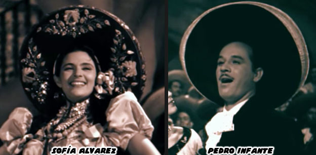
Was Pixar aware of how some of couplas were not always between two men? One of the iconic duels was between Infante and Sofía Alvarez in the 1947 film Soy charro de Rancho Grande. The two were not love interests in the movie but they were trading some heavy verbal punches at each other. Alvarez appeared earlier with Infante in the 1946 film Bajo el sol de Jalisco. Whether competing against each other or singing in unison the female leads were often as important as the stars. It was not a one-sided affair, the women often had a chance to steal the movie. If music was important in Coco then the team at Pixar had to become aware how it had been presented in film. They needed to know who did the singing and why. What were they singing about and why the content and context was important? These were all things that Disney learned how to do before Pixar was ever formed.


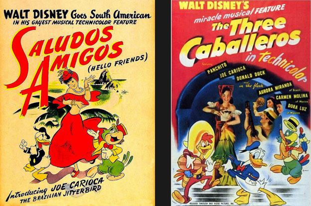
As part of a goodwill tour (on behalf of the US Government) Walt Disney and "El Groupo" traveled to South America. They learned about the customs, and traditions of the various countries. They visited with local artists as well as political officials and immersed themselves in the cultures of Chile, Peru, Argentina and Brazil. They released the film Saludos Amigos in 1942, which introduced the US to Pedro the airplane and the parrot Jose Carioca, the surrogate for Brazil. The following movie, The Three Caballeros (1944) featured new stories and introduced us to Pancho Pistolas, the representative of Mexico. The title song of The Three Caballeros was composed by Manuel Esperón. He was asked personally by Walt Disney to collaborate on the project. His hit song "Ay, Jalisco no te rajes" was the backbone of the theme. Jalisco and the capital city of Guadalajara, was the birthplace of Mariachi music. It was integral to the Mexican identity. The rhythms of Mexican natives, combined with the music from European immigrants (mainly waltzes and German polka) all helped color the mariachi style. Just like Dia de los Muertos and Lucha Libre, there were elements of the old world and the new world featured in mariachi music. These things helped make something brilliant.


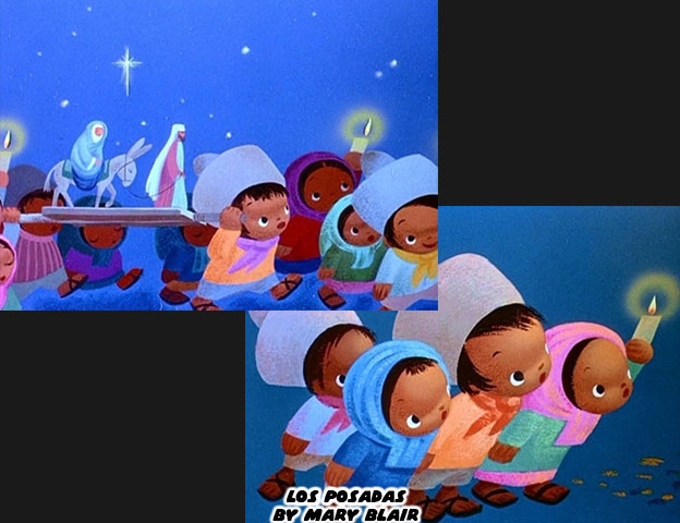
The senior artists that went on the trips were greatly influenced by what they saw. I would argue that nobody was more affected than Mary Blair. She was already a master of paint and color but her work forever changed during her travels. She was able to create several scenes that framed the frenetic energy of Brazil's nightlife and the more solemn Posadas of Mexico. The slight change in how she used color, the ability to capture the children of different ethnicities, would help her develop the figures on it's a small world many years later. There was no backlash when it was announced that the uniquely Spanish Catholic tradition of the Posadas would be featured in an animated project. Then again things were much different 74 years ago. News traveled slower, there was no internet and the voices of minorities in mainstream culture were almost nonexistent. Despite these things Walt's team created work that was respectful of the culture and could be celebrated universally. So this took us full circle. Now that Coco had been released we still needed to have the talk. My contention was not about whether or not Disney or Pixar could produce a good movie. My contention was about who was the telling the stories and why we couldn't tell our own.


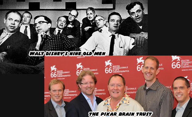
In the golden age Walt Disney had his "Nine Old Men" the artists and directors he trusted to carry out his vision. The work they created set a standard that was hard to top. There wasn't much diversity then but that was a different era. They could still deliver a great film (or theme park) despite their lack of representation. That tradition carried on at Disney for decades. When John Musker and Ron Clements had an idea that would become Moana. Pixar boss John Lasseter pushed them to dig in deeper into the history of the Pacific Islands. By doing so they avoid making the story "Tiki" and instead a more authentic experience. Now there was The Pixar Brain Trust, the senior artists and directors that John Lasseter trusted to get things done. Again, there wasn't much diversity or representation in the lineup but there were results. Smash hit movies, beloved by all. It made me wonder why they didn't have women or minority directors. Why were a group of "white guys" the gatekeepers for animated projects, especially those about other cultures? Were they really the only ones that knew how? Or did they not realize that great storytellers came in every shade and gender?


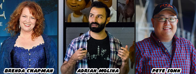
Brenda Chapman was let go from Brave, essentially her original mother/daughter story. When word got out that the Good Dinosaur was in trouble Pixar replaced the director with Pete Sohn, who did his best to lessen the blow or to be thrown under the bus, depending on how you saw the situation. For Coco they brought up long-time Pixar animator Adrian Molina to add an ethnic voice and co-direct with Unkrich. Neither Chapman, Sohn or Molina was considered part of the Brain Trust. If only I could figure out what the three were missing. Following the success of Coco it was doubtful that things would change. Instead both Disney and Pixar would find another culture to talk about, perhaps return to Africa or China. They would go out of their way to do research, bring in advisers and sign up some famous names. They would tout their authenticity during the D23 Expo and parade their stars. The people from that country would be happy that they were being validated by a big Hollywood picture. The world would keep on turning. Just once I wish the studios had a real conversation. With Lasseter on leave maybe now would be the time to acknowledge that a woman could do his job, a minority could do his job, and the Brain Trust could evolve. But I'm just a Mexican-American writing about Japanese fighting games on this blog. What do I know about representing other cultures?

Sunday, October 15, 2017

Zeku, the ninja spirit from the '70s finally returns!

Hello friends, welcome back to another quick character design breakdown. The latest Street Fighter V character has just been revealed. Many people had predicted this character based on the silhouette that was unveiled by Capcom many months ago. The unique hair really was what gave this character away. In case you didn’t know who I was talking about it was the ninja Zeku.


In canon Zeku was the master of Guy, one of the star characters in Final Fight. What made Zeku unique was that he was never a playable character in any previous game. In fact his appearance was very rare. Final Fight was an arcade hit and was ported to several different consoles. In 1993 it spawned a sequel for the Super Nintendo. At that point the only returning character was Haggar. Maki, another fighter from the same clan as Guy had joined his battle against the Mad Gear Gang. Then in 1996 a third Final Fight was released, including the return of Guy to the lineup. At about that time Capcom was also working on a follow up to Street Fighter Zero / Alpha. They had Final Fight on the mind and were going to retcon the events of Street Fighter, Street Fighter II and Final Fight in this new game. Street Fighter Zero 2 included Guy and Rolento from the Final Fight series as well as some Metro City-themes stages. It was at this point that Capcom introduced the world to Zeku.


Zeku appeared very briefly in Guy’s ending. A sort of final showdown between the master and the student. This in addition to the official character art led a lot of Street Fighter fans to speculate that Zeku would soon be joining the lineup. Nobody thought that it would take Capcom 21 years to actually do this. Senior artist Bengus was responsible for his look. It was appropriate that Bengus would update the character for Street Fighter V. It’s funny that I should use the word update when what he did was actually keep the look decidedly “old-school.” Zeku was actually a nod to the characters and artists that influenced the Capcom designers from a young age.


The long, wild, hair of Zeku had its origins in the “70s, when it was trendy for men to sport this look. One of the biggest hits of the time was Science Ninja team Gatchaman, a show from 1972 that was adapted for the USA as Battle of the Planets. The series worked for a number of reasons, not the least of which was that it was a unique blend of different elements. The stars looked like everyday people. They wore shirts and (bellbottom) jeans. They had long hair and sunglasses, making them easily the coolest animé characters of the era. Also the henshin, or transforming hero shows, were just starting to take off in Japan. This was one of the first animated shows to use that concept. It took a group of ordinary teens and turned them into costumed superheroes. What kid growing up didn’t want to be just like them? The Capcom designers were kids and young men during this era. Although Street Fighter is not filed with characters like Viewtiful Joe, the ‘70s aesthetic did leave an impression with many of the artists.


Animé was evolving by leaps and bounds during this era. When manga and animé first took off many designers were copying the style of Osamu Tezuka, considered The Godfather of animé. Gatchaman was pulling away from the Tezuka style, creator Tatsuo Yoshida wanted a more rebellious look for his heroes. This was a stark difference from his previous work on the clean-cut Speed Racer. This rebellious attitude and freeform character designs were combined with the popularity in science fiction. Leiji Matsumoto created the iconic Space Captain Harlock in 1977. His style was very different than his contemporaries, nobody created figures with the same super-exaggerated proportions. His men were almost as slender as his female characters, yet they all oozed personality. He introduced an entirely new aesthetic into animation. Figures had to push the envelope of body types. There could be squat fat men and lanky femmes on frame and somehow it worked. His anti-hero designs were the envy of all. His iconic skull and crossbones would somehow find their way into other manga and animé (and Mad Gear) as well. The next evolutionary step in character design was from an artist known as Haruhiko Mikimoto. The animé Super Dimension Fortress Macross was another sci-fi smash hit. The series began in 1982, and was among the great space operas. Mikimoto further distanced his work from his predecessors, but there were still connective tissue on the heroes and villains. The long hair, sideburns were trimmed but the rebellious spirit was still there.


Zeku was a call-back to the hyper-cool heroes like Ken “the Eagle” Washio and Joe “the Condor” Asakura. It wasn’t enough that he carried over the hair, but his actual facial features, the angles on his jaw and eyes were very much spot-on with the Matsumoto aesthetic. Go back to the illustration at the top of the blog and take a closer look at the “young” version of Zeku. As it appears Zeku had two different sets of costumes. They look like his current older version and a set based on how he looked as a young man. It would make sense that 40 years ago Zeku was in his prime, he would have worn clothing and had hair that looked like he was right out of the ‘70s. Long time Capcom fans would be the first to spot the blue and red uniform that he sported was similar to that of Strider Hiryu as well. Here’s where things get very interesting for the ninja master.


Strider was a character designed by Tatsumi Wada and published by the artist collective Moto Kikaku in 1988. The manga was in collaboration with Capcom who wanted to have their own henshin superstar. The manga set the groundwork and the arcade release came out a year later. During the same development cycle Capcom was also working on Street Fighter ’89 / Final Fight. I believe that Guy was pulled from the same design notes that went into Strider. The comparisons between the two were more than skin deep. Strider was of course presented with a blue uniform but audiences didn’t know that with the original red-toned cover. The genius design element that grounded Guy in the present were his high-top sneakers. The genius design element that grounded Zeku in the past were his ‘70s haircut and fashion choices. If Capcom were to lay the foundation for a Strider reboot then this would be their chance. According to canon Strider Hiryu was born in 2030. At that time Guy would be as old as Zeku was now. And if Zeku were still alive he could have launched the organization fighting against global terrorism. That was of course if Capcom were looking at their long-term game strategy. Even if not Zeku was a welcome addition to the lineup. He certainly had more care given to his re-introduction than either Birdie or Abigail. As always if you enjoyed this blog and would like to sponsor me please visit my Patreon page and consider donating each month, even as little as $1 would help make better blogs and even podcasts!

 follow the Street Writer on Patreon!

Thursday, October 12, 2017

Hiding the master in plain sight, the genius of SNK's character design... final part

SNK had spent more than 25 years creating a library of amazing fighting game characters. The best ones were the results of talented artists and insightful creative decisions. To stand out from the rival studios they created fighting archetypes that were hidden in plain sight. Martial arts masters could wear street clothing, or in some cases trendy fashion and still work within the context of the game. This rule was not set in stone. Some of the early design choices were made because of what audiences expected from fighters. After all, how would the player be able to tell a karate fighter apart from a boxer if they both wore identical suits? Because of this some martial arts were represented by characters in classic costumes. Some boxers wore shorts and punching gloves. Some karate fighters wore gi's and black belts. China was considered the birthplace of modern martial arts. Just about every major studio, Capcom, Sega, Namco, Midway and SNK at one point or another created a kung-fu master wearing a traditional uniform. Some of these designs were actually quite memorable. In the Art of Fighting for example the character Lee Pai Long not only wore a classic costume, he also sported a monkey mask. This was the type of outfit an actor from the Chinese Opera would actually wear.


Lee was a mysterious figure, his actual face was known only by a few people in King of Fighters continuity. As memorable as the character was, he didn't work well enough to be used as often as some other fighters. The seeds however had been planted to include the traditional costumed fighter from time to time. Almost 25 years later the studio went back to the classics and introduced another masked Chinese character. Mian was not a representative of the Chinese team in the KOF series, she was instead a member invited by tournament organizer Antonov. The dancer and master of the Chinese art of mask changing, was breaking down stereotypes. Her Sichuanese Opera costume was traditionally worn by male actors and even the historic mask changing magic was performed almost exclusively by men. SNK had become more attuned to the Chinese consumer over the past few years. Chinese gaming had exploded in popularity the past decade and every major studio was trying to make headway into the Chinese market. SNK had even partnered with Shanda, one of the largest publishers, to get a KOF massively multiplayer online (MMO) game launched. They were paying closer attention to the growing markets than just about any other fighting game publisher had in the past few years. After facing a few financial crisis, a merger with Playmore and restructuring, SNK had to ensure that they made business savvy moves. This wasn't the case when they originally fleshed out the Chinese team or even Brazilian team in KOF '94.


SNK wanted to create a sense of a global competition in the KOF series, the only problem was that they lacked familiar characters from each nation. To circumvent this they relied on characters from other games to act as representatives of a country. The Chinese team of Athena Asamiya and her partner Sie Kensou for example were pulled from the game Psycho Soldier. They were not necessarily fighters trained in a specific named form. The two relied instead on psychic attacks to supplement their martial arts training. The third Chinese representative, Chin Gentsai, was modeled after the "Drunken Master" a movie character named Beggar So played by Yuen Siu-tien. The three barely had a thread that connected them to China. How do you think that Chinese audiences reacted to the characters? The same thing could be observed with the Ikari Warriors, Ralf Jones and Clark Still. The two had appeared in an action shooter set in the jungle but it was not known if they, or team captain Heidern, were actually from Brazil. The three were mercenaries and didn't represent any school of Brazilian martial arts. More than 20 years later SNK had become more attuned to their audiences. The Japanese publishers (Capcom included) were surprised to learn how popular their games were in Central and South America. The Brazil Game Show for example had more than 300,000 attendees in 2017! Because of this the designers took a little more time in crafting new characters for the King of Fighters XIV. Nelson the boxer was from Brazil. I had mentioned previously in this series, but he was joined by two new Brazilians as well.


The masked Bandieras Hattori was obsessed with ninjitsu. He idolized Andy Bogard and Mai Shiranui and wanted to become a full-fledged ninja. His ultimate goal was teaching his own form of ninjitsu in Japan. His dark skin, armor and light pants, with sumi-e waves painted on the cuffs created some incredible contrast. His mask and pulled up braided hair made him appear unlike any other modern fighting game character. The character could be seen as an homage (or even parody depending on your perspective) of how passionate South Americans were about Japanese culture. The third new character was Zarina. She sported the colors of the Brazilian flag and most assumed that she would be a capoeirista. Despite her ginga, or dancing stance, she was actually a samba dancer that happened to be a good fighter. It was strange that the new developers would focus on her dance more than the martial arts. Capoeira had been a part of the SNK legacy since Street Smart back in 1989. Richard Meyer and Bob Wilson were two of the more famous Capoeira stars from the Fatal Fury series. I had talked about the origins of Capoeira in fighting games on a previous blog. I don’t understand why the newer generation of SNK developers would have missed this connection to their actual legacy. To be fair I think that many of the Street Fighter IV and V designs also failed to live up to the legacy designs. But I digress. The mix of new Brazilians was a unique choice, not quite the masters hidden in plain sight but perhaps something the studio could build on and learn from. Just like Heavy D was a change in direction for boxers, I’m certain that Bandeiras, Zarina and Nelson were the start of a new direction as well.


What really surprised me for the new characters in KOF XIV was the Chinese star Shun’ Ei. The design was pandering very heavily to what some Chinese gamers thought made a cool design. Many in the community saw the character as even poaching the design of a couple of characters from Xuan Duo Zhi Wang / the King of Combat. To be fair I had also brought up that fighting games had been stealing things from each other as much as from pop culture for over 30 years. When the Japanese studios did it nobody seemed to mind but when Chinese developers began doing it then suddenly audiences were in an uproar. If anything Shun’Ei was reinforcing the themes that many Chinese audiences favored in the character designs. King of Combat focused on martial arts masters in plain clothes, their inspirations were pulled from post KOF ’94 stars. Terry Bogard was probably the first plain clothes master in a franchise but it was Kyo Kusanagi that redefined the look. From that point going forward the characters in KOF didn’t even need a named fighting art. They could be dressed in trendy fashion and have psychic or elemental powers at their disposal. Ell Blue and Yan were distilled from that understanding.


Kyo Kusanagi, Iori Yagami, Shen Woo and Ash Crimson were some of the templates that the designers from Jade Studio were working from. The majority of the cast was supposed to look cool and trendy and there was no better studio to borrow from. The Chinese developers built a 3D fighter that was presented in 2D so that it played like a classic arcade fighter. They recreated all the elements found in latter KOF games, going so far as to capture the feel of SNK’s level and stage designs. They even sprinkled in elements from Street Fighter and Tekken as well to make a terrific mash-up for the PC. The artists working on the game knew enough of the origins behind characters like Kyo and Iori when they created their stars Ell Blue and Yan. The former being more western-themed and the latter being closer to the East. In case you weren’t familiar Kyo and Iori from the KOF series had costumes that were rooted in high school uniforms. The cut of their clothing was a little bit more fashionable, making them really stand out among the rest of the KOF lineup. Ell Blue had a certain Western hip hop flair to his design, sporting bright blue hair, headphones, and even a rolled up pant leg. He looked like a super producer, a DJ-turned-fighter. Yan had more of the high school uniform mixed with a belt and other stylist accessories.


When Shun’Ei was unveiled his design was so familiar it was uncanny. It was as if the designers at SNK took both Ell Blue and Yan and combined them into one character. There were the elemental powers, fire and electricity, but there was also the strong red and blue theme to accompany those powers. Then there was the costume itself. Part school uniform, with stylish belt, accessories, headphones and rolled up pant leg. There were too many elements brought in to be more than coincidence. They were reflecting back to the Chinese what they assumed they wanted to see in the star of their team. It wasn’t necessarily a case of the Japanese artists copying the Chinese. The publisher of King of Combat, Tencent, was one of the biggest publishers in the world, and they even licensed some KOF stars to appear in their game. There was a good chance that some of the Jade developers helped program or design some of the new faces in KOF IV. Of course only SNK could confirm or deny that observation. Regardless, the company had been at the forefront of fighting game development for almost as long as the genre had existed. Budding developers hoping to capture that SNK-style need to understand why their characters are unlike those in Capcom, Namco, or any other studio. They managed to hide the fighting master in plain sight. Remember this the next time a new character is announced for the series. Now there were two other characters on the new Team China. But I'll talk about them some other day. As always if you enjoyed this blog and would like to sponsor me please visit my Patreon page and consider donating each month, even as little as $1 would help make better blogs and even podcasts!

 follow the Street Writer on Patreon!

Tuesday, October 10, 2017

Hiding the master in plain sight, the genius of SNK's character design... part 5

SNK had exploded on the scene in the early ‘90s. The success of the Neo Geo console in the arcade, and the steady stream of fighting games made sure they would be around for the long haul. I had mentioned previously that the success to their school of design was based in hiding the masters of the martial arts in plain sight. A karate master didn’t have to be Japanese or wear a gi. This was demonstrated in the Art of Fighting (AoF); Robert Garcia was an Italian playboy that drove exotic cars, wore thousand-dollar shoes, tailored suits, and could go toe-to-toe with the ambassador of Kyokugenryu karate, his friend Ryo Sakazaki. King was a Muay Thai goddess but you would never have suspected it as she dressed like a high-class bartender. Shinkiro and the art team didn’t have a chance to create these plain-clothes masters for every new release but that didn’t stop them from experimenting. Before they found their groove they were as guilty as the other developers of following the trends. Boxers Michael Max, Axel Hawk and Micky Rogers were very generic designs. Pulled in part from real-world fighters Mike Tyson and George Foreman. All of that changed in 1994 when the studio released King of Fighters ’94 (KOF). From this point on it was almost mandated that the figures looked like cool manga characters instead of martial artists.


Manga and animé were very influential to the design of early fighting games. The team at Capcom were influenced by Buronson and Tetsuo Hara’s work on Hokuto No Ken / Fist of the North Star. The people at SNK were influenced by Katsuhiro Otomo’s science fiction masterpiece AKIRA. The people at SNK were so influenced by the book that it shaped the story of later KOF games. The entire plot revolving around clones and the paramilitary government organization N.E.S.T.S. was roughly pulled from the plot of AKIRA. Even the character K9999 from King of Fighters 2001 was eerily similar to Tetsuo, the antagonist in AKIRA. The likeness was so much so that publisher Kodansha took SNK to court and got them to remove any likeness of the character from future releases and official publications. I would argue that the imposing Heavy D, mohawk, square jaw and all was based on Colonel Shikishima from AKIRA as well. Thankfully SNK made him a dark-skinned character so the comparisons wouldn’t be as obvious. From that point forward the artists at SNK were taking very bold creative chances.


Heavy D started the trend of non-traditional boxers in the KOF universe. His street fashion, paired with his leather jacket and wild haircut made him look like an intimidating opponent. His was the type of look that audiences expected from SNK. It was their follow-up that was even more unique. One of the most unusual boxers in the SNK universe was Rick Strowd. He first appeared in Fatal Fury Real Bout 2 in 1998. I say he was unusual because of his appearance. He was as physically strong as any other character but that wasn’t unusual. He was actually a Native American character although he didn’t look like a typical one that we might have expected. Rick had pale skin, long white hair and bright paintings covering his body. His white pants and blue gloves were solid color choices, they matched the markings painted on his chest and back. He was not rooted in any actual native group, nor were his markings reflective of any tradition. The inverted skull painted on his back looked a bit too cartoonish for example. SNK was experimenting with different influences, different stylistic choices and different ways of presenting a traditional fighting art. They figured that they could shake things up by presenting a unique looking character and call him a Native. Their decision worked for the most part. From that point on the studio realized that boxing was not the only thing that American characters could represent.


The other thing that the artists at SNK, and a few other Japanese studios, realized post Rick Strowd was that boxers did not all have to be big black guys. Two leaner blonde boxers made their marks after 2000. Namco introduced the fighting community to Steve Fox in Tekken 4. The British boxer had an athletic build and not too bulky. Most Tekken characters were nowhere near as swollen as the Capcom or SNK fighters. Fox had long slick blonde hair and most of his costumes in the series were street outfits. Even his “traditional” costume broke the mold. His boxing trunks were actually long training pants. His most unique element were the enormous scars covering his arm. He wasn’t sure how he got them or what their purpose was, making it an interesting side story for the character. Not to be outdone SNK dropped Shen Woo into KOF continuity in 2003. This blonde boxer was cut from the save cloth as Fox but his look and style were even more street. The Shanghai native was mostly a self-taught fighter, similar to Terry Bogard, and had gained a reputation as one of the most dangerous men in South China. Many of the tournament stars in the KOF series were young cool guys with street clothing so Woo fight right in. If the design had any failings it was that SNK had started relying on the street look too much. Prior to Woo the company had introduced a boxer that I would consider one of the best designs in the past 20 years. This character was named Rob Python from Buriki One.


Python represented a break from tradition, he was reflective of the next-generation fighting black superstar. His look was inspired in part by actual MMA fighters Quinton “Rampage” Jackson and Kevin Randleman. They were wildly popular in Japanese tournaments. SNK knew that audiences had outgrown the clean-cut look of a young Tyson and the aging Foreman. They had been playing Neo Geo fighters for almost a decade and wanted new blood. The next boxer had to ooze personality and in the case of Python, he also had to ooze a sense of danger. He was among one of the most dangerous fighters in the Buriki One tournament and also the rival to Gai Tendo, the star of the game. Python was an understudy of Silber, whom I had mentioned previously on this series. Python’s tattoos were as much a part of his costume as his gloves or shorts were. No character before or after had ever looked as imposing. The enormous pair of Colt revolvers tattooed on his chest were meant to intimidate his opponents. It was assumed that he spent time in prison where he had learned of Silber. SNK, and in particular the talented artist Hiroaki, had changed the formula yet again. Python was not a fighting master hidden in plain sight, instead he was a killer masked as a boxer. It would take Capcom almost 17 years to reinvent the boxer by going full circle as well.


In 1991 M. Bison had pretty much set the standard that other boxers were compared against. There wasn’t a fighting game in the ‘90s that wasn’t compared to Street Fighter II. Every boxer was compared to Bison. His look had stagnated in the late ‘90s while SNK was committed to experimenting. Capcom finally conceded and created their own hidden master with Dudley in Street Fighter III (1997). The aristocratic boxer had a unique library of moves but long-time fans of Bison had a soft spot for tradition. Senior Capcom artist (and personal hero) Bengus was called in to work on the Street Fighter V (2016) designs. While he did not develop the original M. Bison, that was more likely AKIMAN and Shoei, Bengus was responsible for the new look. He wanted Bison to have the same big, brash personality but with an updated costume. The Capcom style of design was rooted in making traditional fighting archetypes. Their karate masters had to look like karate masters, their kung-fu masters had to look like kung-fu masters, and their boxers had to be boxers. Bengus went full-bore Americana with red white and blue trunks but then wrapped everything in a red, white and blue robe, with torn sleeves and gold jewelry to boot. The “Crazy Buffalo” now sported elements of the street, elements of real pro boxers and even cartoonish archetypes. He was still classic layered underneath modern accents.


This was not to take anything away from Rob Python and all of the work that SNK had done with boxers over the past 25+ years. Their fighters had been among the most unique, most colorful and most diverse ever assembled. I honestly wish that they would revisit their Buriki One cast for the future installments of the KOF series. With that said they still managed to break new ground. One of their most stylish boxers debuted in 2000, right on the heels of Python. The new fighter was a mysterious special agent named Vanessa. She had taken up boxing when her lover was killed. Like King she was a master hidden in plain site. Her pants and suspenders were a nice touch under her sleeveless shirt and tie. The look was very chic. It wasn’t the first time than SNK had explored the dangerous femme. Vice and Mature, the valets for early KOF sponsor Rugal Bernstein were assassins in disguise. Vanessa was a hero using a similar fashion aesthetic. The trio predated and were more than likely the inspiration behind Crimson Viper in Street Fighter IV.


The most recent boxer in KOF canon was a mix of traditional and modern. Nelson debuted in the King of Fighters XIV, also released in 2016. He was a dark-skinned Brazilian and up-and-coming phenom. The young fighter was involved in a hit and run leaving the gym one night. He lost an arm and his girlfriend was put into a coma. A secretive sponsor paid for his cybernetic replacement arm and saw him enter the KOF tournament. SNK embraced his back story and and incorporated the tire tread motif on his boxing gloves and workout gear. His scars were very bright and spread across his face and torso, giving him the look of someone with the skin disease vitiligo. While I think there may have been too many color choices and design elements placed on the character he worked within the series. Like Vanessa he was a progressive character. His appearance might have appealed to people with disabilities or those recovering from amputations. I would like to see how SNK builds on their library moving forward. Speaking of which, some of the more recent entries in the KOF universe were also a mixed bag of design choices. We’ll look at these in the next blog. As always if you enjoyed this blog and would like to sponsor me please visit my Patreon page and consider donating each month, even as little as $1 would help make better blogs and even podcasts!

 follow the Street Writer on Patreon!

Thursday, October 5, 2017

Hiding the master in plain sight, the genius of SNK's character design... part 4

SNK was working hard to stay a step ahead of the competition. Their one-two punch of Fatal Fury and the Art of Fighting were unique entries to the genre. Each game provided a different experience and both expanded on the themes found in Street Fighter II. Not every character in both games worked or were even memorable. SNK had to learn and adapt to the trends quickly. The studio had to focus on multiple fighting games, each with their own aesthetic, while Capcom had to focus on patching and upgrading Street Fighter II. With the focus spread out over several games some of the fighters in the Fatal Fury (FF) and Art of Fighting (AoF) lacked the impact of Capcom's "World Warriors." In one particular field SNK started off slowly but then quickly caught up.


It was no coincidence that Street Fighter II's boxer M. Bison (Balrog in the USA) looked like pro boxer Mike Tyson. Capcom used the heavyweight champ as the template for their ring general earlier. Tyson had launched his professional career in 1985 and was featured in a version of Nintendo's Punch-Out!! He helped inspire the character Mike in the original Street Fighter as well. Tyson dominated the squared circle, at the age of 20 he became the youngest ever to win a heavyweight title. He earned a reputation for being destructive, and often knocked out opponents shortly after the opening bell. His supernatural fighting ability made him the perfect candidate for a fighting game. Of course Capcom didn't want to pay the boxer any royalties for using his likeness so they made a few changes, swapping out his name with another Shadowlaw general, and presented him in warmup gear. He was an easy fit into Street Fighter II and would even inspire a Fatal Fury boxer. Michael Max was literally cut from the same cloth as Bison, both having roughly the same size, shape, similar warmup gear and even haircut. Audiences felt this character was lacking, even if he had a unique tornado uppercut.


SNK's follow-up boxer had a more unique look. The bald and pudgy Axel Hawk was a friend and trainer for Michael Max. This fighter, featured in Fatal Fury 2, was taller and heavier than his protege. From a design standpoint it was strange to have a character that was older and fatter than the previous star. From a real-world influence however it made sense. George Foreman was a legendary heavyweight fighter that started his career in 1969 and stopped fighting at the end of the '70s. He became a preacher but returned to the ring in the late '80s. He got a title shot against Bernard Hopkins, a fighter 16 years younger than he was. Foreman recaptured the heavyweight championship at the age of 45, making him the oldest person ever to win the title. It was an underdog story that inspired long-time boxing fans. Chances were that SNK boss and boxing aficionado Eikichi Kawasaki suggested a version of Foreman for the sequel. Axel was a bit more rotund, especially in the official character art, than Foreman but they both had amazing power behind their strikes. Pop culture tended to color the SNK character designs more than any other studio. Aside from real-world fighters there were also decisions based on popular aesthetics. This was seen on another boxer in the SNK universe.


Micky Rogers was the boxing archetype introduced in the AoF series. The character sported braids in his first appearance and the look was changed slightly when he appeared again in a sequel. Visually the fighters in the AoF series were much different than the figures in FF. The artists working on the characters tried to make them more proportional to actual people. The reason for this was because of the larger sprites that AoF featured. If the character were drawn too muscular it would have looked awkward when they were scaled up. The fighters would have looked like cartoon characters in an otherwise realistic setting. Micky looked anemic compared to some of the other characters. He was lanky but well defined. It made sense given he was a boxer where speed was often more prized than power. The manga Ashita No Joe was a wildly popular boxing manga from Japan. The artist Tetsuya Chiba would draw his character with long, lean muscles. The action was easy to follow on the page because of his slender lines. This style of art that he popularized in 1968 would end up influencing countless other manga and anime shows about boxing. I believe that this design also found its way to SNK, given the Mr. Kawasaki was a boxing fan. Micky had almost the same build as characters like Joe or Rikishi, the champion fighters from the book.


SNK, like most major arcade publishers realized that in order to succeed they had to become global players. This meant that they had to include fighters from other countries, especially the USA. Capcom and a few other studios included fighters from the USA in their games but gave them the slightest connection to real western culture. Joe and Mike in the original Street Fighter looked very plain, wearing street clothes, they were somewhat forgettable. The studio punched up their efforts with Guile in SF II. If anything they were pandering quite heavily to each nation, easily to the point of parody. Look at Zangief and Dhalsim’s original endings. Even the American was over-the-top. He was a military fighter wearing camouflage pants, with an absurd haircut, that was all muscles, and sported USA flag tattoos. As a Mexican-American I can confess that I must run into people that look like Guile at least twice a day! SNK did a slightly better job with their US characters and realistic street fashion in both the FF and AoF games. They decided to really crank it up with each sequel. They payed close attention to the trends happening in tv and in movies. When the studio began work on the King of Fighters, which would bridge all of their fighting games together they began pandering heavily to the USA. They did this by making the US team captain a boxer, and by looking at pop culture for his design cues.


Decades ago fashion trends travelled much slower than they did today. The artists at SNK wanted international audiences to visually identify the US team because of how they looked, rather than what school of fighting they were representing. In order to do this they had to create archetypes that were wearing the most “Western” costumes. The people at SNK were using fashion cues from pop culture as the basis. The only problem was that street culture evolved rapidly. The look of the US fighters were reminiscent of dancers from the films Beat Street and music videos from Salt-N-Pepa and Queen Latifah. The spandex and leather outfits of the late ‘80s were quite outdated for a game dropping in 1994. Thankfully the studio revised the outfits and based the fighters more on sports icons. A hint of the street fashion remained but for the most part it worked given the character. Heavy D, the captain of the team (and a name pulled from a popular rapper) was a breath of fresh air. He was a boxer that completely rewrote the book on character design. In the next entry we’ll look at how SNK’s designs evolved post 1994. As always if you enjoyed this blog and would like to sponsor me please visit my Patreon page and consider donating each month, even as little as $1 would help make better blogs and even podcasts!

 follow the Street Writer on Patreon!