Showing posts with label m bison. Show all posts

Tuesday, October 10, 2017

Hiding the master in plain sight, the genius of SNK's character design... part 5

SNK had exploded on the scene in the early ‘90s. The success of the Neo Geo console in the arcade, and the steady stream of fighting games made sure they would be around for the long haul. I had mentioned previously that the success to their school of design was based in hiding the masters of the martial arts in plain sight. A karate master didn’t have to be Japanese or wear a gi. This was demonstrated in the Art of Fighting (AoF); Robert Garcia was an Italian playboy that drove exotic cars, wore thousand-dollar shoes, tailored suits, and could go toe-to-toe with the ambassador of Kyokugenryu karate, his friend Ryo Sakazaki. King was a Muay Thai goddess but you would never have suspected it as she dressed like a high-class bartender. Shinkiro and the art team didn’t have a chance to create these plain-clothes masters for every new release but that didn’t stop them from experimenting. Before they found their groove they were as guilty as the other developers of following the trends. Boxers Michael Max, Axel Hawk and Micky Rogers were very generic designs. Pulled in part from real-world fighters Mike Tyson and George Foreman. All of that changed in 1994 when the studio released King of Fighters ’94 (KOF). From this point on it was almost mandated that the figures looked like cool manga characters instead of martial artists.


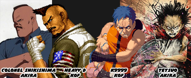
Manga and animé were very influential to the design of early fighting games. The team at Capcom were influenced by Buronson and Tetsuo Hara’s work on Hokuto No Ken / Fist of the North Star. The people at SNK were influenced by Katsuhiro Otomo’s science fiction masterpiece AKIRA. The people at SNK were so influenced by the book that it shaped the story of later KOF games. The entire plot revolving around clones and the paramilitary government organization N.E.S.T.S. was roughly pulled from the plot of AKIRA. Even the character K9999 from King of Fighters 2001 was eerily similar to Tetsuo, the antagonist in AKIRA. The likeness was so much so that publisher Kodansha took SNK to court and got them to remove any likeness of the character from future releases and official publications. I would argue that the imposing Heavy D, mohawk, square jaw and all was based on Colonel Shikishima from AKIRA as well. Thankfully SNK made him a dark-skinned character so the comparisons wouldn’t be as obvious. From that point forward the artists at SNK were taking very bold creative chances.
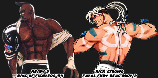
 

Heavy D started the trend of non-traditional boxers in the KOF universe. His street fashion, paired with his leather jacket and wild haircut made him look like an intimidating opponent. His was the type of look that audiences expected from SNK. It was their follow-up that was even more unique. One of the most unusual boxers in the SNK universe was Rick Strowd. He first appeared in Fatal Fury Real Bout 2 in 1998. I say he was unusual because of his appearance. He was as physically strong as any other character but that wasn’t unusual. He was actually a Native American character although he didn’t look like a typical one that we might have expected. Rick had pale skin, long white hair and bright paintings covering his body. His white pants and blue gloves were solid color choices, they matched the markings painted on his chest and back. He was not rooted in any actual native group, nor were his markings reflective of any tradition. The inverted skull painted on his back looked a bit too cartoonish for example. SNK was experimenting with different influences, different stylistic choices and different ways of presenting a traditional fighting art. They figured that they could shake things up by presenting a unique looking character and call him a Native. Their decision worked for the most part. From that point on the studio realized that boxing was not the only thing that American characters could represent.
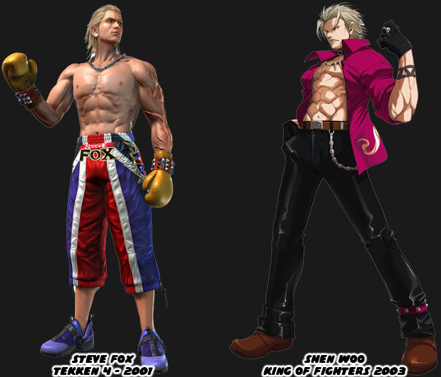
 

The other thing that the artists at SNK, and a few other Japanese studios, realized post Rick Strowd was that boxers did not all have to be big black guys. Two leaner blonde boxers made their marks after 2000. Namco introduced the fighting community to Steve Fox in Tekken 4. The British boxer had an athletic build and not too bulky. Most Tekken characters were nowhere near as swollen as the Capcom or SNK fighters. Fox had long slick blonde hair and most of his costumes in the series were street outfits. Even his “traditional” costume broke the mold. His boxing trunks were actually long training pants. His most unique element were the enormous scars covering his arm. He wasn’t sure how he got them or what their purpose was, making it an interesting side story for the character. Not to be outdone SNK dropped Shen Woo into KOF continuity in 2003. This blonde boxer was cut from the save cloth as Fox but his look and style were even more street. The Shanghai native was mostly a self-taught fighter, similar to Terry Bogard, and had gained a reputation as one of the most dangerous men in South China. Many of the tournament stars in the KOF series were young cool guys with street clothing so Woo fight right in. If the design had any failings it was that SNK had started relying on the street look too much. Prior to Woo the company had introduced a boxer that I would consider one of the best designs in the past 20 years. This character was named Rob Python from Buriki One.
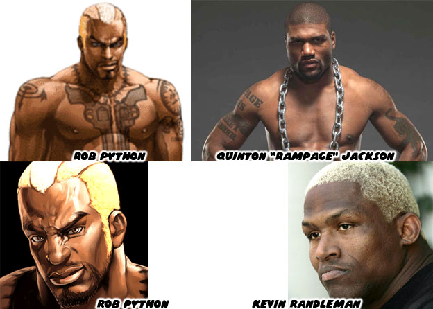
 

Python represented a break from tradition, he was reflective of the next-generation fighting black superstar. His look was inspired in part by actual MMA fighters Quinton “Rampage” Jackson and Kevin Randleman. They were wildly popular in Japanese tournaments. SNK knew that audiences had outgrown the clean-cut look of a young Tyson and the aging Foreman. They had been playing Neo Geo fighters for almost a decade and wanted new blood. The next boxer had to ooze personality and in the case of Python, he also had to ooze a sense of danger. He was among one of the most dangerous fighters in the Buriki One tournament and also the rival to Gai Tendo, the star of the game. Python was an understudy of Silber, whom I had mentioned previously on this series. Python’s tattoos were as much a part of his costume as his gloves or shorts were. No character before or after had ever looked as imposing. The enormous pair of Colt revolvers tattooed on his chest were meant to intimidate his opponents. It was assumed that he spent time in prison where he had learned of Silber. SNK, and in particular the talented artist Hiroaki, had changed the formula yet again. Python was not a fighting master hidden in plain sight, instead he was a killer masked as a boxer. It would take Capcom almost 17 years to reinvent the boxer by going full circle as well.
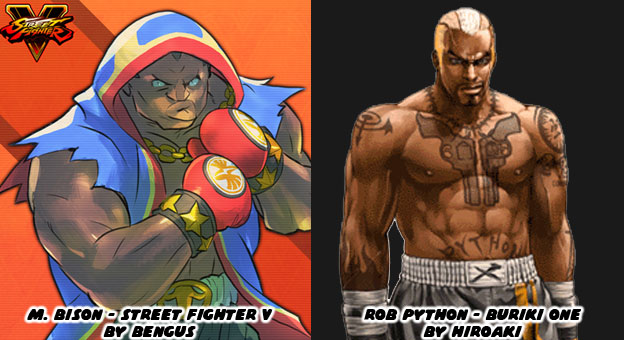
 

In 1991 M. Bison had pretty much set the standard that other boxers were compared against. There wasn’t a fighting game in the ‘90s that wasn’t compared to Street Fighter II. Every boxer was compared to Bison. His look had stagnated in the late ‘90s while SNK was committed to experimenting. Capcom finally conceded and created their own hidden master with Dudley in Street Fighter III (1997). The aristocratic boxer had a unique library of moves but long-time fans of Bison had a soft spot for tradition. Senior Capcom artist (and personal hero) Bengus was called in to work on the Street Fighter V (2016) designs. While he did not develop the original M. Bison, that was more likely AKIMAN and Shoei, Bengus was responsible for the new look. He wanted Bison to have the same big, brash personality but with an updated costume. The Capcom style of design was rooted in making traditional fighting archetypes. Their karate masters had to look like karate masters, their kung-fu masters had to look like kung-fu masters, and their boxers had to be boxers. Bengus went full-bore Americana with red white and blue trunks but then wrapped everything in a red, white and blue robe, with torn sleeves and gold jewelry to boot. The “Crazy Buffalo” now sported elements of the street, elements of real pro boxers and even cartoonish archetypes. He was still classic layered underneath modern accents.
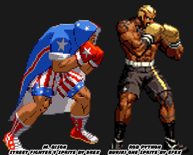
 

This was not to take anything away from Rob Python and all of the work that SNK had done with boxers over the past 25+ years. Their fighters had been among the most unique, most colorful and most diverse ever assembled. I honestly wish that they would revisit their Buriki One cast for the future installments of the KOF series. With that said they still managed to break new ground. One of their most stylish boxers debuted in 2000, right on the heels of Python. The new fighter was a mysterious special agent named Vanessa. She had taken up boxing when her lover was killed. Like King she was a master hidden in plain site. Her pants and suspenders were a nice touch under her sleeveless shirt and tie. The look was very chic. It wasn’t the first time than SNK had explored the dangerous femme. Vice and Mature, the valets for early KOF sponsor Rugal Bernstein were assassins in disguise. Vanessa was a hero using a similar fashion aesthetic. The trio predated and were more than likely the inspiration behind Crimson Viper in Street Fighter IV.


The most recent boxer in KOF canon was a mix of traditional and modern. Nelson debuted in the King of Fighters XIV, also released in 2016. He was a dark-skinned Brazilian and up-and-coming phenom. The young fighter was involved in a hit and run leaving the gym one night. He lost an arm and his girlfriend was put into a coma. A secretive sponsor paid for his cybernetic replacement arm and saw him enter the KOF tournament. SNK embraced his back story and and incorporated the tire tread motif on his boxing gloves and workout gear. His scars were very bright and spread across his face and torso, giving him the look of someone with the skin disease vitiligo. While I think there may have been too many color choices and design elements placed on the character he worked within the series. Like Vanessa he was a progressive character. His appearance might have appealed to people with disabilities or those recovering from amputations. I would like to see how SNK builds on their library moving forward. Speaking of which, some of the more recent entries in the KOF universe were also a mixed bag of design choices. We’ll look at these in the next blog. As always if you enjoyed this blog and would like to sponsor me please visit my Patreon page and consider donating each month, even as little as $1 would help make better blogs and even podcasts!

 follow the Street Writer on Patreon!

Thursday, October 5, 2017

Hiding the master in plain sight, the genius of SNK's character design... part 4

SNK was working hard to stay a step ahead of the competition. Their one-two punch of Fatal Fury and the Art of Fighting were unique entries to the genre. Each game provided a different experience and both expanded on the themes found in Street Fighter II. Not every character in both games worked or were even memorable. SNK had to learn and adapt to the trends quickly. The studio had to focus on multiple fighting games, each with their own aesthetic, while Capcom had to focus on patching and upgrading Street Fighter II. With the focus spread out over several games some of the fighters in the Fatal Fury (FF) and Art of Fighting (AoF) lacked the impact of Capcom's "World Warriors." In one particular field SNK started off slowly but then quickly caught up.


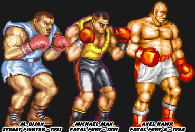
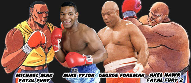
It was no coincidence that Street Fighter II's boxer M. Bison (Balrog in the USA) looked like pro boxer Mike Tyson. Capcom used the heavyweight champ as the template for their ring general earlier. Tyson had launched his professional career in 1985 and was featured in a version of Nintendo's Punch-Out!! He helped inspire the character Mike in the original Street Fighter as well. Tyson dominated the squared circle, at the age of 20 he became the youngest ever to win a heavyweight title. He earned a reputation for being destructive, and often knocked out opponents shortly after the opening bell. His supernatural fighting ability made him the perfect candidate for a fighting game. Of course Capcom didn't want to pay the boxer any royalties for using his likeness so they made a few changes, swapping out his name with another Shadowlaw general, and presented him in warmup gear. He was an easy fit into Street Fighter II and would even inspire a Fatal Fury boxer. Michael Max was literally cut from the same cloth as Bison, both having roughly the same size, shape, similar warmup gear and even haircut. Audiences felt this character was lacking, even if he had a unique tornado uppercut.


SNK's follow-up boxer had a more unique look. The bald and pudgy Axel Hawk was a friend and trainer for Michael Max. This fighter, featured in Fatal Fury 2, was taller and heavier than his protege. From a design standpoint it was strange to have a character that was older and fatter than the previous star. From a real-world influence however it made sense. George Foreman was a legendary heavyweight fighter that started his career in 1969 and stopped fighting at the end of the '70s. He became a preacher but returned to the ring in the late '80s. He got a title shot against Bernard Hopkins, a fighter 16 years younger than he was. Foreman recaptured the heavyweight championship at the age of 45, making him the oldest person ever to win the title. It was an underdog story that inspired long-time boxing fans. Chances were that SNK boss and boxing aficionado Eikichi Kawasaki suggested a version of Foreman for the sequel. Axel was a bit more rotund, especially in the official character art, than Foreman but they both had amazing power behind their strikes. Pop culture tended to color the SNK character designs more than any other studio. Aside from real-world fighters there were also decisions based on popular aesthetics. This was seen on another boxer in the SNK universe.


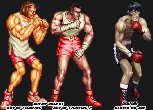
Micky Rogers was the boxing archetype introduced in the AoF series. The character sported braids in his first appearance and the look was changed slightly when he appeared again in a sequel. Visually the fighters in the AoF series were much different than the figures in FF. The artists working on the characters tried to make them more proportional to actual people. The reason for this was because of the larger sprites that AoF featured. If the character were drawn too muscular it would have looked awkward when they were scaled up. The fighters would have looked like cartoon characters in an otherwise realistic setting. Micky looked anemic compared to some of the other characters. He was lanky but well defined. It made sense given he was a boxer where speed was often more prized than power. The manga Ashita No Joe was a wildly popular boxing manga from Japan. The artist Tetsuya Chiba would draw his character with long, lean muscles. The action was easy to follow on the page because of his slender lines. This style of art that he popularized in 1968 would end up influencing countless other manga and anime shows about boxing. I believe that this design also found its way to SNK, given the Mr. Kawasaki was a boxing fan. Micky had almost the same build as characters like Joe or Rikishi, the champion fighters from the book.


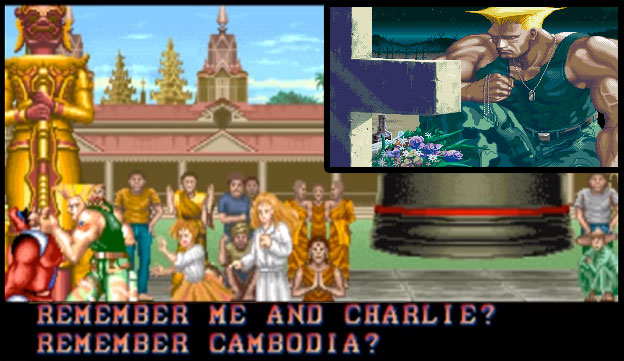
SNK, like most major arcade publishers realized that in order to succeed they had to become global players. This meant that they had to include fighters from other countries, especially the USA. Capcom and a few other studios included fighters from the USA in their games but gave them the slightest connection to real western culture. Joe and Mike in the original Street Fighter looked very plain, wearing street clothes, they were somewhat forgettable. The studio punched up their efforts with Guile in SF II. If anything they were pandering quite heavily to each nation, easily to the point of parody. Look at Zangief and Dhalsim’s original endings. Even the American was over-the-top. He was a military fighter wearing camouflage pants, with an absurd haircut, that was all muscles, and sported USA flag tattoos. As a Mexican-American I can confess that I must run into people that look like Guile at least twice a day! SNK did a slightly better job with their US characters and realistic street fashion in both the FF and AoF games. They decided to really crank it up with each sequel. They payed close attention to the trends happening in tv and in movies. When the studio began work on the King of Fighters, which would bridge all of their fighting games together they began pandering heavily to the USA. They did this by making the US team captain a boxer, and by looking at pop culture for his design cues.


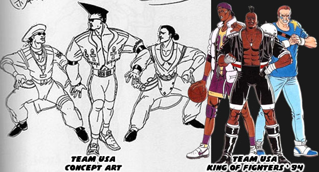
Decades ago fashion trends travelled much slower than they did today. The artists at SNK wanted international audiences to visually identify the US team because of how they looked, rather than what school of fighting they were representing. In order to do this they had to create archetypes that were wearing the most “Western” costumes. The people at SNK were using fashion cues from pop culture as the basis. The only problem was that street culture evolved rapidly. The look of the US fighters were reminiscent of dancers from the films Beat Street and music videos from Salt-N-Pepa and Queen Latifah. The spandex and leather outfits of the late ‘80s were quite outdated for a game dropping in 1994. Thankfully the studio revised the outfits and based the fighters more on sports icons. A hint of the street fashion remained but for the most part it worked given the character. Heavy D, the captain of the team (and a name pulled from a popular rapper) was a breath of fresh air. He was a boxer that completely rewrote the book on character design. In the next entry we’ll look at how SNK’s designs evolved post 1994. As always if you enjoyed this blog and would like to sponsor me please visit my Patreon page and consider donating each month, even as little as $1 would help make better blogs and even podcasts!
 follow the Street Writer on Patreon!

Monday, August 21, 2017

A look at Ed from Street Fighter V, design meets legacy...

It’s been a while since I’ve talked about a new Street Fighter character, I haven’t been happy with most of them. I’m not going to talk about Kolin, probably ever, sorry about that. Instead I’m going to look at one of the new guys. Ed, revealed at the end of Street Fighter V Season 1 as the understudy of M. Bison / Boxer, was now a playable character. As a whole I think his design and assignment of moves and powers was done very well. There were the things that seemed off, like his animations which seemed to lack polish. Then there was the ability to perform special attacks with simple button combinations instead of traditional joystick+button inputs. Long time fans of Street Fighter thought this was pandering to Nintendo’s Smash Bros. community. But speaking from a visual design standpoint I would say Ed was probably the best new character in the past few years. The reasons for this were subtle but well done.

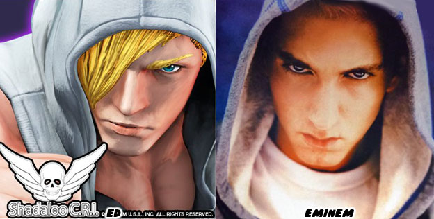
The first thing we should look at was his age. Ed was a young character. Most people in the series were adults. Young characters in a fighting game had mostly been girls, rarely men. In the Season 1 cut scenes he looked like a skinny kid, someone that you might see in real life. The use of a sleeveless hoodie was a good costume choice as it was not too modern. It made sense given that he was learning the art of boxing. Fighters had been wearing training sweatsuits for over half a century. It worked in any era the game was taking place in. This look was also used in pop culture. Rappers like Eminem used street fashion to build an identity. He dressed the part because he was genuine. He was from the streets and not created by a marketing wing of a record label. It was Ed’s updated costumes that worked even better.

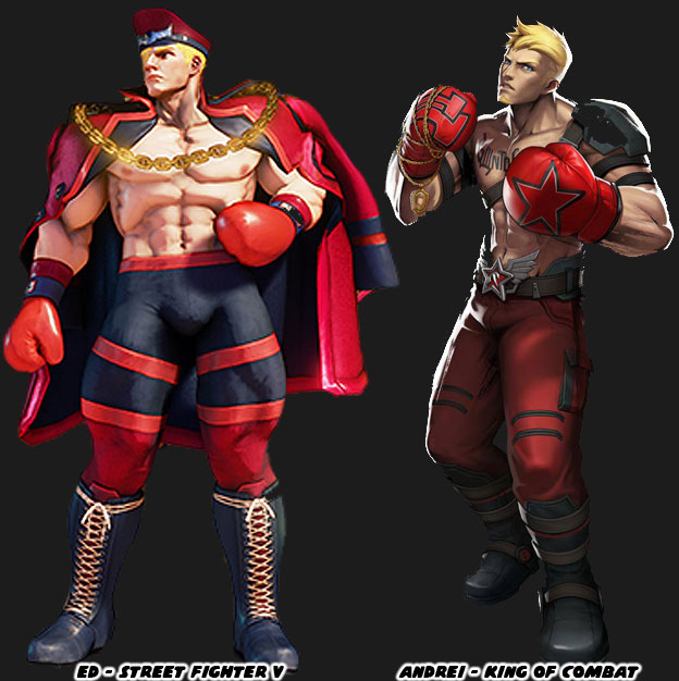
The black and red motif of Ed’s Battle Costume worked extremely well, especially against the light skin and blonde hair the character. The three colors, red, black and yellow were considered a triad of colors. The main color red, contrasting color black and accent color gold worked well visually. Go back through your fighting game history and look at the other characters that had similar color choices. Ken or course had a red gi for most of the games but in SFV he was paired with a black rash guard as well. The other blonde characters with similar color schemes were Paul Phoenix from Tekken, Jacky Bryant from Virtua Fighter, Rugal from the King of Fighters and Andrei the boxer from King of Combat. Having a strong color pallet was something that had made previous characters so memorable. Of course the use of the colors, jacket and military cap was also a callback to the organization that made Ed unique.

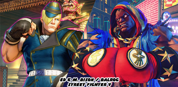
Ed had matured some, had gotten bigger and stronger, from the last time he appeared. Season 2 saw the addition of multiple costumes, the Default, Story and Battle uniforms. Each one of the costume choices complimented the character very well. In his Default costume Ed now looked like a full-fledged Shadowlaw officer. In the story he was aging quickly because of the experiments that S.I.N., the Shadowlaw weapons group, had performed on him. When I saw his militaristic costume and fingerless gloves it worked on multiple levels. He was now using the striking techniques taught to him by the former world boxing champ. Yet he was also his own unique fighter. He wouldn’t be riding the coattails of M. Bison for long. When I saw the character going toe-to-toe with his mentor I wasn’t put off. In fact seeing him in action reminded me of another young fighter taking on a veteran.

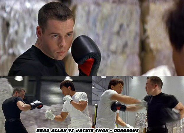
Brad Allan, a martial artist, stuntman and fight choreographer was a villain in the 1999 Jackie Chan film Gorgeous. Allan was a cocky young fighter that gave Jackie a run for his money. In the movie Allan didn’t want the fight to be over too quickly so he allowed Chan to wear light sparring gloves while he wore heavily padded boxing gloves. At that time Chan was a well-established movie star. Fans had seen him beat up all sorts of different martial artists over the years. Most of the people he fought were about the same age and the same size, yet every now and then he took on much larger opponents. Chan had lightning fast punches and was a master at improvisation, he could adapt to his opponents and overcome them quickly. People expected more of the same in this film. Imagine their surprise when they saw the kid trading punches and kicks as fast if not faster than Chan. For the first time in a long time it appeared as if the veteran had been outclassed. The stakes had suddenly become much higher because of this villain. When I saw Ed’s assortment of boxing moves I got flashbacks to how Allan was portrayed in the film. It got me excited for his potential in the Street Fighter series.

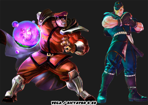
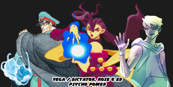
It wasn’t enough that Ed was a striker. His costume revealed a lot more about his true purpose and the extend of his powers. He was being groomed by the Dictator himself to become an important member of Shadowlaw. Would he perhaps become a general in the organization? Would he replace Sagat, F.A.N.G. or even the Boxer on the roster? Or would he assume total leadership of the organization some day? In order to accomplish this goal it meant that Ed would be given powers that went above those of normal people. This was where the fictional “Psycho Power” was reintroduced into the series. It had first appeared in Street Fighter II and was used to explain the awesome powers of Vega / the Dictator. The origins of Psycho Power were touched upon in the Street Fighter Zero series in 1995. The character Rose was a fortune teller whose powers were harnessed by Vega. This form of psychic energy allowed people to float, throw balls of energy and strike with burning force.

Psycho Power faded into history as Street Fighter III changed the main villain in 1997. Gill represented a secretive group known as the Illuminati. He had some sort of elemental powers, fire and ice specifically, at his disposal. This was never full explained in the series making him more fantastic in origin. In 2008 Street Fighter IV returned back to the SF II timeline. The head of S.I.N. was developing a new form of energy that could be weaponized. The character Seth had a Tanden Engine, installed into his abdomen, which allowed him to generate fields of energy and attract or repel opponents. A miniature version of the Tanden Engine was placed behind Juri’s eyepatch, which gave her superhuman strength. The Tanden Engine was combining the spiritual studies of Yin and Yang with science. It was the spiritual energy that allowed Ken and Ryu to throw fireballs but for the first time had been recreated mechanically. This technology took a back seat when Ed showed up and brought Psycho Power back to the forefront.

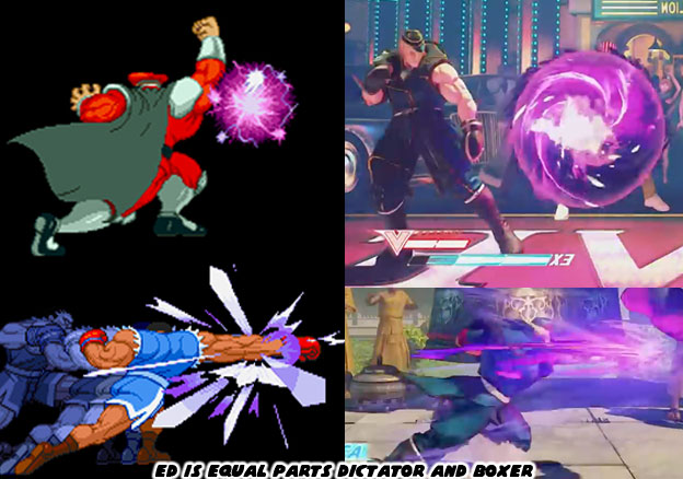
Psycho Power was a great explanation for why Ed was more than just another martial arts master in a tournament. It allowed the artists at Capcom to pull design elements that went into both the Boxer and Dictator and create something new. For the artists and budding designers reading this it was an important lesson in creativity. Take a look at your favorite character and try to pinpoint the best features. Look at the colors used, look at the cut of the costume. Look at the moves they had. Then take a look at a another one of your favorite characters and do the same thing. Now imagine how you could combine their features. For bonus points try making a good guy or bad guy version of the character. Or try changing the sex of the character or ethnicity. But Ed was more than just a distilled mix of the Dictator and Boxer. He had a unique special attack all his own.

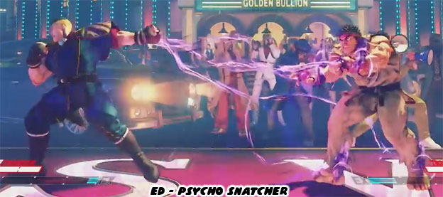
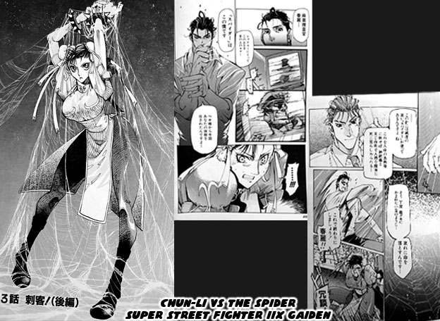
Ed could use his Psycho Power to create a web of energy and pull his opponents to him, it was called the Psycho Snatcher. It looked like the sort of move Spider-Man might use. This attack opened up the potential from a game play standpoint. The web of energy could cut off projectile attacks mid-air. It could also snatch opponents right out of the air. At a close range it could stun opponents and ensnare them even if they were blocking. From a design standpoint this also meant that Psycho Power was malleable. It didn’t have to be used as concentrated bursts of energy, and it didn’t have to be used to engulf the player in a psychic flame. Psycho Power could be used like a whip or net as well. Its other uses were limited only by the imagination of the designer. This special attack actually had its roots in the manga series Super Street Fighter II X Gaiden by Mami Itoh.

In the manga Chun-Li, acting as an INTERPOL agent was investigating a dangerous new drug that had hit the streets. It lead her to Los Angeles and eventually San Francisco where she ran into Ken’s wife Eliza. A handsome young investigator was assigned to the case as well. The two were tracking down the drug trafficker and assassin known by the alias the Spider. Chun-Li’s partner turned out to be the Spider and he was working on behalf of Shadowlaw. He tried to kill Chun-Li before she bring down the operation. The Spider had developed a deadly neurotoxin which he coated spikes with. He would use these poison barbs to kill his enemies. The trap that he set, the web symbolism used in the comics especially, made him a unique opponent. If he could have been presented in a fighting game with monofilament wires (like the kind Rolento uses) and his poison spikes then he could have made for a very unique Street Fighter villain. Seeing the Psycho Snatcher reminded me of the the Spider. I wondered if this double agent was not an inspiration for Ed. Even if he wasn't I think Ed’s design was well done. It worked in the lineup better than most of the new heroes and villains introduced up until now. What did you think about this character? Were you a fan or not? Why was that? Please let me know in the comments section. As always if you enjoyed this blog and would like to sponsor me please visit my Patreon page and consider donating each month, even as little as $1 would help make better blogs and even podcasts!
follow the Street Writer on Patreon!