Showing posts with label usa. Show all posts

Monday, July 17, 2023

Daytona USA, Let’s Go Away! - Originally published on 1UP - April 8, 2009

The Daytona USA series is an odd duck among racers. It, like Super GT and the other Sega classics, is either loved or loathed by racing fans. Feelings about Daytona USA are much stronger than any other racer by Yu Suzuki, or to be more accurate as Alex aka FerrarimanF355 pointed out to me the director for many of the Sega racers including Daytona USA was Toshihiro Nagosh. The reasons for which might come down to what Japan doesn't understand about Western racing culture. Those that dislike Daytona USA would argue that the title was unabashedly Japanese in scope, it succeeds by being an ignorant arcade statement about stock cars and western racing. Those critics might be right. 
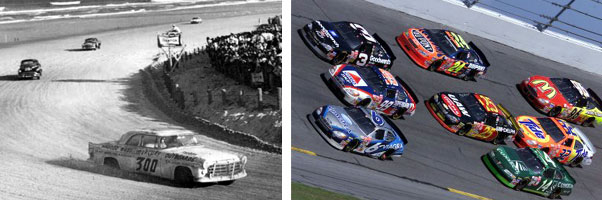
The track for which the game is named is based on the legendary Daytona International track in Florida. It was among the oldest of tracks in a fledgling NASCAR circuit. Back in the 50's the track was right on the beach. Massive production cars would tear up the sand, just a few feet from brave, or crazy spectators. These cars were stock in appearance but everything under the sheet metal was anything but. Even today the stock cars carry the large proportions granted by their originators. The current Daytona track is built right over that original track in the sand. It is as beloved a racing course as any other track in the world. Only a few things in Daytona USA would even draw comparisons to the real deal.

The original beginner track in Daytona USA was a three turn oval but it looked nothing like the real course. It was far more fantastic in origin. Snow capped mountains loomed in the background and a rocky cliff was etched with the visage of Sonic the Hedgehog. This track, like every track AM2 was famous for, excelled in the spectacle. The layout defied logic but was an amazing sight to behold. Virtual architecture that rivaled the greatest wonders of the world. Courses that snaked through a canyon, inches from NYC skyscrapers or rumbled down the middle of an amusement park. These were the best tracks I had ever experienced but at the same time the name of the game and style of car had rubbed me the wrong way.
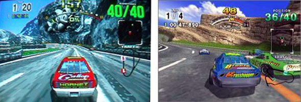
I grew up on racing. Being a fan of every type of circuit and style imaginable. You can guess that my feelings toward a Sega game named Daytona would be mixed. The game featured the familiar boxy cars from the NASCAR circuit but they looked a little odd. This was not a licensed stock car racer so the cars had to give a familiar vibe by their shape and bright paint job. However these things were done from a Japanese perspective. Japan had more experience with GT and even F-1 racing. Those were cars that were created with racing in mind, rather than regular cars turned into racers by mechanics. The Japanese interpretation of the stock car was, for lack of a better word, dubious. The stock car was a foreign breed, a big and brutish American racer. It was unrefined and garish, much too swollen for racing, brightly painted in contrasting colors, a rolling reflection of the loud gaijin and beer swilling rednecks that adored driving 500 miles in a circle. The cars featured in Daytona USA reflected this brutal opinion.
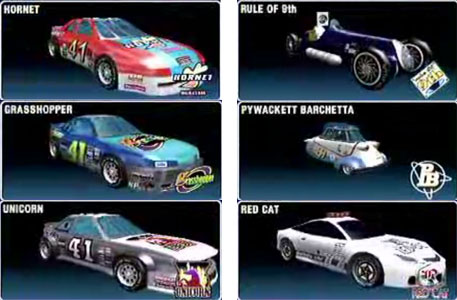
The cars were more or less shaped like stock cars but with fanciful names and questionably-designed logos. Undoubtedly fruity names to get Japanese gamers interested in these brutes. The game was made to bring American gamers to the arcade, but to make it more appealing to the rest of the world it made many concessions to the car design and gameplay. The Daytona series played just like the previous Sega racers. The only way to beat the courses was to drift, or power slide, around every corner. Each successive pass would "slingshot" you past opponents. The sight of massive blocky cars sliding around corners, in the way that was previously reserved for lightweight Ferraris, was too much to behold. The secret cars were anything but more stockers, they were instead crazy-named cars that players could unlock for added replay value. These odd cars were a jab at the roster of racing machines featured in Namco's rival Ridge Racer. I was unimpressed with the effort and slightly disappointed with how Japan was treating the stock car name.

The game was beautiful and is still fun to play, if you could get past the suspension of disbelief. Daytona USA 2 looked amazing on an updated version of the Model 3 board. It's tracks were among the best ever, even trumping the eye candy featured in Super GT.

Unlike Super GT the consoles and PC saw several versions of the Daytona racer released. The most recent appearance of Daytona USA also happens to be the most memorable. The great Daytona USA 2 tracks make an appearance as a single interconnected track in OutRun 2's bonus stage. Making it a definite must-get for racing game fans. Did you know that the things that got NASCAR purists riled up with Daytona USA worked in a different breed of racer? Sega's obsession with drifting would finally make an appropriate appearance, but not in a Yu Suzuki game. Find out which game I'm talking about tomorrow!

Were you a fan of this racing series? Let me know in the comments section please. As always if you would like to sponsor me please visit my Patreon page and consider donating each month, even as little as $1 would help make better blogs and even podcasts!
follow the Street Writer on Patreon!

Thursday, October 5, 2017

Hiding the master in plain sight, the genius of SNK's character design... part 4

SNK was working hard to stay a step ahead of the competition. Their one-two punch of Fatal Fury and the Art of Fighting were unique entries to the genre. Each game provided a different experience and both expanded on the themes found in Street Fighter II. Not every character in both games worked or were even memorable. SNK had to learn and adapt to the trends quickly. The studio had to focus on multiple fighting games, each with their own aesthetic, while Capcom had to focus on patching and upgrading Street Fighter II. With the focus spread out over several games some of the fighters in the Fatal Fury (FF) and Art of Fighting (AoF) lacked the impact of Capcom's "World Warriors." In one particular field SNK started off slowly but then quickly caught up.


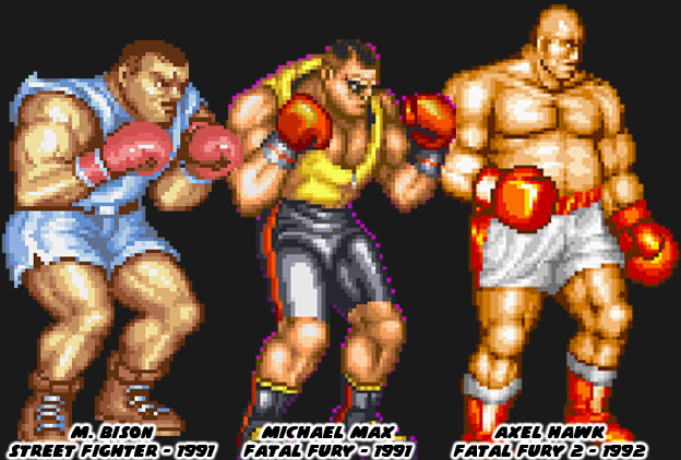
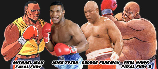
It was no coincidence that Street Fighter II's boxer M. Bison (Balrog in the USA) looked like pro boxer Mike Tyson. Capcom used the heavyweight champ as the template for their ring general earlier. Tyson had launched his professional career in 1985 and was featured in a version of Nintendo's Punch-Out!! He helped inspire the character Mike in the original Street Fighter as well. Tyson dominated the squared circle, at the age of 20 he became the youngest ever to win a heavyweight title. He earned a reputation for being destructive, and often knocked out opponents shortly after the opening bell. His supernatural fighting ability made him the perfect candidate for a fighting game. Of course Capcom didn't want to pay the boxer any royalties for using his likeness so they made a few changes, swapping out his name with another Shadowlaw general, and presented him in warmup gear. He was an easy fit into Street Fighter II and would even inspire a Fatal Fury boxer. Michael Max was literally cut from the same cloth as Bison, both having roughly the same size, shape, similar warmup gear and even haircut. Audiences felt this character was lacking, even if he had a unique tornado uppercut.


SNK's follow-up boxer had a more unique look. The bald and pudgy Axel Hawk was a friend and trainer for Michael Max. This fighter, featured in Fatal Fury 2, was taller and heavier than his protege. From a design standpoint it was strange to have a character that was older and fatter than the previous star. From a real-world influence however it made sense. George Foreman was a legendary heavyweight fighter that started his career in 1969 and stopped fighting at the end of the '70s. He became a preacher but returned to the ring in the late '80s. He got a title shot against Bernard Hopkins, a fighter 16 years younger than he was. Foreman recaptured the heavyweight championship at the age of 45, making him the oldest person ever to win the title. It was an underdog story that inspired long-time boxing fans. Chances were that SNK boss and boxing aficionado Eikichi Kawasaki suggested a version of Foreman for the sequel. Axel was a bit more rotund, especially in the official character art, than Foreman but they both had amazing power behind their strikes. Pop culture tended to color the SNK character designs more than any other studio. Aside from real-world fighters there were also decisions based on popular aesthetics. This was seen on another boxer in the SNK universe.


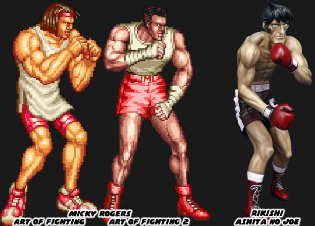
Micky Rogers was the boxing archetype introduced in the AoF series. The character sported braids in his first appearance and the look was changed slightly when he appeared again in a sequel. Visually the fighters in the AoF series were much different than the figures in FF. The artists working on the characters tried to make them more proportional to actual people. The reason for this was because of the larger sprites that AoF featured. If the character were drawn too muscular it would have looked awkward when they were scaled up. The fighters would have looked like cartoon characters in an otherwise realistic setting. Micky looked anemic compared to some of the other characters. He was lanky but well defined. It made sense given he was a boxer where speed was often more prized than power. The manga Ashita No Joe was a wildly popular boxing manga from Japan. The artist Tetsuya Chiba would draw his character with long, lean muscles. The action was easy to follow on the page because of his slender lines. This style of art that he popularized in 1968 would end up influencing countless other manga and anime shows about boxing. I believe that this design also found its way to SNK, given the Mr. Kawasaki was a boxing fan. Micky had almost the same build as characters like Joe or Rikishi, the champion fighters from the book.


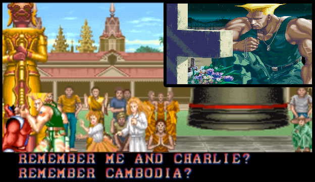
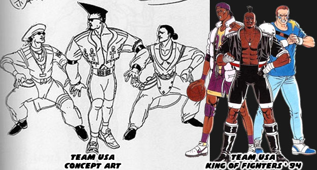
SNK, like most major arcade publishers realized that in order to succeed they had to become global players. This meant that they had to include fighters from other countries, especially the USA. Capcom and a few other studios included fighters from the USA in their games but gave them the slightest connection to real western culture. Joe and Mike in the original Street Fighter looked very plain, wearing street clothes, they were somewhat forgettable. The studio punched up their efforts with Guile in SF II. If anything they were pandering quite heavily to each nation, easily to the point of parody. Look at Zangief and Dhalsim’s original endings. Even the American was over-the-top. He was a military fighter wearing camouflage pants, with an absurd haircut, that was all muscles, and sported USA flag tattoos. As a Mexican-American I can confess that I must run into people that look like Guile at least twice a day! SNK did a slightly better job with their US characters and realistic street fashion in both the FF and AoF games. They decided to really crank it up with each sequel. They payed close attention to the trends happening in tv and in movies. When the studio began work on the King of Fighters, which would bridge all of their fighting games together they began pandering heavily to the USA. They did this by making the US team captain a boxer, and by looking at pop culture for his design cues.


Decades ago fashion trends travelled much slower than they did today. The artists at SNK wanted international audiences to visually identify the US team because of how they looked, rather than what school of fighting they were representing. In order to do this they had to create archetypes that were wearing the most “Western” costumes. The people at SNK were using fashion cues from pop culture as the basis. The only problem was that street culture evolved rapidly. The look of the US fighters were reminiscent of dancers from the films Beat Street and music videos from Salt-N-Pepa and Queen Latifah. The spandex and leather outfits of the late ‘80s were quite outdated for a game dropping in 1994. Thankfully the studio revised the outfits and based the fighters more on sports icons. A hint of the street fashion remained but for the most part it worked given the character. Heavy D, the captain of the team (and a name pulled from a popular rapper) was a breath of fresh air. He was a boxer that completely rewrote the book on character design. In the next entry we’ll look at how SNK’s designs evolved post 1994. As always if you enjoyed this blog and would like to sponsor me please visit my Patreon page and consider donating each month, even as little as $1 would help make better blogs and even podcasts!

 follow the Street Writer on Patreon!

Thursday, August 17, 2017

Speculation on ARIKA's unnamed Street Fighter EX successor, final part

I have said a lot about the poor design choices made at Capcom over the past few years. I haven’t found much greatness in characters like Rufus, Hakan or F.A.N.G. introduced in Street Fighter IV and V. Nor have I enjoyed watching classic characters like Birdie, Hugo and Abigail get turned into jokes. Of course I had a dilemma. Capcom Producer Yoshinori Ono was beloved in the community. He traveled the globe promoting the brand, promoting the games and meeting with fans. His energy was infectious, his enthusiasm was genuine and his passion just about single-handedly brought back the franchise. Without him the Street Fighter series would have stayed dead and fighting game scene would not have been as big as it was today. Without him other developers would not have pushed to bring back long-extinct titles like Killer Instinct, or even ARIKA’s updated EX title. With all that said I’m not on board with his creative input. I don’t agree with the addition of silly characters, silly mechanics, silly animations or silly game play. I will continue to call his team out on the poor choices that I think they made with regards to character design. I will remind them of the standards that they used to have. Let’s talk about one of the worst characters Capcom ever put into the series.


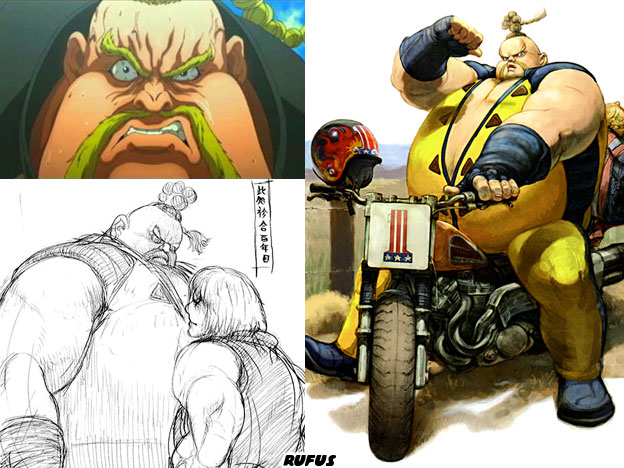
Rufus captured everything that was wrong with the direction of the Street Fighter cast starting with Street Fighter IV. He was big, fat, dumb and obnoxious. He was written as Ken’s great American rival, the only thing was he was too stupid to even know what Ken looked like. How can you be a rival when you can’t recognize your nemesis? What’s worse is that in the early stages Rufus was a powerful black character, nicknamed the King Cobra / Black Cobra. Capcom wanted to give Ken his very own Sagat-type rival, a literal giant. The inspiration was Kareem Abdul-Jabbar from Bruce Lee’s last film Game of Death. This character evolved and became a unique karateka in his own right. Then Yoshinori Ono decided that it would be funny if he put a fatty in the game instead. This new character was rushed into the game and both Ono and the artist Ikeno said it was a bad choice later on. Ono saw that the fat gimmick worked for Bob in the Tekken series. Bob was a much better developed character and was never presented as an idiot. The subtext was obvious to international audiences, fat was funny, and Americans were fat and dumb. There was a different path that could have been used to create the self-obsessed American. ARIKA showed us that more than 20 years ago.


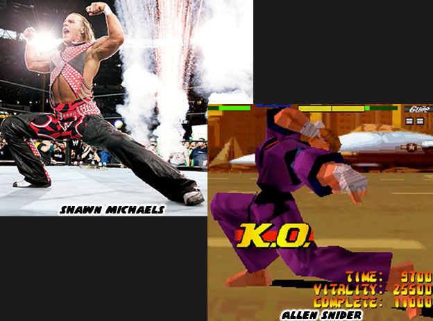
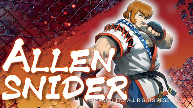
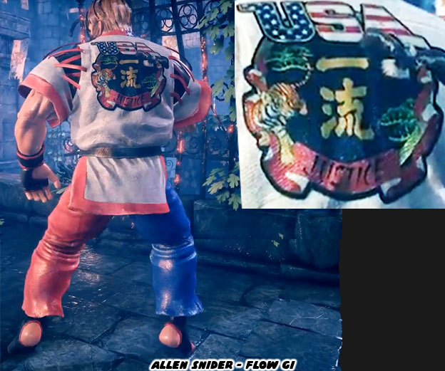
I said in the previous blog that Allen Snider was a second chance for the Street Fighter II and Street Fighter EX developers to create the Ken archetype. They wanted this character to be way more “American” than Ken. Somebody that would be easy to identify in a lineup. He didn’t need to wear camouflage pants or have USA flag tattoos on his shoulders. They gave him a very non-traditional karate gi and made him brash. As over the top as Allen was he was still a good fighter. He couldn’t be confused with Dan Hibiki as being a joke character. Allen was also as far removed from the personality of Kairi as possible. I think they accomplished their goal. Snider was loud in the EX and Fighting Layer titles. He captured the arrogant showmanship of television superstars. His victory poses reminded me of the characters from US pro wrestling. Clearly the team at ARIKA had picked up the personality traits of the most famous superstars of the late ‘80s and early ‘90s. When he was revealed for the new EX game he looked better than ever.


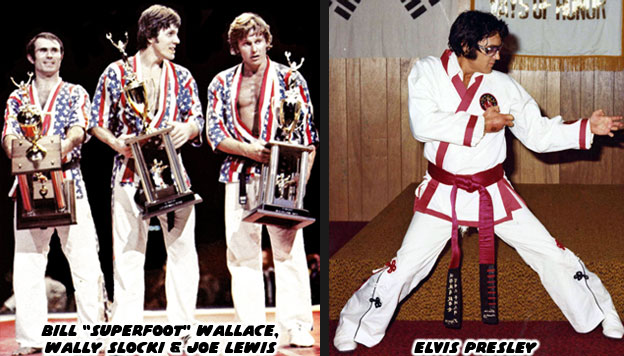
There was no mistaking that Snider had returned in all his patriotic glory. His star-spangled uniform was amazing. It was layered in details that helped tell a story. Even if you had never heard of the character you could tell a lot just by looking at him. He was definitely American and he was definitely not Ken. The updated look also harkened back to the era that inspired the original Street Fighter. Ken was based on actual fighters like Bill Wallace and Joe Lewis. While his hair and facial features were inspired by Chuck Norris and Bruce Lee, the whole persona of Snider being the great American hero were based on multiple real-world sources. Kung-fu and karate enjoyed a popularity boom in the ’60s and ‘70s thanks to cinema. American fighters appeared almost overnight on television competing against Japanese champions. Imagine how absurd it looked to the rest of the world. Karate had evolved in Japan from Chinese immigrants that had introduced them to kung-fu. The Asian countries had centuries perfecting the “empty hand” techniques. It was a part of their culture. It was a part of their national identity. It was sacred and revered. All of a sudden a bunch of Americans showed up in colorful uniforms treating the martial art like a team sport.


Karate tournaments popped up all over the country and trophies were handed out at a feverish pace. People wondered if it was easy to earn a black belt and pick up a bunch of medals in the process. After all, if the guys on TV could do it then anybody could, right? Even the famous singer Elvis Presley was smitten with the fighting arts. He studied under a number of different teachers, having various belts bestowed upon him. Traditionalists didn’t appreciate karate being treated like an organized sport. It had cultural relevance, it was more like a lifestyle, with the discipline of a serious religion rolled into one. It was certainly not a points-based game that anyone could “play.” Thanks to people like Wallace, Norris and Lewis, who were legit athletes, and the coverage provided by ABC’s Wide World of Sports it gained momentum through the ‘70s and ‘80s. For better or worse they laid the foundation for mixed martial arts schools gaining a foothold in the states. The team at ARIKA didn’t forget the culture shock of seeing how the US represented the martial arts in those early days. It made the costume choice placed on Snider that much sweeter.


In the EX series Snider’s first professional defeat was at the hands of Ken Masters. Akira Nishitani didn’t want to disrespect the template he was working from after all. Snider decided to become the understudy of masters and unlock his true potential. This was before Sean was created as his pupil in Street Fighter III. When I looked at Rufus I didn’t see half the forethought that went into making Snider. I didn’t see the nods to history, to the legacy characters or the real world legends that inspired them. I could see it in Black Cobra for certain but not in Rufus. I wondered if Yoshinori Ono and his team could really be so blind to their design choices when other studios didn’t seem to fall into the same traps. There were many days when I wished that Akira Nishitani and his team were still at Capcom, but sadly that ship sailed 21 years ago. Now that Snider was back I hoped that his library of moves had been expanded. Every character revealed so far seems to have matured, I expected no less for the champ. What do you think of the character? Do you think I was too hard on Rufus or Mr. Ono? I’d like to read about your favorite characters it in the comments section. As always if you enjoyed this blog and would like to sponsor me please visit my Patreon page and consider donating each month, even as little as $1 would help make better blogs and even podcasts!

 follow the Street Writer on Patreon!