Showing posts with label guile. Show all posts

Tuesday, June 14, 2022

A new look for Guile, or correcting a mistake? His update in Street Fighter 6.

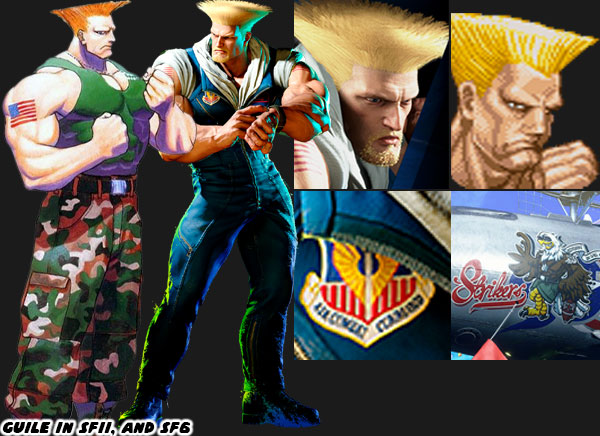
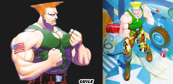
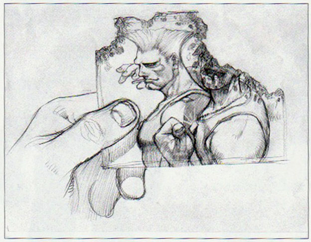
Today we’re going to look at the makeover Guile received for Street Fighter 6. I’m a fan of the character, and I ranked him eight on my personal list of the 30 most important Street Fighters. SF6 Designer Yusuke Hashimoto did a great job of capturing the look, proportions, and details that worked for him in Street Fighter II. Guile has always had a bodybuilder physique, even more so than Ken, and Ryu. Bengus did some of the most memorable illustrations of the character some 31 years ago. Mr. Hashimoto essentially worked out a modern interpretation of him, while still giving him some unique touches.

If you look at the size of the character, his hair, and proportions it’s as close to the look of SFII than any other sequel. Mr. Hashimoto added some facial hair, and eyebrows to Guile to show that time had passed since his previous appearance. The biggest change to the character comes in the way of the color of his uniform. You know already that I am a proponent of SF characters being assigned a main solid color, and complimentary secondary color. For Guile his costume went from green camouflage to a dark blue flight suit. I’m fairly certain that the military fans of Street Fighter are jumping for joy. Soldiers are just about universally accepted as being exceptional fighters in the genre. Green is mainly associated with Army soldiers, and not Air Force pilots. Technically Guile had been wearing the wrong colors for a generation. It doesn’t matter though at this point. His clothing maintains its military designation. Heavy boots for stomping on opponents. A weathered flight crew top with a couple of patches on it including Air Combat Command signaling his place in the United States Air Force.

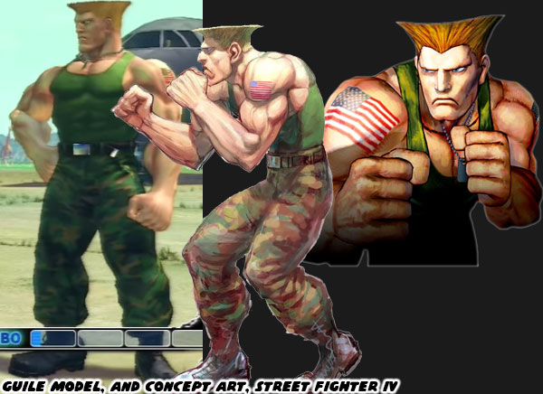
Guile’s first 3D appearance was in Street Fighter EX in 1996. That game was developed by ARIKA. The first time he was presented in 3D by Capcom was with Street Fighter IV in 2008. The version of the characters that appeared in those games were heavy stylized. Artist Daigo Ikeno created the look of the World Warriors for that sequel. Many people noted how bulky the cast looked. Producer Yoshinori Ono said the characters were much thicker than they used to be in order to make them appealing to western audiences. Their reasoning was based on looking at the hyper-masculine heroes in first person shooter games. The cast of Gears of War, Doom, and Duke Nukem were big, muscular stars after all. He didn’t think that the characters appealed to fans on this side of the Pacific because of the Japanese aesthetic. Yes there were some bodybuilder physiques in the original SFII, but there were also fat, skinny, and feminine body types as well. Most of them became bulky across the board in SFIV. Thankfully the distinct body types seem to have returned in SF6.

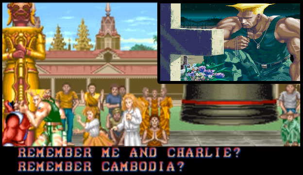
The other appealing thing about Guile has to do with his story. He entered the SFII Tournament in order to get revenge on the organizer for killing his friend Charlie Nash. The emotionally scarred soldier looking for vengeance made for a very interesting plot point. Audiences could root for a character like that. Guile In the end he doesn’t murder the villain. He is instead dispatched by Ken, and Ryu. Guile comes to his senses, and returns to the wife, and child that he had abandoned. Coming to terms with what happened to his friend, and becoming a family man made for a very satisfying conclusion. Why he would be in SF6 has yet to be revealed, but I’m certain it will make for an interesting story. What do you think about the return of Guile? Do you like the switch in color scheme? Do you wonder how he will be incorporated into the plot of SF6? Give me your takes in the comments section please. If you would like to sponsor me please visit my Patreon page and consider donating each month, even as little as $1 would help make better blogs and even podcasts!
follow the Street Writer on Patreon!

Saturday, June 23, 2018

30 years of Street Fighter: 30 years of Characters #8


Guile is without a doubt an over-the-top G.I. Joe-cartoon character squeezed into the Street Fighter II lineup for the sake of appealing to Westerners. I should be mad but I'm not. I'm not mad about his nonsensical haircut. Or that he looks like a caveman because he's missing his eyebrows. I'm not even mad about the USA flag tattoo and camo pants that obviously every serviceman gets when they enlist. Capcom of Japan really had our number when designing the westerner. Every fiber of Guile's being was infused with military imperialism. It was a bit on the nose. That's why I can't say anything bad about it. Guile deserves to be remembered on the 30th anniversary of Street Fighter. Not because of the overt pandering but instead because of what he evolved into.


Guile's look was obtuse for a reason. The Capcom designers were heavily influenced by the stylish manga JoJo's Bizarre Adventure. The tall hair was pulled from Jean Pierre Polnareff, the military muscle from Rudol von Stroheim and the name taken from Jean Pierre's rival J. Geils. Despite this mix of influences Guile was a prime example of how military design worked in a fighting game. Just about every other character presented was an archetype of a school of fighting. We had the karate guys, the kung-fu girl, the wrestler, the boxer, a muay thai champ, and so on. We could more or less tell what they were about just by looking at them. Then there was this super buff American soldier. We didn't know what style he practiced but knew he could brawl. Not only could he fight but he had some very unorthodox moves. He could do an inverted head kick, a somersault "Flash Kick" and even had his own variation of the fireball called the "Sonic Boom." These moves were flashy and very effective in the game, making him a sold choice for the tournament crowd. His fighting ability was as mysterious as his personality. His origins and reason for entering the Street Fighter competition were shrouded in secrecy.  


It turned out that Guile was a special forces officer. He was on the hunt for Vega / The Dictator. Years ago he lost his best friend Charlie Nash in a Shadowlaw ambush. Guile swore revenge and traveled the globe looking for clues. His obsession lead him to abandon his family. Nash was not only his best friend, he was also the one that taught him how to fight. These small details would be revealed over the events in Street Fighter II and Street Fighter Zero. As Guile's origin came into focus it made him more interesting. He wasn't just a pandering brute but an interesting archetype. He would become central to the plot of Street Fighter II and even get a prominent role in the animated movie. There hadn't been many military fighters in this series or other games that was as interesting. So to Guile we salute you on this anniversary! As always if you enjoyed this blog and would like to sponsor me please visit my Patreon page and consider donating each month, even as little as $1 would help make better blogs and even podcasts!
 follow the Street Writer on Patreon!

Thursday, October 5, 2017

Hiding the master in plain sight, the genius of SNK's character design... part 4

SNK was working hard to stay a step ahead of the competition. Their one-two punch of Fatal Fury and the Art of Fighting were unique entries to the genre. Each game provided a different experience and both expanded on the themes found in Street Fighter II. Not every character in both games worked or were even memorable. SNK had to learn and adapt to the trends quickly. The studio had to focus on multiple fighting games, each with their own aesthetic, while Capcom had to focus on patching and upgrading Street Fighter II. With the focus spread out over several games some of the fighters in the Fatal Fury (FF) and Art of Fighting (AoF) lacked the impact of Capcom's "World Warriors." In one particular field SNK started off slowly but then quickly caught up.


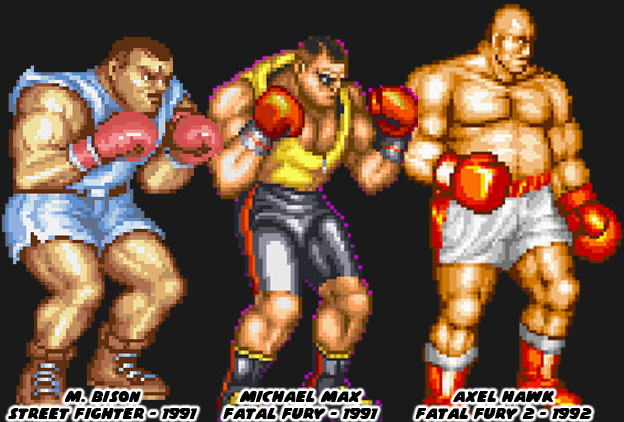
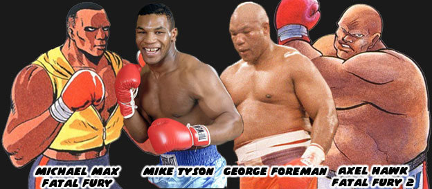
It was no coincidence that Street Fighter II's boxer M. Bison (Balrog in the USA) looked like pro boxer Mike Tyson. Capcom used the heavyweight champ as the template for their ring general earlier. Tyson had launched his professional career in 1985 and was featured in a version of Nintendo's Punch-Out!! He helped inspire the character Mike in the original Street Fighter as well. Tyson dominated the squared circle, at the age of 20 he became the youngest ever to win a heavyweight title. He earned a reputation for being destructive, and often knocked out opponents shortly after the opening bell. His supernatural fighting ability made him the perfect candidate for a fighting game. Of course Capcom didn't want to pay the boxer any royalties for using his likeness so they made a few changes, swapping out his name with another Shadowlaw general, and presented him in warmup gear. He was an easy fit into Street Fighter II and would even inspire a Fatal Fury boxer. Michael Max was literally cut from the same cloth as Bison, both having roughly the same size, shape, similar warmup gear and even haircut. Audiences felt this character was lacking, even if he had a unique tornado uppercut.


SNK's follow-up boxer had a more unique look. The bald and pudgy Axel Hawk was a friend and trainer for Michael Max. This fighter, featured in Fatal Fury 2, was taller and heavier than his protege. From a design standpoint it was strange to have a character that was older and fatter than the previous star. From a real-world influence however it made sense. George Foreman was a legendary heavyweight fighter that started his career in 1969 and stopped fighting at the end of the '70s. He became a preacher but returned to the ring in the late '80s. He got a title shot against Bernard Hopkins, a fighter 16 years younger than he was. Foreman recaptured the heavyweight championship at the age of 45, making him the oldest person ever to win the title. It was an underdog story that inspired long-time boxing fans. Chances were that SNK boss and boxing aficionado Eikichi Kawasaki suggested a version of Foreman for the sequel. Axel was a bit more rotund, especially in the official character art, than Foreman but they both had amazing power behind their strikes. Pop culture tended to color the SNK character designs more than any other studio. Aside from real-world fighters there were also decisions based on popular aesthetics. This was seen on another boxer in the SNK universe.


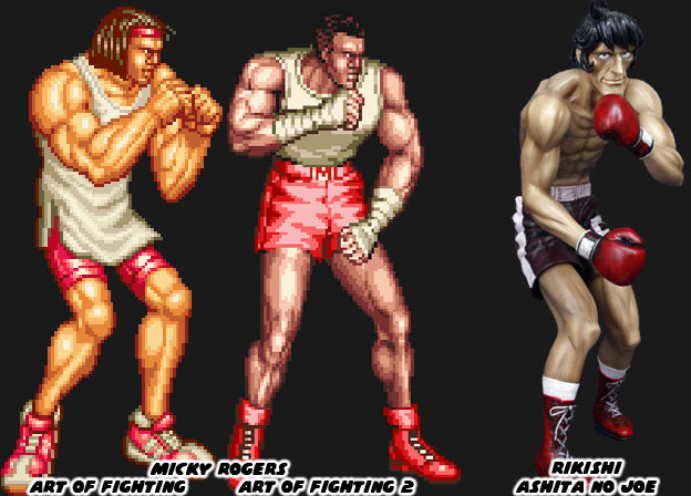
Micky Rogers was the boxing archetype introduced in the AoF series. The character sported braids in his first appearance and the look was changed slightly when he appeared again in a sequel. Visually the fighters in the AoF series were much different than the figures in FF. The artists working on the characters tried to make them more proportional to actual people. The reason for this was because of the larger sprites that AoF featured. If the character were drawn too muscular it would have looked awkward when they were scaled up. The fighters would have looked like cartoon characters in an otherwise realistic setting. Micky looked anemic compared to some of the other characters. He was lanky but well defined. It made sense given he was a boxer where speed was often more prized than power. The manga Ashita No Joe was a wildly popular boxing manga from Japan. The artist Tetsuya Chiba would draw his character with long, lean muscles. The action was easy to follow on the page because of his slender lines. This style of art that he popularized in 1968 would end up influencing countless other manga and anime shows about boxing. I believe that this design also found its way to SNK, given the Mr. Kawasaki was a boxing fan. Micky had almost the same build as characters like Joe or Rikishi, the champion fighters from the book.


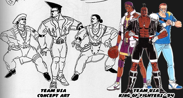
SNK, like most major arcade publishers realized that in order to succeed they had to become global players. This meant that they had to include fighters from other countries, especially the USA. Capcom and a few other studios included fighters from the USA in their games but gave them the slightest connection to real western culture. Joe and Mike in the original Street Fighter looked very plain, wearing street clothes, they were somewhat forgettable. The studio punched up their efforts with Guile in SF II. If anything they were pandering quite heavily to each nation, easily to the point of parody. Look at Zangief and Dhalsim’s original endings. Even the American was over-the-top. He was a military fighter wearing camouflage pants, with an absurd haircut, that was all muscles, and sported USA flag tattoos. As a Mexican-American I can confess that I must run into people that look like Guile at least twice a day! SNK did a slightly better job with their US characters and realistic street fashion in both the FF and AoF games. They decided to really crank it up with each sequel. They payed close attention to the trends happening in tv and in movies. When the studio began work on the King of Fighters, which would bridge all of their fighting games together they began pandering heavily to the USA. They did this by making the US team captain a boxer, and by looking at pop culture for his design cues.


Decades ago fashion trends travelled much slower than they did today. The artists at SNK wanted international audiences to visually identify the US team because of how they looked, rather than what school of fighting they were representing. In order to do this they had to create archetypes that were wearing the most “Western” costumes. The people at SNK were using fashion cues from pop culture as the basis. The only problem was that street culture evolved rapidly. The look of the US fighters were reminiscent of dancers from the films Beat Street and music videos from Salt-N-Pepa and Queen Latifah. The spandex and leather outfits of the late ‘80s were quite outdated for a game dropping in 1994. Thankfully the studio revised the outfits and based the fighters more on sports icons. A hint of the street fashion remained but for the most part it worked given the character. Heavy D, the captain of the team (and a name pulled from a popular rapper) was a breath of fresh air. He was a boxer that completely rewrote the book on character design. In the next entry we’ll look at how SNK’s designs evolved post 1994. As always if you enjoyed this blog and would like to sponsor me please visit my Patreon page and consider donating each month, even as little as $1 would help make better blogs and even podcasts!

 follow the Street Writer on Patreon!

Saturday, July 11, 2015

The Ken reaction, part 1...

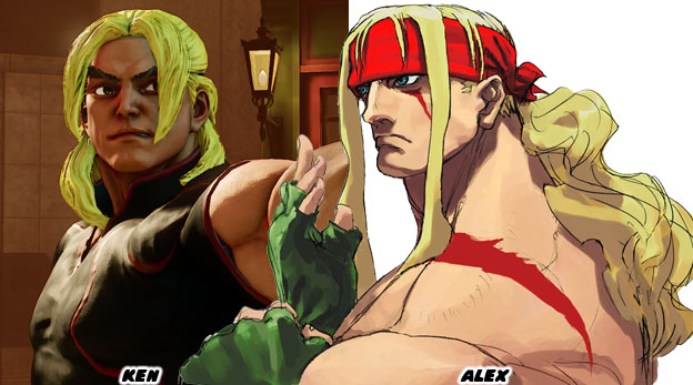
Let's talk a moment about the reaction to Ken returning in Street Fighter V. There are people that love the news, the new look and new moves and people that are offended by all the changes. It's understandable from either perspective. Those that have been with the series for a long time might not welcome the changes made to the character. Those that are relatively new don't mind the makeover as long as he still plays well. One of the biggest knee-jerk reactions has actually been about his hair. It is much longer now than in the previous game. So much so that it is falling over his eyes. There hasn't been a male character with this much hair since Alex in Street Fighter III.

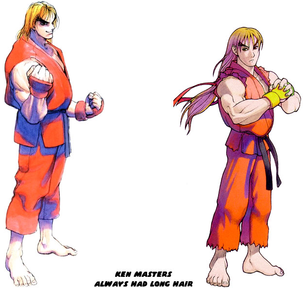
Of course the people that are complaining about his long hair may fail to address that this character has always had long blonde hair. In fact this is the second major makeover for the character. In Street Fighter Alpha / Zero, he had much longer hair and in a ponytail. The decision to present a young Ken and Ryu in the series was based in part on the designs used for the Street Fighter II anime movie. Most fans enjoyed the look so long as Ken was still a fun character to play as.

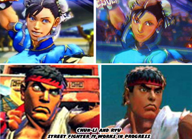
The other major complaint is that the model in the trailer is ugly. The hair itself looks like it was sculpted out of Play-doh. I'd actually like to remind critics that these are Beta and possibly even Pre-Alpha models going into the teaser trailers. The character is still months and months away from being finalized. In case these people forgot the early footage of Street Fighter IV caused the same reaction from many gamers. Ryu was ugly, as was Chun-Li. Their heads were odd, their proportions were funny. Their hair looked like blobs of colored clay. On and on people complained while the game was still being developed. Many wrote off the series then and there. They should have stuck around a bit longer because from month to month the models changed greatly. I can only assume that the same thing is going to happen with Ken and the rest of the cast. Also for the people that dropped the series while it was still in beta were not really missed. The over 8 million copies of the Street Fighter IV series sold helped single-handedly revive and entire genre with the masses.

I'll hold my judgement on Ken until he is finalized. I'm already not happy with what the studio did with Birdie but that's an entire series in and of itself. Right now I am sitting on the fence regarding the redesign for Ken. Like many long-time fans of the genre I can point out what the issues are. First and foremost the character is part of a legacy design going back to the start of the genre. And I'm not talking about the first Street Fighter either. I mean a game even older than that!
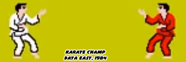

The karate guy in the white uniform versus the karate guy in the red uniform was a tradition started by Data East over 30 years ago! There were a couple of reasons why the characters were presented this way. First off the uniforms could have actually been worn in competition. Secondly the red uniform was a good contrast because two characters wearing white would be difficult to track as they jumped toward each other. It made a lot of sense for programmers that had to use two main karate fighters in a game. It would become a tradition that other studios would follow.
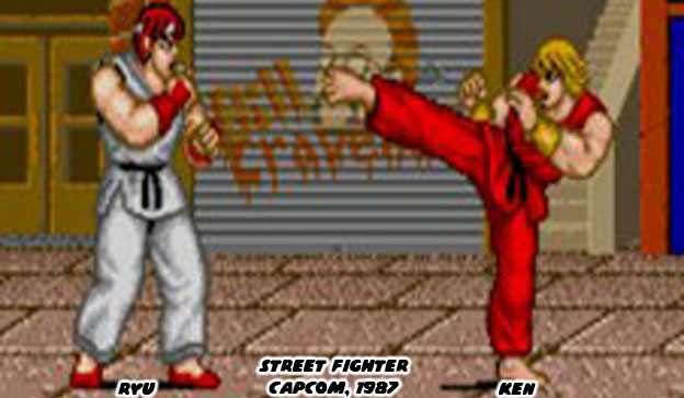

Capcom pretty much set the standard a few years later with the original Street Fighter. Since the game engine was running on the CPS-1 board the sprites were larger and supported more colors than what was possible earlier. They used these extra colors to add some details to the characters. Ryu had reddish hair, red punching gloves and red slippers. Ken had blonde hair and gold punching gloves. These details would become standardized for both characters over the next 25+ years.


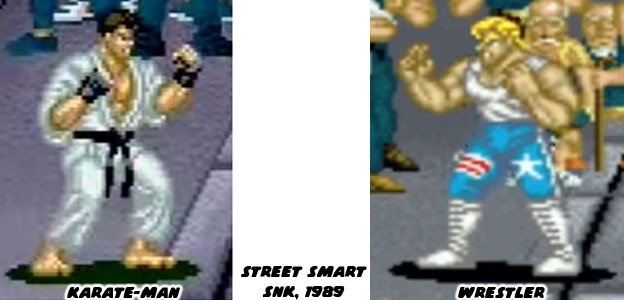
As more developers began creating fighting games of their own they started out with two main characters. They were almost always a Japanese and an American because that was the two biggest markets the industry was focused on. The Japanese was usually a karate fighter and the American was also a karate fighter or some sort of wrestler. SNK had experimented with the formula since early on. Such was the cast with Street Smart. A game that was a hybrid brawler and fighting game.


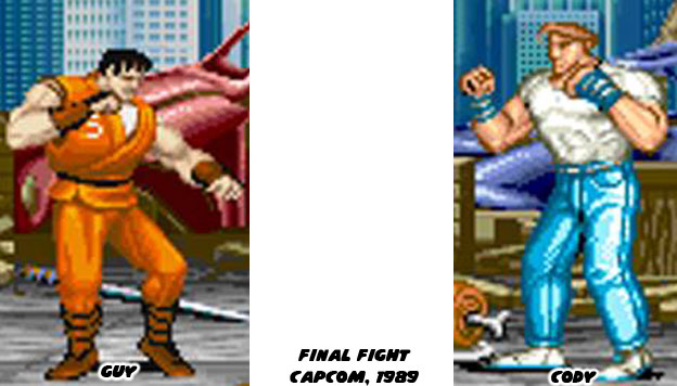
That same year Capcom also released a title that was a hybrid fighting game and brawler. Final Fight was designed as the sequel to Street Fighter. What was interesting was that the uniforms for the main characters were reversed. The American wore white and the Japanese wore red, well actually a burnt orange color.


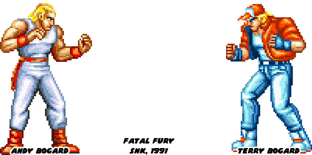
And so the trend continued through the years. In 1991 Capcom released Street Figher II and updated the look of Ryu mostly. Ryu had dark hair and lost the slippers. Ken more or less stayed the same. The other developers were keenly aware of the trends and had also released their own fighters. The closest one on the calendars was Fatal Fury, which was produced by the planner on the original Street Fighter. The main colors remained on the characters, red and white yet this time they were brothers. Also SNK began inserting more contrasting colors and even secondary colors to all of the uniforms. This would be a trend that made the SNK library appear much different.
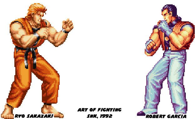

A year later SNK released the Art of Fighting. Again the colors were reversed on the main characters, except this time there was more diversity. Instead of a blonde American, the second player was a black haired Italian. I'm sure many audiences noticed that while Ryo was very much an amalgamation of Ken and Ryu, his uniform had a distinct black vest under his gi. This was something that would return for Ken in Street Fighter V.


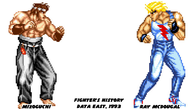
The following year was a major period for the evolution of fighting games. Three titles were released that each shaped the course of history. Data East finally returned to the genre they created with Fighters History. From the neck up the two main characters were very much identical to Ken and Ryu. The rest of the cast was even similar to the World Warriors in Street Fighter II. So much so that Capcom sued Data East for copyright infringement. Capcom would lose the case which allowed other studios to release games and characters very similar to Street Fighter.


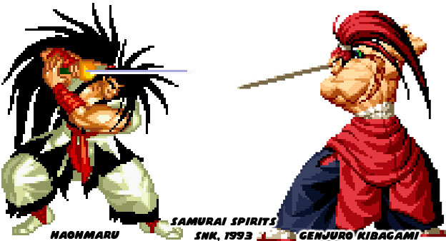
SNK would return with one of the most popular weapon-based fighting games of all-time. Samurai Spirits came out in 1993 and introduced Haohmaru. However he was without his balance until the sequel came out. Genjuro was very much the Ken to Haohmaru's Ryu, although technically both were Japanese.


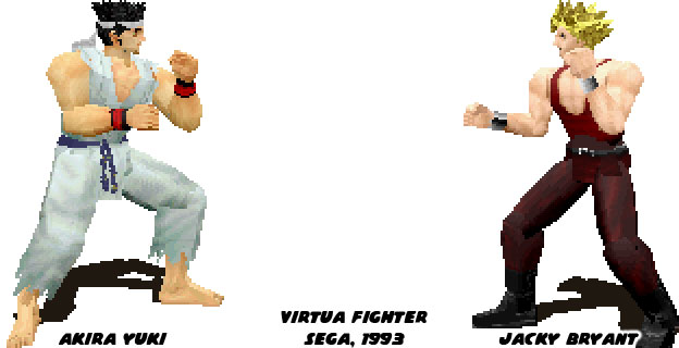
The most revolutionary title of '93 was Virtua Fighter by Sega. It was the first 3D fighting game. Yet despite all of the advances with graphics technology the main characters were still a Japanese and blonde American wearing white and red respectively.
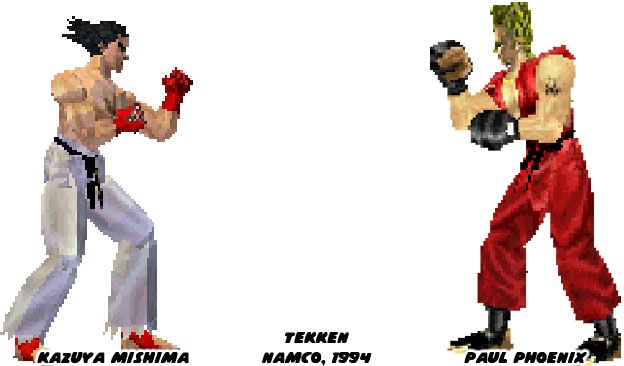

A year later Namco released their first entry in the 3D arena and surprise-surprise there was a Japanese protagonist wearing white and a blonde American in red. Of course any similarity between Ken and Ryu to Paul and Kazuya was superficial. The Street Fighters and the Tekken games had different control schemes, different combo setups and altogether different gameplay elements. The biggest franchises, at least those that came from Japan kept the tradition alive for a generation. Red and white costumers were done because of technical limitations originally. The early arcade engines only had enough memory and processing power to display a few colors at a time. Characters had to be painted in broad single colors. As technology improved so did the ability to display dozens and then hundreds of colors on screen. Even then developers learned that the most memorable characters preserved a single main color. This was most obvious in Street Fighter.
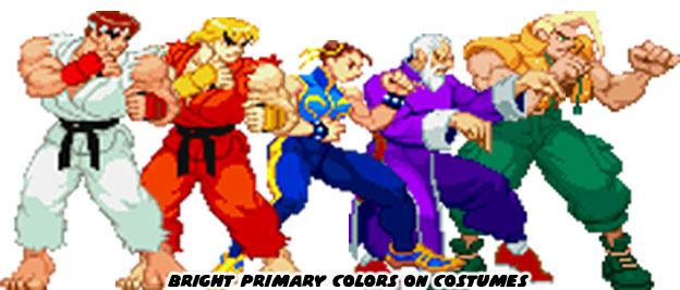

Let's play some word association. What is the first color that comes to mind when you think about these characters: Ryu, Ken, Chun-Li, Gen and Charlie Nash? Chances are you would think white, red, blue, purple and green. Think about every Street Fighter character and how you could pin a color to them, Sean was synonymous with yellow, Blanka was green and Makoto was white. Costumes or uniforms with a solid color were easier to track on the screen than a character with busy patterns on them. This worked in traditional animation, in comic books and just about everywhere else where you wanted to grab the attention of the audience. If there was one thing that Capcom had relied too much on over the past 30 years was that certain nationalities were stuck with the same colors.
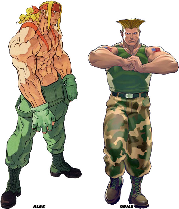

It was not a hard and fast rule but audiences around the world were expected to identify the American character because they were white with blue eyes, blonde hair and military themes. Costumes started to become a little heavy handed with social bias. Japanese characters that were not wearing a gi were sumo wrestlers. Black fighters were mainly boxers and on an on. This started to wear a little thin with audiences. They wanted to see some more original ideas. If not more diversity then perhaps costumes that would make the characters look a little more contemporary. The only down side was that Street Fighter had gone unchanged for such a long time that giving a main character with a completely new look was going to make a lot of players mad. Capcom found a nice middle ground by offering DLC costume packs which offered everything from actual street clothing to animal costumes. However Street Fighter V was a completely different approach to the genre and because of that some of the returning characters would not be the same. In the next blog we will take a closer look at the new Ken. As always if you enjoyed this blog and would like to sponsor me please visit my Patreon page and consider donating each month, even as little as $1 would help make better blogs and even podcasts!