Wednesday, May 24, 2017

The Style Files: Daraku Tenshi The Fallen Angels, part 2...

We were looking at Daraku Tenshi: The Fallen Angels in the previous blog. It was a game at least three years in the making from a team called Steel Hearts. The publisher, Psikyo, wanted to create a fighting game the likes of which were never seen before. They released the game before it was completed but it still retained enough elements for audiences to know where it was headed. The game had a very strong aesthetic, one of the most unique visual styles ever created for a fighter. It wasn't set in a cartoonish world, or a hyper-realistic world. It was instead set in a world with realism, painted with memories of a town slowly decaying. The people fighting to survive in this place were not typical game characters. Even the karate fighter, Torao Onigawara, was a homeless brute. He was a far cry from the hero that Capcom had created with Ryu. Then there was the military officer, estranged from his family and dumped on the island of Eden. His sole purpose was tracking down a crime lord. There were a pair of sister club owners, one of which was a (rare for gaming) trans. character. A thief, a bouncer, an assassin and a green skinned brute made up the rest of the cast. Each had their own unique look, moves and reason for fighting.


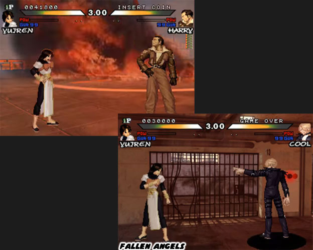
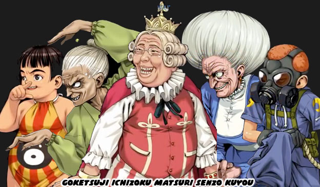
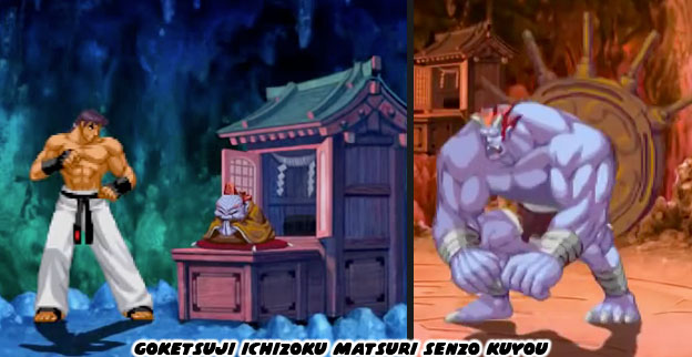
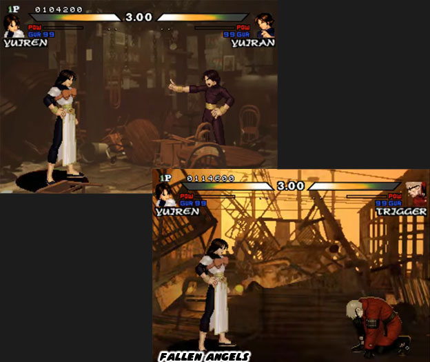
A crime boss by the name of Carlos was pushing all the other mobsters out of power. He wanted to rule the island nation of Eden. This enraged other crime bosses and gangs. But in a world that was cut off from emergency services and even law enforcement this meant that only those that could fight had power. To increase his dominance Carlos began assassinating his rivals. During the events of The Fallen Angels he had heard that there were some dangerous people trying to hunt him down. That was when he called in his right hand man. This person was very stylish, he wore a red suit and dark sunglasses. He was called Trigger and acted as the sub-boss in the game. Trigger was the type of character that could drive a fighting game player mad. He did not use any style of martial arts, instead he fought with a pair of revolvers. They were equally deadly at distance and up close. Also, unlike other fighting games where a bullet was easy to track or evade, in this game every gun shot was near instantaneous. The words cheap and overpowered often came into play when talking about fighting game balance. Yet at the same time Trigger made sense in the context of the game. This was not a tournament, this game was about vigilante justice. There were no rules saying that people could not use weapons in a fight. If audiences were able to get past Trigger then they faced off against the final boss in a darkened board room.


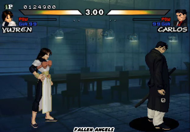
Carlos was tall, almost the tallest character in game. His strength and range were already above average but then Steel Hearts gave him a weapon as well. Carlos fought with a katana aka samurai sword. It didn't matter what type of form the heroes practiced. Just a few slashes with a sword could kill them. In a traditional fighting game this was cheap but in the Fallen Angels it made sense. Think about it for a moment; if this were an action movie, or action game, then audiences wouldn't have complained that a boss character not fighting fair. Bad guys in films always fought dirty and did things that the heroes couldn't. In the end, depending on which character was selected, a single line explained why each person was fighting. Some did it to get a fresh new start in Eden. Some did it to bring justice to the city. Others did it to save themselves. And some did it just for the sake of taking over. Steel Hearts did not get a chance to create any proper ending cinemas for the cast. Nor were they allowed to create any sort of in-depth level intros. Who knows how far the story would have gone and what the fallout would have been. Maybe the game would have had a sequel or maybe it was designed to be a self-contained adventure.


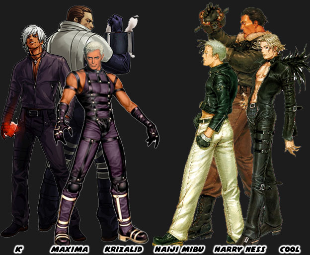
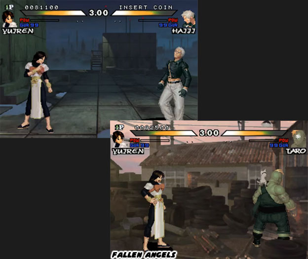
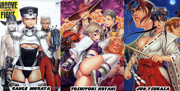
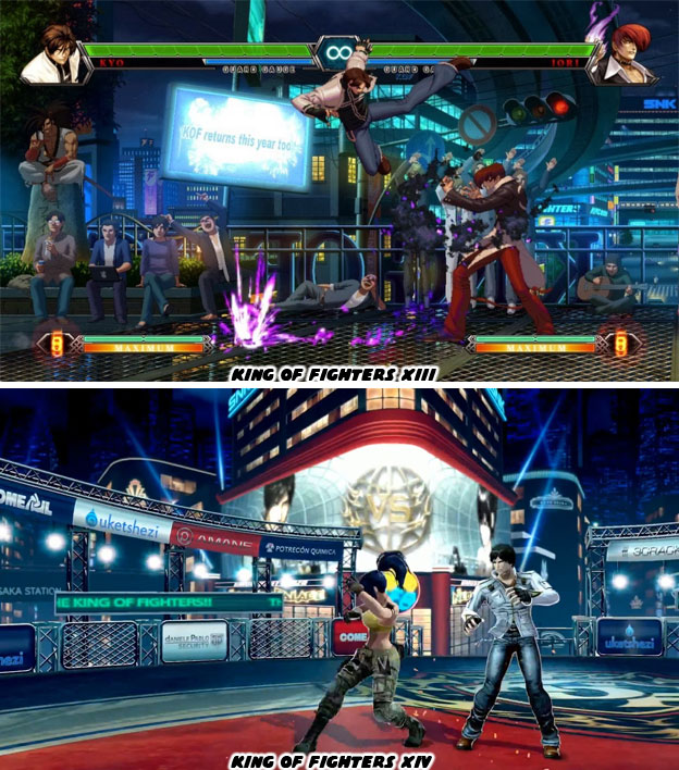
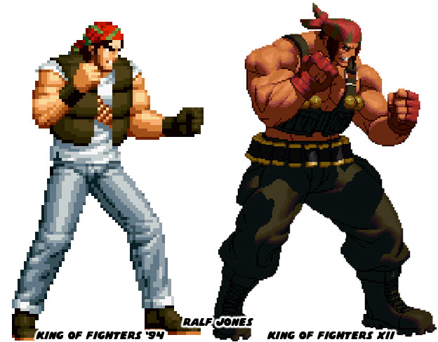
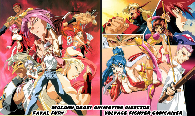
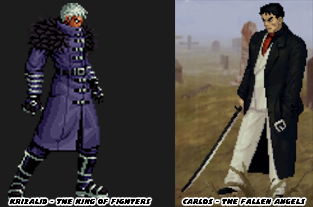
The developers had planned on shaping a bigger experience than what was presented. The incomplete story, unfinished sprites and other data found in the game ROM could attest to that. No other developer followed in their footsteps. The lesson was learned, creating a game with an incredibly strong aesthetic, a unique visual style and presentation would cost too much money and take too much time to be worth it for any publisher. The influence of Steel Hearts, the importance of what the studio was trying to deliver however did not stop with the Fallen Angels. Director and co-designer Mitsuo Kodama, along with artist Toshiyuki Kotani aka Styleos, went to work at SNK. One of the first things they did was change the direction of the King of Fighters franchise. They introduced some new lead characters and villains. Eagle-eyed fans noticed that the new characters in KOF '99 looked eerily similar to the characters in The Fallen Angels. the French website GangGeekStyle did a great writeup and compared the Fallen Angels to the KOF characters that evolved from them. Remember that the team also went on to work on The King of Fighters '00 and The King of Fighters '01. Around this time SNK was in bad financial straights and underwent bankruptcy, I wonder if the change in direction had anything to do with it. The KOF 2001 and 2002 were actually developed by the South Korean studio Eolith. The comparisons between the white-haired antagonists in the KOF series, K' and Krizalid and the metrosexual anti-heroes in the Fallen Angels Haiji Mibu and Cool should be obvious. Also the trademark attacks for both Maxima and Harry Ness were rockets in the sleeves of their jacket. The major difference being that Maxima was a tall cyborg and Harry was a big soldier. Yet the idea of a villain in a long coat was nothing new in SNK fighting games, See Rugal, Goenitz, Mr. Big, etc. Both Krizalid and Carlos fit the mold as well.


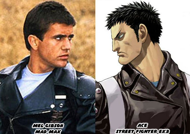
SNK had made changes to their franchise very quickly. They didn't try to recreate the aesthetic from the Fallen Angels, the mood of the levels, or even the large detailed sprites. That would have held up the development of the King of Fighter series for a few years and put them way over budget. The decision to pursue Dot Art graphics, detailed high-resolution sprites, eventually happened. It may have been influenced by what Steel Hearts was trying to achieve. But that was not the only interesting thing that happened following the debut of The Fallen Angels. In 2000 ARIKA released Street Fighter EX3. This was the first fighting game that the studio had released after Fighting Layer in the arcade in 1998. ARIKA had made waves with the fighting game community because Fighting Layer was published by Namco but it featured two characters from the Street Fighter EX series, Blair Dame and Allen Snider. Neither of which appeared in Street Fighter EX3. In their place was a new character named Ace. Movie fans noticed how much this new character appeared like Max Rockatansky from the Mad Max films. He had the same angular haircut and the same armored jacket with only his pants being a different color. In the canon of the series Ace was the next evolutionary step from the Cycloid program. These were cyborgs that could copy the moves of any fighter.


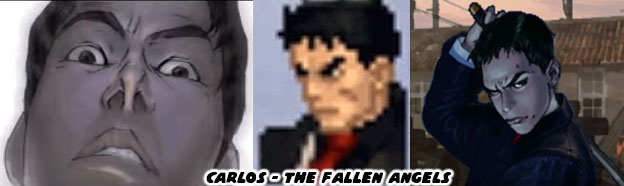
Ace ended up having a few of the moves of Blair and Allen at his disposal. Some people wondered if he had crossed paths with the former EX stars. Did he beat them in combat? Did he arrest them? Is he a clone? ARIKA wasn't saying anything official about the events or canon of this game or Fighting Layer. Leaving audiences to speculate about what happened. It didn't help that ARIKA would tease the characters in their infamous April Fool pranks. Credited in Street Fighter EX3 were producer Tatsuya Minami and co-designer: Hiroshi Okuda, Kiminori Tsubouchi. None of the senior people had worked on The Fallen Angels, at least none that I saw in the credits had any involvement with The Fallen Angels. But here is where things get very interesting. For many years some people in the fighting game community thought there was something oddly familiar about Ace. I think his look was partially inspired by Carlos from The Fallen Angels. The sharp hair, and dark coat being the most obvious similarities. But it turned out that there was much more to it than that.


For more than a decade I looked high and low for official art from Capcom or ARIKA on Ace. I got just about every art book Capcom had ever released and even a few of the ones that Udon translated from Japanese. There was nothing outside of the character profile that we had already seen. That was until the Street Fighter PIA Mook (magazine/book) was released in 2016. The paperback talked about every character and game released in the series up until Street Fighter V. F.A.N.G. was at that time the newest character. The book also mentioned every crossover that the series had with other franchises, including the costumes in Monster Hunter, and Dragons Dogma. The reason that I bought the book was because it inlcuded all of the Street Fighter EX characters as well. The most obscure being ARK-99, a satellite that players could beat up in the bonus stage of Street Fighter EX2. The second-most obscure character was Ace and that was when I got a clear shot confirming my suspicions. I bought the issue so that I would always have proof that the character was canon and the art was either stolen or never credited correctly.


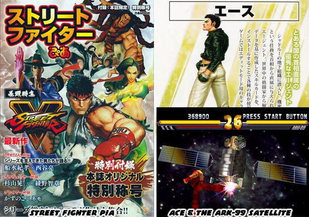
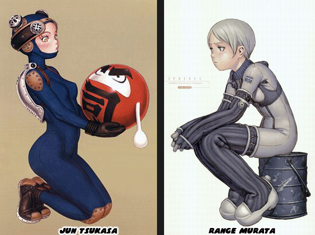
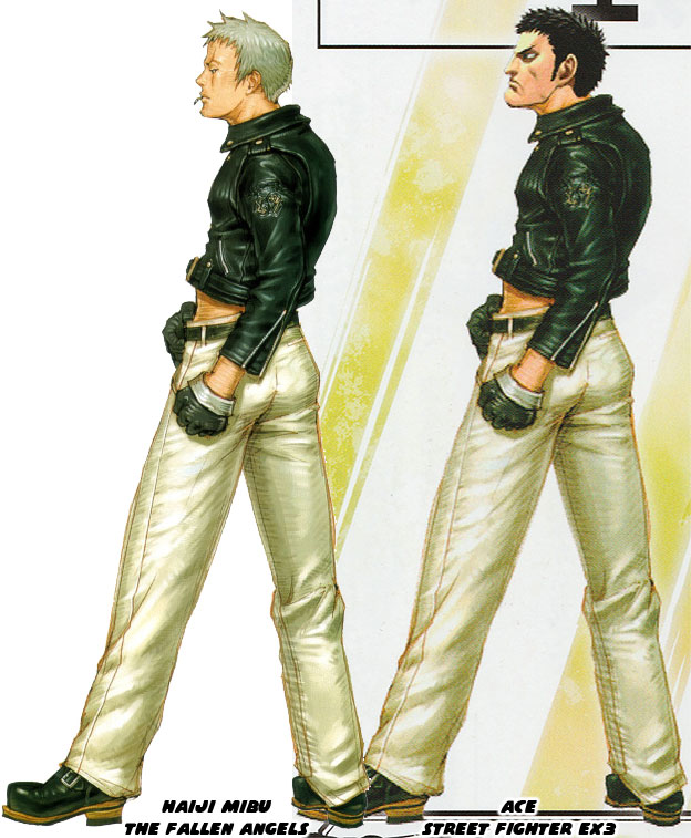
The character art for Ace was poached from the original illustration of Haiji Mibu from The Fallen Angels. I don't mean that they were similar poses, similar costumes or similar color choices. I mean that the studio took the original head off of the character and replaced it with Ace. If the artist that did this was anybody but Morioka Shinichi then it would be art theft. It is possible that Mr. Shinichi went with an alias in the credits. But if so I have to wonder who at ARIKA thought that this would be a good idea. The Fallen Angels may not have been widely received but the characters were so unique that they were hard to miss. When I got the Street Fighter PIA the first thing I did was scan the full body picture of Ace and then track down my copy of Games Mook Vol. 113: Psikyo Illustrations. I scanned in the Haiji Mibu piece and put them side-by-side. There was no mistaking the illustration now. The suspicions that Street Fighter fans had was confirmed. Audiences had seen this character before, and for some they had seen the design used twice in both an SNK and Psikyo game. I have yet to find a Japanese article or site that would explain why the recycled art was used.


The Fallen Angels was an example of what would happen if a developer decided to pour all of their resources into a game with an uncompromising aesthetic. They transcended the argument of what good graphics look like because no other studio could compare to what they achieved. Aside from being beautiful to look at The Fallen Angels introduced new ideas into the genre. Things such as characters that were partially animated using rotoscope techniques. A mix of paintings and cgi models used to build interactive stages. Incorporating video loops to create realistic weather and environmental effects. A cast that was not made up of traditional martial artists but whose forms were still realistic and believable. Challenging conventional tournament design and focusing on a story with mature themes. Incorporating characters with and without weapons as well as including a trans character. It had been years since a single studio had pushed so many new ideas on the genre. Of course all of this innovation came at a price. The game did not look or play as Steel Hearts had intended. It took several years to get a mostly running version of the game ready. It left the developers wanting more, even years later they wanted to return to it and finish what they had started. No developer could realistically complete a project like this, it would bankrupt just about any studio. I am grateful that they were willing to give it their best. Steel Hearts showed what one studio could do for the genre. Imagine if every studio poured their heart and soul into setting their fighting game apart. The majority of fighting games today use the same graphics engine. They all have the same visual language, and because of that they have a diminished impact. Audiences are eager to see a return to strong aesthetics, graphics be damned. If you have a favorite fighting game that broke the mold I would like to hear about it in the comments section. As always if you enjoyed this blog and would like to sponsor me please visit my Patreon page and consider donating each month, even as little as $1 would help make better blogs and even podcasts!

 follow the Street Writer on Patreon!

Monday, May 22, 2017

The Style Files, Daraku Tenshi: The Fallen Angels, part 1

Steel Hearts had been working on a fighting game called Daraku Tenshi - The Fallen Angels for about three years. The publisher Psikyo had been patient for the most part but by 1998 almost every fighting game franchise had run its course. Street Fighter, Tekken, Virtua Fighter, Mortal Kombat, the King of Fighters had sequels upon sequels in the arcades and home consoles. Psikyo had been floating the bill all this time and was running out of money and patience. They wanted their new franchise title in arcades as quickly as possible. Steel Hearts did the best they could and polished what they had and scrapped the rest. There were incomplete animations, unbalanced rosters, missing shadows and other sprite data was patchy. The endings, cut scenes and stories were not all in place when the game was released. In recent years arcade fans tracked down copies of the title and dumped the ROMs online for game fans to emulate. Some fans dug through the files and discovered unfinished sprite data for at least four more characters with names and costumes. There may have been even an extra character or two in beta that they had just started before publishing the game.


Psikyo had an uphill battle trying to get audiences behind their new game. Battle K-Road was such a poorly received fighter that most people assumed they were going to get more of the same. When it came to sprite-based titles audiences thought that the peak had already been reached. Capcom released Warzard two years earlier and Street Fighter III a year before The Fallen Angels. Fans were skeptical that Psikyo could match the size, and quality of the sprites in either game. Little did they know that there was always room to grow. The Fallen Angels and King of Fighters XII demonstrated that. Anyhow Psikyo went on a full press blitz for their title. They got Gamest, the top Japanese arcade magazine, to do a four-page special on The Fallen Angels. They wanted to show fans that their game was worth the wait. It started by breaking conventions. The majority of fighting games up until that point had martial artists in some sort of tournament. This game had no tournament, the fights were al interconnected through a story. This game had a couple of martial artists but they weren’t the traditional heroes that we had seen previously. Take the karate master in The Fallen Angels for example. Torao Onigawara was the hardest hitting karate fighter the world had ever seen. Yet his extreme dedication to his craft turned him into a literal demon. Well, a homeless demon.


The romantic ideal of the karate fighter, somebody like Ryu for example, is flawed. Ryu was based on people like Mas Oyama and Yoshiji Soeno. People that became heroes by defeating other martial artists. In order to become great karate masters they lived like hermits. They trained in the mountains, under extreme weather conditions, isolated from human contact. They did pretty much nothing else for years. This made them mentally and physically stronger than their opponents. It turned them into legends. Then you take that idea to the extreme with a character like Torao. His zealotry showed in his design. His gi was worn and tattered, like Ryu’s, but unlike Ryu it was also dirty and covered in sweat stains. Torao in the game had literally stepped on screen after a training session. He had long, oily unwashed hair. The character looked like he hadn’t bathed in months. Steel Hearts actually animated Torao with tiny flies buzzing around his head. Other studios presented their characters in an ideal light, Psikyo went the opposite way. Ryu was always illustrated as young and handsome, even if a little bit rugged. Torao was raw, with a wild look in his eyes by comparison. Steel Hearts painted him with flies-a-buzzing and a snaggletooth sticking out from under his lip in the official character art. Even the name Onigawara was a play on words. An oni-gawara, literally a demon tile, was a decoration on a Japanese roof. Torao was no Ryu, he was more accurate to what an insane karate demon would look like.


Every character in the game had an intense level of design and back story, not just Torao. Every character had a reason to fight and a reason to go through the lineup. Steel Hearts wanted players to feel as if they were living vicariously through the cast. The society that they were being brought into was on the verge of collapse. The stages were desolate, as if the last people on Earth were the main characters. It turned out that the fate of a tiny island nation rested in the hands of these people and an evil crime lord. Steel Hearts had reached a new level of directing for a fighting game. The situations that the cast found themselves in were serious. These weren’t some random fighters in a tournament, brought together by fate. Each encounter was a life or death struggle. I don’t think that any Japanese game since had matched the tone of The Fallen Angels. It was as if had been written and directed by Michael Mann, David Lynch or Brian De Palma. I’m certain that lead artist Morioka Shinichi, producer / co-designer Kouzou Fujimoto, and director / co-designer Mitsuo Kodama could turn this story into a compelling 6-episode OVA. Just look at the official story that played in the introduction.


The world that Steel Hearts painted was very grim and brooding, more so than any standard metropolis. The island of Eden place never completely recovered from a massive earthquake. There was a reason why the inhabitants on the island were melancholy and hesitant to leave their homes. Drugs and crime had taken over the streets. Without direct access to state emergency resources they were at the mercy of local mob bosses. Also unlike other fighting games, even the gruesome ones like Mortal Kombat, the action here was grounded in realism. The characters did have some level of fantastic martial arts ability but they weren’t shooting fireballs or throwing burning dragon punches. They did actual take downs and slams, spinning backhand punches and thrusting axe kicks. We could imagine that these people were very real, or inspired by real heroes and villains. There was a dash of science fiction rather than fantasy in this world. Demons weren’t real in this game as they were in the Goketsuji Ichizoku / Power Instinct universe. Instead things like kidnapping, brainwashing, cloning were. To an extent even genetic modification was possible in this world. These sci-fi elements had been touched upon in the Tekken and Street Fighter universes. Yet none of the previous games had put the characters in such a foreboding world. No other game was ripe with an aura of depression. It was palpable. It hung over the stages. Over the cast, and over the intro screens.


The streets were desolate in Eden. It made sense given the story leading up to the events in the title. Also since this wasn’t a game about a competition then it made sense that there weren’t bystanders cheering on the fighters. Sure it could be argued that the developers didn’t have enough time to create background characters but I do not think that was their intent all along. After spending years on an unfinished main cast they must have realized their resources weren’t being used to populate the city. This worked to their advantage. It made Eden look like a nice place to drive through but not stay. The team could focus on the cast, on the moves, on the fight mechanics. They could explore things that weren’t being done in other fighting games. For example, one of the things they created were custom win quotes for each character and rival. Having dedicated lines for every opponent helped create a relationship between characters. It helped sell the story and connect the reasons why everyone was fighting.


Every stage told a story, like the great fighting games before it. Eden had a literal atmosphere, including realistic fog and rain effects. The studio wanted Eden to look worn and lived in. The buildings and streets weren’t in the best condition. The fights didn’t happen in front of a flashy casino or sporting event. They happened in darkened rooftops and side alleys. They happened in seedy bars and open cemeteries. There was a sense of decay in these levels. This world was real and it was slowly falling apart. The years of neglect following the earthquake were showing. If something didn’t happen soon, and for the better then this world would fall apart completely. This was important to the story. All great stories happen at the critical moment, they don’t take place during the inconsequential periods. It was no different in this game. A crime boss named Carlos was consolidating his power. He was taking out his rivals with the help of some assassins, including a red-suit wearing gunman named Trigger. Carlos was making an already bleak existence in Eden even harder. Every character in the game had a vendetta against Carlos, if they weren’t secretly working for him. At least one person, a soldier named Harry Ness, was trying to bring him to justice in the mainland. But getting through Eden and back out alive would prove to be a challenge.


Steel Hearts took a number of unique approaches to the game. The final cast had eight playable characters. Like the original Street Fighter II. It also had a sub boss and boss. But like I said earlier, they were not the traditional martial arts masters. For example there were two female characters in the game, sisters named Yuiran and Yuiren. They ran a club called the Wind Fish. Yurien was a singer in the club and was actually a trans character. She was born the brother of Yurian, acting as protector and entertainment while her sister acted as a bouncer. Yurien had very fast strikes while her sister had the power moves. It was a unique change of traditional roles. This stage was an example of the sort of interactive environment that the studio wanted to build. There were chairs and tables in the foreground that obscured the view of audiences. This sort of blocking wasn’t done in other games. As players fought they could kick the chairs and tables over. It was a nice detail that was rarely used in other fighters. It helped make the fights look like they took place in an action film. The smoky club looked like it had been in business for a few generations and the sisters were doing everything they could to keep it going. The Wind Fish actually appeared twice in the game. The first time the club was intact, as if they had just closed for the night. By the end of the game Carlos and his goons had trashed the club. Whether he wanted the land, the clientele or the sisters out of business we might never know.


The Wind Fish was the only level to have foreground elements to knock over but again every stage told a story. Steel Hearts was experimenting with the format and trying to add details and effect rarely if ever used in other games. The chairs and tables were one example of expanding stage design. In other places they experimented with effects. Realistic fog and rain were one thing but the studio tried very hard to create a realistic flame effect on Harry’s stage. There was a massive fire on a helipad, as if Harry’s chopper had just crashed. Steel Hearts blended video effects onto the stage so that the raging inferno looked realistic because it was a real fire. The sprites the studio created also had a certain weight and depth to them. This was because not only were they carefully painted to display shadows and highlights, but because many of the idle and strike animations were rotoscoped. This was to say they were based on video of actual people performing the moves.


As the game progressed the encounters got more and more unique. The locations became more diverse and the opponents a little bit stranger. They were all leading up to a final showdown. Carlos had heard the rumors that there were fighters in Eden ready to take him down. So he pushed back with hitmen of his own. Some did it for the money, others did it because they were just evil. The final battles were unique. We will look at these in the next blog and see the legacy that the studio established. As always if you enjoyed this blog and would like to sponsor me please visit my Patreon page and consider donating each month, even as little as $1 would help make better blogs and even podcasts!

follow the Street Writer on Patreon!

Friday, May 19, 2017

The Style Files, Psikyo and the aesthetic copies

Many game fans wish their favorite developers had an unlimited budget and an unlimited development cycle to create “perfect” titles. This would make for better movies, cartoons and comic books as well. But we live in a practical world. A world that doesn't have unlimited time or money. We live in a world where the decision makers are not always the creative types. Stockholders demand a return on investment and they have little patience for a director's flights of fancy. No studio could survive for long if they wrote their team a blank check. Do you wonder what would happen if a studio gambled really big and put all their chips on one game? What would happen if they spent years in development and were still not finished when the game was published? How good could a rushed game really be? How much better could it have been? This happened with a lot of games, including many of the biggest franchises. The best managed to cut the right parts without sacrificing the overall experience. One game in particular became a sort of urban legend in the fighting game community. It was released before it was ready, didn’t see too many arcades and then vanished. It retained enough elements to let audiences know where the developer was headed with it. The people that worked on the game ended up coloring the biggest franchises, including Street Fighter and the King of Fighters. In order to tell the story properly we need to look at the agenda of the publishers and developers separately.


Studios copied game designs from each other. That was a tradition that went back to the earliest days of the arcade. If one company created a racing game then another studio created a racing game. If one studio created a space shooter then the other studio followed suit. The more popular the game was the more likely it was to be copied. The runaway success of Pac Man in the '80s meant that every developer would create their own maze game. Psikyo was no different when it came to copying ideas. What they did was unique. They waited a few years, sometimes a decade, and released a game that had many of the elements of a classic arcade title. The shoot 'em up (SHMUP) was an arcade standard. Every designer tried to improve on the classic Space Invaders formula. Studios experimented with graphics, controls and game play. Capcom took the SHMUP out of space and used the mechanics to tell a story set in WWII featuring planes and ships from that era. The game 1942 was a phenomenal success. They created a sequel called 1943 and many years later, riding a wave of arcade nostalgia, released 1944. Psikyo had developed their own take on the title, Strikers 1945, released almost a decade after Capcom's original game.


Psikyo had become very good at filling in a certain niche. It was as if they knew that arcade audiences occasionally longed for classic experiences. Even with the leaps and bounds in graphics and genres there was still a certain charm to the feel of a traditional game. So they used newer technology and better graphics to enhance the classic-inspired titles. Strikers 1945 was probably one of the better known releases but one of their games with a very strong aesthetic was called Sol Divide - Sword of Darkness. It was a side-scrolling SHMUP that featured flying characters in a fantasy universe. If I were to compare it to another classic it would undoubtedly be Capcom's Forgotten Worlds and sure enough it came out almost 10 years later. To be fair the Capcom game was set in a post-apocalyptic wasteland where monsters and angels were fighting alongside jet-pack wearing mercenaries. Sol Divide had similar mechanics but a strict fantasy environment. It was a fun game and an under appreciated Playstation title. When fighting games were red-hot at the start of the ‘90s Psikyo couldn’t afford to stay quiet for another decade. They jumped into the genre with a game called Battle K-Road.


The game was inspired by the hugely popular K-1 fighting tournament. It was one of the influencers of modern MMA tournaments. It focused more on strikes than grapples. The name of the tournament actually got its name by taking the first letter of Karate, Kickboxing and Kung Fu. One of the most popular fighters was a Swiss Kyokushin practitioner named Andy Hug. He was an exceptional fighter and helped build a bridge between western and eastern practitioners. His look was the basis for one of the lead characters in Battle K-Road, Anthony Hawk, yes as in “Tony” Hawk. The game was notoriously bad. The control, balance, animation and character design were forgettable. Even the boss character Mr. Bear was overpowered. It poached a number of elements from other fighting games but especially the likenesses of real people. Andy looked similar to Anthony but there was even a cyborg in the game that was a dead ringer for a certain bodybuilder-turned-actor-turned-politician. Psikyo’s flop was released in 1994 for the arcade and never saw a console or PC release, which was rare for most fighting games of the era.


Psikyo had struck out when they really needed a hit. They asked their development team Steel Hearts to work on a new fighting game. If Psykio’s first attempt failed because it lacked originality then this new one would pull out all the stops. Steel Hearts looked at their art team and pushed for a very strong aesthetic. This new game could not look remotely like any other fighting game that had ever come out. In order to set themselves apart they had to have a distinct visual style that carried through every part of the game, not just the character designs, but every stage, every intro screen and ending as well. Capcom, SNK, Sega, Namco and the other big companies knew that there was a steep price to developing fighting games. Perhaps Psikyo was underestimating the task. There were many variables that went into the budget; programmers, animators, sound and music all factored in. Sprite creation accounted for a good chunk of the money. The size of the sprite, number of colors, number of animation frames all effected the price. Of course the team also had to settle on the lineup. Not enough unique characters and audiences would skip the title, too many and the game would never be completed in a reasonable time frame. Steel Hearts wanted to create larger-than-average sprites that looked as if they were hand-painted by the lead artist on top of highly-detailed stages. Except they didn’t have a lead artist right away or theme they wanted to pursue.


What the studio did know was that the game industry focused on cartoonish or animé-style aesthetics. They didn’t pursue anything with softer, more realistic tones. A designer like Range Murata really stood out in the crowd. It would be wonderful if they could get his style, down to the color palette that he used in a fighting game. Yet Range was contracted by Atlus not to mention that he was already doing the designs for the Goketsuji Ichizoku / Power Instinct Series. The team at Atlus had other tremendous artists that filled in the stage art, menu art and other details. Range didn’t do everything himself and that’s why there were some slight differences in the stage art and background characters between games. They didn’t all capture his unique perspective. One of the secret weapons that Atlus had was an artist named Toshiyuki Kotani aka Styleos. He could mimic the Range Murata style very well especially in the final games of the series. Later on he began to show off his own style, which had soft, blended colors on top of lean athletic figures. His style of art really stood out when he worked on the indy fighter Yatagarasu: Attack on Cataclysm along with former KOF developers. Atlus had a packed art team working on their fighting game series; Haya, Kobayashi Takashi, Masafumi Fujii, Shioi Tomohide (KOF Maximum Impact), Nishikawa Yoshikazu and dadamusi. They had no lack of talent coming up with all the wild characters and stages in their games.


Psikyo had their own art team as well and a special designer whose illustrations were very much on par with those of Murata. Jun Tsukasa was the character designer and illustrator on Psikyo’s Sengoku Blade series and mahjong games. He often created cheesecake paintings of very busty women in revealing costumes if not semi-nude for the in-game graphics as well as arcade posters. I cannot recall a time a time that Range Murata painted voluptuous women. When Tsukasa drew young men and women they often had the same proportions and stylings of Murata. When put side-by-side it was almost eerie how similar their work was. If you have difficulty telling the artists apart then just compare their main body of work. Tsukasa tended to focus on paintings of busty women whereas Range’s subjects were often thin girls. Unfortunately Mr Tsukasa was not able to help Steel Hearts develop the characters, I’m not sure what he was working on in that time. So Steel Hearts turned to the talented Morioka Shinichi to come up with the art direction of their next game; Daraku Tenshi - The Fallen Angels. His own style of illustrating was similar to those of Murata and Tsukasa. Toshiyuki Kotani also ended up working on the project, helping keep the Murata / Tsukasa aesthetic very close. In Gamest Mook Vol. 113: Psikyo Illustrations Mr. Shinichi said that he worked on the project for three years and wishes to revisit it so he could complete what the studio set out to do. Imagine working every day for three years and having the game published but considering it unfinished. Did Steel Hearts not hire enough talent to properly complete the title? Did Psikyo again underestimate what it took to create a AAA fighting game? Or were both studios to blame? We’ll look at this title in the next blog and see what made it one of the most anticipated fighting games of the ‘90s. As always if you enjoyed this blog and would like to sponsor me please visit my Patreon page and consider donating each month, even as little as $1 would help make better blogs and even podcasts!

 follow the Street Writer on Patreon!

Wednesday, May 17, 2017

The Style Files, Voltage Fighter Gowcaizer & Goketsuji Ichizoku aka Power Instinct

The importance of style had been on my mind these past few weeks. It was the first thing audiences noticed about a game. Before they even got their hands on a controller or keyboard people would perk up when they saw innovative "graphics" in previews. If a game transitioned from 2D to 3D graphics they wanted to make sure they played the same. Audiences kept coming back in part because of how a game looked. The control and game play were consistent in the longest lived franchises. The most recent Street Fighter, Tekken, and the King of Fighters all played like their previous titles. Aesthetically speaking each game in the particular franchises also shared their consistency. The King of Fighters franchise had held off on going to 3D graphics longer than any other studio. From the first numbered game in the series, KOF '94, through KOF XIII (2010) there was a commitment to sprites. There were some "spinoff" games from the universe made in 3D, these were the Maximum Impact titles. Those games experimented with the game play, and character designs. Not to mention that they revolved around a different competition, the Mephistopheles Fighting Tournament. The Maximum Impact series was like KOF's version of Street Fighter EX universe. There were some good ideas in there, some unique characters too but fans in general passed over the game.


If you add in the time between the original Fatal Fury and KOF XIV there had been 25 years of the franchise, older than many people discovering fighting games today. When SNK officially transitioned to 3D, during KOF XIV, they tried very hard to capture the highly-stylized stages and characters. Audiences appreciated their dedication to the format. Characters maintained their unique proportions. Well, to be fair, most of the characters were not as swollen as they had appeared in the previous game. The costumes changed ever so slightly in the King of Fighters series however the stars each retained their moves, abilities and personality. Without consistency fighting games would have never taken off. The same rules applied for all the big franchises whether they were in 2D or 3D.


Between 1992-1995 developers were falling over themselves trying to get a fighting game to the market. Capcom had a certifiable hit in Japan and the USA with Street Fighter II. Just about the same level of success that Space Invaders enjoyed in the ‘70s or Pac Man did in the ‘80s was experienced by Street Fighter II in the ‘90s. No other game was single-handedly responsible for creating an arcade boom during that era. Many other companies tried to copy the formula verbatim, but few succeeded in winning any ground against Capcom. Some of the more innovative studios knew that they had to set their game apart from the competition. They couldn’t just repeat what was popular and needed to look elsewhere for inspiration. Since games were and continue to be about visual storytelling, the studios had to create a very strong visual language. The lead artist on each game could almost make or break the title. Some of the developers thought that asking directors from animé could help set their games apart. One of the biggest risk-takers was Technos. Their game Voltage Fighter Gowcaizer was released in 1995 on the Neo Geo platform. It featured the design work of animé veteran Masami Obari.


Masami had a very unique style of art. He cut his teeth working on many influential television shows and at a young age ended up directing original video animations (OVA) including Bubblegum Crisis and Dangaioh. His characters were very long and lean. The women were very busty and often wore revealing costumes. He wasn’t afraid to use bright colors either. This type of design worked well in animation, especially on the giant robot shows that Mr. Obari sometimes directed. His style was very popular and influenced a generation of artists in Japan as well as around the world. The types of characters he designed, the costumes / armor he worked with, the proportions that he used, the shape of the face and trademark eyes stood apart from his contemporaries, so much so that SNK hired him to create the Fatal Fury animé. It was only natural that a developer that published games for the SNK console asked him to create a library of characters for an original fighting game. It never gained much of a following but there was no mistake, nothing in the market before or after looked remotely similar to Voltage Fighter Gowcaizer (VFG). This was the type of game that budding fighting game designers need to dissect.

Mr. Obari created a world that had influences from animé, but also from live action television shows and even western comic books. The end result was a treat for the eyes. Each character in the game represented a sort of trope. Whether they were in the vein of a live-action sentai hero (like the Power Rangers), a traditional martial artist, a heavy metal vampire (really!) or comic book superhero, they each captured their respective genre. Their costumes, moves and poses all reflected the world they were drawn from. Just as important, every stage reflected this influence. The super hero for example, Captain Atlantis, looked like he had been designed during the silver age of comic books. With his bright costume, and underwear on the outside of his tights, he could have fit right into the Justice League. His stage was very American, it had turn of the century high-rises next to skyscrapers, a sort of cartoonish New York skyline. The view was covered up by an enormous billboard celebrating the upcoming Captain Atlantis movie. What could be more western than that? This level of storytelling applied through the entire game, in Mr. Obari’s unique aesthetic.


Voltage Fighter Gowcaizer was not the first game to repeat level design tropes. Things like rooftop stages, concerts, clubs, historical landmarks had been featured in different games. What VFG did however was put an example of each level trope in a single game. It set a sort of precedence. A fighting game could never be complete unless they also repeated the level choices from other games. Despite the memorable aesthetics the game never gained too much traction in Japan or the US. It didn’t have the control and balance that audiences had come to expect from fighters, especially those released in the mid-90s. Not even fantastic graphics, err, aesthetics could save the title. It nonetheless demonstrated that a great art director could develop a cast that broke convention. If only Technos would have spent a little bit more time working on the other elements there is no doubt the game would have been better received. No game before or since looked like Gowcaizer but it wasn’t the only fighter with a designer from outside the industry.


One of the oddest casts ever assembled debuted in 1993, before Gowcaizer. Over the years the characters in the game only got stranger and stranger until they included a delusional prince, a few elderly maidens and even a kindergarten sentai hero that turned into a dog. Seriously, I didn't make this stuff up. Professional illustrator Range Murata lent his services to the design team at Noise Factory. Range was a legend in the design community, his work on the animé OVAs Last Exile, and Blue Submarine No. 6 were gorgeous. His various magazine covers and art books were highly collectable. There were a number of other artists working with the developer, but Range’s unique style, his fingerprints were everywhere. Atlus published the game, Goketsuji Ichizoku aka Power Instinct in 1993. It did well enough to receive a number of sequels, spin-off titles and even cameos. The title started in the arcade and managed to stay in the arcade and in home consoles for almost two decades. Sadly the majority of gamers had never heard of it. Not that it stopped the cult-like following from within the fighting game community.


The various sequels had covered just about every trope that you could imagine. Every typical fighting game character, from the ninja to the karate master were in the series. What Range and more specifically Noise Factory did was to turn those tropes on their head. Not every character was heroic or noble. The Shaolin priest for example, Thin Men (also written Chinnen), had a violent temper and lusted after women and money. He was pretty much the opposite of what a Buddhist should aspire to be. The entire plot of the series revolved around a family power struggle. Every few years relatives of the Goketsuji clan, one of the richest families in the world, would fight for control of their empire. The longest-standing leader was not some sort of massive karate master, but instead a geriatric lady with some odd powers. Oume Goketsuji was cruel and manipulative, she had a younger twin sister named Otane that she despised. She actually trapped her in a box and threw her into the ocean at a young age. And you thought that Heihachi was cruel to Kazuya when he was a kid? Both sisters were 78 at the start of the series and aged along with the rest of the cast in the sequels. Despite their advanced ages they could fight better than people one quarter of their age. The developer had a unique reputation within the development community. They created an unlicensed Double Dragon fighting game called Rage of Dragons. It was designed by a Mexican developer named Evoga. They couldn’t get the rights to make a sequel to the 1995 SNK fighting game Double Dragon, created by Technos. So they created characters with similar looks and names, while Noise Factory and BreezzaSoft did the programming. Some of the characters were unique and some were lamentable but they lived on. The fifth game in the Power Instinct series: Matrimelee had a crossover with the Rage of Dragons cast, including Jimmy, Elias, Lynn and Jones


The characters appearing in the Power Instinct franchise actually came from every walk of life. Well, to be fair, they came from every walk of life depicted in a television show or comic book. There were dominatrices, martial artists, ninjas, heavy metal rockers, natives, princesses, robots and demons of every shape and size. Noise Factory created a fighting game series that stuck closely to its own canon yet at the same time never took itself too seriously. They wanted to create a game that was fun and memorable, not one that would necessarily be featured in tournaments. They wanted the story and characters to sell the experience, especially to their Japanese base. In order to accomplish this the majority of the figures each represented a slice of Japanese culture. They were not interested in capturing the global tropes that Gowcaizer or even Street Fighter were built on. Things like underground idols and their fan base, or maid cafes, magical girls, live action kid shows and even rockabilly dancers from Yoyogi Park.


Noise Factory were heavy-handed about the Japanese experience and how the Japanese perceived pop culture. They included the tropes from other games and television shows. There were many things that would have been difficult if not impossible to translate for the US market so a good portion was left in when the west was introduced to Power Instinct. This unapologetic school of design helped make it anything but another cookie-cutter series. While audiences in the west might not have been able to make heads or tails of the costumes, characters or ancient tournament hosts they were intrigued by their design. Some of the heroes and villains were familiar but many had looks that western players had never seen before. Remember that in the mid-90s the internet wasn’t readily available. People were not downloading animé or manga online. Many of the designs from Japan were still bold and unique. The games released by the studios were shaping the tastes of the young artists and programmers in the west. They wanted to see more characters and more games set in a world they didn’t quite understand. These games as well as those from Capcom, SNK, Sega, and Namco were setting a standard that the US had to match if not outright copy.


Of all the unique worlds and characters presented in the Goketsuji Ichizoku series there was one that really stood out. Groove on Fight was the third entry in the franchise. A tag-team fighting game that was released in 1997 for the arcade and Sega Saturn. In canon it was actually the last game in continuity. It was set 20 years after the events in the first game. There wasn’t too much to let people know they were looking at some sort of dystopian or idyllic future. The Goketsuji sisters were still alive and about 100-years-old. Other characters now had children fighting in their place. There were even robots and demons to contend with in the future. The game not only had character designs but entire stages rooted in the work of Range Murata. Some of the places visited had a very strong visual appeal to them. They went from whimsical; an enormous chess board inside a throne room, to downright macabre; a giant mechanical baby head that opened its eyes and cried. The characters featured in the title were also not like the ones in the previous games. They had more of a manga feel to them. As if they were really great fighters that dressed in stylish costumes instead of karate uniforms. All the aesthetic choices I think really worked to set the game apart from its contemporaries.


Very few people ever saw, let alone played Groove on Fight. Not that many people in the west ever got behind the Power Instinct series either. All of the games in the series were fairly well made and deserved a second look. They demonstrated how imaginative and unique a fighting game could be if they stuck with a strong aesthetic. Atlus didn’t have to follow the trends and in doing so were able to create a franchise that lasted almost 20 years. Sadly Noise Factory shut down operations in March 31, 2017. Not too long before this blog was posted. Their work should be studied and dissected by everyone hoping to design a fighting game or create characters of their own. Of all the studios that developed a fighting game there was one that stood head and shoulders above the rest. We will look at this game and the minor controversy surrounding it in the next entry. I hope to see you back for that! As always if you enjoyed this blog and would like to sponsor me please visit my Patreon page and consider donating each month, even as little as $1 would help make better blogs and even podcasts!

 follow the Street Writer on Patreon!

Monday, May 15, 2017

The aesthetic versus graphics debate, part 3...

When it came to creating innovative fighting games with a strong aesthetic style you didn’t have to look any further than Arc System Works. Known best for creating Guilty Gear in 1998, the studio had released some very innovative titles over the past three decades. Some of the games were licensed and some were original titles. Each one had its own unique visual style. I had mentioned one of their gems previously, Battle Fantasia, a sleeper from 2007. Some of their other unique releases were Hokuto No Ken (Fist of the North Star) in 2005 and BlazBlue Centralfiction in 2015. Hokuto No Ken recreated the style of the classic 1980’s animé. The manga was drawn by Tetsuo Hara but the anime series was directed by Toyoo Ashida. Mr. Ashida was a character designer and animator that had started working in the ‘60s. By the time he worked on Hokuto No Ken he had studied under multiple different artists. It was this experience that allowed him to capture the essence of the violent comics while retaining the designs that Mr. Hara was known for. The team at Arc System Works did their homework and were able to capture the Hara and Ashida influences in the game.


Battle Fantasia had a much softer feel to it. It was designed to look like a storybook painting come to life. The director Emiko Iwasaki was one of the lead artists on Guilty Gear. When she helmed her own title she wanted to present a visual language that was different than what fighting game fans were used to. She succeeded and showed that 3D games could retain a strong 2D aesthetic. Not only that but female directors were just as innovative as their male peers. The BlazBlue series was a sort of complimentary game to the Guilty Gear franchise. The co-directors Toshimichi Mori and Yūki Katō wanted to create a world that was heavily influenced by bright, colorful anime shows and lay into it heavy doses of the supernatural. Guilty Gear was rooted more in animé-meets-heavy metal. Perhaps it was their work on the Persona 4 fighting game that sparked the interest in humans and demons? 

When Arc System Works (ASW) was founded in 1988 they developed their games and adaptations using the same technology and the same techniques as their peers. As the industry changed they also evolved. In the late ‘90s they saw that fighting games were starting to become stagnant. Sprites were being reused in games by Capcom and SNK. This made a lot of the sequels to the Street Fighter Zero, King of Fighters and Vampire games look redundant. They decided to create a whole new game but using high resolution sprites. This way they could create characters with a lot of style and fidelity. It would be as if an animé show had come to life as a fighting game. Guilty Gear was a treat to the eyes. Players hadn’t seen that level of style in a fighting game in a long while. Arc System Works did not stop there. As 3D technology became more powerful, and started appearing in home consoles, the studio knew that they would have to leave sprites behind as well. They didn’t give up on sprites right away but slowly weaned themselves off. Every game, fighter or not, that they developed gave them more experience in 3D. It forced the studio to see how the change in graphics formats would affect their fighting library. Battle Fantasia and Hokuto No Ken were proving grounds. They were showing that they could use 3D graphics to reproduce 2D aesthetics. Their biggest advancement happened when they created an entirely new engine for Guilty Gear Xrd - SIGN (2014) and REVELATOR (2015).


Many games prior to the Xrd title had used a technique called cel-shading to make their graphics appear more hand-drawn. What cel-shading did was filter the colors and shadows into a bold contrast and create an outline on the figures. It was a way to visually flatten out 3D objects and preserve a strong 2D aesthetic. One of the earliest games to popularize the format was the Jet Set Radio series by Sega. What ASW did was study what worked and what didn’t over the past decade and to reconstruct the graphical approach. They weren’t stingy with their findings either but freely gave a presentation at the Game Developer's Conference on the Guilty Gear Xrd graphics format. The studio demonstrated how they bridged the 2D/3D divide and shared those with the industry. They hoped to inspire other developers to create graphics that stood out. The company knew that no matter how well sprites looked in HD, the budgets for most companies would no longer allow them to develop hand-drawn graphics. These companies would have to find ways of preserving the hand-drawn style without betraying the visual style that audiences were used to. This also applied to the way the game moved and played. Everything from frame-skipping to hit box data would now be written using new software.

 The studio showed off examples of how character designs evolved for the new technology. Some of the changes were subtle, the length of a coat, the shape of a hairline, other things were more profound, like the redesign of the massive Potemkin. In every example the game managed to retain its unique aesthetic. They could stay on budget, develop innovative titles and appease their fans. The challenge was laid out to other studios. They could keep doing what they were doing. Using the Unreal Engine 3 or 4 their games could all look the same. Or, they could approach graphics from a different angle and give audiences a new experience. It took some effort and fine-tuning in order to achieve the desired results but ASW was not hiding anything from the industry. They learned from their mistakes and wanted to show other companies what they did. The question was whether or not Namco, Microsoft, Capcom, SNK or the other publishers would take these lessons to heart.


Some people might not think there was much of a difference between graphical styles. After all, as long as a fighting game has good balance, control and animation then what do the graphics matter? Well the graphics matter because the industry thinks that the graphics matter. It is often the first thing that audiences and reviewers talk about. It is the thing that draws our eyes to the screen. It is what makes a game visualy appealing. Yet as we know is what they mean to say is that they are attracted to the the aesthetics of the game. The style is more important than the technical numbers powering the graphics engine. The best example of how much of a difference it is to have a 3D game with similar aesthetics could be seen in Guilty Gear Xrd and its contemporaries. Take a close look at the character Kum Haehyun. She was a master of the martial arts and knew how to harness the power of chi / ki. She could use her powers to heal or strengthen not only herself but other people. She could have been introduced into the lineup with an arsenal of moves that fit within the series. In the game she actually pilots a robot body that looks like an elder fighting master called Kum Jonryoku.


Arc Systems Work introduced Jonryoku as a jab at the recent trend of putting overly-muscular, aged, masters in their games. Specifically the robot was a parody of Gouken, the master of Ken and Ryu, from Street Fighter IV, and Jinpachi Mishima, the father of Heihachi Mishima from Tekken 5. In each of those games a character had literally returned from the dead even stronger and more massive than they ever were in life. They were presented among the biggest and strongest characters in their respective series. They made audiences wonder how people so big and powerful could have ever been killed in the first place. They also made people wonder why it was that they were big and strong while the other elderly martial arts masters looked old and feeble. Jonryoku was the culmination of both Gouken and Jinpachi’s school of design. He sported a long white beard, and ponytail. He had enormous chains instead of a belt and fought against weapons with his bare hands. He was both absurd and awe-inspiring as the previous characters were. The funny thing however that underneath the facade was a girl doing all the actual fighting.


When you looked at the characters side-by-side there wasn’t much of a difference between Gouken and Jinpachi. But when you compared them to Jonryoku the choice of aesthetics was striking. All three games used 3D graphics. All three games kept the majority of the game play on a 2D plane. But only one game managed to recreate the exact aesthetic that the lead designer and director wanted. In a sea of similar-looking fighting games why blend in when you could stand out? These were the things that the best studios did to set themselves apart in the’90s. It was something that the industry forgot how to do following the success of Street Fighter IV. Hopefully other studios would rediscover the importance of aesthetics and try harder in the next round of fighting games. At least I hope that they do. What about you, what were some of your favorite fighting games and why? I’d like to hear about it in the comments section. As always if you enjoyed this blog and would like to sponsor me please visit my Patreon page and consider donating each month, even as little as $1 would help make better blogs and even podcasts!

 follow the Street Writer on Patreon!

Friday, May 12, 2017

The aesthetic versus graphics debate, part 2...

A good portion of our entertainment media is visually based. Video games succeed when they have a strong visual style to go with a solid control scheme and innovative game play. In the previous blogs I have talked about the importance of having a good aesthetic. It was essentially more important than having great graphics. The demo for Fighting EX Layer reminded audiences how similar the graphics in most fighting games were today. When Street Fighter EX debuted almost 20 years ago it was visually much different than the sprite-based fighting games from Capcom. This helped set it apart from the traditional fighters. The challenge for modern game developers was whether or not they could the match the aesthetic of a lead artist or if indeed all of the aesthetics had to look the same because of the modern hardware. When graphics technology was sprite-based it was easy to draw characters in the styles of a particular artist. Once the graphics engines moved to 3D it became harder to preserve the aesthetic of hand-drawn art. SNK made a very ambitious go at it when the created Dot Art graphics for the King of Fighters XII in 2009. The studio created 3D models of each character and then used cel-shading technology to outline the figure and create general points of light and shadow. Artists then went in and redrew the models and painted in the gradients.


The end result was brilliant but most studios could not afford to spend a good chunk of their budget creating sprites. The Dot Art process was a slow, expensive and time-consuming process. Studios had to balance the game and fine tune the controls as well. There was only so much money to go around, especially for a genre that many considered had peaked in the ‘90s. One of the largest Chinese developers, Tencent, licensed a few of the SNK characters for their game Xuan Dot Zhi Wang in 2015. They created 3D models and used textures and lighting effects to make them appear as close to the Dot Art versions as possible. The end result was amazing. The Chinese studio demonstrated that 3D games could not only play like their 2D counterparts, they could also look like them as well.


Directors working on fighting games, or any game in general have to find a visual balance between what the art director wants and what the audience expects. Each artist after all has their own way of illustrating. They each have their own sense of shape, scale, proportion and movement. How they frame the action, how they color the world. All of these things are done in concept art even before the first line of code is written. The best directors for animation have historically been people that understand the visual language. Stop for a moment and consider how different artists interpret Batman from the DC comics.


Bruce Timm for example has an extensive amount of history with character design and animation. He reduces the lines in his illustrations to the bare minimum. His shapes are clean and easy to read and perfect for cartoons. Jim Lee on the other hand is from the world of comic books. He had a unique style that made him a breakout artist on the X-Men comics in the ‘90s. Now he is in charge of comics at DC. His trademark style, made up of tight lines is easy to identify. Frank Miller is a screenwriter and artist that has experience in storyboarding. His style is unique. His lines are jagged and thick, they make his characters look like they are wearing crumpled paper bags. He likes to create panels with very strong shapes and poses when he works on Batman. Simon Bisley is in his own world. He paints his panels and uses very exaggerated shapes and proportions. His panels bleed into each other and come off as dream-like. It is easy to identify each of the artists based on their own style. It is important for the comic book industry to have a diversity of styles. After all who would like to read a comic book if they were all written alike and drawn alike? Of these artists the one that has proven to be the most influential for the industry has been Bruce Timm.


Bruce and writer Paul Dini were responsible for the popular Batman the Animated Series, which debuted in 1992. The duo went on to help shape the DC animated universe for over the next 20 years. The Timm-style of art was very flexible. It worked well in animation and in comic books. Not every comic book artist was allowed to show off their trademark style. Some were hired for their ability to draw in the style of another artist. Ty Templeton for example did a number of the Batman Adventures comic books and was able to capture the style of the animated show. Imagine Templeton as a member of the DC art team. They each had their own style but when called upon could help fill in for their lead artist or designer. Similar things applied to the artists and freelancers working at Capcom, SNK or other studios. The Bengus and Akiman styles were very different but whichever person set the style guide for a particular Street Fighter everyone else in the team followed it to the letter. This ensured consistency throughout the project. The magic of having an animation director like Bruce Timm was how well his style adapted across platforms. His shape and proportion worked as well in 3D as they did in 2D.


Here was the thing, a studio didn’t even have to work on a Batman game in order to take advantage of Mr. Timm’s aesthetic. Take the game Drake of the 99 Dragons for example. Developed by Idol FX in 2003, the studio created a 3rd person action game featuring an immortal yakuza hitman. The company made use of cel-shading technology to make the graphics appear more two-dimensional. The game was remembered mostly because it was bad. The control was bad, the animation less than stellar, the game play a bit redundant and the overall experience was poor. The reason it stood out were because of the aesthetics. It looked like an episode of the Batman Adventures come to life. It was and remains the best example of how the Bruce Timm aesthetic really compliments the look of an action project. Yet the Timm style didn’t always have to apply. For example in Batman: Arkham Asylum (2009) the developers at Rocksteady Studios were trying to create a world that had pulled its inspiration from the realism of the Chris Nolan Batman film, as well as the serious Jim Lee reboot of the Batman comics. That game succeeded not so much for its graphics, the Unreal Engine 3 that it was using were comparable to the graphics in just about every other 3D game. It was the control, animation and ease of play that really put audiences in the role of the Batman. I’m certain that if Drake of the 99 Dragons had the control of Arkham Asylum it would have become a franchise title. 

Bruce Timm was also gifted in the fact that he could direct in the style of a different artist. In the episode “Legends of the Dark Knight” from the New Batman Adventures he actually directed in three different styles. That of himself, that of Frank Miller from the Dark Knight Returns and of Richard Sprang who inspired the opening credits of the 1966 live action series. In the episode three kids, Matt, Carrie and Nick take turns telling a story about Batman. Each story is unique and matched perfectly with a particular art style. The sequences capture an era in the history of Batman. The boys are actually based on a young Bruce Timm and Paul Dini. They come across a fourth kid named Joel who happens to be trying out pink feather boa in front of a store called Shoemaker. He says some thinly-veiled homoerotic things about Batman. This was a jab at the live action movie director Joel Schumacher for his overly camp, overly glam and somewhat homosexual take in the Batman and Robin and Batman Forever films. Schumacher had never read the comics, had no knowledge of the character outside of the television series but was hired to make the films more mainstream. The studio was looking for a reason to increase licensing, where the real money of a film was made. He was asked to cram in as many gadgets and characters as possible because toys=sales. It was Schumacher’s decision to give the costumes of Batman and Robin nipples. To turn Bane into a brainless slave of Poison Ivy. To add wacky sound effects and visuals at every turn. He wanted to cast as many big-name actors as he could into the film. It didn’t matter if they were right for the part or if their characters were even remotely true to the comics.


There was a strong contrast with how well the Warner Bros. animated films were compared to the live action features (with the exception of the Chris Nolan Dark Knight Trilogy). The people working in animation knew the universe of the DC characters, respected the source material and were able to adapt individual comics, graphic novels and original screenplays into award winning cartoons. The people working in live action, for the most part, had little to no respect for the source material and tried to follow the popular trends when making decisions about a property. Warner Bros. animation would have been at a loss without Bruce Timm. He knew the importance of visual storytelling. He knew how to frame his scenes, how to choreograph his fights and how to design original heroes and villains when the time required. In art, in animation, you need a director that knows the importance of visual storytelling. Having a unique art style is not enough.


Think of the artist Tim Burton. He has a very strong aesthetic. His style, like those of the aforementioned Batman artists, is very unique. Like Bruce Timm he also came from an animation background. Burton loved to film his own stop-motion and live action projects. They all carried his own unique aesthetic. He designed and directed for the first and second live action Batman features in 1989 and 1992. They all had a strong vision and put forward unique takes on Batman and the villains, including the first black Harvey Dent (Two-Face) as played by Billy Dee William. Burton was familiar with the comics and characters and was able to adapt them to live action with his own unique spin. Warner Bros felt that they could make more money by hiring a big-name director and that was when they went after Schumacher. Burton went on to great commercial and critical success while the Schumacher films were panned by audiences and critics. Burton’s work on Edward Scissorhands, the cult film-turned stop-motion feature Frankenweenie, and the Corpse Bride were all memorable. Some would argue that his crown jewel was the film the Nightmare Before Christmas. Yet not many people realize that while Burton wrote the story and did the design work, it was actually directed by Henry Selick. Mr. Selick was also a master of visual storytelling. He was a director on par with Timm. He knew how to work with different types of artists, and different visual languages. He knew how to best frame the scenes and bring the artists intention to life. His directing on James and the Giant Peach for Disney and Coraline for Laika demonstrated his range.


The reason that I bring up the importance of visual storytelling and directors is because they choose a lot of what ends up in the project. The same rules apply for fighting games. If you have a fighting game like Street Fighter IV and V where the new female characters were fairly well received but the majority of the new male characters seemed a little bit outlandish you might look at the director for answers. Yoshinori Ono, the most accessible and entertaining senior person at Capcom, has a unique background. His first eight credits with the studio in chronological order are: Sound Manager, Sound Producer, Opening FMV Sound Manager, Sound Producer, Publicist, Sound Design Coordinator, Sound Manager and Sound Producer. Mr. Ono has tremendous experience with sound but you start to wonder if an audio person rather than a visual arts person should be spearheading a game. He graduated to Assistant Producer and Producer on his next projects. In the next two games he is credited for visual work; CG Modeling and Character Design Director. The first fighting game he was a Producer for was Capcom Fighting Jam in 2004. Salvaging what was left of Capcom Fighting All Stars. Mr. Ono was the one that decided to turn a powerful young black fighter into a big fat white guy with Rufus. The other odd characters like Hakan, Necalli, and F.A.N.G. were his to approve to ask for a redesign. He couldn’t even manage to put a masked lucha libra character in the game without giving his moves silly Spanish names. Understanding the visual language was something that I think Mr. Ono lacked. He was passionate about the projects but made a few bad decisions because he didn’t truly understand all of the subtleties that went into the visual appeal of Street Fighter. That’s however my opinion. 


This is not a new observation. I’ve been against the tone of the new series while it was in development. I’ve been arguing about the direction of the game since 2008. I do it to remind Capcom that they could try harder that they could do more. They have made great characters out of questionable source material. They’ve also made some bad calls in the past 30 years. I’ve always been against the silly characters that Mr. Ono saw fit to introduce into the universe. I did give him credit for bringing back the series, for traveling the world promoting it, for getting the game outlets to start talking about it. He had faith in Street Fighter and the fighting game community when Capcom had given up. Mr. Ono has been a great ambassador for the brand. For that I am grateful. But remember that Rufus, Hakan and F.A.N.G. were put into the game on his watch, and often, at his insistence. I appreciate the man but I will never be content with his vision. It was possible to create a game on a property, in 3D, while still preserving the aesthetic of the designer. We’ll explore how in the next entry. As always if you enjoyed this blog and would like to sponsor me please visit my Patreon page and consider donating each month, even as little as $1 would help make better blogs and even podcasts!

follow the Street Writer on Patreon!