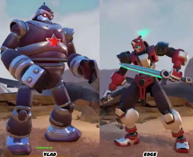
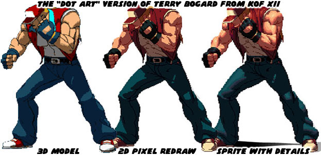
A good portion of our entertainment media is visually based. Video games succeed when they have a strong visual style to go with a solid control scheme and innovative game play. In the previous blogs I have talked about the importance of having a good aesthetic. It was essentially more important than having great graphics. The demo for Fighting EX Layer reminded audiences how similar the graphics in most fighting games were today. When Street Fighter EX debuted almost 20 years ago it was visually much different than the sprite-based fighting games from Capcom. This helped set it apart from the traditional fighters. The challenge for modern game developers was whether or not they could the match the aesthetic of a lead artist or if indeed all of the aesthetics had to look the same because of the modern hardware. When graphics technology was sprite-based it was easy to draw characters in the styles of a particular artist. Once the graphics engines moved to 3D it became harder to preserve the aesthetic of hand-drawn art. SNK made a very ambitious go at it when the created Dot Art graphics for the King of Fighters XII in 2009. The studio created 3D models of each character and then used cel-shading technology to outline the figure and create general points of light and shadow. Artists then went in and redrew the models and painted in the gradients.
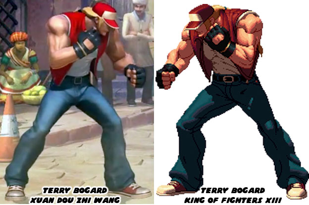
The end result was brilliant but most studios could not afford to spend a good chunk of their budget creating sprites. The Dot Art process was a slow, expensive and time-consuming process. Studios had to balance the game and fine tune the controls as well. There was only so much money to go around, especially for a genre that many considered had peaked in the ‘90s. One of the largest Chinese developers, Tencent, licensed a few of the SNK characters for their game Xuan Dot Zhi Wang in 2015. They created 3D models and used textures and lighting effects to make them appear as close to the Dot Art versions as possible. The end result was amazing. The Chinese studio demonstrated that 3D games could not only play like their 2D counterparts, they could also look like them as well.
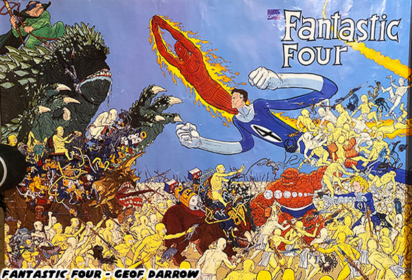
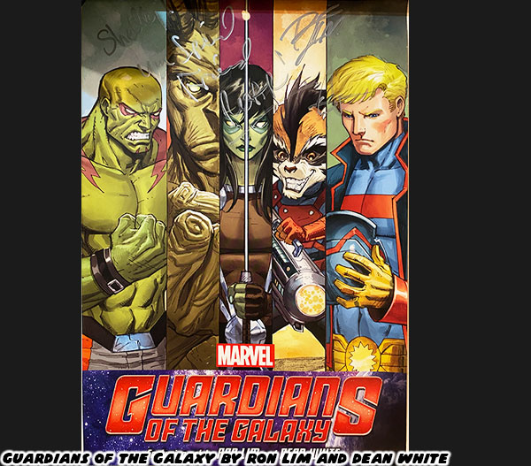
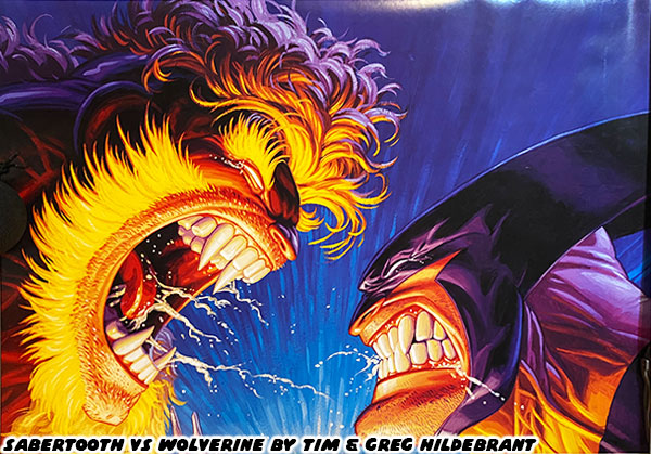
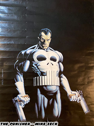
Directors working on fighting games, or any game in general have to find a visual balance between what the art director wants and what the audience expects. Each artist after all has their own way of illustrating. They each have their own sense of shape, scale, proportion and movement. How they frame the action, how they color the world. All of these things are done in concept art even before the first line of code is written. The best directors for animation have historically been people that understand the visual language. Stop for a moment and consider how different artists interpret Batman from the DC comics.
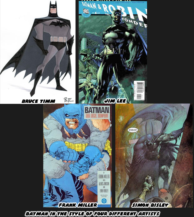
Bruce Timm for example has an extensive amount of history with character design and animation. He reduces the lines in his illustrations to the bare minimum. His shapes are clean and easy to read and perfect for cartoons. Jim Lee on the other hand is from the world of comic books. He had a unique style that made him a breakout artist on the X-Men comics in the ‘90s. Now he is in charge of comics at DC. His trademark style, made up of tight lines is easy to identify. Frank Miller is a screenwriter and artist that has experience in storyboarding. His style is unique. His lines are jagged and thick, they make his characters look like they are wearing crumpled paper bags. He likes to create panels with very strong shapes and poses when he works on Batman. Simon Bisley is in his own world. He paints his panels and uses very exaggerated shapes and proportions. His panels bleed into each other and come off as dream-like. It is easy to identify each of the artists based on their own style. It is important for the comic book industry to have a diversity of styles. After all who would like to read a comic book if they were all written alike and drawn alike? Of these artists the one that has proven to be the most influential for the industry has been Bruce Timm.
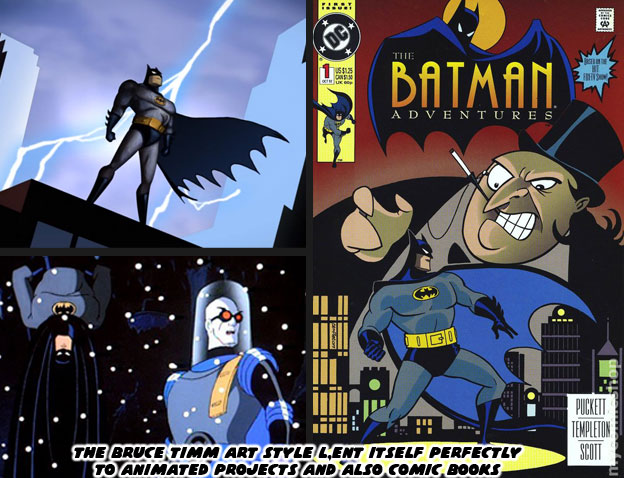
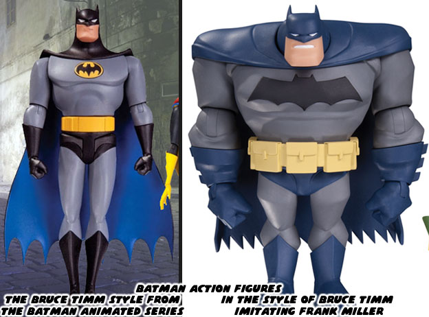
Bruce and writer Paul Dini were responsible for the popular Batman the Animated Series, which debuted in 1992. The duo went on to help shape the DC animated universe for over the next 20 years. The Timm-style of art was very flexible. It worked well in animation and in comic books. Not every comic book artist was allowed to show off their trademark style. Some were hired for their ability to draw in the style of another artist. Ty Templeton for example did a number of the Batman Adventures comic books and was able to capture the style of the animated show. Imagine Templeton as a member of the DC art team. They each had their own style but when called upon could help fill in for their lead artist or designer. Similar things applied to the artists and freelancers working at Capcom, SNK or other studios. The Bengus and Akiman styles were very different but whichever person set the style guide for a particular Street Fighter everyone else in the team followed it to the letter. This ensured consistency throughout the project. The magic of having an animation director like Bruce Timm was how well his style adapted across platforms. His shape and proportion worked as well in 3D as they did in 2D.
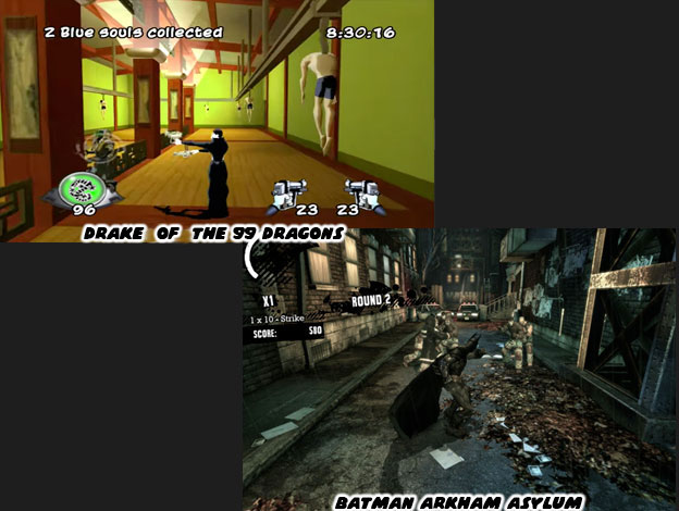
Here was the thing, a studio didn’t even have to work on a Batman game in order to take advantage of Mr. Timm’s aesthetic. Take the game Drake of the 99 Dragons for example. Developed by Idol FX in 2003, the studio created a 3rd person action game featuring an immortal yakuza hitman. The company made use of cel-shading technology to make the graphics appear more two-dimensional. The game was remembered mostly because it was bad. The control was bad, the animation less than stellar, the game play a bit redundant and the overall experience was poor. The reason it stood out were because of the aesthetics. It looked like an episode of the Batman Adventures come to life. It was and remains the best example of how the Bruce Timm aesthetic really compliments the look of an action project. Yet the Timm style didn’t always have to apply. For example in Batman: Arkham Asylum (2009) the developers at Rocksteady Studios were trying to create a world that had pulled its inspiration from the realism of the Chris Nolan Batman film, as well as the serious Jim Lee reboot of the Batman comics. That game succeeded not so much for its graphics, the Unreal Engine 3 that it was using were comparable to the graphics in just about every other 3D game. It was the control, animation and ease of play that really put audiences in the role of the Batman. I’m certain that if Drake of the 99 Dragons had the control of Arkham Asylum it would have become a franchise title.
Bruce Timm was also gifted in the fact that he could direct in the style of a different artist. In the episode “Legends of the Dark Knight” from the New Batman Adventures he actually directed in three different styles. That of himself, that of Frank Miller from the Dark Knight Returns and of Richard Sprang who inspired the opening credits of the 1966 live action series. In the episode three kids, Matt, Carrie and Nick take turns telling a story about Batman. Each story is unique and matched perfectly with a particular art style. The sequences capture an era in the history of Batman. The boys are actually based on a young Bruce Timm and Paul Dini. They come across a fourth kid named Joel who happens to be trying out pink feather boa in front of a store called Shoemaker.
He says some thinly-veiled homoerotic things about Batman. This was a jab at the live action movie director Joel Schumacher for his overly camp, overly glam and somewhat homosexual take in the Batman and Robin and Batman Forever films. Schumacher had never read the comics, had no knowledge of the character outside of the television series but was hired to make the films more mainstream. The studio was looking for a reason to increase licensing, where the real money of a film was made. He was asked to cram in as many gadgets and characters as possible because toys=sales. It was Schumacher’s decision to give the costumes of Batman and Robin nipples. To turn Bane into a brainless slave of Poison Ivy. To add wacky sound effects and visuals at every turn. He wanted to cast as many big-name actors as he could into the film. It didn’t matter if they were right for the part or if their characters were even remotely true to the comics.
There was a strong contrast with how well the Warner Bros. animated films were compared to the live action features (with the exception of the Chris Nolan Dark Knight Trilogy). The people working in animation knew the universe of the DC characters, respected the source material and were able to adapt individual comics, graphic novels and original screenplays into award winning cartoons. The people working in live action, for the most part, had little to no respect for the source material and tried to follow the popular trends when making decisions about a property. Warner Bros. animation would have been at a loss without Bruce Timm. He knew the importance of visual storytelling. He knew how to frame his scenes, how to choreograph his fights and how to design original heroes and villains when the time required. In art, in animation, you need a director that knows the importance of visual storytelling. Having a unique art style is not enough.
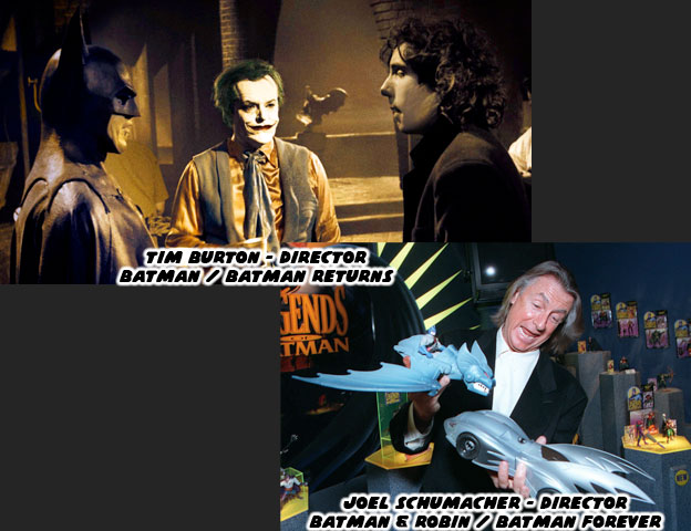
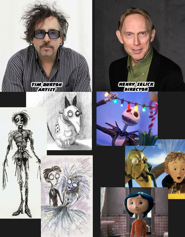
Think of the artist Tim Burton. He has a very strong aesthetic. His style, like those of the aforementioned Batman artists, is very unique. Like Bruce Timm he also came from an animation background. Burton loved to film his own stop-motion and live action projects. They all carried his own unique aesthetic. He designed and directed for the first and second live action Batman features in 1989 and 1992. They all had a strong vision and put forward unique takes on Batman and the villains, including the first black Harvey Dent (Two-Face) as played by Billy Dee William. Burton was familiar with the comics and characters and was able to adapt them to live action with his own unique spin. Warner Bros felt that they could make more money by hiring a big-name director and that was when they went after Schumacher. Burton went on to great commercial and critical success while the Schumacher films were panned by audiences and critics. Burton’s work on Edward Scissorhands, the cult film-turned stop-motion feature Frankenweenie, and the Corpse Bride were all memorable. Some would argue that his crown jewel was the film the Nightmare Before Christmas. Yet not many people realize that while Burton wrote the story and did the design work, it was actually directed by Henry Selick. Mr. Selick was also a master of visual storytelling. He was a director on par with Timm. He knew how to work with different types of artists, and different visual languages. He knew how to best frame the scenes and bring the artists intention to life. His directing on James and the Giant Peach for Disney and Coraline for Laika demonstrated his range.
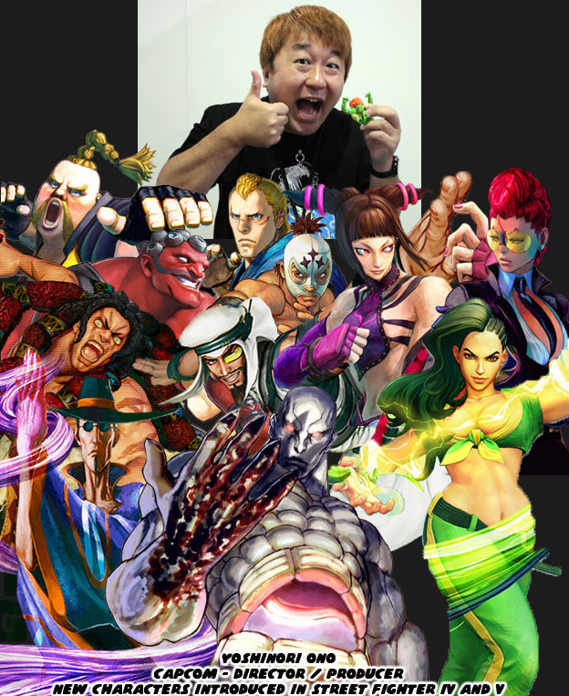
The reason that I bring up the importance of visual storytelling and directors is because they choose a lot of what ends up in the project. The same rules apply for fighting games. If you have a fighting game like Street Fighter IV and V where the new female characters were fairly well received but the majority of the new male characters seemed a little bit outlandish you might look at the director for answers. Yoshinori Ono, the most accessible and entertaining senior person at Capcom, has a unique background. His first eight credits with the studio in chronological order are: Sound Manager, Sound Producer, Opening FMV Sound Manager, Sound Producer, Publicist, Sound Design Coordinator, Sound Manager and Sound Producer. Mr. Ono has tremendous experience with sound but you start to wonder if an audio person rather than a visual arts person should be spearheading a game. He graduated to Assistant Producer and Producer on his next projects. In the next two games he is credited for visual work; CG Modeling and Character Design Director. The first fighting game he was a Producer for was Capcom Fighting Jam in 2004. Salvaging what was left of
Capcom Fighting All Stars. Mr. Ono was the one that decided to turn a powerful young black fighter into a big fat white guy with Rufus. The other odd characters like Hakan, Necalli, and F.A.N.G. were his to approve to ask for a redesign. He couldn’t even manage to put a masked lucha libra character in the game without giving his moves silly Spanish names. Understanding the visual language was something that I think Mr. Ono lacked. He was passionate about the projects but made a few bad decisions because he didn’t truly understand all of the subtleties that went into the visual appeal of Street Fighter. That’s however my opinion.
This is not a new observation. I’ve been against the tone of the new series while it was in development. I’ve been arguing about the direction of the game since 2008. I do it to remind Capcom that they could try harder that they could do more.
They have made great characters out of questionable source material. They’ve also made some bad calls in the past 30 years. I’ve always been against the silly characters that Mr. Ono saw fit to introduce into the universe. I did give him credit for bringing back the series, for traveling the world promoting it, for getting the game outlets to start talking about it. He had faith in Street Fighter and the fighting game community when Capcom had given up. Mr. Ono has been a great ambassador for the brand. For that I am grateful. But remember that Rufus, Hakan and F.A.N.G. were put into the game on his watch, and often, at his insistence. I appreciate the man but I will never be content with his vision. It was possible to create a game on a property, in 3D, while still preserving the aesthetic of the designer. We’ll explore how in the next entry. As always if you enjoyed this blog and would like to sponsor me
please visit my Patreon page and consider donating each month, even as little as $1 would help make better blogs and even podcasts!