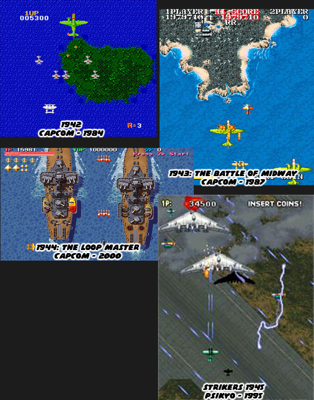
Studios copied game designs from each other. That was a tradition that went back to the earliest days of the arcade. If one company created a racing game then another studio created a racing game. If one studio created a space shooter then the other studio followed suit. The more popular the game was the more likely it was to be copied. The runaway success of Pac Man in the '80s meant that every developer would create their own maze game. Psikyo was no different when it came to copying ideas. What they did was unique. They waited a few years, sometimes a decade, and released a game that had many of the elements of a classic arcade title. The shoot 'em up (SHMUP) was an arcade standard. Every designer tried to improve on the classic Space Invaders formula. Studios experimented with graphics, controls and game play. Capcom took the SHMUP out of space and used the mechanics to tell a story set in WWII featuring planes and ships from that era. The game 1942 was a phenomenal success. They created a sequel called 1943 and many years later, riding a wave of arcade nostalgia, released 1944. Psikyo had developed their own take on the title, Strikers 1945, released almost a decade after Capcom's original game.
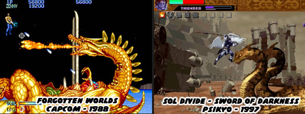
Psikyo had become very good at filling in a certain niche. It was as if they knew that arcade audiences occasionally longed for classic experiences. Even with the leaps and bounds in graphics and genres there was still a certain charm to the feel of a traditional game. So they used newer technology and better graphics to enhance the classic-inspired titles. Strikers 1945 was probably one of the better known releases but one of their games with a very strong aesthetic was called Sol Divide - Sword of Darkness. It was a side-scrolling SHMUP that featured flying characters in a fantasy universe. If I were to compare it to another classic it would undoubtedly be Capcom's Forgotten Worlds and sure enough it came out almost 10 years later. To be fair the Capcom game was set in a post-apocalyptic wasteland where monsters and angels were fighting alongside jet-pack wearing mercenaries. Sol Divide had similar mechanics but a strict fantasy environment. It was a fun game and an under appreciated Playstation title. When fighting games were red-hot at the start of the ‘90s Psikyo couldn’t afford to stay quiet for another decade. They jumped into the genre with a game called Battle K-Road.
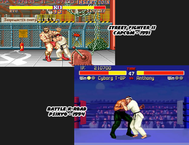
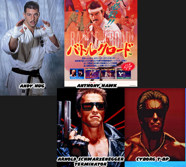
The game was inspired by the hugely popular K-1 fighting tournament. It was one of the influencers of modern MMA tournaments. It focused more on strikes than grapples. The name of the tournament actually got its name by taking the first letter of Karate, Kickboxing and Kung Fu. One of the most popular fighters was a Swiss Kyokushin practitioner named Andy Hug. He was an exceptional fighter and helped build a bridge between western and eastern practitioners. His look was the basis for one of the lead characters in Battle K-Road, Anthony Hawk, yes as in “Tony” Hawk. The game was notoriously bad. The control, balance, animation and character design were forgettable. Even the boss character Mr. Bear was overpowered. It poached a number of elements from other fighting games but especially the likenesses of real people. Andy looked similar to Anthony but there was even a cyborg in the game that was a dead ringer for a certain bodybuilder-turned-actor-turned-politician. Psikyo’s flop was released in 1994 for the arcade and never saw a console or PC release, which was rare for most fighting games of the era.
Psikyo had struck out when they really needed a hit. They asked their development team Steel Hearts to work on a new fighting game. If Psykio’s first attempt failed because it lacked originality then this new one would pull out all the stops. Steel Hearts looked at their art team and pushed for a very strong aesthetic. This new game could not look remotely like any other fighting game that had ever come out. In order to set themselves apart they had to have a distinct visual style that carried through every part of the game, not just the character designs, but every stage, every intro screen and ending as well. Capcom, SNK, Sega, Namco and the other big companies knew that there was a steep price to developing fighting games. Perhaps Psikyo was underestimating the task. There were many variables that went into the budget; programmers, animators, sound and music all factored in. Sprite creation accounted for a good chunk of the money. The size of the sprite, number of colors, number of animation frames all effected the price. Of course the team also had to settle on the lineup. Not enough unique characters and audiences would skip the title, too many and the game would never be completed in a reasonable time frame. Steel Hearts wanted to create larger-than-average sprites that looked as if they were hand-painted by the lead artist on top of highly-detailed stages. Except they didn’t have a lead artist right away or theme they wanted to pursue.
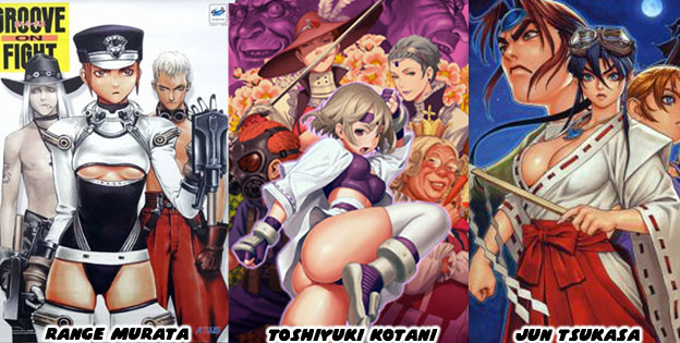
What the studio did know was that the game industry focused on cartoonish or animé-style aesthetics. They didn’t pursue anything with softer, more realistic tones. A designer like Range Murata really stood out in the crowd. It would be wonderful if they could get his style, down to the color palette that he used in a fighting game. Yet Range was contracted by Atlus not to mention that he was already doing the designs for the Goketsuji Ichizoku / Power Instinct Series. The team at Atlus had other tremendous artists that filled in the stage art, menu art and other details. Range didn’t do everything himself and that’s why there were some slight differences in the stage art and background characters between games. They didn’t all capture his unique perspective. One of the secret weapons that Atlus had was an artist named Toshiyuki Kotani aka Styleos. He could mimic the Range Murata style very well especially in the final games of the series. Later on he began to show off his own style, which had soft, blended colors on top of lean athletic figures. His style of art really stood out when he worked on the indy fighter Yatagarasu: Attack on Cataclysm along with former KOF developers. Atlus had a packed art team working on their fighting game series; Haya, Kobayashi Takashi, Masafumi Fujii, Shioi Tomohide (KOF Maximum Impact), Nishikawa Yoshikazu and dadamusi. They had no lack of talent coming up with all the wild characters and stages in their games.
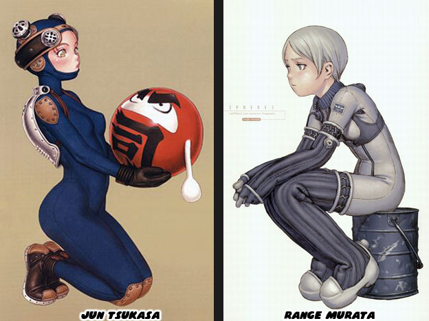
Psikyo had their own art team as well and a special designer whose illustrations were very much on par with those of Murata. Jun Tsukasa was the character designer and illustrator on Psikyo’s Sengoku Blade series and mahjong games. He often created cheesecake paintings of very busty women in revealing costumes if not semi-nude for the in-game graphics as well as arcade posters. I cannot recall a time a time that Range Murata painted voluptuous women. When Tsukasa drew young men and women they often had the same proportions and stylings of Murata. When put side-by-side it was almost eerie how similar their work was. If you have difficulty telling the artists apart then just compare their main body of work. Tsukasa tended to focus on paintings of busty women whereas Range’s subjects were often thin girls. Unfortunately Mr Tsukasa was not able to help Steel Hearts develop the characters, I’m not sure what he was working on in that time. So Steel Hearts turned to the talented Morioka Shinichi to come up with the art direction of their next game; Daraku Tenshi - The Fallen Angels. His own style of illustrating was similar to those of Murata and Tsukasa. Toshiyuki Kotani also ended up working on the project, helping keep the Murata / Tsukasa aesthetic very close. In Gamest Mook Vol. 113: Psikyo Illustrations Mr. Shinichi said that he worked on the project for three years and wishes to revisit it so he could complete what the studio set out to do. Imagine working every day for three years and having the game published but considering it unfinished. Did Steel Hearts not hire enough talent to properly complete the title? Did Psikyo again underestimate what it took to create a AAA fighting game? Or were both studios to blame? We’ll look at this title in the next blog and see what made it one of the most anticipated fighting games of the ‘90s. As always if you enjoyed this blog and would like to sponsor me please visit my Patreon page and consider donating each month, even as little as $1 would help make better blogs and even podcasts!
Hi Noe, I enjoy each and every blog you post.
ReplyDeleteKeep up with your good work! Have you already seen the video about MK (bad) animations? https://youtu.be/t06Dkdg6fEo I'd like to know your opinion about that aspect.
Bye
Zero, thanks for checking in, I have not seen that video on the MK animations but the host brings up a lot of good points. These are subtle things that help make for good fighting game design.
Delete