Showing posts with label redesign. Show all posts

Friday, May 15, 2026

Taking a shark bite out of my monster collection

Previously on the blog I mentioned how I had started collecting some monster truck toys decades after I stopped. I discovered that not only did they look good sitting on my desk, but they actually photographed fairly well. My pride and joy were the Bigfoot trucks that I had. The oldest was the one from the Matchbox Super Charger series from 1986. This was the one that I could never find on the store shelves. Thankfully an inexpensive one popped up on eBay so I had to pick it up. The newer one from the Hot Wheels Monster Truck line circa 2025 looked great as well. The one with the 10-foot tires from Greenlight models was stunning. It had a highly detailed interior where you could make out the console, glove compartment, and even cup holders! These three were the clearest example of how far toys had evolved in 40 years. I could look at them every day, and never get tired of how cool they were.

I made a conscious decision to clear more room on my desk for more toys, specifically my trucks. I then got the idea of photographing them for the blog. Many 1/64 scale model car collectors had scale garages, parking lots, and even light up gas stations that they displayed their favorite cars on. I didn’t have that much space, or money. Also if I wanted to display monster trucks they might seem out of place next to a scale building. I then got an idea based on the color of my desk. The hardwood was very light in tone, almost like dirt, or sand. So I wondered if I could find a desk mat that looked like a beach, complete with crashing waves. There were a few options, but found one that I think worked best. As soon as I laid down the mat I knew that I was going to have fun with it. I stated previously that I was a fan of storytelling with monster truck designs. I specifically mentioned that the Wreckreation monster camping truck was probably my favorite of the past decade. However that truck wouldn’t make much sense in the middle of the surf. I needed to find other trucks that worked better for the pics.

I found three that were absolutely perfect. Hot Wheels made two of them, the Surf Bus, and the Great Bite shark-bodied truck. Spinmaster / Monster Jam had created the Big Kahuna. Despite my distaste for Feld Motorsports I wasn’t going to lie about how great the design behind the Big Kahuna truck was. The rusty square-body truck with surfboards in the bed definitely told a story. In fact I think it worked better than the more traditional Woodie body that the latter Big Kahuna used. It had a good color scheme, a classic monster truck shape. There wasn’t much they could have added or taken away from its look. The surf bus was self-explanatory. It was the type of bus that would have been used by surfers to visit destinations up and down the coast. The Great Bite however was definitely something else entirely.

I mentioned previously how I didn’t care for monster trucks with silly 3D bodies. This was something that the Monster Jam tour pushed in the late ‘90s when they were booming in popularity. The trucks shaped like dogs, ponies, skulls, and sharks I thought were doing a disservice to the sport. Granted there were a few 3D body trucks in the early ‘90s including Snake Bite which was designed by the Bigfoot Team. To put it in perspective maybe three out of the dozens of trucks competing professionally had non-traditional bodies. The majority of the ones with animal-type bodies appeared almost 20 years after the birth of the culture, so I felt that they weren’t carrying on the tradition. I had no idea who thought this was a great idea, but I was sure that they hadn’t followed the history of the sport. I could just imagine that a corporate boardroom put together truck bodies based on a marketing survey. They asked kids what they liked. The responses were things like ponies, dinosaurs, and monsters. So the people at Feld ran with it. It would be easy for them to market these trucks, make tee shirts, and toys out of them with little regard for the sport itself.

Of the animal bodies the shark was one of the most popular ones in the past decade. This was overlooking Monster Mutt (2003), and El Toro Loco (2001) of course. The Megalodon truck was announced in 2016, and debuted in 2017. It became a hit with audiences, and opened the floodgates for more outlandish animal bodies. The thing was that Hot Wheels had actually created the body style much earlier. Great Bite appeared as a toy way back in 2003, and its sister Shark Wreak in 2010. So once again Monster Jam was cashing in on ideas that they didn’t even come up with. With that said I didn’t care much for the body shape. It wasn’t really telling a story as much as it was just a gimmick. The designers at Hot Wheels went back to the drawing board and came up with something infinitely better.

The new Great Bite body released in 2025. It was another master class in storytelling from the people at Mattel. Instead of creating a generic shark-shaped body the designers Kevin Cao, and Kurina Alim went full Hot Wheels mode into it. For almost 60 years the toy series was known for coming up with all sorts of fun, and wild cars. In this case Alim, and Cao asked themselves what would it look like if a great white shark mutated into a monster truck? They incorporated elements of a shark, but also a shark cage, manta ray, and enormous V8 motor into the body itself. Every angle was dynamic, all of the body lines flowed into each other organically. It was flesh, and machine made into one. It was a radical look that could never be confused with the older shark bodies. It spoke to me when it came out, and I certainly knew why. When I was a kid Hot Wheels launched a line of cars shaped after animals, bugs, monsters, and robots. They called them the Speed Demons.

The Speed Demons were bolder than anything I had seen in the late ‘70s when I got my first toy cars. The line included such memorable names as Vampyra, Cargoyle, Turboa, Ratmobile, and Rodzilla. I’m sure you could imagine what inspired them. Of all the cars released there was one that I thought was the best of all. The Sharkruiser was an absolute beast in both look, and performance. It didn’t have any flashy graphics, or bright stickers to dress it up. Instead it was a flat gray body with chrome teeth, and an enormous engine. It was an apex predator hunting for other fast cars on the road. I took it to school, and my friends agreed that it was the coolest Hot Wheel they had ever seen. I kept that car in my pocket wherever I went. I always had something to play with when my family was traveling. It was one of the few cars that I didn’t give to my cousins when I got older.

The Sharkruiser certainly looked great on my desk. It made me think about getting a small playset to put on the desk as well. I remembered that Mattel released a few shark-themed tracks. For some reason sharks and cars just seemed to go together. I had no idea how many had come out until I started searching for them. There must have been nine or ten released in the past 30 years. Then there were tracks themed around snakes, spiders, dinosaurs, volcanoes, slime pits, and more. The majority of the playsets were too big to display, but there might be one that could fit onto my beach mat. If, and when I decided to get one then it would be a topic for another blog.

I’d like to know your thoughts. Did you have any classic toys that you held onto? Did you get any re-releases of a favorite figure, or car? Tell me about it in the comments section. As always if you enjoyed this blog, and would like to sponsor me please visit my Patreon page and consider donating each month, even as little as $1 would help make better blogs and even podcasts!
follow the Street Writer on Patreon!

Saturday, May 18, 2024

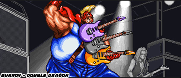
The story of Burnov. Or how to make a fat character work in a fighting game.

Last week I talked about Rage of the Dragons by Evoga, Steel Hearts, and BreezaSoft from 2002 as a sequel to the Double Dragon fighting game by Technōs from 1995. Technōs had created the original Double Dragon as a brawler way back in 1987. It put the genre on the map, and had every major studio making their own clone. Each Double Dragon sequel in the arcade lacked the innovative game play that appeared in rival titles. It seemed that when it came to development they were playing it safe, cheap, and simply going through the motions. A few years later when fighting games were more popular they released their own fighter as well. The game suffered when they tied their SNK fighter to the horrid live action movie. The company did not seem to know how to evolve their own franchise regardless of what format they used. Despite the failings of their fighting game I would argue that one of the best character designs, and certainly one of my favorite redesigns came out of it.
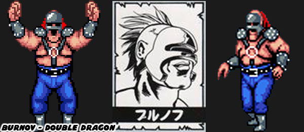
The original Double Dragon brawling game was set in a post apocalyptic future. Although there were still big cities, cars, and modern amenities there were also roving gangs, mutants, and bad guys that terrorized even the police. It was up to people to take the law into their own hands. This was the context that stars of the game Billy, and Jimmy Lee fought in. Abobo was one of the giant characters in the first game. Those massive bruisers changed a little in the sequel. One of the larger bad guys was a masked former wrestler-turned-villain. Burnov made his debut in Double Dragon II: The Revenge. His look in the game pulled elements from pro wrestlers, but more specific the gangs featured in the Mad Max movie series. The films by director George Miller started in 1979. The wild characters, armor, and vehicle designs by Miller influenced the mangas Hokuto No Ken / Fist of the North Star, Trigun, Battle Angel Alita, and the game franchises Twisted Metal, Carmageddon, and even Street Fighter II.
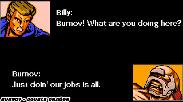
Burnov had a metal mask in his original form, and long stringy hair. He was most likely inspired by the Lord Humungus from the Road Warrior sequel to Mad Max. He appeared as a level 1 boss in Double Dragon II. He was much taller than the Lee brothers, and even came with his own stage music. If you got too close to this boss, or tried to grapple with him then he would pick you up by the head, and punch you in the face. It was a brutal but equally cool attack. This character would turn up again in the various sequels, and reboots to the franchise. Shortly after his debut the character was made a considerably fatter. Contrary to popular belief I didn’t have a problem with fat fighting game characters. I had an issue with fat being used as a punchline. Bob in Tekken, and Rufus in Street Fighter being introduced as joke characters. They diluted otherwise great ensembles.
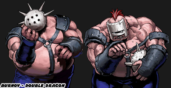
Some of the best designs for brawlers, and fighters were obese wrestlers. Almost a decade ago I talked about how Burnov, and Kimala the Bouncer were two of the best characters ever featured in a game. They happened to be massively fat, but underneath that fat was a large amount of muscle as well. They had power in spades, as some famous fat strongmen had all throughout history. I had a low opinion of the Double Dragon fighting game, and especially the movie, but thought that Burnov’s new look was brilliant.
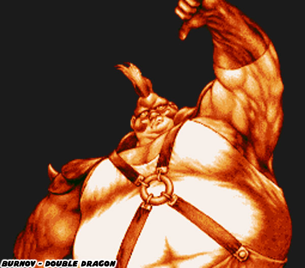
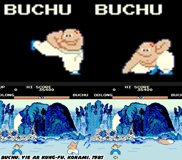
I was surprised at how fat he had become, especially when compared to his original look. He was proportionally much fatter than any other character used in a fighting game. This list would go beyond sumo wrestlers, and into the realm of fantasy characters like Avu, Sheik Maherl, and Karnov. With the exception of Buchu from Konami's Yie Ar Kung-Fu (1984) it was Karnov (1987) that became first breakout game star that was also fat. I had mentioned his status in the blog about representation a decade ago

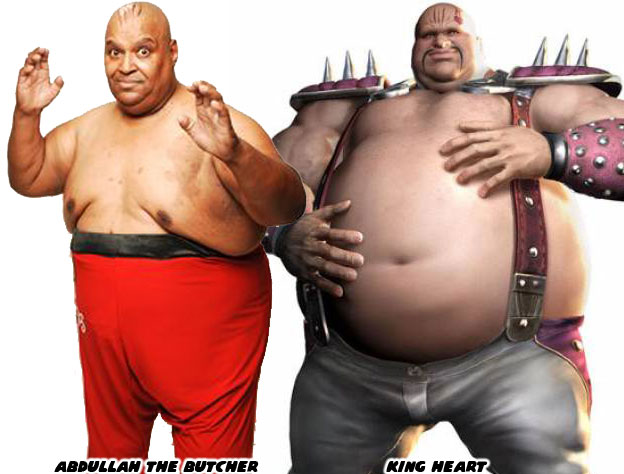
Aside from Kimala the Bouncer, the closest design that you compare him to would be King Heart from Hokuto No Ken. Both were obese boss characters from a post apocalyptic world. Yet like Heart this character was also absurdly muscular as well. It turned out that it was more than coincidence that their designs were so similar. Kimala, Burnov, and Heart (and especially Karnov) were all inspired by the pro wrestler Abdullah the Butcher. The “Madman from Sudan” traveled the globe brutalizing his opponents. He wore a keffiyeh, curled toe boots, and Arabian pants as part of his outfit.
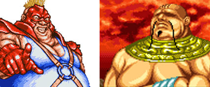
Technōs had the WWF (WWE) license for arcade games in the late '80s, and had created the wrestling games WWF Superstars in 1989, and WWF Wrestlefest in 1991. Abdullah was supposed to be in the game. He was in the design stages, but his sprite, and animations were never finished. So the developers instead changed his skin color, added some armor, and a mohawk. Thus the sprite that would become  Burnov was born. His strikes were still based on wrestling moves, chops, tackles, and leg drops. His special attacks were fire-based, like the Arabian characters mentioned above. Everything about this character worked surprisingly well, especially in the context of the Double Dragon universe.
Burnov was created as the second bruiser in the game, a sort of rival to Abobo. His girth, strikes, and special attacks were a perfect counter to Abobo’s height, and power moves. Remember that Abobo was a literal giant. He was over seven feet tall, and 336 lbs. In order to hold his own the shorter Burnov had to be massive, weighing in at 495 lbs. The game referred to him as the Muscle Bomber Man. I'm not sure if they were calling out the Capcom wrestling series Muscle Bomber intentionally. In any instance it was completely believable that he could bulldoze through all of his opponents. In fact I thought his Dynamite Tackle was one of the most awesome moves in all of fighting game history. 
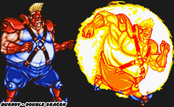
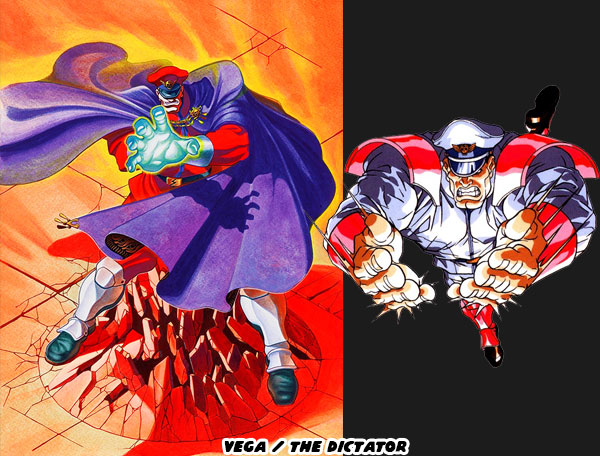
His super attack saw the man nicknamed “The Human Bomb” become engulfed in flame, and just plow through his enemies. It wasn't a fireball, sonic boom, knife, or other kind of projectile attack. Instead it was a man that weighed a quarter-ton simply running full speed at his opponent. I ranked this attack above Vega’s Psycho Crusher from Street Fighter II, especially when it came to believability. Why would I think so? When I was younger I studied karate with my big brother, and our friends. It was hard for me to find an equal sparring partner given my height, and weight. I was 6’ 7”, and around 330 lbs. at the time. Our sensei appreciated how hard I was working to learn the proper forms, and strikes. He revealed that in an actual fight these moves were impractical for me.
My teacher knew that I was a passive person, and not the type to look for trouble. Anyone foolish enough to pick a fight with me was probably carrying a weapon. They were looking for a reason to shoot, or stab somebody. This was especially true if they could claim self defense, or hide behind stand-your-ground laws. He advised that if I could not avoid a fight then I should literally run through that person. "In a life or death situation don’t try to punch, kick, or grapple." He said "just bowl them over, and get out of there." They wouldn't be able to stop me from doing so. Even the best martial arts practitioners could get trampled. Burnov was really good at doing exactly what I was taught. The fact that he could run down the Double Dragon sub-boss Duke, and boss Shuko was proof of this.
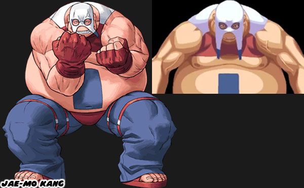
The next version of this character in a Double Dragon title wouldn't have the same impact. Jae-Mo Kang was a fat South Korean wrestler that appeared in the Rage of Dragons. He was a silly homage to Burnov. According to the designers at Evoga "Kang was one of the last characters to join, since we decided to include Mr. Jones I thought on a "Laurel & Hardy" team, so at first his name was McGuire, a Pro Wrestler and Businessman, later on during development we were told that we needed to change his nationality ot Korean for marketing reasons, so I asked for advice about a good Korean name..." Sadly Evoga missed the point of Burnov's redesign. This was evident when they insisted on making Kang, and his partner Mr. Jones into stereotypical caricatures

Burnov was the type of over-the-top character that added color, and personality to fighting games. He had a shocking appearance in the vein of Blanka, and Dhalsim, mixed with the entertainment factor of Skullomania. Like those characters he was also effective against the various martial arts styles. He was fun, and energetic, but not a joke. He was the fat fighter done right. He was a template that should be learned from for all the budding game designers out there. Were there any fighting game characters that you thought were well done in otherwise forgettable games? I’d like to read about them in the comments section. As always if you would like to sponsor me please visit my Patreon page and consider donating each month, even as little as $1 would help make better blogs and even podcasts!
follow the Street Writer on Patreon!

Friday, January 26, 2024

Oswald the Lucky Race Car Driver?

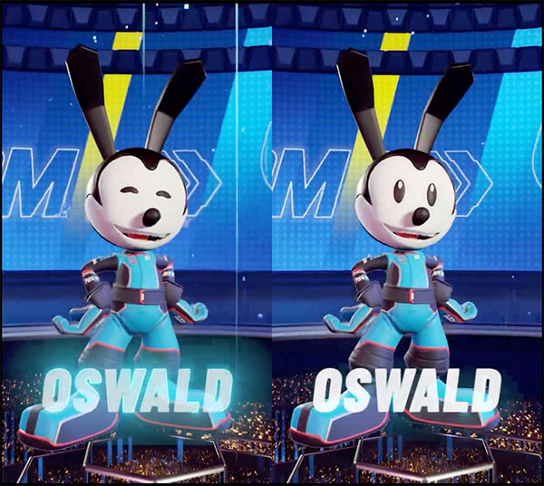
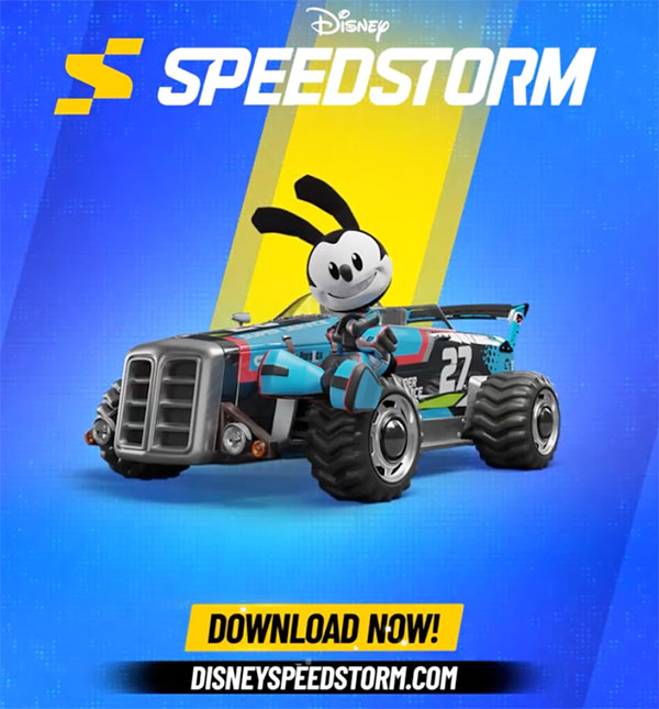
Hello friends, I hope your week went well. I’ve got a few things on the back burner now, that I hope to share with you in the future. News is a little slow this early in the new year, I’m sure you’ve already heard that Mickey Mouse has now entered public domain. Well to be fair it is a specific version, the Steamboat Willie / Plane Crazy iteration of the mouse are now available to be produced by fans for commercial purposes. If you try to make knock-off versions of recent Mickey art then you can expect a cease and desist letter from the Disney legal team. It got me thinking about Mickey’s older brother, and how he had recently popped up in a racing game. I wanted to share the updated design with you.

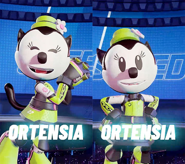
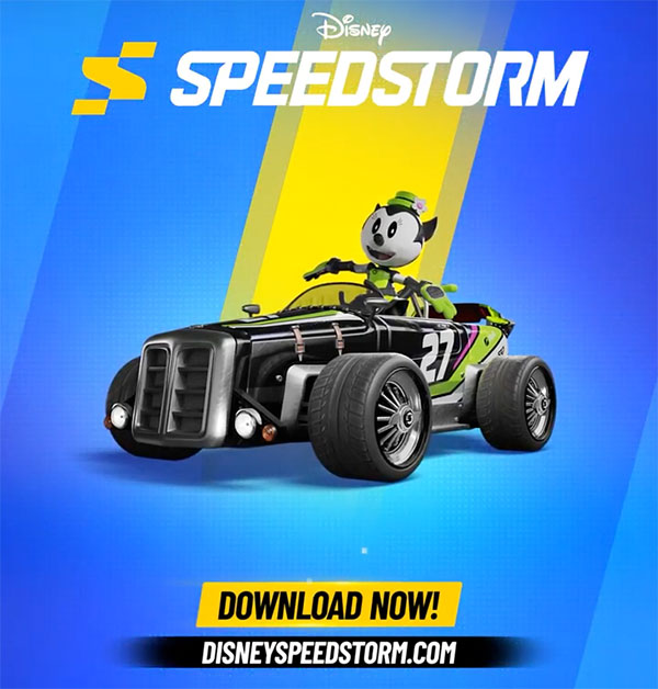
Oswald the Lucky Rabbit was the star character that Walt Disney had created before Mickey Mouse back in 1927. Unfortunately he lost the rights to the character to Universal Studios. The company wouldn’t regain the rights until around 2006. Since then he has appeared on merchandise in the parks, and even a few video games. In fact his girlfriend / wife Ortensia the Cat was redesigned for the SpeedStorm racing game as well.

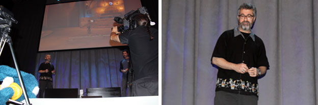
We have to give credit where it is due. Ortensia was not really a set character until Warren Spector, and his team at Junction Point created her in Epic Mickey, the Wii exclusive from 2010. In the early Oswald cartoons he would move in between a cat, and a rabbit girl as his girlfriend. It was Warren that decided on making her design stick with a cat, and even named her. I was fortunate enough to see his presentation at the E3 in Los Angeles when he talked about this. He was also jealous of my Oswald plush.

Animation fans are sort of split on the classic character appearing in new games. Not so much in that they are being brought in, but rather how they are being presented with modern aesthetics. Specifically when they get details like teeth added to their 3D models, when those were rarely, if ever, seen in old cartoons. It’s not quite uncanny valley, but a small detail that throws off their classic roots. I’m just happy to see something being done with these icons.

I’d like to know what you think about classic cartoon characters appearing in modern games of any genre. Would like you like to see more, or less of them? Do you think they would be better used in platform titles, or other games? I’d like to know.

If you’d like to learn more about Oswald then please check out some of my earlier blogs below. 
As always if you would like to sponsor me please visit my Patreon page and consider donating each month, even as little as $1 would help make better blogs and even podcasts!
follow the Street Writer on Patreon!

Wednesday, October 11, 2023

Street Fighter 6: A master class in game design, final part

Street Fighter 6 Designer Yusuke Hashimoto had an impossible task. Update the look of the classic SF characters without causing an all-out riot with the fans. I did a quick take on all the leaked designs last year, like Zangief for example. Mr. Hashimoto had impeccable fashion sense, knew how to work with color, and use fabric, and layers to tell a story with costuming. He worked on Bayonetta, and Bayonetta 2 previously. Those games had some amazing designs, turning witches, demons, angels, and other religious figures into a dazzling runway fashion show but with guns, and cheeky humor. I would argue that he approached each SF character with a certain level of respect. He wouldn't be turning them into Bayonetta characters, but preserve their roots as best as he could while trying to update them a little. He might have asked himself what did they wear in a formal setting? What did they wear when they weren’t fighting? I believe that half the SF6 lineup were wearing casual outfits on purpose.

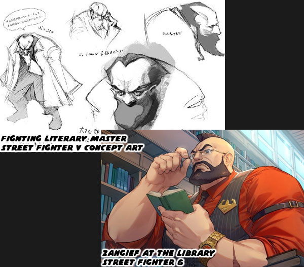
We wouldn’t expect Chun-Li to walk around the city wearing 30 lbs. spiked bracelets on each wrist, and wrestling boots. So she was given a very casual makeover that still looked like classic Chinese costuming. The same applied to Luke, Jamie, Kimberly, and the other new faces. They each had fight wear, and street wear as alternate costumes or vice-versa. Mr. Hashimoto had probably gone through the Capcom archives to see what some of the concept art was for each character, and even abandoned characters like the Fighting Literary Master that was in the planning stages of SFV. The bearded professor archetype would be easy to apply to the Red Cyclone. Presenting Zangief an intellectual when he wasn’t wrestling perfectly captured his personality. Zangief was absolutely dedicated to his craft. When he wasn’t training we could expect to find him learning new subjects with the same level of intensity. In the game he finished books faster than he finished reps in the weight room.

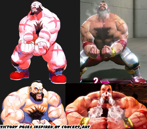
The animation team was as insightful as Mr. Hashimoto. They dug into the archives when modeling the cast. The studio used concept art to create taunts, and victory poses from. They captured an absurd amount tiny details for each character that either was missed, or never created in the first place. For example Zangief was known for being covered in scars. This was because he wrestled bears in the Siberian tundra. However all of his scars were only on his front. As a trained wrestler he never gave his back up to an opponent, and never ran from a conflict. In canon he actually had one scar on his back, but this was from taking an assassin’s bullet for the former president of the Soviet Union. I think it was only mentioned in a novel, and never illustrated in any manga. This tiny, insignificant detail was modeled, and skinned onto the character. As I said previously, the amount of work that went into SF6 was absurd.

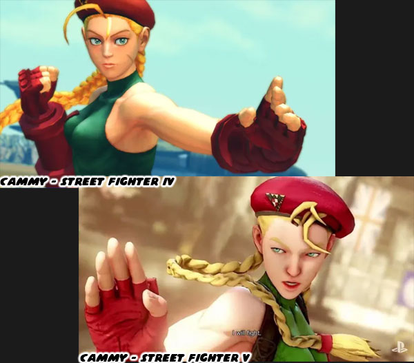
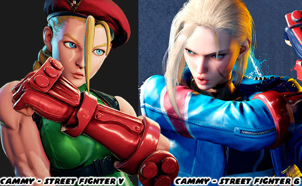
The SF6 art team also had to figure out what style, aesthetic, and proportions they were going to go with for the cast. One of the things that really made Japanese audiences upset was when the studio changed the look of Cammy between SFIV, and SFV. many Japanese gamers said Cammy looked ugly in Street Fighter V. They said the studio was trying to appeal more to European tastes, rather than keep her looking more like an anime character. I had covered the aesthetic debate previously on this blog. It was hard to make the visuals of a franchise stand out from the competition. Every now and then we would get a genius like BENGUS to create new looks for the character that were recreated in sprite form. The SFIV models were based on Daigo Iken's work, and SFV models were trying to use the BENGUS style. Unfortunately proportions that worked in 2D did not always work in 3D.

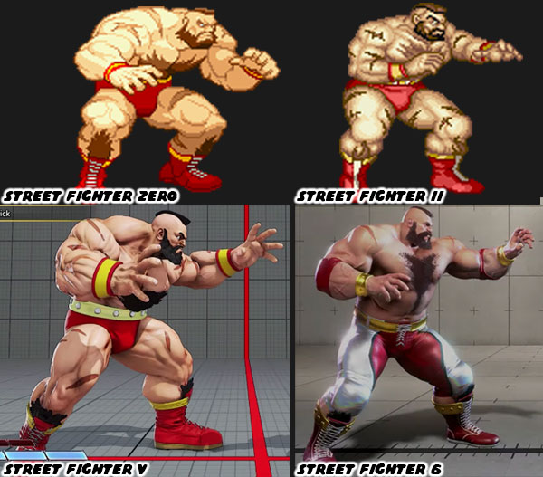
The models in SFIV, and SFV were getting bulkier, and bulkier, and it was hard to see relative heights between the fighters because they were so thick. Not to mention that the character models looked like they were made out of lumpy clay. The exaggerated BENGUS proportions that looked brilliant as sprites in Street Fighter Zero / Alpha were hard to recreate in 3D without making the characters look grotesque. The SF6 team went back to the more realistic proportions that AKIMAN, and Shoei used when designing the SFII lineup. These more lifelike designs were easier to read on screen, their moves, and animations flowed better, and the differences between fat, skinny, tall, and short body types really stood out.

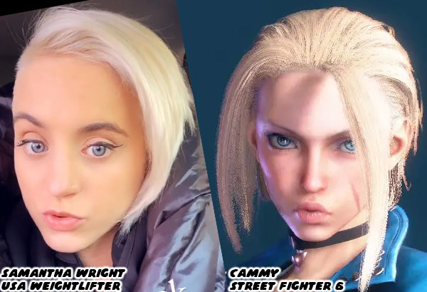
Cammy got a similar type of ground-up makeover. I don’t know what the average Japanese or global reaction was for the cast. Based on the fan art I’ve seen online it looked like people on both sides of the Pacific were really digging her new look. She still had a youthful appearance, but her eyes weren’t too big, or cartoonish like with Lily. Her muscular frame was still there, as was her love of cats. For anybody that believed athletic women couldn’t have her model looks I would argue that she might have been based on Team USA weightlifter Samantha Wright. Her bright eyes, soft features, and naturally pursed lips beguiled that she could easily out lift many men in the gym. It turned out that it was possible to find a balance between realistic, and stylized aesthetics for the cast. In this way it could be argued that the developers were able to strike a look that could appeal to international audiences.

In my book Capcom had knocked Street Fighter 6 out of the park. Every element that went into the game was influenced by 35 years of the Capcom legacy. We're not only talking about the Street Fighter franchise but also Final Fight, Rival Schools, Tech Romancer, Vampire / Darkstalkers, Star Gladiator, Muscle Bomber / Saturday Night Slam Masters, and Warzard / Red Earth. It also allowed players to enjoy more than a dozen classic arcade games in a virtual arcade open 24/7. The studio was making nods to anime, manga, wrestling, and pop culture all throughout the adventure. Capcom was doing all of this while pushing the franchise into the future. Character design, plot, music, sound, animation, modeling, balance, level design, stage layout, world building, control, and balance were executed to perfection. Capcom did the impossible. They elevated the fighting genre, and put it on par with the best AAA adventure titles. The games that took 30 or 40 hours to complete now had competition from a completely different format. We did not have to play as Link, Mario, Spider-Man, the One-Armed Wolf, Kratos, or any other named character. Instead we could make up our own avatar and become the hero of the Street Fighter universe. I do not think that any other studio could have pulled it off. At least not nearly as well. In fact I do not think that any other studio did anything more revolutionary for gaming in 2023. Street Fighter 6 was an absolute master class in game design.

I’ve spent the past three months on this blog showing the individual elements that when combined made for what I consider to be the game of the year. What more could I say to convince you? When voting opens up on the various forums, and websites later this year I sincerely hope that you consider Street Fighter 6 as the best of the lineup. Thank you for joining me on this series. I appreciate every view, share, and comment. I put a lot time, energy, and myself into this series. I'm exhausted, and will probably rest for a few months before writing something new. Thanks for watching me massacre the English sentence structure. I wouldn't have done it without you. If you are a long time fan of Final Fight, or Street Fighter then I would like to hear your impressions of SF6. If you have never played any game previously then tell me your experiences in the comments section please. As always if you would like to sponsor me please visit my Patreon page and consider donating each month, even as little as $1 would help make better blogs and even podcasts!
follow the Street Writer on Patreon!

Tuesday, February 28, 2023

Lili gets a makeover, just in time for Street Fighter 6!

Quick update today. If you didn’t get a chance to see the new trailer featuring Zangief, Lili, and Cammy please have a look. It is chock full of new moves for the returning character, and a complete makeover of the new character. I wrote a bit about Lili’s early design on a previous blog specifically I said 
“Lili’s outfit Inspired in part by Mayan fashion, which is more Central American, than Mexican. The Aztec, and Mayan cultures did not exist at the same time, nor in the same part of Mexico. Many character artists don’t necessarily know this, but lack of knowledge is not an excuse for coloring all natives with one brush. There were hundreds, if not thousands of unique indigenous tribes in North, Central, and South America. Lili is an okay design, much better than the joke characters featured in SF IV, or the cannibal featured in SFV.”

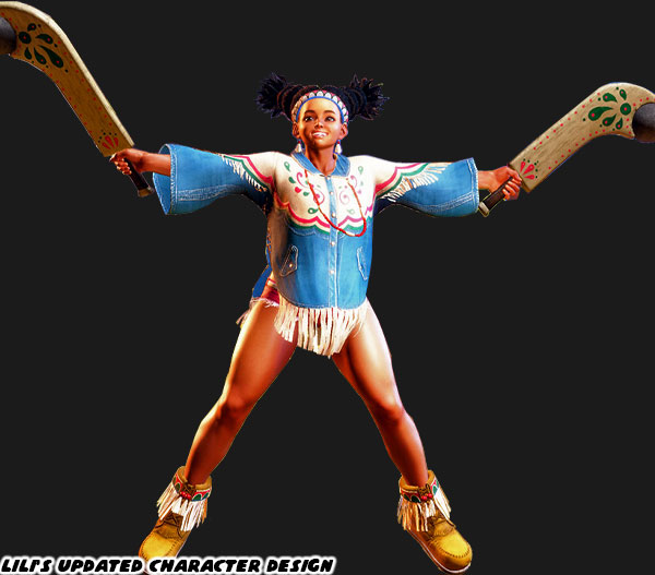
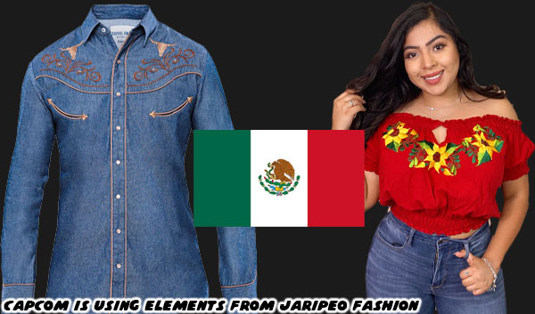
I do not now if Designer Yusuke Hashimoto took my criticism to heart, or the other Mexican voices asking for less stereotypical designs. Either way he went back to the drawing board, and delivered a much better character. Her look, choice of colors, and cut of her costume seem authentic, but are anything but traditional. Let’s start with the most obvious things. A number of elements were taken away from her look. The feather was taken out of her headband, and necklace. As was the war paint across her nose. A single string of beads does a lot more to sell her native roots, rather than movie stereotypes. Her weapon is decorated with accurate native patterns. Her costume is less of a poncho, or folksy dress, and instead made of denim. The material is durable, and long lasting. It is easily identified with the west, and native traditions. The cut of her shirt, pattern, and color choices were very deliberate. They reflect jaripeo culture, a sort of Mexican cowboy subculture. A jaripeo is actually a bull rider, so the toughest type of cowboy. Western hats, dresses, boots, and shirts are very in fashion. These are the types of things that a young girl like Lili would actually wear.

The addition of fringes, or tassels helps show movement on the costume, and is entirely accurate to the cultures she reflects. Also the pattern on her shirt is accented with red, and green over a white band. This is a nod to the colors of the Mexican flag. Even her denim shorts are red so they stand out. Her stage is a celebration of Mexico with some very obvert cues, but also details that I don’t think a lot of people noticed.

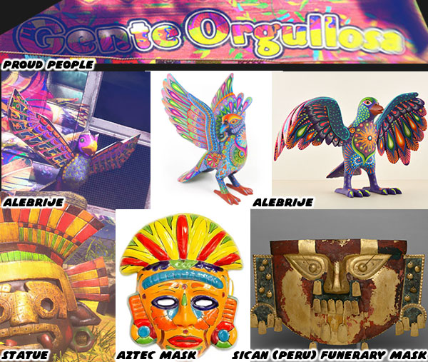
Yes there is a stereotypical guy wearing a poncho, and sombrero in the background. Also there are bottles of beer, pulque, and possibly mezcal or tequila in the background as well. Look beyond that to the elements that Capcom wanted to highlight, and celebrate. Starting with the banner above one of the trailers. It says Gente Orgullosa, which literally translates to Proud People. We understand that the “Thunderfoot” tribe doesn’t have much, but they do have family, and culture. This comes across in the myriad of details. Some of which include the alebrije. These are colorful creatures that sometimes resemble monkeys, dogs, birds, and jaguars. If you have seen the animated film Coco then you know what I’m talking about. There is a statue of an alebrije in the background. But that isn’t the only statue. There is a larger head with headdress in the corner. It looks like a mask worn in Aztec, and possibly earlier Sican ceremonies.

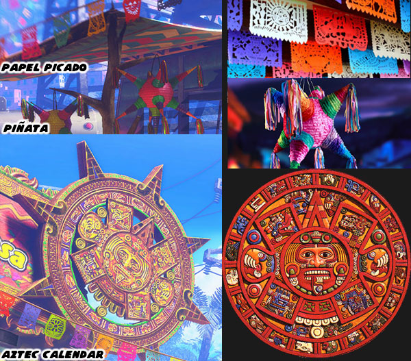
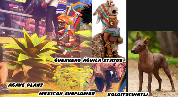
The more typical Mexican details are obvious. There is an enormous Aztec calendar in the background, piñatas, as well as paper picado, or streamers, hanging in the stage as well. We’ve seen these things before in other Mexican levels, such as those featured in the King of Fighters series. The real subtle things are hidden in plain view. The desert plants are accurate. We see an agave plant, it is native to Mexico, and it can be harvested for its sweet nectar, or to help make tequila. The yellow sunflowers are also native plants. They are used to decorate memorials, graves, and religious icons. They represent faith, loyalty, and adoration. There is also a hairless dog in the background, these are known as Xoloitzcuintli, or Xolo for short. Again, if you’ve seen the movie Coco then you remember these dogs.

Last of the details I’d like to mention are the Guerrero águila, or the “Eagle Riders/Warriors.” There is a statue that is easy to miss in the colorful stage. These are the fearsome warriors of the Aztec empire. They would wear elaborate armor made of animal bones, skins, and decorate their headdresses with bright feathers. In this way the gods would be able to see them in battle, and grant them favor. We can imagine that the massive T. Hawk would be considered the biggest warrior for the tribe, and Lili is trying to walk in his footsteps. What were some of the details that you found in the trailer? I’d like to hear about it in the comments section please. As always if you would like to sponsor me please visit my Patreon page and consider donating each month, even as little as $1 would help make better blogs and even podcasts!
follow the Street Writer on Patreon!

Wednesday, December 14, 2022

The Street Fighter 6 pre-order trailer, a look at Manon, the graceful judo practitioner

In the previous blog I mentioned that Street Fighter 6 Director Takayuki Nakayama, Producers Kazuhiro Tsuchiya, and Shuhei Matsumoto, and Designer Yusuke Hashimoto were doing a much better job with design, diversity, and inclusion than in either SFIV, and SFV. Although they were working with Capcom on the previous games the final direction of the series was in the hands of Yoshinori Ono, whom as a director I had argued took the franchise into some dumb places. The roots of some great characters were in both SFIV, and SFV, however some of the best ideas seemed left on the cutting room floor. The decision to put Rufus in the game instead of King Cobra set the tone that Mr. Ono would be going with during his time leading the projects. I had mentioned previously that Capcom was able to make a memorable character out of an ugly stereotype in the early days of SFII. Mr. Ono didn’t seem to have the same level of insight that I believe the franchise deserved. I contend that many of the new cast members in Street Fighter 6 are an attempt to redo the plans the staff had much earlier.

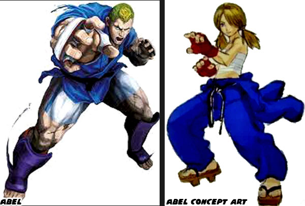
In the planning stages of SFIV the team wanted to introduce an androgynous young grappler.The skinny boy in pigtails would eventually evolve into the hulking Abel. The French-raised fighter was a master at judo. The game series had always had a spot open for the various fighting arts, including judo. The decision to make Abel large, and muscular, along with the rest of the cast, was specifically to make him appeal to western audiences. Capcom saw that the most popular games in the USA featured buff characters. Popular FPS titles like Doom, and Gears of War had characters that were more bodybuilder than standard body types. Hence Abel was hyper muscular, as were Ken, and Ryu. Even skinny characters like Dhalsim now had broad shoulders, and developed pecs, and biceps. Not only that, but the game also gave Abel some absurd judo throws to show off his strength.

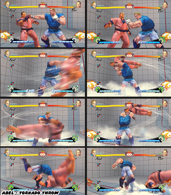
It was the animation that I found most jarring with the new characters introduced in SFIV. The fact that the obese Rufus could move faster than the skinniest fighters took me out of the game. But that was just a part of a bigger trend. The best grab moves in the series were impossible, but plausible. The fact that Abel would grab an opponent by the collar, and easily swing them around like a Tom and Jerry cartoon made little sense in context with the lineup. It was certainly believable against small, and skinny fighters like Sakura, or Dhalsim, but looked absurd when doing that to E. Honda, Zangief, or Hugo. Plus what exactly was Abel grabbing if the opponents did not have a collar? These were things that the designers did not seem to consider. Not only that but some of his moves lacked the setup that coded the special attack as a judo move. Street Fighter 6 needed a cast whose moves were grounded more in that plausible reality. In order to do that the studio had to literally go back to the drawing board. What they gave us was a new take on the original SFIV plans.

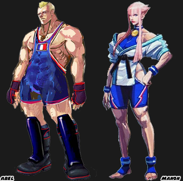
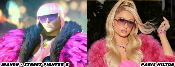
A fighter that we could identify was French was on the menu. Accomplishing this was easy. Using the colors of a national flag was one way that the artists at Capcom would code the lineup. In an early Abel draft, as well as an alternate costume we see him wearing wrestling tights, and a gold medal. Manon’s costume features similar colors, and striping on her outfit as well. In order to make her appear as more of a judoka rather than a wrestler she is wearing a juka top, along with her medal and black belt. Notice however that Manon is wearing her top off-the-shoulders in a very fashionable way. Not only that but her hair is colorful, and stylish. These are all details that support her story. According to her bio she is “A super model and world champion judoka, Manon is an idealist, forever seeking self-improvement in the pursuit of beauty. She struts the catwalk of street fighting to become the world's strongest model.” We can see a bit of her flair in the trailer, and can make comparisons to other fashion icons, and beauty figures like Paris Hilton.

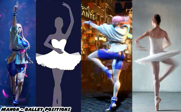
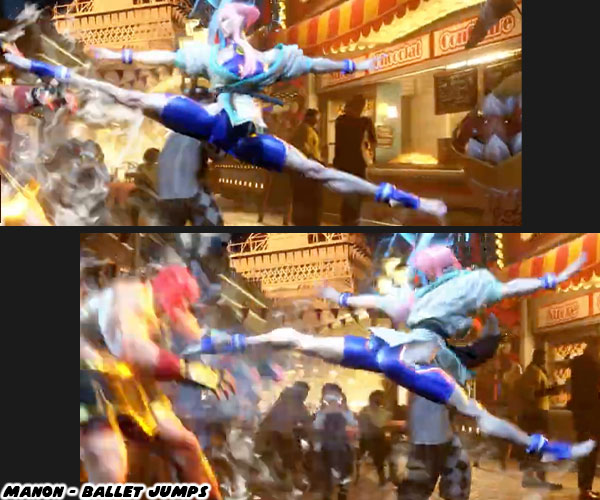
I strongly hoped that Manon was a practitioner of Savate, and with the cut of her outfit even predicted her to be one. It turned out that was not the case, but there was a reason for the tights after all. The range of motion they provided complimented the grace she fought with. We see her spin, leap, and twirl in the air with the ease of a ballerina. If she is a supermodel, then it stands to reason she might be an accomplished dancer as well. Manon might be the most polished model in the genre. No doubt she knows more about the world than other affluent girls that attended a prestigious finishing school.

The SF6 pre-order trailer is filled with many examples of Manon fighting with the grace of a dancer. The moves of Juri, or Chun-Li are focused on delivering strong attacks with their legs, and not so much with their hands. Chun-Li is rooted in sweeping kung-fu strikes, whereas Juri has more open tae kwon do kicks. Manon’s legs are long, and lanky. Her thighs are nowhere as thick, and developed as Chun-Li. This means she does not do a lot of striking with her legs, however her flexibility as a dancer helps her cut down the space between opponents with a leaping kick, while setting up another grapple.

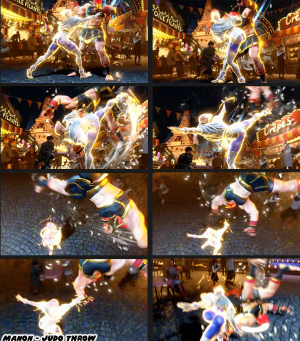
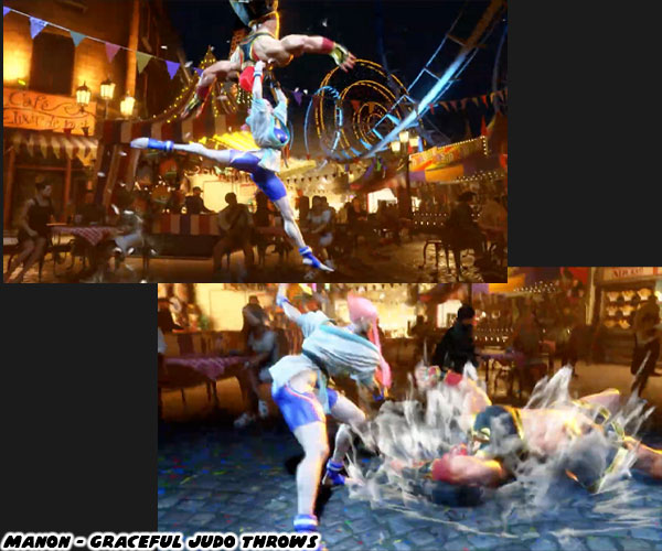
Manon's moves are more plausible for the character, and more important, are more believable for a judoka. Unlike other martial arts judo, and ju-jitsu are not about size, and strength. Certainly a large person with a grasp of the martial arts could do some serious damage. Judo is not about strength, it works through leverage, balance, and a fulcrum. A smaller opponent can easily flip a larger person. Anyone that has tripped over a bench could tell you that gravity does most of the work of falling over. We see these things in action in the SF6 footage. Manon may have dance-like moves, but she also grips her opponent like an actual judo practitioner. In all of her throw moves we see her drop her hip under the opponent’s center of balance. Then she sweeps the leg, and flips them upside down. She grabs their wrist, and controls the landing. It doesn’t matter if the character has a collar to grab onto or not, she is simply tipping them over. They may be exaggerated attacks, but these are fundamental judo moves.

Unlike the cartoonish moves that Abel was given in SFIV, the ones that Manon employs are grounded in actual judo. She doesn’t swing opponents in the air, or toss them like rag dolls. Her throws do not require her to be overly strong. Even massive characters like Hugo, and Abigail would flip head over heels if someone tripped them over their center of gravity. The best moves in the series are inspired by actual martial arts, whether it is a karate uppercut, Muay Thai knee, boxing punch, or wrestling suplex. They can all be made to look fantastic, while not breaking the suspension of disbelief for the audience. In paying attention to all of these elements in the costume cues, moves, and animation of Manon I think that the SF6 team has created a fighter that has more staying power than Abel. The thing that Capcom does better than most studios is exaggerate the method, and outcome of the attacks in animation without going overboard. This is the magic of creating Street Fighter special, and super attacks.

I have established that Kimberly is another take on the Guy template, JP follows closely on the heels of Falke, and that Manon appears to be a new version of Abel. What about Marisa, the other new character revealed in the SF6 pre-order trailer? Is she a new take on an existing character, or is she an entirely new idea? I would argue that Marisa was a redo of one of the cringiest characters in the series. I will explain how, and why in the next blog. I hope to see you back for that. I would like to hear your take on any of the new characters slated for SF6. Who are you going to main when the game drops in 2023? Let me know in the comments section. As always if you would like to sponsor me please visit my Patreon page and consider donating each month, even as little as $1 would help make better blogs and even podcasts!
follow the Street Writer on Patreon!