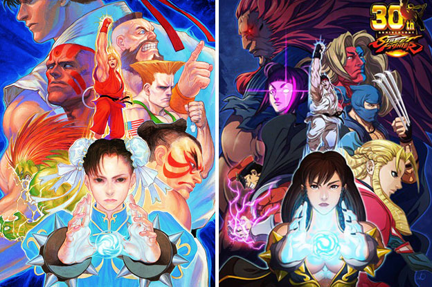
The previous blog had us trying to figure out the Street Fighter Style of character design. I used Chun-Li, and Jamie as examples. Capcom had historically done a great job at creating fighters from various nations in pseudo-traditional costumes. This made it so that audiences from any country could easily figure out who the character was, and what form they represented. Even if you didn’t speak English, or Japanese, you could look at just about anybody in the SFII lineup and tell a lot about them. There were two karate guys, one wore red, and one wore white. There was a huge wrestler, a sumo wrestler, and a female kung-fu practitioner. There was a buff American in military fatigues. The odd ones were a stretchy Indian, and a green skinned beast man. They were the outliers that literally added some color to the lineup.
Every successive Street Fighter made sure to strike a balance between easily identifiable archetypes, with the occasional oddball thrown into the mix. Capcom made a fortune with SFII, and the successive updates. They were so good at what they did they gave some studios the impression that it would be easy to make their own fighting game. I mean all you had to do was follow the template right? Here was where design, and experience came into play. The artists in every company had their own style, their own aesthetics. An art team in Japan drew differently than a team in Taiwan, or Korea, or Hong Kong. Yet there was some aesthetic overlap, and audiences in the West could tell that the designs were from Asia, even if they couldn’t necessarily pinpoint the country of origin. Now imagine if a studio wanted to make their own fighting game, and put archetypes from a certain country in it. They wanted to release this game in all the markets, and capture some of the sweet arcade money that Capcom had enjoyed. If they didn’t want to use the military look for an American then how else could they convey their nationality to audiences?
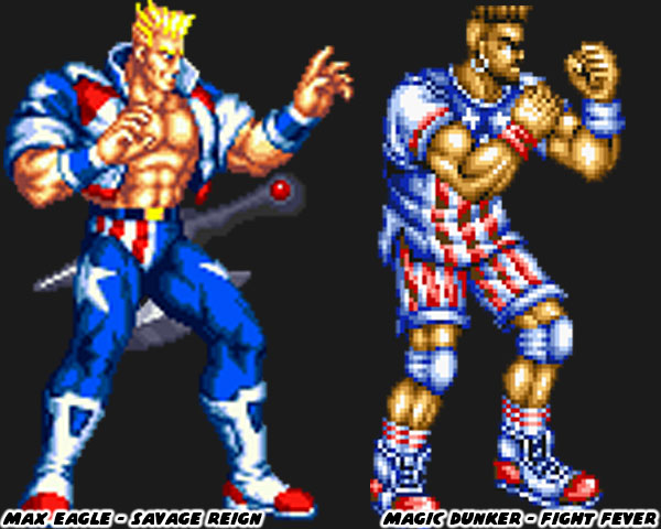
The studios could absolutely say “here’s Number One Yankee GI Joe”, and wrap that character in the stars, and stripes. Audiences the world over would instantly be able to tell a lot about that person. In fact it would be fair to do that. The point of reference about westerners many studios in Japan had were the over-the-top wrestling personalities, and sports stars they saw on TV. Even in formal karate tournaments they had seen actual contestants from the USA show up in gaudy outfits.
The obnoxious red, white, and blue gi of Allen Snider from Fighting EX Layer was based on reality. Of course this type of character design could also be seen as pandering. It didn’t always translate well with the target audience. The lack of cultural understanding, or sensitivity also had a lot to do with it. In 1994 SNK published three fighting games where the Black characters were given basketball attacks, and a fourth game where the Black guy used dance attacks. Imagine the fallout if a studio perpetuated the stereotype of Blacks only being good at dancing or basketball today. Experience with the target audience helped senior designers know when they needed to change the direction of a character, or cut them altogether. For over 30 years Capcom had designed characters with Western markets in mind. The focus on guessing western tastes became more prevalent starting with Street Fighter IV.
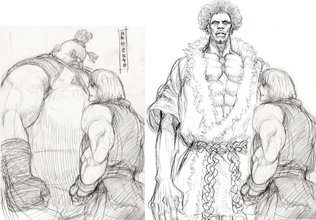
By now you were aware that Capcom originally created a tall Black character as a rival to Ken. A sort of Sagat for the US legend.
This character evolved to become King Cobra. Unfortunately his style of fighting was called “breakdance kung-fu.” The idea of a dancing Black guy in 2008 was outdated, and I’m sure despite his awesome appearance it wouldn’t have been appreciated by everyone in the community. Those dance fight moves would eventually find their way to Jamie in SF6. King Cobra would evolve to become Rufus, which I would consider to be the worst fighting game character of the past 20 years. There were plenty of odd choices coming from Capcom.
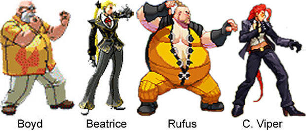
It turned out that part of the reason why some of the character designs seemed out of place was because their roots were not necessarily from Capcom. The studio had outsourced some of the development work to DIMPS. That company was filled with former SFII staffers. They had created some amazing 3D fighting games, including the Dragon Ball Z Budokai series, Spikeout: Battle Street, and The Rumble Fish. Two of the characters from The Rumble Fish looked to have directly influenced two new characters slotted for SFIV. It was becoming apparent that the Producer Yoshinori Ono had been steering the franchise in a silly direction. It was as if he had not paid attention to the process that Capcom had used previously. The studio would talk about how Western audiences playing early builds of the game were not drawn to the characters they had created specifically for them. If you understood the design elements that I had mentioned previously then you would understand why Abel stood out.
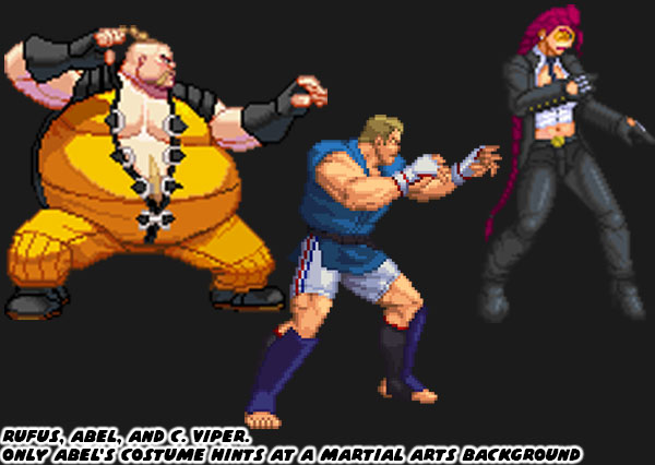
Abel had the pseudo-traditional costume. Given his size, and build, he looked like an actual fighter. By comparison audiences skipped Rufus because he was seen as a fat joke character. Crimson Viper looked like a sexy spy. Mr. Ono assumed that Western players would be drawn to this mysterious character. Instead test players immediately went to Abel because he looked authentic. Mr. Ono misread this attraction because of his size. He thought that western players would only use characters if they were hyper muscular. It would help explain why every male character in SF IV was absolutely swollen. Even “skinny” characters like Dhalsim were much bulkier than ever before. The trend continued with every expansion, and DLC fighter especially Gouken. By the time of Street Fighter V the biggest character in SF canon was put into the game as well. Abigail was eight-feet-tall. He was so massive he wore truck tires around his biceps as if they were armbands. It was definitely pandering as if Yoshinori was saying “here he is, look at this super buff American for you to play with.” I don’t think he was aware of how to fix the bad character ideas, or how to improve on the good ones. We could see that through Hakan, and El Fuerte, as well as his insistence of adding Rufus to the lineup. If we dug deeper we could also see the fixation on muscles with the original design of Abel.
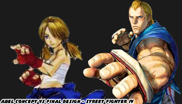
The earliest version of Abel was a sort of oddball character, like Blanka, or Dhalsim. The character was still a judoka, however he was not massive. In fact he was a skinny little androgynous boy in pigtails. Age wise he might have been the youngest person ever featured in the series. He was supposed to be incredibly quick, and have the ability to flip any character onto their head. I think that Daigo Ikeno had come up with the earlier concept because he was trying to put together a lineup with different sizes, and abilities. Maybe Abel would have always ended up being a big man, or maybe he was pushed in that direction because the team didn’t understand his appeal. Whatever the reason the changes went over well with the test audiences. What I think this did for the team was reinforce the idea that people in the US wanted to see big blonde characters in leading roles. That somehow the game narrative should be written around them. It was a tradition they started with Ken in 1987, and Guile in 1991 because they wanted to give Americans someone to play as. They never considered that Ryu, Chun-Li, Cammy or another character would be more popular with westerners. They repeated that way of thinking when Alex was introduced as the star of Street Fighter III: New Generation in 1997. Yoshinori saw the reaction to Abel, and it must have influenced his decision to push for Cody, Ed, and Luke as central to the story. Big muscular guys didn’t guarantee a fighting game would be more appealing to westerners. It was simply an aesthetic choice, this was a lesson that SNK learned in 2009.
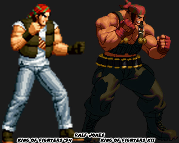
The King of Fighters series could be considered one of the true rivals to the Street Fighter series. The SNK school of design differed from Capcom in that they often had their cast in street wear. The costumes on the characters from 1994 to 2022 were roughly the same. At least there was more consistency in their look than the jump Capcom had between Street Fighter V, and 6. In 2009 SNK published KOF XII with completely new sprite art.
SNK mastered Dot Art graphics which allowed for larger sprites with more frames of animation, and greater fidelity than their rivals. Several of the characters in the game were far more muscular than they had ever been. They made the changes Mr. Ikeno put on the SFIV cast pale by comparison. I’m not sure if SNK had assumed that the new swollen characters would instantly be embraced by western audiences. The game sold well, and it got a sequel with KOF XIII in 2010. However the time, and price of developing high resolution sprites didn’t seem worth it to the publisher. By KOF XIV the studio switched to 3D graphics as well. That was not the only change from the studio. They decided to steer their school of design away from the west. We will look at how Capcom, and SNK adapted to their audience in the next blog. I hope to see you back for that. If you have any thoughts on the topic please share them in the comments section. As always if you would like to sponsor me
please visit my Patreon page and consider donating each month, even as little as $1 would help make better blogs and even podcasts!
Abigail is Canadian. :p
ReplyDelete