
Showing posts with label chun-li. Show all posts

Wednesday, May 13, 2026

Bookmark This Page; Women in fighting games

I love to write about fighting games, and fighting game characters. If you want a collection of articles about women in fighting games then Bookmark This Page.

The return of Rainbow Mika, did Capcom cross the line in Street Fighter V?

Laura, the new leading lady of Street Fighter V or more fanservice?

Odd Girl Out, a look at alternate female fighting game characters...

The legend of Blue Mary, or girls in fighting games, part 1…

The legend of Blue Mary, or girls in fighting games, part 2…

The legend of Blue Mary, or girls in fighting games, part 3…

Why is Street Fighter playing with Dolls?

Meet Street Fighter V's Menat, an old soul in a young body?

The rise of Falke, or how military design works in fighting games...

The Chun-Li template, don't follow it too closely! A 1UP classic...

A look at Marisa, the Street Fighter 6 gladiator...

A look at Lili, the new native Mexican fighter in Street Fighter 6

Juri in Street Fighter 6, how her design got better with time

Manon in Street Fighter 6, representing a style over 200 years in the making

Cammy gets an entirely new look for Street Fighter 6, let's see how

Let's talk about A.K.I., the Dragon Lady of Street Fighter 6

Meet Kimberly, is she the Urban ninja of Street Fighter 6?

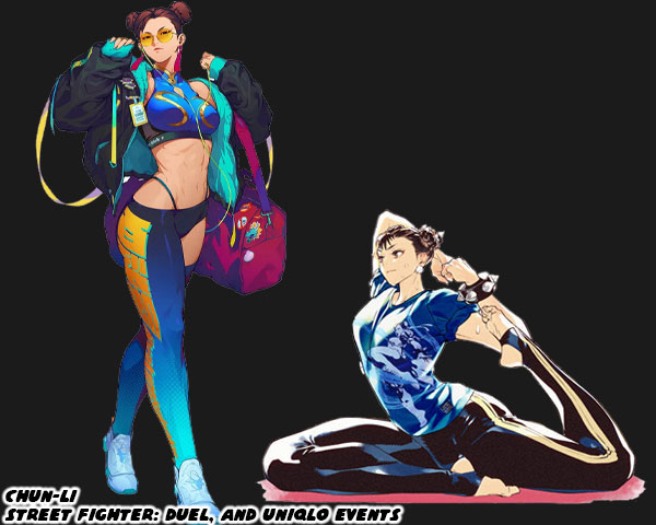
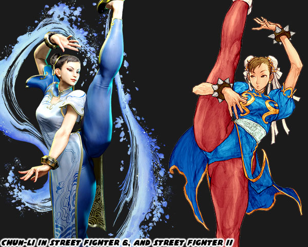
Chun-Li's new look in Street Fighter 6. Is it a step backwards?

Style Wars, looking at Kimberly in Street Fighter 6, and Isla from King of Fighters XIV.

The Street Fighter 6 pre-order trailer, a look at Manon, the graceful judo practitioner

The Street Fighter 6 pre-order trailer, a look at Marisa, the modern gladiator

Lili gets a makeover, just in time for Street Fighter 6!

Do you have a favorite female character in a fighting game. Tell me about it in the comments section. As always if you enjoyed this blog, and would like to sponsor me please visit my Patreon page and consider donating each month, even as little as $1 would help make better blogs and even podcasts!

follow the Street Writer on Patreon!

Wednesday, July 6, 2022

Figuring out the changing Street Fighter style, part 1...

Over the last month I had talked a lot about the new, and returning faces in Street Fighter 6. I studied their outfits, the colors assigned to them, their nationality, and physical build. I did my best to try to figure out their roots, and fighting method, and share it with the visitors to my blog. In the end it reminded me that there was a style of character design that could be considered uniquely “Street Fighter.” By that same token there was a style of design that worked for Mortal Kombat, Tekken, King of Fighters, and Killer Instinct. The aesthetic of Capcom was distinct. This was thanks to the legacy of artists that had worked there. Akiman, Shoei, Bengus, Daigo Ikeno, Edayan, Kinu Nishimura were brilliant artists that had a hand in developing the style, and direction of the SF series.

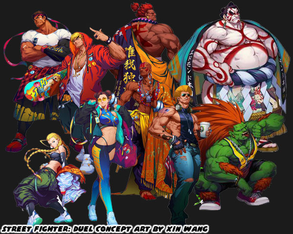
The newest designer Yusuke Hashimoto, was now putting his own unique stamp on the lineup. Yusuke had produced Bayonetta, so he was comfortable designing all manner of characters with different outfits, skin colors, builds, and body types. In short, he was the perfect person to shape the direction of this generation of fighters. With that said let’s try to figure out what made the “SF Style” distinct. The most obvious thing would be the costumes the characters wore. Could you really put a SF character in just any outfit, and would it work within the context of the game? I’m not saying that every character had to be wearing an authentic martial arts costume. That type of visual storytelling did not work great in SF. Instead there was a mix of pseudo-authentic costumes, and casual uniforms to break up the monotony. Consider for a moment what it would look like if everyone in the lineup wore casual clothing. Concept artist Xin Wang came up with fashionable makeovers for the SF cast in the Chinese mobile game Street Fighter: Duel. I would argue that Mr. Hashimoto’s designs were sort of a counter to that. He wanted to bring back the classics, but not go overboard with their costumes.

Long time fans would enjoy seeing their favorite characters in new outfits. However what did this do to new players? How did the game change by shifting just one element? Were new players able to make out the style of fighting that a character represented based on casual wear? Were they able to figure out what they could do based on the color of their skin, or their physical size? Now consider what costumes affected from a game play perspective. Was it easy to read the action on the screen if a character was covered up with long sleeves, or pants? What about vivid patterns, or clashing color choices on an outfit? Did these things make it easier to play the game, or were they distracting? I could argue similar points for excessive splashes of color, lightning, fire, smoke, etc. while the characters performed special attacks. There were many individual elements that made up the main costume choices for the SF cast. In the early days arcade cabinets, and game consoles lacked the memory, and processing power to render anything too detailed. The developers were limited to a simple outfit, and a primary color. This set the standard that was copied the world over. Now that consoles, and even mobile devices were more powerful then it became easier to create characters with highly detailed outfits, and millions of color choices. Was is then critical to take advantage of all this processing power? Or did putting too much into a costume’s detail take away from the overall presentation of the character?

I welcomed the addition of Story, Arcade, and Battle costumes that were put into the library in SFV. I was not against a character getting an updated main costume in the series, as long as it didn’t stray too far from the original design. The importance of a primary costume still remained. This was why I had no objections to the new designs for Dhalsim or Blanka in SF6. There was even a chance for the studio to take a good idea, and make it even better. I thought this was the case for Juri’s update. I saw the studio taking a step backwards when they revealed the new look of Chun-Li. They took away the small details that added up to make her costume truly stand out not only in the lineup, but across the spectrum of fighting games. Chun-Li perfectly encapsulated the Street Fighter school of design. It didn’t matter if you were from the Middle East, South America, or Europe. It didn’t matter if you had played a million fighting games, or if this was your first. When you looked at Chun-Li for the first time you almost instantly thought “Chinese Fighter.” Why was this? 

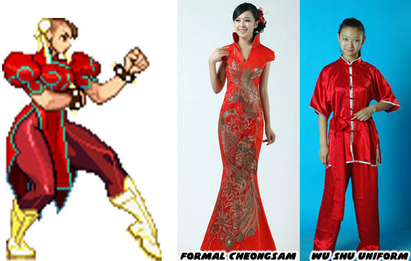
Audiences had seen Chun-Li’s prototype appear in pop culture generations before the game came out. Whether in story, film, photo, television, cartoon, or comics. The artists working at Capcom were pulling from various influences. People saw the repetition of heroic Chinese fighters, especially in Taiwanese, and Hong Kong cinema. They had seen physical Chinese representations in the form of certain hairstyles, makeup, and fashions. The cut of a dress, the use of ribbons, belts, sashes, and how they were assembled could be considered Chinese, or Mexican, or French, or American. Audiences had seen some combination of a wu shu uniform, or a traditional cheongsam at some point in the past. These were actual, traditional outfits from China. The genius of Capcom was how Akira “Akiman” Yasuda arranged certain elements when designing Chun-Li. The puffy shoulders, the pantyhose, wrestling boots, wide belt, and weighted bracelets had never been used in an actual martial arts costume, let alone any traditional Chinese dress. Audiences filled in the blanks with what they knew. They saw elements that they had seen before, and they assumed the rest was traditional Chinese. It was an absolutely brilliant trick, and set a standard that few studios could match. Yusuke Hashimoto showed that he was aware of what Akiman had done. Jaime in Street Fighter 6 followed the exact same design path of Chun-Li.

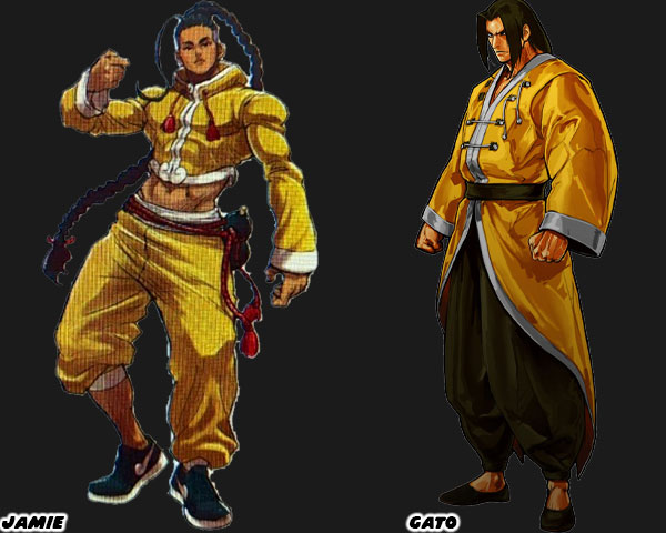
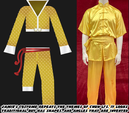
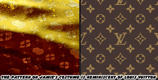
I want you to compare Jamie, and Gato who was a fighter from SNK’s Garou Mark of the Wolves. I had already highlighted Jamie’s various elements on my blog, but let me point them out again. Street Fighter 6 Director Takayuki Nakayama, Producers Kazuhiro Tsuchiya, and Shuhei Matsumoto, along with Yusuke Hashimoto spoke about the influence that Hip Hop had on SF6 in several interviews. Jamie was from Hong Kong, and at first glance it looked like he was wearing a traditional kung-fu outfit, but his costume had a decidedly urban flair to it. Just like Chun-Li it wasn’t apparent until you looked closer. The crop top, long sleeves, and wide collar were tailored to his frame, they were not baggy at all. This fit hadn’t really been worn in any traditional form of Chinese kempo, or kung-fu. The pants with one leg rolled up was a style from USA Hip Hop circles. The color of the fabric looked authentic, until you looked closer, and saw that it had a Louis Vuitton-inspired pattern on it.

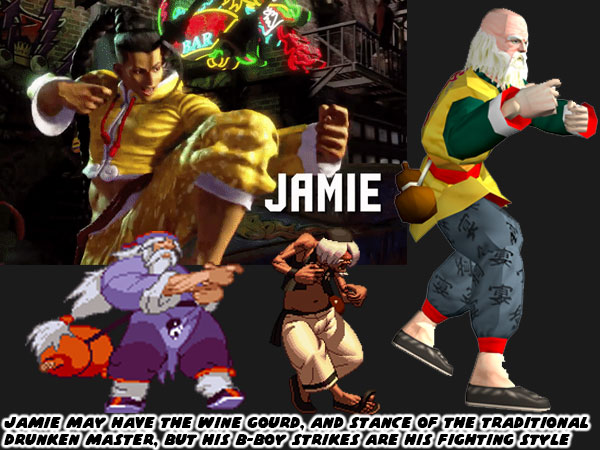
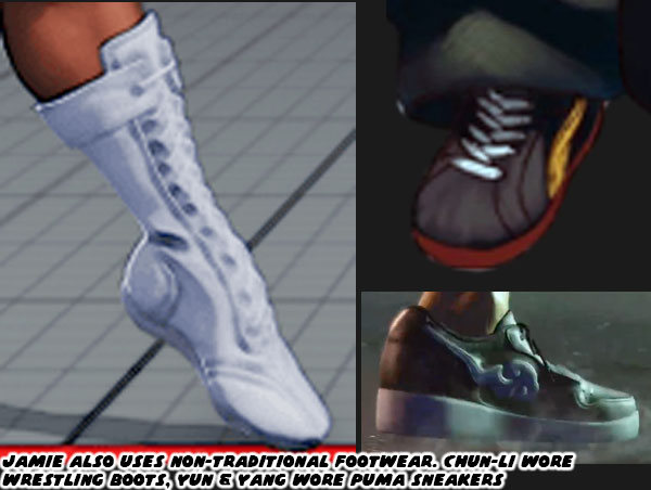
Jamie also wore sneakers with a cloud pattern at the front of what looked like the Nike swoosh design. Even his haircut wasn’t quite traditional. The long braid was supposed to make audiences think of the queue worn by men during the Qing Dynasty. Yet that hair style required the men to shave the front part of their scalp. Jamie instead had a modern fade on the sides, and back of his head. Jamie had a red rope belt with a wine gourd strapped to his hip. Many classical heroes in Chinese mythology such as Lu Zhishen, Ji Gong, and Li Tieguai carried a wine gourd as well. Capcom swore that Jamie was drinking a special juice, and not booze from the gourd. Jamie’s design really captured the SF Style, but it did not reflect the quality of the designs placed on some of the returning characters.

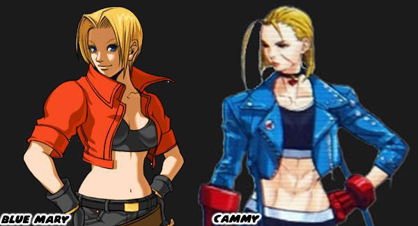
Cammy for example had an entirely new look that was much more casual than earlier looks. I felt that her short jacket, and leggings outfit betrayed the spirit of her original military-inspired uniform. My old friend DarthEnderX mentioned that she looked like a knock-off Blue Mary. That was a valid comparison. I had done a three part series on Blue Mary from the Fatal Fury series by SNK. Mary was essentially a female version of the protagonist Terry Bogard. She wasn’t a Sakura in terms to counterpart either, but more of a super cop like Chun-Li. Her look of jeans, and jacket was warranted as she was supposed to be very Western character. The casual costumes featured on the majority of SNK characters helped distinguish their lineup from Capcom’s. The Street Fighter-Style of character design relied on putting fighters in pseudo-traditional outfits. They had to be instantly recognizable to represent a certain country, school, or style. Like Ken, Ryu, Chun-Li, and Jamie. SNK had an entirely different approach. The genius of SNK’s design was that they hid the martial arts master in plain sight. They might be wearing a three-piece suit, a tuxedo, or a Hawaiian shirt, and flip flops. In every case they were unstoppable brawlers.

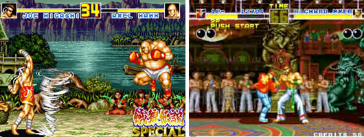
A good chunk of the Fatal Fury, Art of Fighting, and King of Fighters lineup were trained martial artists in street clothes. There were some with classical outfits sprinkled through the series, like Gato, Joe Higashi, and Kim Kaphwan. These traditional designs helped connect the audience to the well-dressed modern archetypes. If you are a budding designer, and are trying to figure out if your style works for SNK, Capcom, or other studios then practice creating fighters of common martial arts. See if you can put a karate fighter in a pseudo traditional gi. Or what that fighter would look like in a suit. How would audiences be able to tell that this person was a fighter? It’s a difficult exercise for sure. Capcom, and SNK had actually been broadcasting who their designs were targeted for in the past decade. We will explore these things in the next blog. I hope to see you back for that. If you have any thoughts on the blog please let me know in the comments section. As always if you would like to sponsor me please visit my Patreon page and consider donating each month, even as little as $1 would help make better blogs and even podcasts!
follow the Street Writer on Patreon!

Friday, July 1, 2022

Chun-Li's new look in Street Fighter 6. Is it a step backwards?

Today we are going to look at the last character I had yet to talk about for Street Fighter 6. Chun-Li was an icon. I had her listed #2 on my list of the 30 most important Street Fighter characters of the past 30 years. When she appeared in the SF6 debut trailer audiences all over the world celebrated. Fan art started pouring in online featuring her in the new costume. The reaction so far had been overwhelmingly supportive. I’m sure this pleased SF6 Designer Yusuke Hashimoto. I was happy to see her return, along with the rest of the original World Warriors. What I didn’t care for frankly was her new outfit. I think it's actually regressive, and betrays the spirit, and design that made Chun-Li unique.

Let’s take a deep dive into the origins of Chun-Li. The nation of China and the Chinese martial arts were perfect for video games. They were celebrated for their visual splendor, and fancy moves. Especially in Hong Kong cinema. Fan and Star were featured opponents in Yie Ar Kung-Fu, released by Konami in 1984. They were the first female martial arts fighters in a game. They predated Chun-Li by six years. In fact before Capcom even created Chun-Li they had designed a trio of female martial artists that could hold their own against the titular character Strider Hiryu in the arcade game Strider. The Kuniang Martial Arts Team aka The Tong Pooh Three Sisters appeared in 1989. Chun-Li would not appear until 1991. The sisters were fabled bounty hunters, selling their deadly talents to the highest bidder. Their pseudo-traditional Chinese martial arts uniforms beguiled their amazing powers. The sisters could cut tanks in half with their powerful kicks. They were the perfect challenge to the futuristic ninja Hiryu.

In some of the earliest design notes Chun-Li was essentially credited as another one of the sisters. Her method of fighting was originally listed as Northern Praying Mantis. Not only that, but her special attack was based on whipping her hair. Capcom was one of my favorite companies growing up. I loved their games, yet looking back I could see that some cultural stereotypes were also perpetuated by the studio. Chinese characters in fighting games were often presented in some sort of pre-revolutionary martial arts costume. It didn't matter if the characters were appearing in a current timeline. They were often dressed in the costume that would have been appropriate in the late 19th century rather than in casual modern clothing. For example the Three Sisters were presented in outfits that made more sense in classical Chinese Opera rather than in the science fiction future that Strider was set in. Even Chun-Li was presented in a pseudo-traditional costume in Street Fighter II. Within the context of the game however her costume made sense. It took a lot of subtle changes to get Chun-Li just right. Let’s talk about her evolution.

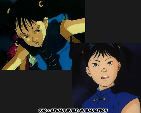
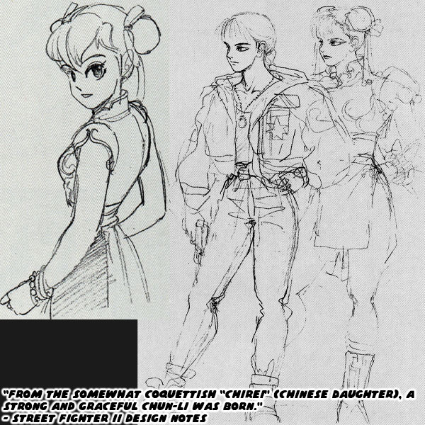
Chun-Li was going to be a very generic female kung-fu practitioner. According to the “father” of Chun-Li; Akira “Akiman” Yasuda said she was inspired by Tao from the anime Genma Wars: Harmagedon (1983). Japan had a fondness for setting stories in China, or borrowing cultural touchstones from China in the '80s. This included putting characters in traditional dresses, even if they didn’t reflect contemporary Chinese fashion. Lynn Minmay was a half-Chinese heroine in Super Dimension Fortress Macross (1982), Son Goku in Dragon Ball (1984) was a retelling of Journey to the West, then there was Pai from 3x3 Eyes (1987), and Ranma from Ranma ½ (1987) to name a few. Chun-Li was going to be as middle-of-the-road Chinese character as you could get. Even in the early design notes from Capcom she was labeled “Chirei” which translated to Chinese Daughter. Something amazing happened though. The studio kept going back and revising the cast again, and again. They poured more people into the development of Street Fighter than had ever been assembled on any other Capcom game. The end result was nothing short of amazing.

It was the insistence of all the senior developers in making the lineup better than any of their concept art. Producer Yoshiki Okamoto, and Designers Akira Nishitani, and Akira Yasuda pushed the staff to create a lineup that would not only define a franchise, but set the standard for the genre as well. With Chun-Li they really dug into the heart of the character. They knew that it would be great to have a representative of the different fighting arts as playable figures. In the earliest drafts they even had a military contractor, and capoeira master set for SFII. Yet they knew that audiences wanted more than a plain karate guy, or kung-fu girl in the roster. These characters needed to have more dimension, more personality, and more details than were provided in Yie Ar Kung-Fu. Chun-Li came to life when the studio realized that she was actually an undercover cop in a fighting tournament.

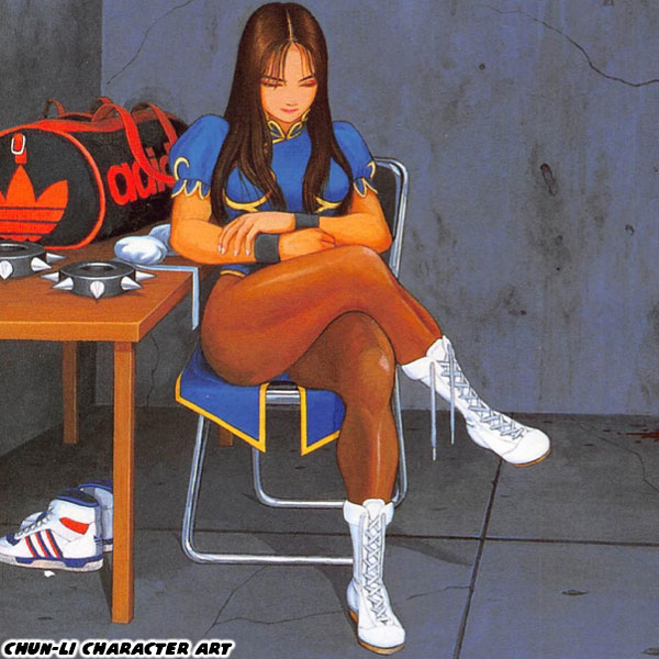
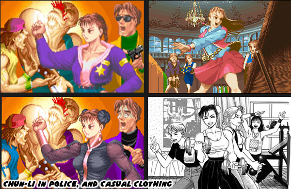
Her costume was literally a disguise, it was something to hide her true identity. Although the cut, and color of the outfit seemed authentic, there was nothing remotely classical about it. The short dress with open sides, large puffy shoulders, dark tights, wrestling boots, and weighted spiked bracelets had never been worn by an actual practitioner of any Chinese martial art. The genius of Akiman was that he assembled all the elements in such a way that on first glance they looked like authentic kung-fu garb, that was until you looked closer. Akiman, and SHOEI would paint official character art to remind us what Chun-Li was like in between fights. They presented her with her hair down, sometimes without makeup. She was an actual person. These were some of the most important illustrations that defined the character. We could see that she had an Adidas sports bag where she kept all her gear. She would rather be wearing sneakers when traveling instead of slippers or boots.

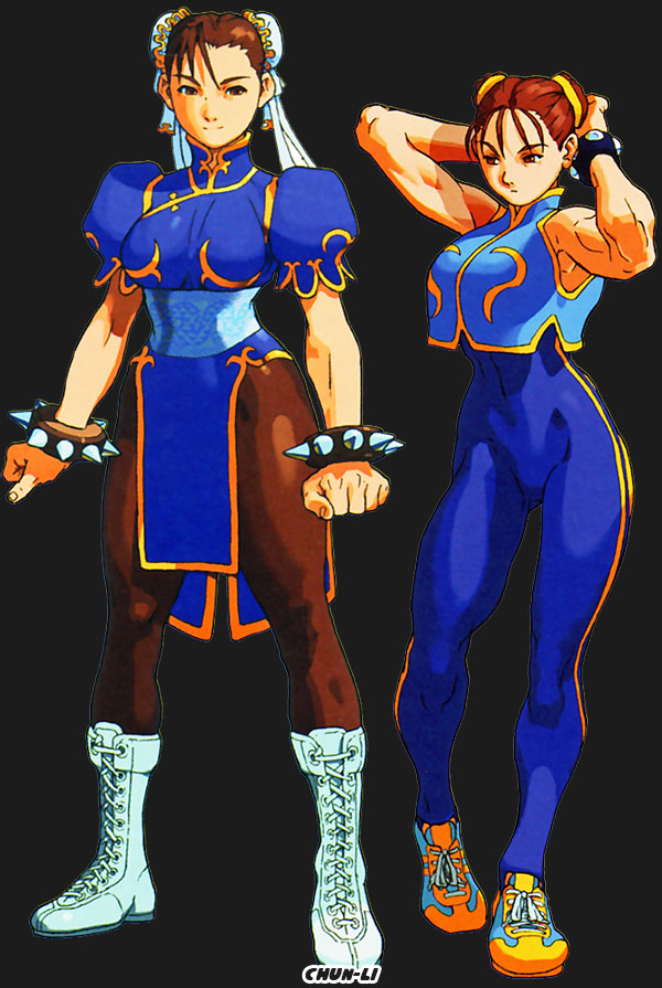
Audiences were reminded again, and again in the ending screens that she was a modern woman. She was not a stereotypical Chinese girl from manga, or anime. Chun-Li was often presented either in her police uniform, or in casual urban clothing. She didn’t stay in costume once the fighting was done. Sometimes she was seen in workout gear, or while going out on a date with her friends. This didn't really change until 1999, when in Street Fighter 3: Third Strike the company turned her into a sort of martial arts instructor that stayed in costume. Prior to that the studio did a major revision to her in Street Fighter Zero / Alpha in 1995. They created a costume for a young Chun-Li. With it they had her in a striped bodysuit, weighted bracelet, a pseudo-traditional crop top, and sneakers. She kept the Capcom logo colors of blue, and yellow even in this outfit. It went over well with audiences as they were reminded of the striped bodysuit worn by Bruce Lee in his final film the Game of Death. The original, and young versions of the outfits were so well crafted that it would be easy to dismiss them as traditional Chinese, but were actually costumes put together for a modern woman. These were the things that Capcom had started ignoring when designing alternate costumes for her in Street Fighter V. The goal seemed to be make Chun-Li sexier, and sexier with every revision.

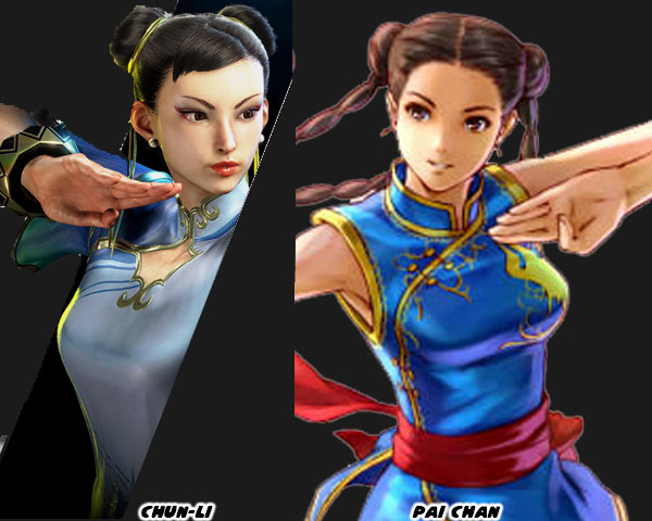
I think the SF6 developers completely missed the mark with her as well. It was as if they took that first-glance understanding of Chun-Li, and perpetuated only the Chinese stereotypes. They essentially regressed the character to Chunrei. Her costume became more formal, the dress became longer, with pants, and flats. No more wrestling boots, gone was her spiked bracelet, replaced by a more modest gold, and mahogany bangle. Her subversive design elements became more conservative. Chun-Li had inspired the creation of other female kung-fu masters in the genre. Most of the developers working on their own variation never got past the Chinese Daughter look. Sega most notably had Pai Chan, the daughter of Lau Chan in Virtua Fighter from 1993. It was no accident that her costume was blue with gold trim, or that she had her hair in braids. Pai’s costume was much more authentic, and it made sense in context. Sega was trying to make their series look, and feel more realistic than Street Fighter. The plausible fantastic was one of the things audiences enjoyed most with the design of the World Warriors. It was possible to have a seven-foot one eyed muay thai master, it was possible to have an air force pilot with a wild flat top. You might never see them, but they could be out there. With Chun-Li's new look she was easily out there because her outfit was so middle-of-the-road. 

When I look at the changes that Capcom made to Chun-Li I saw them going backwards. They were forgetting her evolution, and what the countless artists working at the studio changed during the revision process. She was never designed to be an ancient Chinese master, like Gen, or Lee. She was an Interpol officer working an undercover assignment. The world seemed to offer more for her other than fighting in the story mode. Seeing her floating in the air like Ip Man, acting like a movie hero in the SF6 trailer made me doubt the studio. I’m sure she still plays like Chun-Li, and will be a top tier character. No doubt about it. I do hope that they consider her original design, and purpose moving forward. I’ll be eager to see what DLC outfits they have planned for her. Like Ken, Ryu, and Cammy, I’m not feeling her new look. That’s my take anyway. Please let me know what you think about Chun-Li’s updated design. Will she be a character you try out on day one? Tell me about it in the comments section. As always if you would like to sponsor me please visit my Patreon page and consider donating each month, even as little as $1 would help make better blogs and even podcasts!
follow the Street Writer on Patreon!

Saturday, June 18, 2022

Juri in Street Fighter 6, how her design got better with time

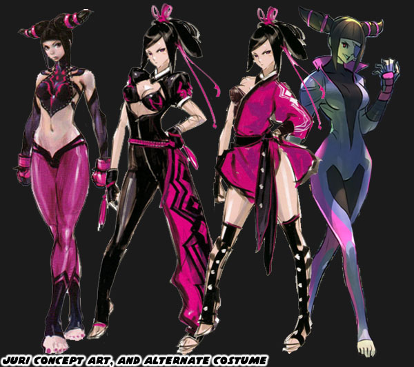
Today we talk about the best character introduced to the Street Fighter universe in the past 10+ years. Juri Han first appeared in Super Street Fighter IV in 2010. Can you believe the game came out that long ago? When she debuted the fan response was almost immediate. Abel, C. Viper, Rufus, Hakan, and El Fuerte took a back seat to the new femme fatale. A lot of people online think my ideas on character design posts are garbage because they think I hate Juri. That couldn’t be further from the truth. I was hyper critical of her design, and said that Capcom could have done better. From a story perspective she seemed overpowered. She was hyper sadistic in the game animations, and written to be god-like compared to Cammy, and Chun-Li. I thought that was a bit much, and disrespectful to established fighters. The biggest gripe I had was because Juri’s final design was closely based on Chun-Li. I was sure that the studio could have introduced a Tae Kwon-Do villain, without poaching Chun-Li’s design almost point for point. As time went on it was rumored that the studio had created some 400+ designs, and costumes for the character before settling on the one that appeared in the game. Several of her earlier concept designs, especially the tight skin suits, eventually became alternate costume DLC for the character.

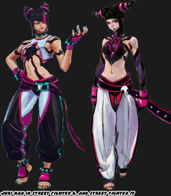
I think that the most recent version of Juri is much better than her debut. Her look, and costume look similar to her first appearance, but the changes made to them were subtle, but numerous. Let’s start with her dobok, the uniform worn by tae kwon-do practitioners. The colors are almost reversed from the original. Her leggings were white, and her pants were black, with fuchsia, and aqua accents. Not only that but they were shorter so we could see the contrasting colors on her feet, and ankles. The zipper on the inside leg makes the cut look very fashionable. White pants work okay for Ryu, but by going with much darker primary colors it really helps Juri stand out in the lineup.  Also a bit of trivia for you. Some of the costume colors assigned to the cast were based on the flags of their respective nations. Juri represented South Korea, their flag is colored red, blue, white, and black. So if you mix the colors blue, and red you end up with purple, the primary color of Juri. It would have been in poor taste for a Japanese studio to outright paint a villain with the flag of South Korea. The two nations have a lot of bad blood, especially for the numerous war crimes the Japanese perpetuated in Asia.  

The skull on Juri's belt was replaced with a yin yang symbol. This detail could be related to her chi abilities, or Tanden engine-accelerated powers. Her top reflects her evil origins. When Daigo Ikeno was working on the character the team nicknamed her the Spider. She was like a poisonous black widow that killed her mates. The spider logo appeared on the back of her top in her debut. This time it was put front, and center, like a sexy Spider-Man outfit. Although one of the spider legs covers her nipple Street Fighter designer Yusuke Hashimoto knew better than just leave most of her boobs dangling there. He covered her breasts with a split-open hanbok. He took the shape, and color of what would have been a traditional dress, and turned it basically into a lingerie top. Also her spiked bracelet was finally given some contrasting colors. The aqua on her pants was reflected on her fingernails, toenails, belt buckle, and more importantly, the spikes themselves. By adding the spiked bracelet to her ankles it was the type of nod to Chun-Li without just poaching the look. I think this addition may be the most inspired update to her costume.

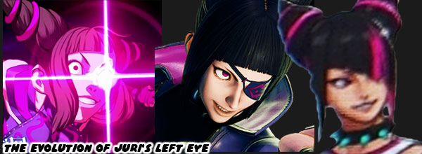
The next major change to Juri would be the cut of her hair. Her conical braids made a quick impression with fans, and became her trademark style. The studio observed the unique hair styles of other SF females. Chun-Li had buns, Cammy had braids, C. Viper had a pompadour with ponytail, Rose had purple hair, etc. Juri still had the cones, but now they were curved upwards in a more obvious devil horn fashion. Her bangs also changed shape, they were diagonal now, and extended over part of her face. Not only that but she had a fuchsia streak that lined up over her left eye. Juri had an artificial left eye fitted with the powerful Tanden, or Feng Shuei engine. When she is at full power the eye glows, in one of her alternate costumes she wore a patch over it. This new haircut keeps her face slightly obscured, and mysterious like C. Jack, but it also helps mask the eye. It was a very smart update to her look. Sadly I don’t think that Mr. Hashimoto realized that the colored hair streak was considered an Asian stereotype in the US. Glamour magazine said it best “It's Time to Retire the 'Hairstreak Asian' Trope”. I think the hair streak makes sense in context, but I understand why people are over designing Asian leads with similar hairstyles.

All in all I think that Juri’s redesign for Street Fighter 6 is her strongest look yet. I’m still more partial to her skin suit, but if you were to design an evil Chun-Li then you couldn’t do anything better. I don’t think I would have been as critical of the character if she looked more like this when she debuted in SFIV. Capcom may have created some 400+ looks for her in the early days, and they were very close to perfection. It took and additional 12 years, and a handful of changes to get her just right. What do you think about the updated look for Juri? Are you eager to try the returning characters, or the new characters? I’d like to hear your thoughts in the comments section. If you would like to sponsor me please visit my Patreon page and consider donating each month, even as little as $1 would help make better blogs and even podcasts!
follow the Street Writer on Patreon!

Wednesday, June 8, 2022

Coloring the action, how color impacted the development of fighting games

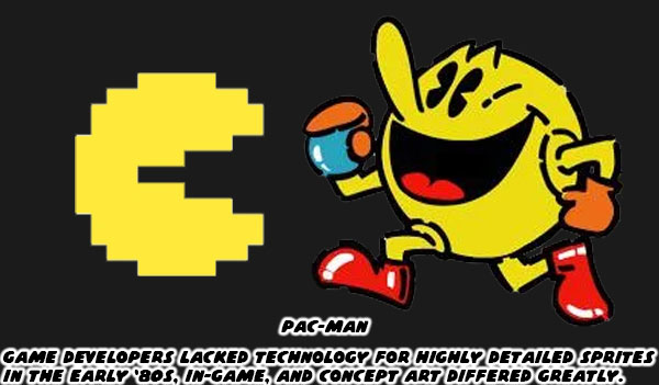
This entry is written with fighting game fans, and budding game designers in mind. If you take away anything today I want you to remember that the use of color may be the most important thing when designing fighting game characters. To expand on the idea, the stronger the color scheme, the bigger the impact it will have on audiences. This goes back to the birth of the genre. In the late ‘70s, and early ‘80s game designers fought the limitations of hardware, and software to bring their ideas to life. Studios like Atari, and Namco created animation through the use of sprites, instead of paint, on cells. Simple shapes, and two, or three frames of data were all they could apply on characters, and enemies. Despite the memory constraints the limited animation brought games to life. Look at a character like Pac-Man. While the game was not the first breakout hit, the character could be considered the original gaming mascot. The character was fairly three dimensional in the eyes of creator Toru Iwatani. You could see this in the official character art, cabinet, and marquee art. The actual sprite of Pac-Man was another story.

Toru plotted out the proportions of Pac-Man in the game on graph paper. Figuring that he could contain the open, and closed mouth animation across 28x36 tiles, and three frames of data. As the character moved left, right, up, and down across the maze it was a simple task of flipping the sprite to save on excess turning animations. The hardware limited the number of sprites, sizes, and frames of animation. It also limited the colors the game could exploit. Iwatani used a bright yellow for Pac-Man, and other solid colors to represent the ghosts Pinky (pink), Blinky (red), Inky (sky blue), and Clyde (orange). Solid color characters, and sprite mirroring would be used by other studios to create the illusion of movement in their games. The limitations of hardware turned out to be a blessing in disguise.

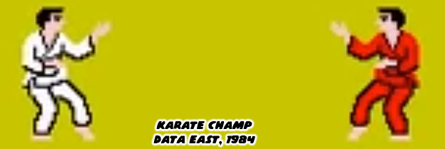
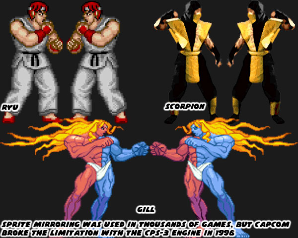
In the earliest days of the fighting genre sprite mirroring allowed characters to face left, or right. Karate Champ was different from action games because two players could go against each other. The white, and red karate uniforms were pallet swaps. In this way it would be easy for players to see who was who on screen. It was easy to track punches, and kicks because players had a clear view at the arms, and legs of the characters. Sprite mirroring ensured that characters always faced the player. A fighter would never have their back turned, and their strikes hidden from view. This came in handy when presenting different styles. A developer could focus on making a boxer look, and move like a boxer, or a ninja look, and move like a ninja. They were secure in the knowledge with sprite mirroring they would move the same whether facing left or right. From an artistic standpoint this was a problem. Characters couldn’t really have text, or graphics on one side of their costumes, because they would be reversed when facing the opposite direction. Most studios in the East, and West understood this limitation so they created characters, and costumes that didn’t have details, or text that wouldn’t make sense if flipped.

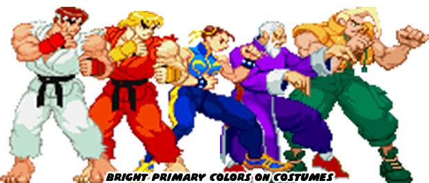
Capcom had become exceptionally good at developing sprites thanks to their extensive fighting game, and side-scrolling library. They created one of the most powerful sprite-based engines in 1996. The CPS-3 was capable of rendering switched colors on a sprite. For example, this meant that the Street Fighter III villain Gill could have one blue, and one red side toward the player depending on which way he was facing. It was revolutionary technology, but it proved too hard to develop for so only a few CPS-3 titles were ever released compared to the dozens of CPS-2 games. The thing that limited sprite technology in the past worked in favor of the SF designers. A decade after Pac-Man 2D engines allowed teams to have bigger sprites, more frames of animation, and more colors on screen at the same time. Even with this in mind the SF designers tended to place solid primary colors, and bright complimentary colors onto their characters. They kept the designs clean, and simple. No complex patterns, stripes, or filigree were fitted to their costumes. No matter how frenzied the action became it was easy to pick out the fighters, their moves, and special attacks on the screen.

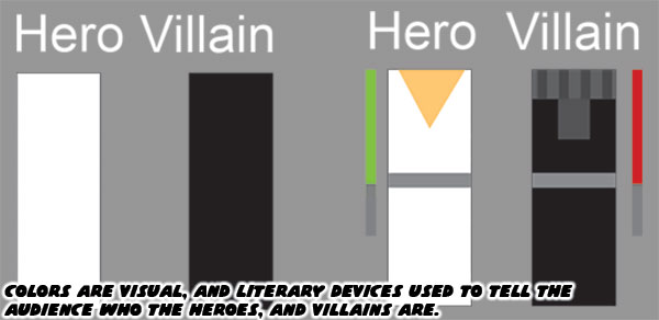
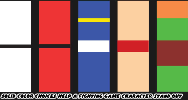
Street Fighter II, Super Street Fighter II, Street Fighter Zero / Alpha, and Street Fighter III more or less kept that tradition alive. The colors that the studio used set a template that would be repeated across the industry. You’ll get clear examples in the next blog. For now I want you to think about what colors your favorite character wears. What color comes to mind if you think about the Incredible Hulk? What about the Flash? How about Batman, or Superman? Even though the characters have been around for decades, and have had several revisions, you can perfectly imagine the colors associated with them. When you are watching a film for the first time, or reading a work of fiction, what colors are associated with the hero, and which are associated with the villain?

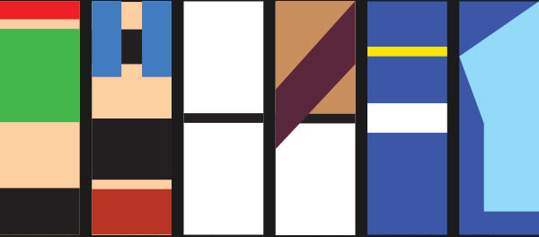
I want you to think about the colors associated with the Street Fighter II cast. I think it’s fair to call them the most iconic fighters ever assembled. I want you to strip down the characters to their most basic elements. If you had a coloring book, and could only use two, or three colors per character, which ones would you pick? There have been plenty of fighting games with karate leads, what was it that made Ken, and Ryu unique? I want you to think about Chun-Li, Zangief, and Blanka. If I were to ask you to name the details applied to the characters where would you begin? Would you talk about the chains on Blanka’s ankles, or would you mention the character had green skin? Would you talk about Chun-Li wearing light makeup, or would you say she wore a blue dress? Zangief didn’t wear much, but you all know his trunks were red.

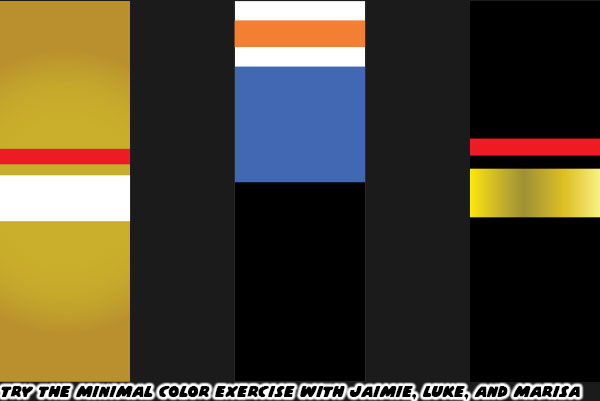
I have talked about three of the new characters in SF 6. Luke, Jamie, and Marisa. Jamie, and Marisa have just a few solid colors assigned to them. It is easy to simplify their details in your mind. Gold, and white for Jamie, and black, gold, and red for Marisa. Luke is a little bit different. He’s wearing layers. A white shirt, with orange print on it, a blue vest over that. Black training pants, and orange boxing gloves. The colors do not necessarily compliment each other very well. His earlier iteration of gold, and blue trunks made more sense. At the very least the colors reflected the Capcom logo. Previous SF characters rarely wore multiple layers, let alone colors that didn’t really blend well together.

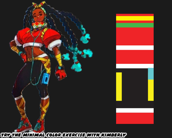
Now I want you to try and pair down the colors associated with Kimberly. Mind you, I haven’t yet posted a full write up on her. I don’t want you to think I’m against her inclusion. She may turn out to be my favorite new fighter once I get to play as her. What I am arguing about is from a color, and costume angle I think her design is too complex. Look at the number of colors, and clothing details put on her. I’m certain that SF 6 designer Yusuke Hashimoto gave careful consideration to his color choices. Red, yellow, and green are colors that are associated with the Pan-Africa movement. It’s fantastic that she is a proud Black lead, with big natural locks. Then there are the turquoise tips at the end of her braids, light blue music player, and aqua laces on her sneakers. Those garnish colors don’t really work with her look, and I would argue throw the scheme off.

If you have seen the costume changes to Cammy, Ryu, and Chun-Li I’m sure you are aware that the community is split on some of the changes. Cammy has gotten the strongest response so far. Her leotard, boots, and beret were all swapped out for more civilian clothes. Without the iconic beret, and green bodysuit some gamers liken her look to Sonya Blade from the Mortal Kombat series. To be fair Sonya was influenced by Cammy. Ryu has a kasaya or Buddhist robe over his torso. Many fans had speculated that he was wearing the rags of his former mentor Oro. The Buddhist robe had been given to his rival Sagat as one of his last alternate costumes. I’m not sure if it was wise to repeat the same thing for Ryu. Then there was Chun-Li. The changes to her costume were distinct as well. The cut of her dress was even more traditional than her original costume. Also her top was two tones of blue; dark, and light. Her dark tights were replaced by blue leggings. Her wrestling boots were swapped out for more traditional flats. Even her trademark spiked bracelets were traded for a smoother weighted bracelet. The look is taking the character back to her earliest concept sketches. I don’t think that is the best thing necessarily.

The community knows, and loves each of the characters regardless of what they wear. As long as they play in the style that fans are used to then I don’t imagine any real problems. Except for the kooks that think Cammy has been forever ruined because she’s wearing pants. I’ll never understand the people that scream censorship when the studio takes a costume in a new direction. I’m pretty sure there will be a classic costume DLC pack announced shortly after the game launches in 2023. Anyhow long time players will accept the new look of Cammy, Ryu, Chun-Li, and the other returning characters. I just caution budding designers not to go overboard with excessive details. Just because we now live in a time where home consoles are powerful enough to render individual teeth on a zipper, plastic caps at the end of shoelaces, and individual eye lashes. It doesn’t mean the game is made better by layering too much onto a character. Even in a world where people can throw fireballs it’s better to keep things simple. If you don’t believe me just think about two Muay Thai fighters.

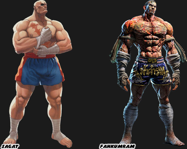
Sagat was the boss in the original Street Fighter. His rivalry with Ryu became the stuff of legend. He had a couple of unique features, a patch over his eye, and scar across his chest. Because of the limitations of hardware his shorts were solid colors with no fancy patterns. Sprite mirroring meant that the patch on his eye would swap sides, but it was a minor detail. For 35+ years he became the standard for Muay Thai in fighting games. In 2020 Namco added their own gigantic Muay Thai fighter as well. Fahkumram was roughly the same height, and weight as Sagat. Yet to set the two apart Fahkumram was covered in tattoos, including half his face, as well as scars all over his body from a lightning strike. The cords on his hand wraps (representing the older Muay Boran) were covered in blood, and his shorts had Thai lettering, and national colors. To say it was design overkill would be fair. There was so many elements placed on him that it became a jumbled mess. The character would have worked well in a manga like Baki the grappler, where you could appreciate the look, but not so much in a fighting game. Where the action is fluid, and details are missed in the movement. Clean, simple designs, and especially colors go a lot further for a fighting game. That’s what I think anyway. Feel free to disagree in the comments section. If you would like to sponsor me please visit my Patreon page and consider donating each month, even as little as $1 would help make better blogs and even podcasts!
follow the Street Writer on Patreon!

Sunday, June 5, 2022

A first take on Jamie, the new Street Fighter 6 character

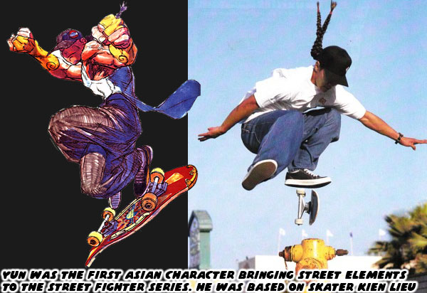
The full Street Fighter 6 trailer dropped recently. Make sure to check it out before continuing. Today we are going to focus on Jamie, the young kung-fu fighter. He is one of the new characters introduced in the footage, and apparently the friendly rival to Luke. I will be going through every character announced so far, the changes made to those returning, as well as those that were leaked in more depth. But for now let’s focus on Jamie. The character is listed as from Hong Kong. As you may know it was previously under British colonial rule before being handed over to China. Culturally they people from Hong Kong had more western influences, and freedoms, thus the transfer to a more authoritarian government was met with resistance. Jamie is similar to other young Street Fighter (SF) characters in that he wears what appears to be traditional martial arts gear, with a hint of modern touches. This trend for the series started in 1997 with Street Fighter III. Yun, and Yang were twin brothers that wore what appeared to be traditional outfits, but skateboarded, and inline skated respectively.

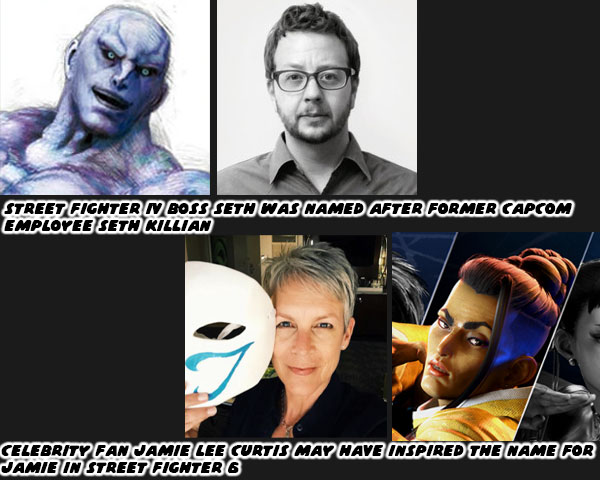
The other thing that stood out for the character was the name. Jamie is not a name that we might consider traditionally Chinese. To be fair, a number of Asians have both traditional names, and adopted western names. For example Lee Jun-fan was the birth name of Bruce Lee, and Fang Shilong is the birth name of Jackie Chan. Capcom often gives the staff leeway on the names they select. James Goddard named his Black kickboxer DeeJay in Super Street Fighter II. It is well known that pro fighting game player, and Seth the boss in Street Fighter IV was named after former Capcom Community Manager Seth Killian. If I were to guess where the name Jamie came from it would be from actress Jamie Lee Curtis. She famously attended the EVO tournament in a full Balrog / Claw costume. She has been known to dress up as various pop culture icons in order to attend conventions incognito with her family.

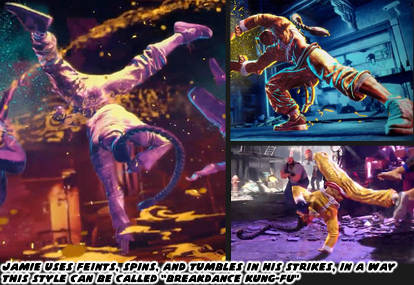
Jamie moves unlike almost any other character in the series, or in fighting games in general. In the trailer we see footage of him spinning, flipping, and tumbling with a ton of dexterity. He has quick strikes which are a mix of kung-fu punches, but with the footwork that appears like an uprock, the foundation of competitive breakdance. His stance, and movement is dance-like, it stands out like a “ginga” does for capoeira practitioners. Given his design, it stands to reason that the young fighter is having fun with his natural abilities, as well as his training.

At first glance the character appears to be a master of Drunk Fist kung-fu. He carries a gourd, which is often filled with wine, according to popular media. Although his stance, and fist positions seem to be those of a traditional kung-fu master, very few of his strikes appear to be based on any traditional form of kung-fu.

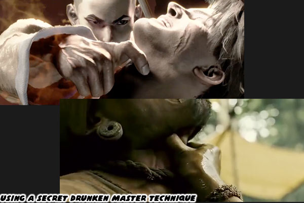
There is a part in the trailer where Jamie says “my secret art” then goes for Luke’s throat. This was similar to a move used by Tony Jaa in Ong Bak 2. Jaa was playing the mythical fighter Tien in the film. Tien was a young prince that got kidnapped by pirates, and trained in multiple forms of combat. The character makes his way to some bandits that had brutalized him, and his friends earlier in the film, and fights off a slave trader using Drunken Fist. He grabs the villain by his Adam’s apple before throwing him through a stand via fishhook to the mouth. I sincerely hope that Jamie doesn't have the full attack in SF6.

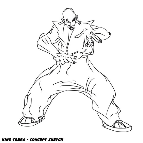
Jamie’s style can be best described as “Breakdance Kung-Fu.” If you remember your SF history you will know that before Rufus there was a young Black fighter in the planning stages called King Cobra. Although he wore what appeared to be a traditional karate gi, his method of fighting was said to be a form of breakdance kung-fu. He sported sneakers, and a gold chain, showing just hints of an urban background. Sadly there was never a 3D model, or sprite built for this character, let alone the actual animated moves. All we have to go on are concept sketches.

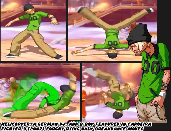
To be completely fair, there was a fighting game character whose entire arsenal was based on breakdancing. Helicopter from Capoeira Fighter 3 used nothing but b-boy moves. Even his stance, and movement saw him performing the wave as he danced through the stages some 15-years-ago.

Many people feel that no great idea goes to waste. Elements of King Cobra eventually found their way into the series. Ken was given an alternate costume in SF IV that looked just like King Cobra’s. Also the fictional form of striking eventually found its way to Jamie. Which makes more sense than to give it to the Black kid from the US. Since Jamie is from Hong Kong, and blends eastern, and western cultures. So what exactly are the origins of dancing as a form of fighting? The roots are based on tropes, and racial undertones. The Black athlete, and Black entertainer are stereotypes known the world over. In many of the early fighting games Black characters were presented often as basketball players. At least one was presented as a dancer.

Mind you, before the internet, it was tough for Japan to get a finger on the pulse of US culture. All the gaming studios had to go by was pop culture references. The way Blacks were portrayed in movies, music videos, and TV shows did a lot to color their perception. Hip Hop was, and continues to be a major part of that perception. The cultural revolution moved into every corner of the world. The four elements of Hip Hop; rap, breakdance, DJ, and graffiti influenced everything from advertising, to fashion, language, and music of course. The trailer for Street Fighter 6 even begins with a graffiti styled version of the Capcom logo. 30+ years ago the Japanese studios were not as in tune as to the proper ways to reflect, let alone incorporate that culture.

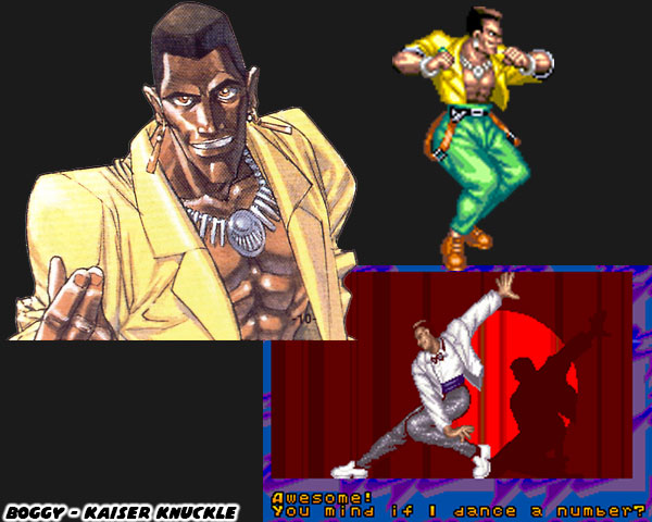
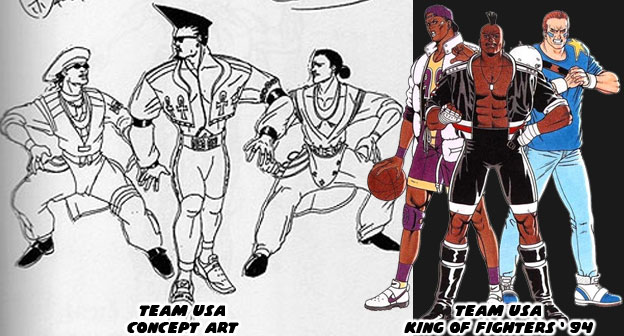
The concept for Team USA in SNK’s iconic King of Fighters series was laughable. The trio of men in costumes that were reminiscent of back-up dancers for Salt n Pepa, or Janet Jackson made little to no sense in a fighting tournament. Yet the Japanese designers persisted. They continued putting in elements of Hip Hop into the games. Jamie may yet be the most in tune the studio has ever been to the elements.

Pay very close attention to the cut, color, and design of Jamie’s costume. It looks traditional, but is far from an actual outfit worn in classic China. The illusion of a certain form, and fit is a long-standing design legacy of Street Fighter. I spoke about it at length with Chun-Li’s costume. Most wushu, or tai chi uniforms are made of soft, silk material, but the shirts usually hang long, and the pants are baggy. Jamie’s has a cut top, exposed midriff, and the the shirt, and pants fit more snugly. Also instead of a sash belt, Jamie wears a red cord belt, to hold his gourd. Also note that in all of the footage revealed of the character he wears one pant leg rolled up. Sure enough the Hip Hop elements are not lost on this kid.

If you look carefully at his costume there is a repeated pattern over it. Some competition uniforms may feature an embroidered phoenix, lion, or dragon on them. However Jamie has a pattern reminiscent of the Louis Vuitton brand. As you may know a lot of rappers promote material displays of wealth. In videos, and photo shoots they are often showing off, or “flossing” diamonds, gold, and rocking brands like Louis Vuitton, Gucci, Prada, Dolce and Gabanna, etc. Jamie’s version of the pattern uses the stars, and gourd motif, as a clever nod to the designer. Also Jamie is rocking some Cloud-label sneakers, instead of the flat-soled shoes that most practitioners wear. The cloud motif shows up on other parts of his outfit. Perhaps to denote his light, and airy fighting style. The use of non-traditional footwear again goes back to Chun-Li, who wore white wrestling boots instead of dainty slippers. Yun, and Yang sported Puma brand sneakers. As a nod to Keen Lieu, who was sponsored by the brand when Street Fighter III was developed.

These were the things that I was able to pick out about Jamie after seeing the footage of the character. I will be digging in to the rest of the cast over the next several weeks. I hope to see you back for that. Is there a character you would like me to look at sooner, rather than later please let me know. Also any feedback would be appreciated. What details did you notice about Jamie? What do you think of the SF6 announcement so far? Are you interested in playing this game when it’s released? Let me know in the comments section please. If you would like to sponsor me please visit my Patreon page and consider donating each month, even as little as $1 would help make better blogs and even podcasts!
follow the Street Writer on Patreon!

Wednesday, August 4, 2021

The Chun-Li template, don't follow it too closely! A 1UP classic...

NOTE: This blog entry was originally published on 1UP on April 18, 2012.

In the previous blog I had highlighted how Chun Li was the template from which Capcom drew its great female character designs. I wanted to make a special mention of how the context of the character design was important as well. The studio could have and did try to introduce two new female characters in Street Fighter IV. The audience reaction was lukewarm to one and somewhat better for the other. Crimson Viper, the spy in a tight fitting pantsuit was actually a character design based on marketing data. Capcom learned that western audiences were drawn to women that looked like Angelina Jolie. They decided to make a Jolie-like character and put her in the game. Unfortunately most players skipped out on playing her during the first public showings of the game. This was a surprise to everyone working internally. The studio had made the mistake of trying to predict their audience based on trends from outside of the community. Jolie was a popular actress and she might have made for a fun character in a game like Tomb Raider, where running and gunning were the objective, however she had absolutely zero credibility as a martial artist. She was no Angela Mao or or Michelle Yeoh, those were actresses that had made a living by playing fighters on the big screen.

Capcom could not convince audiences that a fighting game character in tight-fitting street clothes with the same features of a size zero Hollywood actress belonged in the Street Fighter universe. The other character, Juri Han, went much further with audiences.

Capcom learned that SF fans were interested more in fighting designs than pop culture caricatures. You would think that they had learned that with the Bruce Lee clone called Fei Long… but I digress. Players were used to seeing multiple layers of detail that supported the character as a fighter. With Juri the details were more apparent. The costumes for the SF cast were story elements that explained who the character was in fighting style and personality to gamers. Juri was like Chun-Li, a variation of a traditional design. However it took Capcom senior designer Daigo Ikeno multiple revisions to find a character that worked.

Like Chun-Li before her the character started off in a more traditional costume. The new character was to be of Korean descent and Capcom wanted audiences to identify her easily as such. She was placed her in a Hanbok or traditional Korean clothing. The oversized dress was an interesting design choice however might have proved nonfunctional in a fight. Juri was to have a majority of kicking attacks to balance out her rival, Chun-Li. Her kicks would have been impossible to make out in the dress. Ikeno went back to the drawing board and kept on revising the character.

There were many revisions made Juri. Some of the design choices were bold while others were nonsensical. In this way Mr. Ikeno was able to demonstrate that during the development process every idea was considered, not solely the traditional choices but the outlandish ones as well. The countless revisions would not end up influencing the final design as much as Chun-Li did.

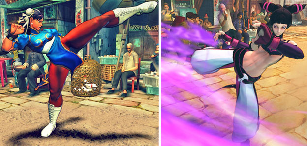
Visually Juri was almost point-for-point a repeat of the elements featured with Chun-Li. Savvy viewers might notice that some of the clothing options were reversed for the character. Chun-Li had bare arms and legs and Juri had covered arms and legs. Chun-Li wore a wide belt and Juri had a bare midriff.

Both characters had unique elements on their heads. Chun-Li had her hair in buns with long flowing ribbons while Juri sported two outlandish pigtails. Both characters featured a contrasting color on their uniforms, a filigree pattern that outlined their breasts.

Both characters also sported spiked bracelets. Juri's were a little harder to make out and seemed more decorative than functional in a fight.

Both characters relied on kicking moves that were supposedly inspired by their home countries. Chun-Li used a fictional form of kung-fu while Juri relied on fantastic Tae-Kwon Do attacks. Both characters also sported uniforms that were pseudo-authentic. Chun-Li's was a little more believable but it was still completely fabricated. These things were not noticeable until her uniform was compared to actual Chinese martial arts clothing. The cut of Juri's costume was extremely odd. Her top and sleeves were not based on any known martial art or fashion. Her leggings were a take-off of the traditional dobok or tae kwon do uniform. The dobok sported loose fitting pants so practitioners could perform a wide range of kicks. Juri's pants actually hung from her belt and were open on the hips and inner thigh, they were more like chaps that people wore while riding horses. Even her belt was unlike the traditional "dhee" worn on a dobok. Tae Kwon Do belts were styled similar to karate belts and were also colored to show what level of proficiency the fighter had. Instead of a short black belt Juri had an extremely long belt with purple striping which hung low across her waist.

Juri made a bigger impression on players of Street Fighter IV than almost any other character introduced in the series. A big reason for that was because she borrowed tremendously from the design of Chun-Li. Gamers that didn't pay attention to Juri's design influences but enjoyed the character nonetheless were possibly drawn to her at a subconscious level. Daigo Ikeno did a good job at introducing a new female into the SF universe that covered many of the elements that made the other characters memorable. Juri certainly stood apart from the more "traditional" designs explored in the SNK games. SNK had created an entire library of Korean characters starting with Kim Kaphwan, a TKD practitioner from Fatal Fury 2, released in 1992 a year after SF II had come out. The Fatal Fury and King of Fighters series had a unique cross sampling of Korean characters and styles. Capcom was barely exploring this part of Asia some 16 years after SNK.

SNK had at least two female Korean leads in the KOF series. The first was Mae Lee, a character dressed in modern street clothing sporting a strange belt and large scarf. Her design was rooted more in henshin, the Japanese superhero shows than on a classic fighting art. The other was Chae Lim. She was the first female wearing a traditional dobok featured in a videogame. She predated Juri by six years. The bold cut of Juri's uniform and use of contrasting colors black, white and purple made her stand out from the crowd however. Juri was designed to be a non-conformist or a non-traditionalist. It could explain why the character took extreme liberties with the uniform of TKD practitioners. Everything from the hair and colors associated with her were bold. She had shock value going in her favor, more so than even Crimson Viper and her electrified gloves. However was shock value enough to make her fit within the Street Fighter universe?

I would argue that Juri was lacking the elements to make her as timeless as Chun-Li. The character was instantly liked because she borrowed a large number of elements from Chun-Li. However this new character lacked inspiration and originality. Chun-Li went through several revisions before a character emerged that audiences could identify with. The influences from martial arts cinema and Chinese culture were tangible with Chun-Li. With Juri audiences could not readily see or identify any inspirations behind the character other than those of Chun-Li. Juri was a copy of a caricature. She suffered from the same inconsistencies of the other characters placed into SFIV, namely that the designers were not looking to the outside world for inspiration but looking at their own series to fill a slot on the roster.

Juri was a bit too formulaic. Capcom saw the reaction that western audiences had with the new characters and went back to the drawing board for Super SFIV. They went back to basics and tried applying a traditional fighting style on a national representative. Juri represented Korea and TKD and Hakan represented Turkey and their native wrestling. The the decision to reverse the clothing elements featured on Chun-Li helped make sure that Juri was better received than the oily red-colored man. Juri was a better design than C. Viper and certainly leagues ahead of Rufus, however even those two seemed pulled from characters featured in an older DIMPS fighting game.

Perhaps Mr. Ikeno played the design a little too safe. By following the template of Chun-Li so closely he created a character that lacked personality. All of the moves attached to the character were over-the-top, not to mention that she acted out sadistically in her animations. She was like an animé character placed into a fighting game. If the character was indeed a non-traditionalist then Capcom should have ignored trying to give her dobok leggings. The character in only her tights looked more like a cross-between Cammy and Chun-Li and possibly would have been more believable as the super fighter capable of taking on both icons at once. But that's just me speaking as an armchair designer.

I don't believe that Juri was as well designed as she could have been. Capcom wanted to push the envelope but they were not sure how. They had tried to make a dramatic change and failed with C. Viper. They returned to basics and succeeded somewhat with Juri. The differences between the two characters was obvious. One had more fighting elements while the other looked like she was wearing street clothes. Yet the nuances for a memorable female fighting lead were harder to pin down. Cammy was not a reversal of the costume elements of Chun-Li, she was her own person that complimented the designs of the earlier character. Cammy did not move or fight like Chun-Li but had her own special attacks. In Street Fighter EX Blair Dame was also nothing like Chun-Li yet she represented a strong female archetype with her own original style. Juri's pseudo-traditional costume and kick-based attacks were a little too similar to Chun-Li's to be considered completely original. That was my interpretation of the character, what do you think?