Showing posts with label details. Show all posts

Monday, December 12, 2022

The Street Fighter 6 pre-order trailer, a love letter to the series, and a look at JP

Thank you for dropping by the blog. We have a lot to talk about with the release of the Street Fighter 6 - Pre-Order Trailer. Make sure to watch it if you haven’t already.
   
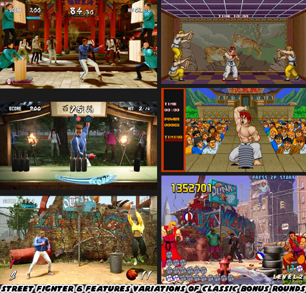
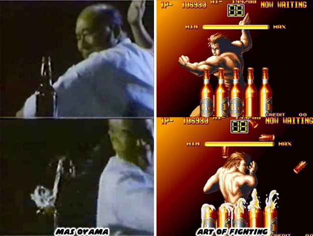
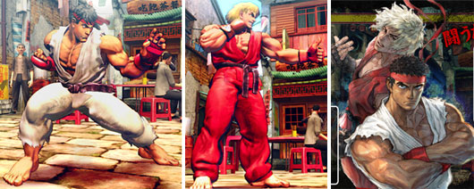
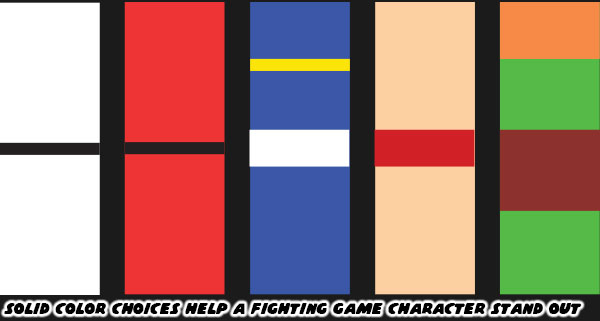
There is a tremendous amount of new information revealed about SF6, including official reveals of some new faces. One of the things that surprised me was the re-introduction of bonus stages. Ways to earn extra points, learn skills, and practice special attacks have been a part of the SF franchise since the very first game in 1986. In fact one of the earliest bonus stages involved board breaking. After 35 years this returns in the game. Long-time players would spot nods to other classic bonus stages, and even new challenges.

There was a shot of the player character chopping the tops off of glass bottles in one bonus challenge. Those of us old enough to remember would know this bonus was first used in the Art of Fighting in 1992. The SNK game directed by Hiroshi Matsumoto, and Akashi Nishiyama was a sort of updated take on the Street Fighter formula. The duo had developed the original SF before leaving Capcom to join SNK. They took with them a number of their martial arts influences, and translated them into game form. I have written a lot about Mas Oyama, and his influence in the creation of fighting games. The “God Hand” of karate could legit kill bulls with his bare hands. He was the basis for Mr. Karate / Takuma Sakazaki, arguably the most power karateka, and one of the top bosses in the SNK universe. Oyama would put on demos where he would cut the tops off of bottle with a knife hand chop. SNK used the bottle chop as a bonus stage in the original Art of Fighting. This skill now gets a nod in the SF franchise as well.

I have said it before, and it bears repeating. Street Fighter 6 Director Takayuki Nakayama, Producers Kazuhiro Tsuchiya, and Shuhei Matsumoto, and Designer Yusuke Hashimoto have all demonstrated a better understanding, and love of the culture than the previous director Yoshinori Ono with every SF6 update released. The game is not only pushing the genre forward, it is also a love letter to the games that came before. These influences are from Capcom, and from other studios as well. I am not going to focus on Dee Jay this time because he is a returning character. Instead I want to talk about the new faces revealed. Let’s start off with the sharply dressed older gentleman. According to the official bio “JP is the head of an international NGO (nonprofit organization, designed to address social or political issues) responsible for many successful investment projects, and the man behind Nayshall's present prosperity. Has a beloved cat named Cybele.” I did a quick look at JP earlier on the blog. As far as his look, and use of weapons is concerned there is a lot of precedence in the series.

The gentlemanly fighter Eagle was the top British striker in the original Street Fighter. He dressed sharply, and fought with the use of two sticks. JP is a continuation of other well dressed fighters who use a weapon in combat. The closest one that I compared him to would be White from the Fatal Fury sequel Real Bout Garou Densetsu Special: Dominated Mind. It could be considered fair for him to use a cane because JP was an older gentleman competing against fighters half his age, and twice his size. Of course as with any fighter in the franchise looks were often deceptive. JP was more than just skilled with a cane, in the trailer we can see he harasses some sort of psychic ability. The purple glow of “psycho power” had been featured as early as 1991 through Vega / Dictator, as well as in later games with Rose, Menat, Ed, and Falke.

It was established in previous SF games that psychic powers could be funneled, or rather focused through objects. Menat used a crystal ball for example. Falke used a military staff. The vast majority of characters in the SF universe fought with their bare hands, but a select few fought with weapons. These characters helped add balance to roster. From a storytelling perspective it made sense that a Mad Gear boss like Sodom would fight with a weapon. But it also worked when smaller fighters, or older fighters, were allowed to use weapons in combat. To learn more please read the blog on Falke, and how military design works in fighting games.

The other two fighters revealed in the Pre-Order Trailer were more interesting to me. They seem to cement the idea that a lot in the online community had. Namely that the SF6 team was trying to redo the characters introduced in SFIV, to redo not only their looks, but also their over-the-top, cartoonish special attacks. Let’s do a recap of what we know, and then what we can infer. Many SF fans learned that the rival to Ken was not originally planned to be the obese, and stupid Rufus. A young Black, “breakdance kung-fu” fighter named King Cobra was going to be his arch-rival. Audiences felt this was a very strong design, one with tremendous potential. Producer Yoshinori Ono insisted on adding a “fatty” for comedic effect instead. The world was robbed of a potentially fantastic design.

Of course no great idea really dies. At least not at a major studio. I believe that the fighting style originally planned for King Cobra was instead assigned to Jamie, the rival to Luke in SF6. The idea of giving a strong balance, or younger upstart to compliment to a franchise character was expanded on with others in the cast. Chun-Li as you may know finally had a worthy rival with the villainous Juri in SFIV. Juri’s design I believe had finally been perfected in SF6. Although we have not been introduced to A.K.I. officially as of this writing, many online also believe her to be a redesigned version of F.A.N.G. from SFV. One who loses the silly personality, to become a much more sinister archetype. Not every new face in the series is designed to be a rival to an established character. For example, Kimberly is the young ninja that is designed to be the understudy to Guy.

Guy was a featured character in the 1989 hit Final Fight. He was originally designed to be the replacement for Ryu in the Street Fighter series. As Cody was designed to replace Ken as well. The wrestler-turned-mayor Mike Haggar was the prototype for Zangief. But I digress… The sneaker-wearing ninja was certainly cooler than Ryu in design. Bringing just a hint of urban fashion into a traditional martial arts world. Kimberly carries a lot more of that same forward thinking. Mr. Nakayama, Mr. Tsuchiya, Mr. Matsumoto, and Mr. Hashimoto have gone all-in on incorporating the western influences that helped create the SF series. In doing so they expanded the diversity, and more important, created much better representation than in either SFIV, or SFV. They understand, perhaps better than the majority of Japanese designers, that Black culture is pop culture in the west. Not only that Black culture is the backbone of pop culture the world over. Using the fashion, the music, and art of Hip-Hop without including Black characters would have been a disservice to the community. The two other women introduced are other great examples of representation. I will dig into those on the next blog. What are your thoughts on everything revealed with SF6 so far? What are you looking forward to? Let me know in the comments section please! As always if you would like to sponsor me please visit my Patreon page and consider donating each month, even as little as $1 would help make better blogs and even podcasts!
follow the Street Writer on Patreon!

Friday, June 24, 2022

The Red Tornado returns in Street Fighter 6, a look at Zangief.

Today we’re going to look at Zangief, and his updated look in Street Fighter 6. For the most part very little was done with the character. He doesn’t seem to have aged much, if at all. There is no gray in his hair, or beard. Also he remains as massive as ever. The primary color associated with him remains red. In Street Fighter II he wore red trunks, and boots with gold trim. This time he is wearing red pants with white, and gold accents. Given his size these aren’t normal pro wrestler pants, but instead the kind worn by USA football players. They do incorporate kneepads as well. The only other changes made to him are the addition of red elbow pads, and the tape on his wrists have been replaced with gold bracelets. I’m kind of surprised at this stage in his career he isn’t presented with the Capcom Wrestling Association championship belt. Similar to the way Darun Mister wore his belts in Street Fighter EX, and Fighting EX Layer. All in all I think this redesign maintains the classic look that we’ve come to expect from the Red Tornado.

By now you should have noticed that not one returning character in the series is wearing their same costume. They may have similar color choices, like Zangief, or go with a different color scheme like Ken, but in either case nothing is exactly the same in this sequel. These are bold directions from Street Fighter 6 Director Takayuki Nakayama, Producer Kazuhiro Tsuchiya, and Designer Yusuke Hashimoto. Previously the studio did their best to incorporate as many details from the sprite-based versions featured in SFII when being adapted for 3D. Even “minor” details like Ryu having ragged edges on his gi, while Ken had hemmed edges were not overlooked by Yoshinori Ono, and the team working on Street Fighter IV. I am not on board with all of the changes that they have made, but I do appreciate the tweaks that they made to designs to make them stronger. Changing the cut of Rashid’s uniform, as well as the cut, and color choices for Juri were well done. Completely revising Luke helped make him look less like a nationalist.

What do you think of the decision to completely redo the costumes for everyone revealed so far? Was this a good idea? Are you eager to get DLC of the classic costumes if Capcom offers them? My friends, and family know that I love playing as Zangief in the game. I can't wait to see how the studio has updated his move set, and special attacks. Did you ever play any of the wrestling characters in the franchise? I’d like to read your thoughts in the comments section. If you would like to sponsor me please visit my Patreon page and consider donating each month, even as little as $1 would help make better blogs and even podcasts!
follow the Street Writer on Patreon!

Wednesday, June 8, 2022

Coloring the action, how color impacted the development of fighting games

This entry is written with fighting game fans, and budding game designers in mind. If you take away anything today I want you to remember that the use of color may be the most important thing when designing fighting game characters. To expand on the idea, the stronger the color scheme, the bigger the impact it will have on audiences. This goes back to the birth of the genre. In the late ‘70s, and early ‘80s game designers fought the limitations of hardware, and software to bring their ideas to life. Studios like Atari, and Namco created animation through the use of sprites, instead of paint, on cells. Simple shapes, and two, or three frames of data were all they could apply on characters, and enemies. Despite the memory constraints the limited animation brought games to life. Look at a character like Pac-Man. While the game was not the first breakout hit, the character could be considered the original gaming mascot. The character was fairly three dimensional in the eyes of creator Toru Iwatani. You could see this in the official character art, cabinet, and marquee art. The actual sprite of Pac-Man was another story.

Toru plotted out the proportions of Pac-Man in the game on graph paper. Figuring that he could contain the open, and closed mouth animation across 28x36 tiles, and three frames of data. As the character moved left, right, up, and down across the maze it was a simple task of flipping the sprite to save on excess turning animations. The hardware limited the number of sprites, sizes, and frames of animation. It also limited the colors the game could exploit. Iwatani used a bright yellow for Pac-Man, and other solid colors to represent the ghosts Pinky (pink), Blinky (red), Inky (sky blue), and Clyde (orange). Solid color characters, and sprite mirroring would be used by other studios to create the illusion of movement in their games. The limitations of hardware turned out to be a blessing in disguise.

In the earliest days of the fighting genre sprite mirroring allowed characters to face left, or right. Karate Champ was different from action games because two players could go against each other. The white, and red karate uniforms were pallet swaps. In this way it would be easy for players to see who was who on screen. It was easy to track punches, and kicks because players had a clear view at the arms, and legs of the characters. Sprite mirroring ensured that characters always faced the player. A fighter would never have their back turned, and their strikes hidden from view. This came in handy when presenting different styles. A developer could focus on making a boxer look, and move like a boxer, or a ninja look, and move like a ninja. They were secure in the knowledge with sprite mirroring they would move the same whether facing left or right. From an artistic standpoint this was a problem. Characters couldn’t really have text, or graphics on one side of their costumes, because they would be reversed when facing the opposite direction. Most studios in the East, and West understood this limitation so they created characters, and costumes that didn’t have details, or text that wouldn’t make sense if flipped.

Capcom had become exceptionally good at developing sprites thanks to their extensive fighting game, and side-scrolling library. They created one of the most powerful sprite-based engines in 1996. The CPS-3 was capable of rendering switched colors on a sprite. For example, this meant that the Street Fighter III villain Gill could have one blue, and one red side toward the player depending on which way he was facing. It was revolutionary technology, but it proved too hard to develop for so only a few CPS-3 titles were ever released compared to the dozens of CPS-2 games. The thing that limited sprite technology in the past worked in favor of the SF designers. A decade after Pac-Man 2D engines allowed teams to have bigger sprites, more frames of animation, and more colors on screen at the same time. Even with this in mind the SF designers tended to place solid primary colors, and bright complimentary colors onto their characters. They kept the designs clean, and simple. No complex patterns, stripes, or filigree were fitted to their costumes. No matter how frenzied the action became it was easy to pick out the fighters, their moves, and special attacks on the screen.

Street Fighter II, Super Street Fighter II, Street Fighter Zero / Alpha, and Street Fighter III more or less kept that tradition alive. The colors that the studio used set a template that would be repeated across the industry. You’ll get clear examples in the next blog. For now I want you to think about what colors your favorite character wears. What color comes to mind if you think about the Incredible Hulk? What about the Flash? How about Batman, or Superman? Even though the characters have been around for decades, and have had several revisions, you can perfectly imagine the colors associated with them. When you are watching a film for the first time, or reading a work of fiction, what colors are associated with the hero, and which are associated with the villain?

I want you to think about the colors associated with the Street Fighter II cast. I think it’s fair to call them the most iconic fighters ever assembled. I want you to strip down the characters to their most basic elements. If you had a coloring book, and could only use two, or three colors per character, which ones would you pick? There have been plenty of fighting games with karate leads, what was it that made Ken, and Ryu unique? I want you to think about Chun-Li, Zangief, and Blanka. If I were to ask you to name the details applied to the characters where would you begin? Would you talk about the chains on Blanka’s ankles, or would you mention the character had green skin? Would you talk about Chun-Li wearing light makeup, or would you say she wore a blue dress? Zangief didn’t wear much, but you all know his trunks were red.

I have talked about three of the new characters in SF 6. Luke, Jamie, and Marisa. Jamie, and Marisa have just a few solid colors assigned to them. It is easy to simplify their details in your mind. Gold, and white for Jamie, and black, gold, and red for Marisa. Luke is a little bit different. He’s wearing layers. A white shirt, with orange print on it, a blue vest over that. Black training pants, and orange boxing gloves. The colors do not necessarily compliment each other very well. His earlier iteration of gold, and blue trunks made more sense. At the very least the colors reflected the Capcom logo. Previous SF characters rarely wore multiple layers, let alone colors that didn’t really blend well together.

Now I want you to try and pair down the colors associated with Kimberly. Mind you, I haven’t yet posted a full write up on her. I don’t want you to think I’m against her inclusion. She may turn out to be my favorite new fighter once I get to play as her. What I am arguing about is from a color, and costume angle I think her design is too complex. Look at the number of colors, and clothing details put on her. I’m certain that SF 6 designer Yusuke Hashimoto gave careful consideration to his color choices. Red, yellow, and green are colors that are associated with the Pan-Africa movement. It’s fantastic that she is a proud Black lead, with big natural locks. Then there are the turquoise tips at the end of her braids, light blue music player, and aqua laces on her sneakers. Those garnish colors don’t really work with her look, and I would argue throw the scheme off.

If you have seen the costume changes to Cammy, Ryu, and Chun-Li I’m sure you are aware that the community is split on some of the changes. Cammy has gotten the strongest response so far. Her leotard, boots, and beret were all swapped out for more civilian clothes. Without the iconic beret, and green bodysuit some gamers liken her look to Sonya Blade from the Mortal Kombat series. To be fair Sonya was influenced by Cammy. Ryu has a kasaya or Buddhist robe over his torso. Many fans had speculated that he was wearing the rags of his former mentor Oro. The Buddhist robe had been given to his rival Sagat as one of his last alternate costumes. I’m not sure if it was wise to repeat the same thing for Ryu. Then there was Chun-Li. The changes to her costume were distinct as well. The cut of her dress was even more traditional than her original costume. Also her top was two tones of blue; dark, and light. Her dark tights were replaced by blue leggings. Her wrestling boots were swapped out for more traditional flats. Even her trademark spiked bracelets were traded for a smoother weighted bracelet. The look is taking the character back to her earliest concept sketches. I don’t think that is the best thing necessarily.

The community knows, and loves each of the characters regardless of what they wear. As long as they play in the style that fans are used to then I don’t imagine any real problems. Except for the kooks that think Cammy has been forever ruined because she’s wearing pants. I’ll never understand the people that scream censorship when the studio takes a costume in a new direction. I’m pretty sure there will be a classic costume DLC pack announced shortly after the game launches in 2023. Anyhow long time players will accept the new look of Cammy, Ryu, Chun-Li, and the other returning characters. I just caution budding designers not to go overboard with excessive details. Just because we now live in a time where home consoles are powerful enough to render individual teeth on a zipper, plastic caps at the end of shoelaces, and individual eye lashes. It doesn’t mean the game is made better by layering too much onto a character. Even in a world where people can throw fireballs it’s better to keep things simple. If you don’t believe me just think about two Muay Thai fighters.

Sagat was the boss in the original Street Fighter. His rivalry with Ryu became the stuff of legend. He had a couple of unique features, a patch over his eye, and scar across his chest. Because of the limitations of hardware his shorts were solid colors with no fancy patterns. Sprite mirroring meant that the patch on his eye would swap sides, but it was a minor detail. For 35+ years he became the standard for Muay Thai in fighting games. In 2020 Namco added their own gigantic Muay Thai fighter as well. Fahkumram was roughly the same height, and weight as Sagat. Yet to set the two apart Fahkumram was covered in tattoos, including half his face, as well as scars all over his body from a lightning strike. The cords on his hand wraps (representing the older Muay Boran) were covered in blood, and his shorts had Thai lettering, and national colors. To say it was design overkill would be fair. There was so many elements placed on him that it became a jumbled mess. The character would have worked well in a manga like Baki the grappler, where you could appreciate the look, but not so much in a fighting game. Where the action is fluid, and details are missed in the movement. Clean, simple designs, and especially colors go a lot further for a fighting game. That’s what I think anyway. Feel free to disagree in the comments section. If you would like to sponsor me please visit my Patreon page and consider donating each month, even as little as $1 would help make better blogs and even podcasts!
follow the Street Writer on Patreon!

Monday, March 12, 2018

The Giant Monster Series, part 16...


War of the Monsters is the best giant monster video game ever made. Nothing before or after could hold a candle to it, certainly none of the Godzilla or Rampage games. Yet it also held a tremendous debt of gratitude to those titles for paving the way and teaching the developers where the pitfalls of the genre were. War of the Monsters was released in 2003. It had favorable reviews but most audiences slept on the title. Those that got into it enjoyed the experience. They appreciated the layers of substance put into the game by Incog Inc. (later absorbed into Sony Santa Monica). The game began as a love letter to the classic giant monster genre. It was dreamed up by gaming icon David Jaffe and his Twisted Metal colleagues. War of the Monsters evolved from a simple idea into something that gamers could really sink their teeth into. In order to pull off a great giant monster experience the developers went to the roots of the genre, the cinema. The game began in the classic movie broadcast format. The entire set-up of involving an alien invasion and where the monsters came from was explained in the first few moments. Eagle-eyed players noticed a couple of cars from the Twisted Metal series in the opening shot.


After the film played the camera panned back to reveal the title screen was set on a drive-in movie screen. Classic cars, circa the late '50s and early '60s were in the lot waiting for the feature to start. The tiny details on the menu screen rekindled memories of another era. The light coming from the background had the same hues of dusk setting in. Houses, telephone poles and even a water tower could be seen beyond the tall wooden fence. Movie fans in the suburbs would enjoy going out to the local drive-in because it was an altogether different experience. This was a slice of Americana that Incog Inc. wanted to bring bring players into.


No movie palace could ever have the same atmosphere of an open-air arena. On a warm summer night patrons would get mixed sensations. A soft breeze, the sounds of crickets softly chirping in the distance, the smell of popcorn, pretzels and hot dogs wafting in from the concession stand. Even the sound of kids running through the gravel could only be experienced there. Patrons could enjoy the film from the privacy of their own cars. Families would sometimes pack an entire picnic to enjoy during the movie. Tiny steel boxes were hung on the car door to pipe audio directly to them. This was a prosperous time for the USA. We had just gotten out of WWII. Industry was booming, the middle class had grown exponentially and people were enjoying a culture that revolved around the automobile. Drive-in movies and drive-in fast food restaurants were the hottest trends. The greatest memories of a generation were tied to the drive-in. Some of these details were clearly seen on the title screen and in the various game menus.


The main menu and character select menu were split between two different movie screens. The camera would pan between them as the player made a selection. The amount of detail placed on the drive-in was amazing. It was a way to ease audiences into this world. If the gamer went into the settings menu they were taken to the concession stand. The sign was certainly retro, the color of the settings menu was off white-almost plastic, like an old '50s drive in or even diner menu would have appeared.


If a player went to load a saved file then the menu would take them into the projector room. Inside there were multiple projectors for each screen. The players were shown a cardboard box, it would be empty at first but as they saved games it would slowly fill with movie reels. Each reel had a picture of the level being saved and the title of the monster they were playing as. It was a nice touch making the monsters the stars of each picture. The format allowed players to save up to two cardboard boxes or two memory cards worth of reels. Friends could bring over their own saved files and share them on the Playstation 2.


If a player wanted to try a 2-player mini game then the menu screen would shift. Next to the concessions stand was a bench for families to enjoy their food. There was a pinball machine and a weathered arcade machine. The camera would focus on the arcade cabinet. There players could scroll between three 80's looking titles; Crush-o-Rama, Dodge Ball and BIG SHOT. Incog went to the trouble of discoloring the font and adding scan lines onto the screens as if they were projecting onto a CRT monitor. If players wanted to see what items could be unlocked they went outside the projection room. In front of the coming attraction posters was a list of characters and levels that could be unlocked with enough credits.


No other studio had ever put this amount of detail just for the menu screens in a game. To be fair however The Movie Monster game by Epyx and I was an Atomic Mutant by Canopy Games certainly came close to recreating the feel of the classic cinema. Remember that Epix even included the interior of the theater and previews to enjoy before starting the game. The publisher could have never imagined what technology would have allowed for in the future. The mix of aesthetic elements from the late '50s through the early '80s in War of the Monsters was done for a reason. Incog wanted to bring players into the world they had developed. They wanted players to understand what the US was like during this era. They had to provide enough sounds and visual elements to help them do that. For many players and most working at Incog Inc. this was their childhood they were reliving. The developers wanted to recreate the excitement of being a kid and getting to go to a drive-in to watch a monster movie. At the same time they wanted to make it visually interesting to contemporary audiences. The designers were reproducing the golden era of monster movies, which would have been experienced by the majority of their parents, and the final years of the drive-in which they would have remembered as kids. They certainly managed to do all of that with style.


The details that Jaffe and Co. included did not even start there. The instruction booklet included with the game was written as if it were the journal from the Editor in Chief of the Global Observer. It was the fictional newspaper featured in the opening moments of the game. It described the alien invasion and how the alien menace was defeated with gigantic pulse emitters. Then it explained how the radioactive goo released by the spaceships created giant monsters. A poster page was included with the instruction manual. On one side there was a special edition of the Global Observer, complete with articles on the monsters and some secrets and tips for players. On the other side was a movie poster for players to frame.


The level load screens were absolutely brilliant. They were made to look like movie posters. Each one highlighted the level details and sometimes opponents that players would be facing. The poster art, created by the talented Owen Richardson was stunning and looked genuine for the era. In fact the colors used for all the levels and environments had very solid hues and distinct lighting.


The color palette applied to each level was more than just good planning. The developers actually created color compositions for the stages inspired by the art used on actual classic movie posters. Every detail placed in the game built on top of the previous, these were meant to trigger memories and build emotional responses. Older gamers that remembered the drive in and the classic sci-fi and monster films would get the inspiration on the posters and levels. Younger gamers would be hooked by the art. All of the players would learn that the lighting created specific atmospheres for each level. From the eerie green glow that illuminated Atomic Island to the rose and yellow neon trappings of Gambler's Gulch, no two levels shared a color scheme or layout.


On the character select screen audiences had to choose from one of eight available monsters. An additional two monsters could be earned with battle points. Whichever creature the audience chose became the star of the game. The plot was very straightforward. The star was going to do battle with whatever other monster, or monsters they came across. War of the Monsters set players right in the middle of the action and did not waste too much time with backstory. The levels began with a portion of a "film" playing out before them. It highlight a specific rival and stage setting. In one stage there was a monster chasing police and military vehicles, in another it was giant robots fending off UFOs. In each case the camera would then turn and focus on the player-controlled monster and start the action.


The monsters were fairly diverse and inspired by several generations of icons. The giant lizard Togera and ape Congar were expected as were the giant Japanese mecha Ultra-V and giant praying mantis Preytor. Those four represented the classic archetypes from cinema. The other characters were inspired by various creatures but came off as fairly original. To help diversity the cast players could unlock "costumes" for the creatures. The game rewarded credits for the damage players caused and the number of opponents they defeated. Boss characters were worth tremendous points. Players could turn in these credits at the concession stand to unlock costumes and levels. The new skins were meant to be seen as completely new characters. It was not unlike what Pipeworks had attempted to do with Rampage.


In the first level Congar was being pursued by the military. It was assumed that they recovered the body after the player had defeated him. Congar was returned by military transport choppers a few levels later with an entirely different look. He had been turned into a weapon to fight the other monsters. The newly created cyborg Congar had half a robotic face and eerie glowing eye. Even his limbs were replaced with machinery. This costume was available to be purchased as well as an albino ape, possibly interpreted as an abominable snowman. The fourth costume for each character often turned out to be the most original and the one least likely to be confused as just another re-skinned character. For Congar that was an alien with metallic skin. All four of the costume choices for each monster were well done.


The visuals hooked the players but the game play itself was what kept them coming back. I would like to spend the next blog looking at the game in depth. I hope to see you back for the next entry!