War of the Monsters is the best giant monster video game ever made. Nothing before or after could hold a candle to it, certainly none of the Godzilla or Rampage games. Yet it also held a tremendous debt of gratitude to those titles for paving the way and teaching the developers where the pitfalls of the genre were. War of the Monsters was released in 2003. It had favorable reviews but most audiences slept on the title. Those that got into it enjoyed the experience. They appreciated the layers of substance put into the game by Incog Inc. (later absorbed into Sony Santa Monica). The game began as a love letter to the classic giant monster genre. It was dreamed up by gaming icon David Jaffe and his Twisted Metal colleagues. War of the Monsters evolved from a simple idea into something that gamers could really sink their teeth into. In order to pull off a great giant monster experience the developers went to the roots of the genre, the cinema. The game began in the classic movie broadcast format. The entire set-up of involving an alien invasion and where the monsters came from was explained in the first few moments. Eagle-eyed players noticed a couple of cars from the Twisted Metal series in the opening shot.
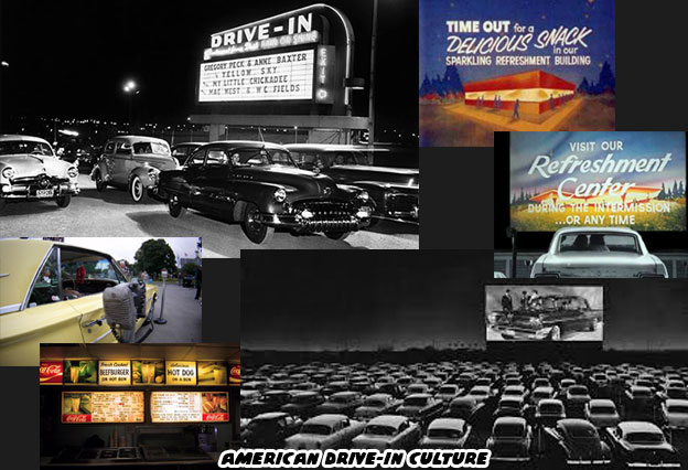
After the film played the camera panned back to reveal the title screen was set on a drive-in movie screen. Classic cars, circa the late '50s and early '60s were in the lot waiting for the feature to start. The tiny details on the menu screen rekindled memories of another era. The light coming from the background had the same hues of dusk setting in. Houses, telephone poles and even a water tower could be seen beyond the tall wooden fence. Movie fans in the suburbs would enjoy going out to the local drive-in because it was an altogether different experience. This was a slice of Americana that Incog Inc. wanted to bring bring players into.

No movie palace could ever have the same atmosphere of an open-air arena. On a warm summer night patrons would get mixed sensations. A soft breeze, the sounds of crickets softly chirping in the distance, the smell of popcorn, pretzels and hot dogs wafting in from the concession stand. Even the sound of kids running through the gravel could only be experienced there. Patrons could enjoy the film from the privacy of their own cars. Families would sometimes pack an entire picnic to enjoy during the movie. Tiny steel boxes were hung on the car door to pipe audio directly to them. This was a prosperous time for the USA. We had just gotten out of WWII. Industry was booming, the middle class had grown exponentially and people were enjoying a culture that revolved around the automobile. Drive-in movies and drive-in fast food restaurants were the hottest trends. The greatest memories of a generation were tied to the drive-in. Some of these details were clearly seen on the title screen and in the various game menus.
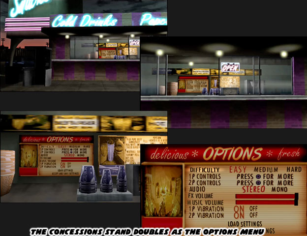
The main menu and character select menu were split between two different movie screens. The camera would pan between them as the player made a selection. The amount of detail placed on the drive-in was amazing. It was a way to ease audiences into this world. If the gamer went into the settings menu they were taken to the concession stand. The sign was certainly retro, the color of the settings menu was off white-almost plastic, like an old '50s drive in or even diner menu would have appeared.
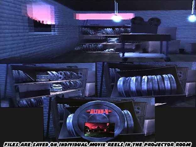
If a player went to load a saved file then the menu would take them into the projector room. Inside there were multiple projectors for each screen. The players were shown a cardboard box, it would be empty at first but as they saved games it would slowly fill with movie reels. Each reel had a picture of the level being saved and the title of the monster they were playing as. It was a nice touch making the monsters the stars of each picture. The format allowed players to save up to two cardboard boxes or two memory cards worth of reels. Friends could bring over their own saved files and share them on the Playstation 2.
If a player wanted to try a 2-player mini game then the menu screen would shift. Next to the concessions stand was a bench for families to enjoy their food. There was a pinball machine and a weathered arcade machine. The camera would focus on the arcade cabinet. There players could scroll between three 80's looking titles; Crush-o-Rama, Dodge Ball and BIG SHOT. Incog went to the trouble of discoloring the font and adding scan lines onto the screens as if they were projecting onto a CRT monitor. If players wanted to see what items could be unlocked they went outside the projection room. In front of the coming attraction posters was a list of characters and levels that could be unlocked with enough credits.
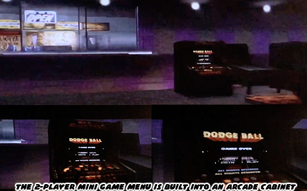
No other studio had ever put this amount of detail just for the menu screens in a game. To be fair however The Movie Monster game by Epyx and I was an Atomic Mutant by Canopy Games certainly came close to recreating the feel of the classic cinema. Remember that Epix even included the interior of the theater and previews to enjoy before starting the game. The publisher could have never imagined what technology would have allowed for in the future. The mix of aesthetic elements from the late '50s through the early '80s in War of the Monsters was done for a reason. Incog wanted to bring players into the world they had developed. They wanted players to understand what the US was like during this era. They had to provide enough sounds and visual elements to help them do that. For many players and most working at Incog Inc. this was their childhood they were reliving. The developers wanted to recreate the excitement of being a kid and getting to go to a drive-in to watch a monster movie. At the same time they wanted to make it visually interesting to contemporary audiences. The designers were reproducing the golden era of monster movies, which would have been experienced by the majority of their parents, and the final years of the drive-in which they would have remembered as kids. They certainly managed to do all of that with style.

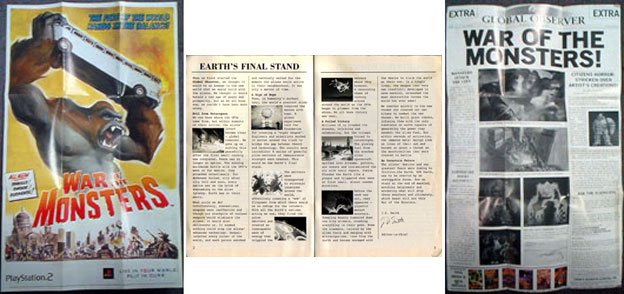
The details that Jaffe and Co. included did not even start there. The instruction booklet included with the game was written as if it were the journal from the Editor in Chief of the Global Observer. It was the fictional newspaper featured in the opening moments of the game. It described the alien invasion and how the alien menace was defeated with gigantic pulse emitters. Then it explained how the radioactive goo released by the spaceships created giant monsters. A poster page was included with the instruction manual. On one side there was a special edition of the Global Observer, complete with articles on the monsters and some secrets and tips for players. On the other side was a movie poster for players to frame.
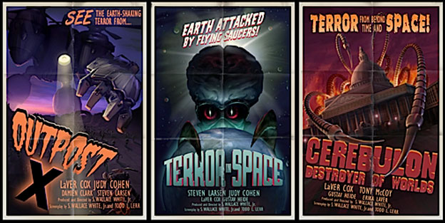
The level load screens were absolutely brilliant. They were made to look like movie posters. Each one highlighted the level details and sometimes opponents that players would be facing. The poster art, created by the talented Owen Richardson was stunning and looked genuine for the era. In fact the colors used for all the levels and environments had very solid hues and distinct lighting.
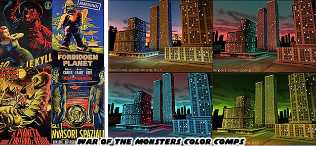
The color palette applied to each level was more than just good planning. The developers actually created color compositions for the stages inspired by the art used on actual classic movie posters. Every detail placed in the game built on top of the previous, these were meant to trigger memories and build emotional responses. Older gamers that remembered the drive in and the classic sci-fi and monster films would get the inspiration on the posters and levels. Younger gamers would be hooked by the art. All of the players would learn that the lighting created specific atmospheres for each level. From the eerie green glow that illuminated Atomic Island to the rose and yellow neon trappings of Gambler's Gulch, no two levels shared a color scheme or layout.
On the character select screen audiences had to choose from one of eight available monsters. An additional two monsters could be earned with battle points. Whichever creature the audience chose became the star of the game. The plot was very straightforward. The star was going to do battle with whatever other monster, or monsters they came across. War of the Monsters set players right in the middle of the action and did not waste too much time with backstory. The levels began with a portion of a "film" playing out before them. It highlight a specific rival and stage setting. In one stage there was a monster chasing police and military vehicles, in another it was giant robots fending off UFOs. In each case the camera would then turn and focus on the player-controlled monster and start the action.
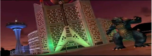
The monsters were fairly diverse and inspired by several generations of icons. The giant lizard Togera and ape Congar were expected as were the giant Japanese mecha Ultra-V and giant praying mantis Preytor. Those four represented the classic archetypes from cinema. The other characters were inspired by various creatures but came off as fairly original. To help diversity the cast players could unlock "costumes" for the creatures. The game rewarded credits for the damage players caused and the number of opponents they defeated. Boss characters were worth tremendous points. Players could turn in these credits at the concession stand to unlock costumes and levels. The new skins were meant to be seen as completely new characters. It was not unlike what Pipeworks had attempted to do with Rampage.
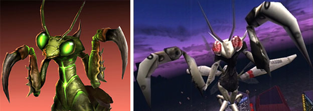
In the first level Congar was being pursued by the military. It was assumed that they recovered the body after the player had defeated him. Congar was returned by military transport choppers a few levels later with an entirely different look. He had been turned into a weapon to fight the other monsters. The newly created cyborg Congar had half a robotic face and eerie glowing eye. Even his limbs were replaced with machinery. This costume was available to be purchased as well as an albino ape, possibly interpreted as an abominable snowman. The fourth costume for each character often turned out to be the most original and the one least likely to be confused as just another re-skinned character. For Congar that was an alien with metallic skin. All four of the costume choices for each monster were well done.

The visuals hooked the players but the game play itself was what kept them coming back. I would like to spend the next blog looking at the game in depth. I hope to see you back for the next entry!
No comments:
Post a Comment