Showing posts with label costume. Show all posts

Friday, August 9, 2024

Remix Culture, a bonus entry!


I hope you enjoyed the Remix Culture series from the past few Fridays. I had some material for a bonus entry this week. Previously I shared with you my love of basketball, and how I fell into urban vinyl art. I revealed that some of my favorite toys combined both basketball, and vinyl figures. The Super-X figures by Dragon Models, All Star Vinyl figures by Upper Deck, and most recently the Street Mask figures by JT Studios were the gems in my collection. They brought me tremendous joy. Those weren’t the only toys that I was happy with. I also had a great collection of Oswald figures, and plenty from Michael Lau, the Godfather of the urban vinyl movement.

One of the reasons I was able to build a great collection over my lifetime was because I was very selective about which 12” figures I bought. Those figures could be very expensive compared to the other toys in my library. For the price of a single 1/6 figure I could get a half dozen Oswald plush dolls. In order to maximize the return on my investment I had to be very picky. When I started collecting the high-end basketball figures I knew that I would have to give up on curating another line. I knew exactly what I would never be able to add to my shelves; space figures. Like many of you I’m a huge fan of space. Like a really, really, really big fan of space; astronauts, and science in general. Growing up I would check out books on space travel from the library. My parents, and brothers supported my fascination. They got me a really nice telescope when I was a kid, and today my wife, and I have a high-end telescope. The science behind space travel had always been part of my identity. 

In grade school my friends knew that I was a big science nerd. They could often find me going over books on rockets, and space shuttles. At least that was whenever I wasn’t reading about monster trucks. On the blog I mentioned that Lunar Lander from 1979 was the first simulator-style arcade game that I could remember. I credited it with sparking my love of arcade games, and planting the seeds that would eventually see me land a job working mission support with JPL. When I joined Instagram one of my first photos was from the Challenger memorial in Little Tokyo. My family was there in Downtown Los Angeles in 2012 when the Endeavor got a flyby. It was definitely a highlight for me. When I left JPL for my current job I took that love of space with me. At that time our office had moved into a bigger building. Every holiday meant we were going all out. Catered tacos for Cinco de Mayo, hot dogs, and burgers for the 4th of July, big Christmas parties etc. We celebrated Halloween with everyone on the staff showing up in costume.

I had created a couple of custom rash guards for my kid, who was a huge fan of the Aquabats. We would go to their concerts when we could, and everyone loved her outfits. I would usually dress as a Sandflea, the arch-rivals of the Aquabats. After a few shows I decided to create a space-themed rash guard for myself. I created all the vector art for the outfit, including the graphics that looked like mission patches on the sleeves. The logos were a call out to other space themed bands, video games, actual missions, and even Disney attractions. The silver shorts were from AND1, a white anti-negativity helmet, goggles, and white Converse sneakers completed the outfit. I wore it to work, along with my NASA-themed laptop bag. My coworkers loved it as much as the fans at the concerts. Hopefully this proved how much of a fan I was of astronauts. When I said that it hurt giving up on collecting astronaut toys I meant it. Budgeting money for Michael Lau figures meant I would miss out on something equally cool.

Science fiction toys, spacemen, and aliens had been in pop culture since the start of the 20th century. When I told fellow collectors that I wished I had more space toys I wasn’t talking about Star Wars, Star Trek, Battlestar Galactica or any other sci-fi lines. I meant actual astronaut figures, like the classic 12” G.I. Joe astronaut toy that debuted in 1966. There was a major shift in pop culture post WWII in America. Astronauts reached peak cultural relevance in the ‘60s thanks to the space race between the USA, and the Soviet Union. It would rise again in the ‘80s thanks to the Space Shuttle missions, and disasters. It was hard to imagine, but space travelers were treated like celebrities decades ago. There was a time when no singer, athlete, or movie star could even compare. Because of that popularity some of the best toys ever made, at least in my book, were inspired by astronauts. These figures looked amazing whether they were based on actual Kennedy-era NASA astronauts, Ronald Reagan-era Space Shuttle pilots, or even fictional space explorers.

Being on the cutting edge of what was possible had inspired me all my life. I had always enjoyed action figures based on anything other than soldiers. I talked about it previously that the Adventure People by Fisher Price meant more to me than the G.I. Joes by Hasbro. Regular people that had cool jobs inspired my creativity more than glamorized combat. There was no job cooler than that of astronaut. They were the ultimate explorers. In my mind they were the last people that were really pushing humanity into the future. There was something to the uniforms, hoses, patches, helmets, life support, and especially space ships that really sung to me. It was an aesthetic that was cutting edge in form, and function.

By the time I was an adult, and able to start collecting the astronaut figures were few, and far between. If I didn’t have a space toy that managed to survive childhood then I wouldn’t see anything new. The people at Dragon Models, the same people that made my Super-X figures, released an Apollo 11 figure in 2002. At around $300, this figure set the standard by which every following astronaut toy would be measured against. Unfortunately for me this was right when I was on the hunt for Michael Lau figures from Hong Kong. It was at that very moment that I knew I could never afford to collect 12” figures from the space line. I could get two, possibly three Lau figures, or the entire Super-X team for the same price. The choice would be easier in that context. That didn’t stop me from keeping tabs on other explorers. What I saw started making me reconsider the choices I made.

Artists in the 2000’s started going down some really creative paths when designing a new generation of toys. These creators saw the reaction to every new release was met with nothing but love from collectors. It didn’t matter if the artists were remixing kaiju characters, sculpting original cartoon animals, putting together robots, or celebrating everyday heroes like construction workers, cops, and chefs. There was a person out there that was a fan. Not only did they want to support every new release they were also eager to see creators push the envelope. They wanted to see horror elements get added to the art toy format. Monster toys were nothing new, but creature urban vinyl figures went extra hard. Sure astronauts were cool, but what if they were zombie astronauts instead? Or what if they were alien shapeshifters pretending to be astronauts? This was the kind of storytelling that made the movement really stand out from traditional toy lines.

I was happy with the collection of vinyl toys I had built in the 2000’s. There was one figure that popped up in 2014 that hit me like a freight train. The South Korean artist CoolRain created a figure to celebrate Air Max Day on March 26. It was the 27th anniversary of the release of the Nike Air line of sneakers. Nike had all sorts of artists contribute pieces to their gallery, and CoolRain outdid them all. He created a custom astronaut figure, that at first glance looked similar to the Dragon Models figure mentioned above, but was even more detailed. Upon further inspection this handmade figure had modern uniform fittings, not the classic Apollo gear. The mission patches were a collection of Nike logos, and brands. The space boots were fictional sneakers dubbed Astromax. The figure got the same reaction from me that Michael Lau’s Maxx, and Jai Tseng’s King generated in me. They were works of art that completely blew my mind. They had that rare combination of elements of everything I loved, in this case astronauts, sneakers, and figure art.

The pieces that CoolRain created for Nike were only used in the gallery shows. CoolRain had no intention of mass producing these works of art. His follow up in October of the same year was arguably just as cool. The Austrian daredevil Felix Baumgartner had set a record in 2012 for the highest skydive of all time. He rode a balloon to the very edge of space, almost 120,000 feet up. He jumped from a capsule in a pressurized suit. It was like an astronaut speed suit designed to survive his supersonic fall back to Earth. On the second anniversary of that record breaking jump Zenith had opened a store in Singapore. The high-end Swiss watchmaker had sponsored Felix’s jump, along with Red Bull. It was called project Stratos. They commissioned CoolRain to design a figure to celebrate the occasion. What he delivered was one of the best pieces he has ever designed.

The duo of Astromax, and Baumgartner figures not only made me insanely jealous, they also sparked my imagination. The only consolation that I had was that these figures were so complex that they would never be reproduced for collectors. So nobody except for CoolRain would ever be able to display them. At least that was what I thought. CoolRain developed a resin statue version called Astrocat. It was a variation of the sitting Astromax figure as part of his “Everyone needs break time” line. He collaborated with other artists to have their trademark figures sitting on a bench, taking a breather. When it was his turn he released a few of his figures in statue form also sitting on the bench. I was absolutely tempted by this figure, but didn’t like that it was a statue, or that it had cat ears on the helmet. It seemed out of place on an otherwise great collectable.

I kept an eye on what CoolRain, and the other figure artists had worked on over the years. Nothing ever inspired me to save my money except for the recent Street Mask line by JT Studio. This spring of 2024 I absolutely lost my mind. It was the 20th anniversary of CoolRain’s debut. He announced that his fans would finally be able to buy the figure they had long been clamoring for. CoolRain, and Blitzway would release four variations of the Astromax figure. The original white uniform would be joined by silver, blue, and black. Each one had all the same details as the original art toy. This news would have made me extremely happy at any other time. Unfortunately I had purchased the King, and Flash figures from JT Studio just a few days before the press release went out. The JT figures cost so much that I promised myself I wouldn’t buy any other high ticket item this year. I considered them my birthday, and Christmas presents from myself, and my family.

It was a cruel twist of fate that the only non-basketball 12” figure I would justify purchasing finally hit the market. I should have known something like that would happen. I’m not going to lie. I am saving every penny that I have in the hopes that the figures do not sell out before the end of the year. That I might be able to get one before the resellers scoop them up. Only time will tell if that’s possible. If I get one then you’ll find out about it on the blog. If I don’t then I’ll just remain salty about it until my dying day. Anyhow this wraps up the bonus entry for my remix series. I’d like to know if there were any toys you collected, or any expensive figures you had on your wishlist. Tell me about it in the comments section please. I’d like to hear your thoughts on the comments section. As always if you would like to sponsor me please visit my Patreon page and consider donating each month, even as little as $1 would help make better blogs and even podcasts!
follow the Street Writer on Patreon!

Wednesday, July 6, 2022

Figuring out the changing Street Fighter style, part 1...

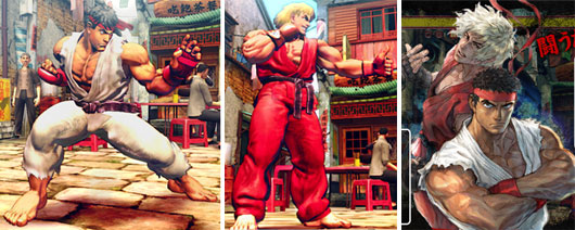
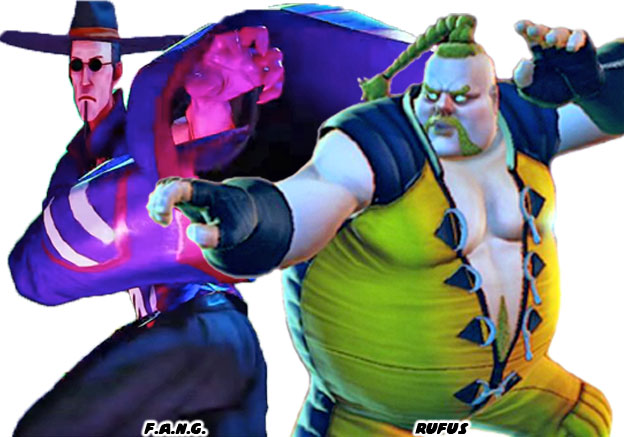
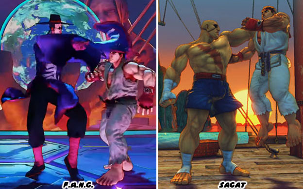
Over the last month I had talked a lot about the new, and returning faces in Street Fighter 6. I studied their outfits, the colors assigned to them, their nationality, and physical build. I did my best to try to figure out their roots, and fighting method, and share it with the visitors to my blog. In the end it reminded me that there was a style of character design that could be considered uniquely “Street Fighter.” By that same token there was a style of design that worked for Mortal Kombat, Tekken, King of Fighters, and Killer Instinct. The aesthetic of Capcom was distinct. This was thanks to the legacy of artists that had worked there. Akiman, Shoei, Bengus, Daigo Ikeno, Edayan, Kinu Nishimura were brilliant artists that had a hand in developing the style, and direction of the SF series.

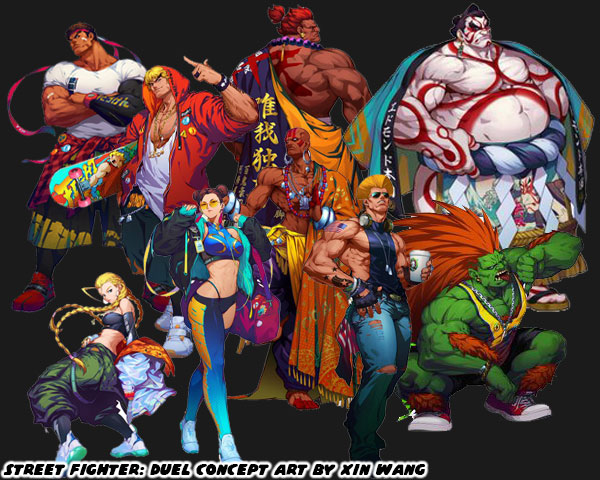
The newest designer Yusuke Hashimoto, was now putting his own unique stamp on the lineup. Yusuke had produced Bayonetta, so he was comfortable designing all manner of characters with different outfits, skin colors, builds, and body types. In short, he was the perfect person to shape the direction of this generation of fighters. With that said let’s try to figure out what made the “SF Style” distinct. The most obvious thing would be the costumes the characters wore. Could you really put a SF character in just any outfit, and would it work within the context of the game? I’m not saying that every character had to be wearing an authentic martial arts costume. That type of visual storytelling did not work great in SF. Instead there was a mix of pseudo-authentic costumes, and casual uniforms to break up the monotony. Consider for a moment what it would look like if everyone in the lineup wore casual clothing. Concept artist Xin Wang came up with fashionable makeovers for the SF cast in the Chinese mobile game Street Fighter: Duel. I would argue that Mr. Hashimoto’s designs were sort of a counter to that. He wanted to bring back the classics, but not go overboard with their costumes.

Long time fans would enjoy seeing their favorite characters in new outfits. However what did this do to new players? How did the game change by shifting just one element? Were new players able to make out the style of fighting that a character represented based on casual wear? Were they able to figure out what they could do based on the color of their skin, or their physical size? Now consider what costumes affected from a game play perspective. Was it easy to read the action on the screen if a character was covered up with long sleeves, or pants? What about vivid patterns, or clashing color choices on an outfit? Did these things make it easier to play the game, or were they distracting? I could argue similar points for excessive splashes of color, lightning, fire, smoke, etc. while the characters performed special attacks. There were many individual elements that made up the main costume choices for the SF cast. In the early days arcade cabinets, and game consoles lacked the memory, and processing power to render anything too detailed. The developers were limited to a simple outfit, and a primary color. This set the standard that was copied the world over. Now that consoles, and even mobile devices were more powerful then it became easier to create characters with highly detailed outfits, and millions of color choices. Was is then critical to take advantage of all this processing power? Or did putting too much into a costume’s detail take away from the overall presentation of the character?

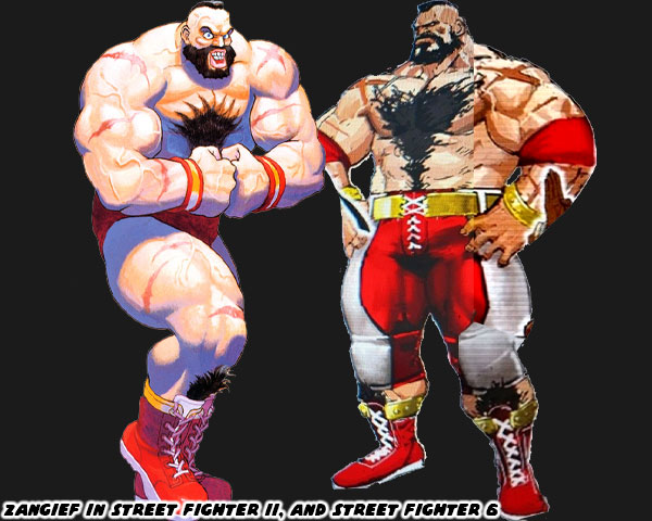
I welcomed the addition of Story, Arcade, and Battle costumes that were put into the library in SFV. I was not against a character getting an updated main costume in the series, as long as it didn’t stray too far from the original design. The importance of a primary costume still remained. This was why I had no objections to the new designs for Dhalsim or Blanka in SF6. There was even a chance for the studio to take a good idea, and make it even better. I thought this was 
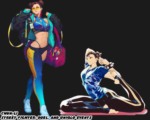
the case for Juri’s update. I saw the studio taking a step backwards when they revealed the new look of Chun-Li. They took away the small details that added up to make her costume truly stand out not only in the lineup, but across the spectrum of fighting games. Chun-Li perfectly encapsulated the Street Fighter school of design. It didn’t matter if you were from the Middle East, South America, or Europe. It didn’t matter if you had played a million fighting games, or if this was your first. When you looked at Chun-Li for the first time you almost instantly thought “Chinese Fighter.” Why was this? 

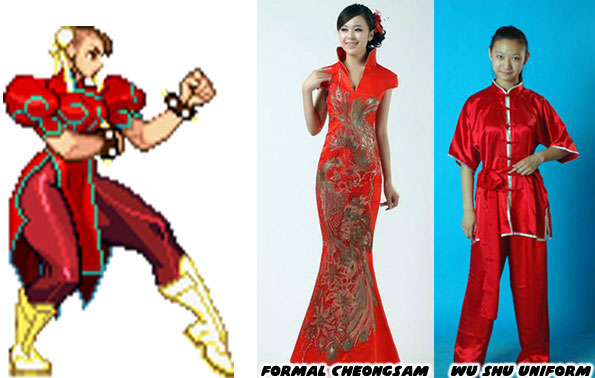
Audiences had seen Chun-Li’s prototype appear in pop culture generations before the game came out. Whether in story, film, photo, television, cartoon, or comics. The artists working at Capcom were pulling from various influences. People saw the repetition of heroic Chinese fighters, especially in Taiwanese, and Hong Kong cinema. They had seen physical Chinese representations in the form of certain hairstyles, makeup, and fashions. The cut of a dress, the use of ribbons, belts, sashes, and how they were assembled could be considered Chinese, or Mexican, or French, or American. Audiences had seen some combination of a wu shu uniform, or a traditional cheongsam at some point in the past. These were actual, traditional outfits from China. The genius of Capcom was how Akira “Akiman” Yasuda arranged certain elements when designing Chun-Li. The puffy shoulders, the pantyhose, wrestling boots, wide belt, and weighted bracelets had never been used in an actual martial arts costume, let alone any traditional Chinese dress. Audiences filled in the blanks with what they knew. They saw elements that they had seen before, and they assumed the rest was traditional Chinese. It was an absolutely brilliant trick, and set a standard that few studios could match. Yusuke Hashimoto showed that he was aware of what Akiman had done. Jaime in Street Fighter 6 followed the exact same design path of Chun-Li.

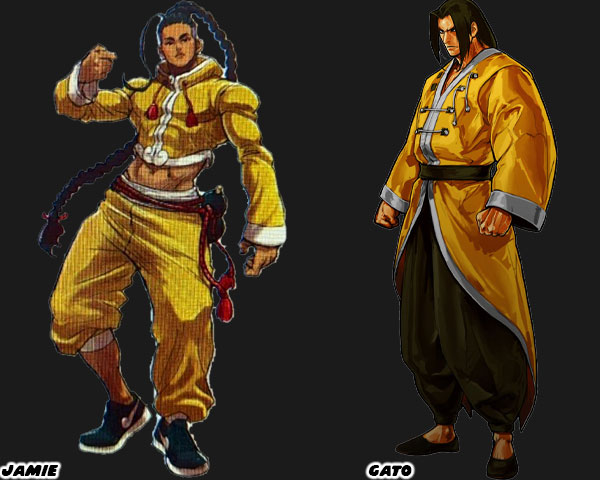
I want you to compare Jamie, and Gato who was a fighter from SNK’s Garou Mark of the Wolves. I had already highlighted Jamie’s various elements on my blog, but let me point them out again. Street Fighter 6 Director Takayuki Nakayama, Producers Kazuhiro Tsuchiya, and Shuhei Matsumoto, along with Yusuke Hashimoto spoke about the influence that Hip Hop had on SF6 in several interviews. Jamie was from Hong Kong, and at first glance it looked like he was wearing a traditional kung-fu outfit, but his costume had a decidedly urban flair to it. Just like Chun-Li it wasn’t apparent until you looked closer. The crop top, long sleeves, and wide collar were tailored to his frame, they were not baggy at all. This fit hadn’t really been worn in any traditional form of Chinese kempo, or kung-fu. The pants with one leg rolled up was a style from USA Hip Hop circles. The color of the fabric looked authentic, until you looked closer, and saw that it had a Louis Vuitton-inspired pattern on it.

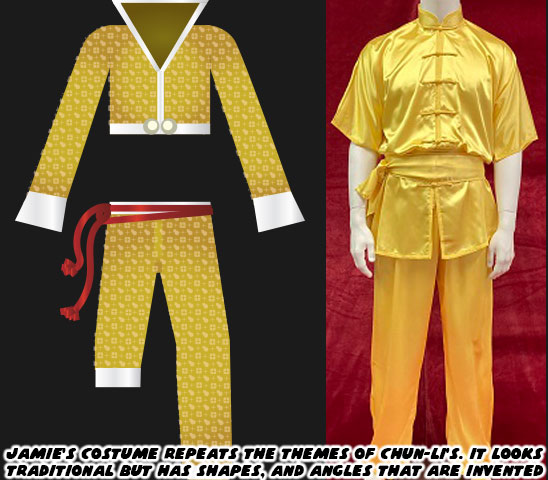
Jamie also wore sneakers with a cloud pattern at the front of what looked like the Nike swoosh design. Even his haircut wasn’t quite traditional. The long braid was supposed to make audiences think of the queue worn by men during the Qing Dynasty. Yet that hair style required the men to shave the front part of their scalp. Jamie instead had a modern fade on the sides, and back of his head. Jamie had a red rope belt with a wine gourd strapped to his hip. Many classical heroes in Chinese mythology such as
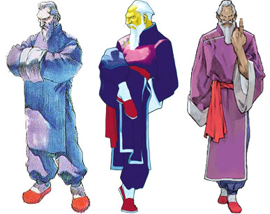
 Lu Zhishen, Ji Gong, and Li Tieguai carried a wine gourd as well. Capcom swore that Jamie was drinking a special juice, and not booze from the gourd. Jamie’s design really captured the SF Style, but it did not reflect the quality of the designs placed on some of the returning characters.

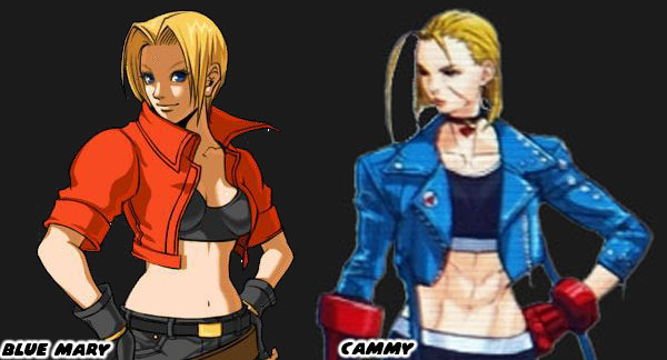
Cammy for example had an entirely new look that was much more casual than earlier looks. I felt that her short jacket, and leggings outfit betrayed the spirit of her original military-inspired uniform. My old friend DarthEnderX mentioned that she looked like a knock-off Blue Mary. That was a valid comparison. I had done a three part series on Blue Mary from the Fatal Fury series by SNK. Mary was essentially a female version of the protagonist Terry Bogard. She wasn’t a Sakura in terms to counterpart either, but more of a super cop like Chun-Li. Her look of jeans, and jacket was warranted as she was supposed to be very Western character. The casual costumes featured on the majority of SNK characters helped distinguish their lineup from Capcom’s. The Street Fighter-Style of character design relied on putting fighters in pseudo-traditional outfits. They had to be instantly recognizable to represent a certain country, school, or style. Like Ken, Ryu, Chun-Li, and Jamie. SNK had an entirely different approach. The genius of SNK’s design was that they hid the martial arts master in plain sight. They might be wearing a three-piece suit, a tuxedo, or a Hawaiian shirt, and flip flops. In every case they were unstoppable brawlers.

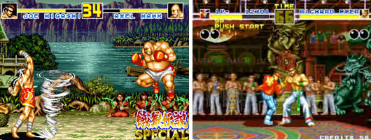
A good chunk of the Fatal Fury, Art of Fighting, and King of Fighters lineup were trained martial artists in street clothes. There were some with classical outfits sprinkled through the series, like Gato, Joe Higashi, and Kim Kaphwan. These traditional designs helped connect the audience to the well-dressed modern archetypes. If you are a budding designer, and are trying to figure out if your style works for SNK, Capcom, or other studios then practice creating fighters of common martial arts. See if you can put a karate fighter in a pseudo traditional gi. Or what that fighter would look like in a suit. How would audiences be able to tell that this person was a fighter? It’s a difficult exercise for sure. Capcom, and SNK had actually been broadcasting who their designs were targeted for in the past decade. We will explore these things in the next blog. I hope to see you back for that. If you have any thoughts on the blog please let me know in the comments section. As always if you would like to sponsor me please visit my Patreon page and consider donating each month, even as little as $1 would help make better blogs and even podcasts!
follow the Street Writer on Patreon!

Friday, June 24, 2022

The Red Tornado returns in Street Fighter 6, a look at Zangief.

Today we’re going to look at Zangief, and his updated look in Street Fighter 6. For the most part very little was done with the character. He doesn’t seem to have aged much, if at all. There is no gray in his hair, or beard. Also he remains as massive as ever. The primary color associated with him remains red. In Street Fighter II he wore red trunks, and boots with gold trim. This time he is wearing red pants with white, and gold accents. Given his size these aren’t normal pro wrestler pants, but instead the kind worn by USA football players. They do incorporate kneepads as well. The only other changes made to him are the addition of red elbow pads, and the tape on his wrists have been replaced with gold bracelets. I’m kind of surprised at this stage in his career he isn’t presented with the Capcom Wrestling Association championship belt. Similar to the way Darun Mister wore his belts in Street Fighter EX, and Fighting EX Layer. All in all I think this redesign maintains the classic look that we’ve come to expect from the Red Tornado.

By now you should have noticed that not one returning character in the series is wearing their same costume. They may have similar color choices, like Zangief, or go with a different color scheme like Ken, but in either case nothing is exactly the same in this sequel. These are bold directions from Street Fighter 6 Director Takayuki Nakayama, Producer Kazuhiro Tsuchiya, and Designer Yusuke Hashimoto. Previously the studio did their best to incorporate as many details from the sprite-based versions featured in SFII when being adapted for 3D. Even “minor” details like Ryu having ragged edges on his gi, while Ken had hemmed edges were not overlooked by Yoshinori Ono, and the team working on Street Fighter IV. I am not on board with all of the changes that they have made, but I do appreciate the tweaks that they made to designs to make them stronger. Changing the cut of Rashid’s uniform, as well as the cut, and color choices for Juri were well done. Completely revising Luke helped make him look less like a nationalist.

What do you think of the decision to completely redo the costumes for everyone revealed so far? Was this a good idea? Are you eager to get DLC of the classic costumes if Capcom offers them? My friends, and family know that I love playing as Zangief in the game. I can't wait to see how the studio has updated his move set, and special attacks. Did you ever play any of the wrestling characters in the franchise? I’d like to read your thoughts in the comments section. If you would like to sponsor me please visit my Patreon page and consider donating each month, even as little as $1 would help make better blogs and even podcasts!
follow the Street Writer on Patreon!

Wednesday, December 9, 2015

What is going on with the Street Fighter V character designs? Part 1, who is F.A.N.G?

I've been pretty quiet these past few months on the characters unveiled for Street Fighter V. However seeing as the majority have been announced I think we can start talking about them. Let's start with the newest character F.A.N.G. Let's put down the initial impressions of him. The character is dumb, he is ugly, he is insincere and has no redeeming factors.


I think it would be safe for me to say that F.A.N.G. is the new Rufus. He is a character that is so over-the-top, that is so beyond the conventions of the other Street Fighter characters that he simply doesn't belong in the game. This is really saying something considering that a rubber-limbed Indian and a green-skinned Brazilian wild man are considered some of the great all-time characters. So what is it about F.A.N.G. that doesn't work? Well his design is a sort of polar opposite of Rufus. Instead of a big, fat and dumb US character we have a tall, skinny and sneaky Chinese character. In either case we have extremes in stereotype, extremes in caricature that say a lot more about the producer and director of the game than of what Street Fighter has become.

Yoshinori Ono should be taken to task for every character, every design that makes in into the game. He was the one that pulled the Black Cobra and made a strong black character into a fat white character. The excuse was that he thought it would be funny to put a fatty into the game. He was the one that made sure that the Turkish character was beet red and obsessed with oil, he was the one that made sure that the masked Mexican wrestler named every move after a Mexican dish. He made sure that the returning black character in Street Fighter V was turned into a fat slob. And now the joke is that a tall skinny Chinese character is flying around the screen like a pelican. Stop and think about how he has presented the British, Japanese, white and female characters that are returning to the series. Is there any bias, whether intended or not, in his decisions?


As the producer Mr. Ono has the final say as to how the game is going to present itself. He has a reputation for being a funny guy, always kind to his fans, but very silly at the same time. This silly humor has found its way into the game in how the characters act, how their special moves appear and even with the constant use of breaking the fourth wall. The Street Fighter games that came before Mr. Ono were considered templates for great design. The ones that came after certainly looked nice and were well balanced but they did not contribute as much to the genre as the earlier titles. This is especially true with the appearance of F.A.N.G. I know some people read my blogs because I try and understand the roots of a character's design. The long sleeves given to his costume are more akin to Chinese opera than a traditional kung-fu uniform or even classic Mandarin robe.


The combination of sunglasses and robes has been seen many times before in film and television. Sometimes detectives set in pre-cultural revolution China wear fedoras and sunglasses while tracking down criminals. However in film the majority of those wearing the sunglasses and robes are villains. They are often mob bosses if not mob enforcers. A good example of these dangerous characters can be seen in the film Kung-Fu Hustle. The harpist assassins as played by Gar Hong-hay and Fung Hak were mysterious agents sent to kill some kung-fu masters. Their traditional costumes were nondescript. They seemed harmless until they unveiled their secret techniques. Of course there was nothing subdued about F.A.N.G.'s costume. The colors and cut on his robe were as flamboyant as his personality. Instead of a modest hat he wore the widest brim possible.


There was a reason why F.A.N.G.'s design had to be super exaggerated. Every character in the Street Fighter universe had been presented in a costume that looked traditional on a superficial level. Karate masters after all did not walk around with torn sleeves, and female masters of wushu did not really wear wrestling boots and spiked bracelets. F.A.N.G. had a costume that at first glance looked like a traditional robe and hat. But the more you looked at his costume the more you realized that they were as exaggerated as his proportions. F.A.N.G. wasn't just skinny, his head appeared as if it had been squeezed by a vice grip. His costume shared the same qualities, he didn't just have long sleeves, they could double as wings if he flapped his arms fast enough. It was absurd of course but also par the course for Street Fighter character designs.


Traditional Chinese costumes had been used for generations in pop culture. Whether they were in a movie, comic book or cartoon, the classic Chinese tunic had been seen many times by audiences and not solely on Chinese people either! These costumes were even finding their way into game designs. The Jiangshi for example were zombie-like Chinese ghosts. They could be summoned to life with a special talisman placed on their head. Since they were dead and rigor mortis had set in they had limited use of their limbs. Rather than shuffle around like a zombie these monsters had to hop around like rabbits. Read about it on the Chinese Ghost Primer. The jiangshi turned up in a number of modern games, for example you could fight them in Sleeping Dogs, specifically the DLC called Nightmare in North Point. The costumes and designs of the undead were stylized in the fighting game Vampire / Darkstalkers by Capcom. The sisters Lei-Lei & Lin-Lin aka Hsien-Ko and Mei-Ling wore very bright (and revealing) versions of the classic robes. The costume given to F.A.N.G. was no more different than what Capcom had done previously. At first glance it had the appearance of a traditional costume however upon further inspection it was something else entirely. Yet the costume, weird moves and silly personality were only part of the reason why F.A.N.G. didn't really inspire me.


In the reveal trailer we could see several things about the character. He was goofy and lanky of course but he was also quite tall. In fact he appeared to be as tall as Sagat, the once world champion. And like Sagat this new character was marking a place for himself in the pantheon of Shadowlaw / Shadaloo villains. In the reveal trailer there was a level that was set inside of a secret base. In the background there was a statue celebrating the leader and "generals" of Shadowlaw. Sagat was previously the second-in-command to Vega "the Dictator." Yet during Street Fighter V there is no sign of Sagat, not only that but his visage would not be in the background details either. Instead the bust of F.A.N.G. had been carved out of a mini Mt. Rushmore.


This flew in the face of everything that had been established about Shadowlaw from many years earlier. Whether it was mentioned in the game, in the comics or supplemental material The other generals were dangerous fighters in their own right. In propaganda posters, in Shadowlaw art the four figures were placed side-by-side in a show of solidarity. The generals looked intimidating but there was something about F.A.N.G. that did not match the gravitas of the earlier bosses. A one-eyed, seven-foot, muay thai fighter was a sight to behold. A seven-foot, flamboyant Chinese kung-fu master was also a sight to behold, but not for the same reasons. Why the designers working on Street Fighter V would replace the legacy character Sagat with F.A.N.G. didn't make much sense. Why they would go out of their way to erase any hint of Sagat was frankly insulting.


What were the roots of F.A.N.G. and why was he so bad? Was there anything about the character that might work? These are things that we can explore in the next blog. Right now I'd like to read your thoughts on the character. As always if you enjoyed this blog and would like to sponsor me please visit my Patreon page and consider donating each month, even as little as $1 would help make better blogs and even podcasts!