Showing posts with label character study. Show all posts

Sunday, June 7, 2026

Arjun in Street Fighter 6, a great warrior with a mediocre design

Hello friends, it’s been a few years since I’ve talked about Street Fighter 6. I was happy with everything that went into the game, and saw little reason to discuss the seasonal updates. Either you played them, or you didn’t. In the past three years I didn’t talk about the SNK characters that turned up in the game. I didn’t talk about the return of Elena, Crimson Viper, Ed, Sagat, or Alex. I didn’t even talk about the introduction of Ingrid from the cancelled project Capcom Fighting All-Stars or Tifa from Final Fantasy VII. I didn’t even talk about the resurrection of Bosch either. Yet with the Season 4 trailer that was played during the 2026 Summer Games Fest we have some new faces that I did want to talk about.

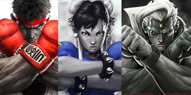
The first that caught my eye was Arjun. It was mainly due to the fact that he looked like Ryu with wild hair, and a long beard. As it was Ryu had taken on more of a monk-like appearance in the game. He already had a short beard, and wore a Kāṣāya, or traditional brown colored Buddhist monk robe over his gi. It showed growth for the character, and helped visually signal his story arc had concluded. He was not the young warrior traveling the globe as he was in the original Street Fighter. Nor was he the wandering champion post Street Fighter II. He had finally become a master, and had settled his life in a temple. He was essentially a philosophical, and visual opposite of Gouki / Akuma at this point. The thing I wondered was why the designers at Capcom would reuse the overall look. In fact Arjun appeared very much like some of the earlier concept art for Ryu. I honestly think this was a poor design choice from an otherwise great art team.

Street Fighter 6 Designer Yusuke Hashimoto was an absolute master of his craft. I had already sung his praises on this blog. He knew the importance of character art, and fashion design from his work on PlatinumGames Bayonetta, and Bayonetta 2. He helped redesign the iconic uniforms worn by all the classic SFII World Warriors, the New Generation from SFIII, and some of the faces introduced in SF IV, and V. If there was a person that I trusted to help create a new SF 6 character it would be Mr. Hashimoto. With that said I think Arjun fell flat. Some people online theorise that this design was from somebody else on the team, because he might be busy helping with a SF 7 roster, or major SF 6 update. In either case I appreciated that Capcom was putting in a distinct warrior to represent Nayshall in the game. Previous to Season 4 Bosch was the iconic fighter from the region. He had a great look, a great origin story, and his arc was crucial to the plot of the World Tour mode. Unfortunately he was an unplayable character. This was similar to the other important characters from the region, including Nayshall freedom fighter Rewancha, Fou-Lu the dragon of Nayshall, and Kalima the leader of the Nayshall Resistance.

These were all fantastic designs, but sadly all the Nayshall figures were NPCs as well. It’s great that we would finally be able to play as Bosch in Season 4, however we would be getting a completely new representative too. I believe that Arjun was a good guy. Not only that but I think this person created to take down JP once and for all. The name Arjun was based on Arjuna from the Mahabharata. He was a mighty warrior in the story, and regarded for his bravery, strength, but also for his talents in the arts. The name itself represented several things such as white, clear or silver. He could see those things in the color of his pants, and the silver chains on his belt. Arjuna can can also go by other names such as Vijaya (विजय) – always victorious, invincible and undefeatable, Jiṣṇu (जिष्णु) – triumphant, conqueror of enemies, and Bībhatsu (बीभत्सु) – one who always fights wars in a fair, stylish and terrific manner and never does anything horrible in the war. All of these things might be true of the character. If so then he is the opposite of JP. He would be fighting to undo his silent coup against the people of Nayshall.

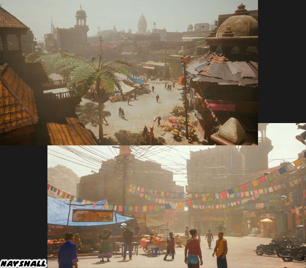
Capcom did tremendous world building around the fictional Nayshall. This region, its language, and NPC designs borrow heavily from Nepal. The actual border country sits between China, and India. Nepal itself pulls elements from multiple cultures, while also creating its own identity. Nayshall was as unique in the Street Fighter universe. There was a tremendous love, and respect that the team at Capcom had for the people they were reflecting. You could tell in the look of this place, in the plot of the game, the language on the billboards as well as the graffiti in the lowlands, not to mention the thousands of supporting details. Nayshall was easily one of my favorite places to visit in any modern game. In fact I said that this place had more life, and personality than any of the regions in the Norse God of War titles. I stood by my statement then, and still think that way today.

With that said I still think Arjun is a poor design. I haven’t even seen his move set, or know his exact role in SF6. From a visual perspective however I think he has one of the weakest looks in the franchise. It is very plain, and poorly thought out. Several of the NPC characters had a better look. I get that the concept art for Ryu was worth revisiting. Yet I do not think that it was strong enough to support an entirely new character. I don’t know what the studio was thinking with Arjun aside from someone to carry the plot forward. There was another new character announced for Season 4 that I thought had stronger design elements. I’d like to talk about that in the next blog. Until then I would like to know what you thought about the SF6 announcement this year. Tell me about it in the comments section. As always if you enjoyed this blog, and would like to sponsor me please visit my Patreon page and consider donating each month, even as little as $1 would help make better blogs and even podcasts!
follow the Street Writer on Patreon!

Saturday, December 14, 2024

The Street Fighter 6 master class index

I am grateful for all the new readers to the blog at the end of 2024. I noticed that a number of different entries into my Street Fighter 6 master class were getting shares. For those that do not know I did a 30-part series in 2023. It took a lot out of me, in fact I got super sick because I was spending so much time working on it. I’m pacing myself better now. For those that are interested here are all the links. I discuss the history of Capcom, Street Fighter, Final Fight, and the arcade legacy. We look at the mechanics of fighting games. We dissect the origins of the cast, and how they were improved over time. Plus how the new developers were making everyone a better fighting game player. Please share this if your friends love fighting games. 


As always if you would like to sponsor me please visit my Patreon page and consider donating each month, even as little as $1 would help make better blogs and even podcasts!
follow the Street Writer on Patreon!

Wednesday, July 13, 2022

Figuring out the changing Street Fighter Style, final part

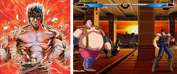
In the previous blog I mentioned that the characters in the King of Fighters, and King of Combat series tended to go over well with the broader Asian market, especially the Chinese. If you wondered why Asian-style leads were younger, or less muscular than the archetypes that Americans tended to favor I want you to think about pop culture. Think about every anime, and manga you had ever seen. There were some very muscular stars throughout history. Hokuto No Ken / Fist of the North Star, Dragon Ball Z, and Baki featured swollen leads. However those titles were the exception, and not the rule. The vast majority of manga, and anime featured characters with skinny-to-average builds. More often than not the stars were high school, or middle school kids. It wouldn’t make any sense for them to be huge, or vascular.

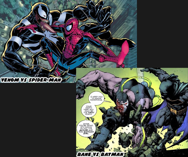
By comparison comic book, and animation heroes in the US were fully grown adults. They almost all had bodybuilder physiques. The villains were sometimes even more physically imposing than the heroes. Think of the difference between Batman, and Bane, Spider-Man, and Venom, the Hulk, and the Abomination. There was a distinct size advantage to the rivals. Even relatively young characters like Robin, or Kid Flash were often drawn more muscular than the average child. It stood to reason that Japanese studios would try to create equally buff characters when trying to appeal to the west. 

I think that the market had a bigger influence on the design changes happening at SNK, and Capcom than they had discussed publicly. Money talked, and if a studio wasn't hitting their goals then they had to find a new direction. In the previous blog I mentioned that DIMPS had co-developed Street Fighter IV. It was something that not everybody in the fighting game community was aware of. I believe that they had a hand in influencing the look of C. Viper, and Rufus. Even studios outside of Japan got a chance to shape the direction of the series. The Malaysian company Streamline Studios helped in pre-planning and development of Street Fighter V It wasn't the only time that an outside studio had shaped the direction of a flagship title. Most publishers outsourced some work to smaller developers. They might have built assets from the game, painted backgrounds, or created the title, and ending credits. The bigger the budget the more work a studio had to build from, and possibly outsource. If a game didn't perform then the publisher had a reason to cut down the team size, or try something different.

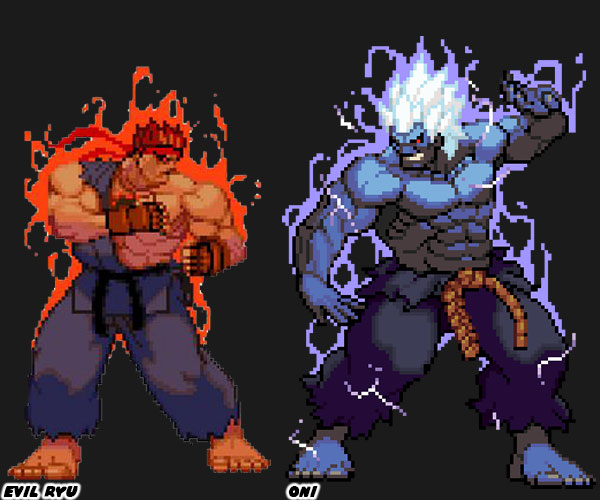
Street Fighter IV sold over 9 million units, across all versions, and platforms. It was credited with relaunching the fighting game craze. Street Fighter V sold over 6 million units, across all versions, and platforms. Both were hits, but they did not outsell Mortal Kombat X, which was just shy of 11 million units, and Mortal Kombat 11 which sold 12 million. The lack of numbers compared to MK, plus the drop off in sales from SF IV to V probably had a hand in seeing Yoshinori Ono leave Capcom. It wasn't the only reason that a change was warranted. Mr. Ono had lead the company to some interesting places during his tenure. He brought back a number of classic characters, but also introduced a number of odd ones as well. Rufus, Hakan, and F.A.N.G. stretched the idea of what worked in the series. They looked, and played like he was trolling audiences. He brought Gouken back from the dead. His murder was integral to Ryu, and Ken's story. All of a sudden he was alive without explanation. Then he introduced Kage, and Oni which were evolved versions of Evil Ryu, and Gouki respectively. These characters were already well designed, they didn't need an upgrade. To many in the community he was pushing the series very far from its roots. 

A new team made up of internal members had to step in. Director Takayuki Nakayama was joined by Producer Kazuhiro Tsuchiya, who had been with Capcom since 1992, Produced Asura’s Wrath, and was the lead Producer on the Mega Man series since 2018. Producer Shuhei Matsumoto had worked on Street Fighter: 30th Anniversary Collection, Marvel vs. Capcom: Infinite, Ultra Street Fighter II: The Final Challengers. Designer: Yusuke Hashimoto had Produced Bayonetta, and Directed Bayonetta 2. It was up to them to steer the ship in a new direction, without losing the Street Fighter Style. They had mentioned in interviews how they wanted the game to feel like a worthy successor to SFII. That meant they wouldn't have as many fantastic elements, and over-the-top characters as audiences had seen previously. The game would be focused on fantastic, but plausible fighters. Closer to the World Warriors, rather than Rufus, and other joke designs. So let’s have a thought exercise. If you were Japanese employee, working at Capcom, and tasked with creating a character that would appeal to American audiences, who would you come up with? It might be a pro wrestler, as wrestling was still popular, or it could be a more contemporary mixed martial arts (MMA) star.

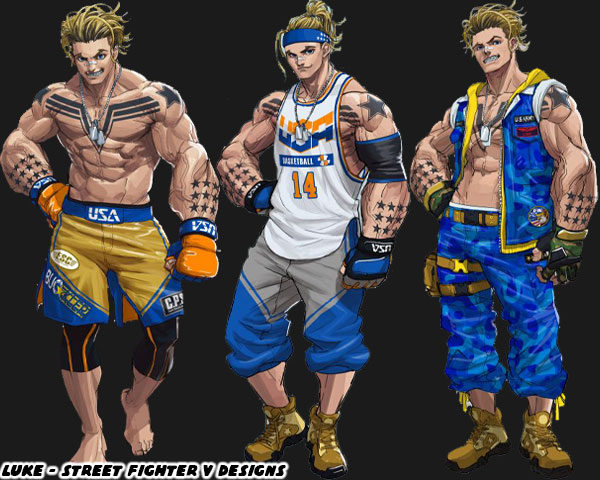
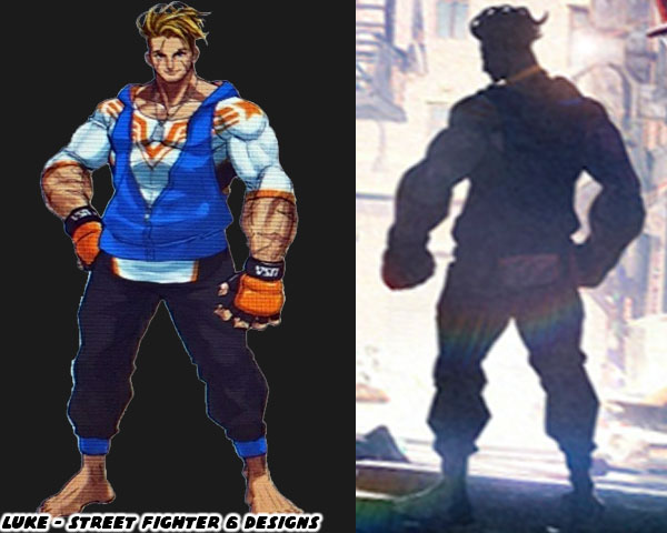
Luke appeared like an up-and-coming MMA star. The new designers followed the rules that Capcom had established in 1987. He was a muscular, blond haired white guy. He could certainly never be mistaken for the skinny Kyo, or Shun’ei. The difference for Capcom this time was that the character was much younger than the other leads in the series. He was younger than Ken, Alex, and Abel when they made their debuts in SF, SFIII, and SFIV respectively. He was roughly the same age of Ryu in Street Fighter Zero / Alpha. Using the SF style of character design they tried to give him a pseudo-traditional martial arts outfit. MMA fighters often wore shorts, sometimes a rash guard. Luke was given both. He also had striking gloves instead of larger boxing gloves. His color scheme was distinct, he wore gold, and blue, the colors of the Capcom logo. The pride in his nation was displayed on his main, and alternate costumes. The USA logo, the dog tags, the US Army fatigues, and Team USA basketball jersey to name a few.

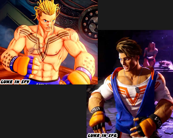
Despite his age he was a special forces op. He was a skilled fighter with a patriotic duty, somewhere in between Cammy, and Guile. The thing about his main costume was that it didn’t allow much material to establish his color, and identity. By comparison think about how much the colors, and costumes on Ryu, Ken, Chun-Li helped frame them. The designers at Capcom made up for it by covering his arms, and chest is solid black tattoos. It wasn’t the only thing the studio did to give him a distinct look. They gave him cartoonishly large forearms, this completely changed his profile. It made it so that despite his height, it looked as if he could hold his own with larger characters. They were design choices that wouldn’t have necessarily been used in a newer KOF game. The differences between Luke, and Shun’ei reflected both the aesthetic of Capcom, and SNK, as well as the target audience that they were going after. Capcom wanted to push the series forward in SF6, age the cast slightly, and give them new costumes. Luke’s uniform was changed to cover him up. Not only that but he lost the logo colors, going now to black, blue, white, and orange. His forearm tattoos were replaced with scars, and the chest tattoo was put on his rash guard. I think it was a good choice to leave the tattoos behind because patriotic symbols had been co-opted by the far right in recent years. 

Despite these changes you could still identify him even with just his outline because of his cartoonish proportions, and wavy haircut. I’m not sold on the colors selected for the fighter. I think that blue, and gold worked better for him. That’s my opinion anyhow. I think he would still be popular among new players. With character costumes becoming more casual, and more conservative in SF6 do you think that Capcom was moving closer to the SNK style? That's how it seemed with designs like Cammy, and DeeJay. Was this a good idea to attract new players? Do you think this was a business decision? I’d like to hear your take in the comments section. Let me know what you think defines the Capcom, SNK, or any other publisher style. As always if you would like to sponsor me please visit my Patreon page and consider donating each month, even as little as $1 would help make better blogs and even podcasts!
follow the Street Writer on Patreon!

Wednesday, July 6, 2022

Figuring out the changing Street Fighter style, part 1...

Over the last month I had talked a lot about the new, and returning faces in Street Fighter 6. I studied their outfits, the colors assigned to them, their nationality, and physical build. I did my best to try to figure out their roots, and fighting method, and share it with the visitors to my blog. In the end it reminded me that there was a style of character design that could be considered uniquely “Street Fighter.” By that same token there was a style of design that worked for Mortal Kombat, Tekken, King of Fighters, and Killer Instinct. The aesthetic of Capcom was distinct. This was thanks to the legacy of artists that had worked there. Akiman, Shoei, Bengus, Daigo Ikeno, Edayan, Kinu Nishimura were brilliant artists that had a hand in developing the style, and direction of the SF series.
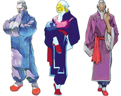
The newest designer Yusuke Hashimoto, was now putting his own unique stamp on the lineup. Yusuke had produced Bayonetta, so he was comfortable designing all manner of characters with different outfits, skin colors, builds, and body types. In short, he was the perfect person to shape the direction of this generation of fighters. With that said let’s try to figure out what made the “SF Style” distinct. The most obvious thing would be the costumes the characters wore. Could you really put a SF character in just any outfit, and would it work within the context of the game? I’m not saying that every character had to be wearing an authentic martial arts costume. That type of visual storytelling did not work great in SF. Instead there was a mix of pseudo-authentic costumes, and casual uniforms to break up the monotony. Consider for a moment what it would look like if everyone in the lineup wore casual clothing. Concept artist Xin Wang came up with fashionable makeovers for the SF cast in the Chinese mobile game Street Fighter: Duel. I would argue that Mr. Hashimoto’s designs were sort of a counter to that. He wanted to bring back the classics, but not go overboard with their costumes.
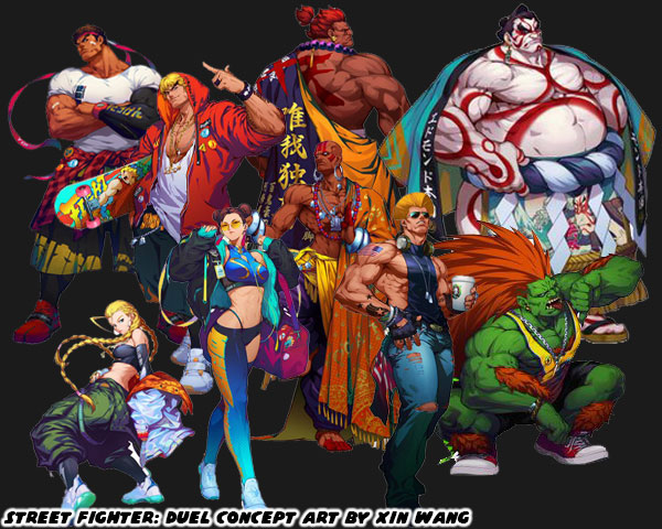
Long time fans would enjoy seeing their favorite characters in new outfits. However what did this do to new players? How did the game change by shifting just one element? Were new players able to make out the style of fighting that a character represented based on casual wear? Were they able to figure out what they could do based on the color of their skin, or their physical size? Now consider what costumes affected from a game play perspective. Was it easy to read the action on the screen if a character was covered up with long sleeves, or pants? What about vivid patterns, or clashing color choices on an outfit? Did these things make it easier to play the game, or were they distracting? I could argue similar points for excessive splashes of color, lightning, fire, smoke, etc. while the characters performed special attacks. There were many individual elements that made up the main costume choices for the SF cast. In the early days arcade cabinets, and game consoles lacked the memory, and processing power to render anything too detailed. The developers were limited to a simple outfit, and a primary color. This set the standard that was copied the world over. Now that consoles, and even mobile devices were more powerful then it became easier to create characters with highly detailed outfits, and millions of color choices. Was is then critical to take advantage of all this processing power? Or did putting too much into a costume’s detail take away from the overall presentation of the character?
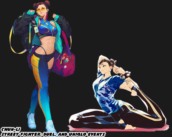
I welcomed the addition of Story, Arcade, and Battle costumes that were put into the library in SFV. I was not against a character getting an updated main costume in the series, as long as it didn’t stray too far from the original design. The importance of a primary costume still remained. This was why I had no objections to the new designs for Dhalsim or Blanka in SF6. There was even a chance for the studio to take a good idea, and make it even better. I thought this was the case for Juri’s update. I saw the studio taking a step backwards when they revealed the new look of Chun-Li. They took away the small details that added up to make her costume truly stand out not only in the lineup, but across the spectrum of fighting games. Chun-Li perfectly encapsulated the Street Fighter school of design. It didn’t matter if you were from the Middle East, South America, or Europe. It didn’t matter if you had played a million fighting games, or if this was your first. When you looked at Chun-Li for the first time you almost instantly thought “Chinese Fighter.” Why was this? 
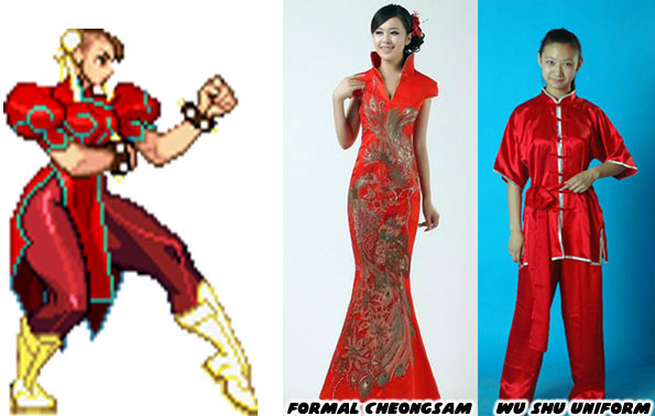
Audiences had seen Chun-Li’s prototype appear in pop culture generations before the game came out. Whether in story, film, photo, television, cartoon, or comics. The artists working at Capcom were pulling from various influences. People saw the repetition of heroic Chinese fighters, especially in Taiwanese, and Hong Kong cinema. They had seen physical Chinese representations in the form of certain hairstyles, makeup, and fashions. The cut of a dress, the use of ribbons, belts, sashes, and how they were assembled could be considered Chinese, or Mexican, or French, or American. Audiences had seen some combination of a wu shu uniform, or a traditional cheongsam at some point in the past. These were actual, traditional outfits from China. The genius of Capcom was how Akira “Akiman” Yasuda arranged certain elements when designing Chun-Li. The puffy shoulders, the pantyhose, wrestling boots, wide belt, and weighted bracelets had never been used in an actual martial arts costume, let alone any traditional Chinese dress. Audiences filled in the blanks with what they knew. They saw elements that they had seen before, and they assumed the rest was traditional Chinese. It was an absolutely brilliant trick, and set a standard that few studios could match. Yusuke Hashimoto showed that he was aware of what Akiman had done. Jaime in Street Fighter 6 followed the exact same design path of Chun-Li.
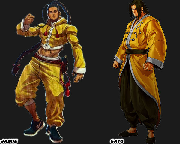
I want you to compare Jamie, and Gato who was a fighter from SNK’s Garou Mark of the Wolves. I had already highlighted Jamie’s various elements on my blog, but let me point them out again. Street Fighter 6 Director Takayuki Nakayama, Producers Kazuhiro Tsuchiya, and Shuhei Matsumoto, along with Yusuke Hashimoto spoke about the influence that Hip Hop had on SF6 in several interviews. Jamie was from Hong Kong, and at first glance it looked like he was wearing a traditional kung-fu outfit, but his costume had a decidedly urban flair to it. Just like Chun-Li it wasn’t apparent until you looked closer. The crop top, long sleeves, and wide collar were tailored to his frame, they were not baggy at all. This fit hadn’t really been worn in any traditional form of Chinese kempo, or kung-fu. The pants with one leg rolled up was a style from USA Hip Hop circles. The color of the fabric looked authentic, until you looked closer, and saw that it had a Louis Vuitton-inspired pattern on it.
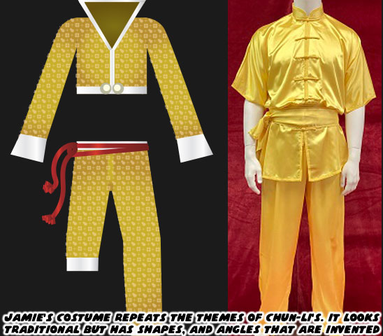
Jamie also wore sneakers with a cloud pattern at the front of what looked like the Nike swoosh design. Even his haircut wasn’t quite traditional. The long braid was supposed to make audiences think of the queue worn by men during the Qing Dynasty. Yet that hair style required the men to shave the front part of their scalp. Jamie instead had a modern fade on the sides, and back of his head. Jamie had a red rope belt with a wine gourd strapped to his hip. Many classical heroes in Chinese mythology such as Lu Zhishen, Ji Gong, and Li Tieguai carried a wine gourd as well. Capcom swore that Jamie was drinking a special juice, and not booze from the gourd. Jamie’s design really captured the SF Style, but it did not reflect the quality of the designs placed on some of the returning characters.
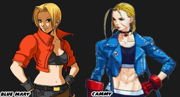
Cammy for example had an entirely new look that was much more casual than earlier looks. I felt that her short jacket, and leggings outfit betrayed the spirit of her original military-inspired uniform. My old friend DarthEnderX mentioned that she looked like a knock-off Blue Mary. That was a valid comparison. I had done a three part series on Blue Mary from the Fatal Fury series by SNK. Mary was essentially a female version of the protagonist Terry Bogard. She wasn’t a Sakura in terms to counterpart either, but more of a super cop like Chun-Li. Her look of jeans, and jacket was warranted as she was supposed to be very Western character. The casual costumes featured on the majority of SNK characters helped distinguish their lineup from Capcom’s. The Street Fighter-Style of character design relied on putting fighters in pseudo-traditional outfits. They had to be instantly recognizable to represent a certain country, school, or style. Like Ken, Ryu, Chun-Li, and Jamie. SNK had an entirely different approach. The genius of SNK’s design was that they hid the martial arts master in plain sight. They might be wearing a three-piece suit, a tuxedo, or a Hawaiian shirt, and flip flops. In every case they were unstoppable brawlers.
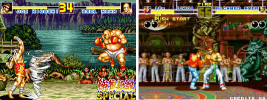
A good chunk of the Fatal Fury, Art of Fighting, and King of Fighters lineup were trained martial artists in street clothes. There were some with classical outfits sprinkled through the series, like Gato, Joe Higashi, and Kim Kaphwan. These traditional designs helped connect the audience to the well-dressed modern archetypes. If you are a budding designer, and are trying to figure out if your style works for SNK, Capcom, or other studios then practice creating fighters of common martial arts. See if you can put a karate fighter in a pseudo traditional gi. Or what that fighter would look like in a suit. How would audiences be able to tell that this person was a fighter? It’s a difficult exercise for sure. Capcom, and SNK had actually been broadcasting who their designs were targeted for in the past decade. We will explore these things in the next blog. I hope to see you back for that. If you have any thoughts on the blog please let me know in the comments section. As always if you would like to sponsor me please visit my Patreon page and consider donating each month, even as little as $1 would help make better blogs and even podcasts!
follow the Street Writer on Patreon!