Showing posts with label gatchaman. Show all posts

Friday, March 23, 2018

The Giant Monster Series, Final Part


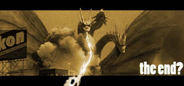
The giant monster genre has entertained movie audiences for almost a century. However the legends that inspired those creatures were much older than that. In a way they were the roots of the fairy tales, the religious parables and the creation myths thousands of years old. The giant monster was a way to explain the uncertainty of life, the terrible tragedies and natural disasters. Chaos was easier understood when people could put a shape and name to it. There were artists in the modern world that were exceptional at capturing the images of chaos. People like Ian Miller, Wayne England and Mark Gibbons created horrific creatures with an exceptional level of detail. It was as if they were tapping into the fears of primitive civilizations and framing nightmares in ink and paint. Then there were artists that took the opposite approach while rendering the giants of chaos. An artist like Bob Eggleton made classic beasts like griffons and dragons accessible and managed to do the same to modern legends like Godzilla. Eggleton was not alone in this regard, the painter Yasushi Torisawa and Bill Gudmundson kept the images of those primal heroes and villains alive. In pop culture circles the comic book style illustrator Matt Frank AKA the Kaiju Samurai had earned a strong following. The artist that I would like to highlight today is the best representative of the many themes I have explored over this series, including science fiction and horror.

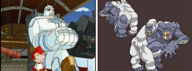
Thomas Perkins is an illustrator and character designer in title but his volume of work is much more than just that. His designs on the original Ben 10 series earned him an Emmy. It validated his time in animation as much as his impeccable style. Mr. Perkins had cut his teeth designing for the great Richard Raynis on a string of projects including the Extreme Ghostbusters, Big Guy and Rusty the Robot, Godzilla: the Series, and the Jackie Chan adventures. It was impressive that Mr. Perkins actually got a chance to follow in the footsteps of Geof Darrow, the artist on the Big Guy and Rusty graphic novels. Geof's insanely detailed giant monster illustrations became the stuff of legend in the community. Mr. Perkins was certainly no slouch while crafting his own villains. The beasts that the Big Guy and Godzilla battled over several seasons were consistently great.

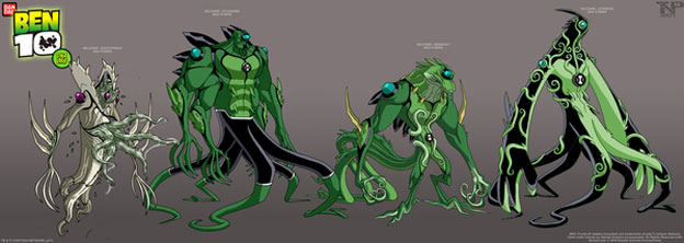
His work on the Ben 10 series was known by every kid and kid-at-heart in the US. The people he worked with created the monsters Spidermonkey, Humongousaur, Jetray, Chromastone and Swampfire. The assortment of creatures that Ben Tennyson could turn into and battle were amazing. He followed up with a new library of creatures in Ben 10 Alien Force and Ultimate Alien. Here's a sampling of the characters he designed: Ditto, Waybig, Artiguana, Upchuck, Benwolf, Benmummy, Ben 10K, Ken 10, Gullet / Samohtsnikrep, Benviktor, Charmcaster, Eye Guy, Captain Kork, and Big Chuck. The characters in Ben 10 Omniverse were designed by Derrick J. Wyatt as an homage to the original creatures. These creatures would influence countless generations of designers. It would not be a stretch to say that his work over the years became the encyclopedia of modern monster designs. What made the artist special however were the illustrations and characters that most people never get to see. He detailed many of these designs on his blog and liked to insert as many comic book references and insider jokes as he could. For example one of his original characters, Kid Kuthulu, was a vintage hero that could only have existed if HP Lovecraft were a comic book writer.
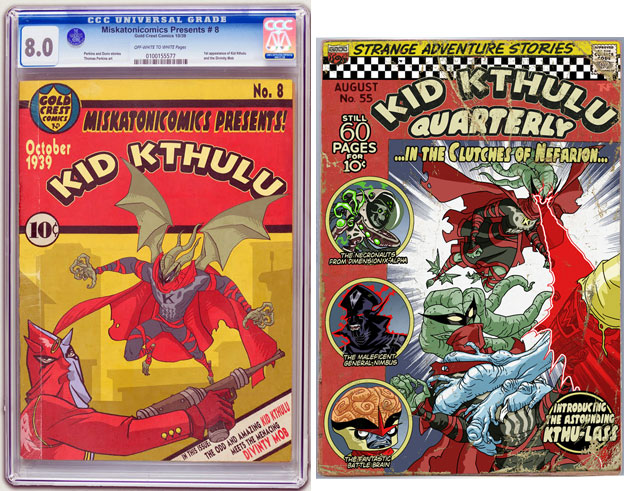

Mr. Perkins' best work may be in deconstructing and rearranging pop culture characters and references. He had done revisionist versions of the Marvel and DC characters from the 70's that would work in the modern, Bruce Timm-style, super hero cartoons. He had even created a few convincing illustrations of Chinese bootleg super heroes just for fun.
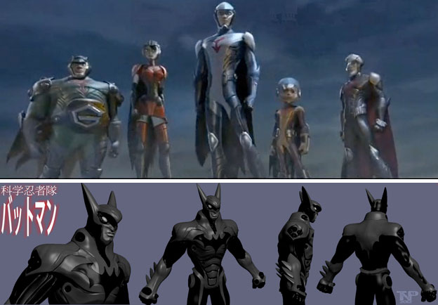

Recently he did a version of Batman that was set in the Science Ninja Team: Gatchaman universe. Instead of going with the classic animated show as a template he followed the more recent Imagi studio redesigns of the characters. His version of "Batchaman" was genius and certainly deserved a chance for a DC spin-off.
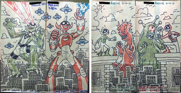


As if Mr. Perkins was not busy in television he was also busy being a dad. His entry for father of the decade would be posted on the Lunch Bag Blog. He illustrated a multi-panel scene on his kid's lunch bags every day of every week during their school year. He turned his kids into super powered characters and let their adventures be told over several seasons. He took the interests that each had and built narratives around their hero persona and the powers they had. On occasion little sister Perkins Lass Purple would join her brothers Red and Green on their adventures. More often than not the kids ended up fighting against or even fighting as giant monsters.
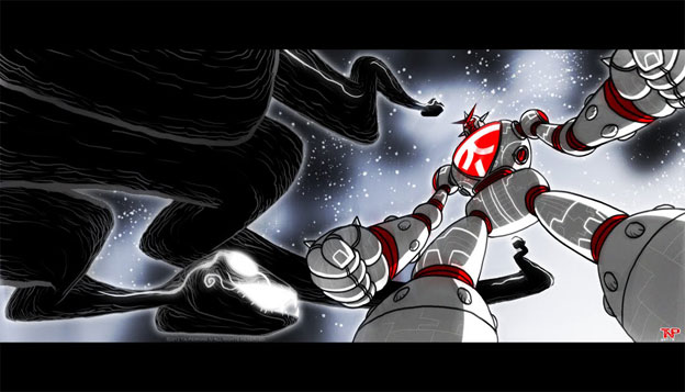

Thomas Perkins should be celebrated as one of the best giant monster designers ever. His style could be read very easily by comic book and animation fans equally. His use of lines and shapes were clean, even when drawing the grotesque. He gave all of his creatures personality on top of presence. The giant monsters written about over the course of this series have all shown some level of personality. They are remembered for more than their awe inspiring size and power. They have existed in our dreams and myths since the dawn of time and will continue to fill the spaces in the minds of future generations. Mr. Perkins is one of the artists working in animation that understands that all too well. I am glad that he is one of the people working to keep the genre alive and well.

I hope that you have enjoyed this series and give pause to think about some of your favorite giant monsters and giant monster games as well. Hopefully there will be some more great monster stories to write about as new games and movies get off the ground. If you have any thoughts or comments on the series please let me know in the comments section.

Sunday, October 15, 2017

Zeku, the ninja spirit from the '70s finally returns!

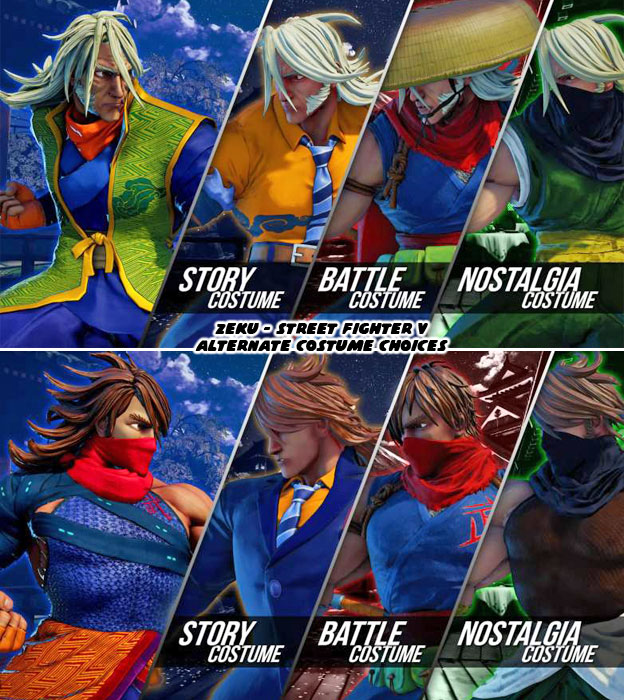
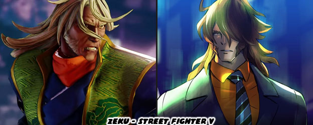
Hello friends, welcome back to another quick character design breakdown. The latest Street Fighter V character has just been revealed. Many people had predicted this character based on the silhouette that was unveiled by Capcom many months ago. The unique hair really was what gave this character away. In case you didn’t know who I was talking about it was the ninja Zeku.


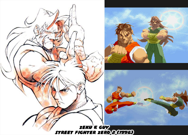
In canon Zeku was the master of Guy, one of the star characters in Final Fight. What made Zeku unique was that he was never a playable character in any previous game. In fact his appearance was very rare. Final Fight was an arcade hit and was ported to several different consoles. In 1993 it spawned a sequel for the Super Nintendo. At that point the only returning character was Haggar. Maki, another fighter from the same clan as Guy had joined his battle against the Mad Gear Gang. Then in 1996 a third Final Fight was released, including the return of Guy to the lineup. At about that time Capcom was also working on a follow up to Street Fighter Zero / Alpha. They had Final Fight on the mind and were going to retcon the events of Street Fighter, Street Fighter II and Final Fight in this new game. Street Fighter Zero 2 included Guy and Rolento from the Final Fight series as well as some Metro City-themes stages. It was at this point that Capcom introduced the world to Zeku.


Zeku appeared very briefly in Guy’s ending. A sort of final showdown between the master and the student. This in addition to the official character art led a lot of Street Fighter fans to speculate that Zeku would soon be joining the lineup. Nobody thought that it would take Capcom 21 years to actually do this. Senior artist Bengus was responsible for his look. It was appropriate that Bengus would update the character for Street Fighter V. It’s funny that I should use the word update when what he did was actually keep the look decidedly “old-school.” Zeku was actually a nod to the characters and artists that influenced the Capcom designers from a young age.


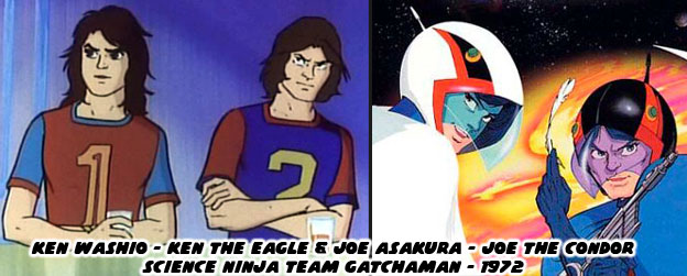
The long, wild, hair of Zeku had its origins in the “70s, when it was trendy for men to sport this look. One of the biggest hits of the time was Science Ninja team Gatchaman, a show from 1972 that was adapted for the USA as Battle of the Planets. The series worked for a number of reasons, not the least of which was that it was a unique blend of different elements. The stars looked like everyday people. They wore shirts and (bellbottom) jeans. They had long hair and sunglasses, making them easily the coolest animé characters of the era. Also the henshin, or transforming hero shows, were just starting to take off in Japan. This was one of the first animated shows to use that concept. It took a group of ordinary teens and turned them into costumed superheroes. What kid growing up didn’t want to be just like them? The Capcom designers were kids and young men during this era. Although Street Fighter is not filed with characters like Viewtiful Joe, the ‘70s aesthetic did leave an impression with many of the artists.


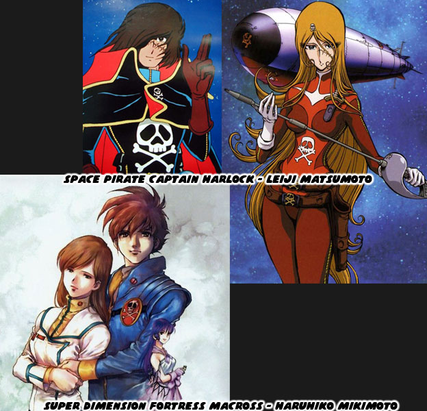
Animé was evolving by leaps and bounds during this era. When manga and animé first took off many designers were copying the style of Osamu Tezuka, considered The Godfather of animé. Gatchaman was pulling away from the Tezuka style, creator Tatsuo Yoshida wanted a more rebellious look for his heroes. This was a stark difference from his previous work on the clean-cut Speed Racer. This rebellious attitude and freeform character designs were combined with the popularity in science fiction. Leiji Matsumoto created the iconic Space Captain Harlock in 1977. His style was very different than his contemporaries, nobody created figures with the same super-exaggerated proportions. His men were almost as slender as his female characters, yet they all oozed personality. He introduced an entirely new aesthetic into animation. Figures had to push the envelope of body types. There could be squat fat men and lanky femmes on frame and somehow it worked. His anti-hero designs were the envy of all. His iconic skull and crossbones would somehow find their way into other manga and animé (and Mad Gear) as well. The next evolutionary step in character design was from an artist known as Haruhiko Mikimoto. The animé Super Dimension Fortress Macross was another sci-fi smash hit. The series began in 1982, and was among the great space operas. Mikimoto further distanced his work from his predecessors, but there were still connective tissue on the heroes and villains. The long hair, sideburns were trimmed but the rebellious spirit was still there.


Zeku was a call-back to the hyper-cool heroes like Ken “the Eagle” Washio and Joe “the Condor” Asakura. It wasn’t enough that he carried over the hair, but his actual facial features, the angles on his jaw and eyes were very much spot-on with the Matsumoto aesthetic. Go back to the illustration at the top of the blog and take a closer look at the “young” version of Zeku. As it appears Zeku had two different sets of costumes. They look like his current older version and a set based on how he looked as a young man. It would make sense that 40 years ago Zeku was in his prime, he would have worn clothing and had hair that looked like he was right out of the ‘70s. Long time Capcom fans would be the first to spot the blue and red uniform that he sported was similar to that of Strider Hiryu as well. Here’s where things get very interesting for the ninja master.


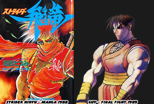
Strider was a character designed by Tatsumi Wada and published by the artist collective Moto Kikaku in 1988. The manga was in collaboration with Capcom who wanted to have their own henshin superstar. The manga set the groundwork and the arcade release came out a year later. During the same development cycle Capcom was also working on Street Fighter ’89 / Final Fight. I believe that Guy was pulled from the same design notes that went into Strider. The comparisons between the two were more than skin deep. Strider was of course presented with a blue uniform but audiences didn’t know that with the original red-toned cover. The genius design element that grounded Guy in the present were his high-top sneakers. The genius design element that grounded Zeku in the past were his ‘70s haircut and fashion choices. If Capcom were to lay the foundation for a Strider reboot then this would be their chance. According to canon Strider Hiryu was born in 2030. At that time Guy would be as old as Zeku was now. And if Zeku were still alive he could have launched the organization fighting against global terrorism. That was of course if Capcom were looking at their long-term game strategy. Even if not Zeku was a welcome addition to the lineup. He certainly had more care given to his re-introduction than either Birdie or Abigail. As always if you enjoyed this blog and would like to sponsor me please visit my Patreon page and consider donating each month, even as little as $1 would help make better blogs and even podcasts!

 follow the Street Writer on Patreon!