In the previous blog I featured fan art of a Sonic Team character that never was. Selph was a cancelled boss character for the original NiGHTS into dreams… I speculated what the character looked like, and even that the studio turned the character into Chaos for the Sonic Adventure series. It wasn’t the only time I speculated on their characters. Not long ago my kid asked if I had seen Metal NiGHTS. I had never heard of this iteration of my favorite mascot. It turned out that
Metal NiGHTS was hidden in Sonic Superstars, along with Metal Tails, Metal Amy, and more. This inspired me to create fan art on what a meeting of the characters would look like.
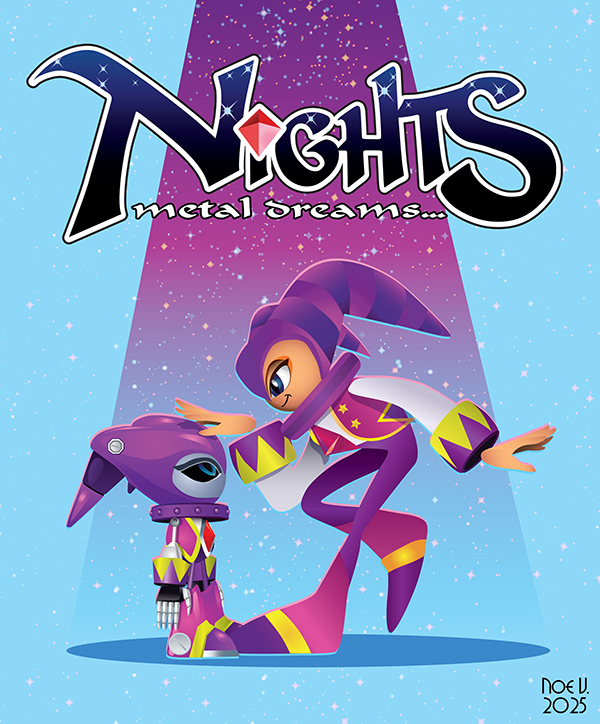
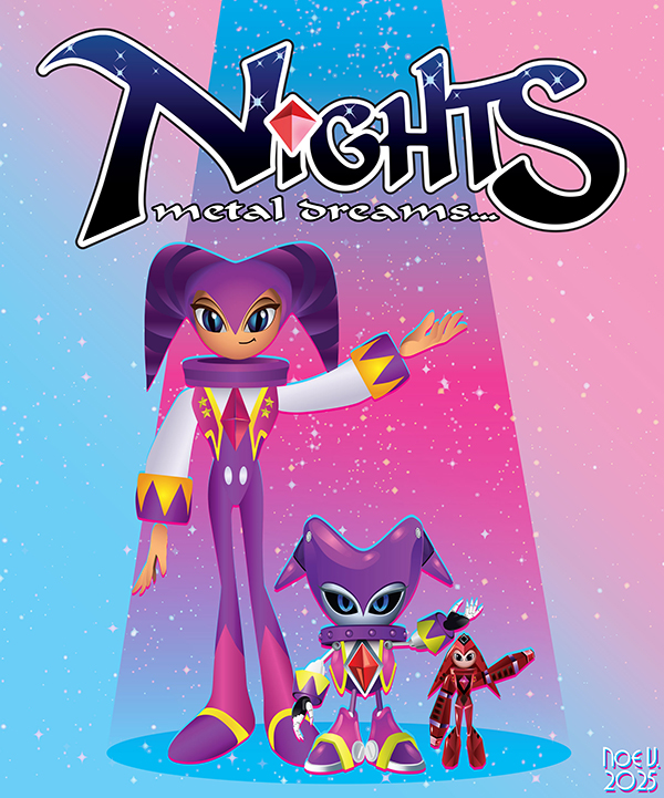
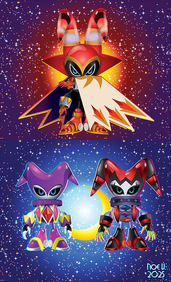
That illustration launched a creative rush, and I had to capitalize on it. It had been a long time since I've drawn back-to-back pieces in illustrator. I remembered that there was a smaller Mecha NiGHTS that was a hidden asset in the original game. So I absolutely had to put together a family portrait.
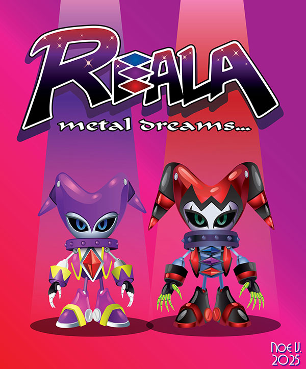
Then as long as I was drawing metal versions I figured there should be a Metal Reala as well. There was not a version in Sonic Superstars, but that didn't stop me from drawing it up. Some people call these little guys chibi-versions but technically they are classic Sonic proportions, rather than modern Sonic. Reala was just a hair bigger than NiGHTS in the original game, so even his metal version was a little bigger as well.
As long as I was creating versions of the robots that never existed I thought about the third “brother” from the series. I absolutely had to create an illustration for Metal Jackle. This character was much bigger than NiGHTS in the original game. He was actually about four times the size of the other hooded nightmarens.
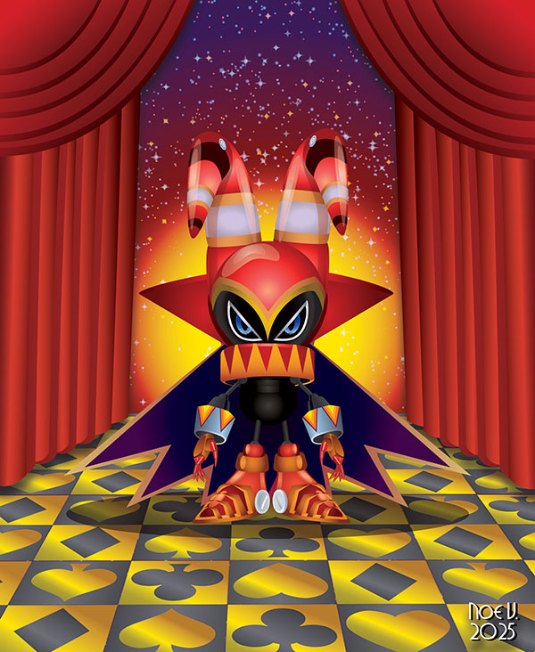
I didn’t want to break the scale of the robots I had already drawn, so I simply made Jackle just a hair larger than Reala. I had so much fun creating these illustrations it made me wish that I knew how to create 3D models. I would love to get a 3D printed version of my little robots made. Don’t you think they look cute?
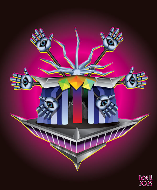
The only other sort of humanoid figure in NiGHTS into dreams... was the final boss named Wizeman. Yet this character didn't really have a body or head. He was more like a floating cloak on a platform. I didn't think it would be possible to make a Metal version of him, until one day I decided to give it a go. I won't be making Metal versions of the other characters because their proportions are already very much in line with the format. The more I look at these illustrations the more I wonder if it would be possible to remake NiGHTS into a game featuring robots that dream of breaking away from the control of Dr. Eggman. What do you think?
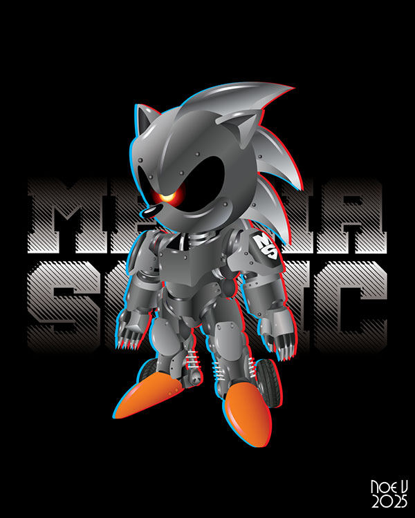
I was on an absolute drawing tear so I thought about what other Sonic Team character I would like to bring back. I remembered that Mecha Sonic from Sonic 2 had some great concept art. I thought it would look even better in color. I think this illustration came out great.
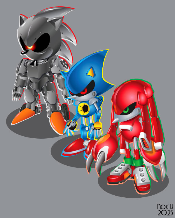
I figured as long as I made an illustration of the Mecha Sonic concept art I might as well render the other metal variations. Did you have a favorite metal doppelganger? I really need to get a copy of Sonic Superstars so I can see the various builds.
There was an illustration that I had been dreading for a long time. It was not the Super Pian aka the King of the Nightopians. I absolutely loved that little guy! I had mentioned him previously on the blog. He was a rare character that you could unlock in the original NiGHTS into dreams… The king would fly around the level and choose a spot to built a floating castle. It would be added to the game, and saved via the internal memory. The castle was randomly placed on the level, and would never appear in the same place twice, no matter how many times you erased, and resrtated your data! He was an incredibly cute character that I finally got around to drawing.
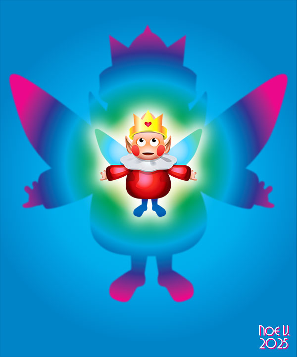
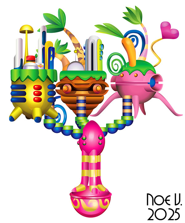
Rendering the king didn’t make me nervous but the castle he created did. It was all but impossible to get a clean picture of the castle from the game for my own personal notes. The original Nightopian Castle was rarely captured on screen because it was not guaranteed to ever show up in the game. Normally it wouldn’t be hard to find a YouTube clip to work from however the Sega Saturn was a 32-bit system from 30 years ago. Any existing video was low resolution. If you didn’t have a video capture card, or an emulator, and knew how to earn the Super Pian then even today it would be hard screenshot to get. The closest thing I could find was a fuzzy shot from the NiGHTS Wiki page but this model was pulled from the PS2 remake, which was not 100% console accurate. The Chinese developers did a really great job recreating the game engine, but not all the assets were accurate to their sprite counterparts.
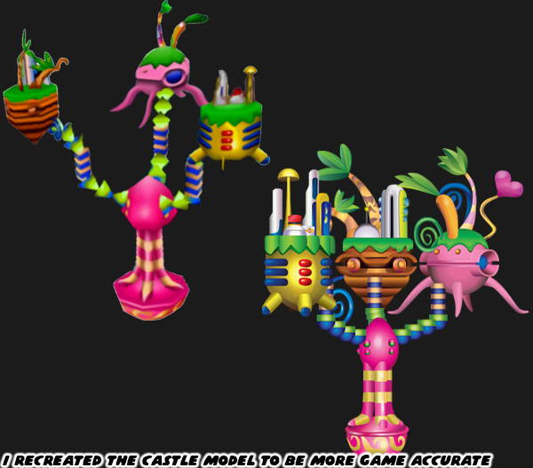
Whenever there was a game asset that I couldn’t track down then I would challenge myself to draw a reproduction as accurately as I could. So I used every screenshot, and grainy video clip that I could find of the castle to work from. It took me a few days to finalize the design, and it’s essentially a high resolution, vector version of the sprites. There was no doubt that the Nightopian Castle was one of my most challenging drawings of the past decade. Maybe I should put it on a poster or tee shirt for the die-hard fans.
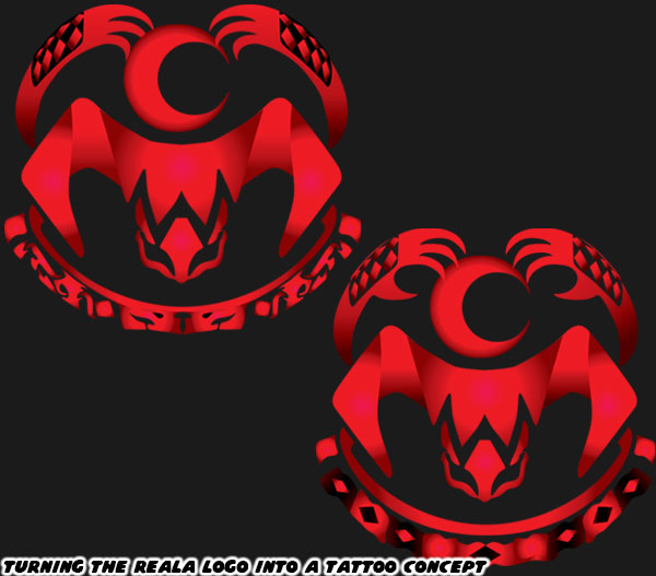
There was another game asset in NiGHTS that I always wanted to recreate. The villain Reala had a stylish logo on the ceiling of his boss battle stage. About 30 years ago my little brother said it would make a great design for a tattoo. I agreed, and finally decided it was time for me to recreate it. It was hard to find a clean screenshot, or the asset uploaded. So again I went by any scans that I could find. Making out the pattern at the bottom of the logo was the hardest part, so I mocked up a couple of different designs. I even changed the hands above the moon a little. Now I’m not saying that I am getting a tattoo with it, but I am certainly thinking about it.
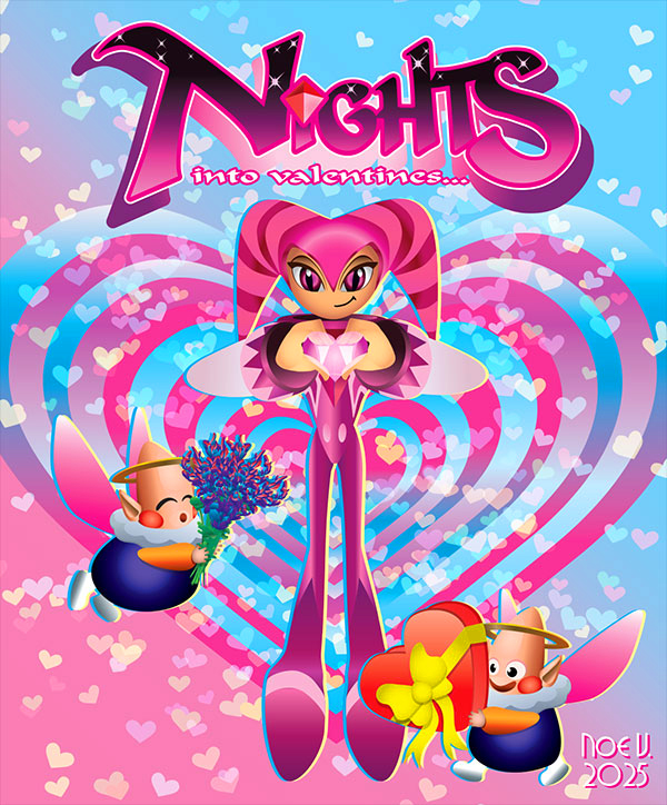
When Valentine’s Day was approaching I decided to see what a pink version of NiGHTS would look like. I even added some Nightopians to round out the pic. I might do other holiday versions in the future. We already have a Christmas version, but I wonder how an autumnal NiGHTS would look like. Orange like the leaves in fall, or black like a Halloween monster? That's food for thought...
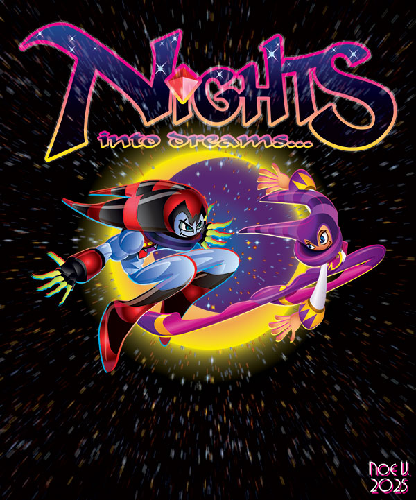
After a few weeks of drawing I decided to get out of my comfort zone, and do an illustration of NiGHTS, and Reala as cartoonish, and dynamic as I possibly could. I think the end result really showed how far I had come in the past few years.
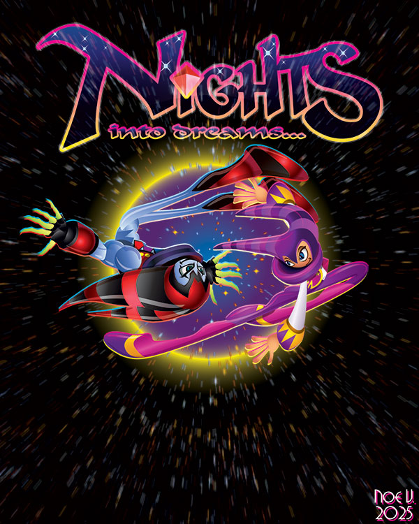
The best part about working mainly in Adobe Illustrator is that I can always circle back to a piece and make changes to it. I think the second go round between NiGHTS and Reala works much better. What do you think? All in all it was fun creating new illustrations these past few weeks. I had Sonic Team to thank for that. They kept me motivated when work, and politics had been weighing on my mind. The library of Sega games had inspired me most of my life. It was time to express that love in art form.
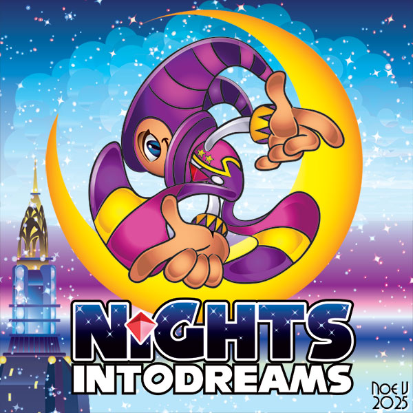
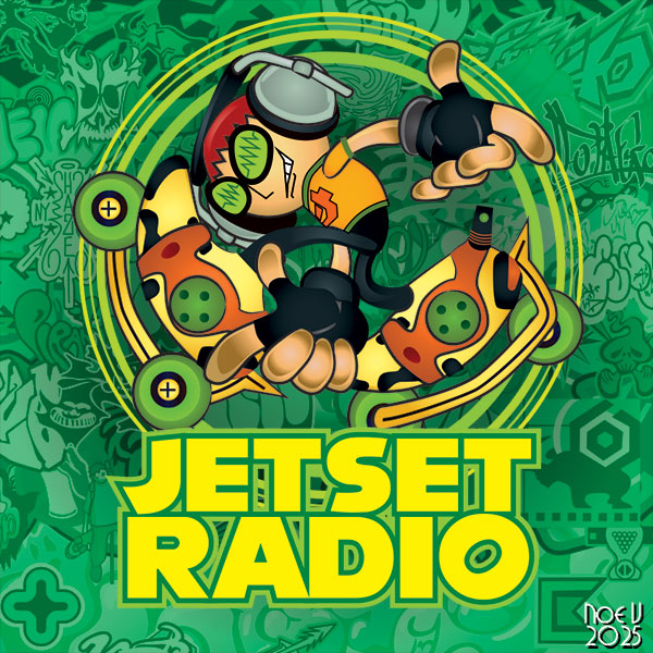
To round out my Sonic Team fan art I combined the classic Sonic pose from the cover of Sonic Adventure on the Dreamcast but replaced our hero. It was one of the more popular illustrations I ever uploaded to social media.
I know Jet Set Radio is not a Sonic Team game, but it is a Sega title, and
one of my favorites of all-time. This will probably be the last time I draw the Sonic Adventure pose, but don't hold me to it.
I hope you enjoyed this look back at how the studio built a fan. I’d like to know if you were a fan of Sonic Team, and if you had a favorite game, or character as well. Tell me about it in the comments section. As always if you enjoyed this blog, and would like to sponsor me
please visit my Patreon page and consider donating each month, even as little as $1 would help make better blogs and even podcasts!





