

Showing posts with label dc. Show all posts

Monday, May 4, 2026

Bookmark This Page; Art, graphics, and aesthetics in fighting games

Video game players sometimes use the word graphics, when instead they mean the aesthetics, or art style of the game. If you want to learn about some of the most unique looking fighters then Bookmark This Page.

The aesthetic versus graphics debate, part 1…

The aesthetic versus graphics debate, part 2…

The aesthetic versus graphics debate, part 3…

The Style Files, Voltage Fighter Gowcaizer & Goketsuji Ichizoku aka Power Instinct

The Style Files, Psikyo and the aesthetic copies

The Style Files, Daraku Tenshi: The Fallen Angels, part 1

The Style Files: Daraku Tenshi The Fallen Angels, part 2...

Did you get a chance to play any of these fighting games? Let me know about it in the comments section. As always if you enjoyed this blog, and would like to sponsor me please visit my Patreon page and consider donating each month, even as little as $1 would help make better blogs and even podcasts!

follow the Street Writer on Patreon!

Friday, November 22, 2024

Freeze frame, my poster collection, part 11…

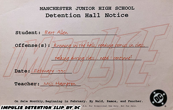
Outside of Disney, and video game posters the largest amount of prints in my collection are from comic books. One of my favorite things from collecting comics are the occasional giveaway from a comic book store. For example a diploma from the Charles Xavier institute, or a detention notice for Impulse (a descendant from the Flash), announcing the launch of his comic book series in 1995.

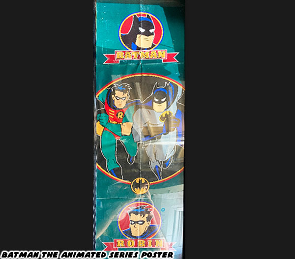
Sometimes my brothers and I would score a poster for a hot cartoon. In the early '90s nothing was hotter than the Batman Animated Series. This long skinny poster belongs to my older brother, but I'm holding onto it for him.

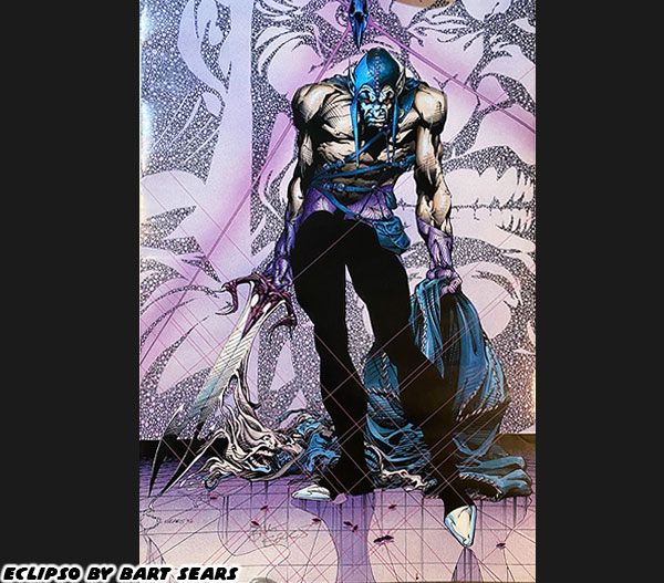
Today I’m going to highlight Bart Sears. He is one of my all-time favorite artists. He drew mainly on Justice League Europe, and DC comics back in the ‘90s. His sense of anatomy was unparalleled among his contemporaries. He studied male, and female bodybuilders extensively so he could draw strong characters much more realistically than anybody else. One of his standout books was Eclipso. Writer Keith Giffen, and Ian Flemming took a minor character, and turned him into a villain with the potential to destroy the entire DC universe. It was great storytelling, with amazing art to carry the plot. I was happy when I got a chance to have Mr. Sears autograph my Eclipso poster.

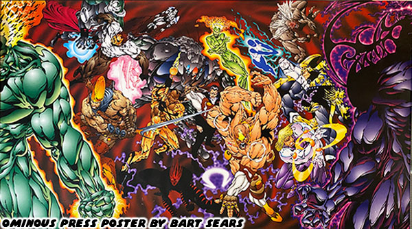
Similar to the superstar artists that left Marvel to start up Image comics Sears eventually launched his own comic book company as well. Ominous Press has been around for over 25 years. At the San Diego Comic Con I picked up this print celebrating the company. It’s one of my favorite indy studio prints.

Were there any comic book artists that you admired? Did you collect any prints, books, or posters from them? I’d like to read about it in the comments section. As always if you would like to sponsor me please visit my Patreon page and consider donating each month, even as little as $1 would help make better blogs and even podcasts!
follow the Street Writer on Patreon!

Friday, October 18, 2024

Generations of Hulk creators, part 3...

In the previous blog I mentioned that the Hulk was a monster, very much similar to Frankenstein’s creation. He was large, twisted, and grotesque in proportions. The character worked exceptionally well in horror stories as both the monster, and hero. An artist like Bernie Wrightson was a perfect choice to draw some of the Incredible Hulk issues, and stand-alone stories. I also mentioned that some comic book artists made the mistake of presenting the Hulk with a large bodybuilder physique. Where he had well defined muscles, and low body fat. I argued that these types of builds worked on a surface level to represent strength, but that wasn’t necessarily the best way to do it. There was an artist that had worked for DC, and Marvel that demonstrated that it was possible to render power, without making the characters swollen bodybuilders.

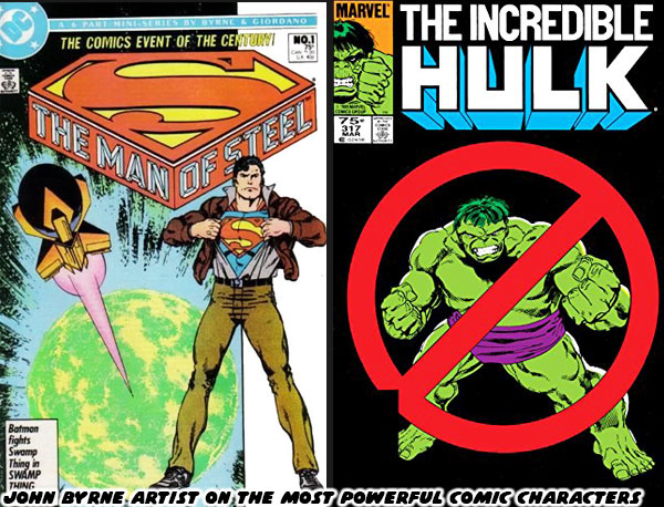
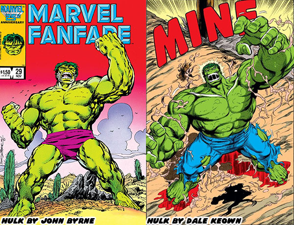
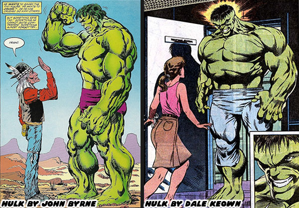
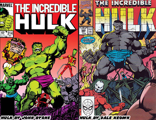
John Byrne was a titan in the industry. He developed countless issues, and helped shape the most important stories of several comic book publishers. He was one of the rare artists that actually had a hand in drawing what were considered the most powerful characters in their respective universes. He drew both Superman (starting in 1986), and the Incredible Hulk (starting in 1985). He did this without making either character overly muscular. Yes, both had good physiques, but they didn’t look like steroid abusers. Byrne’s understanding of anatomy, and physiology helped him render realistic frames that maintained a sense of power. For Superman he accomplished this by making Clark appear athletic, and fitting him in clothing that highlighted his body type. Readers could tell that he was in great shape, but not overtly muscular. When he changed into Superman he maintained a realistic athletic physique. Byrne was able to convey power not through muscles, but rather through the use of dynamic poses, and framing him doing the impossible with ease. He used similar techniques when drawing for the Hulk. The Hulk was not human by comparison. He was broad, with a wide head, large mouth, heavy brow, massive hands, and feet. He was supposed to be monstrous in proportions, rather than monstrous in muscle definition.

Byrne was able to present the Hulk as insanely powerful not by making the Hulk do the impossible with ease. That was a trick that he reserved for Superman. The Hulk on the other hand appeared powerful because he was able to shrug off perpetually escalating military attacks. When guns didn’t work they sent tanks after him. When that didn’t work they sent fighter jets, and missile. When that didn’t work they began unleashing monsters, giant robots, and biological attacks. When that didn’t work the biggest villains, and heroes in the Marvel Universe would be called in to stop him. The results were always the same. The Hulk took his hits, but often walked away with the win. The Hulk was powerful because no amount of escalation could break the character. The cautionary tale was that he simply wanted to be left alone, but his rivals were too arrogant to do so. Byrne set a standard for both Superman, and the Incredible Hulk that was hard to follow.

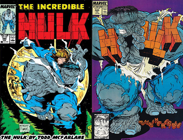
Many other artists would work on the Hulk books through the late 1980’s, but they would always be compared to Byrne. That was except for the artists whose style was so unique that they had few peers. Todd McFarlane was one such person. His style completely broke the classic mold. His version of the Hulk was as broad as he was tall. He was shaped like a cinder block, truly monstrous in proportions. This was around the time that Peter David started writing on the series. The duo used the horror element to great effect when crafting the “Ground Zero” arc. Not everyone was a fan of the bold art style, and longed for a return of something more traditional. McFarlane was moved over to the Amazing Spider-Man where he would absolutely flourish. A young Australian named Dale Keown had submitted some test pages to the studio, and they saw a similarity between his style, and Byrne’s. The new Hulk artist was called up.

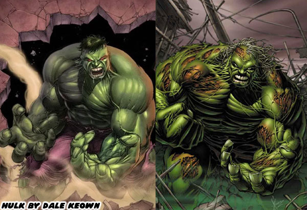
Byrne’s heir apparent took over, and the fans were clamoring for more on day one. The way Dale rendered his physique, his use of crosshatching, rendering details, shapes, and proportions was spot on with the classic Byrne style. The Hulk was muscular, but not shredded like a bodybuilder. The shape of his body, his massive hands, and heavy brow were reminiscent of Byrne, however Keown had his own style too. Over the years he would tweak the proportions of the character, exaggerate it a bit more, use different poses, different panel breakdowns, and framing techniques which were distinctly his own. He would update the wardrobe, and move to jeans rather than purple pants for the Hulk, and snazzy suits for the gray Joe Fixit. Keown would also refine, and update the classic villains. The thing was that he did these things subtly over the late ‘80s, and early ‘90s so as not to shock to long-time fans. By the time he finished his run he was considered by many to be the best Hulk artist to ever live. In fact over the past 30+ years he would turn up to do a couple of issues written by Peter David, as well as create variant covers for Marvel in his own style.

The new crop of artists working at Marvel in the early ‘90s, including Jim Lee, Joe Quesada, Whilce Portacio, and Rob Liefeld were definitely a changing of the guard. Each had their own unique style that was really hitting with Generation-X. They were creating a fresh aesthetic, that sometimes included manga, and anime influences. They were rewriting the style of the company, and western comic books in general. Keown was definitely part of the equation. His hand was on the scale of the most powerful character in the Marvel U. It was essential to make his work stand apart from his contemporaries. He did this on his debut, issue #367 in March 1990. It was the fourth, and final part of the Countdown saga where the Madman was unmasked. The villain was not only massively strong, but also absolutely insane. I never thought I’d see a monster that could even terrorize even the Hulk, bringing Joe Fixit to the brink of death. From that moment on the fans knew that Keown was going to be carrying the series. Sadly it wasn’t going to be a forever run on the books.

Peter David used Keown’s red-hot pencils to break down, and rebuild both the classic green Hulk, and gray Joe Fixit. They would introduce a merged personality known as Professor Hulk. He would become a leader of a group of immortal beings known as the Pantheon, and travel the globe on all sorts of adventures. Fans were eating it up, and eager to see what else the duo had planned. Sadly that wouldn’t happen. After 31 issues, while on his second year with the series Keown shocked everyone by leaving. He would join fellow artists to leverage their skills, and fanbase to quit Marvel. The group would start up Image Comics. He would develop the alien monster series called the Pitt. The hero was a massive humanoid like the Hulk, but with razor sharp claws similar to Sabertooth, the arch-rival of Wolverine. It was a fun comic, with lots of creature designs in the trademark Keown style. There was some bad blood between the Marvel executives and the young creators, but competition, and business was generally good for the industry. Peter David was even reunited with Keown to write a one-shot book featuring the Hulk versus the Pitt. They would also work together on other short Hulk stories, including “The End” where we saw the end of the Banner many centuries from now.

It turned out that Dale Keown leaving was both a blessing, and a curse for Marvel. It was bad because in the eyes of many he was literally born to draw the character. The artists that followed in his footsteps had a hard time meeting the standard he set. At the same time Marvel was able to give chances to dozens of other artists over the next three decades. Each brought their own unique aesthetic to the character. Some weren’t quite fits for the Hulk, but they managed to be perfect for Iron Man, Spider-Man, Captain America, Thor, or any other franchise. There were a few standout artists that managed to breathe new life into the Green Goliath. I’m going to highlight some of these artists in the next entry. Until then I’d like to know if you followed the Hulk, or had a favorite comic book artist. I’d like to read about it in the comments section. As always if you would like to sponsor me please visit my Patreon page and consider donating each month, even as little as $1 would help make better blogs and even podcasts!
follow the Street Writer on Patreon!

Monday, July 1, 2024

More lucha libre comics for you! - A 1UP classic from August 10, 2011

You may know that I am a huge fan of lucha libre and especially enmascarados or masked wrestlers. I talked a little bit about a masked wrestler comic book not too long ago with Big Daddy Danger. There were two other books that I would like to mention.
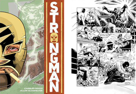
Strongman written by Charles Soule, drawn by Allen Gladfelter and published by Slave Labor Graphics is a pulpy novel featuring a past-his-prime enmascarado named El Tigre. The story is well done and the art, all black and white is okay. It has a violent edge to it with lots of blood spilled on both sides. It doesn't reach the level of style or storytelling of a Sin City graphic novel but is a fun ride nonetheless.

La Mano Del Destino by Castle and Key Publications is a newer color series featuring a masked wrestler named the Hand of Destiny. This character was double crossed during a match and lost his title and mask in the ring, the worst of all humiliations! He vowed revenge and must now face a series of opponents, each tougher than the last, before he can get his hands on the man that betrayed him. Sounds like the setup to a fun series, if not a videogame as well.
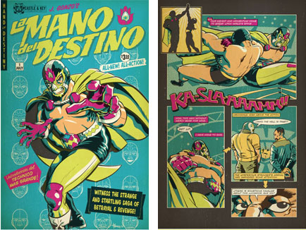
The art style is classic, printed on traditional newsprint with 4 color processes it looks like something out of the vault. The first issue was available in comic book stores but every additional issue will only be available from the publisher. Hopefully these indy publishers will help make it easier for original stories to get to market without having to deal with the monopoly that is Diamond Distribution. What was the last good or original comic that you have read?

As always if you would like to sponsor me please visit my Patreon page and consider donating each month, even as little as $1 would help make better blogs and even podcasts!
follow the Street Writer on Patreon!

Wednesday, June 26, 2024

Big Daddy Romantic Monthly Danger - A 1UP classic from July 28, 2011

Hello friends, sorry if you've gotten burned out on the Disney coverage over the past couple of weeks. I'm still on a comic book kick though and for that I'm not apologizing. I'd like to share with you a couple of books that had caught my eye over the past couple of weeks. Big Daddy Danger by Adam Pollina and Tyson McAdoo and Strongest Dad, a romantic monthly by Minoru Hiramatsu were some fun reads that you should be aware of.

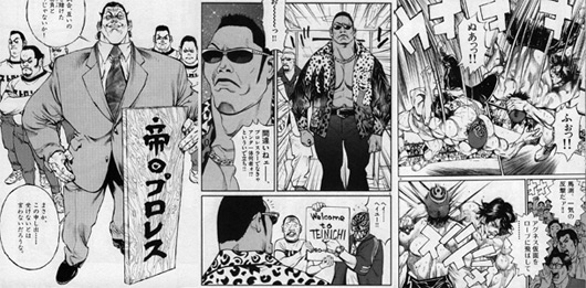
The books were from a few years ago and covered some oddly similar territory. Big Daddy Danger was a short series published by DC featuring a masked wrestling character that doubled as a secret agent. Strongest Dad was a comedy about an undefeated MMA fighter trying to raise a family. The manga series was featured in Big Spirits from Japan. The story was collected in a three-part anthology.

Both titles had fun art, clever designs and plenty of nods to pop culture and the troubles of raising a family. For the Strongest Dad his troubles were compounded by the fact that he could not accept defeat or decline any challenge. Even if it meant having to test his mettle against an elephant at the nearby animal park.

Big Daddy Danger was just as absurd but equally fun. Big Daddy was both a championship wrestler and secret agent. His manager / trainer looked like Col. Sanders and got secret messages printed out of his cane. Big Daddy had a son and wife whom he often had to spend lots of time away from. In fact his son had no idea that his father was moonlighting as an agent.

The Strongest Dad lead a more normal life where the biggest challenges were more about raising two daughters and fulfilling his wife's expectations.

Both main characters had older brothers which wanted nothing more that to see the main characters defeated and humiliated. In Big Daddy Danger the brother tried to move in and become a surrogate father to the Danger son and even steal away the Danger wife.

In Strongest Dad the brother wanted to find the man or beast alive that could dethrone his kin. He even had his brother fight against a gorilla when he tried to humble him! Eventually he found a Russian bruiser, an ex solder that was built like a tank and was obsessed with drawing manga girls. When "Dad" wasn't dealing with animals he was busy beating up on a unscrupulous fight promoter that dressed like a dictator and drove a copy of the Batmobile!

The art provided by Polina and McAdoo in BDD was very cartoonish, there were great splash pages and hilarious expressions featured on the cast. The characters interacted with all sorts of goons and even demons. Possibly the funniest part was that Big Daddy would continuously peel off his mask and have a different one underneath for whatever challenge he was facing. It certainly would make for an interesting videogame mechanic in a title other than NiGHTS.

Not to be outdone, Mr. Hiramatsu was a king of facial expressions. The characters in his books have always had memorable takes. He featured some of his panels in a blog about the series.

Both issues wrapped up rather quickly, BDD in 9 months and Strongest Dad within a year. If I wanted to see a series continue however it would have to be Strongest Dad. As much of a fan as I am of lucha libre, the Big Daddy series seemed flat. Big Daddy seemed to walk through opponents and there was no real sense of drama or tension in the issues, worse there was no resolution for his brother. Strongest Dad on the other hand made every little activity into a challenge, whether it was learning to play piano or escorting his daughters on a field trip. The Strongest Dad seemed a more three dimensional character that readers could root for. It was a fun series and almost matched the greatness of Mr. Hiramatsu's magnum opus. The Japanese wrestling, parable known as Agnes Kamen.

As always if you would like to sponsor me please visit my Patreon page and consider donating each month, even as little as $1 would help make better blogs and even podcasts!
follow the Street Writer on Patreon!

Friday, January 25, 2019

The Marvel Contest of Champions Legacy, part 2...


In the previous blog I talked about how Marvel's Secret Wars was as influential to the development of the Contest of Champions mobile game as any other Marvel story arc. It was not however what I believe to be the most influential crossover event in '80s comic book history. That title would belong to DC comics. Writer Marv Wolfman did not like the different versions of the DC universe characters occupying the same space. Unless you had been following the DC comics for a long time you didn't necessarily know that Superman and Superboy were two different characters occupying two different Earths. You simply assumed that before Clark Kent became Superman he was naturally Superboy. There was actually a long-standing legal battle around who owned the rights to Superboy. To compound things there were different dimensions and different timelines happening where Clark landed on Earth in the '20s or '30s and thus interacted with different historical characters. Superman had been given lots of nonsensical powers through the years, super ventriloquism, super face shifting, super hypnosis, etc. There were also dimensions where there was a super dog (Krypto), a super horse (Comet), and even super cat (Streaky). To try and make sense of it all, de-power Superman and others, and streamline the DC canon Wolfman, artists George Perez, John Byrne, and the editors at DC agreed on an ultimate crossover, the Crisis on Infinite Earths.


What set Crisis apart from every other comic book crossover at the time was the finality of the events. Whatever the outcome it would determine which characters remained in publication, which "Earth" was officially canon and who lived or died. Thus when Barry Allen, the Flash, passed away it was a sacrifice that meant something to an entire generation of readers. His protege' Wally West, the Kid Flash, would have to become the new Flash. Comic books were starting to "grow up" and writers like Wolfman and Alan Moore made sure to write some complex and mature material that forever changed the way comics would be presented. In the Crisis series a villain named the Anti-Monitor was collapsing dimensions in his wake. Each alternate timeline, or dimension was labeled with a number. This is where you might have heard things like Earth-1, Earth-2, Earth-Prime, etc. Imagine that in one Earth it was perpetually World War II, or that in a different Earth the Justice League was made up of criminals. It was a lot for fans to keep track of so DC needed to sort things out. Wolfman was using the gigantic Anti-Monitor as a sledgehammer to shatter each Earth. The fan-favorite characters that survived the onslaught managed to do so by traveling from Earth to Earth and joined all of the heroes for one final stand. If you are relatively new to comic books but have been to a movie theater in the past decade then this might sound like a familiar idea. Marvel had also created their own universe smasher and this one went by the name of Thanos.


The roots of Thanos and how he was worked into the mobile game Marvel Contest of Champions was inspired. In the previous blog I mentioned that the events in Secret Wars and the original Contest of Champions had a hand in shaping the development of the mobile game. But it went much deeper than that. Those comic runs from the early '80s focused mainly on the traditional Marvel heroes and villains, whereas DC had brought forward the idea of a battle royal across different dimensions, or the multiverse. In 2018 Sony Animated Pictures brought audiences the wonderful Spider-Man Into the Spider-verse. It helped introduce the concept of the multiverse to Marvel fans. Long time comic book readers knew that there were different Earths as well. Except they went by a different numbering system than DC. It was something that Alan Moore and Alan Davis made up. They called the traditional Marvel universe Earth-616, the events from other comics took place on other Earths, for example there were many different versions of Spider-Man. In one world we had Peter Parker, in another there was Penny Parker (Earth-14512) or Gwen Stacy (Earth-65).


There was a punk rock Spider-Man, the militant Hobart Brown from Earth-138. He wore sneakers and had spikes on his mask. There was Earth-8311 where all the Marvel heroes were cartoon animals, including the Goose Rider, Captain Americat, the Incredible Hulk Bunny and of course Peter Porker the Spectacular Spider Ham. These characters often appeared in one-shot comics or short run series, never to be seen again. Fans never forgot these characters and neither did the writers and editors at Marvel. They were waiting for just the right story to tell. Many of these alternate realities went into the Spider-Verse comic book run in 2014 and the Spider-Geddon follow up in 2019. The popularity of the original run gave Sony the inspiration to pursue an animated feature. Hopefully you have seen it because it is more than a great comic book film, or a great animated film, but because it is simply was a great film. MMC does feature the Peter Parker, Miles Morales and Gwen Stacy versions of Spider-Man but Marvel went much deeper than that.


There were many other alternate timelines in the Marvel U where heroes were not quite how you remembered them. There was the Fear Itself timeline, a crossover from 2011, where some heroes, and villains were given magical hammers. Similar to Mjolnir, Thor's hammer. Except the hammers possessed the bearer, and caused them to wreak havoc on the Earth. The mastermind behind this was Cul Borson, the evil elder brother of Odin. Then there was the Infinity Wars from 2018. This timeline had all sorts of weird twists. It was the dimension where Steve Rogers became the Soldier Supreme during WWII, and when Tony Stark was actually Tony Odinson. He created the enchanted Iron Hammer armor. These versions did make it into the mobile game Marvel Future Fight by Netmarble Games. Incorporating the idea of multiverse was really where the Contest of Champions shone.


The game from Kabam took cues from the live action films and television shows. Since the game took place during a nebulous period, far outside of whatever was currently happening in any one particular comic book it allowed characters from the past, future, and essentially any dimension to exist at the same time. For a Marvel fan this was the ultimate experience. Fans didn't have to worry about being locked into one canon, one continuity, one version of their beloved heroes and villains.  For example fans of the Hulk could actually take on the roles of at least three different versions of the Green Goliath. There was the classic green Hulk, the grey mob enforcer "Mr. Fixit" persona and even the evil future version known as The Maestro. Kabam had opened the floodgates for what it meant to be compete against other champions. The path that the company took and how they pulled the Marvel continuity into uncharted waters was nothing short of genius. We'll explore the adaptation process in the next blog. As always if you enjoyed this blog and would like to sponsor me please visit my Patreon page and consider donating each month, even as little as $1 would help make better blogs and even podcasts!

 follow the Street Writer on Patreon!