In the previous blog I mentioned that the Hulk was a monster, very much similar to Frankenstein’s creation. He was large, twisted, and grotesque in proportions. The character worked exceptionally well in horror stories as both the monster, and hero. An artist like Bernie Wrightson was a perfect choice to draw some of the Incredible Hulk issues, and stand-alone stories. I also mentioned that some comic book artists made the mistake of presenting the Hulk with a large bodybuilder physique. Where he had well defined muscles, and low body fat. I argued that these types of builds worked on a surface level to represent strength, but that wasn’t necessarily the best way to do it. There was an artist that had worked for DC, and Marvel that demonstrated that it was possible to render power, without making the characters swollen bodybuilders.
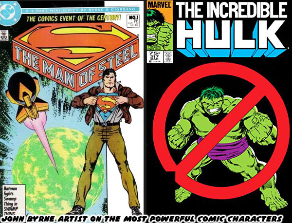
John Byrne was a titan in the industry. He developed countless issues, and helped shape the most important stories of several comic book publishers. He was one of the rare artists that actually had a hand in drawing what were considered the most powerful characters in their respective universes. He drew both Superman (starting in 1986), and the Incredible Hulk (starting in 1985). He did this without making either character overly muscular. Yes, both had good physiques, but they didn’t look like steroid abusers. Byrne’s understanding of anatomy, and physiology helped him render realistic frames that maintained a sense of power. For Superman he accomplished this by making Clark appear athletic, and fitting him in clothing that highlighted his body type. Readers could tell that he was in great shape, but not overtly muscular. When he changed into Superman he maintained a realistic athletic physique. Byrne was able to convey power not through muscles, but rather through the use of dynamic poses, and framing him doing the impossible with ease. He used similar techniques when drawing for the Hulk. The Hulk was not human by comparison. He was broad, with a wide head, large mouth, heavy brow, massive hands, and feet. He was supposed to be monstrous in proportions, rather than monstrous in muscle definition.
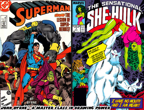
Byrne was able to present the Hulk as insanely powerful not by making the Hulk do the impossible with ease. That was a trick that he reserved for Superman. The Hulk on the other hand appeared powerful because he was able to shrug off perpetually escalating military attacks. When guns didn’t work they sent tanks after him. When that didn’t work they sent fighter jets, and missile. When that didn’t work they began unleashing monsters, giant robots, and biological attacks. When that didn’t work the biggest villains, and heroes in the Marvel Universe would be called in to stop him. The results were always the same. The Hulk took his hits, but often walked away with the win. The Hulk was powerful because no amount of escalation could break the character. The cautionary tale was that he simply wanted to be left alone, but his rivals were too arrogant to do so. Byrne set a standard for both Superman, and the Incredible Hulk that was hard to follow.
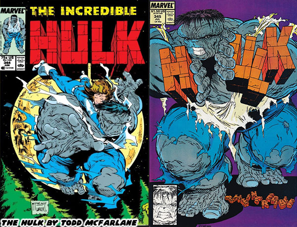
Many other artists would work on the Hulk books through the late 1980’s, but they would always be compared to Byrne. That was except for the artists whose style was so unique that they had few peers. Todd McFarlane was one such person. His style completely broke the classic mold. His version of the Hulk was as broad as he was tall. He was shaped like a cinder block, truly monstrous in proportions. This was around the time that Peter David started writing on the series. The duo used the horror element to great effect when crafting the “Ground Zero” arc. Not everyone was a fan of the bold art style, and longed for a return of something more traditional. McFarlane was moved over to the Amazing Spider-Man where he would absolutely flourish. A young Australian named Dale Keown had submitted some test pages to the studio, and they saw a similarity between his style, and Byrne’s. The new Hulk artist was called up.
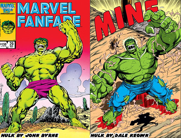
Byrne’s heir apparent took over, and the fans were clamoring for more on day one. The way Dale rendered his physique, his use of crosshatching, rendering details, shapes, and proportions was spot on with the classic Byrne style. The Hulk was muscular, but not shredded like a bodybuilder. The shape of his body, his massive hands, and heavy brow were reminiscent of Byrne, however Keown had his own style too. Over the years he would tweak the proportions of the character, exaggerate it a bit more, use different poses, different panel breakdowns, and framing techniques which were distinctly his own. He would update the wardrobe, and move to jeans rather than purple pants for the Hulk, and snazzy suits for the gray Joe Fixit. Keown would also refine, and update the classic villains. The thing was that he did these things subtly over the late ‘80s, and early ‘90s so as not to shock to long-time fans. By the time he finished his run he was considered by many to be the best Hulk artist to ever live. In fact over the past 30+ years he would turn up to do a couple of issues written by Peter David, as well as create variant covers for Marvel in his own style.
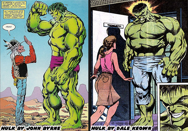
The new crop of artists working at Marvel in the early ‘90s, including Jim Lee, Joe Quesada, Whilce Portacio, and Rob Liefeld were definitely a changing of the guard. Each had their own unique style that was really hitting with Generation-X. They were creating a fresh aesthetic, that sometimes included manga, and anime influences. They were rewriting the style of the company, and western comic books in general. Keown was definitely part of the equation. His hand was on the scale of the most powerful character in the Marvel U. It was essential to make his work stand apart from his contemporaries. He did this on his debut, issue #367 in March 1990. It was the fourth, and final part of the Countdown saga where the Madman was unmasked. The villain was not only massively strong, but also absolutely insane. I never thought I’d see a monster that could even terrorize even the Hulk, bringing Joe Fixit to the brink of death. From that moment on the fans knew that Keown was going to be carrying the series. Sadly it wasn’t going to be a forever run on the books.
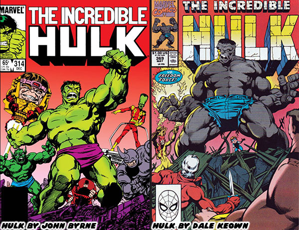
Peter David used Keown’s red-hot pencils to break down, and rebuild both the classic green Hulk, and gray Joe Fixit. They would introduce a merged personality known as Professor Hulk. He would become a leader of a group of immortal beings known as the Pantheon, and travel the globe on all sorts of adventures. Fans were eating it up, and eager to see what else the duo had planned. Sadly that wouldn’t happen. After 31 issues, while on his second year with the series Keown shocked everyone by leaving. He would join fellow artists to leverage their skills, and fanbase to quit Marvel. The group would start up Image Comics. He would develop the alien monster series called the Pitt. The hero was a massive humanoid like the Hulk, but with razor sharp claws similar to Sabertooth, the arch-rival of Wolverine. It was a fun comic, with lots of creature designs in the trademark Keown style. There was some bad blood between the Marvel executives and the young creators, but competition, and business was generally good for the industry. Peter David was even reunited with Keown to write a one-shot book featuring the Hulk versus the Pitt. They would also work together on other short Hulk stories, including “The End” where we saw the end of the Banner many centuries from now.
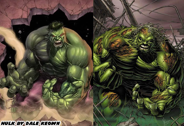
It turned out that Dale Keown leaving was both a blessing, and a curse for Marvel. It was bad because in the eyes of many he was literally born to draw the character. The artists that followed in his footsteps had a hard time meeting the standard he set. At the same time Marvel was able to give chances to dozens of other artists over the next three decades. Each brought their own unique aesthetic to the character. Some weren’t quite fits for the Hulk, but they managed to be perfect for Iron Man, Spider-Man, Captain America, Thor, or any other franchise. There were a few standout artists that managed to breathe new life into the Green Goliath. I’m going to highlight some of these artists in the next entry. Until then I’d like to know if you followed the Hulk, or had a favorite comic book artist. I’d like to read about it in the comments section. As always if you would like to sponsor me
please visit my Patreon page and consider donating each month, even as little as $1 would help make better blogs and even podcasts!


Peter David’s Hulk run was probably the best ever in all of comics! All the top artists seemed to be clamoring to draw for it back in the 90’s. I loved Keown’s Hulk stuff but wasn’t a fan of Pitt (both art and story.)
ReplyDeleteIt's a shame a lot of comic book readers haven't gotten a chance to see what happens when an amazing writer does their homework, and elevates an already iconic character.
Delete