Showing posts with label peter david. Show all posts

Monday, October 28, 2024

Generations of Hulk creators, final part...

I hope my rambling series on the Hulk has kept you entertained these past couple of weeks. I had fun researching, putting it together, and sharing my thoughts on the best way to present the character. I hope it helps budding writers, and artists think about the approach they take when working on their own stories. I also wished it helped non-Hulk fans understand the appeal of the Jade Giant. He was certainly much more complex than has been presented in the recent Marvel live action films, and television shows. Today I’d like to talk about my favorite artists to work with the character. Let’s pretend that only one living artist allowed to draw the character until they retired. Who would I choose, and in what order?

In the number one spot is Dale Keown. In my opinion he is, and remains the best Hulk artist ever. He’s illustrated countless iconic moments thanks to the writing of Peter David. His sense of scale, proportion, and strength is so great it should be studied by all comic artists. Especially those trying to make memorable strong characters. His style simply works whether the story involves the classic “Savage” Hulk, the street savvy Joe Fixit, the genius Professor Hulk, or the tyrannical Maestro. He is adept at drawing epic battles, horror stories, alien monsters, heroic team-ups, and dramatic arcs equally well. He is additionally good at drawing normal-sized heroes, and villains. This allows him to frame them alongside the Hulk so we get a sense of scale. To me Dale Keown is the standard that every modern Hulk artist is measured against. It is a well deserved honor.

My second choice to draw the Hulk forever, and ever is Arthur Adams. Just about all the same praise I heap on Dale Keown applies to Mr. Adams as well. The major difference between the two is that Art knows monsters better than any other living artist. From the largest kaiju to the smallest imp, from pulp monsters that appeared only once in an obscure book, to the world famous Universal Horror monsters. Mr. Adams has drawn all of them at least once in his career. Drawing monsters is absolutely in his DNA. He has been rendering highly detailed pieces for 40 years, and shows no sign of slowing. The Hulk is one of the greatest monsters he’s ever brought to life, but to say that his greatness is limited to the Hulk would be a disservice to his talents. He is a fantastic pin-up artist, and can arguably be called the best X-Men artist, the best Fantastic Four artist, and the best Avengers artist to ever live. Saying he should only draw the Hulk from this point on would rob the world of a true genius.

My third choice for who should draw the Hulk in perpetuity is relatively new. In fact he did not exist in my rankings until a few weeks ago. The same thing applies to my number five choice. Ryan Ottley is one of those people that was born to draw powerful characters. If the Hulk is the strongest there is, then he deserves an illustrator that knows how to present it. Mr. Ottley’s work on the Starship Hulk arc written by Donny Cates was absolute madness, but in a good way. He is known for drawing gratuitous violence in the Invincible series, and was able to bring that gore into the Hulk but did so sparingly. He has a surprisingly unique take on creature, and monster designs that is unlike his peers. These twisted creations work in the context of the series, especially when the Hulk has to tear through swaths of powerful opponents. Mr. Ottley also knows his supporting characters, and does a great job illustrating the Hulk’s allies, and rivals. I just wish he had gotten more than 14 issues to show off his talent. I would kill to see his take on the Leader, the Abomination, or the Maestro.

The fourth person on my list was previously my number three. I have already sung the praises of Ed McGuinness, and will continue doing so until my dying day. He is one of those people that you want to create a second Hulk book, just so he can have more to draw. I mean if there can be a Spectacular Spider-Man, Amazing Spider-Man, Web of Spider-Man, and Ultimate Spider-Man comics all out at the same time then why can’t we have two or more Hulk books going? McGuinness draws the Hulk so well that it hurts thinking I will never be half as good as he is at drawing the character. His rendering of the Hulk uses every synonym of power that you can think of. He has force, might, energy, and intensity. The only limitation for McGuinness is that he is too good at drawing muscular characters. Even the “normal” heroes are swollen. It makes the Hulk have a diminished impact when he shares a panel with characters that have the same physique but are a few feet shorter. But that’s a minor issue for someone that I’ve said was born to draw the character.

The fifth person that I think could carry the Hulk for all time would be Nic Klein. I said previously his style was equal parts Bernie Wrightson, and Mike Deodato Jr. His take on the Hulk oozed strength. The monsters, and demons he draws tap into some primordial fears of humanity. He presents the stuff of nightmares in vivid detail. It’s scary how good he is at bringing the ugly to life. If the Hulk book is only about horror then there is no one else on the list better qualified to draw it. I wanted to see how he would draw other Marvel characters working with, or against the Hulk. I wanted to see if he could render technology, weapons, or battle sequences with the Hulk. But based solely on the few issues he’s released in 2024 I can tell that he is up to the task. The sky is the limit for Mr. Klein, and I look forward to following it.

I want you to think of Joe Madureira as my honorable mention. He is an artist that would have been a top-five in my book, possibly a top-three to carry the Hulk forever. That is of course if only he got a chance. The Hulk is an absolute unit when he draws him. Proportionally landing somewhere in between McGuinness, Ottley, and Klein. The thing is with the exception of some concept sketches, and the occasional cover, he hasn’t really had a chance to show fans what he could do with the character.

Joe Mad’s style of art oozes personality. He comes from a generation of artists that’s much more animated than any other illustrator that made their mark in the ‘90s. Similar to Humberto Ramos, artists in that era were pulling influences from manga, and video games into their comic work. That is to say it looked vastly different than anything else on the shelves. The fact that he drew massive bruisers so well that I was furious that he never seemed to land a run on the Hulk. Worse yet, when he finally got a chance to draw a power character for Marvel it ended up being the Red Hulk.

As a comics fan it felt like I was living in the worst possible timeline. The best artists to never draw the Hulk were finally given a chance by the powers that be. Only to find out that they would be drawing the red clone character instead. If I was upset that Ed McGuinness’ talents were wasted on a 10+ issue run featuring mainly the Red Hulk, I was twice as angry when Joe drew the Red Hulk for a Spider-Man team up. Just to see what it would have looked like I changed the hue on the Red Hulk in Photoshop. It helped me imagine that I was in a better timeline. The constant disappointments with Marvel writers, and editors was one of the reasons why I walked away from comic books for more than a decade.

I pray that someone at Marvel might let Joe Mad, or Ryan Ottley get a chance to draw a proper Hulk arc in the future. It would certainly give me a reason to start collecting again. There were many other artists that could draw a fantastic Hulk. I might talk about them someday. For now I’d like to hear your thoughts. Did you have a favorite artist that drew your favorite characters? Was there an artist that you could imagine would be a great fit for a book if they ever got a chance? I’d like to read about it in the comments section. As always if you would like to sponsor me please visit my Patreon page and consider donating each month, even as little as $1 would help make better blogs and even podcasts!
follow the Street Writer on Patreon!

Friday, October 18, 2024

Generations of Hulk creators, part 3...

In the previous blog I mentioned that the Hulk was a monster, very much similar to Frankenstein’s creation. He was large, twisted, and grotesque in proportions. The character worked exceptionally well in horror stories as both the monster, and hero. An artist like Bernie Wrightson was a perfect choice to draw some of the Incredible Hulk issues, and stand-alone stories. I also mentioned that some comic book artists made the mistake of presenting the Hulk with a large bodybuilder physique. Where he had well defined muscles, and low body fat. I argued that these types of builds worked on a surface level to represent strength, but that wasn’t necessarily the best way to do it. There was an artist that had worked for DC, and Marvel that demonstrated that it was possible to render power, without making the characters swollen bodybuilders.

John Byrne was a titan in the industry. He developed countless issues, and helped shape the most important stories of several comic book publishers. He was one of the rare artists that actually had a hand in drawing what were considered the most powerful characters in their respective universes. He drew both Superman (starting in 1986), and the Incredible Hulk (starting in 1985). He did this without making either character overly muscular. Yes, both had good physiques, but they didn’t look like steroid abusers. Byrne’s understanding of anatomy, and physiology helped him render realistic frames that maintained a sense of power. For Superman he accomplished this by making Clark appear athletic, and fitting him in clothing that highlighted his body type. Readers could tell that he was in great shape, but not overtly muscular. When he changed into Superman he maintained a realistic athletic physique. Byrne was able to convey power not through muscles, but rather through the use of dynamic poses, and framing him doing the impossible with ease. He used similar techniques when drawing for the Hulk. The Hulk was not human by comparison. He was broad, with a wide head, large mouth, heavy brow, massive hands, and feet. He was supposed to be monstrous in proportions, rather than monstrous in muscle definition.

Byrne was able to present the Hulk as insanely powerful not by making the Hulk do the impossible with ease. That was a trick that he reserved for Superman. The Hulk on the other hand appeared powerful because he was able to shrug off perpetually escalating military attacks. When guns didn’t work they sent tanks after him. When that didn’t work they sent fighter jets, and missile. When that didn’t work they began unleashing monsters, giant robots, and biological attacks. When that didn’t work the biggest villains, and heroes in the Marvel Universe would be called in to stop him. The results were always the same. The Hulk took his hits, but often walked away with the win. The Hulk was powerful because no amount of escalation could break the character. The cautionary tale was that he simply wanted to be left alone, but his rivals were too arrogant to do so. Byrne set a standard for both Superman, and the Incredible Hulk that was hard to follow.

Many other artists would work on the Hulk books through the late 1980’s, but they would always be compared to Byrne. That was except for the artists whose style was so unique that they had few peers. Todd McFarlane was one such person. His style completely broke the classic mold. His version of the Hulk was as broad as he was tall. He was shaped like a cinder block, truly monstrous in proportions. This was around the time that Peter David started writing on the series. The duo used the horror element to great effect when crafting the “Ground Zero” arc. Not everyone was a fan of the bold art style, and longed for a return of something more traditional. McFarlane was moved over to the Amazing Spider-Man where he would absolutely flourish. A young Australian named Dale Keown had submitted some test pages to the studio, and they saw a similarity between his style, and Byrne’s. The new Hulk artist was called up.

Byrne’s heir apparent took over, and the fans were clamoring for more on day one. The way Dale rendered his physique, his use of crosshatching, rendering details, shapes, and proportions was spot on with the classic Byrne style. The Hulk was muscular, but not shredded like a bodybuilder. The shape of his body, his massive hands, and heavy brow were reminiscent of Byrne, however Keown had his own style too. Over the years he would tweak the proportions of the character, exaggerate it a bit more, use different poses, different panel breakdowns, and framing techniques which were distinctly his own. He would update the wardrobe, and move to jeans rather than purple pants for the Hulk, and snazzy suits for the gray Joe Fixit. Keown would also refine, and update the classic villains. The thing was that he did these things subtly over the late ‘80s, and early ‘90s so as not to shock to long-time fans. By the time he finished his run he was considered by many to be the best Hulk artist to ever live. In fact over the past 30+ years he would turn up to do a couple of issues written by Peter David, as well as create variant covers for Marvel in his own style.

The new crop of artists working at Marvel in the early ‘90s, including Jim Lee, Joe Quesada, Whilce Portacio, and Rob Liefeld were definitely a changing of the guard. Each had their own unique style that was really hitting with Generation-X. They were creating a fresh aesthetic, that sometimes included manga, and anime influences. They were rewriting the style of the company, and western comic books in general. Keown was definitely part of the equation. His hand was on the scale of the most powerful character in the Marvel U. It was essential to make his work stand apart from his contemporaries. He did this on his debut, issue #367 in March 1990. It was the fourth, and final part of the Countdown saga where the Madman was unmasked. The villain was not only massively strong, but also absolutely insane. I never thought I’d see a monster that could even terrorize even the Hulk, bringing Joe Fixit to the brink of death. From that moment on the fans knew that Keown was going to be carrying the series. Sadly it wasn’t going to be a forever run on the books.

Peter David used Keown’s red-hot pencils to break down, and rebuild both the classic green Hulk, and gray Joe Fixit. They would introduce a merged personality known as Professor Hulk. He would become a leader of a group of immortal beings known as the Pantheon, and travel the globe on all sorts of adventures. Fans were eating it up, and eager to see what else the duo had planned. Sadly that wouldn’t happen. After 31 issues, while on his second year with the series Keown shocked everyone by leaving. He would join fellow artists to leverage their skills, and fanbase to quit Marvel. The group would start up Image Comics. He would develop the alien monster series called the Pitt. The hero was a massive humanoid like the Hulk, but with razor sharp claws similar to Sabertooth, the arch-rival of Wolverine. It was a fun comic, with lots of creature designs in the trademark Keown style. There was some bad blood between the Marvel executives and the young creators, but competition, and business was generally good for the industry. Peter David was even reunited with Keown to write a one-shot book featuring the Hulk versus the Pitt. They would also work together on other short Hulk stories, including “The End” where we saw the end of the Banner many centuries from now.

It turned out that Dale Keown leaving was both a blessing, and a curse for Marvel. It was bad because in the eyes of many he was literally born to draw the character. The artists that followed in his footsteps had a hard time meeting the standard he set. At the same time Marvel was able to give chances to dozens of other artists over the next three decades. Each brought their own unique aesthetic to the character. Some weren’t quite fits for the Hulk, but they managed to be perfect for Iron Man, Spider-Man, Captain America, Thor, or any other franchise. There were a few standout artists that managed to breathe new life into the Green Goliath. I’m going to highlight some of these artists in the next entry. Until then I’d like to know if you followed the Hulk, or had a favorite comic book artist. I’d like to read about it in the comments section. As always if you would like to sponsor me please visit my Patreon page and consider donating each month, even as little as $1 would help make better blogs and even podcasts!
follow the Street Writer on Patreon!

Monday, October 7, 2024

A symmetry of villainy, part 3…

When I started this series I mentioned that the Incredible Hulk’s greatest villain was returning. It caused me to start talking about my theory on rival design. For people new to character design I advised if they were stuck on creating villain then they should try making an evil mirror version of the hero. For example the Abomination was the evil counterpart to the Hulk, and Bizarro was the same for Superman. These types of enemies worked well all throughout pop culture. I also mentioned that the most interesting rivals had asymmetrical designs. They did not have a similar group of skills or abilities as the protagonist. Even opponents that were physically inferior could be considered the most dangerous of rivals. Lex Luthor was a regular human compared to the Kryptonian Superman, yet for over 80 years he was considered the greatest opponent.

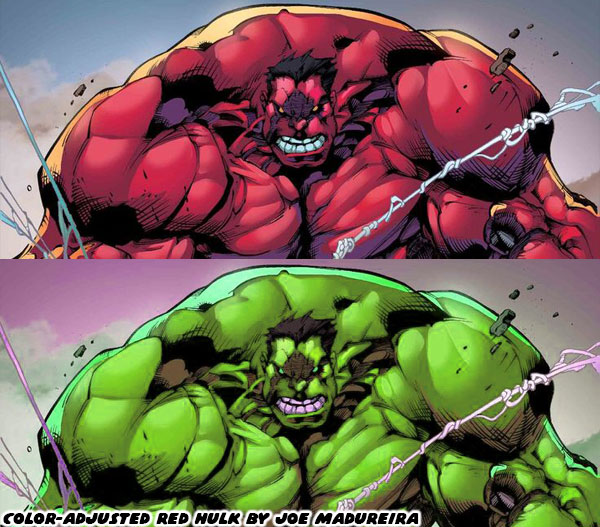
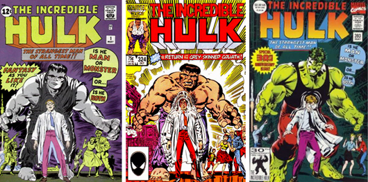
For the Hulk I mentioned that General Thaddeus "Thunderbolt" Ross was similar to Lex Luthor. Introduced in the first issue of the Hulk way back in 1962 he was a military leader that managed to be very problematic for the most powerful monster in the Marvel U. Then I talked about how not every author understood the characters that they were assigned, and ended up changing them to fit their own narrative. Jeph Loeb was a writer that gave Ross powers, and turned him into the Red Hulk in 2008, forever changing their dynamic in Marvel continuity. He then went on to give his daughter a gag comic where she added a Blue Hulk as well. I thought it was a bad idea then, and still think so to this day. If I were to give all the flowers to a writer that went in blind, and managed to continue building the legend of the Hulk then I would go with Peter David. Mr. David had written all sort of stories, and characters over the years. When he was hired at Marvel his dream was to write the Spider-Man books. He said he would have been happy with any book he was given, as long as it wasn’t the Hulk.

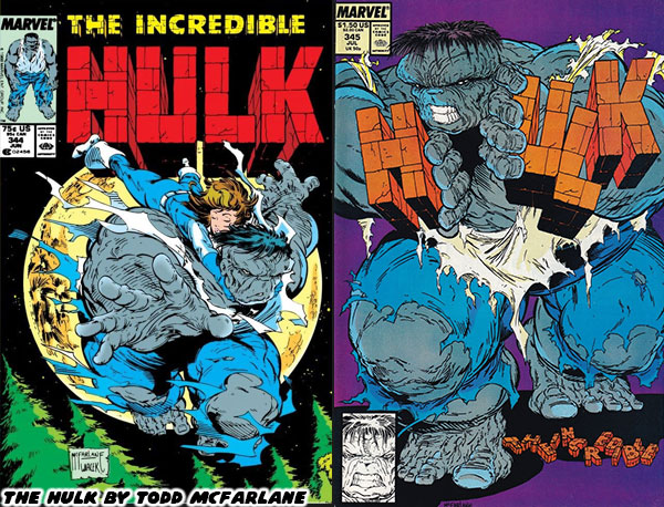
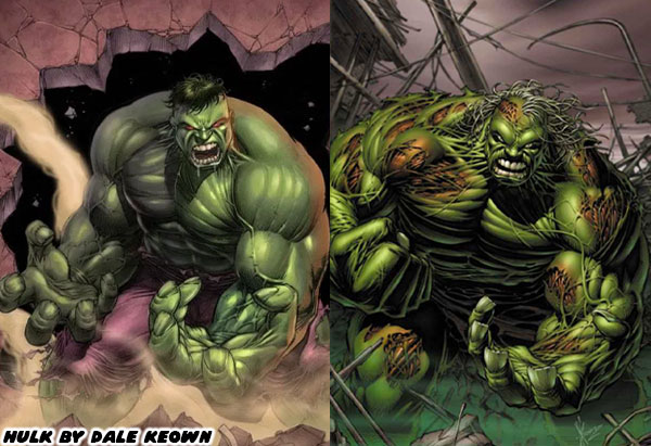
He thought that character had no dimension, and nothing interesting about him. Yet that was exactly the book he was told to write for in the late 1980’s. He didn’t complain or change the character to fit his preconceived notions. Instead he rolled up his sleeves, and studied every previous story in order to figure out the dynamics of he hero, his allies, and opponents. Once he understood the appeal Mr. David created several fantastic arcs for the character. He revisited old rivalries, introduced new friends, and conjured up amazing villains as well. He worked with a penciler named Todd McFarlane, and helped develop the Gray Hulk, or Mr. Fixit persona. McFarlane presented a version of the Hulk that was as wide, as he was tall, a literal walking tank. A few years later he would find popularity on the Amazing Spider-Man. Then he left as a co-founder of Image comics, and created Spawn. Little did we know that an even better Hulk artist would turn up not long after.

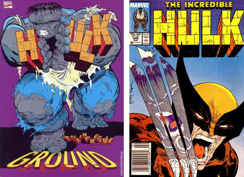
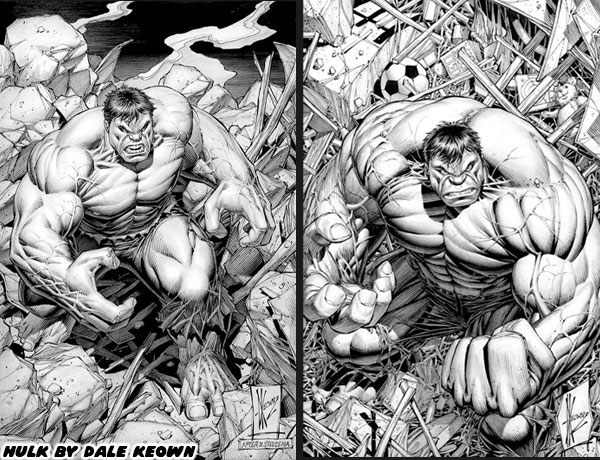
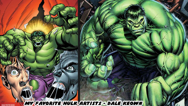
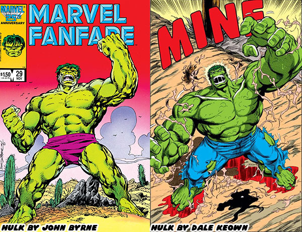
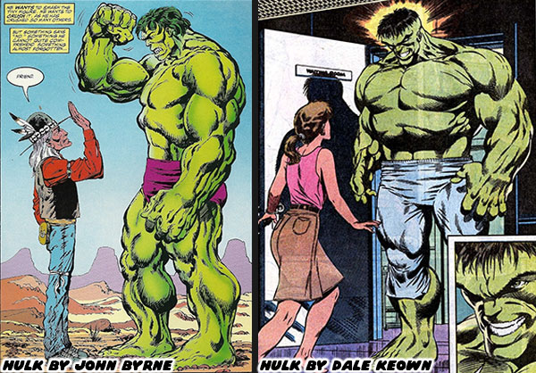
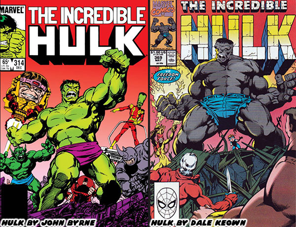
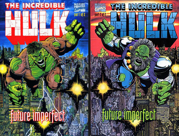
David worked with the brilliant Australian penciler Dale Keown (creator of the Pitt), and the duo helped make the Gray, and Green Hulk appealing to new fans. At the same time they never insulted the continuity for older readers. One of Mr. David’s greatest contributions was introducing the Maestro. The stories with the Abomination, the Juggernaut, and other heavy-hitters were amazing, but he wanted the Hulk to have a rival that was his superior in every way. An older, wiser, and stronger version of the Hulk from the distant future was what he came up with. After all, the only monster that actually stood a chance against the Hulk was… himself. The first appearance of this character was in the 1992 series called Future Imperfect (which was pencilled by George Perez). It was such a hit that the Maestro became an important part of canon, appearing in comics, but also animation, and video games for over 30 years.

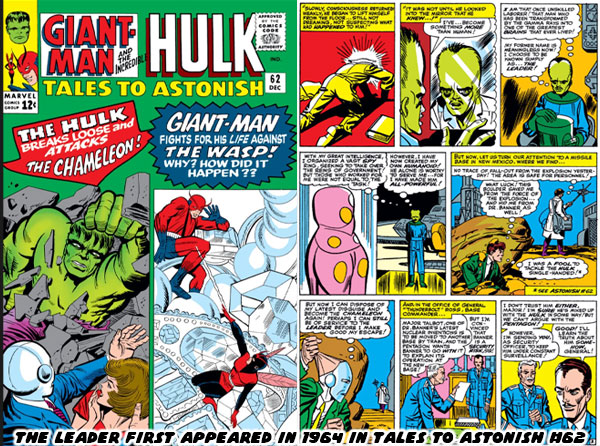
The Maestro was a brilliant design, however I would not consider him to be the Hulk’s greatest rival. Nor would I think of Thunderbolt Ross (in any form) as his greatest opponent. I would reserve that honor to the Leader. The Leader, also known as Samuel Sterns, first appeared in Tales to Astonish #62, way back in December 1964. He was a simple-minded janitor that was exposed to gamma rays during a work accident. He opened a drum of toxic waste because he thought it might have something that he could steal. Instead of dying from radiation poisoning he mutated. He turned into a genius rivaling the most brilliant minds in the Marvel Universe. His skin turned green similar to the Hulk, and other gamma-powered characters. His skull also grew to grotesque proportions. He developed awesome mental powers, including telekinesis, and mind control, on top of his inventing proficiency.

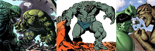
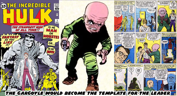
Most Hulk fans, myself included believe that the Leader was actually a chance to reboot the Hulk’s original mutated opponent. In the first issue of the Incredible Hulk from May 1962 there was a Russian spy that was transformed when he tried to recreate the conditions that changed Banner. Instead of growing massively powerful the scientist turned into a twisted version of his former self, with an enormous skull. The first Gargoyle, Yuri Topolov, was created by Stan Lee and Jack Kirby. A few years later the Leader was created by Stan Lee, and Steve Ditko. This formula of mutating spies for the Hulk to battle even applied to the Abomination, previously known as Emil Blonsky. The different looks, and powers of each character was explained as a psycho-physical manifestation of gamma mutation. Their subconscious self actually determined how they would appear to the world. Emil was an abusive husband, and a cruel manipulator. Of all the enemies he was the one that was truly a monster on the inside, and out. That was why he looked like a nightmarish beast when he transformed. The Leader was aware that people thought Sam Sterns was a dummy, but subconsciously he wanted to make everyone feel dumb. Thus he gained a massive brain. Yuri was already intelligent, but thought himself superior to his western rivals. His conceited nature was as ugly as the Gargoyle.

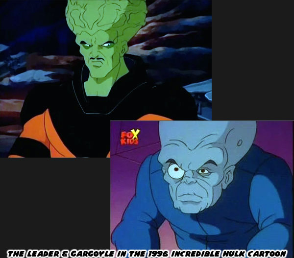
The Gargoyle would be used less, and less as the years went on. His most notable contribution to pop culture happened decades after his debut. In the Incredible Hulk animated series from 1996 he was voiced by Mark Hamill. Hamill was famous for playing Luke Skywalker in the Star Wars films, but for an entire generation his voice work was even better known. Hamill gained a massive following in cartoon circles when he started voicing the Joker for the Batman Animated Series in 1992. In the cartoons the Gargoyle was a subordinate to the Leader, voiced by character actor Matt Frewer. He first gained fame by playing the digital character Max Headroom. The Hulk animated series melded classic plots from the early era of the comics, plus newer designs that had been featured during the Peter David run. It managed to present the lore of the comics fairly well, and explained how the gamma mutations worked to newer fans. It summed up the obsession that the Leader had with the Hulk. He felt superior to Banner in every regard, except for his body, which lacked the strength, and resilience of the Hulk. He felt that he needed to possess the body in order to prove he was the ultimate being.

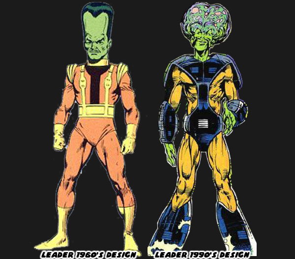
Like most comic book characters the Leader, and Gargoyle underwent some design changes over the years. Early on the Gargoyle had a large deformed head, with a relatively proportional human body. His frame became diminished, and twisted in later versions. His features made grotesque, and impish. The version featured in the animated series more or less defined his modern appearance. The Leader was traditionally seen with a long vertical head, and average build. In canon his body was covered in sores, and he wore a special uniform to allow him to function without pain. He was upset with his frail body, and expected that the perfect mind should be supported by a powerful physique. His look evolved early in the Peter David run. I believe it was Todd McFarlane (before Spider-Man, and Spawn fame) that gave him a new look. He figured that if his brain were to expand then it should have two massive hemispheres, rather than grow straight up. It made sense to me, although many fans were split on the new look. The comics even referred to him as “Jiffy Pop” head, after the popular way to make popcorn before microwavable bags.

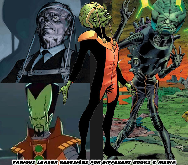
Different iterations of the Leader would appear in comics, and animation. Sometimes the designers would strike a middle ground between the classic look, and the Jiffy Pop form. The Ultimates version of the Marvel U, a sort of retelling of the classic characters in a more contemporary setting influenced the presentation of the live action movies. In that continuity the Leader was a British Special Forces officer named Peter Wisdom. He experimented on himself to save his program, and also in an attempt to become a super soldier. He did gain mind control powers, and telekinesis, but also ended up wheelchair bound. His brain was so big that his neck couldn’t support it. He required a brace in order to keep his head upright. This macabre look was incorporated into some of the latter designs of the traditional Marvel comics. The Leader had a mind literally big enough to figure out every way to take on the Hulk, and have backup plan, after backup plan that even Thunderbolt Ross couldn’t even contemplate.

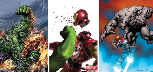
Tony Stark invented power armor light years ahead of anything else on Earth. Yet his biggest rival dressed in robes, and used 10 magic rings that science could not explain. The Mandarin’s powers came from the time of mysticism, and superstition, millennia before science had cracked the atom. The Mandarin was determined to rule the world, and in order to do so he had to destroy Stark, and his precious technology. The Hulk on the other hand could beat any conventional weapon, or other form of technology by sheer force. He had fought Iron Man on numerous occasions. Each time the monster took apart Iron Man like a tin can, including the fabled “Hulkbuster” armor. The Leader made sense in the tradition of great Marvel villains. He was so unlike the Hulk in every way that he was destined to be the ultimate rival. He was able to defy the Hulk by using powers that Banner did not possess. It was his awesome mental abilities, and not brute strength that would challenge Banner, and the Hulk. 

The Leader was another example of the asymmetric enemies that I previously discussed. Despite his frail appearance the Leader was actually a dangerous character. He didn’t even need to know how to throw a punch. His ability to use mind control on individual, and even groups of people was scary enough. If he was mortally wounded he seemed to have the ability to resurrect himself as well. He was a relentless villain that could hunt the Hulk with more vigor than even Thunderbolt Ross. There was a certain logic to his design that made sense in the context of the Marvel universe. I will talk about that in the next blog. Until then I want to know if you have a favorite Hulk villain, or any villain in general. Tell me about it on the comments section. As always if you would like to sponsor me please visit my Patreon page and consider donating each month, even as little as $1 would help make better blogs and even podcasts!
follow the Street Writer on Patreon!

Monday, May 6, 2024

Disney, the Italian Legacy, part 6 - A 1UP classic from July 19, 2011

When Epic Mickey was under development Disney in the USA used it as a vehicle to reach out to the community. They wanted to remind younger audiences why Mickey Mouse was an icon. The studio wanted to show them why the mouse had international appeal, even decades after his introduction. The concepts of selflessness, friendship and loyalty that made Mickey famous had to be made clear. In order to reach the younger generations the studio had to tap into their primary forms of entertainment, videogaming was the obvious one, yet comic books were also a contemporary form of entertainment that the studio could use as well.

While Warren Spector penned the outline for the Epic Mickey game, fellow Disney fan, comic book veteran and Eisner Award Winner Peter David was hired to write the story in comic book form. These were set to be a series of adventures that took place before the videogame, titled “Tales from the Wasteland.” In the US the comics were distributed digitally using the Disney DigiComics service, available via the iTunes store. Those with an iPhone, iPod or iPad could download the comics for free. The actual collected stories would not appear in graphic novel format until almost year later.

The decision to distribute comics digitally did not make a lot of sense to comic or videogame fans. Perhaps the studio did not want to have the stories get lumped together with the children’s comics in stores. By going all digital they ensured that part of the target audience would have direct access to the story without having to hunt for issues.

At the same time the stories were made available digitally they were published physically overseas in the pages of Topolino.

In keeping with Topolino magazine tradition there was a multi-page blowout about the game, plot and interviews with Warren Spector. Epic Mickey concept art, characters and history were featured before audiences got a chance to read the first in a series of adventures.

In order for Disney to accomplish their goal of reaching audiences via the comic book medium the best option was to go to Italy. Very few comic book artists working in the USA were trained in the Disney style or had any experience drawing Disney Comics. Italy was the one place where Disney comics were being published regularly and developed with a strong attention to detail.

Peter David got most of the attention in the US media outlets yet the art staff was just as accomplished. Fabio Celoni and Paolo Mottura were veterans from the pages of Topolino. They trained with the Disney Academy and had experience drawing just about every character in the universe at one point or another through their careers Their styles were not quite classic but more of a modern cartoon style instead. They helped bring Epic Mickey to life for fans on both sides of the Atlantic. The stories laid out by Mr. David were fun and took many chances to call out the classic attractions that would be highlighted in Epic Mickey. He was able to incorporate the most memorable elements that visitors saw at each attraction. For example the ballroom scene and bride from the Haunted Mansion were incorporated into the story. 

The lovelorn bride chased Oswald and the mechanized Donald and Goofy around the inside of the mansion as well as through the graveyard on floating “Doom Buggies.” Fabio and Paolo did a great job making cartoon versions out of the classic Marc Davis designs. Although they were ghosts none were too macabre as to scare off younger readers. Mr. David also wrote in Oswald trying to fill in the shoes of other classic characters. Instead of Donald Duck they tried out Oswald the Lucky Duck. Instead of Chernabog, the large demon at the end of Fantasia, Oswald tried his best at being menacing. Neither roles really worked for the rabbit. The classic squash and stretch reactions rendered by the art team did work in his favor though.

The collaboration of US writing and Italian art worked in favor of the Tales from the Wasteland. In a few months those that did not get a chance to read the digital downloads will be able to buy the collected graphic novel. This will include concept art from Junction Point and additional notes from Warren Spector and Peter David. The collection will be published by Disney Press instead of Boom Studios.

Not to be outdone Boom Studios, or rather Kaboom Studios had started publishing an all new series written by Warren Spector and penciled by other Italian greats. The next blog will take a look at the new DuckTales comic book adventures. I hope to see you back for that. As always if you would like to sponsor me please visit my Patreon page and consider donating each month, even as little as $1 would help make better blogs and even podcasts!
follow the Street Writer on Patreon!