Showing posts with label designs. Show all posts

Monday, February 23, 2026

Designing Wonder Eggs merch...

Hello friends, I hope that you are doing well. Work has been going well, and a few projects are chugging along over here. I was thinking the other day about the rare Oswald watch that I got my hands on. It gave me an idea for an illustration; I was wondering it might have looked like if Namco created prize watches for their Wonder Eggs theme park. As I was doing some research on the merchandise from the park I found out that one of their old shopping bag designs featured a pyrallis on the face of a pocket watch. So that was more than enough inspiration. Here were what I think the watch faces would have appeared. I used the classic Ingersoll “Mickey Mouse” movement for the arms.

The symbols on the outside edge of the watch were the actual numbers from “Elds’ Character” the fictional language used in the theme park. As an art study I actually recreated the fonts for myself a year or so ago. In this way if I ever wanted to do art on Laperot Village, or anything else Wonder Eggs related then it would be accurate. Since I was already drawing the pyrallis I came up with a design for a tee shirt for their seasonal Wonder Halloween Party at the actual park. The pumpkin character was a walk-around costume used in the park.

I had fun coming up with costume ideas for the different pyrallis characters. I just wish I had gotten a chance to visit the park when it was around. Thankfully I have a collection of items from the park that will always remind me of its greatness. Were there any theme parks or attractions you wish you had visited before they were torn down? Let me know about it in the comments section. As always if you enjoyed this blog, and would like to sponsor me please visit my Patreon page and consider donating each month, even as little as $1 would help make better blogs and even podcasts!
follow the Street Writer on Patreon!

Monday, October 7, 2024

A symmetry of villainy, part 3…

When I started this series I mentioned that the Incredible Hulk’s greatest villain was returning. It caused me to start talking about my theory on rival design. For people new to character design I advised if they were stuck on creating villain then they should try making an evil mirror version of the hero. For example the Abomination was the evil counterpart to the Hulk, and Bizarro was the same for Superman. These types of enemies worked well all throughout pop culture. I also mentioned that the most interesting rivals had asymmetrical designs. They did not have a similar group of skills or abilities as the protagonist. Even opponents that were physically inferior could be considered the most dangerous of rivals. Lex Luthor was a regular human compared to the Kryptonian Superman, yet for over 80 years he was considered the greatest opponent.
For the Hulk I mentioned that General Thaddeus "Thunderbolt" Ross was similar to Lex Luthor. Introduced in the first issue of the Hulk way back in 1962 he was a military leader that managed to be very problematic for the most powerful monster in the Marvel U. Then I talked about how not every author understood the characters that they were assigned, and ended up changing them to fit their own narrative. Jeph Loeb was a writer that gave Ross powers, and turned him into the Red Hulk in 2008, forever changing their dynamic in Marvel continuity. He then went on to give his daughter a gag comic where she added a Blue Hulk as well. I thought it was a bad idea then, and still think so to this day. If I were to give all the flowers to a writer that went in blind, and managed to continue building the legend of the Hulk then I would go with Peter David. Mr. David had written all sort of stories, and characters over the years. When he was hired at Marvel his dream was to write the Spider-Man books. He said he would have been happy with any book he was given, as long as it wasn’t the Hulk.
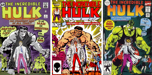
He thought that character had no dimension, and nothing interesting about him. Yet that was exactly the book he was told to write for in the late 1980’s. He didn’t complain or change the character to fit his preconceived notions. Instead he rolled up his sleeves, and studied every previous story in order to figure out the dynamics of he hero, his allies, and opponents. Once he understood the appeal Mr. David created several fantastic arcs for the character. He revisited old rivalries, introduced new friends, and conjured up amazing villains as well. He worked with a penciler named Todd McFarlane, and helped develop the Gray Hulk, or Mr. Fixit persona. McFarlane presented a version of the Hulk that was as wide, as he was tall, a literal walking tank. A few years later he would find popularity on the Amazing Spider-Man. Then he left as a co-founder of Image comics, and created Spawn. Little did we know that an even better Hulk artist would turn up not long after.
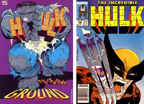
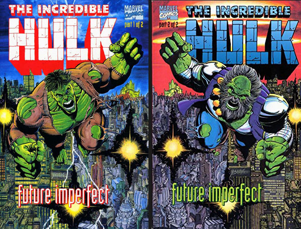
David worked with the brilliant Australian penciler Dale Keown (creator of the Pitt), and the duo helped make the Gray, and Green Hulk appealing to new fans. At the same time they never insulted the continuity for older readers. One of Mr. David’s greatest contributions was introducing the Maestro. The stories with the Abomination, the Juggernaut, and other heavy-hitters were amazing, but he wanted the Hulk to have a rival that was his superior in every way. An older, wiser, and stronger version of the Hulk from the distant future was what he came up with. After all, the only monster that actually stood a chance against the Hulk was… himself. The first appearance of this character was in the 1992 series called Future Imperfect (which was pencilled by George Perez). It was such a hit that the Maestro became an important part of canon, appearing in comics, but also animation, and video games for over 30 years.
The Maestro was a brilliant design, however I would not consider him to be the Hulk’s greatest rival. Nor would I think of Thunderbolt Ross (in any form) as his greatest opponent. I would reserve that honor to the Leader. The Leader, also known as Samuel Sterns, first appeared in Tales to Astonish #62, way back in December 1964. He was a simple-minded janitor that was exposed to gamma rays during a work accident. He opened a drum of toxic waste because he thought it might have something that he could steal. Instead of dying from radiation poisoning he mutated. He turned into a genius rivaling the most brilliant minds in the Marvel Universe. His skin turned green similar to the Hulk, and other gamma-powered characters. His skull also grew to grotesque proportions. He developed awesome mental powers, including telekinesis, and mind control, on top of his inventing proficiency.
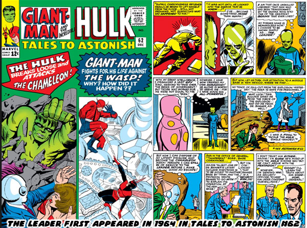
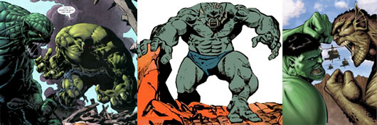
Most Hulk fans, myself included believe that the Leader was actually a chance to reboot the Hulk’s original mutated opponent. In the first issue of the Incredible Hulk from May 1962 there was a Russian spy that was transformed when he tried to recreate the conditions that changed Banner. Instead of growing massively powerful the scientist turned into a twisted version of his former self, with an enormous skull. The first Gargoyle, Yuri Topolov, was created by Stan Lee and Jack Kirby. A few years later the Leader was created by Stan Lee, and Steve Ditko. This formula of mutating spies for the Hulk to battle even applied to the Abomination, previously known as Emil Blonsky. The different looks, and powers of each character was explained as a psycho-physical manifestation of gamma mutation. Their subconscious self actually determined how they would appear to the world. Emil was an abusive husband, and a cruel manipulator. Of all the enemies he was the one that was truly a monster on the inside, and out. That was why he looked like a nightmarish beast when he transformed. The Leader was aware that people thought Sam Sterns was a dummy, but subconsciously he wanted to make everyone feel dumb. Thus he gained a massive brain. Yuri was already intelligent, but thought himself superior to his western rivals. His conceited nature was as ugly as the Gargoyle.
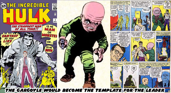
The Gargoyle would be used less, and less as the years went on. His most notable contribution to pop culture happened decades after his debut. In the Incredible Hulk animated series from 1996 he was voiced by Mark Hamill. Hamill was famous for playing Luke Skywalker in the Star Wars films, but for an entire generation his voice work was even better known. Hamill gained a massive following in cartoon circles when he started voicing the Joker for the Batman Animated Series in 1992. In the cartoons the Gargoyle was a subordinate to the Leader, voiced by character actor Matt Frewer. He first gained fame by playing the digital character Max Headroom. The Hulk animated series melded classic plots from the early era of the comics, plus newer designs that had been featured during the Peter David run. It managed to present the lore of the comics fairly well, and explained how the gamma mutations worked to newer fans. It summed up the obsession that the Leader had with the Hulk. He felt superior to Banner in every regard, except for his body, which lacked the strength, and resilience of the Hulk. He felt that he needed to possess the body in order to prove he was the ultimate being.
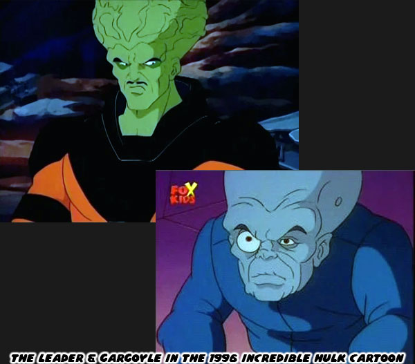
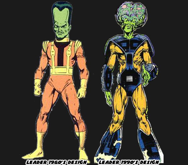
Like most comic book characters the Leader, and Gargoyle underwent some design changes over the years. Early on the Gargoyle had a large deformed head, with a relatively proportional human body. His frame became diminished, and twisted in later versions. His features made grotesque, and impish. The version featured in the animated series more or less defined his modern appearance. The Leader was traditionally seen with a long vertical head, and average build. In canon his body was covered in sores, and he wore a special uniform to allow him to function without pain. He was upset with his frail body, and expected that the perfect mind should be supported by a powerful physique. His look evolved early in the Peter David run. I believe it was Todd McFarlane (before Spider-Man, and Spawn fame) that gave him a new look. He figured that if his brain were to expand then it should have two massive hemispheres, rather than grow straight up. It made sense to me, although many fans were split on the new look. The comics even referred to him as “Jiffy Pop” head, after the popular way to make popcorn before microwavable bags.
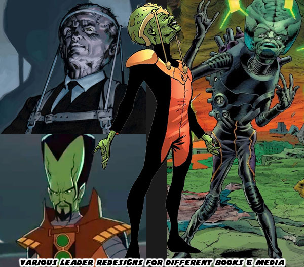
Different iterations of the Leader would appear in comics, and animation. Sometimes the designers would strike a middle ground between the classic look, and the Jiffy Pop form. The Ultimates version of the Marvel U, a sort of retelling of the classic characters in a more contemporary setting influenced the presentation of the live action movies. In that continuity the Leader was a British Special Forces officer named Peter Wisdom. He experimented on himself to save his program, and also in an attempt to become a super soldier. He did gain mind control powers, and telekinesis, but also ended up wheelchair bound. His brain was so big that his neck couldn’t support it. He required a brace in order to keep his head upright. This macabre look was incorporated into some of the latter designs of the traditional Marvel comics. The Leader had a mind literally big enough to figure out every way to take on the Hulk, and have backup plan, after backup plan that even Thunderbolt Ross couldn’t even contemplate.
Tony Stark invented power armor light years ahead of anything else on Earth. Yet his biggest rival dressed in robes, and used 10 magic rings that science could not explain. The Mandarin’s powers came from the time of mysticism, and superstition, millennia before science had cracked the atom. The Mandarin was determined to rule the world, and in order to do so he had to destroy Stark, and his precious technology. The Hulk on the other hand could beat any conventional weapon, or other form of technology by sheer force. He had fought Iron Man on numerous occasions. Each time the monster took apart Iron Man like a tin can, including the fabled “Hulkbuster” armor. The Leader made sense in the tradition of great Marvel villains. He was so unlike the Hulk in every way that he was destined to be the ultimate rival. He was able to defy the Hulk by using powers that Banner did not possess. It was his awesome mental abilities, and not brute strength that would challenge Banner, and the Hulk. 
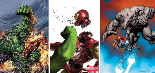
The Leader was another example of the asymmetric enemies that I previously discussed. Despite his frail appearance the Leader was actually a dangerous character. He didn’t even need to know how to throw a punch. His ability to use mind control on individual, and even groups of people was scary enough. If he was mortally wounded he seemed to have the ability to resurrect himself as well. He was a relentless villain that could hunt the Hulk with more vigor than even Thunderbolt Ross. There was a certain logic to his design that made sense in the context of the Marvel universe. I will talk about that in the next blog. Until then I want to know if you have a favorite Hulk villain, or any villain in general. Tell me about it on the comments section. As always if you would like to sponsor me please visit my Patreon page and consider donating each month, even as little as $1 would help make better blogs and even podcasts!
follow the Street Writer on Patreon!

Wednesday, August 30, 2017

Meet Street Fighter V's Menat, an old soul in a young body?

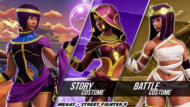
More news from the people at Capcom. The latest fighter for Street Fighter V; Season 2 has been revealed. This time it is a young female by the name of Menat. Harrison at Capcom-Unity gave the fighting game crowd a full preview of the character. In case you haven't seen her here she is along with her alternate costumes.


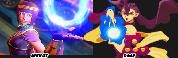
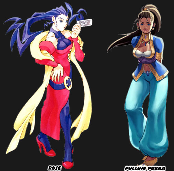
The character was actually teaser earlier, appearing in the visions of Ed. In her earlier debut she was listed only as a Fortune Teller. The connection between her and Ed was instant. I had mentioned previously that Ed was a return to Psycho Power. This was the mysterious psychic energy that powered Vega / the Dictator and allowed him to do things like fly, teleport and glowing orbs of psychic energy. The origins of this power were connected by a mystical person named Rose. She debuted in Street Fighter Zero / Alpha, which tied together the events that happened between Street Fighter, Final Fight and Street Fighter II. It looks like Menat is filling in that same role. Harrison said that Menat was the understudy of Rose. It made sense that Menat and Ed were connected. Rose and Vega also shared a psychic bond. This was explored in the various endings.


The moves and special abilities of Menat had a few things in common with Rose. She could reflect fireball attacks and even add energy to them to make them more powerful. Yet like Ed, she was her own unique character. Menat fought with a crystal ball, which she named Ankh. The Capcom designers called it a soul sphere, the name was based on the ancient Egyptian symbol which symbolized life. I didn't know if the crystal ball actually contained her soul, or was a conduit for her psychic powers. I suppose we'll find out shortly. There had been a few characters from the Middle East in the history of fighting games. Egyptian characters were not unique but they sometimes wore costumes that were more classical than contemporary.


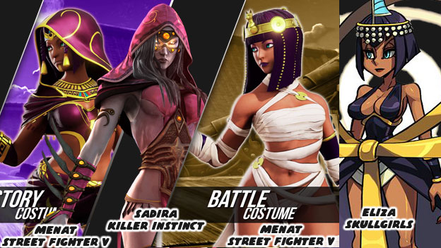
I wouldn't say that Menat's default costume was daily wear for an Egyptian but her alternate costumes did seem eerily familiar. At worst the costumes could be considered culturally insensitive. I mean did Egyptians in the 21st century really wear mummy wraps? But more important than that, a lot of people have noticed that the alternate costumes looked like costumes worn by characters in other fighting games. Sadira for example was an assassin introduced in Killer Instinct. The fighting game from 2013 was a relaunch of a cult-classic Rare franchise. Sadira was inferred to be from the Middle East. The colors of her hood and patterns on her costume looked like traditional dress. Something inspired loosely by the bedleh, the light clothing worn by dancers. Sadira's uniform looked very much like the basis for Menat's costume. Then there was Eliza. This Pharaoh-themed character was introduced in Skullgirls Encore. The indy fighting game from 2014 pulled inspiration from dozens of different sources, including classic American cartoons and Japanese anime. Eliza was actually a design that was voted on by fans. The studio used Kickstarter to raise funds for new characters and Eliza was extremely popular in the voting. She really stood out when she was finally added. It was as if Cleopatra had become a fighter, her dress, Ankh symbol and crown were pulled from ancient history. And then apparently it looked like these things were poached by Capcom to be used for Menat as well. The similarities I think were too close for this to be more than coincidence.


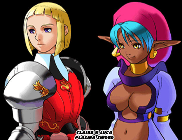
Poaching costumes from a rival studio was pretty low in my book. But then it might all be coincidence. The first time I saw the Fortune Teller / Menat the very first thing that stood out to me was the cut of her hair. Her look, her costume didn't immediately strike me as something that was featured in any contemporary game. Instead the hair, the colors and overall look actually reminded me of a few characters that Capcom had designed previously. The hair specifically reminded me of Claire, an officer in the Fourth Empire. She had a look that was inspired by medieval Spanish knights. She even fought with a plasma rapier. Plasma Sword: Nightmare of Bilstein came out in 1998. It was the sequel to Star Gladiator, a 1996 3D game, that was essentially Capcom's version of Star Wars as a fighting game. The sequel also introduced us to Luca, an alien fighter that was the fiance' of the alien Gore.


When I first saw Menat I thought that she was a sort of combination design of Claire and Luca. As if the designers revisited the notes on other fighters and tried to create something new. Also, seeing her bubbly personality reminded me of ARIKA's Pullum Purna. The youthful and energetic girl from the Arabian peninsula predated Menat by 20 years. It was hard to deny that Sadira and and Eliza also predated if not outright influenced Menat's design. What Capcom did right was in approaching her move set, her special abilities and connection to the past. Menat worked in part because she was reminiscent of Rose. Just as Ed reminded us of M. Bison and Vega, the Boxer and Dictator. But Menat was her own character, with her own special attacks, strategies and techniques. She would bridge the legacy designs and make a unique spot in the lineup.


If you are an artist trying to crack the code of the Street Fighter designs just look at three of the newer characters introduced into the series. Juri, Ed and Menat were all inspired by previous characters, they were in essence mirroring legacy designs. Juri was like an evil version of Chun-Li. Ed was a hybrid of Vega and Bison. Menat was the fresh face. She was to Rose as Cammy was to Chun-Li. It was not a coincidence that audiences gravitated towards these characters. Whether they realized it or not Capcom was using the same design elements that brought people into the fold 30 years ago. You can't really say the same about Rufus, Hakan, F.A.N.G. or Necali could you? I'd like to hear your take on Menat. Do you like the character? Why do you think she does or doesn't work in the series. As always if you enjoyed this blog and would like to sponsor me please visit my Patreon page and consider donating each month, even as little as $1 would help make better blogs and even podcasts!

 follow the Street Writer on Patreon!

Tuesday, August 15, 2017

Speculation on ARIKA's unnamed Street Fighter EX successor, part 3...

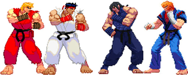
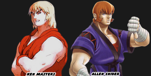
Allen Snider was recently announced for the new ARIKA fighting game, let’s call it Fighting Layer EX or FLEX for short. Allen Snider, along with Kairi, were created as sort of rivals / parallels to Ken and Ryu in the Street Fighter EX series. In fact just about every character in the game was a sort of parallel to the Street Fighter II World Warriors. Blair Dame was a balance to Chun-Li, Darun Mister was the perfect rival for Zangief and Doctrine Dark was a military assassin to counter Guile. Skullomania was the oddball character, a sort of Dhalsim or Blanka in the lineup. Akira Nishitani was one of the designers on Final Fight and Street Fighter II. When he left Capcom to start his own company, ARIKA, he didn’t forget the many lessons he had learned from his teammates.


One of the things that ARIKA did was dissect the elements that made the Street Fighter II characters iconic. They looked at the color pallet, costumes, martial arts represented, origin stories and nationalities. They they tried to recreated these things. If a character set a standard, like Ken and Ryu did for karate-type fighters, then they wanted to figure out how to top those designs. It was very important that they show audiences that Kairi and Allen were not simply the same character with a different head. The colors, costumes, stance and fighting styles of Kairi and Allen were very unique. The difference between the two was much greater than the difference between Ken and Ryu. At the same time ARIKA wanted it to be understood that Kairi was the star of the game, the Ryu, and Allen was a sort of Ken in the universe, without necessarily being a friend of Kairi’s.


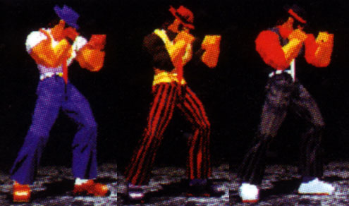
ARIKA didn’t settle for simple hue shifts or alternate colors for their characters. They actually created unique costumes as the alternates. Each costume told a story. Kairi’s showed the evolution of his character from fighter to boss-tier master. Allen went from one flamboyant gi to another more outlandish one. Supporting characters like Darun wore different wrestling championship belts depending on his costume selection. C. Jack went from one stylish outfit, including gambler-style hat, vest and tie, to an even more stylish one. This design rule followed every character in the series. But having a unique set of costumes, which were all character appropriate, were only part of the design elements behind the EX series.


Allen Snider was a second attempt at creating the Ken character. Takashi Nishiyama was the director and Hiroshi Matsumoto was the designer on the original Street Fighter. The reason they created Ken was to have someone for the USA players to identify with and thus play. Their design choice was far from unique. The white gi versus red gi character had been seen a few years earlier in Technos’ Karate Champ. There was little then that made Ken and Ryu unique. They shared the same moves and aside from Ryu having a different head and pair of traditional Chinese slippers, they were identical. When Nishitani took over the reigns in Street Fighter II (SFII) he and the team wanted to make Ken and Ryu a little more unique. Bengus, AKIMAN, SHOEI and Sensei, a literal who’s-who of fighting game designers introduced small details into the characters. If you look carefully at the official Street Fighter II art Ryu wore a gi that was ragged and frayed whereas Ken wore one whose cuffs were hemmed. That detail was very easy to overlook, especially since the sprites remained identical in the game. So when the opportunity arose to make a new American karate champ they went all out with the designs.


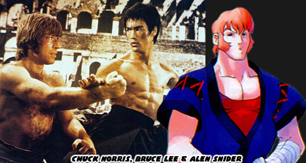
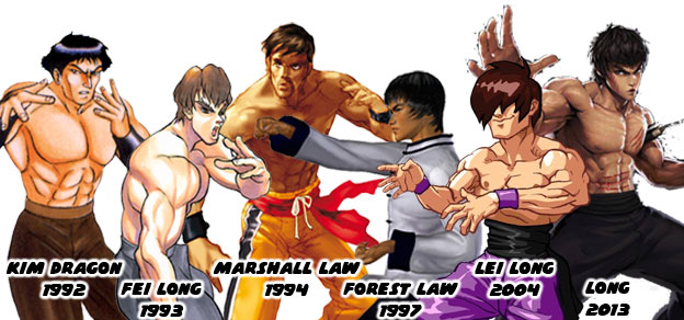
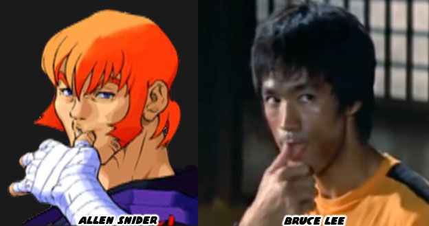
The artists looked at the heroes they had in comics, in animé, in martial arts cinema and then made an amalgamation out of these figures. Allen Snider in a nutshell had the hair and sideburns or Chuck Norris, but with the desire to be a breakout star like Bruce Lee. Snider was not simply a cut-and-paste of the two. He was especially not just a carbon copy of Bruce Lee. Many studios tried to put a Bruce Lee clone into their games, including ADK, Capcom, Namco and a few indy developers. But each attempt was just a caricature of the man. He seemed out of place when put in a lineup of figures that were more unique. That were more memorable.


So what artists did was focus on the elements that made Lee and Norris unique. They tried to find some symmetry there. Allen was meant to bring back memories of the previous generation of karate stars. Not necessarily the underground legends but instead those that fought in televised contests. The developers had seen how well incorporating elements from real people had worked for Ryu. I’ve talked about it again and again but I always go back the gold standard in character designs. Ryu was inspired by the true-life adventures of Mas Oyama and Yoshiji Soeno. The thing was the character did not look anything like the real men. Yet watching him dominate the competition with his superior techniques would rekindle memories of Oyama, a man nicknamed the God Hand. Snider was the high kicking star from the USA. Someone that was ready for his movie debut. He was not supposed to have the gravitas of Kairi, his drama was more manufactured. He was a reflection of the modern martial arts star. Someone who was more comfortable on the big screen than in the back-alley fights.


ARIKA did an excellent job at making the difference between Kairi and Allen more profound than that of Ken and Ryu. Kairi was covered in scars, had long hair and was missing an eye. Snider had the good looks and shaggy long hair of a ‘70s star. Kairi was a tortured soul that pained with every victory while Allen celebrated with gusto. They didn’t want to let tiny details tell the story, there were no hemmed cuffs separating the models. Reusing sprites was a thing of the past. There were fresh uniforms, bright colors and original 3D models to look at. They hammered away at this difference all throughout the series. The way each controlled had to be as unique as how they looked. Kairi was the more experienced fighter, he had a broader library of attacks and could be played more aggressively. Snider was new to the unsanctioned tournament scene. He was designed to be used more tactically. Even the game endings were very different. Kairi was the outcast, haunted by his past he was meant to fight his battles alone. Allen was the budding movie star and got his big break at the end of the first EX Tournament. ARIKA gave audiences another nod to his forefather. If Bruce Lee fought one giant on film then Allen had to fight two.


When Allen Snider was announced for the new ARIKA game I was excited. The changes made to the character perfectly reflected his origin. We’ll look at these things on the next blog. As always if you enjoyed this blog and would like to sponsor me please visit my Patreon page and consider donating each month, even as little as $1 would help make better blogs and even podcasts!

 follow the Street Writer on Patreon!