Showing posts with label illustrator. Show all posts

Friday, October 25, 2024

Generations of Hulk creators, part 6...

When I started this series I talked in broad terms about how the Incredible Hulk was a horror story. Jack Kirby and Stan Lee created a modern retelling of Frankenstein. Dr. Bruce Banner was the fill in for Dr. Victor Frankenstein, and the Hulk was his dark shadow, his creation. Not every great Hulk story was about war, and escalation like the classic Kirby / Lee stories. Not every writer could pull off a galactic-spanning adventure like Donny Cates did in his Starship Hulk run. It required a deep understanding of the characters, and canon of the universe in order to pull off. On the other hand suspense, and horror, including body horror, were also major drawing points for the series. It was a format that great writers could use when they wanted to shape a plot. Even new creators unfamiliar with the monster could lean into the horror elements of the Hulk, and know it would fit the character. This was something that didn’t necessarily work with other Marvel characters like Spider-Man, Captain America, or Iron Man. The most significant Hulk story to come out in the past decade was the Immortal Hulk.

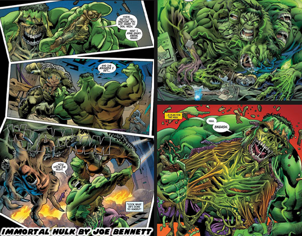
The story was written by British author Al Ewing, and illustrated by Brazilian artist Joe Bennett. Among all of the comic book artists hired by Marvel in the past 15-odd years, the work that Mr. Bennett delivered absolutely stood out. He was another one of those artists that you could tell was born to draw the Hulk. He had a sense of scale, and power that was rarely seen by any illustrator. He had essentially recreated the heavy browed monster of Jack Kirby but for a new generation. At the same time he delivered some of the goriest, most twisted panels I had ever seen. I would have ranked him quite high in my personal list of the best Hulk artists, unfortunately he could not avoid controversy. He made bigoted remarks about writer Glen Greenwald, then was accused of Anti-Semitism in one of his story panels. He was let go by Marvel not long after. He went on record to apologize for his comments but it made me sad that such a great horror artist could hold onto hateful stereotypes. I suppose it was a reflection of his insight into the human condition that made him so good at drawing ugly situations. I didn’t think that there would be any other artist to come along that could match that level of horror storytelling. That was until a new team started the Age of Monsters arc in 2024.

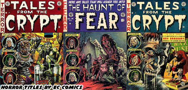
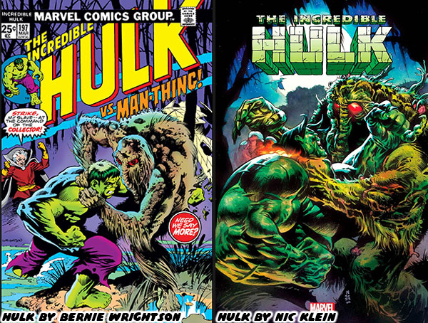
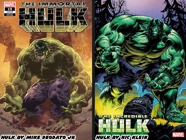
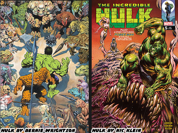
Writer Phillip Kennedy Johnson, and artist Nic Klein were delivering a masterclass on the green monster. They presented a horror tale that was distinctly unlike the Ewing / Bennett run. Theirs was instead pulled from an even older format. They were creating a nod to the mysterious, the weird, and the strange myths that inspired the pulp-era horror stories. They were working on a callback to the classic EC Horror books like Tales From The Crypt, the Haunt of Fear, and the Vault of Horror. Only now Johnson, and Klein were knitting Bruce Banner into the plots, and updating the visuals for the modern world. The first thing that stood out to me about Mr. Klein’s art was how much he drew in the style of Bernie Wrightson. Bernie was greatly influenced by the classic pulp stories of post WWII America. Although he was born too late to be a founder of the movement his art clearly hinted at the greats like Johnny Craig, Jack Davis, Graham “Ghastly” Ingels, Harvey Kurtzman, and Wally Wood.

Comparisons aside Wrightson’s draftsmanship was unparalleled. His Frankenstein book for Marvel was an essential work for all illustrators to study. Wrightson did more for the horror genre in black, and white than any other artist working in the 20th century. On top of everything he also worked on various monster stories for DC, and Marvel, including the respective Swamp Thing, and Man-Thing. His style, rendering techniques, and creature designs, both monsters, and aliens were unlike the regular Hulk artists. These unique elements made him a stand out whenever his art would appear in comic book format. Wrightson was absolutely a great fit for horror stories. Yet he produced less and less comic material as he got older. By the late ‘70s, and early ’80s he wasn’t releasing too many things. His work in the ‘90s was even more sparse. Unless you were familiar with the artist then you had no idea how great he was, and how much we lost when he passed away in 2017.

It had been more than 40 years years since the Wrightson style of art carried a Hulk story. Seeing the art by Nic Klein rekindled all the memories I had as a kid. I hadn’t seen anything similar in a long time. Knowing that Mr. Klein was going to be the lead on a Hulk horror story filled me with joy. Over the past few blogs I had highlighted some of my favorite Hulk artists, however you should know that not every Hulk creator was a good fit for a horror title. Some were great with action sequences, and team ups. Other artists knew how to draw the reluctant hero, or misunderstood monster archetype. Horror stories took an entirely different approach. We would be getting closer to the characters, much more intimate with their fears, and desires. We needed an artist that could render action, but also close in on details when the scene required it. If you don’t know anything about illustrating then let me say that this type of art took an entirely unique set of skills.

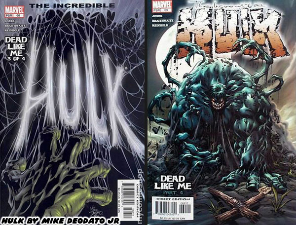
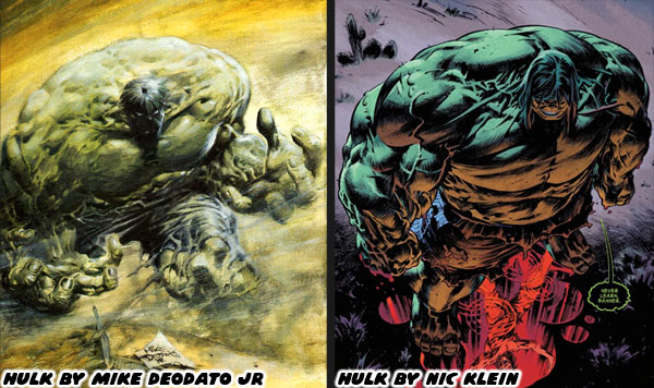
I do want to be fair, and give flowers to a Hulk artist that I am haven’t mentioned. Mike Deodato Jr. worked under different writers at Marvel for years, and years. He was, and remains a fantastic Hulk artist. He first got on my radar during the ‘90s. His style was its own unique thing. It was different than Keown, Adams, McGuinness or any other illustrator that I’ve mentioned so far. Mr. Deodato Jr’s style rose to new heights whenever he needed to do a horror story featuring the Hulk such as the covers for the Dead Like Me arc written by Bruce Jones, and Garth Ennis. The regular artists on the series were Doug Braithwaite, and John McCrea. They were great artists as well, however the person that set the tone was Mike, and his cover art. It gave us a glimpse of a Hulk that was much darker, and more twisted than anything we had ever seen.

Mike had a style that worked exceptionally well for a Hulk horror story, dark character like Venom, or gritty vigilantes like the Punisher. His monster proportions were very extreme, even when compared to Keown, or Adams. The Hulk’s torso was as thick, and broad as he was tall. Not unlike the old McFarlane version of the gray Hulk. Except Mike had a better sense of anatomy, and physiology. I hadn’t seen anything similar to that style until Nic Klein began drawing the books. These were almost 20 years after Mike’s last run. Mr. Klein seemed to marry the proportions of Deodato Jr. with the rendering techniques of Mr. Wrightson. This combination of influences was so well done that it made Nic criminally underrated. He would set the standard for the foreseeable future. I had no doubt that kids reading the comics today would become illustrators in the future because of how influential the art was.

Nic was another example of how each generation of artists were refining the style of the masters that came before. With that said where would I rank him against my favorite Hulk artists? I’ll talk about it on the next, and final part of this series. I hope to see you back for that. Did you read the Immortal Hulk arc? Were there any young artists that you thought were underrated? I’d like to read about it in the comments section. As always if you would like to sponsor me please visit my Patreon page and consider donating each month, even as little as $1 would help make better blogs and even podcasts!
follow the Street Writer on Patreon!

Friday, October 18, 2024

Generations of Hulk creators, part 3...

In the previous blog I mentioned that the Hulk was a monster, very much similar to Frankenstein’s creation. He was large, twisted, and grotesque in proportions. The character worked exceptionally well in horror stories as both the monster, and hero. An artist like Bernie Wrightson was a perfect choice to draw some of the Incredible Hulk issues, and stand-alone stories. I also mentioned that some comic book artists made the mistake of presenting the Hulk with a large bodybuilder physique. Where he had well defined muscles, and low body fat. I argued that these types of builds worked on a surface level to represent strength, but that wasn’t necessarily the best way to do it. There was an artist that had worked for DC, and Marvel that demonstrated that it was possible to render power, without making the characters swollen bodybuilders.
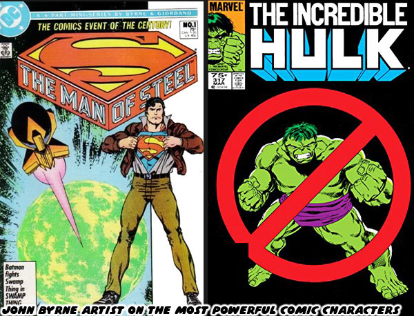
John Byrne was a titan in the industry. He developed countless issues, and helped shape the most important stories of several comic book publishers. He was one of the rare artists that actually had a hand in drawing what were considered the most powerful characters in their respective universes. He drew both Superman (starting in 1986), and the Incredible Hulk (starting in 1985). He did this without making either character overly muscular. Yes, both had good physiques, but they didn’t look like steroid abusers. Byrne’s understanding of anatomy, and physiology helped him render realistic frames that maintained a sense of power. For Superman he accomplished this by making Clark appear athletic, and fitting him in clothing that highlighted his body type. Readers could tell that he was in great shape, but not overtly muscular. When he changed into Superman he maintained a realistic athletic physique. Byrne was able to convey power not through muscles, but rather through the use of dynamic poses, and framing him doing the impossible with ease. He used similar techniques when drawing for the Hulk. The Hulk was not human by comparison. He was broad, with a wide head, large mouth, heavy brow, massive hands, and feet. He was supposed to be monstrous in proportions, rather than monstrous in muscle definition.

Byrne was able to present the Hulk as insanely powerful not by making the Hulk do the impossible with ease. That was a trick that he reserved for Superman. The Hulk on the other hand appeared powerful because he was able to shrug off perpetually escalating military attacks. When guns didn’t work they sent tanks after him. When that didn’t work they sent fighter jets, and missile. When that didn’t work they began unleashing monsters, giant robots, and biological attacks. When that didn’t work the biggest villains, and heroes in the Marvel Universe would be called in to stop him. The results were always the same. The Hulk took his hits, but often walked away with the win. The Hulk was powerful because no amount of escalation could break the character. The cautionary tale was that he simply wanted to be left alone, but his rivals were too arrogant to do so. Byrne set a standard for both Superman, and the Incredible Hulk that was hard to follow.
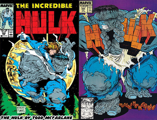
Many other artists would work on the Hulk books through the late 1980’s, but they would always be compared to Byrne. That was except for the artists whose style was so unique that they had few peers. Todd McFarlane was one such person. His style completely broke the classic mold. His version of the Hulk was as broad as he was tall. He was shaped like a cinder block, truly monstrous in proportions. This was around the time that Peter David started writing on the series. The duo used the horror element to great effect when crafting the “Ground Zero” arc. Not everyone was a fan of the bold art style, and longed for a return of something more traditional. McFarlane was moved over to the Amazing Spider-Man where he would absolutely flourish. A young Australian named Dale Keown had submitted some test pages to the studio, and they saw a similarity between his style, and Byrne’s. The new Hulk artist was called up.
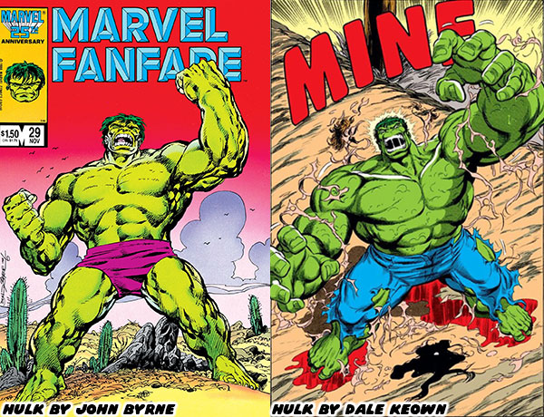
Byrne’s heir apparent took over, and the fans were clamoring for more on day one. The way Dale rendered his physique, his use of crosshatching, rendering details, shapes, and proportions was spot on with the classic Byrne style. The Hulk was muscular, but not shredded like a bodybuilder. The shape of his body, his massive hands, and heavy brow were reminiscent of Byrne, however Keown had his own style too. Over the years he would tweak the proportions of the character, exaggerate it a bit more, use different poses, different panel breakdowns, and framing techniques which were distinctly his own. He would update the wardrobe, and move to jeans rather than purple pants for the Hulk, and snazzy suits for the gray Joe Fixit. Keown would also refine, and update the classic villains. The thing was that he did these things subtly over the late ‘80s, and early ‘90s so as not to shock to long-time fans. By the time he finished his run he was considered by many to be the best Hulk artist to ever live. In fact over the past 30+ years he would turn up to do a couple of issues written by Peter David, as well as create variant covers for Marvel in his own style.
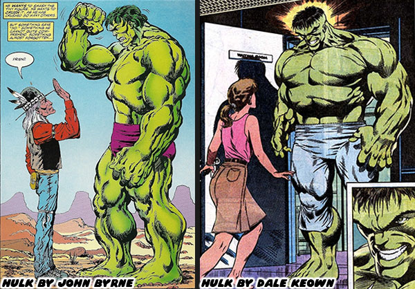
The new crop of artists working at Marvel in the early ‘90s, including Jim Lee, Joe Quesada, Whilce Portacio, and Rob Liefeld were definitely a changing of the guard. Each had their own unique style that was really hitting with Generation-X. They were creating a fresh aesthetic, that sometimes included manga, and anime influences. They were rewriting the style of the company, and western comic books in general. Keown was definitely part of the equation. His hand was on the scale of the most powerful character in the Marvel U. It was essential to make his work stand apart from his contemporaries. He did this on his debut, issue #367 in March 1990. It was the fourth, and final part of the Countdown saga where the Madman was unmasked. The villain was not only massively strong, but also absolutely insane. I never thought I’d see a monster that could even terrorize even the Hulk, bringing Joe Fixit to the brink of death. From that moment on the fans knew that Keown was going to be carrying the series. Sadly it wasn’t going to be a forever run on the books.
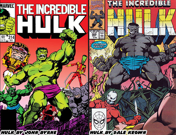
Peter David used Keown’s red-hot pencils to break down, and rebuild both the classic green Hulk, and gray Joe Fixit. They would introduce a merged personality known as Professor Hulk. He would become a leader of a group of immortal beings known as the Pantheon, and travel the globe on all sorts of adventures. Fans were eating it up, and eager to see what else the duo had planned. Sadly that wouldn’t happen. After 31 issues, while on his second year with the series Keown shocked everyone by leaving. He would join fellow artists to leverage their skills, and fanbase to quit Marvel. The group would start up Image Comics. He would develop the alien monster series called the Pitt. The hero was a massive humanoid like the Hulk, but with razor sharp claws similar to Sabertooth, the arch-rival of Wolverine. It was a fun comic, with lots of creature designs in the trademark Keown style. There was some bad blood between the Marvel executives and the young creators, but competition, and business was generally good for the industry. Peter David was even reunited with Keown to write a one-shot book featuring the Hulk versus the Pitt. They would also work together on other short Hulk stories, including “The End” where we saw the end of the Banner many centuries from now.
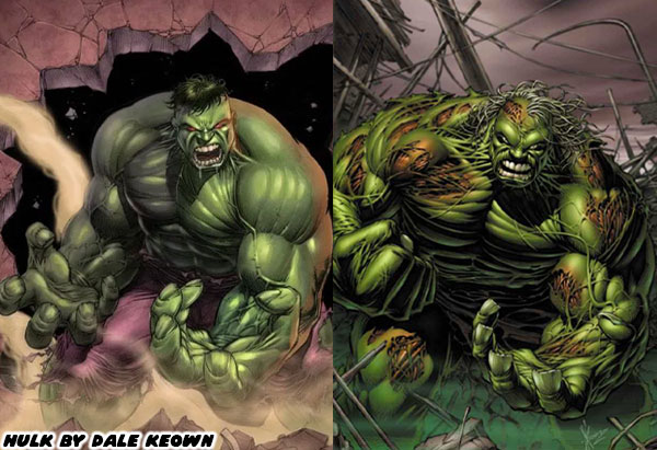
It turned out that Dale Keown leaving was both a blessing, and a curse for Marvel. It was bad because in the eyes of many he was literally born to draw the character. The artists that followed in his footsteps had a hard time meeting the standard he set. At the same time Marvel was able to give chances to dozens of other artists over the next three decades. Each brought their own unique aesthetic to the character. Some weren’t quite fits for the Hulk, but they managed to be perfect for Iron Man, Spider-Man, Captain America, Thor, or any other franchise. There were a few standout artists that managed to breathe new life into the Green Goliath. I’m going to highlight some of these artists in the next entry. Until then I’d like to know if you followed the Hulk, or had a favorite comic book artist. I’d like to read about it in the comments section. As always if you would like to sponsor me please visit my Patreon page and consider donating each month, even as little as $1 would help make better blogs and even podcasts!
follow the Street Writer on Patreon!

Wednesday, May 22, 2024

Count Dante, the man, the myth, the illustration - A 1UP classic from May 21, 2012

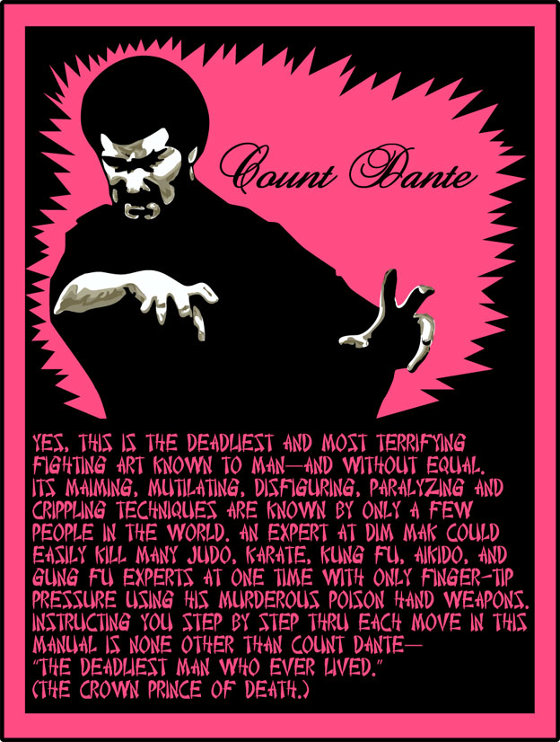
Hello friends, how was your weekend? I hope it went well. Things didn't go quite as planned on my side. Ended up running a lot of chores and missed the book signing. I hope to catch up with Dwayne Vance at a later date to talk about his new book a little further down the road. Right now I'm planning out some new projects and working on my portfolio. What did you guys and gals get up to this weekend and what do you have coming up? One thing I hadn't done in a long while was work on a new illustration. I decided to take a simple graphic and try to recreate it on the computer. I found one from the classic comic book ad for Count Dante.

It turns out that the real Count Dante was a character and a half. Martial artist, self-promoter and Playboy hairstylist? There had been dueling documentaries being produced over the past decade but only one looks like it will actually be coming out. I'm a big fan of the martial arts myth, especially the true stories of the fighters that inspired the legends, and in the case of Count Dante, the urban legends.

Are there any odd characters you wish you knew more about? As always if you would like to sponsor me please visit my Patreon page and consider donating each month, even as little as $1 would help make better blogs and even podcasts!

follow the Street Writer on Patreon!