Showing posts with label progressive. Show all posts

Friday, December 22, 2023

Where Mickey Mouse and friends are still alive and well - A 1UP classic from October 26, 2012

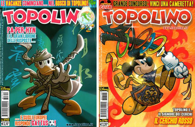
What is it about Topolio that makes the Disney characters accessible and relevant to audiences? A major part of it is having a monthly series dedicated to all of the characters written and drawn by some of the best creators in Europe. The publisher actually has a series of books dedicated to specific characters, trade paperbacks and even special hardcover editions for collectors. Like Marvel and DC in the US there are Topolino comics written for a very diverse audience. Unlike the comic book publishers in the USA the Topolino readers never feel left out because they missed a major event or story arc like Civil War or the New 52. The Disney characters are all familiar and although they might be set in the far future or fantasy setting audiences accept the story and situations at face value. They might be wizards in one story and then martial arts masters a month later, audiences never ask how or why this happened they simply enjoy the story.
Comic books in the US are rooted in nonstop action, with sometimes violent or even frightening encounters for the heroes. Some of the Topolino stories keep pace with the Western traditions and place the Disney characters in peril month after month without creating a backlash from the community. Nowhere is this seen more than in the adventures of Double Duck. Casting Donald Duck as a super spy enables the character to be given a cadre of gadgets, and in rare cases a gun as well. He is sometimes joined by femme fatale Kay K while going on adventures that would make James Bond jealous.
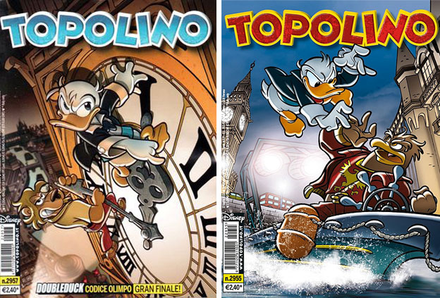
By making a familiar Disney character an action star it instantly makes Donald more appealing and accessible to adolescent audiences. Every genre explored in the pages of Topolino shows readers that the Disney characters can fill any role and be written for any age. Classic stories like Romeo and Juliet, Dr. Faustus and the Three Musketeers have all worked when cast with Disney mascots. The stories and characters do not have to be "dumbed down" for children, and in fact younger readers may be offended if they do not see their favorite characters act like real heroes in the face of adversity.
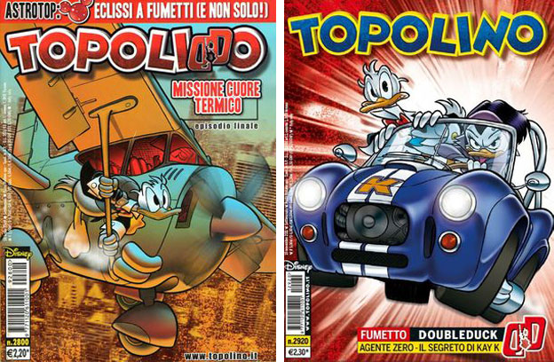
It might sound obvious that Disney in the US should follow the Italians if they want to make the mascots more relevant to audiences. The US would actually have a hard time localizing Topolino or even following the template. Topolino has been in publication for almost 80 years. In that time it has never dumbed down the writing or reduced the roles for and of the characters. If anything Topolino has actually done more for the personalities of the Disney mascots than the parent company has in the past 25 years. Unfortunately some people they could never, ever, accept a universe where the mascots handled firearms. The old comic books published in the US and even some of the old cartoons used to feature the characters as cops, robbers, soldiers and western heroes. They were allowed to have shoot outs so long as nobody got hurt or no blood was ever shown. This was how a cartoon like GI Joe got on the air during the 80's.
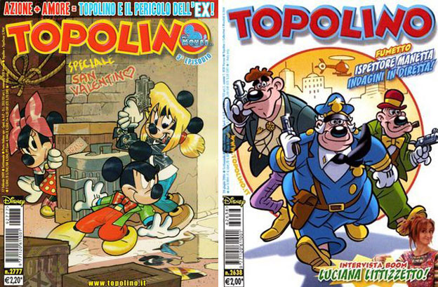
Public perception of how the characters can be used may be the biggest obstacle in making them relevant in the US. Purists would never imagine an acceptable story in which Mickey or his friends handled a gun. In fact purists would never imagine seeing the character have much of a personality at all. Mickey and his friends should never have too strong of a range of emotions. They should be constantly smiling and ever happy to many in the USA. Topolino has never dumbed down the characters or turned them into simplistic babysitters. Over the decades the comics have tackled a diversity of subjects and have never steered clear of even controversial ideas.
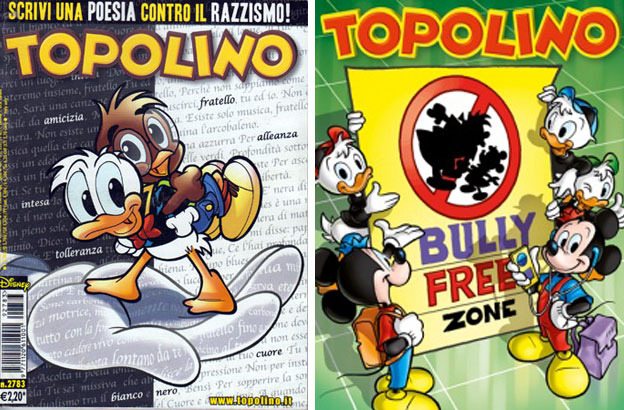
For example over the past decade some extremist fans of European football / soccer leagues had been the focus of sports media. Some clubs tolerated racist chants and iconography at matches. In a way to address this the comics talked about how friendships could be formed despite the differences of color. The books not only spoke out against racism they also let families know that they should speak up against discrimination. By aligning themselves with a progressive stance Disney was instilling very important values to their younger readers and earning the respect of older fans. Currently Topolino is running an anti-bully campaign. The stories teach ways to identify bullies and how to deal with them and what happens to people that are victims of bullying. The issues are able to communicate these ideas to young readers because the universe has many young characters they can identify with. Grade school characters Huey, Dewey, Louie and the slightly older Morty and Ferdie are very rarely seen in the US but are commonplace in Italy.
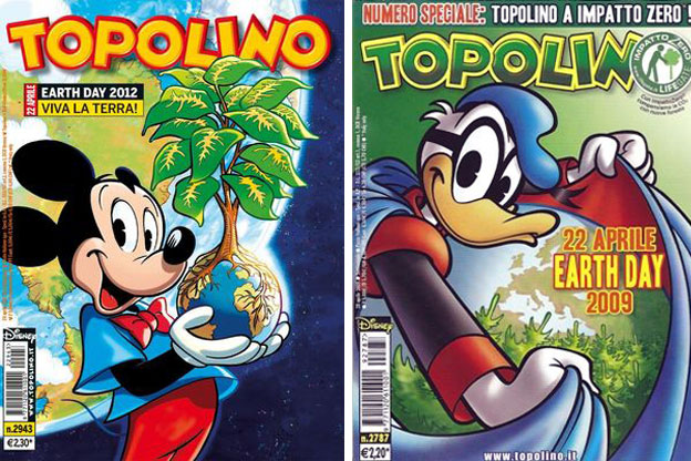
The comics in Italy go through a range of topics while managing to entertain as well. In one month they may have Donald Duck jumping out of an exploding helicopter and in the next he might be planting a tree in his backyard and teaching his nephews about conservation. Those that can get past the shock of seeing guns in the hands of cartoon icons would see that the books are not only well illustrated but also well written. Audiences identify with the mascot characters because they are written with distinct personalities. They are allowed to explore different genres and entertain readers at every level. Most important the comics are released month after month without exception. Movies and television shows may come and go but there was never a point where the Italians were without the Disney characters in print. Disney in the US could learn the importance of diligence from their overseas counterparts. As always if you would like to sponsor me please visit my Patreon page and consider donating each month, even as little as $1 would help make better blogs and even podcasts!

follow the Street Writer on Patreon!

Wednesday, September 13, 2023

Street Fighter 6: A master class in game design, part 20

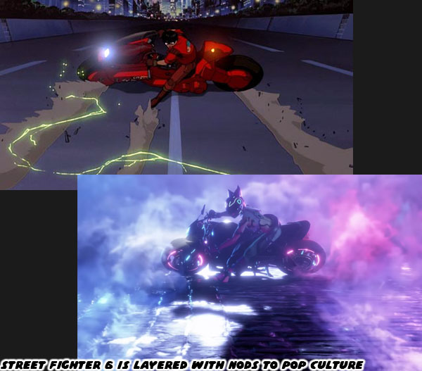
In the previous blog I had mentioned that Bosch had disappeared, and we weren’t sure if he would return. To be fair he didn’t’t disappear as much as he was kidnapped by Juri. After stealing money from Mad Gear to enter a secret underground tournament they had put a bounty on him. The tournament happening in Metro City was a preliminary event that was related to the secret competition. The various gangs were vying for entry into the finals, and its grand prize. That was the case for most of the gangs anyhow. There was a group from Nayshall, including Rewancha from the previous blog, that was trying to get to the finals for ulterior reasons. A clever nod to pop culture happened when Juri appeared to kidnap Bosch. Animation fans could spot the reference from a mile away.

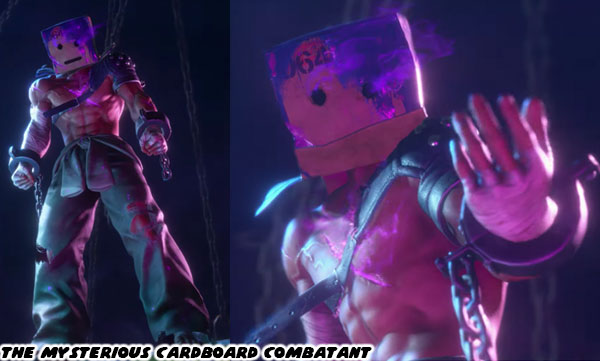
Shortly after Bosch disappeared a mysterious fighter showed up absolutely demolishing all the amateur entrants. The tournament in Metro City was called off due to bomb threats. This was roughly at the same time that the mystery fighter had appeared. He was covered in eerie purple glowing scars. He had broken shackles on his wrists. Long time fans of the SF series would swear that this person was filled with some version of Psycho Power. The same force that Vega / M. Bison / Dictator had been harassing to become more powerful. After the events of SFV it was assumed that Shadowlaw had been completely destroyed, and their technology along with it. This mystery fighter showed that there were still people that had access to that science. He would attack you, and warn you to drop out of the competition. He was known only as the Cardboard Combatant by the people that survived the fights with him.

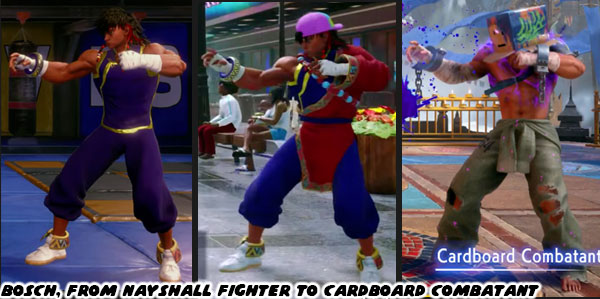
If you were familiar with character turns in any form of media then you could probably guess who the Cardboard Combatant was. Or if you were obsessed with the details of fighting games you could have studied his size, and stance then you would recognize it was a variation of Yahriki, the martial arts form from native to Nayshall. Only three characters in the game used this particular style of fighting. Those were Bosch, Rewancha, and a character you might run across at the end of the journey named Fou-Lu. Many of us had guessed that this was Bosch well before he took off the box. But the how this happened, and why it happened to him became a mystery that you would have to unravel. In order to do this the World Tour would send you to the other side of the world. To a small town near the Himalayas known as Nayshall.

I would consider the second half of the game, the portion from Nayshall on, to be when Street Fighter 6 stopped being a great game, and became the game of the year. Think about all the praise I had heaped on Capcom over the past few weeks. Everything that they got right when it came to the balance, animation, character updates, new faces, animation, control, and features of Metro City. All of this praise was essentially doubled thanks to all the work the studio had put into Nayshall.

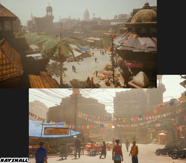
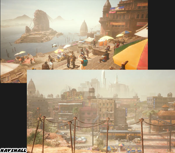
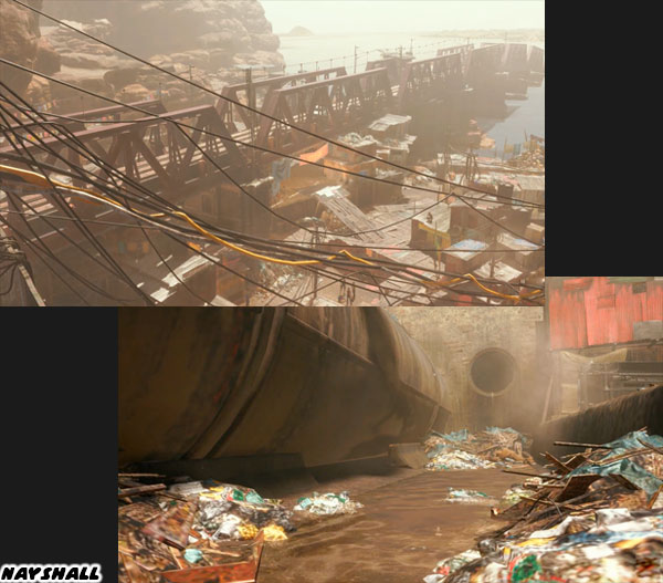
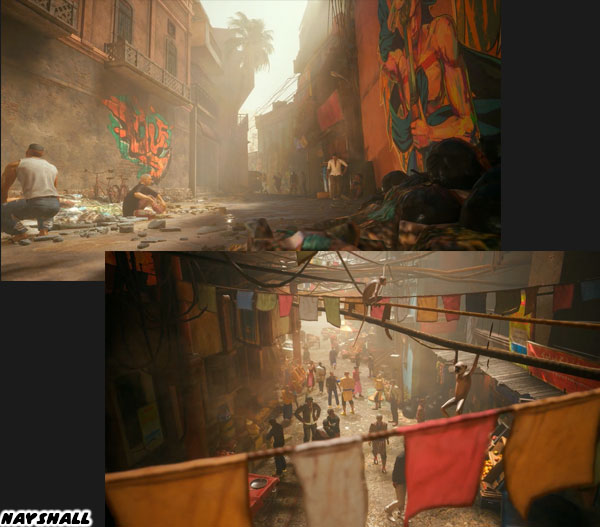
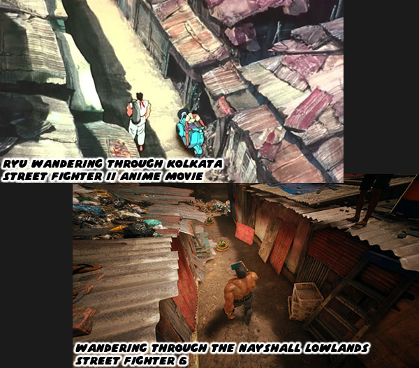
As I was taking screenshots for this series it never occurred to me where to even begin talking about this fictional country. It was easy to ease into Metro City starting at Beat Square, and then expand from there. There was so much to talk about in Nayshall that I felt like it would be easy to overlook something that made this stage feel real to me. So let’s just pause for a moment, and enjoy the first few screens the studio gave us of this country.

You could clearly see a market, a rail yard, a statue of some sort, and even Tibetan prayer flags strung up across the street. You could also see piles of trash, and people living in slums. There was a lot happening in the city, and many stories waiting to be heard. As I was wandering through the Lowlands I had an epiphany. It was the path of the warrior. The SF6 developers wanted you to feel like you were on a journey of self discovery. To have the same reactions, and reflections that someone like Ryu must have had as he traveled the globe.

The studio quite literally gave us bite-sized cinematic moments. No matter where we went, or who we battled, around every corner there was a new encounter, a new piece of the story. You were building the narrative for your avatar. In order to appreciate how the studio was able to accomplish this we need to travel back in time, to see how a movie shaped the destiny of the franchise. I hope to see you back for that. If you are a long time fan of Final Fight, or Street Fighter then I would like to hear your impressions of SF6. If you have never played any game previously then tell me your experiences in the comments section please. As always if you would like to sponsor me please visit my Patreon page and consider donating each month, even as little as $1 would help make better blogs and even podcasts!
follow the Street Writer on Patreon!

Monday, September 4, 2023

Street Fighter 6: A master class in game design, part 16

Capcom had set the gold standard of lineups when they released Street Fighter II in 1991. I could argue that the greatest character they ever made was Chun-Li. It stood to reason that when they wanted to introduce a new female that they would use her as the template. Cammy was designed as the young upstart, and British special forces counterpart. In Street Fighter EX the characters Pullum Purna, and Blair Dame were inspired by Chun-Li as well. The most popular character post Street Fighter IV was Juri. She borrowed heavily from the design from Chun-Li as well. Street Fighter 6 Designer Yusuke Hashimoto was tasked to create another Asian female villain. Black was a color traditionally given to bad guys in pop culture. Red was an excellent accent color. Black hadn't really been assigned as one of the primary colors for any of the classic characters. The combination would be obvious go-to colors from the beginning. Mr. Hashimoto had to be aware of what the studio's contemporaries were working on. Whether the game came from Japan, China, or the US, he had to be conscious of how the genre had evolved over the past 30 years. Would it be possible to create A.K.I. in a vacuum? I think it was impossible. There would always be elements of some other character that could be pinned on any new one. Many in the fighting game community noticed that there were parallels with A.K.I. and those that came before. 

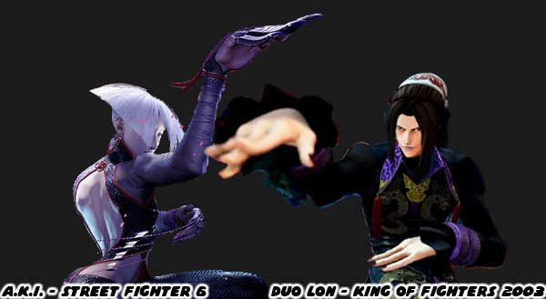
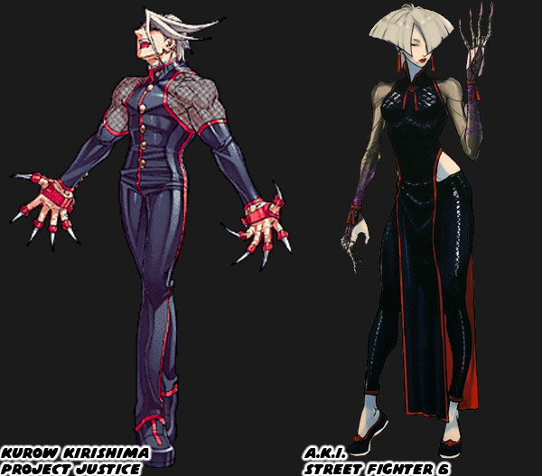
For example the Chinese kung-fu master with a unique hairstyle, that was wearing black, purple, and red, who also fought with a quick snake fist had been seen almost 20 years ago! Duo Lon made his debut in the King of Fighters 2003 in sprite form, and been revealed to be a 3D DLC character in KOF XV fall 2023. Just in time for A.K.I. to appear now that I think about it. Then there was an even earlier character who also eerily predated the look of A.K.I. The silver-haired, form-fitting costume, poison-claw-wearing Kurow Kirishima was created by Capcom in 2000. The ninja was the main villain from the game Project Justice. It was the sequel to the cult favorite Rival Schools. He was poisoning, and brainwashing students from different schools, and turning them against each other. If you've never heard of the series I want you to imagine Street Fighter featuring high school kids. It was one of the early 3D fighters the studio made, and has long been cited in fan polls for a reboot. I could imagine Kurow, and Kimberly having a heated rivalry. But I digress!

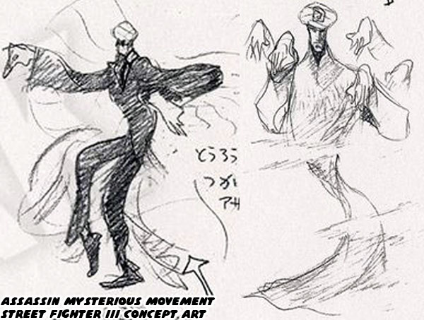
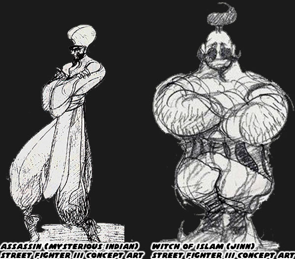
Fans were definitely onto something. The look, choice to be a villain, and move selection from Capcom seemed to mirror earlier antagonists. A.K.I.'s design could actually be traced back even earlier than Luo, or Kurow. In the previous blog I talked about the concept art from Street Fighter III. One of the designs proposed was a Mysterious Assassin. This was supposed to be an Indian character that had his own unique fighting style. The designs were from 1995-96. Many of the ideas were tossed, but there were a few solid ideas that would be revisited in the future. The Assassin was one such character that seemed to stick in the memories of the Capcom staff. In some cases these early concept figures included possible moves, and special attacks. For the Assassin the studio wanted him to have "mysterious movements". His hands would be obscured by long sleeves. His legs would be hidden under a long cloak, making it look like he could float.
  

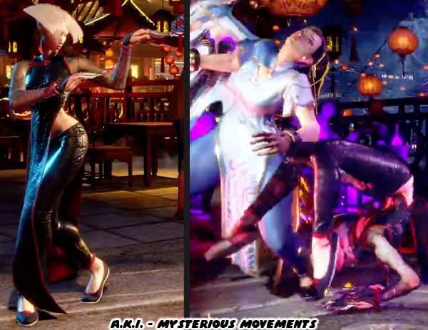
While this character didn’t really go anywhere for SFIII I believe that many of these details were revisited in SFV. Specifically for the creation of F.A.N.G. The assassin with strange movements, that appeared to be able to float certainly fit the bill! By Street Fighter 6 the design elements were revised, and refined once more, and the character A.K.I. appeared. In 2022 I wrote that the design was giving off a dragon lady vibe. When the teaser for the character dropped during EVO 2023 my suspicions were confirmed. The longer move reveal trailer from just a couple of days ago showed that she had strange movements as well. She slashed with outstretched fingers, just like the Assassin concept art from many years prior. 

Eagle-eyed viewers noticed that several of A.K.I. moves were based on poisonous animals, she could slither along the ground like a snake, and even employ some kicks from the fantastic scorpion style of kung-fu. Hats off to the animation team, it must have been tremendous fun creating her attack library. The trailer gave us the best example of how to present hidden strikes. I want you to think about your favorite characters, and how they stand with their hands forward, or exposed to the game camera. If you threw a punch for a kick, then it would be easy to track on the screen. A.K.I was turned away from the opponent. This meant that several of her attacks were actually obscured from the game camera. A.K.I. could backhand, or hook kick opponents. Her torso hid which hand she used, and her dress covered which kick was being delivered as well. This mirrored how the Assassin concept fighter hid his attacks under a long cloak. The more difficult part for either F.A.N.G. or A.K.I. were creating lethal strikes that could be described as poisonous.

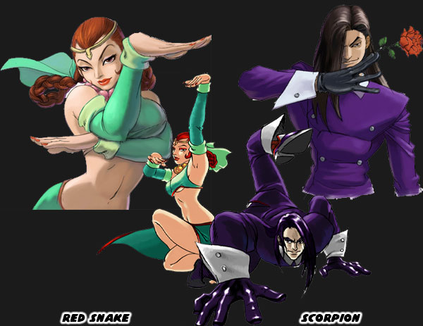
The turned stance was seen in several forms of actual Chinese wushu, and Shaolin kung-fu. The use of stealth, and sneaky moves was not a new thing in fighting games. One of the best, and rarest fighting games to use classic kung-fu forms was Martial Masters by IGS from 1999. The game featured a sexy fighter named Red Snake, she used the snake form, and a flirtatious ladies man known as the Scorpion.  I had written about the game from a Taiwan studio a few years ago, and how much they were influenced by the Capcom games from the mid-'90s. The characters in the game were inspired by a few classic kung-fu movies, not the least of which were the Once Upon a Time in China films featuring a young Jet Li playing the folk hero Wong Fei Hung. Martial arts cinema from Hong Kong, and Taiwan had a major hand in influencing the development of Street Fighter, and the entire fighting game genre. With regards to F.A.N.G., and A.K.I. there was actually a lot of precedence for having a "poison fist" fighting style. 

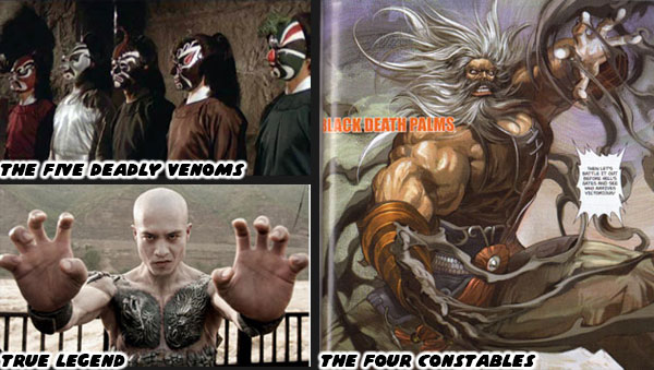
In cinema there was an all-star film from 1978 called The Five Deadly Venoms. In it the assassins were all trained in a particular deadly art; Centipede, Snake, Scorpion, Lizard, and Toad. One or several of these poison fists were referenced in many classic manhua, or comic books. The villains often mimicked the attacks of these dangerous creatures. Some of these techniques were so dangerous that even a single touch could kill. This was the case for Elder Guan from the Four Constables. His hands would turn dark when he summoned the Black Death Palms technique. A live action version of this power was seen with the character of Yuan in the 2010 film True Legend. There was no doubt that the people at Capcom were heavily influenced by these stories. The most powerful characters in myth could perform a dim mak, or death touch. The Shun Goku Satsu from Gouki / Akuma was probably the most popular death touch in modern culture. A.K.I. was a sort of nod to these mysterious, and often deadly techniques, but there was much more to her design.

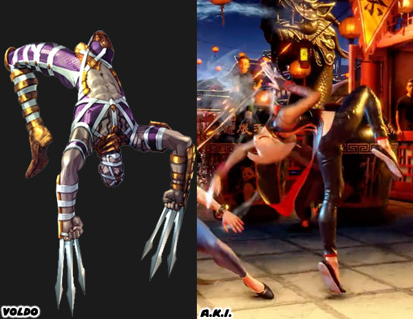
A.K.I. had to be an over-the-top villain in order to stand out from the rest of the Street Fighter lineup. She couldn't just be a kung-fu practitioner that happened to be mean. It wasn't enough that she had some sneaky moves either. Every part of her presentation had to be more outrageous than the traditional kung-fu characters like Chun-Li, or even Jamie. This meant that she had to have stances, and grapples that twisted, and contorted her body. She would fold herself in half before slashing, or drop flat to the ground before kicking. Not knowing where the next strike would come from would throw off opponents. The fighting game community had first seen these types of awkward angles, and strikes through the character of Voldo from Namco's 1995 hit Soul Edge. Voldo was an assassin, and could strike with his razor sharp katars from any position, including while laying on the ground.

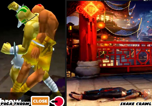
In the gameplay reveal trailer we could see A.K.I. slither on her back. It was unnerving seeing the character move like that. This snake crawl allowed her to get under ranged attacks, and close the gap on opponents. Previously the franchise did feature snake-like movement with at least one other character. In the Street Fighter EX series by ARIKA Dhalsim could perform a Yoga Throw. The setup for it was very unique. The Indian yogi would wind around his opponent like a serpent before grabbing their torso and flipping them on their head. It remained one of my favorite fighting game animations to this day. I'm certain that Street Fighter 6 animators were able to pick, and choose the best elements they could find from pop culture, from actual kung-fu, and even earlier games while fleshing out the moves of the new assassin.  

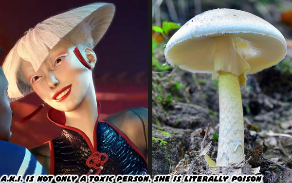
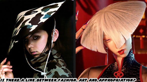
For the developers it also wasn't enough to have a character that fought, or moved like a snake. She had to look dangerous,and untrustworthy. From a visual perspective A.K.I. was figuratively, and literally a toxic person. The pale white skin was unnatural, as if she was drained of her blood. The cut of her hair was reminiscent of the amanita phalloides aka the death cap mushroom. As far as her costume went it could be argued that Street Fighter 6 Designer Yusuke Hashimoto was making a bold fashion statement. The use of modern tulle sleeves, and pants under a traditional cheongsam was only the beginning. His choice of costume, skin color, jewelry, and haircut were very avant-garde. Every detail added reflected the same fashion sense that he tapped into when creating the designs in the first two Bayonetta games. Had Juri, F.A.N.G., or Kurow never existed then I'm certain that A.K.I.'s introduction would have had a greater impact on the franchise. 

Capcom must have known that between Juri, and A.K.I. the toxic female Asian trope was becoming redundant. I'm not sure why they felt like they had to double-down on this route. The question remained. Was Capcom doing right with character representation? Could this simply be chalked up to an artistic choice, and not a jab at the Chinese villain trope? The studio had done much better with Dhalsim, Blanka, and Rashid in this title. However A.K.I seemed to be a step backwards, at least to me. Street Fighter 6 was doing a lot to address the mistakes in the past. To make up for ugly characters, and ugly design choices. To become more inclusive when it came to ideas of sex, and gender roles. There would be a lot of positive new changes, faces, and game design elements introduced into the franchise. One of the major shifts to the cast came with the addition of NPCs to help carry the story. We will look at how in the next blog. I hope to see you back for the next entry. If you are a long time fan of Final Fight, or Street Fighter then I would like to hear your impressions of SF6. If you have never played any game previously then tell me your experiences in the comments section please. As always if you would like to sponsor me please visit my Patreon page and consider donating each month, even as little as $1 would help make better blogs and even podcasts!
follow the Street Writer on Patreon!

Friday, September 1, 2023

Street Fighter 6: A master class in game design, part 15

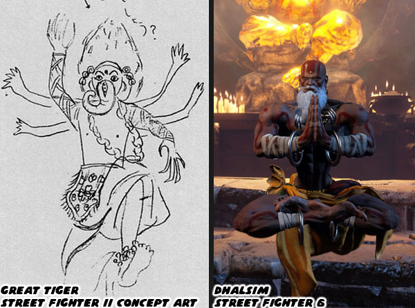
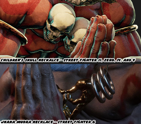
In the previous blog I talked about how Capcom was revising old character designs, and trying to make them more palatable to modern audiences. Every popular character was getting a redo. In the early stages of SFII Blanka had started off as an ugly Black brute in chains. He was turned into a green mutant, a wild man from the jungle. For SF6 this wild man was dressed in overalls. He was turned into a businessman starting up his own jungle tourism company. In the Street Fighter II concept art Dhalsim had started off as the Great Tiger, an Indian mystic wearing a Ganesh Balinese costume. He was turned into a stretchy limbed yoga master. Some of his more offensive costuming choices, specifically the child skull necklace was removed, and replaced with a necklace depicting the mudras. He would become a yogi, and instructor of yoga at a temple.

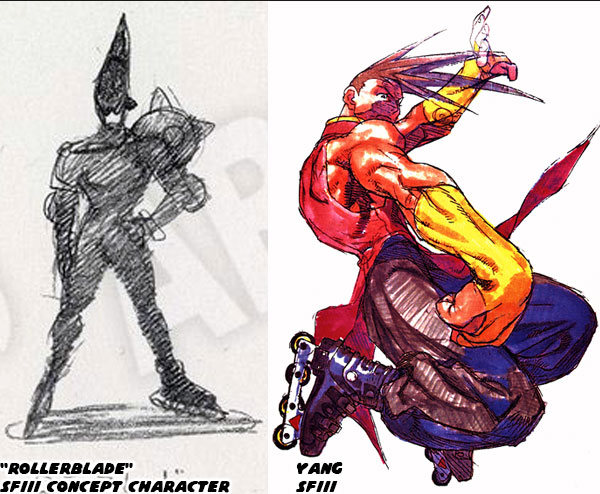
You would think that following the success of SFII the designers at Capcom would be more mindful of their international audience. For the most part the studio was able to create characters around a certain form of fighting. Whether they represented kung-fu, karate, wrestling, Muay Thai, or MMA. Those fighters had a look that reflected their style. The problem was when trying to create a design for a new fighter that didn’t represent a certain style. Blanka, and Dhalsim were examples of that. They fought in an unorthodox fashion, and thus had an unorthodox look to them. Before starting on a new game the designers would throw out all sorts of ideas, and see which ones stuck. For example one of the ideas for a SFIII character was simply titled “Rollerblade.” This character had some odd armor, and a helmet / hairstyle.

Designing an entire fighting style around a person that could inline skate didn’t go anywhere. Instead the studio took the skating, and made it a hobby for one of the kung-fu twins they were working on. The older of the two Yun, would be a skateboarder, inspired by Ken Lieu an actual skate legend. Yang was more than likely based on the Yasutoko Brothers, Takeshi, and Eito. Both of them were aggressive inline world champs. I would argue however that at least the spiky helmet in the concept sketch was turned into spiky hair for the younger twin. Not every design was as neutral. Some designs were right on the edge of offensive. What might have been meant as an homage to a certain archetype could be seen a stereotype to another person.

Let’s take a look at how the studio had been trying to incorporate a Middle Eastern character in the franchise for over 25 years. Some of the oldest drafts in Street Fighter III had a mysterious Indian assassin character. This fighter was dressed in classic Arabian fashion. I mean these costumes might have worked in a storybook, or Disney cartoon. That concept was fairly mild compared to the Witch of Islam. An enormous musclebound character that could be mistaken for a djinn, or genie. If you don’t think the design could be considered problematic then I wouldn’t know what to tell you. The Street Fighter 6 team didn't seem to be able to let some of their older designs go, no matter how far out of step they were with representation. 

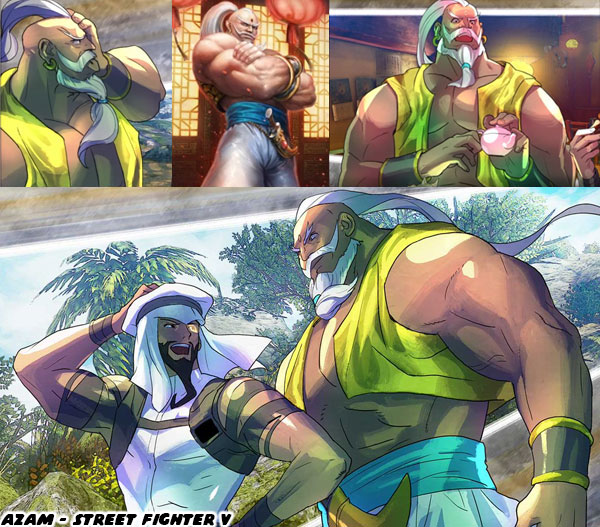
In Street Fighter V there was an NPC named Azam that was the attendant / bodyguard to Rashid. The duo represented a lost kingdom in the desert. Azam wore costuming that made sense in one of the classic tales of Sindbad. You could easily imagine the musclebound character in a fight with a cyclops, pirate, or sea monster. He looked nothing like a modern person from the Middle East. He was reminiscent of the Witch of Islam concept. Capcom thankfully thought better than making him a main character. The studio still had to develop somebody whose look spoke to Middle Eastern culture. I would argue that they leaned heavily into orientalism when presenting Rashid in Street Fighter V. The studio didn’t lighten their approach to Azam when updating him for SF6, Rashid was another story. 

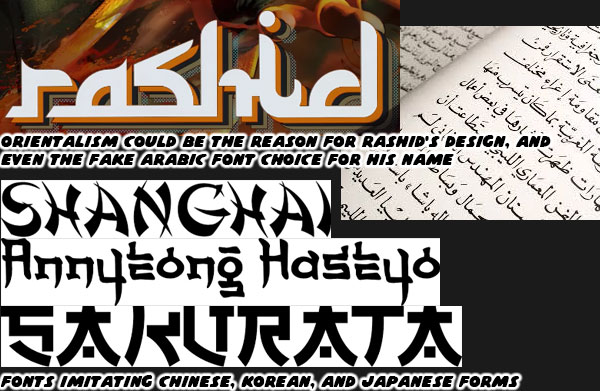
The developers didn’t second guess using a font that imitated the Arabic language, and script when announcing his return. It was a clever design choice, and I'm certain that Capcom had tremendous love, and respect for the people of the Middle East. This did not mean that some of their choices were not rooted in outdated ideas. Orientalism was the representation of Asia, especially the Middle East, in a stereotyped way that is regarded as embodying a colonialist attitude. This was something that had always been a part of character design from Japanese studios. I'm talking about magic, harems, genies, and inflatable characters! I created a series exploring the origins of these tropes. If you have some time please visit the following links; The Middle Eastern fighter, pt. 1, The Middle Eastern fighter, pt. 2, The Middle Eastern fighter, pt. 3, and The Middle Eastern fighter, pt. 4 (is where I talk about Rashid).

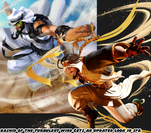
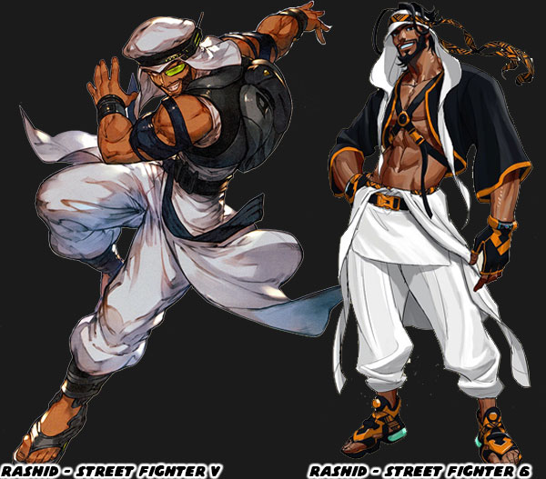
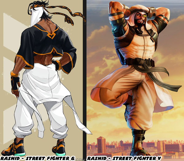
I would say that the newest version of Rashid was greatly improved over the previous. Let’s take a look at the differences between the designs in SFV, and SF6. One of the biggest problems I saw with the original look was the plain color scheme assigned to Rashid. Street Fighter II set a standard for character costumes, one of the reasons they worked was by sheer coincidence. The hardware that Capcom developed on was powerful for its time, but still had a limited sprite size, number of animations, and particularly limited palette of colors. The designers made sure that each character was given a strong primary color, and a complimentary second color. They would be easy to pick out of a crowd. If you think about Ken, and Ryu the colors that come to mind are red, and white. When you think of Chun-Li the color is blue. When I mention Blanka the color is green. You get the idea. For Rashid the color was primarily white, with a black belt. Something was lost when his costume was very similar to Ryu’s.

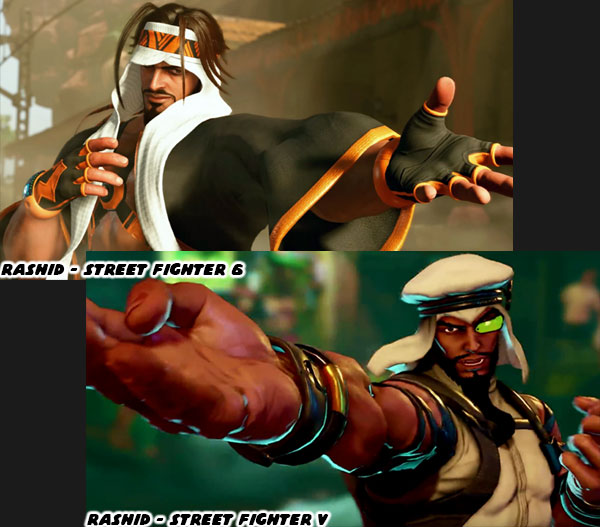
Designer Yusuke Hashimoto gave Rashid a makeover without losing too many elements from his original look. The first thing he did was expand the the secondary color black to cover the top half of his costume, and added orange as an accent color to separate him from Ryu. He also shortened the beard into something more realistic. He also did away with the overt technology the fighter relied on. Rashid was an expert at parkour, he was exceptionally quick, agile, and athletic. These things did not necessarily make him a dangerous fighter. He supplemented his strikes through technology. Hidden in his boots, and costume were tiny engines that created whirlwinds. In his original look he wore a large backpack to power these devices. The new costume got rid of these things.

His keffiyeh, the traditional headscarf was previously large, and puffy. This was swapped out to a visor head wrap with a long orange headband. His green viewfinder was ditched, as he was not a Sayan from Dragon Ball Z. His shoulders were now covered, there was no sign of the straps that had randomly criss crossed his arms. His smart devices were now integrated into his gloves. His sandals used to be plain looking, but were now stylized more like sneakers with electronics. Mr. Hashimoto pulled Rashid’s design into the 21st century, tried to leave the fairy tale elements out, while still making it unlike any traditional Arab costume. It followed the rules that went into the costumes of the other classic characters. After all Ryu, Chun-Li, and Guile’s costumes looked authentic, but only pulled a few cues from actual uniforms. His work should be studied in greater depth by anyone looking to create, or update a library of fighters.

Street Fighter 6 was evolving with the times, and pushing for a more diverse cast, without losing their unique eye. The Mysterious Assassin, and the Witch of Islam may have been the inspiration behind Rashid, and Azam, however they more directly influenced the creation of F.A.N.G. in SFV, and A.K.I. in SF6. We will look at how in the next blog. I hope to see you back for the next entry. If you are a long time fan of Final Fight, or Street Fighter then I would like to hear your impressions of SF6. If you have never played any game previously then tell me your experiences in the comments section please. As always if you would like to sponsor me please visit my Patreon page and consider donating each month, even as little as $1 would help make better blogs and even podcasts!
follow the Street Writer on Patreon!

Wednesday, August 30, 2023

Street Fighter 6: A master class in game design, part 14

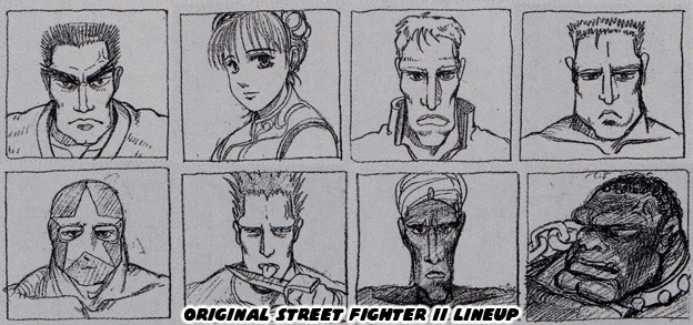
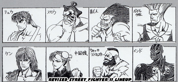
The Street Fighter 6 senior team; director Takayuki Nakayama, producers Kazuhiro Tsuchiya, and Shuhei Matsumoto, and designer Yusuke Hashimoto had brought the franchise into the 21st century. This was not only from a technical standpoint, but in addressing the ugly roots of some of their characters. In the previous blog I mentioned how the studio had put progressive ideas of gender representation, and fluidity into the series through characters designs, and avatar options. As I was working through the World Tour I told my family that this game felt like it was fixing a lot of old issues. That the franchise was no longer going to perpetuate some old stereotypes, even if the fans expected them to. Let’s go back in time, and look at how the Street Fighter II designers approached the original lineup.

I had written a lot about the concept characters previously on the blog. Including the actual fighters like Yoshiji Soeno who influenced the creation of Sakurada Gashou. Sakurada was actually going to be the focus of SFII instead of Ryu. Thankfully the team did a lot of revision after the initial lineup. Of course if you didn’t know about the rough draft you were probably looking at the dark-skinned characters posted above. If you had time you could read about Anabebe, and the roots of Blanka’s racist origins. You could also read about the kung-fu cinema origins of Dhalsim on an earlier blog. Thankfully the designers knew that these characters might be racist, or at the very least misinformed stereotypical in their origins. They went back to the drawing board, and created what could arguably be seen as the greatest fighting game lineup of all time.

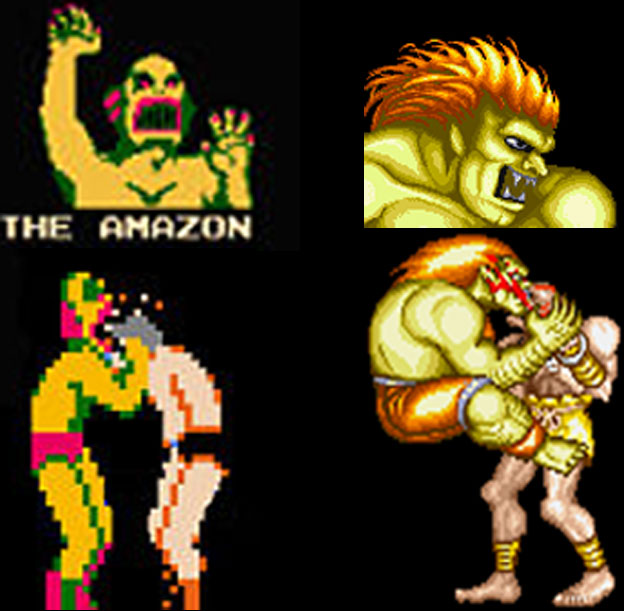
The majority of the cast represented an actual fighting art, such as karate, kung fu, military special ops, and wrestling. Then there were two characters as sort of oddballs. They were designed to add figurative, and literal color to the lineup. In the earliest drafts Blanka was easily the ugliest racist design you could think of. He was a dark skinned, big lipped, collar-wearing wild man. He had been captured by a hunter, and was going to be taken from battle to battle in a cage. This was instead changed to a green skinned wild man from the jungle. The entire roots of that change were because AKIMAN, the designer that gave us Chun-Li, always remembered how The Amazon would bite his wrestler’s face in the old Nintendo Pro Wrestling game. He wanted Blanka to be that same green skinned savage monster in this game. Both Dhalsim, and Blanka became popular with the fans, thanks to how they balanced out the cast, as well as how unique they were to play as. Capcom pretty much didn’t make too many changes to the characters over the next 30 years.

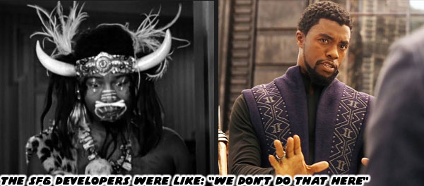
Blanka, and Dhalsim were rooted in some ugly history. People from the jungle, or natives that aided colonizers created the Myth of the Noble Savage. Native dress was often parodied in popular media. I’m talking about costumes made of fur, and feathers with a bone through the actor's nose. These caricatures were seen as harmless like Bumbo the wild man from Borneo, from a 1933 Little Rascal’s film the Kid from Borneo. Bumbo was a cannibal whose only line was "Yum, Yum Eat-Em-Up!" That ugly stereotype was used for decades in TV, and animation. Now I want you to imagine that you’re a Brown kid, or a Black kid that loves fighting games. At the same time you can’t help but notice that the only colored characters in your favorite games were either weirdos, or villains (M. Bison/Boxer). The community told you no, these characters were positive stereotypes, not negative stereotypes. Blanka, the only Brazilian in the series at the time couldn’t even speak. His game voice was nothing but screeches, and roars. Then Dhalsim’s only lines were “Yoga Fire, Yoga Flame, Yoga, Yoga, Yoga.” It’s fair to say that these characters might as well have been saying "Yum, Yum Eat-Em-Up!"

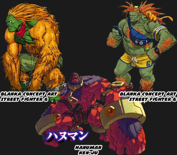
The Street Fighter 6 team took a hard look at these designs, at their roots, and decided that they would no longer pursue those tropes. The studio had essentially two choices when it came to redesigning the oddball characters. They could double-down on their origins, or they could try to soften, and fix the character. Let’s look at Blanka for example. In the early SF6 concept art the team was thinking of making him even more of a monster. He would be covered with even more orange fur, looking like a long haired ape, instead of a man. This would have essentially turned him into a lab experiment like Hanuman from the game Ken-Ju. The other would be to have him look, and dress more like a human. He would remain a person with a sort of mutation that had to learn to survive in the jungle. He was aware that he was different from regular people, but was eager to make them see past that, and embrace the jungle for its beauty. The SF6 art team went with the second choice, and turned Blanka into a budding tour guide filled with childlike wonder.

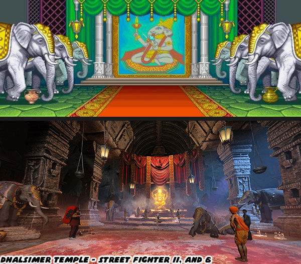
It was a good start, they did a number of similar things with Dhalsim. The first thing I noticed was his updated stage. In SFII the Dhalsimer Temple was a brightly painted stage with a mural of Ganesha in the background, and elephants in the wings. The updated version in SF6 had essentially recreated the temple, but presented it as how it might look if it actually existed. The colors were much more subdued. There was a statue of Ganesha now at one end of the temple. The tapestries, lanterns, carpets, column reliefs, and elephants looked much more authentic. The art team did not just study graffiti, and tattoo art for the game. They were being mindful of trying to understand, and reproduce the small details from other cultures. This was especially true of places that had a less than positive origin.

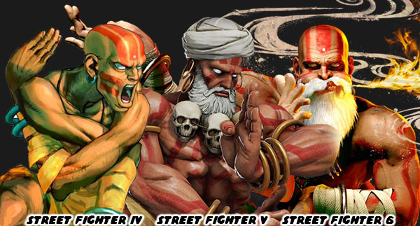
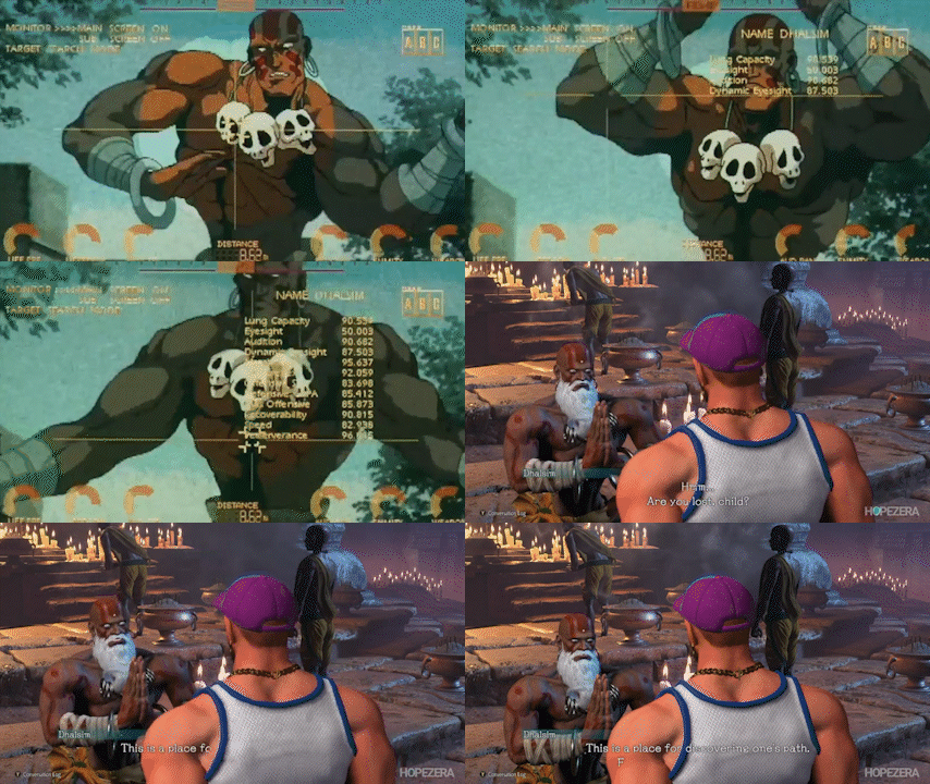
As for Dhalsim the changes applied to the character were more subtle. He was still a stretchy guy that breathed fire. However in every interaction with him, and the NPC visitors in the temple all carefully explained the purpose of yoga. They talked in reverence about the power of mediation, of being mindful, and the search for inner peace. The character hadn’t gone through many redesigns in over 30 years. He looked pretty much unchanged through SFII, SFZero, SFEX, and SFIV. In Street Fighter V his biggest change was his white beard. He was also playable with a turban. He actually wore the head wrap in his intro in SFZero, but would pull it off before the match started. Not all Hindus wore a turban, but at the same time it was a little disrespectful to have him toss it aside. In SF6 Dhalsim had a longer beard, and the turban was gone.

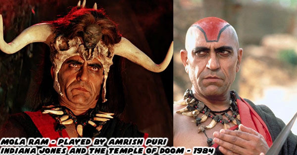
While I had spoken a lot in the past about how Dhalsim was essentially pulled from a villain in the Master of the Flying Guillotine, that only had to do with his stretchy powers. As for how the character came to have a bald head, and red paint. I would point to the character of Mola Ram. The villain of 1984’s most successful film; Indiana Jones and the Temple of Doom. The character was a cult leader, looking to usurp a young maharajah. He lead a group of Thuggee warriors, and was determined to bring his cult to prominence with the power of three sacred lingam stones. He didn’t have any stretchy powers, but he could rip the still beating heart out of a person’s chest, predating the Mortal Kombat fatalities even!

I believe that Capcom took design cues from the previously mentioned films. and managed to make a hero out of them. Unfortunately one of the ugliest elements in his design was the necklace that he wore through the past 30 years. There were three small skulls on a simple rope necklace. Dhalsim wore this in a form of penance. These were pulled from children that died in a famine. It was a barbaric design, and somehow it seemed okay for decades. The SF6 team thought that it was time to move past that. The skulls were ditched, and replaced with metal jewelry. There were two hands forming the jnana mudra. The mudra were almost 400 possible hand positions that you could hold during meditation. For example had the hands been inverted it would have been the chin mudra. Each of these hand positions had a purpose, and could have various health benefits. Dhalsim was a teacher, and thus it made sense that the specific mudra was related to knowledge. It could be used to invoke wisdom, peace and clear communication.

Getting rid of the skulls was a small gesture, an attempt by the designers to make up for past mistakes. Possibly earn the respect of their audience. It was the least they could do, but definitely a welcome change. The developers were also demonstrating that they were paying attention to the smallest details of the international community. Some might consider it another throwaway detail, but how many of you noticed that when Dhalsim spoke in the World Tour he would perform an Indian head wobble? I would contend that this was another deliberate choice. It was meant to rectify an earlier mistake. In the Street Fighter II anime movie there was a three second shot of Dhalsim performing a head shake while fighting E. Honda. Those three seconds were actually my favorite shot in the entire movie.

As nice as it was the head shake was not correct for the character. The way he moved his head from side to side in the anime was based on traditional Balinese dance. There was some cultural cross pollination between India, and Bali, however their customary dances were quite unique. It looked like the SF6 team bothered to study the differences, and make sure that they approached Dhalsim with much more respect this time around. Could the same thing be said of the other dark-skinned characters returning in SF6? We will look at how in the next blog. I hope to see you back for the next entry. If you are a long time fan of Final Fight, or Street Fighter then I would like to hear your impressions of SF6. If you have never played any game previously then tell me your experiences in the comments section please. As always if you would like to sponsor me please visit my Patreon page and consider donating each month, even as little as $1 would help make better blogs and even podcasts!
follow the Street Writer on Patreon!