Showing posts sorted by date for query blue mary. Sort by relevance Show all posts

Wednesday, May 13, 2026

Bookmark This Page; Women in fighting games

I love to write about fighting games, and fighting game characters. If you want a collection of articles about women in fighting games then Bookmark This Page.

The return of Rainbow Mika, did Capcom cross the line in Street Fighter V?

Laura, the new leading lady of Street Fighter V or more fanservice?

Odd Girl Out, a look at alternate female fighting game characters...

The legend of Blue Mary, or girls in fighting games, part 1…

The legend of Blue Mary, or girls in fighting games, part 2…

The legend of Blue Mary, or girls in fighting games, part 3…

Why is Street Fighter playing with Dolls?

Meet Street Fighter V's Menat, an old soul in a young body?

The rise of Falke, or how military design works in fighting games...

The Chun-Li template, don't follow it too closely! A 1UP classic...

A look at Marisa, the Street Fighter 6 gladiator...

A look at Lili, the new native Mexican fighter in Street Fighter 6

Juri in Street Fighter 6, how her design got better with time

Manon in Street Fighter 6, representing a style over 200 years in the making

Cammy gets an entirely new look for Street Fighter 6, let's see how

Let's talk about A.K.I., the Dragon Lady of Street Fighter 6

Meet Kimberly, is she the Urban ninja of Street Fighter 6?

Chun-Li's new look in Street Fighter 6. Is it a step backwards?

Style Wars, looking at Kimberly in Street Fighter 6, and Isla from King of Fighters XIV.

The Street Fighter 6 pre-order trailer, a look at Manon, the graceful judo practitioner

The Street Fighter 6 pre-order trailer, a look at Marisa, the modern gladiator

Lili gets a makeover, just in time for Street Fighter 6!

Do you have a favorite female character in a fighting game. Tell me about it in the comments section. As always if you enjoyed this blog, and would like to sponsor me please visit my Patreon page and consider donating each month, even as little as $1 would help make better blogs and even podcasts!

follow the Street Writer on Patreon!

Wednesday, October 2, 2024

A symmetry of villainy, part 1...

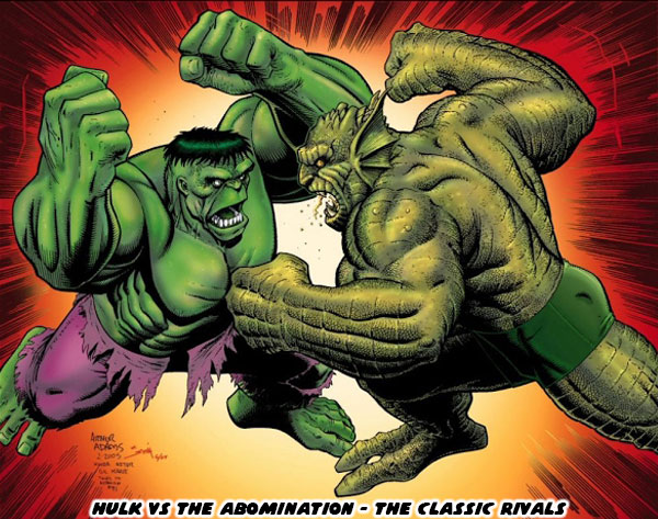
Hello friends, I hope you are doing well. Today I want to talk about great comic book rivalries. How they are put together, and what I think makes the best ones work. This topic was actually inspired by the return of one of my favorite Incredible Hulk villains. I’ll talk about who that is in a moment. Right now I want to focus on my theory of great rival design. It is a sort of follow-up to a blog I wrote ages ago regarding The Frightful Symmetry of Street Fighter. I argued that all great fighting game designs worked because there was a lot of symmetry in the development of their cast. In the early days of fighting games the main characters had a rival or balance. They were often presented as the Asian versus Western master of the fighting arts. Think of Ken, and Ryu from Street Fighter, or Paul, and Kazuya from Tekken. Then later on the library was expanded to make female counterparts to lead characters. I talked about this on The Legend of Blue Mary. If you were a budding comic book, video game, or storyteller then you might find it hard to come up with a great recurring villain. The easiest way to approach this was by creating an opponent that was a mirror rival to the hero. For example long-time comic book fans might argue that The Abomination was the greatest enemy of the Incredible Hulk. They might be right.

The Abomination was a gamma-irradiated villain that was bigger, and stronger than the Hulk. He was also intelligent, sadistic, and cruel. Whereas the Hulk was filled with a blinding rage, he was still a moral character that just wanted to be left alone. When they battled the Earth literally trembled. There were few forces in the Marvel Universe that could come between them, let alone try to stop them. Unless you had read a lot of comic books then you might not realize how the power scale worked between different comic books. The villains on a street level hero / anti-hero like the Daredevil, or the Punisher, were nowhere near as dangerous as the villains the Hulk comics. The Hulk had single-handedly taken on characters that the entire X-Men, or Avengers rosters were unable to stop. When the Hulk, and Abomination fought it was the western equivalent of a daikaiju battle, like Godzilla vs King Ghidorah. The best course of action was to evacuate the nearest city, and let them fight. Good or evil would triumph, and the survivors would have to deal with the fallout. The Hulk, and Abomination were an example of symmetrical design. Think about your favorite comic book rivalries, and try to recall how many were symmetrical in nature.

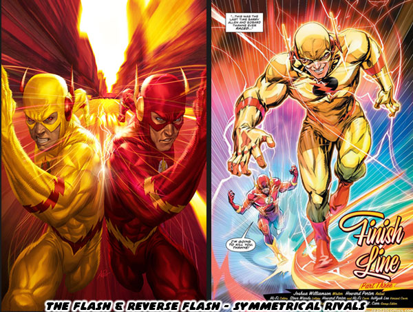
My favorite DC hero was the Flash, it was debatable if I liked Barry Allen, or Wally West as the Flash more. Their greatest rival was also symmetrical in nature. The Reverse Flash was among the most dangerous opponents in all of DC canon. Eobard Thawne hailed from the far future. He had made it his mission to travel through time, and destroy the life, and legacy of the Flash. In several continuities he had succeeded in this, wiping out the Flash, and all of his allies. Having a compulsion to destroy entire generations of characters was a scary thought. Knowing that few in the DC universe could stop the Reverse Flash including Batman or Superman, made having the Flash there to protect the universe essential. For comic books, and most pop culture storytelling making a rival be a perfect balance just made sense. However I would argue that the most interesting rivalries were when the opponents were not perfectly balanced. Let’s talk about asymmetrical rivals.

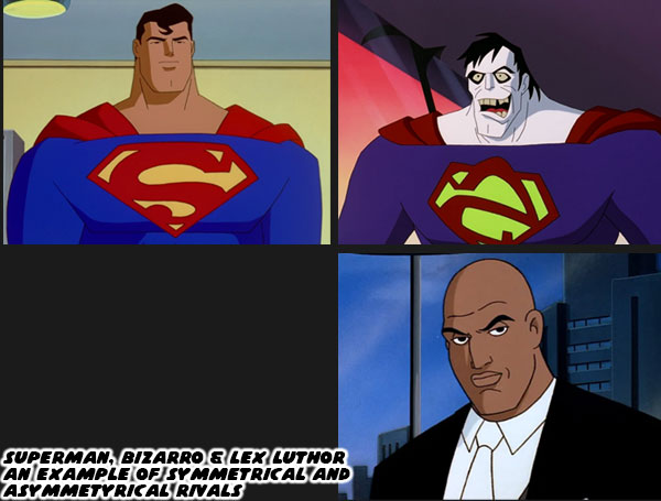
Superman was arguably the most popular hero in DC, if not all of comics history. When he debuted in 1938 he fought mostly low level villains. The gangsters, and petty criminals that most people saw in media. Through the years different creators starting making villains more unique, and powered as well. Once the atomic bomb had been used in WWII the power scaling in comic books jumped exponentially. This was especially true for Superman, and lead to the creation of the Incredible Hulk. One of Superman’s greatest opponents was a freakish mirror version with all the same powers known as Bizarro. While Bizarro had many memorable encounters with the Man of Steel there was one villain who was a perpetual thorn in his side. Lex Luthor was seen by most as his greatest rival. He was intelligent, rich, and calculating. Using his money, and influence to gain as much power as possible he was aware that Superman was the only person that could stop his ambitions. Despite not having any super powers he had brought Superman to brink of death time, and time again. Although Bizarro was a great opponent, it turned out that Luthor was the one that gave Superman the most trouble.

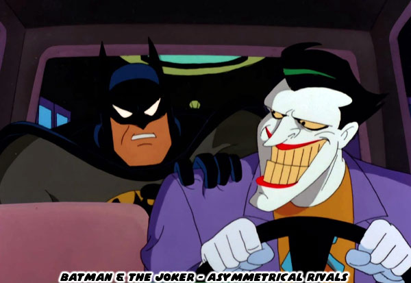
Batman was similar to Superman in that they fought opponents with comparable abilities. Whether it was strength, and martial prowess (like Bane), intelligence (like the Riddler), or fear (the Scarecrow) then Batman had an opponent that could challenge his individual abilities. It was a literal wild card that gave Batman the most trouble. The Joker was pure chaos. He was unpredictable, and nothing the Batman did could prepare him for the next encounter. The Joker did not have the fighting ability of the Batman, nor the ability to calculate his next move. He would often surprise himself with his random schemes, and thus ensure that Batman would be caught off guard as well. This type of character design, the ability to fill a world with both symmetrical, and asymmetrical opponents was critical to pop culture. It made the best comic book, tv, movie, and video game battles work. I would argue that with a few exceptions it was the asymmetrical foes that were the most important for the hero to overcome. This lesson was especially true in team settings. 

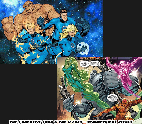
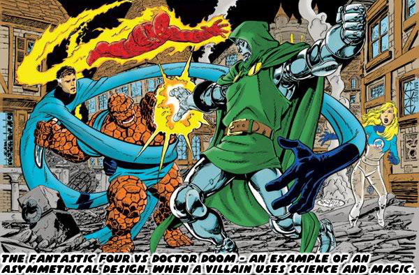
Think about the greatest evil organizations in comic book history. DC had the Legion of Doom which was created to battle the Justice League. The evil organizations were made up of rivals with symmetrical powers to the heroes. This type of design was also featured in a number of Marvel books. The X-Men fought the Brotherhood of Evil Mutants, the Morlocks, and the Reavers to name just a few. They were often composed of opponents that had asymmetrical designs as the heroes, but similar powers. This sort of balance went for a few other teams in the Marvel Universe as well. Most people were familiar with the Fantastic Four, but unless you were familiar with the comics you might have never heard of the U-Foes. This team recreated the same space flight that gave the Fantastic Four their powers through cosmic radiation. They even had brother and sister; Jimmy, and Ann Darnell. The duo of X-Ray, and Vapor mirrored Sue, and Johnny Storm. The respective Invisible Girl, and Human Torch. Yet again, unless you were a long time comic book fan then you might have never heard of these villains. By the same token if you were to poll casual fans, and comic book fans as to who was the greatest enemy of the Fantastic Four were they would often point to Doctor Doom.

Victor Von Doom was an individual gifted with absurd levels intelligence, a creative mind, and an affinity for the magical arts. He combined the sciences, with the dark magics, and made for one of the most powerful villains in all of Marvel history. It was his unique blend of magic, and technology that allowed him to counter anything the Richards family could throw at him. It was this sort of asymmetrical design that made him a standout character, and able to be placed in a story that would work across the spectrum of Marvel heroes, and villains. He could one day be fighting against Dr. Strange, and the next be teaming up with him in order to save the Earth from a demonic invasion. The complexity of his design, and absolute resolve in his purpose allowed writers to put him in stories that were as fascinating for the villain, as they were for the hero. The creators at Marvel understood that the most memorable villains had nothing in common with the heroes.

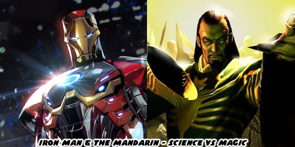
I was lucky enough to have brothers that also read comic books, and we collected titles across the spectrum. We were well versed in the happenings all over the Marvel universe, and the DC universe to a lesser extent. One of the most fascinating rivalries was that of Iron Man. He was possibly my little brother’s favorite Marvel hero, next to Dr. Strange. While Iron Man did fight other armored warriors like Titanium Man, the Iron Monger, and the Crimson Dynamo none were as big a nemesis as the Mandarin. The magic rings that the Mandarin wore allowed him to fight Iron Man on a physical level, but also Tony Stark on a psychological level. People that were only familiar with the characters thanks to the Marvel live action films had no idea how many amazing battles the duo had. As the years went on I realized that being able to create asymmetrical rivals meant a lot to the longevity of a title. It also made me realize that when new creators were placed on a book they did not always understand the characters that they were writing for. I will talk about this more on the next blog. For now I would like to know if there were any great rivalries that you enjoyed. Whether in a movie, game, or comic book. I’d like to hear about it on the comments section. As always if you would like to sponsor me please visit my Patreon page and consider donating each month, even as little as $1 would help make better blogs and even podcasts!
follow the Street Writer on Patreon!

Wednesday, July 6, 2022

Figuring out the changing Street Fighter style, part 1...

Over the last month I had talked a lot about the new, and returning faces in Street Fighter 6. I studied their outfits, the colors assigned to them, their nationality, and physical build. I did my best to try to figure out their roots, and fighting method, and share it with the visitors to my blog. In the end it reminded me that there was a style of character design that could be considered uniquely “Street Fighter.” By that same token there was a style of design that worked for Mortal Kombat, Tekken, King of Fighters, and Killer Instinct. The aesthetic of Capcom was distinct. This was thanks to the legacy of artists that had worked there. Akiman, Shoei, Bengus, Daigo Ikeno, Edayan, Kinu Nishimura were brilliant artists that had a hand in developing the style, and direction of the SF series.

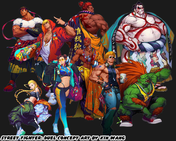
The newest designer Yusuke Hashimoto, was now putting his own unique stamp on the lineup. Yusuke had produced Bayonetta, so he was comfortable designing all manner of characters with different outfits, skin colors, builds, and body types. In short, he was the perfect person to shape the direction of this generation of fighters. With that said let’s try to figure out what made the “SF Style” distinct. The most obvious thing would be the costumes the characters wore. Could you really put a SF character in just any outfit, and would it work within the context of the game? I’m not saying that every character had to be wearing an authentic martial arts costume. That type of visual storytelling did not work great in SF. Instead there was a mix of pseudo-authentic costumes, and casual uniforms to break up the monotony. Consider for a moment what it would look like if everyone in the lineup wore casual clothing. Concept artist Xin Wang came up with fashionable makeovers for the SF cast in the Chinese mobile game Street Fighter: Duel. I would argue that Mr. Hashimoto’s designs were sort of a counter to that. He wanted to bring back the classics, but not go overboard with their costumes.

Long time fans would enjoy seeing their favorite characters in new outfits. However what did this do to new players? How did the game change by shifting just one element? Were new players able to make out the style of fighting that a character represented based on casual wear? Were they able to figure out what they could do based on the color of their skin, or their physical size? Now consider what costumes affected from a game play perspective. Was it easy to read the action on the screen if a character was covered up with long sleeves, or pants? What about vivid patterns, or clashing color choices on an outfit? Did these things make it easier to play the game, or were they distracting? I could argue similar points for excessive splashes of color, lightning, fire, smoke, etc. while the characters performed special attacks. There were many individual elements that made up the main costume choices for the SF cast. In the early days arcade cabinets, and game consoles lacked the memory, and processing power to render anything too detailed. The developers were limited to a simple outfit, and a primary color. This set the standard that was copied the world over. Now that consoles, and even mobile devices were more powerful then it became easier to create characters with highly detailed outfits, and millions of color choices. Was is then critical to take advantage of all this processing power? Or did putting too much into a costume’s detail take away from the overall presentation of the character?

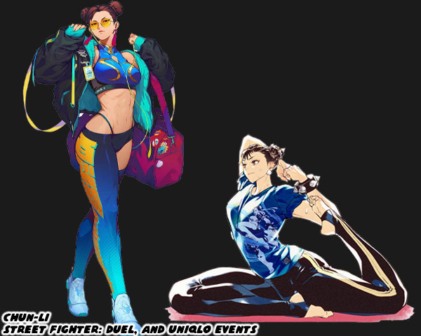
I welcomed the addition of Story, Arcade, and Battle costumes that were put into the library in SFV. I was not against a character getting an updated main costume in the series, as long as it didn’t stray too far from the original design. The importance of a primary costume still remained. This was why I had no objections to the new designs for Dhalsim or Blanka in SF6. There was even a chance for the studio to take a good idea, and make it even better. I thought this was the case for Juri’s update. I saw the studio taking a step backwards when they revealed the new look of Chun-Li. They took away the small details that added up to make her costume truly stand out not only in the lineup, but across the spectrum of fighting games. Chun-Li perfectly encapsulated the Street Fighter school of design. It didn’t matter if you were from the Middle East, South America, or Europe. It didn’t matter if you had played a million fighting games, or if this was your first. When you looked at Chun-Li for the first time you almost instantly thought “Chinese Fighter.” Why was this? 

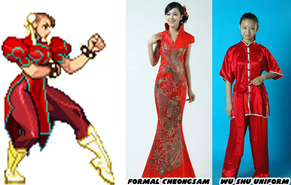
Audiences had seen Chun-Li’s prototype appear in pop culture generations before the game came out. Whether in story, film, photo, television, cartoon, or comics. The artists working at Capcom were pulling from various influences. People saw the repetition of heroic Chinese fighters, especially in Taiwanese, and Hong Kong cinema. They had seen physical Chinese representations in the form of certain hairstyles, makeup, and fashions. The cut of a dress, the use of ribbons, belts, sashes, and how they were assembled could be considered Chinese, or Mexican, or French, or American. Audiences had seen some combination of a wu shu uniform, or a traditional cheongsam at some point in the past. These were actual, traditional outfits from China. The genius of Capcom was how Akira “Akiman” Yasuda arranged certain elements when designing Chun-Li. The puffy shoulders, the pantyhose, wrestling boots, wide belt, and weighted bracelets had never been used in an actual martial arts costume, let alone any traditional Chinese dress. Audiences filled in the blanks with what they knew. They saw elements that they had seen before, and they assumed the rest was traditional Chinese. It was an absolutely brilliant trick, and set a standard that few studios could match. Yusuke Hashimoto showed that he was aware of what Akiman had done. Jaime in Street Fighter 6 followed the exact same design path of Chun-Li.

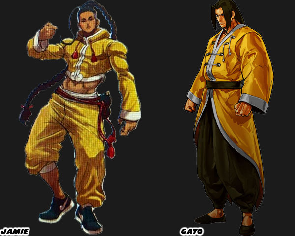
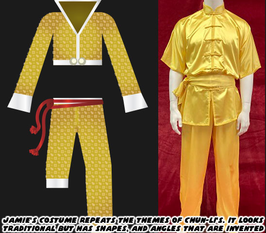
I want you to compare Jamie, and Gato who was a fighter from SNK’s Garou Mark of the Wolves. I had already highlighted Jamie’s various elements on my blog, but let me point them out again. Street Fighter 6 Director Takayuki Nakayama, Producers Kazuhiro Tsuchiya, and Shuhei Matsumoto, along with Yusuke Hashimoto spoke about the influence that Hip Hop had on SF6 in several interviews. Jamie was from Hong Kong, and at first glance it looked like he was wearing a traditional kung-fu outfit, but his costume had a decidedly urban flair to it. Just like Chun-Li it wasn’t apparent until you looked closer. The crop top, long sleeves, and wide collar were tailored to his frame, they were not baggy at all. This fit hadn’t really been worn in any traditional form of Chinese kempo, or kung-fu. The pants with one leg rolled up was a style from USA Hip Hop circles. The color of the fabric looked authentic, until you looked closer, and saw that it had a Louis Vuitton-inspired pattern on it.

Jamie also wore sneakers with a cloud pattern at the front of what looked like the Nike swoosh design. Even his haircut wasn’t quite traditional. The long braid was supposed to make audiences think of the queue worn by men during the Qing Dynasty. Yet that hair style required the men to shave the front part of their scalp. Jamie instead had a modern fade on the sides, and back of his head. Jamie had a red rope belt with a wine gourd strapped to his hip. Many classical heroes in Chinese mythology such as Lu Zhishen, Ji Gong, and Li Tieguai carried a wine gourd as well. Capcom swore that Jamie was drinking a special juice, and not booze from the gourd. Jamie’s design really captured the SF Style, but it did not reflect the quality of the designs placed on some of the returning characters.

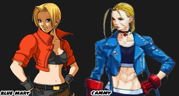
Cammy for example had an entirely new look that was much more casual than earlier looks. I felt that her short jacket, and leggings outfit betrayed the spirit of her original military-inspired uniform. My old friend DarthEnderX mentioned that she looked like a knock-off Blue Mary. That was a valid comparison. I had done a three part series on Blue Mary from the Fatal Fury series by SNK. Mary was essentially a female version of the protagonist Terry Bogard. She wasn’t a Sakura in terms to counterpart either, but more of a super cop like Chun-Li. Her look of jeans, and jacket was warranted as she was supposed to be very Western character. The casual costumes featured on the majority of SNK characters helped distinguish their lineup from Capcom’s. The Street Fighter-Style of character design relied on putting fighters in pseudo-traditional outfits. They had to be instantly recognizable to represent a certain country, school, or style. Like Ken, Ryu, Chun-Li, and Jamie. SNK had an entirely different approach. The genius of SNK’s design was that they hid the martial arts master in plain sight. They might be wearing a three-piece suit, a tuxedo, or a Hawaiian shirt, and flip flops. In every case they were unstoppable brawlers.

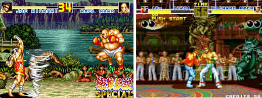
A good chunk of the Fatal Fury, Art of Fighting, and King of Fighters lineup were trained martial artists in street clothes. There were some with classical outfits sprinkled through the series, like Gato, Joe Higashi, and Kim Kaphwan. These traditional designs helped connect the audience to the well-dressed modern archetypes. If you are a budding designer, and are trying to figure out if your style works for SNK, Capcom, or other studios then practice creating fighters of common martial arts. See if you can put a karate fighter in a pseudo traditional gi. Or what that fighter would look like in a suit. How would audiences be able to tell that this person was a fighter? It’s a difficult exercise for sure. Capcom, and SNK had actually been broadcasting who their designs were targeted for in the past decade. We will explore these things in the next blog. I hope to see you back for that. If you have any thoughts on the blog please let me know in the comments section. As always if you would like to sponsor me please visit my Patreon page and consider donating each month, even as little as $1 would help make better blogs and even podcasts!
follow the Street Writer on Patreon!

Friday, December 1, 2017

Coco. Why we need to talk about other cultures in film...

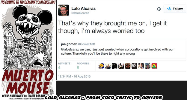
Dear Pixar, Disney and the animation industry in general. We need to have a conversation. It has to be soon. This has been something that's been bugging me for several years. When Disney tried to copyright the name of the Dia de los Muertos and it caused a tremendous backlash from the Latinx community. People were up in arms because it sounded like the corporation was trying to appropriate a holiday. Disney was doing this on behalf of Pixar which was working on a film about the holiday. Animation fans were concerned for a number of reasons, but mainly that Pixar was trying to steal the thunder from The Book of Life, one of the first and most important animated features about the holiday. Pixar had to work overtime trying to fix the public perception. This was not going to be a cash grab, they wanted to assure the community that they would be true to the holiday. Part of the way they did this was by reaching out and soliciting feedback on their story, characters and presentation. Cartoonist Lalo Alcarez went from one of the most outspoken critics to one of the consultants on the project.


The problem that I saw was not in whether or not Pixar could pull it off. I knew that they could. They had an amazing track record. They would be willing to invest the time, energy and resources into making sure the film hit all of the right notes. If they could make people cry over toys and monsters then a story about deceased family members would be a given. What I saw as a problem was the cultural element. There were thousands upon thousands of things that people think about when it comes to reflecting a culture. Having advisers was a good start but for just about every studio that was also where their cultural immersion ended. When the worlds were fictional, say Monsters Inc. or Cars, then people weren't really up in arms about it. Pixar could make up anything they wanted about these worlds and nobody would protest. But as soon as they took on a real holiday with layers of religious and cultural overtones then people (especially minorities) were right to have their concerns.
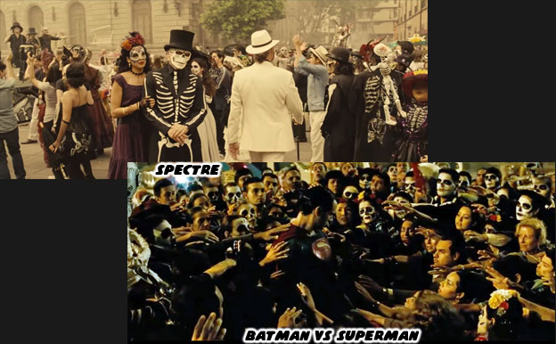
 

The Christian observation All Souls Day did not really conjure up any specific images in pop culture. If you hear the words El Dia de los Muertos however, then the visions of candy skulls, painted skeletons and colorful altars immediately come to mind. Some people mistakenly liken this to Mexican Halloween. It is actually a celebration of family ancestors that is quite humble and solemn. Most didn't realize that the holiday was centuries old and the skeletal imagery was pulled from ancient traditions. There were ceremonies in the Pre-columbian world to honor the dead, two versions of these native holidays were combined by Catholic missionaries when All Souls Day was introduced in Mexico. The colors and symbols used no international artist could ignore. In small chunks the holiday had been appropriated by directors that had little to no understanding of its roots. Dia de los Muertos was used as set dressing for the films Spectre (2015) and Batman v Superman (2016). In which the Mexicans were voiceless actors parading around in a not-quite-right version of the holiday. In more pandering ways it had been stripped of its true meaning and used as a way to sell lottery tickets.
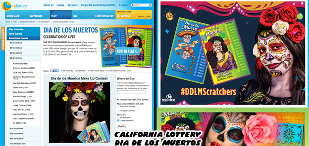
 

When I first saw the California lottery tickets earlier this year it felt like a slap in the face. It was as if the lottery commission was saying to me "Hey stupid, this is your culture and we are selling it back to you $1 at a time." It felt as if our holiday had been appropriated by the USA. The people with the power were taking something that wasn't theirs and repackaging and selling it for mass consumption. It was how I felt when I heard that Pixar wanted to make a Dia de los Muertos film. I wondered how an animation studio that wasn't based in a Latin community, that had never created a short, show or film about the Latin community and was not lead by any Latin directors could take on such a project. It was great that they were interested in the holiday but there was so much nuance to it that I feared that Dia de los Muertos was becoming the new "Tiki."
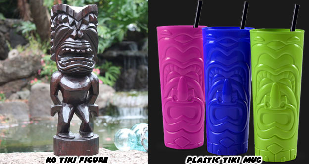
 

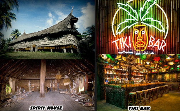
When soldiers came back from the Pacific Islands post WWII they created a caricature of the Oceanic Arts. One in which the mythology, art, architecture, design and landscape of the islands, minus the people, were idealized. Ancient symbols, community gathering places and ancestry worship were stripped of their identity. Ornate carvings in koa wood were made squiggly lines in drink coasters, handmade tapa cloth gave way to plastic grass skirts and ceremonial totems became bottle openers. The spirit house became the bar within a generation. Ask somebody from New Zealand, from Papua New Guinea, from Samoa or Hawai'i what they think about tiki culture. They'd say it had as much to do with their people as Taco Bell had to do with authentic Mexican food. To the mainstream US however, there was no difference between the two.
 

Little by little the symbolism behind Dia de los Muertos had come up more in mainstream culture. It had been incorporated in bite-size pieces. A costume or mask for Halloween. A coloring book and a sticker sheet found in the grocery store. A label on a beer bottle. They were small, innocuous at first. But as more artists, designers and art directors learned about the culture the more they began to "tiki-fy" it, to mass produce the cultural icons and slap them on all sorts of products. Before you knew it there was an entire section in the World Market dedicated to Dia de los Muertos. There were invites at Party City, sweaters in Target and of course lottery tickets all featuring the same sugar skulls and papel picado. I had little to no faith in Hollywood would ever get this right but then The Book of Life came along.
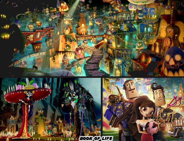
 

The film from 2014 was not only a breath of fresh air. It was also a validation of our people and our culture. It didn't appear overnight. The writer and director, Jorge. R. Gutierrez, had been building a name in the animation industry for years. He had spent at least a decade, along with his talented wife Sandra Equihua fine tuning the story and characters featured in the Book of Life. His artistic style, incorporating elements of Mexican pop culture and art was established early on. His characters didn't look or sound like anything on Western television. His voice was unique in the industry and could be counted on to add an element of authenticity on animation featuring or about Latin culture. Jorge had built a following with shows like ¡Mucha Lucha! (2004), Maya & Miguel (2006) and El Tigre: The Adventures of Manny Rivera (2007). As a native Mexican Jorge had an insight and appreciation of the culture that the vast majority in Hollywood would never understand. His (and his wife's) brilliant designs aside, his comedic timing, his pacing, the ability to insert subtle details about masked wrestling, dramatic supervillains and the occasional churro nobody else in Hollywood could reproduce.
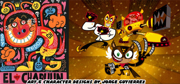
 

Everyone that I knew, Mexican or not, loved the Book of Life. When Disney and Pixar announced that they too were working on a Dia de los Muertos animated feature many fans were up in arms. An amazing film had just come out celebrating our culture, written and directed by "one of us" and we couldn't own it for longer than a minute. It was frustrating. Jorge had spent half his professional career on getting it off the ground. He had poured his heart and soul into this project only to see the biggest animation company in the world come along and cash in on the momentum. It was something that stood out when Coco Director Lee Unkrich asked why people felt threatened by Coco: It was obvious to fans that he simply didn't "get it." On paper the plot of both films was very similar, a boy longed to be a musician and his family forbade it, then he reconciled this with the help of his deceased relatives Yet that was only one level to the frustration.


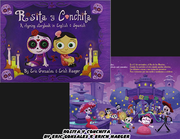
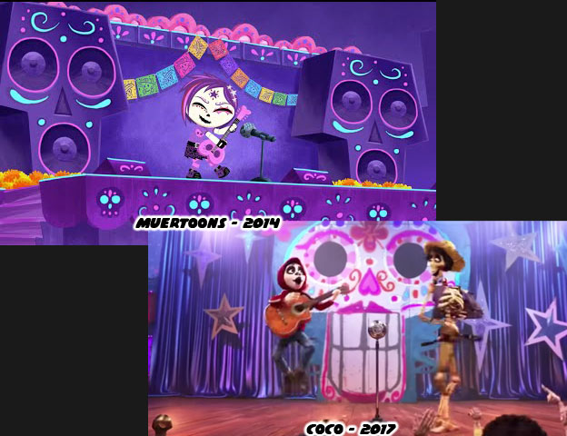
Visual stories featuring el Dia de los Muertos had been around for a while. One of the best was Rosita y Conchita (2010) By Eric Gonzalez and Erich Haeger. Eric was similar to Jorge in that he was known for his fantastic illustrations and 3D pieces featuring styles and themes reminiscent of traditional Mexico. Gonzalez was a staple on the comic convention circuit and pop art shows. He went on to create Muertoons (2014), featuring Rosita and her friends. The animated skeletons went on adventures and learned timeless lessons about family and friendship. This was something that was the crux of both Book of Life and Coco. Family that was not forgotten lived on forever in the land of the dead. In Book of Life the Apology Song (If you can forgive) was sung by Manolo. He begged forgiveness for the countless forgotten bulls that were slaughtered by his family. He also had to return to the land of the living before his town was wiped out and no one would be left to remember them. In Coco the song "Remember Me" had a similar effect. Being remembered was the most important thing for those that had passed on. You would have thought that Pixar had created something new if you didn't know that the Muertoons title song "Not Forgotten" was sung by a rebellious young guitarist named Bibi.


Not only was Pixar coming into the culture late, but they were riding on the coattails of other filmmakers already developing and producing films about the holiday. When Disney applied for the copyright on Dia de los Muertos they didn't realize there was another animation studio already working on a similar project with a similar name. Dia De Muertos, the Mexican directed and produced animated feature by Metacube that was in production before Coco. It wouldn't be released before Coco came out but that didn't stop the small studio from battling, and defeating Disney in court. There was also a computer-generated film about a girl reuniting with her mother during Dia de los Muertos. The 2013 short by Ringling College of Art and Design students Ashley Graham, Kate Reynolds, and Lindsey St. Pierre won a Gold Medal at the Student Academy Awards. In 2006 Laika animator and Texas native Kirk Kelley produced a stop-motion short on the holiday as well. Pixar would certainly gain the lions share of the attention, critical acclaim and profits from their film but they were far from being the first studio to tell a story set in the culture.
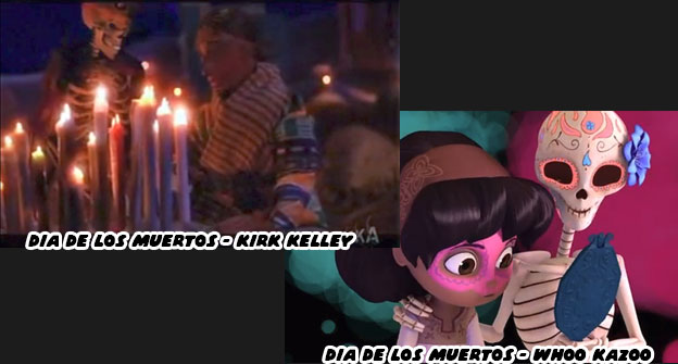
 

The blowback that Disney and Pixar generated when they originally announced their film made their approach more cautious. They began doing things for the film that they had never done on previous projects. Not only did they hire consultants and take trips to Mexico but they also began screening scenes to these outsiders to gauge if they were being sincere, authentic and respectful of the culture. The Latin community represented almost 39% of California's population and 17% of the US population. In an age where the President of the USA said that Mexicans were sending rapists and murderers across the border the pressure for Pixar to get Coco right was tremendous. People were very critical of every real or perceived misstep from the studio. When Central Mexico had an earthquake on September 20th the nation didn't expect any condolences from the North. On September 22 Lee Unkrich shared a picture on Twitter featuring Miguel and Hector from his film. The drawing was credited to story lead Dean Kelly. There was just one problem.
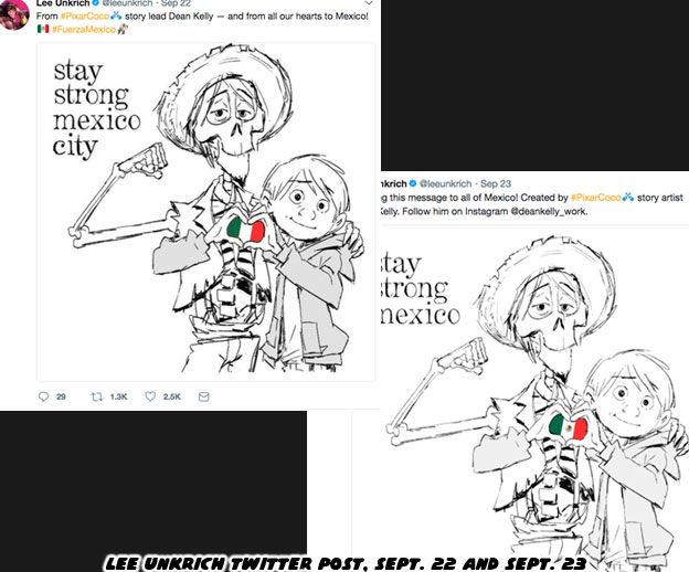
 

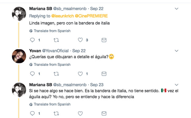
The tiny flag in between the hands of Miguel and Hector was not Mexico’s. The colors were right but it was missing something very important. The eagle and serpent, a story from native legend stretching back more than 600 years was supposed to be at the heart of the flag. Fans called out Unkrich on Twitter and they said the Italian flag was a nice touch, but maybe next time there was a disaster the studio might bother to get the flag right. Unkrich updated the drawing a day later with the new detail. It wasn’t drawn in but looked more like a rushed photo edit. Dean Kelly was then credited as a story artist instead of a story lead. Also in the original post it was about Mexico City but the earthquake had affected many more towns than that, so the repost was changed to read just Mexico. It made many wonder how a studio that had supposedly spent years and years on a project, had brought in outside consultants and had actually traveled to Mexico forgot about the places they went and even the details on the national flag.
 

It was these things and more missteps from Hollywood that were under my skin before Coco ever came out. Mexico was presented with a surface level understanding by most animation studios. When Coco was announced and the plot revealed my mom asked if all Mexican boys wanted to be guitarists. I responded that there were only three stories that the studios could tell. They could make a film about Dia de los Muertos, mariachi music or masked wrestling. Choose any two and make a movie about it. Anything past those three occupations was unrealistic. Heaven forbid there would be a movie about a Mexican girl that wanted to be an astronaut. When some studios created a Latino character they almost always went with the ugliest caricatures of the culture. One of the worst things I ever saw in film was El Macho in the film Despicable Me 2 (2013). The villain, whose real name was Eduardo Perez was the owner of the Salsa & Salsa restaurant. Not only was he an excellent dancer, but he was also very macho you see. He was as absurd as was his son Antonio, the stereotypical latin lover. The audience laughed but I winced as the same tired jokes about Latinos were used over and over again.
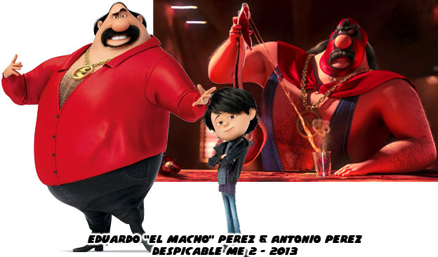
 

Mexico had a complex identity and it was hard to capture that on film. Spain and France helped the US defeat Britain in the Revolutionary war, they were thought of very highly in US history books. At the same time those two nations had also carved up and colonized Mexico and Central America. The people in Mexico did not necessarily favor the way they were treated by the Europeans. There was a tremendous Pre-Columbian identity in Mexico that was almost wiped out when Spanish Catholicism was introduced. The native culture did not mix easily with the European. There was a sharp contrast in the old and new if you were to look at art from 500 or 600 years ago. One minute there was a thriving indigenous population, worshiping ancient gods and the next there were oil paintings of Christ suffering on the cross. There was no transitional period, nothing to bridge the two worlds. That came later, when holidays like Dia de los Muertos evolved.


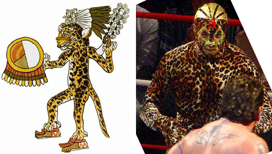
Even masked wrestling had roots in the ancient world as well. Back when war heroes and generals wore animal skins and headdresses that made them appear like eagles or jaguars. The popularization of masked wrestling, some 80 years ago helped bridge ancient and modern traditions. The character El Macho was created out of ignorance. He was just one of several abrasive parodies of Mexico's fascination with masked wrestling.
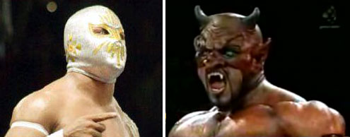
 

I knew that Unkrich and probably most everyone in Pixar didn't know or understand how something like masked wrestling took over Mexico. How it became part of the national identity. Sure it was easy to present in a film. It could even be used for a quick, throw-away gag. But masked wrestlers, enmascarados, represented good and evil. Every match was a morality play. The good guys, the technicos, played by the rules and were held to a high standard. The heels, or rudos, could only win by deceiving their opponents or colluding with a referee. If you looked at the top heroes and villains you could actually identify who was who. The angels were the good guys and the devils were the bad. There was nothing ambiguous about it. There were no anti-heroes that skirted the line. It was easy for crowds to cheer for the good guys and jeer the bad. Kids knew who they wanted to be. They emulated their heroes, they played with their action figures and watched their films. Putting on the mask was akin to a comic book fan putting on a cape. It was transformative.
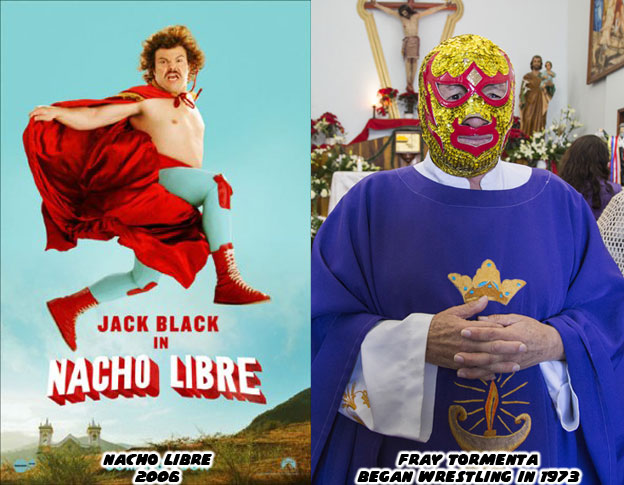
 

Once there was a drug addict that was saved thanks to wrestling. He became a priest and fought to stay sober. He used the gimmick of a wrestling friar to help raise money for his parish and orphanage. Fray Tormenta (Father Storm) became a cult hero and later national hero for his dedication to the craft. He went so far as to actually perform his priestly duties while in character. There was nothing more than an awkward comedy of the man, of the culture and of rural Mexico by the time Napoleon Dynamite director Jared Hess was done filming Nacho Libre. El Macho was cut very much from the same ignorance about Mexican wrestling. It was open for debate if Pixar, Dreamworks, Blue Sky or any other animation studio understood how much of Mexico's national identity was tied into lucha libre. The Latin community kept the same skeptical eye when anything Mexican, and not just Dia de los Muertos was being appropriated for a film.

 

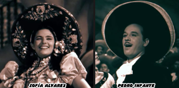
One of the main characters in Coco, Ernesto de la Cruz, was a celebrated musician and film star. Without reading a press release I could tell that he was based in part on the singer Pedro Infante (1917-1957). Infante had a velvety smooth voice and played a number of different characters on film. He was very charming by all accounts and insanely popular in his day. Most that grew up in Mexico were familiar with his films and even generations Mexican-Americans born in the USA had seen the films on television. Infante died in a plane crash at the height of his career. Like many stars that passed before their time it was a wound that never quite healed. Seeing a character design in Coco that reflected the man and the era of "Ranchera" films that he appeared in was something authentic. But the man, his music and films was only part of the story.
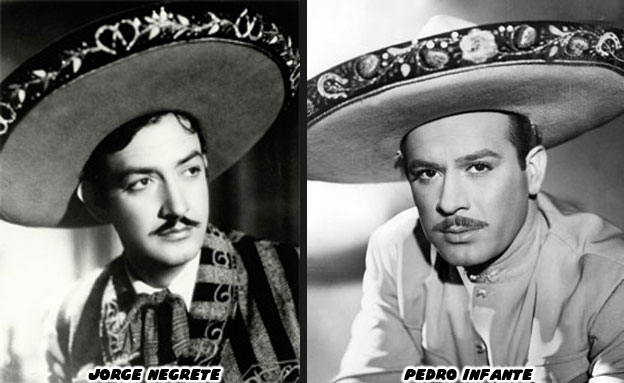
 

Most of the films Infante and his predecessor Jorge Negrete (1911-1953) appeared in were love stories. Often a love triangle between two suitors and a strong-willed woman. This was a tradition that the Book of Life understood and was able to recreate. The films often featured several popular songs. The highlight of each were the Couplas de retache. These were couplet duels, often between the suitors. The singers would trade witty jabs at each other. There were many well worded passages filled with double entendres. At some point one of the men would snap and the two would almost inevitably start throwing punches. When Negrete and Infante appeared on film some argued that there were triple entendres in the couplas. There was the literal meaning behind the words, the subtext to the lyrics and then there was the third meaning on how the personal and professional lives of the actors were always in competition. The two men were friends in real life but public opinion always saw them in competition. Did Unkrich and Pixar know these things about the classic films of Mexico before they started writing Coco? Or did they just want to use the ranchera film as "set dressing?"


Was Pixar aware of how some of couplas were not always between two men? One of the iconic duels was between Infante and Sofía Alvarez in the 1947 film Soy charro de Rancho Grande. The two were not love interests in the movie but they were trading some heavy verbal punches at each other. Alvarez appeared earlier with Infante in the 1946 film Bajo el sol de Jalisco. Whether competing against each other or singing in unison the female leads were often as important as the stars. It was not a one-sided affair, the women often had a chance to steal the movie. If music was important in Coco then the team at Pixar had to become aware how it had been presented in film. They needed to know who did the singing and why. What were they singing about and why the content and context was important? These were all things that Disney learned how to do before Pixar was ever formed.


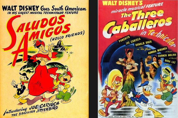
As part of a goodwill tour (on behalf of the US Government) Walt Disney and "El Groupo" traveled to South America. They learned about the customs, and traditions of the various countries. They visited with local artists as well as political officials and immersed themselves in the cultures of Chile, Peru, Argentina and Brazil. They released the film Saludos Amigos in 1942, which introduced the US to Pedro the airplane and the parrot Jose Carioca, the surrogate for Brazil. The following movie, The Three Caballeros (1944) featured new stories and introduced us to Pancho Pistolas, the representative of Mexico. The title song of The Three Caballeros was composed by Manuel Esperón. He was asked personally by Walt Disney to collaborate on the project. His hit song "Ay, Jalisco no te rajes" was the backbone of the theme. Jalisco and the capital city of Guadalajara, was the birthplace of Mariachi music. It was integral to the Mexican identity. The rhythms of Mexican natives, combined with the music from European immigrants (mainly waltzes and German polka) all helped color the mariachi style. Just like Dia de los Muertos and Lucha Libre, there were elements of the old world and the new world featured in mariachi music. These things helped make something brilliant.
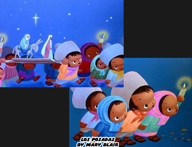
 

The senior artists that went on the trips were greatly influenced by what they saw. I would argue that nobody was more affected than Mary Blair. She was already a master of paint and color but her work forever changed during her travels. She was able to create several scenes that framed the frenetic energy of Brazil's nightlife and the more solemn Posadas of Mexico. The slight change in how she used color, the ability to capture the children of different ethnicities, would help her develop the figures on it's a small world many years later. There was no backlash when it was announced that the uniquely Spanish Catholic tradition of the Posadas would be featured in an animated project. Then again things were much different 74 years ago. News traveled slower, there was no internet and the voices of minorities in mainstream culture were almost nonexistent. Despite these things Walt's team created work that was respectful of the culture and could be celebrated universally. So this took us full circle. Now that Coco had been released we still needed to have the talk. My contention was not about whether or not Disney or Pixar could produce a good movie. My contention was about who was the telling the stories and why we couldn't tell our own.
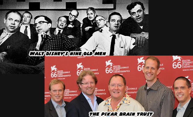
 

In the golden age Walt Disney had his "Nine Old Men" the artists and directors he trusted to carry out his vision. The work they created set a standard that was hard to top. There wasn't much diversity then but that was a different era. They could still deliver a great film (or theme park) despite their lack of representation. That tradition carried on at Disney for decades. When John Musker and Ron Clements had an idea that would become Moana. Pixar boss John Lasseter pushed them to dig in deeper into the history of the Pacific Islands. By doing so they avoid making the story "Tiki" and instead a more authentic experience. Now there was The Pixar Brain Trust, the senior artists and directors that John Lasseter trusted to get things done. Again, there wasn't much diversity or representation in the lineup but there were results. Smash hit movies, beloved by all. It made me wonder why they didn't have women or minority directors. Why were a group of "white guys" the gatekeepers for animated projects, especially those about other cultures? Were they really the only ones that knew how? Or did they not realize that great storytellers came in every shade and gender?


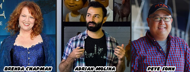
Brenda Chapman was let go from Brave, essentially her original mother/daughter story. When word got out that the Good Dinosaur was in trouble Pixar replaced the director with Pete Sohn, who did his best to lessen the blow or to be thrown under the bus, depending on how you saw the situation. For Coco they brought up long-time Pixar animator Adrian Molina to add an ethnic voice and co-direct with Unkrich. Neither Chapman, Sohn or Molina was considered part of the Brain Trust. If only I could figure out what the three were missing. Following the success of Coco it was doubtful that things would change. Instead both Disney and Pixar would find another culture to talk about, perhaps return to Africa or China. They would go out of their way to do research, bring in advisers and sign up some famous names. They would tout their authenticity during the D23 Expo and parade their stars. The people from that country would be happy that they were being validated by a big Hollywood picture. The world would keep on turning. Just once I wish the studios had a real conversation. With Lasseter on leave maybe now would be the time to acknowledge that a woman could do his job, a minority could do his job, and the Brain Trust could evolve. But I'm just a Mexican-American writing about Japanese fighting games on this blog. What do I know about representing other cultures?


Thursday, September 28, 2017

Hiding the master in plain sight, the genius of SNK's character design...part 2

Fatal Fury introduced audiences to the SNK school of fighting game design. Audiences could now choose between traditional masters like Joe Higashi, street fighters like Terry Bogard, or a hybrid fighter like Andy Bogard. By contrast the Capcom school of design was rooted closer to featuring only martial arts archetypes. The fighters all wore costumes that looked classic, they each represented a certain school of fighting. Almost none of the characters in Street Fighter II wore street clothing, whereas many of those in Fatal Fury did. This boiled down to the people that were developing the games. Takashi Nishiyama and Hiroshi Matsumoto put literal street fighters in the original Street Fighter. People like Mike, Joe and Birdie fought in their everyday clothing. These things carried over into Fatal Fury’s cast. It was Yoshiki Okamoto, Akira Nishitani and Akira Yasuda that decided to focus on archetypes for Street Fighter II. SNK boss Eikichi Kawasaki wanted his fighting games to be the biggest and the best, his new title, developed by Mr. Matsumoto was the most ambitious.


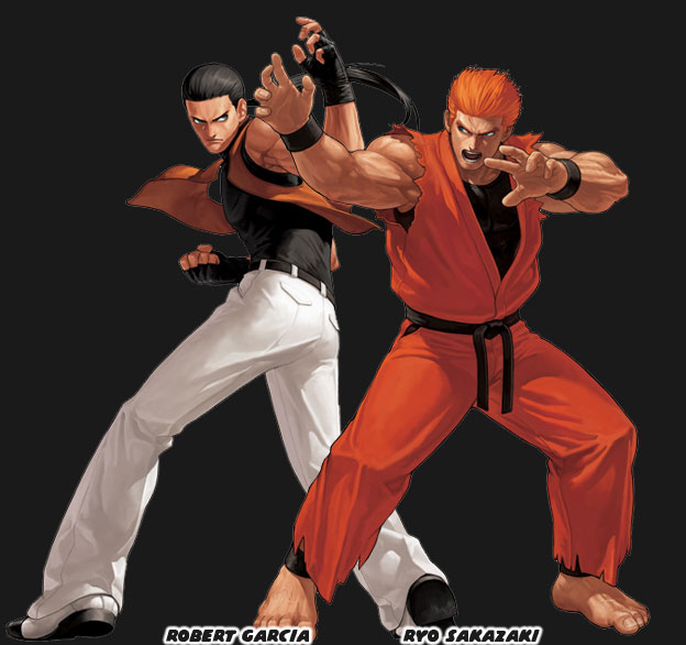
Mr. Matsumoto wanted The Art of Fighting (AoF) to be more cinematic, to look and feel like an action movie. To be more visceral than any game before it. Like Street Smart and Fatal Fury there was a mix of the traditional martial arts master and the street fighter as playable characters. The fictional Kyokugenryu Karate style was placed on both Robert Garcia and Ryo Sakazaki. The two were evolved from the Ken and Ryu template respectively. This new game was really pushing the power of the Neo Geo console. It featured more color, more detail and sprites bigger than the competition’s. Not to mention that it had graphics that zoomed in and out of the action. These sprites could also reveal damage. Characters bruised and their clothing tore from round to round. There was even a slight RPG element as characters could grow and evolve thanks to the lessons learned in the bonus stages. The genius of this game came in the planning stages. If SNK wanted to dethrone Capcom as the best fighting game developer then they had to offer the best experience. Although Fatal Fury and the Art of Fighting looked and played differently they were part of the same shared universe. This meant that at some point there would be a crossover game featuring a massive library of established characters.


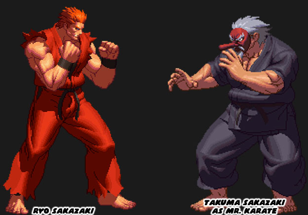
The entire cinematic feel of AoF was not lost on audiences. The figures in the game had more realistic proportions and looked less cartoonish than their rivals. It was much easier to get pulled into this world as bits and pieces of the story were revealed in between every stage. Yuri Sakazaki, the young sister of Ryo had been kidnapped. It was up to Ryo and Robert to find and save her. Every person that the duo faced had been hired or bribed by Mr. Big, a South Town mob boss. Each encounter brought them one step closer to the truth. At the end of the journey Ryo found out that the kidnapper was a martial arts master known as Mr. Karate. At the climax of the game Yuri stopped her brother from killing Mr. Karate. She cried out that man was their father. This was an exceptional plot twist and something that set up a sequel. It turned out that both Mr. Big and Mr. Karate answered to Geese Howard. Now that Yuri was safe there would be a reckoning between the Sakazaki family and Howard. Imagine how confident Geese must have been in his abilities by also starting a war with the Bogard brothers at around the same time. Story points aside the AoF game is one of the perfect examples of the SNK school of design. I’ll begin with one of the best masters hidden in plain sight.


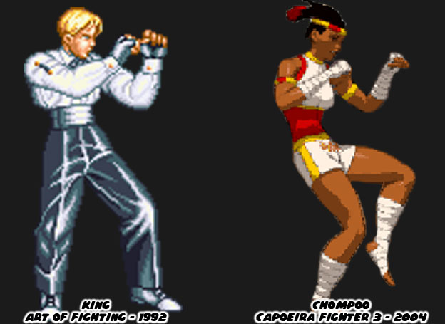
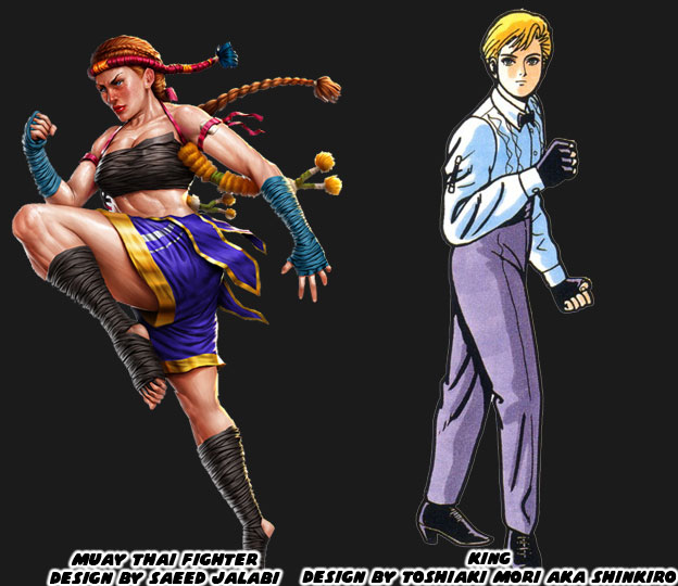
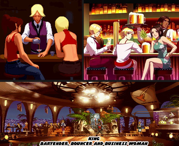
A while back I talked about how the traditional Muay Thai master ended up in fighting games. I called Chompoo the first notable female Muay Thai master in a fighting game. This angered a lot of SNK fans because the character King predated her by more than 20 years. In context I was talking about actual Thai fighters that dressed in the traditional fighting uniforms. Chompoo had the shorts, taped up hands and feet and even headdress. I was not talking about characters that knew Thai boxing. With that said let’s actually look at the elements that went into making King and why she had a fantastic design. First off she wore a suit, close to that of a bartender in a high class restaurant. She had the familiar stance, hands up for striking and moving on the balls of her feet. If you had asked any other designer to create a female Muay Thai master you probably would have ended up with someone that looked more like the character by Saeed Jalabi. Saeed hit all of the traditional notes perfectly. The shorts, headdress and even wrapped cords of older, classical forms of the Thai boxing arts. Any audience member could look at the design and know instantly this was some sort of fighter. Even if the gamer was not familiar with the fighting arts they could still tell a few things about her. The athletic frame, toned muscles, wrapped hands and feet were meant for striking. This was not a ceremonial costume but one for competition.


By contrast look at the design that Toshiaki Mori came up with. The SNK designer would become one of the most influential artists of all time. Most people would recognize him by his pen name, Shinkiro. He didn’t approach his designs the way one would have expected. What made his work so great was how down-to-Earth every figure was. When he was helping create the costumes for the AoF cast he knew to make each character fit the story. As Robert and Ryo made their way through South Town the people they fought reflected a certain part of the city. The thugs looked like biker gang members, those in the military wore fatigues. Having a half-naked Muay Thai fighter in a classy restaurant would not have made any sense. But what about one dressed like a bartender? The uniform was central to the character. Modern martial arts movies featured characters that wore deceptive clothing. One the first examples was the tuxedo that Robert Baker wore when he fought Bruce Lee in Fist of Fury (1972). Bruce Lee helped bring classic wuxia or Chinese hero stories into the modern era. The same thing was true of the suit that Benny Urquidez wore when he fought Jackie Chan in Wheels on Meals (1984).


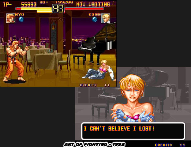
The suit was deceptive but that was only one layer of Shinkiro’s design. King looked like an effeminate man, or perhaps a boy. Audiences had been conditioned to expect 99% of the people they fought to be men. Up until that point Fan from Yie Ar Kung-Fu was the only female opponent in a fighting game and Chun-Li from Street Fighter II was the only playable female character. Audiences expected a female martial artists to be wearing a traditional dress. That whole idea was turned upside down if players tore the blouse off of King with a special attack. That was when it was revealed that she was wearing a bra underneath. That violent act made the game feel far more mature than any other title. This sort of turn was something that you would expect in a movie and certainly not in a game. SNK hid the reveal right until the end, going so far as to name the character King instead of Queen. In doing so it made the design very memorable. This master of the fighting arts was hiding in plain sight. She would be the perfect example as to what set SNK apart from the competition.


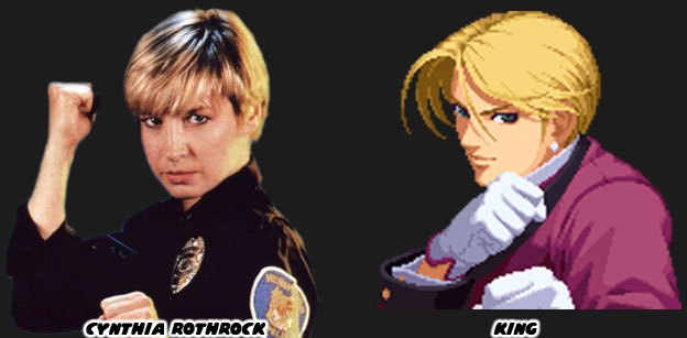
If you have been reading my blogs for a while then you know that I like to dig into the influences behind the various characters. For King the most obvious comparison would be with the martial arts star Cynthia Rothrock. Since 1985 Cynthia had been featured in a string of movies, mostly produced overseas. Women hadn’t really been considered for leading roles in most Western-produced martial arts films. There have been exceptions of course in other action films such as the Black Widow from the Avengers films, Furiosa from Mad Max or Gazelle from the Kingsmen. Those characters were almost always in a supporting role and not the stars of the film. In Hong Kong however women could be the stars of the film. This was a tradition going back to 1928. Heroes came in all shapes (see the chubby Sammo Hung), sizes, and colors even. When Cynthia couldn’t land a role in a US film she was almost always guaranteed to find a spot in Hong Kong. The same thing was true for Ron Van Clief. As a black martial artist, and Army veteran he faced tremendous racism in the USA but was a welcome star in Hong Kong cinema.


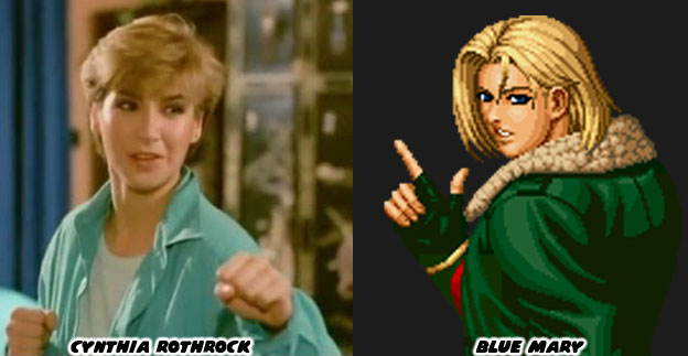
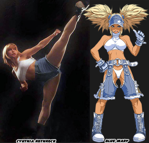
Cynthia’s trademark short haircut, lightning fast kicks and array of martial arts moves made her a stand out star. She had been actively involved in martial arts for a long time and was trained in different schools, including Tang Soo Do, Tae Kwon Do, Eagle Claw, Wu Shu, and both Southern and Northern Shaolin. She was able to hold her own against many men and women artists from Hong Kong, some of which learned fighting and acrobatics from the Chinese Opera, just like Jackie Chan. Cynthia often played a street smart cop, nicknamed China O’Brien in one of her more famous recurring roles. She was such a formidable figure that I would argue she not only influenced the design behind King but also Blue Mary, who turned up in the Fatal Fury series. This made Cynthia one of the rare real world figures that inspired the creation of more than one character, in more than one game series.


Cynthia was not shy about using her good looks in the roles she played. When the part called for it she would show some skin, tastefully of course. The people working at SNK were keenly aware of how the actress sexed up some of her parts or modeling shoots. Shinkiro did not outright try to make King a voluptuous, overly sexualized character. It would have destroyed any surprise waiting for audiences when they first saw her. It was the other artists working at the studio that started putting her in form-fitting suits, they turned her vest into a bustier and starting pushing her breasts out further and further. She would not longer appear androgynous following the AoF. Blue Mary had always been presented as the more sexualized of the designs. She was top heavy with an exposed midriff, wearing uniforms that were not standard law-enforcement. A very skimpy white top and denim bottom was created as an alternate costume for her in King of Fighters (KOF): Maximum Impact 2 Regulation A. This costume was inspired by an outfit worn by Rothrock in a modeling shoot. However we should confuse the two. The design behind King and her planning extended far into the lore or the SNK universe.


On the surface King was a very simple design. She had the skills and grace of a top bartender but with the power of a no-nonsense bouncer. On top of everything she was not going to remain as a bit player in South Town. The figures in the SNK universe had room to grow and the did in the various KOF sequels. The Sakazaki family opened Kyokygenryu schools, with Ryo entering tournaments to help spread its name. Andy and Terry Bogard travelled the globe following the trail of Geese Howard and making new allies along the way. King made fast friends with the other leading females in the KOF series. She partnered with the ninja Mai Shiranui and Kyokugenryu prodigy Yuri Sakazaki to form an all-women team. This was a first in fighting game history. She also partnered with them to open a club in a later timeline. King had taken her experience, including learning from Capoeira master Richard Meyer and his infamous Pao Pao Cafe, and applied it to her own business. She was ambitious and was destined to be a major player in South Town, yet unlike Geese Howard she was going to do this without resorting to extortion. King was an exceptional character design and easily one of the greatest fighting game characters ever created, female or otherwise. Artists and developers try to break into the genre should learn from SNK and see how they were able to hide these martial artists in plain site. The studio was able to hide masters in many ways. We will explore the ways they were able to do this in the next blog. As always if you enjoyed this blog and would like to sponsor me please visit my Patreon page and consider donating each month, even as little as $1 would help make better blogs and even podcasts!

 follow the Street Writer on Patreon!