Thursday, June 23, 2022

Dhalsim, and Blanka, the return of the strange characters in Street Fighter 6

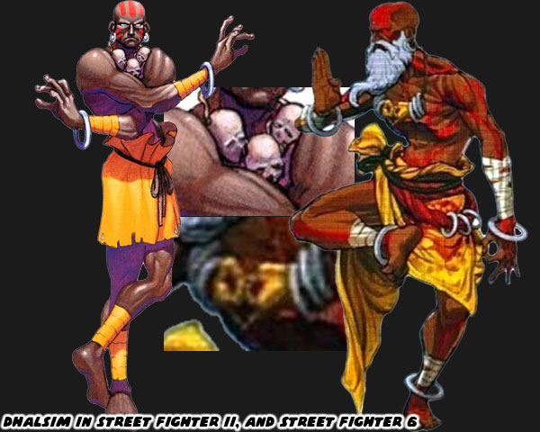
Yesterday we talked about JP the new character in Street Fighter 6. I mentioned that his design was odd on purpose. Normally fighting game characters look like they represent a certain martial art. Whether it's Ryu wearing a karate gi, or Zangief wearing wrestling trunks, it's very easy to see what form they reflect. JP was wearing an orange suit, and white cape. These were not things that defined any named style. The Street Fighter franchise has always relied on some non-mainstream styles, and characters. Even in the original Street Fighter the first two characters that Ken, and Ryu fought were a monk, and a ninja. This concept became more extreme in SFII, especially through the characters of Dhalsim, and Blanka. Dhalsim was based on a stretchy yoga master from the film The Master of the Flying Guillotine. Blanka was a wild man inspired by the green-skinned "Amazon" from Nintendo Pro Wrestling. The two outliers helped create a memorable game. Often times I think that studios forget that fighting games work best when they feature at least one cast member that is an oddball. Dhalsim, and Blanka's look has changed a little through the years, and when it did I think it was for the better. Dhalsim went from wearing rags, a necklace laced with the skulls of children, and a rope belt to portray his humility, and penance. Now he is wearing a necklace showing the Gyan Mudra, or meditating hand positions. He also has the robes of a holy man, or mystic. Dhalsim even went from a freshly shaven bald man, to a bearded man, sporting a turban. Clearly time had passed for the character, and Capcom was interested in capturing details from Indian culture rather than make stuff up.

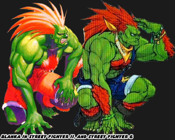
The studio created both fighters from stereotypes, but it was good to see them move away from adding more problematic choices. More important, they started stripping away elements without betraying the spirit of the character. The fact that they were trying to be more inclusive by adding more women, and minority characters in SF6 could be seen as proof that they had learned from the past. There were new people in charge of the franchise, and they were bringing it into the new millennium. The changes applied to Blanka were subtle, but just as important. His original design saw him in orange shorts, and shackles. This was a holdover from the time where he was literally a fighting slave. The beast man from Brazil was reunited with his mother at the end of SFII, and was reintroduced to society. He now wears jean overalls, and a bandana. Clearly he still prefers the outdoors, but no longer looks like he escaped from the circus. I’m not sure why Blanka would keep the ankle shackles, even if they were a gift from his mother. But that’s a minor complaint. These were small changes to the characters, but added much more dimension to them at the same time.

I am eager to see how the duo of odd characters have grown. What are their moves, and special abilities like now? What is their purpose in the latest story? I have plenty of questions, but no answers from Capcom. In the next few months I’m sure a lot more will be revealed. What do you think about the updated looks of Dhalsim, and Blanka? Is Capcom going in the right direction, or would you rather them try something different? Please let me know in the comments section. If you would like to sponsor me please visit my Patreon page and consider donating each month, even as little as $1 would help make better blogs and even podcasts!
follow the Street Writer on Patreon!

Wednesday, June 22, 2022

A look at JP in Street Fighter 6, is this old money personified?

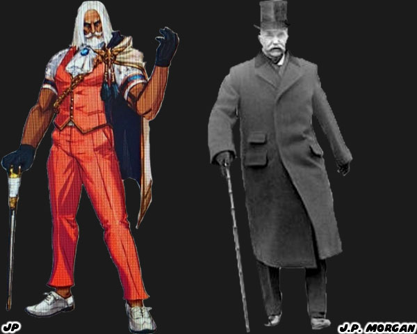
Today we are looking at another new character slated for Street Fighter 6. JP seems to be an odd choice for the lineup. The Russian appears to be an older, well-dressed man, and not a fighter at all. Of course in a universe where British teens are actually deadly spies then it’s fair to say looks can be deceiving. Let’s try to figure out this character, and his inspiration. We’ll begin with the name itself. JP is a Russian, given his choice of clothing, cape, cane, and trim, it’s fair to say he might be an oligarch. In recent news we are aware of the influence of Russian Oligarchs in international politics. The name itself may be a nod to an older tycoon. John Pierpont “J.P.” Morgan was an investment banker, and finance executive from the late 1800’s / early 1900’s. He inherited wealth from his family, along with connections. This allowed him to help form the companies General Electric, International Harvester, and U.S. Steel to name just a few. So far was his business, and political pull that economists feared he owned the country. To this day several of the monopolies he created are still around, and his company merged with Chase Manhattan as one of the premier banks in the nation. It would be interesting to see if JP is supposed to be a magnate with that kind of influence in the SF universe. The other thing that draws us to his design is the color choice. I've long said that solid color choices have historically gone over well on the main characters. JP is wearing a nice shade of orange on his suit, with white, and gold trim. These are all complimentary colors, including the white in his hair, and beard. Plus we have already covered that there are fighters in the series that use weapons. JP would be joining Lili in that regard.

I think the reason that Capcom put him into the game was twofold. First was that every Street Fighter game from SFII to today featured at least one odd character. Figures like Blanka, and Dhalsim were on the extreme end of what worked in the series. Having an older gentleman, and a big woman like Marisa in the game might be balancing out the cast. The other reason I think that he was included was because the team wasn’t happy with how G turned out in Street Fighter V. I had done a lengthy post on G, and other power-hungry characters in the genre. JP might be a second chance to get the power broker trope right. He might be a despot looking to either hire, or eliminate the best fighters in the world. We can only know for certain when Capcom officially unveils the character, and his motivation.

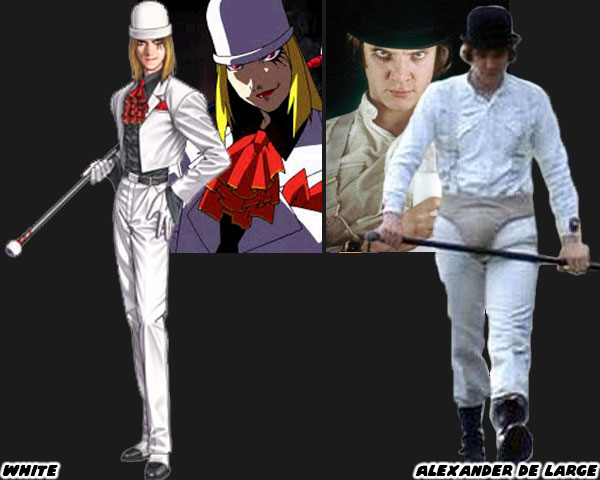
The sneaky-type characters, pulling the strings have been in other fighting games. Real Bout Garou Densetsu Special: Dominated Mind, was a 1998 Playstation version of the 1997 arcade game by SNK. That series was a sequel of the popular Fatal Fury line. The games usually revolved the Bogard family against Geese Howard. This time SNK added a new villain. White showed up in a white suit, bowler hat, and cane. He fought with a series of sneaky attacks, and used his cane to help extend his range. The odd-looking character was based on Alexander de Large (Malcom McDowell) from the 1971 film A Clockwork Orange. I don't think JP is a nod to any specific film character, but I'm betting his cane hides a sword. Again, we won't know all of the details until Capcom releases them. I'm interested in seeing what becomes of this character. Already I think he looks better than G. What about you? Are you interested in these type of character designs, or would you rather see Capcom pushing for something more extreme? I'd like to hear your thoughts in the comments section. If you would like to sponsor me please visit my Patreon page and consider donating each month, even as little as $1 would help make better blogs and even podcasts!
follow the Street Writer on Patreon!

Tuesday, June 21, 2022

Dee Jay is back in Street Fighter 6, is he better than we remember?

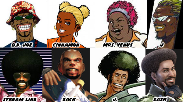
Today we're going to talk about a returning character to Street Fighter 6. Dee Jay made his first appearance in Super Street Fighter II: The New Challengers in 1993. The new challengers the title referred to were T. Hawk, Fei Long, Cammy, and Dee Jay. Capcom was in the planning stages of Street Fighter III, and those four were the earliest characters slated to be inserted into the series. Several of the fighters in the SF series were inspired by pop culture, whether they were film characters, or actual martial artists. Dee Jay was no different. The character was created by James Goddard. The Capcom employee was Co-Lead Designer for Street Fighter II: Champion Edition. The studio had long sought to add a kickboxer to the game. The last time a fighter of that style was featured was with the non-playable Joe in the original SF from 1987.

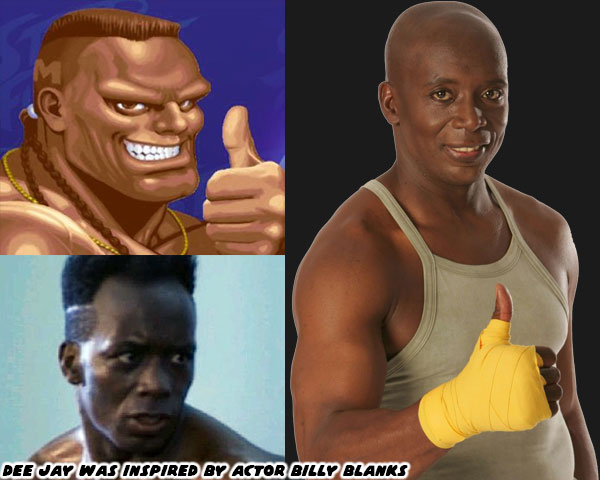
For inspiration Mr. Goddard looked at Billy Blanks who is an actual martial arts practitioner, and fitness guru. Billy's first major role was as the villain Khan the Great in The King of Kickboxers. The film came out in 1990, after Final Fight, but before SFII was released. Billy's next starring role was in TC 2000. In that film he played Jason Storm. The film debuted in August 1993, Super SFII would come out a month later. Many people mistake TC 2000 as the film that inspired Dee Jay, but there's no way a studio could create a character, and their move set in less than a month. Blanks had a great physique, and a trademark fade that was made for game characters. Although there were a few notable Black martial arts film stars in the late '70s like Ron Van Clief, and Jim Kelly, there weren't too many in the late '80s/early '90s. Blanks (and Wesley Snipes) helped spark a new trend for actors like Michael Jai White, Marrese Crump, and Lateef Crowder. As for the character I think his new design was a bit better than his original.

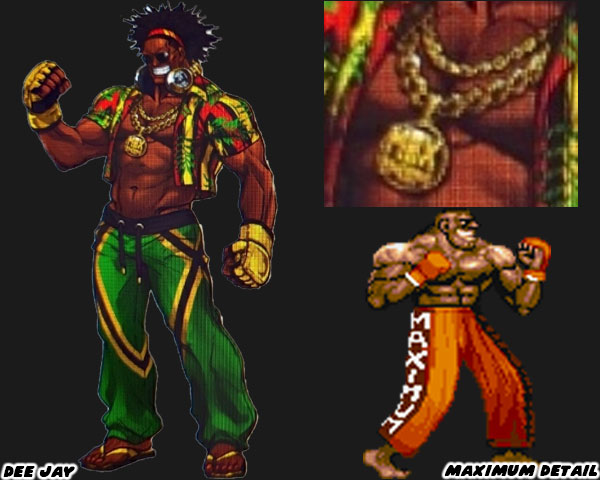
Dee Jay had ditched the fade, and braids for natural hair. This was a nice touch. He was also wearing the colors of the Jamaican flag (green, yellow, and black) on his pants, and the Pan-African colors on his shirt. You know by now that I believe that the most memorable characters were assigned solid colors. Wrapping a character in a multi-colored national flag might be pandering, or a good substitute depending on your perspective. The reason I think for Dee Jay’s multicolored costume in this game was because yellow with black accents were already assigned to Sean in Street Fighter III, and green with yellow trim was assigned to his sister Laura in Street Fighter V. The updated look also includes gold jewelry around his neck, along with a medallion that reads MAXIMUM. This was a nod to his original costume. The studio had originally wanted to put MANTIS on the side of his pants, as in praying mantis. The problem with this was sprite mirroring, the N, and S would have been flipped on the screen. Maximum reads the same when mirrored vertically. The sticking point for me with the character was his stupid grin. It harkened back to an uglier time in US history, and I'm not talking about the '90s.

I am for more minority representation in the series. With that said I would like to see it in a positive light. I did not appreciate the gimmicks, and racial overtones applied to El Fuerte, Birdie, T. Hawk, and Hakan. Also I thought that there could be fat representation without it being used for the sake of comedy like Rufus. I had talked about the perpetually grinning Dee Jay, and the stereotypes behind black characters in Japanese games earlier on the blog. Younger readers may not be aware of it, especially out-of-touch Japanese developers, but the grinning black character was a trope from the days of Jim Crow. In short, to make a Black character more appealing (less threatening) to audiences he often had to be presented as a grinning entertainer. Even if Dee Jay now wore the colors of the Jamaican flag, and sported natural hair, he also wore a lot of jewelry, and never lost that wide grin. I’ve no doubt he would be fun to play with in the game. I also have no doubt that the new developers meant no harm in his return. I just hope that if the studio takes more careful consideration when adding minorities into the franchise. What do you think of Dee Jay? Are you eager to see his return, or would you rather have seen a different, or new character instead? I’d like to hear about it in the comments section. If you would like to sponsor me please visit my Patreon page and consider donating each month, even as little as $1 would help make better blogs and even podcasts!
follow the Street Writer on Patreon!

Monday, June 20, 2022

Manon in Street Fighter 6, representing a style over 200 years in the making

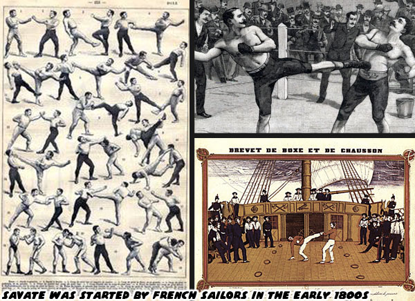
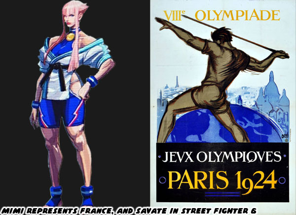
Today we’re going to look at Manon (originally listed as Mimi in the leaked concept art), a new character in Street Fighter 6. She hasn’t been officially announced, like some of the other ones I have previewed so far. So everything I’m going to talk about it just to place her in context. I think that understanding the roots of a character, their design, and especially their fighting art can help you appreciate them a little bit more. Manon is a leggy female fighter, she seems to be kick based. I mentioned her briefly on my symmetry blog. I said she looked like a balance to Juri. She was a sort of “good” version of the evil striker. It’s her implied form of fighting that I think is long overdue for the series. Manon hails from France, and based on the cut of her uniform it is likely that she represents a form of kickboxing known as Savate.

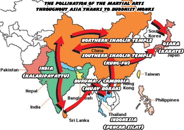
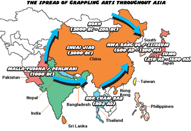
Savate translates to “old shoe” in French. The style of fighting is a few centuries old, and was created by French sailors. I do not believe for one second that the sailors just happened to invent a new form of fighting on their own. Quite the contrary, I think they picked up a number of lessons from various older forms of combat. In my history of the martial arts I mentioned that Buddhism started in India, and moved east. The monks helped pollenate the fighting arts throughout Asia. What I never talked about in the blog was how the fighting arts did not solely pollenate in one direction. Grappling was the oldest of fighting arts, with striking arts evolving from them. The differences between Muay Thai, and Karate were very distinct. One form was considered older, more lethal, while the other was more scientific in approach. Those nuances were applied to characters like Sagat, and Ryu, and in the process made them icons. They represented a pure style of their respective art.

The thing about the fighting arts, and their practitioners, is that many fighters throughout history were not content studying one style alone. The best fought against, and learned from different schools. In the process becoming MMA practitioners a few centuries before the term mixed martial arts was coined. These fighters in turn created new schools of fighting. Perhaps they taught a form of karate that included the kicks of kung-fu, the punches of boxing, with the knee, and elbow strikes of Muay Thai. Perhaps they taught the grappling techniques of Mongolia, with the throws of judo, and the joint locks of ju-jitsu. Masters of the fighting arts went back, and forth between different provinces, as well as continents. They dissected different forms, and found what worked for their method. I have no doubt that Savate was born from French involvement in global trade.

The “Silk Road” made famous by Marco Polo was only the beginning of Europe’s fascination with the East. Seafaring nations including England, Portugal, Spain, and France looked to set up trading routes all throughout the Indian Ocean. France specifically had been trading in Asia since the early 1500’s. Like many of the other nations of Europe they too looked to expand their empire. France colonized parts of Laos, Cambodia, and Vietnam, and created French Indochina in 1887. I have no doubt that the French sailors that had been traveling through the ports of Thailand, Malaysia, and Burma were exposed first-hand to the ancient fighting arts of Muay Thai, as well as silat, and Muay Boran. Almost three hundred years of picking up techniques from port, to port, and refining them while on a ship helped make savate a distinct fighting style.

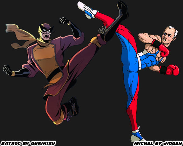
Savate is more akin to kickboxing than Muay Thai. The emphasis is on controlling distance, leaving space for kicks, and punches. In Muay Thai the fighters try to close the distance and kill an opponent with knees, and elbows. The uniform of the practitioners is also distinct. We picture a white gi, and black belt when we think of karate. We think of shorts, and corded wraps for Muay Thai boxers. In savate practitioners wear very light shoes, boxing gloves, and tights. I’m sure that the tights are part of the reason why it isn’t more popular with the men in the US. At the same time I’m surprised that Manon does not wear tight pants, shoes, or gloves. However part of what makes a Street Fighter design unique is that they only try to caricature the fighting art, not make it completely accurate. Manon’s uniform has about as much in common with Savate, as Juri’s does to Tae Kwon-Do. While you may not be aware of savate in US pop culture, its influence has been here for generations. The villain Georges Batroc the Leaper debuted in Marvel comics in 1966. This mercenary was played more recently in the Marvel films, and television shows by MMA legend Georges St-Pierre.

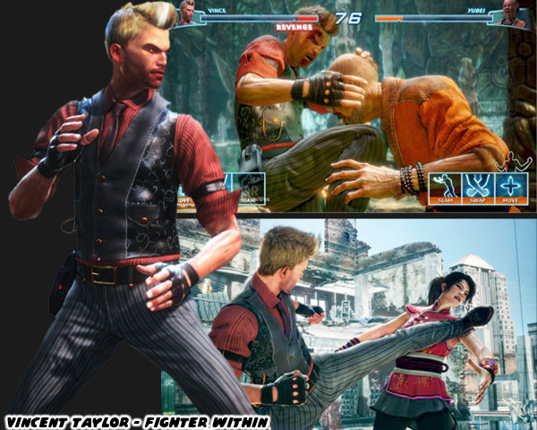
As far as video game adaptations there aren’t many notable savate heroes. Remy in Street Fighter III: 3rd Strike was the first savate fighter in SF history. However most of his moves were poached on the techniques employed by Guile in SFII. Aside from that Ubisoft tried to represent the style in 2013. The Fighter Within debuted for Xbox One Kinect. The character Vincent “Vince” Taylor was a kickboxer, and savate practitioner. The Brit had a gentlemanly look about him. It helped capture the “proper” spirit of the French art. Sadly this game was a miserable experience. Character designs aside, there wasn’t a saving grace to it. The control, and game play left many wondering if Ubisoft just published a game that was still in beta. That’s why few people ever talk about it, or what the studio was going for. I am hoping that Manon sets a new standard. Already I love her design.

As I mentioned at the top of the blog she seems to be a balance to Juri. Like the other female stars her hair has a unique color, and shape. Her long legs, and exposed thighs were made for some fancy kicks. How those kicks will be different from Elena, Chun-Li, Cammy, and Juri remains to be seen. Either way the tireuse (female Savate practitioner) looks heroic. She wears the colors of her nation right on her costume. Look for the blue, white, and red dashes along her shorts. She also seems to be wearing a gold medal, with a ribbon also made in the national flag colors. A bit of trivia for you Savate was an exhibition event in the 1924 Olympics. I don’t think Manon is supposed to be 100-years-old. Instead Capcom is showing us that she’s the best in the sport, and a match for the World Warriors. I am eager to find out more about this character, and her special moves as the release date gets closer. What do you think of the character? Are you a fan of the striking arts? Is there a form of fighting you wish was in the series? I’d like to read your takes in the comments section. If you would like to sponsor me please visit my Patreon page and consider donating each month, even as little as $1 would help make better blogs and even podcasts!
follow the Street Writer on Patreon!

Saturday, June 18, 2022

Juri in Street Fighter 6, how her design got better with time

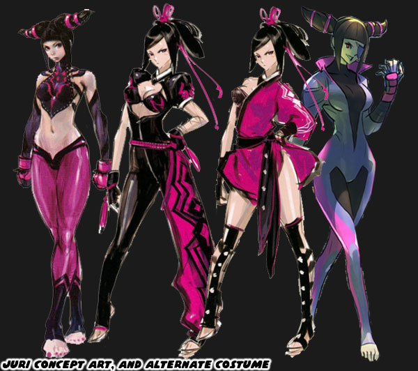
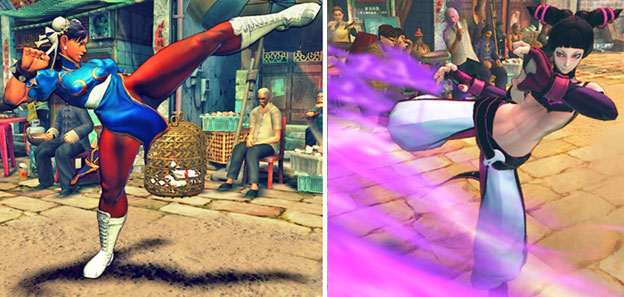
Today we talk about the best character introduced to the Street Fighter universe in the past 10+ years. Juri Han first appeared in Super Street Fighter IV in 2010. Can you believe the game came out that long ago? When she debuted the fan response was almost immediate. Abel, C. Viper, Rufus, Hakan, and El Fuerte took a back seat to the new femme fatale. A lot of people online think my ideas on character design posts are garbage because they think I hate Juri. That couldn’t be further from the truth. I was hyper critical of her design, and said that Capcom could have done better. From a story perspective she seemed overpowered. She was hyper sadistic in the game animations, and written to be god-like compared to Cammy, and Chun-Li. I thought that was a bit much, and disrespectful to established fighters. The biggest gripe I had was because Juri’s final design was closely based on Chun-Li. I was sure that the studio could have introduced a Tae Kwon-Do villain, without poaching Chun-Li’s design almost point for point. As time went on it was rumored that the studio had created some 400+ designs, and costumes for the character before settling on the one that appeared in the game. Several of her earlier concept designs, especially the tight skin suits, eventually became alternate costume DLC for the character.

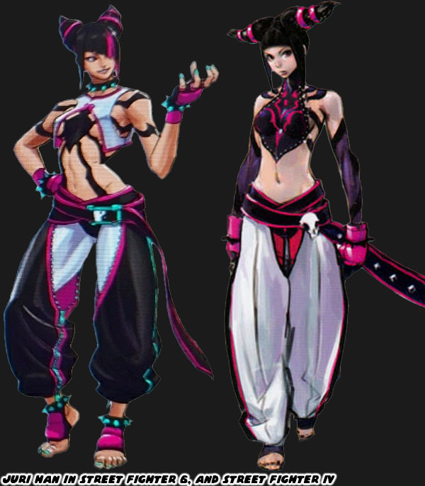
I think that the most recent version of Juri is much better than her debut. Her look, and costume look similar to her first appearance, but the changes made to them were subtle, but numerous. Let’s start with her dobok, the uniform worn by tae kwon-do practitioners. The colors are almost reversed from the original. Her leggings were white, and her pants were black, with fuchsia, and aqua accents. Not only that but they were shorter so we could see the contrasting colors on her feet, and ankles. The zipper on the inside leg makes the cut look very fashionable. White pants work okay for Ryu, but by going with much darker primary colors it really helps Juri stand out in the lineup.  Also a bit of trivia for you. Some of the costume colors assigned to the cast were based on the flags of their respective nations. Juri represented South Korea, their flag is colored red, blue, white, and black. So if you mix the colors blue, and red you end up with purple, the primary color of Juri. It would have been in poor taste for a Japanese studio to outright paint a villain with the flag of South Korea. The two nations have a lot of bad blood, especially for the numerous war crimes the Japanese perpetuated in Asia.  

The skull on Juri's belt was replaced with a yin yang symbol. This detail could be related to her chi abilities, or Tanden engine-accelerated powers. Her top reflects her evil origins. When Daigo Ikeno was working on the character the team nicknamed her the Spider. She was like a poisonous black widow that killed her mates. The spider logo appeared on the back of her top in her debut. This time it was put front, and center, like a sexy Spider-Man outfit. Although one of the spider legs covers her nipple Street Fighter designer Yusuke Hashimoto knew better than just leave most of her boobs dangling there. He covered her breasts with a split-open hanbok. He took the shape, and color of what would have been a traditional dress, and turned it basically into a lingerie top. Also her spiked bracelet was finally given some contrasting colors. The aqua on her pants was reflected on her fingernails, toenails, belt buckle, and more importantly, the spikes themselves. By adding the spiked bracelet to her ankles it was the type of nod to Chun-Li without just poaching the look. I think this addition may be the most inspired update to her costume.

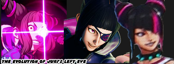
The next major change to Juri would be the cut of her hair. Her conical braids made a quick impression with fans, and became her trademark style. The studio observed the unique hair styles of other SF females. Chun-Li had buns, Cammy had braids, C. Viper had a pompadour with ponytail, Rose had purple hair, etc. Juri still had the cones, but now they were curved upwards in a more obvious devil horn fashion. Her bangs also changed shape, they were diagonal now, and extended over part of her face. Not only that but she had a fuchsia streak that lined up over her left eye. Juri had an artificial left eye fitted with the powerful Tanden, or Feng Shuei engine. When she is at full power the eye glows, in one of her alternate costumes she wore a patch over it. This new haircut keeps her face slightly obscured, and mysterious like C. Jack, but it also helps mask the eye. It was a very smart update to her look. Sadly I don’t think that Mr. Hashimoto realized that the colored hair streak was considered an Asian stereotype in the US. Glamour magazine said it best “It's Time to Retire the 'Hairstreak Asian' Trope”. I think the hair streak makes sense in context, but I understand why people are over designing Asian leads with similar hairstyles.

All in all I think that Juri’s redesign for Street Fighter 6 is her strongest look yet. I’m still more partial to her skin suit, but if you were to design an evil Chun-Li then you couldn’t do anything better. I don’t think I would have been as critical of the character if she looked more like this when she debuted in SFIV. Capcom may have created some 400+ looks for her in the early days, and they were very close to perfection. It took and additional 12 years, and a handful of changes to get her just right. What do you think about the updated look for Juri? Are you eager to try the returning characters, or the new characters? I’d like to hear your thoughts in the comments section. If you would like to sponsor me please visit my Patreon page and consider donating each month, even as little as $1 would help make better blogs and even podcasts!
follow the Street Writer on Patreon!

Friday, June 17, 2022

Ed, and Rashid. A look at two Street Fighter V stars in Street Fighter 6

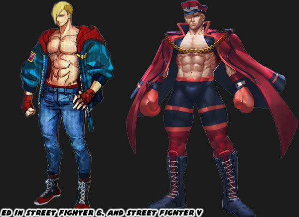
Today is going to be a two-for-one special. We are going to look at Ed, and Rashid’s redesign in Street Fighter 6. The reason for this is because the two characters are relatively new. I’ve already done a deep dive on the origins of their look, especially in the case of Rashid. I covered Ed when he made his debut in Street Fighter V. In case you missed it, Ed is a punch-based fighter. Not quite a pure boxer as his mentor M. Bison/Boxer. He also has some psychic / psycho powers like Vega / Dictator from Shadowlaw. He was designed, and literally programmed to be a high-ranking Shadowlaw officer, but broke away from command with the help of Falke. His appearance in SF6 is similar to a few other characters. His look is more casual than before. His tights, and boxing gloves have given way to pants, and a jacket. Ed represents the new direction of how the fighting arts show up in the franchise. In one sense it’s much more realistic, but in another it steers us away from the things that make Street Fighter, well, look like a Street Fighter game. 

The series was never one about making the most realistic fighting game. Instead it took archetypes of the martial arts, caricatures essentially, and put them in different settings. This meant that karate guys walked around in karate gis, soldiers in their camouflage fatigues, boxers with punching gloves, and trunks. You get the idea. You could almost instantly tell two things just by looking at the character, what their nationality was, and what fighting style they represented. If you look at E. Honda you could probably figure out he was a Japanese sumo wrestler. If you look at Chun-Li you can guess she's a Chinese kung-fu practitioner. Most of the characters in SF6 wear costumes that make a little more sense in a casual setting. The trade off means they are more conservative in some regards. I think part of the appeal of the earlier fighters was their ability to reflect a country of origin, and legendary fighting arts. Ed is a shirtless pretty-boy with his hands wrapped in red athletic tape. Would you care to guess what country he is supposed to represent? If you didn't know he was German, you might have guessed a dozen other countries. I mean he has almost the same colors, and outfit as Ken. Maybe he was going to be Mel in the planning stages? We get he’s ready to fight, but with the blonde-haired Luke already the new punching star of the game what purpose does Ed serve? Or is he a redundant character?

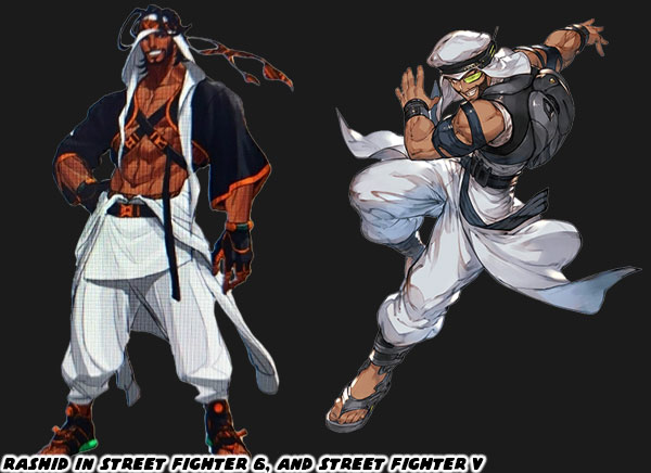
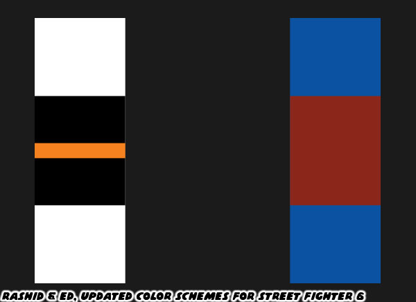
Rashid's design was a lot more classic. It was easy to figure out that he was from the Middle East. He was Saudi Arabian, but it would be understandable if you thought he was from the United Arab Emirates, Jordan, or Quatar. He was previously covered in a four-part series. I was glad to see his return. I always applaud any character of color returning to the franchise. The changes made to his costume are subtle, but help him stand out from the lineup even more. Rashid’s original design in SFV was a little bit lacking. His all-white outfit, with parts of black for contrast was kind of bland. Not to mention that Ryu pretty much had that color scheme for the previous 30 years. The studio realized that the he was lacking a third contrasting color. Ryu had red in his headband, and gloves. Rashid was given splashes of orange on his sandals, belt, backpack, sleeves, and bands of his keffiyeh. Now his look is much more distinct thanks to the use of an accent color. If there is one thing that makes both Ed, and Rashid’s updates work are the colors assigned to their costumes. They are solid colors that are well balanced, and help them stand out from the colors assigned to the other characters. With Ed having a burgundy, and deep blue combination that were not the shades of blue featured on characters like Guile, or Chun-Li. They were actually complimentary to the colors, and outfit of Ken.

What do you think about the return of Ed, and Rashid? Did you enjoy the two in Street Fighter V? Would you have rather seen another returning character, or a new character instead? I’d like to hear about it in the comments section. In case you missed it here are the other entries related to Rashid. Middle Eastern series, Part 1. Middle Eastern series, Part 2. Middle Eastern series, Part 3. If you would like to sponsor me please visit my Patreon page and consider donating each month, even as little as $1 would help make better blogs and even podcasts!
follow the Street Writer on Patreon!

Thursday, June 16, 2022

E. Honda, the return of a sumo legend in Street Fighter 6

Today we are going to look at E. Honda, and his appearance in Street Fighter 6. If you are relatively new to the series, or fighting games in general. Let me give you a short primer. Honda represents sumo wrestling in the fighting tournament. I ranked him #28 on my 30 most important SF characters. You may know that sumo is a highly revered sport in Japan. I did a history on the combat arts, and how they influenced the development of fighting games. Of every form covered grappling was considered the oldest of the forms. The roots of sumo go back centuries. The training regiment of the fighters was rigorous, producing warriors that were massive when compared to the average citizen. Many people mistake sumos to being nothing but fat guys. It’s actually nothing like that. Sumo wrestlers are insanely strong, underneath the fat they have the swollen muscles of bodybuilders. They are also much more flexible, and agile than people realize. Some have the hand-speed of a professional boxer, but without the gloves to protect their opponents from open-hand slaps. Developing a stable of fighters like this was not cheap. For centuries wresters were sponsored by nobility. They also hold a special place in Shinto spiritual belief. Their garb, especially their belts are decorated with Shinto religious symbols, and perform Shinto rituals when starting a tournament.

E. Honda looks like a very powerful wrestler, his muscles are clearly defined, even on his upper abdomen. Like the rest of the SF characters his uniform looks traditional, until you dig a little deeper. His hairstyle is distinct, perhaps not as distinct as Guile’s, but it’s still not one you see every day. The chonmage, or Japanese top knot was worn by samurai, and the upper-class. This tradition started in the Edo-period, which lasted until 1867. In modern times the only two professions that still wear their hair like that are sumo wrestlers, and kabuki actors. The painted face is the second thing that stands out for the character. Sumo wrestlers don’t wear face paint. E. Honda longed to be remembered for his persona was originally created as a sort of joke character. For western audiences imagine a professional boxer showing up wearing Native war paint, it’s a bit over-the-top but helps make a game character memorable. The tradition of a painted face sumo wrester first appeared in Nintendo’s Arm Wrestling game from 1985. It showed up again in 1993 with the character Kishin-Nada in the manga, and game Aah! Harimanada.

Normally sumo wrestlers wear a mawashi, the wrap, and belt when competing. Since E. Honda is fighting outside of the ring he is wearing a kimono, pulled over his mawashi. The detail in his latest update is very subtle as well. He has one arm through the sleeve of his robe. I’m certain that Capcom had always wanted to do this with him, you can see it with character art from the studio. Sprite mirroring prevented them from doing this in game. That was until they moved to 3D. Once in 3D Capcom, Topjoy, and other studios could do all sorts of things with the model, including many memorable  sumo outfits. Like many of the returning characters E. Honda’s changes to SF6 are subtle, but well done. I look forward to seeing an official character reveal, and how his move set has evolved. What do you think about the character? Do you ever use Honda in competition, or not at all? What do you think of his updated look? As always let me know in the comments section. If you would like to sponsor me please visit my Patreon page and consider donating each month, even as little as $1 would help make better blogs and even podcasts!
follow the Street Writer on Patreon!

Wednesday, June 15, 2022

A look at Lili, the new native Mexican fighter in Street Fighter 6

We're going to look at Lili today. The new fighter from Mexico is fairly straightforward. I'd say a safe design even. Previously I mentioned how El Fuerte was a great character in the early stages of his planning, but the more Yoshinori Ono insisted they focus on his personality through cooking, instead of lucha libre, the worse the character got. The same thing could be said of Hakan, and his focus on oil, or Birdie, and his focus on eating. The crown jewel of great character designs thrown out for the sake of comedy was when King Cobra becoming Rufus. But I digress...
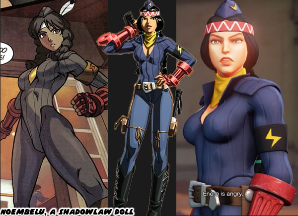
I’m fairly certain that most long-time Street Fighter fans were convinced that Lili, the new native character would turn out to be Noembelu, the Mexican “Doll” agent from Shadowlaw. The dark skin, braids, and feathered headband were spot-on matches. Not to mention that audiences were familiar with Noembelu. She was seen in previous in-game cut scenes, as well as in the comic books. The character fought with dual axes, and this new girl in SF6 fought with dual clubs. Perhaps she was deprogrammed by the government, and returned to her tribe? Something similar happened with Cammy after all. While they could take the agents away from Shadowlaw, they never could take away their ability to fight. When I first saw the new character, I did not think she was a Doll agent. The reason why was because the Street Fighter 6 Director: Takayuki Nakayama, and Producer: Kazuhiro Tsuchiya said they wanted to push the series forward. They would not be trying to tell yet another story related to SFII. Those were things already done to death in SFIV, and SFV. Also because this new character was young, if it were Noembelu she would have been older, based on the current timeline.
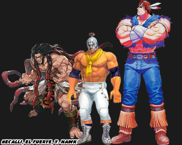
Lili is not the first Mexican character in the series. Let alone the first Mexican fighter across the genre. The studio gave us the gigantic T. Hawk in Super Street Fighter II in 1993. At that time Capcom was in the planning stages of Street Fighter III. The native Mexican was supposed to be the new "Zangief" for the game. He was included along with Cammy, Dee Jay, and Fei Long into the franchise in the form of an upgrade instead of a proper sequel. The other Mexican, or at least character from the peninsula, was Necalli. The wild-haired brute from SFV was an ancient warrior that stole the power from other fighters, and sometimes ate them in the process. Of all the fighters in the series he was possibly the strangest addition. Even fire-breathing Indian mystics made out of rubber were sensible by comparison.
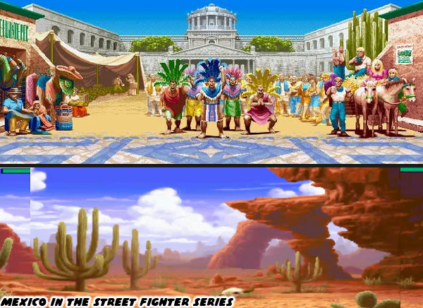
Fighters like T. Hawk, El Fuerte, and Necalli were based on surface level knowledge of Mexico, and Mexican traditions. In pop culture Mexico is often used as set dressing. Piñatas, tequila, Dia de los Muertos, papel picado, fireworks, and masked wrestlers are things incorporated into many fighting games. The architecture, and traditions of small towns are often the centerpiece in stage backgrounds. Mexico is rarely presented as having any modern cities in videogames, even though the capital of Mexico City is a metropolis with one of the biggest populations in the world. The same surface level was applied to the design of characters. A masked wrestler is 90% of how Mexicans are presented in games. With the remaining 5% being guys with big mustaches wearing sombreros, and 5% being professional boxers. T. Hawk, was a native who wore jeans, moccasins, and a feathered headband. A "safe" choice for the series, but a little uninspired. Lili seems to be cut from the same cloth.
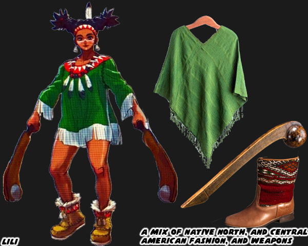
Lili has many of the elements of classic SF designs, but also falls into similar stereotypical traps. Green is her main color, with white, and red accents. I hope that the people reading this realize that she is literally wearing the colors of the Mexican flag. On top of her face paint, and native headdress she is fighting with a club. The cuauhololli, was a club used in Mesoamerica. Here’s the thing that you want to avoid if you are a character designer. It’s something that doesn’t just happen to the people at Capcom, but at other game, and animation studios the world over. Lili, T. Hawk, and other native-styled characters are usually a mix of different regions. They may be wearing clothing from desert, jungle, or mountain environments at the same time. This includes face paint, tattoos, or markings from different tribes, cultures, and even historical periods. Lili’s outfit Inspired in part by Mayan fashion, which is more Central American, than Mexican. The Aztec, and Mayan cultures did not exist at the same time, nor in the same part of Mexico. Many character artists don’t necessarily know this, but lack of knowledge is not an excuse for coloring all natives with one brush. There were hundreds, if not thousands of unique indigenous tribes in North, Central, and South America. Lili is an okay design, much better than the joke characters featured in SF IV, or the cannibal featured in SFV.
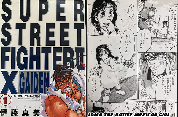
When I first saw Lili I didn’t think she was Noembelu, instead I thought she was an older version of a character featured in Super Street Fighter II X Gaiden. The anthology from Gamest comics was created by Masami “Mami” Itoh. It was one of the best series filling in the events of Super SFII. In one chapter we see T. Hawk, and the few remaining members of his tribe on a reservation. A tiny girl named Loma is introduced. She calls T. Hawk uncle and wants to make flowers bloom in the dry valley. She was an adorable design, with a simple native dress, and large expressive eyes. I thought that it would be great if this little girl had grown up to be a fighter like her uncle. It wouldn’t be the first time that a manga artist had created a character that appeared later in the SF series. Masahiko Nakahira invented Karin Kanzuki, the rival for Sakura in the pages of Sakura Ganbare!. Perhaps SF6 Designer Yusuke Hashimoto might be able to retcon her into the story. There’s still time. What I’m getting at is that the design had been seen before. It was a bit safe, but I understand too that Lili could have been a lot worse.
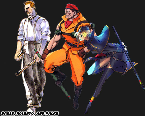
I’m not mad that she fights with a weapon. It makes sense if characters her size need the help of a weapon. Lili wouldn’t stand a chance against someone as massive as Zangief, but a stone, and hardwood club would be a great equalizer. In addition to that there have been several fighters that used weapons in the series. This goes all the way back to Eagle in the original Street Fighter. He fought with two clubs. The military leader Rolento appeared in both Final Fight, and Street Fighter Zero. He fought with a staff, as did Falke from Street Fighter V. I’m eager to see what moves, and special attacks are assigned to Lili. I’m hoping that her alternate costumes are more grounded in reality, like Luke, or Kimberly. I think it’s okay to move away from native pandering for Mexican characters. What about you? What do you think of this character, and her inclusion? Do you like the leaked designs so far? Is there anyone you’d like me to write up next? Please tell me in the comments section. If you would like to sponsor me please visit my Patreon page and consider donating each month, even as little as $1 would help make better blogs and even podcasts!
follow the Street Writer on Patreon!

Tuesday, June 14, 2022

A new look for Guile, or correcting a mistake? His update in Street Fighter 6.

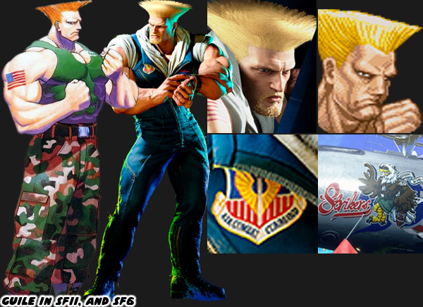
Today we’re going to look at the makeover Guile received for Street Fighter 6. I’m a fan of the character, and I ranked him eight on my personal list of the 30 most important Street Fighters. SF6 Designer Yusuke Hashimoto did a great job of capturing the look, proportions, and details that worked for him in Street Fighter II. Guile has always had a bodybuilder physique, even more so than Ken, and Ryu. Bengus did some of the most memorable illustrations of the character some 31 years ago. Mr. Hashimoto essentially worked out a modern interpretation of him, while still giving him some unique touches.

If you look at the size of the character, his hair, and proportions it’s as close to the look of SFII than any other sequel. Mr. Hashimoto added some facial hair, and eyebrows to Guile to show that time had passed since his previous appearance. The biggest change to the character comes in the way of the color of his uniform. You know already that I am a proponent of SF characters being assigned a main solid color, and complimentary secondary color. For Guile his costume went from green camouflage to a dark blue flight suit. I’m fairly certain that the military fans of Street Fighter are jumping for joy. Soldiers are just about universally accepted as being exceptional fighters in the genre. Green is mainly associated with Army soldiers, and not Air Force pilots. Technically Guile had been wearing the wrong colors for a generation. It doesn’t matter though at this point. His clothing maintains its military designation. Heavy boots for stomping on opponents. A weathered flight crew top with a couple of patches on it including Air Combat Command signaling his place in the United States Air Force.

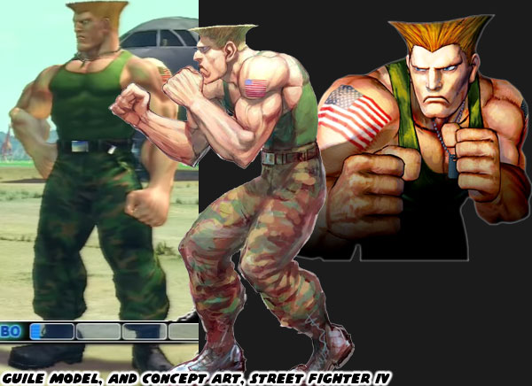
Guile’s first 3D appearance was in Street Fighter EX in 1996. That game was developed by ARIKA. The first time he was presented in 3D by Capcom was with Street Fighter IV in 2008. The version of the characters that appeared in those games were heavy stylized. Artist Daigo Ikeno created the look of the World Warriors for that sequel. Many people noted how bulky the cast looked. Producer Yoshinori Ono said the characters were much thicker than they used to be in order to make them appealing to western audiences. Their reasoning was based on looking at the hyper-masculine heroes in first person shooter games. The cast of Gears of War, Doom, and Duke Nukem were big, muscular stars after all. He didn’t think that the characters appealed to fans on this side of the Pacific because of the Japanese aesthetic. Yes there were some bodybuilder physiques in the original SFII, but there were also fat, skinny, and feminine body types as well. Most of them became bulky across the board in SFIV. Thankfully the distinct body types seem to have returned in SF6.

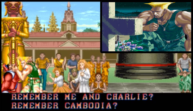
The other appealing thing about Guile has to do with his story. He entered the SFII Tournament in order to get revenge on the organizer for killing his friend Charlie Nash. The emotionally scarred soldier looking for vengeance made for a very interesting plot point. Audiences could root for a character like that. Guile In the end he doesn’t murder the villain. He is instead dispatched by Ken, and Ryu. Guile comes to his senses, and returns to the wife, and child that he had abandoned. Coming to terms with what happened to his friend, and becoming a family man made for a very satisfying conclusion. Why he would be in SF6 has yet to be revealed, but I’m certain it will make for an interesting story. What do you think about the return of Guile? Do you like the switch in color scheme? Do you wonder how he will be incorporated into the plot of SF6? Give me your takes in the comments section please. If you would like to sponsor me please visit my Patreon page and consider donating each month, even as little as $1 would help make better blogs and even podcasts!
follow the Street Writer on Patreon!

Monday, June 13, 2022

Ken Masters, from champ to chump in Street Fighter 6

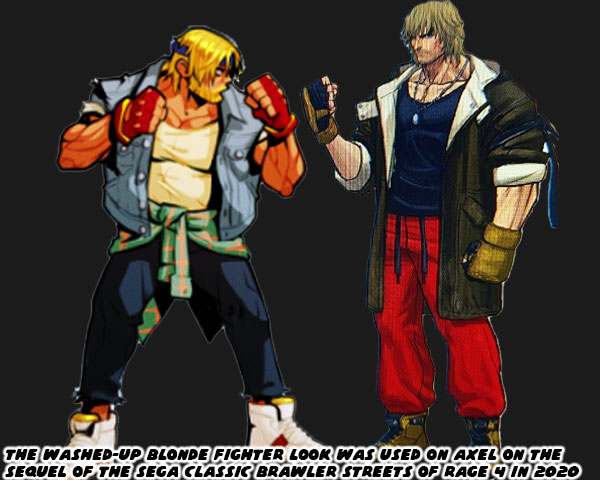
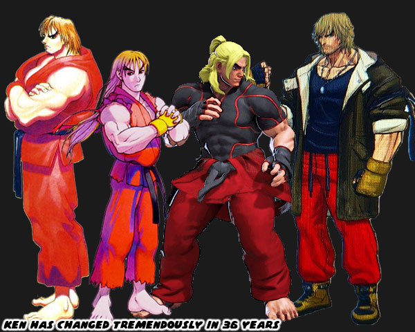
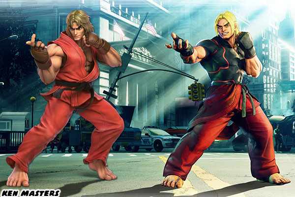
Ken Masters is a video game icon. He’s not only known in the fighting game community, but across the entire gaming landscape. Ken was the US equivalent to Ryu in the very first Street Fighter way back in 1987. I clearly remember the shaggy haired guy with the red gi when I was pounding the giant foam buttons on the original cabinet. The leaked design for Ken in SF6 was met with mixed reactions from the community. Most of them were negative. The very first take was that the redesign was poaching the same thing that developers Lizardcube, Guard Crush Games and Dotemu for Streets of Rage 4 did with the character Axel Stone. In short Capcom aged the character of Ken Masters, gave him a beard stubble and overcoat. Making him look like a washed-up version of his earlier self.

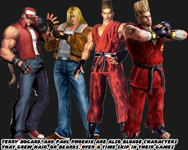
The thing is that this would not be the first time a Japanese developed did the same thing for the blonde-haired western character in a fighting game. Terry Bogard from SNK’s Fatal Fury series, and Paul Phoenix from Namco’s Tekken games had similar makeovers. Terry’s was handled slightly better, as it was a big time jump from the events of the original Fatal Fury. In Garou Mark of the Wolves he was already a seasoned master, and mentor to Rock Howard who was now seen as the star of the franchise. A lot of SF fans lamented that the son of Ken had not been inserted in his place in similar fashion.

There’s not much I want to say about Ken’s new look. It’s sad, and uninspired. I’ve talked about the importance of color on this blog. Hopefully you know how important the assignment of bright primary colors, and complimentary secondary colors has been to the creation of memorable characters. With Ken the designers are throwing away the classic look. A blue shirt, brown jacket, brown gloves, and brown boots clashed badly with his primary red outfit. If Ken had given up on his purpose then I don’t understand why he would even be wearing red gi pants, as they don’t usually contain pockets, not to mention his black belt. The level of disrespect to his form of karate, to himself, his master, and Ryu is off the chart. It would have made more sense if he was presented in street clothes, or even a suit. This half classic Ken, and homeless Ken doesn’t make much sense. This is especially bad considering how much good will the company had created with the character.

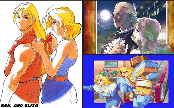
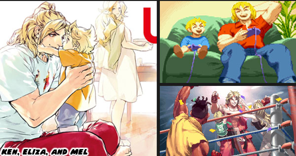
Ken was born into privilege, he didn’t have to work hard, but he did. He is considered to be on par, if not better than Ryu. He considers Ryu his brother. Through the series we got to see both grow up. Ken did a tremendous amount of personal growth when compared to Ryu. We saw his long-time girlfriend Eliza become his wife across several games. We saw them build a life together. They got to travel the globe while Ken racked up tournament victories. They set the standard of the perfect partnership. They seemed to have a better life than any other married couple in gaming. Then it got better. Ken became a father to Mel.

We got to see the baby be born, play games with his dad, throw his first punches. He idolized his old man, thought of Ryu as his uncle. Both Mel, and Eliza celebrated every victory with Ken. We saw all of this, and more character building in the game series, as well as in various manga, and comic book adaptations. Having him appear washed up, and “over” his life as a fighter doesn’t make any sense. Saying that Rose, and Menat predicted this path in a couple of lines in SFV feels like a cop-out. Capcom has not been sprinkling any clues that Ken, and his family were not happy with their lifestyle. Not one drop of apathy, or detachment to the fighting arts, or his own family over 35+ years. In fact the character did nothing but portray the opposite of that. Ryu was not the only one to continue climbing the mountain. Ken continually pushed himself to learn, and grow as well. His attacks became stronger throughout the series. His Shouryuu Reppa, Shinryuu Ken, and Shippuu Jinrai Kyaku were distinct variations of the legendary Dragon Punch, and Hurricane Kick that Ryu couldn’t do, or didn’t know how to do. These were techniques that canonically took him decades to develop. Why then would he suddenly stop doing everything?

Did Ken back away from everything because something happened with Mel, or Eliza? Did they get hurt, or are they dead? If that is the case then it would make sense that Ken was presented as a changed man in SF6. At the same time it would be a sad development for the franchise. Eliza, and Mel were fun characters. They gave Ken so much dimension. They connected Chun-Li, and some of the other characters together. I think it’s too ambitious if Street Fighter 6 Director Takayuki Nakayama wanted to create a come-back story for Ken, especially in one game. Street Fighter has always juggled multiple balls at the same time. We got to find out what happened to each, and every character in the tournament through their own cut scenes, and endings. Sometimes the scenes were comedic, others tragic, and some heroic. Some endings tied two characters closer together, or even pushed them apart.

In any case we could always count on Ken, and Ryu always choosing the right path. They were trusted protagonists that moved the series forward. For the company to suddenly change Ken’s appearance, and motivation off screen was a disservice to the character. I have more faith in Mr. Nakayama, Mr. Tsuchiya, and Mr. Hashimoto than I had in Mr. Ono when it comes to the direction of the series. If there is one saving grace about the leaked designs, it is that the producer, director, and designer can gauge the audience reaction, and make changes accordingly. I hope they consider adjusting the look, and motivation of Ken. They have enough time to do so. What do you think of the leaked Ken redesign? Do you like the character or no? What would you have done different, if anything? I’d like to hear about it in the comments section. If you would like to sponsor me please visit my Patreon page and consider donating each month, even as little as $1 would help make better blogs and even podcasts!
follow the Street Writer on Patreon!