Showing posts sorted by date for query buriki one. Sort by relevance Show all posts

Friday, May 9, 2025

Why I'm not talking about Fatal Fury: City of the Wolves

Hello friends. Thank you for dropping by. You probably know that I’m a huge fan of fighting games. I’ve been playing them for 45 years. The first fighter I remember playing was Warrior by Vectorbeam. I wrote about this when I was doing a look at the Virtua Fighter relaunch. With that said I’ve avoided posting on the Fatal Fury: City of the Wolves for some time now. People may think that I’m biased against SNK, or only write about Street Fighter, but that is far from the truth. In fact the very first blog that I posted here in 2014 was dedicated to Mr. Karate from the SNK universe. I’ve written a lot about the history of Fatal Fury, the creators, and the characters on this blog. I was such a fan of the Garou series specifically that I tracked down the manhua (Chinese comics) based on Garou: Mark of the Wolves. I loved all fighting games, it’s just I loved some titles more than others.

I was very passionate about the Garou / Fatal Fury: City of the Wolves project for some time. I started talking about the development of the game in 2022. It had been ages since I was excited for a classic game to return. By March of 2024 I shared everything that I could pull from the character reveal, and gameplay trailers. I did a look at how the characters featured in the game evolved from concept art. With the guest character reveals of Mai, and Terry in Street Fighter 6 I had to mention why Mai Shiranui was important in fighting game history. Yet once the final details of the game were announced this year, and released on April 25, 2025 I had yet to say anything.

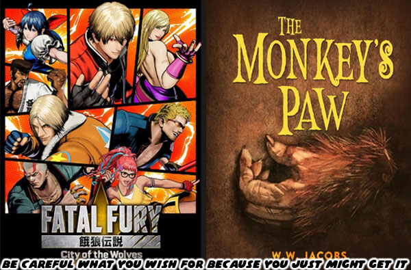
Why would I walk away from a sequel that I had been waiting on since November 26, 1999? That was when the original Garou: Mark of the Wolves came out. After a quarter-century wasn’t it going to be worth the wait? Sadly the answer would be no. The game was the embodiment of The Monkey's Paw. The short story taught us to be careful of what you wish for. Sometimes it’s better for things to stay dead, and buried. Even though SNK said that their new Saudi owners would not influence the direction of the games it was obvious that wasn’t entirely true. The game would be pandering to pop culture, rather than celebrating the fighting game legacy that built an industry. Will Borger with Digital Trends summed up everything that needed to be said about Fatal Fury: City of the Wolves. Mr. Borger's review touches all the basis for the game itself, but does us all a favor and explains why it doesn't reflect the fighting game community at all.

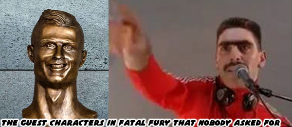
There was a quick answer as to why I walked away from the game after a release date was announced. The two guest characters revealed were shockingly disappointing. Rather than include a classic character from the SNK universe, or any crossover characters from Capcom, Sega, ARIKA, or Namco. The developers decided that a professional futbol / soccer player, and a DJ would be the welcome additions. These two people were so outside of the fighting game orbit that they would have never been voted on by the actual players. The athlete himself had been in the news for sex crimes. As for the Swedish-Bosnian DJ... he might be a global superstar but I had never even heard of him. Apologies to Super Greg for being overlooked as a better Hip Hop representative. It was obvious that the Saudis were directly influencing the development of the game. SNK would not bother to do as much of a cultural deep dive as Capcom did with Street Fighter 6.

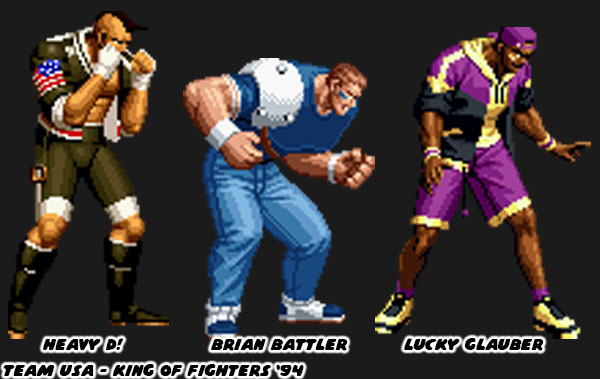
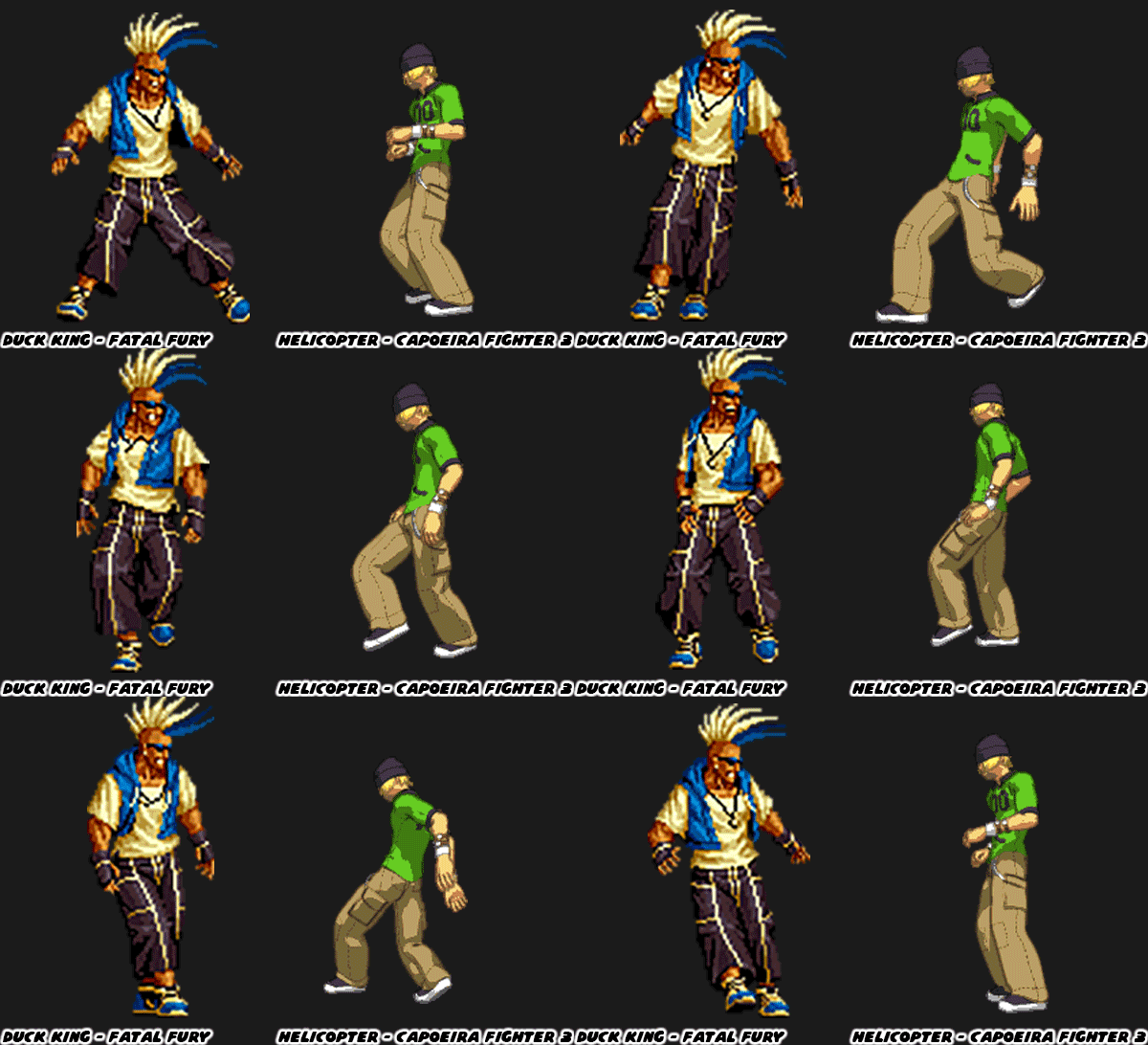
That is not to say that a soccer character couldn’t be used in a fighting game. Roberto Miura from the Capcom game Rival Schools: United by Fate showed us that it was possible way back in 1997. Not only that but athletes had already been used in an SNK fighting game. Team USA aka Team American Sports appeared in King of Fighters ’94. These was a professional boxer named Heavy D! A pro football player / race car driver named Brian Battler. Lastly there was the basketball pro named Lucky Glauber. So yes the game could have used pro sports athletes, as long as they were made somewhat fantastic, and not just a copy / paste of an existing athlete. As for the DJ… fighting breakdancers could be done well. See Helicopter in Capoeria Fighter 3.

In many ways the bigger insult to the Fatal Fury series was in adding a real DJ to the game (whom I would also not name). Hip Hop already had a representative in the series called Duck King. This character debuted in the original Fatal Fury on November 25, 1991 then appeared another 11 times over the decades. The mohawked star was a literal street fighter. He was a battling b-boy (breakdancer) using tumbles, and sweeps to great effect. He was followed by a crew of baby ducks, wore street clothes, had a flamboyant personality, and was beloved in the fighting game community. Even if it was revealed that mentored the DJ in the new game it would have been better to stay with the original South Town legend. It was clear that the people working on SNK today didn’t understand the tone, and feel of the original series.

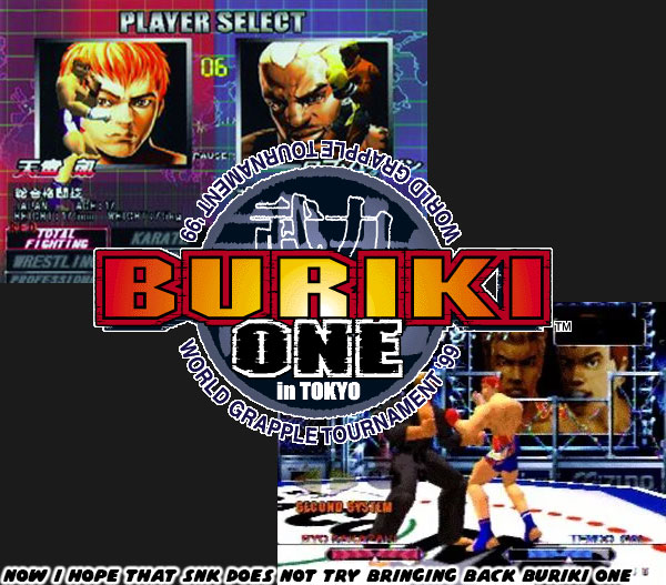
The early days of the arcade era were very experimental for most studios. In the ‘80s SNK was known for its bold game designs. They did combat game exceptionally well because SNK founder Eikichi Kawasaki was a boxer in his younger days. He wanted the fights in his games to be more visceral. This meant that masters of various forms were welcome to be represented in their releases. That was why SNK introduced Capoeira to arcade goers way back to 1989. The developers had a great appreciation for fighting in all styles. When MMA started to surpass all combat sports in the late ‘90s they developed a rare 3D title called Buriki One in 1999. It was the same year that they released Garou: Mark of the Wolves. Many of those team members had since retired, or moved to other studios. The current team at SNK was good at recreating themes, and elements of classic games with modern art, aesthetics, controls, and game play. The thing they seemed to lack was the imagination, and appreciation of the influences that created the iconic series. 

The new developers didn’t seem to know how to add a new character into the franchise that wasn’t pulled from old design notes. Worse yet they were listening to the whims of their Saudi owners, and just throwing in real people for no reason. This made me afraid that they would try to reboot Buriki One next. Or they might reconsider bringing back other games based on the cold reception of Fatal Fury: City of the Wolves. At least I hoped they would do better if they were thinking about it. What about you? Did you pick up the game? Was it your first time playing an SNK game, or were you a veteran player like me? I’d like to hear about it. Tell me about it in the comments section. As always if you enjoyed this blog, and would like to sponsor me please visit my Patreon page and consider donating each month, even as little as $1 would help make better blogs and even podcasts!
follow the Street Writer on Patreon!

Saturday, March 23, 2024

Fatal Fury City of Wolves, a new game system, and new character revealed!

Not long ago SNK released several trailers with new information for Fatal Fury City of the Wolves. This was the successor to the arcade classic Garou Mark of the Wolves. This was a game that I talked about with every new tease. I thought it was funny that each time a game trailers came out from Capcom, or SNK that my blog would get a significant bump in views. Even though I hadn’t written anything new about Street Fighter 6, the King of Fighters, or any other of games from those studios I still managed to double, or triple my daily views whenever there was any footage released by the publishers. It was humbling more than anything thinking that people that did web searches got pointed to my blog because I had written about them on, and off for years.
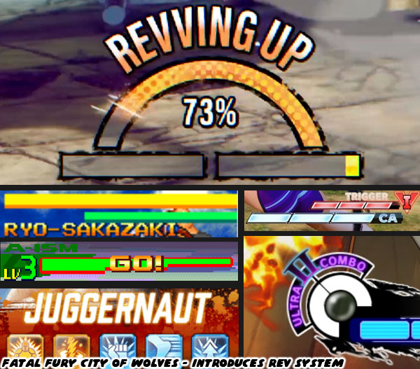
I’m going to highlight the things I was able to pull out of the two most recent trailers, those being the REV system, and the voice reveal trailer. I had no idea what the REV system was about, but according to Game Informer: “The REV system serves as City of the Wolves' big new addition, giving players enhanced attacks to bolster their offense. REV Blows are powerful, near-unblockable supercharged attacks; REV Guard serves as an enhanced block; REV Arts are flashy cinematic combo attacks; and REV Accel is a speedy assault of sorts.”
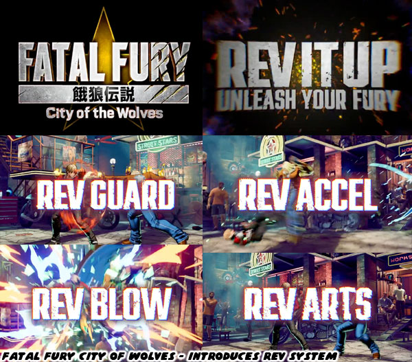
It made sense that the Garou team would be looking for ways to innovate the game play in the sequel. The King of Fighters universe had the tradition of a second “Spirit” bar going back to the Art of Fighting from 1992. Remember that the characters, and game play mechanics of Fatal Fury, and the Art of Fighting were ideas that The Godfather of fighting games Takashi Nishiyama had planned at both Capcom as something that might work in the Street Fighter franchise. Every studio since had been exploring ways to change up the game. V-ISM, Alpha Counters, Rage meters, Revenge meters, Super attacks were all variations on the spirit bar. What made the SNK games different was that you could charge this meter manually, and even drain your opponent’s by taunting them. I had a feeling that the REV system was the logical evolution of that classic mechanic.
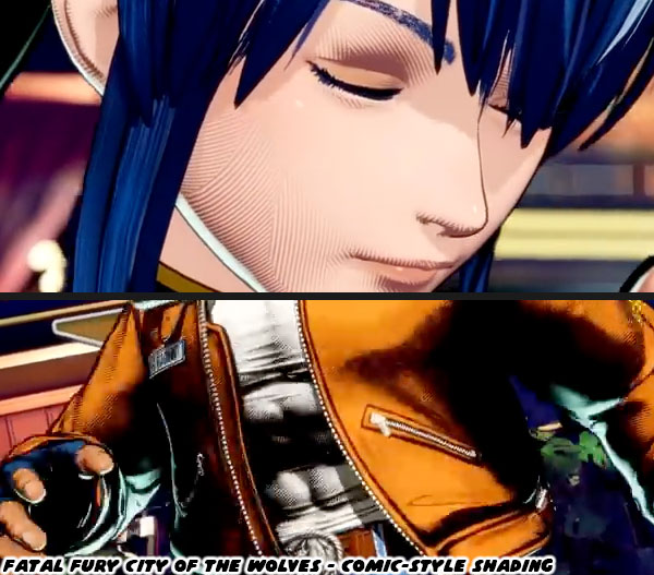
I don’t usually talk a lot about strategy, offense, defense, and attacks. There are plenty of people on YouTube that can talk about frames, counters, and strategy. I’ve always been more focused on the visuals of fighting games. The first thing that stood out to me were the stylized graphics featured in the voice actors trailer. I noticed that the characters had lines, almost crosshatches on their skin, and clothing when the camera zoomed in on them. It made them look like they were hand drawn. This level of detail was not lost on me. Having multiple fighting games developed on the Unreal engine made them all look the same. In order to stand out a lot of studios had to develop their own graphics engine. Even if they used Unreal it was still possible to make their characters stand out from their competition by modifying the light, models, and textures used on the characters. The games that used classic 2D sprite proportions, but created in a 3D model definitely stood out from the rest. This was the topic of GuiltyGearXrd's Art Style : The X Factor Between 2D and 3D, a GDC presentation from 2015.
I genuinely loved what I was seeing in the Fatal Fury City of Wolves trailer. The studio managed to recreate a lot of the same stylized figures that were featured more than 20 years ago in Garou, but now in 3D. The level of care that went into creating the visuals should not be understated. It took much more than lighting a 3D model. If you looked carefully the characters didn’t necessarily have realistic shadows. The darkest parts of the figures were designed to highlight muscles, folds in clothing, and even the lines of hair. On the edges there was just a hint of a contrasting light, that caused the edges to stand out from the background. This light source did not wash out the shadows that the art team wanted to preserve on the character models. This must have taken some clever programming to achieve.
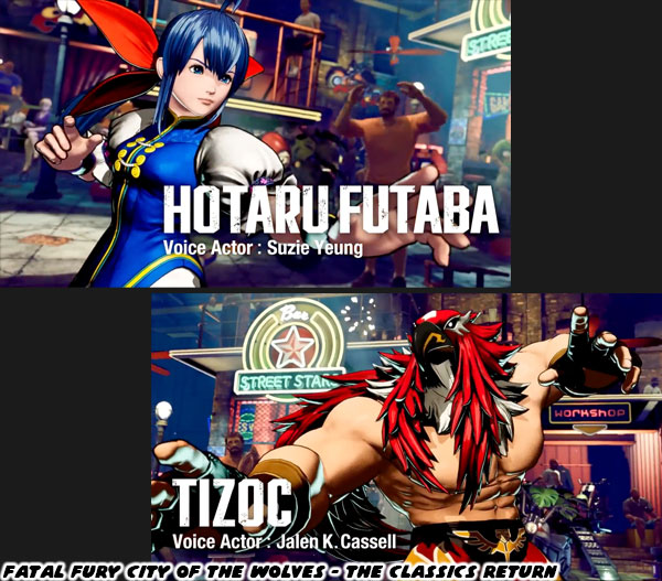
The other thing I noticed in the trailer, aside from the amazing looking bright flashes of light, and color when performing special attacks, were actually the ways in which speed was conveyed. The models were blurred when attacking, this was an old trick that I remember seeing during the development of Street Fighter IV back in 2008. What was different however were how strong the blur effect was depending on the speed of the attacks. When a character ran they were blurred a little. The same thing when they were knocked back. However if they were performing a quick special attack the blur effect was even stronger. For the people that don’t understand the distinction between graphics, and aesthetics in fighting games I wrote a three part series earlier on the blog. Here are the links. The aesthetic versus graphics debate, part 1…, The aesthetic versus graphics debate, part 2…, The aesthetic versus graphics debate, part 3....
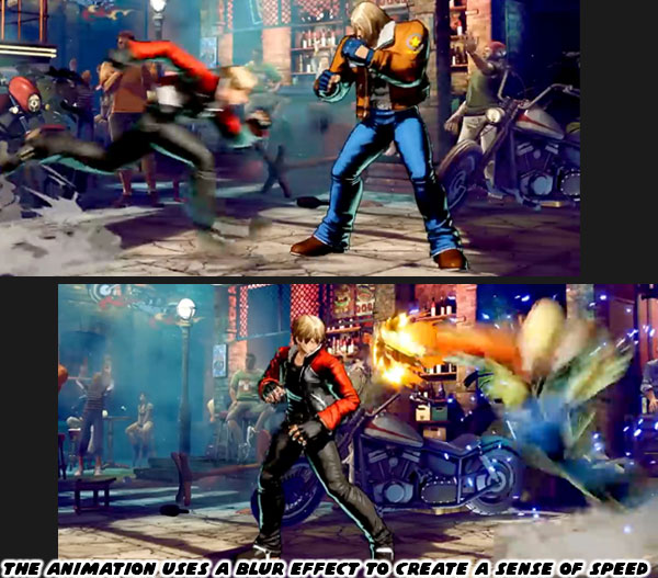
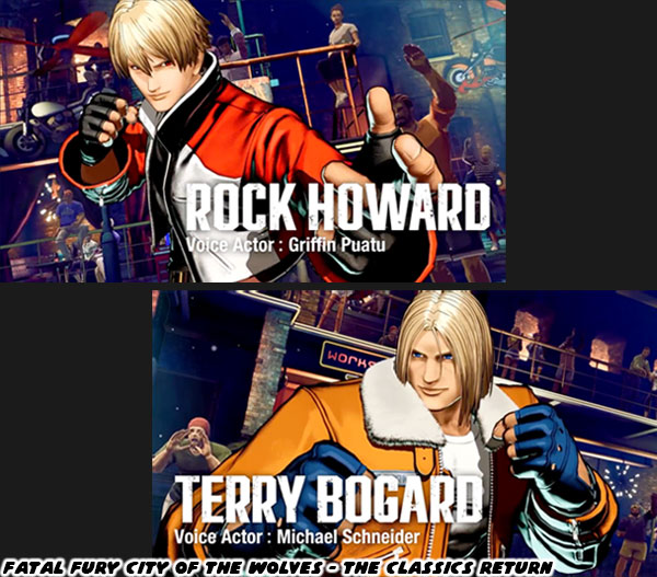
The character reveal trailer highlighted four returning faces; Terry Bogard, Rock Howard, Tizoc, and Hotaru Futaba. The new person in the lineup was named Preecha, and she appeared to be a Muay Thai specialist. SNK had a tradition of introducing girl characters out of left field in several of their fighting games. For example in the King of Fighters 2000 the studio featured Hinako Shijo. The diminutive girl with taped up fingers practiced sumo wrestling. She could manhandle the largest characters, and shove them with almost supernatural force. It certainly broke tradition, and made for an interesting shift in the way fighting game characters would be received. Before Hinako’s debut when most of us thought of sumo we could only imagine fat men like E. Honda from Street Fighter, Taka-Arashi from Virtua Fighter, Akatsuki-Maru from Buriki One, and Ganryu from Tekken. Hinako had actually followed tradition going back decades. Female judo, Muay Thai, and boxers had been featured in SNK titles as early as the ‘90s. Also there was also a trend of featuring girls that had a unique look, and form of fighting. I discussed this in the Odd Girl Out blog. These characters that broke tradition included Lucky Chloe, Emi, Area, and now Hinako.
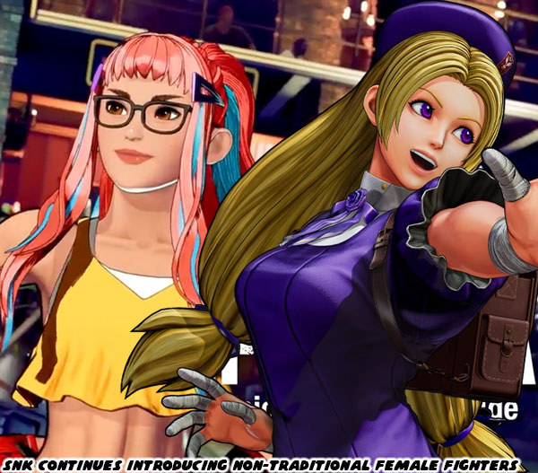
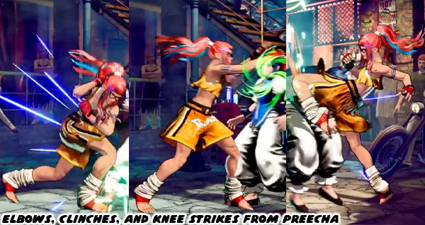
SNK was again shaking up the traditional roles with a female Muay Thai practitioner. That form of fighting was brutal in its effectiveness. It was an ancient tradition that was honed in the battlefield. It was a perfect counter to karate in manga, and anime which was seen as a refined martial art. That was one of the reasons why Sagat had that style against Ryu. The most fearsome, and earliest fighting game bosses was a Muay Thai monster. He was the template that Fahkumram from Tekken 7 was cut from. Now we had a young lady that was capable of delivering traditional clinches, elbows, kicks, and knee strikes. If you were not familiar with the different forms of fighting I covered it previously on the blog as well. Here’s the link where I talked about the history of Muay Thai, and Tae-Kwon Do characters in fighting games. Preecha was not the first female to use that form, that would be Chompoo from Capoeira Fighter 3. But two distinct characters in the 45+ years of fighting games let you know how rare it was to assign traditional forms to girls.
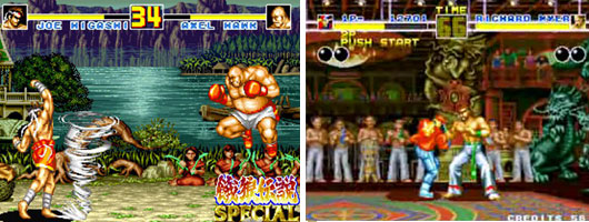
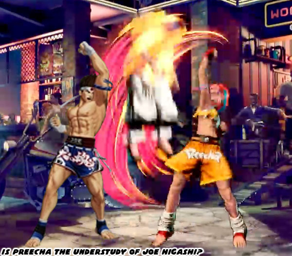
SNK had a couple of star Muay Thai practitioners going back to the birth of the series. Joe Higashi, and Hwa Jai made their debut in the original Fatal Fury. Hwa was a villain in the first game, but would return more recently as a playable character in KOF XIII. Given that Joe was a friend of Terry, and Andy Bogard I would say it was possible that he was the teacher of Preecha. There were several reasons why thought this was the case. The first was the most obvious. In the sprite art for Garou Mark of the Wolves 2 from more than 20 years ago we could see Joe Higashi was in arm, and leg casts. Clearly he was not able to fight at that point, but he was accompanying a Muay Thai, possibly kickboxing girl. This was the template that would be revisited for Preecha.
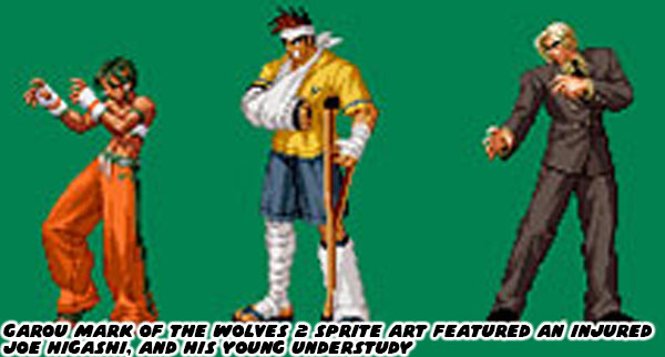
The other thing about having a younger Muay Thai fighter in the game was due to tradition. Many of the characters in the Garou series were young masters of a particular form. They were essentially the new guard, picking up where the icons left off. Even in the sister KOF series Kyo Kusanagi had already surpassed his father Saisyu. Rock Howard was the son of series villain Geese Howard. Yet Rock was mentored by Terry. This meant that his fighting style was a mix of the two, and in time would probably eclipse both of their accomplishments in his battles. The game also featured Kim Dong-Hwan, and Kim Jae-Hoon, the sons of Tae-Kwon Do master Kim Kaphwan, Hokutomaru was a very young ninja master, and understudy of Andy Bogard, the younger brother of Terry. I wouldn’t be surprising to see Lilly Kane appear in the series, the compassionate little sister of the villainous Billy Kane.
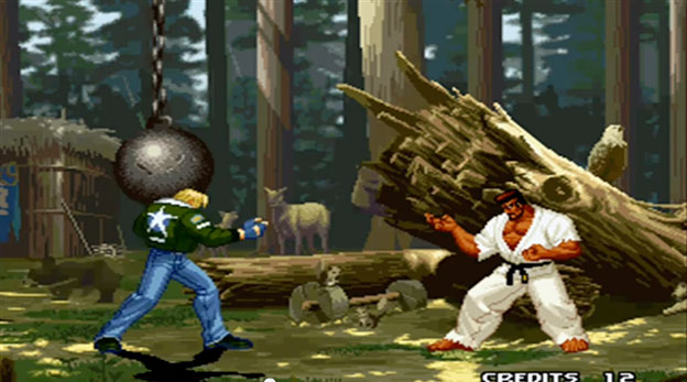
Although Marco Rodriguez was an adult, he was still the heir apparent of Ryo Sakazaki, and the Kyokugen form of karate. Of the original three heroes of Fatal Fury only Joe was lacking representation in the Garou series. I think that was now resolved. The thing about each of the new characters was that they were still lacking the complete library of moves, strength, and stamina of their masters. In the voice trailer we saw that Preecha had a number of amazing moves. She had all of the fundamental Muay Thai strikes, and more important she was performing the moves correctly. There were no missteps, or sloppy attacks. What was noticeable was that she did not have the hurricane uppercut of Higashi, the one that caused a small whirlwind to fly across the stage. She did however have the punch portion worked out, just not the projectile.
Preecha was a popular name in Thailand, it meant “wise.” But how do you tell audiences that she was wise, or smart? We got a hint of that with her glasses, which were typically presented on smart characters in popular media. To highlight her youth we got an explosion of color. Each of her fingernails were alternating pastel colors. Then there were the colorful streaks in her hair, with sensible bangs to keep her hair off her face while fighting. Did you notice her arm bands? The traditional pra jiad arm bands were symbolic of the culture. Preecha had purple bands with orange, and sky colored links. Purple was the colors assigned to a lower-level fighter. The colors of the bands could be similar to the colors of belts in karate, or Tae-Kwon Do. In Muay Thai purple meant she was an intermediate fighter, the alternate colors were complimentary to her hair, and outfit. Traditional Muay Thai featured hands wrapped in knotted cord, which were much more damaging to opponents. We could see her hands were wrapped in cord as well, however these were actually gloves made of cord, so that she could put them on quickly. I think the most interesting detail in her outfit could easily be missed.
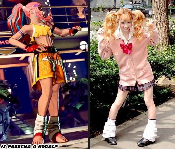
Preecha had taped ankles, however she also wore slouch socks, which was an integral part of kogal, or gyaru fashion. According to Wikipedia “Kogal refers to the members of the Gyaru subculture who are still in high school and who incorporate their school uniforms into their dress style. These high school girls are characterized by the typical bleached hair, make-up, shortened skirts, and wearing of loose socks.” Preecha doesn’t fit the role of fashionable teen, but she does represent the same youthful energy of other characters in Garou. This was the most important part of SNK character designs, when compared to the Street Fighter cast. I did a multi-part series breaking down the approach from the studio. The links are below.
Hiding the master in plain sight, the genius of SNK's character design... part 1 

I’m eager to find out more about Preecha’s story, how she plays overall as I enjoyed playing as Joe in earlier entries. I’m eager to see who else is waiting in the wings of this highly anticipated sequel. Anyhow those were the things I was able to pull from the trailer. What things did you notice? Were there any character you were waiting to be revealed? Tell me about it in the comments section please. As always if you would like to sponsor me please visit my Patreon page and consider donating each month, even as little as $1 would help make better blogs and even podcasts!
follow the Street Writer on Patreon!

Tuesday, March 19, 2024

Gouki in Street Fighter 6, the greatest fighting game villain has returned

Hello friends, I want to say thank you for visiting the blog, even though I am posting old 1UP blogs on Monday, and Wednesday, and trying to come up with new content on Fridays. I noticed in the past week I’ve gotten a significant bump in views following the release of the new Gouki / Akuma reveal trailer for Street Fighter 6, and more recently the first character voice trailers for the next Garou City of the Wolves. I put together a few words on what I picked up in the first trailer.

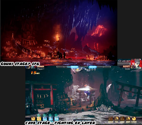
The first thing we saw was a variation of the cave stage, which had been used as the backdrop to Gouki since the days of Street Fighter Zero / Alpha almost 30 years ago. I have a feeling that the location presented in the trailer will be his actual stage in the game. Gouki has always lived as a hermit. Away from society, mediating, and training to turn his body, and mind into steel. There were a number of details in the trailer that meant a lot more to the Asian community rather than western audiences. We could tell that the stage was designed to be as intimidating as the character himself. It reminded me of the Garuda stage from Fighting EX Layer.

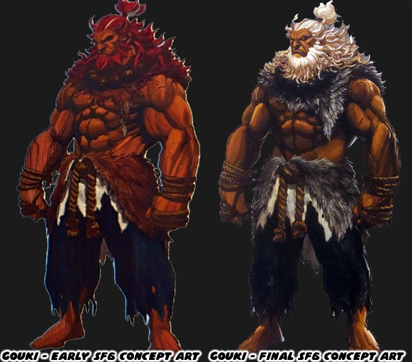
The other thing that stood out to me was that Gouki’s hair has finally gone from red to white. In the early leaked SF6 concept art he looked as intense as ever, but he still had red hair, with some white streaks which were a carry over from SFIII. The finalized version had all white hair, and even white fur on his costume. This was important for several reasons. First off it separated his appearance from that of any other game in the series. The other was that Capcom was willing to continue refining a design until the very last reveal. Remember all the details I pointed at from the original Lili concept art? A lot of that was changed by the time the game was released. Lili’s new look was both culturally sensitive, and culturally relevant. Gouki had several changes, more subtle than Lili’s, but also gave his appearance more of an impact.

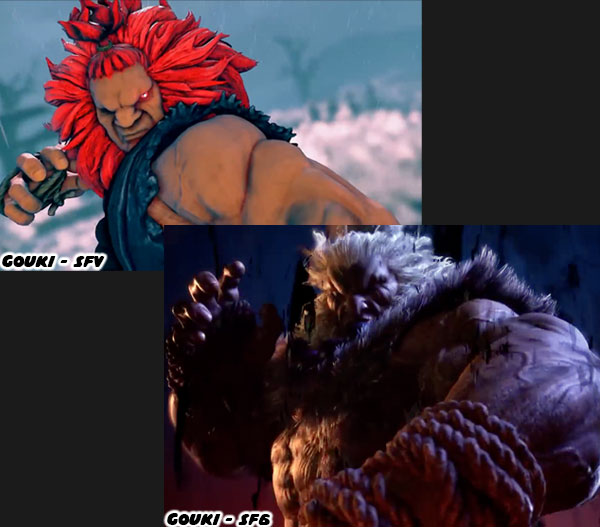
When we first got a good look at Gouki in the SF6 trailer we could tell he was designed to inspire fear. He had always been an imposing villain, however in previous incarnations he was not frightening. In order to tell audiences that they should be afraid the team at Capcom made him much more visceral. His body was more shredded, with veins, and muscles rippling over an entirely new 3D model. From a storytelling perspective they did the reveal slowly. We saw his frame, his massive torso, his thick arms, and his club-like fists. He looked like a nightmare brought to life. When the studio revealed him for Street Fighter V they literally just gave us a trailer made up of cool moves. By telling us nothing about his library of attacks in the SF6 trailer it would give audiences a chance to discover how truly powerful he was in person.

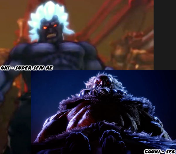
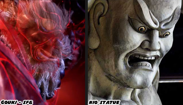
The other thing that the updated look do was signal that his transition from beast-like human into a literal demon. I had talked about it multiple times in the past, but Gouki’s design was based on that of a lion. Going back to Street Fighter IV the studio has transitioned his look into two phases, he went from inspired by a lion, and Nio, to being based on an oni. The white hair, and leathery skin made him a plausible human-turned-demon. In fact the whole trailer was filled with design cues from ancient Japan.

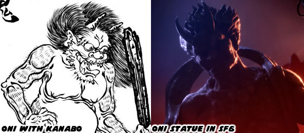
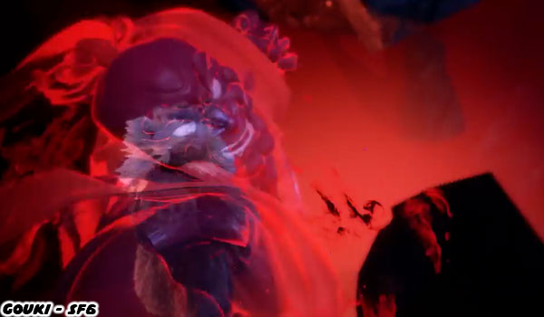
The cave where Gouki is training has several oni statues in the background. These are sometimes confused with the nio, which were the guardians of the gates of the afterlife. Oni were some of the various types of demons the roamed the countryside in ancient Japanese traditions. They were often seen wielding a spiked club, a kanabo. There were a few short shots in the trailer that would be easy to miss if you didn’t know to look for them. When Gouki lets his rage flow though his fist we can actually see a glowing spirit envelop him.

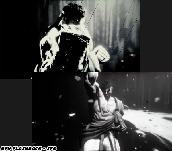
It almost appears that he is wearing the frightful mask of the nio. We can see the large eyes, curved brow, and open grimace. The focus of his rage was actually a few quick flashbacks of Ryu. To long-time fans of the franchise it was the confirmation that he was obsessed with Ryu. The pupil of his former master, and his own brother was certainly under his skin. Gouki was boiling with a supernatural rage. Punching at immovable statues, honing his strike to razor sharp precision. When he went for a shoryuken we could see him enveloped with a red aura. For a fraction of a second we could see Ryu in a white light performing a similar dragon punch, but he looked serene by comparison. It was a yin / yang opposite approach to the powerful strike. Gouki had become the living oni, the living nio.

This was the thing that I loved the most about the best of the Street Fighter designs. They were archetypes, inspired by equal parts real heroes, and mythology. The studio was creating plausible fighters with historical context. Certainly demons didn’t actually roam the Japanese countryside centuries ago, but consider that perhaps there were wild men, hermits built like brick buildings back then as well. There were people that enjoyed lifting heavy stones in order to prove their physical superiority. Those that lived off the land, killed animals with their bare hands, and only rarely interacted with villagers. Then there was the case that these settlers were from China, bringing over Buddhism, as well as the martial arts traditions. These types of outcasts could easily have inspired the rumors that there were fearsome ogres that lived on the outskirts of towns. Or Gouki was genuinely possessed by powers from the spirit world. It was the type of mystical ability that ARIKA used when creating Street Fighter EX, Fighting Layer, and Fighting EX Layer.

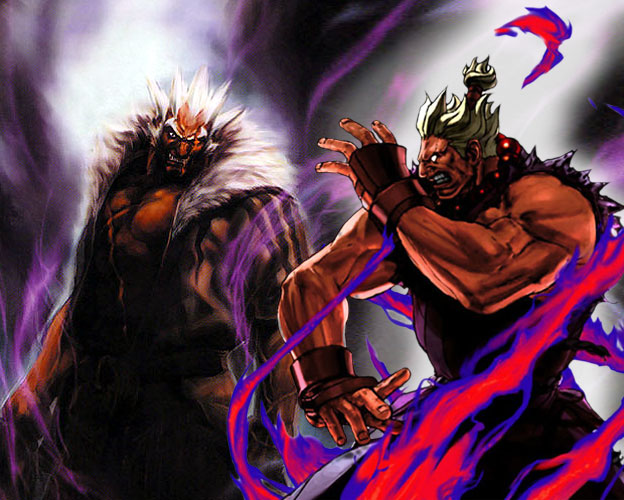
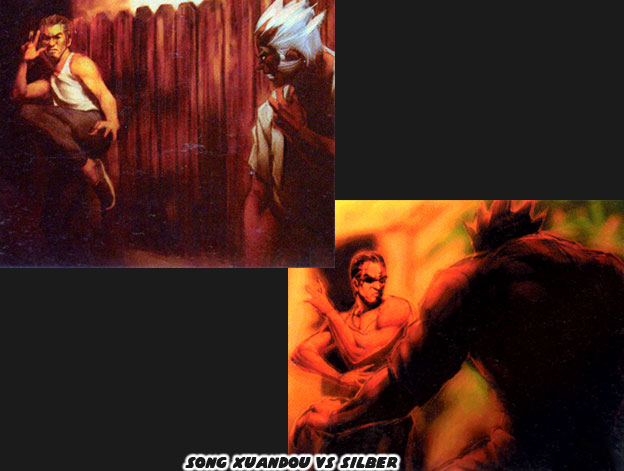
The fighting game archetypes that Capcom had developed over the past 35 years were icons in the gaming world. The artists, and designers at other studios could also exploit these visual storytelling cues when coming up with their own roster. Of the three greatest fighting game boss designs in my book, with Gouki being first, I would argue that Silver was the third best. He worked as a fighting tournament villain because he used many of the same elements as Gouki, however he was western based. I had had discussed Silber previously on this blog. As a quick primer in case you weren’t even born in 1999 when Buriki One was released. The insanely strong German created his own fighting form, and traveled the world seeking out opponents. He would fight wild animals to prove his ability, and had been painted smashing the face of a polar bear in official SNK art. He was very much cut from the same cloth as Gouki.

The animal pelt Silber wore on his gi was not to be confused as the fur lined jacket of a mafioso like Mr. Big. By a similar token Gouki had evolved past his black gi. His appearance in Street Fighter 6 was more feral than ever before. Losing his humanity to the Dark Hadou, the evil force that propelled him forward. That drove him to kill his master, and his brother as well. By having him shirtless with white hair the studio had amalgamated the Oni design from Super Street Fighter IV with his more recent Lion Mane SFV look. I don’t think the company would ever bring back the Shin-Gouki, or Oni characters as essentially Gouki in SF6 was a blend of the alternates. I am certainly interested in how he will be used in the story. I’d like to know your take on the character. Tell me in the comments section please. Now I have to make time to talk about Garou: The City of the Wolves for a future blog. As always if you would like to sponsor me please visit my Patreon page and consider donating each month, even as little as $1 would help make better blogs and even podcasts!
follow the Street Writer on Patreon!

Wednesday, August 10, 2022

Garou Mark of the Wolves 2, the return of a legendary series.

The EVO 2022 Tournament in Las Vegas had a lot of entertaining matches, and reveals over several days. On the Street Fighter front both Kimberly, and Juri were officially unveiled. I had already covered their look on this blog. My guess that Kimberly was a ninja turned out to be correct. She seems to be fascinated by ‘80s pop culture. That she probably has in common with the new Street Fighter developers. I’ll be talking more about SF more in the future, as the rest of the cast gets unveiled. Right now I want to talk about SNK, and all the buzz they have been generating in the past few weeks. It all started when someone got their hands on beta material for the unreleased Garou Mark of the Wolves 2. Sprites, unfinished stages, and some other content was dropped online. It set the community on fire.

The original Garou MOTW was released in 1999. The game was set in the shared universe of the King of Fighters franchise. This includes the characters, and relationships unveiled in Fatal Fury, Art of Fighting, Buriki One, Ikari Warriors, and more. Garou MOTW was centered around a young star named Rock Howard. He was the son of Marie Heinlein, and Geese Howard. Geese, as you may know was the main villain in the Fatal Fury series. Geese was one of the great fighting game heavies, and was such a profound character that my second podcast for this blog was about the rivalry between Terry Bogard and Geese Howard. The Fatal Fury games were created by Takashi Nishiyama, the creator of the original Street Fighter. Once he left Capcom to join SNK he (and many members of the fighting game community) considered Fatal Fury to be the spiritual successor to Street Fighter.

Rock Howard was created by Nobuyuki Kuroki in 1998. Mr. Kuroki, and Yasuyuki Oda wanted to create a young successor to Terry Bogard. They decided that Rock would carry the torch in the Garou series. Terry would still be in the game for fans of the original star, however the plot, and cast were centered on Rock. The game was a generational love letter. Kim Kaphwan was the taekwondo star of the Fatal Fury series. His sons Kim Jae Hoon, and Kim Dong Hwan were also youthful stars of Garou MOTW. Terry was presented as a mentor to the young Howard. Many assumed it was because he had a guilty conscience. That was a fair guess considering that he kicked Geese off the roof of his office building. Over the years it was revealed that Terry had become a father-figure for Rock. He had a genuine affection for the kid. It was revealed in the official character art. In the sprites used through the series, and in the game cinemas.

Every fighting game needs a villain. It would have been interesting if Rock had to battle his father, but that rivalry was usually reserved for Terry. Not to mention that the father, and son rivalry had already been done in the Tekken franchise. Instead the Garou series would pull in not one, but two heavies for Rock. There was Kain R. Heinlein his biological uncle, and Abel Cameron aka Grant, his other father figure. This dynamic would make for an interesting plot. Abel was an enforcer for Kain, he wore a mask while performing his dirty work, not unlike Takuma Sakazaki as “Mr. Karate” when he worked for Geese. The reason Terry was helping raise Rock was because his mother had died. Geese wanted nothing to do with his son, Kain kept his distance for a large chunk of his life. So it was Abel, and Terry that took over duties, especially Terry. One of the biggest revelations in the game (BIG SPOILERS) was that Rock’s mom was allegedly alive. Sadly there was no resolution to this plot twist as SNK was in a bad financial situation post 1999. They cancelled development on the sequel, and had to restructure the company. Fans could only guess what was the fate of Rock, and the rest of the cast.

The game had a very strong reaction from audiences. It was considered one of the greater sprite-based fighters of the ‘90s. The animation was brilliant, balance was spot on, and cast memorable. On the aesthetic front the game looked like the Street Fighter Zero / Alpha version of Fatal Fury. It was such a beloved game that fans never gave up hope on seeing a sequel. Even before the actual sequel sprites were released there were developers that wanted to pick up the license. DotEmu developed Streets of Rage 4, a sequel to a beloved ‘90s brawler series by Sega. They created some fan art of what their version of Garou 2 would look like. It set the FGC ablaze. The community would create animations, and concept backgrounds for what they wish had been. The Jaguar Bridge concept level by Jesús “Nerkin” Campos was an absolute work of art. Many artists never forgot how great the game was, and never gave up hope for a sequel.

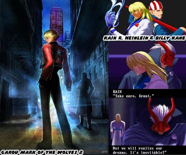
After more than 20 years it looked like nothing would ever become of Garou 2. That was until EVO 2022 when SNK dropped what could be argued as the biggest bomb of the tournament. SNK talked about the updates to KOF XV, and Samurai Showdown, including new characters, cross play, and rollback support for online play. Then they showed an illustration by Tonko aka Aki Senno featuring Rock Howard. The framing of the art was clearly done with purpose. The alleyway might be in Second Southtown, the large building in the distance may be Geese Howard’s. In the background are Billy Kane, a well known enforcer for Geese, and Kain Heinlein. From a storytelling perspective this might be Rock Howard being pulled to the “dark side” in a power struggle over Second Southtown. As of this writing we have no idea who else is going to be in the game, or what the story could be. We don’t even know if the studio is finishing the sprite-based version, or starting from scratch with a whole new cast.

As far as the canon of the game went, there were the events, and relationships specifically mentioned in the title. Some had straightforward endings, some were open-ended. These things really didn’t influence the direction of the King of Fighters tournament in one way or the other. There was not much else in terms of anime, or manga that covered the events of the game. For sure I thought it would have gotten highlighted in the King of Fighters Destiny cgi series. Sadly it did not. Many popular games had a corresponding show or comic book series. Capcom had one of the first illegal, and licensed comics in the world for Street Fighter II. SNK was just behind with the Art of Fighting, and King of Fighter manga. Through the ‘90s the various games would get a licensed manga in Japan, and sometimes that book was translated, and released in the US as well. Licensed books were also created in the Chinese market, these were known as manhua.

I had collected both Street Fighter manga, and manhua, and more than a few manhua books from the various SNK games. Only recently did I learn that there was a manhua series based on Garou MOTW. I managed to get all 10 issues of the limited run comic. As far as I know they have never been translated into another language. I scanned in several pages, and will be sharing them on this blog over the next few days. I hope to see you back for that. I’d like to know if you collect any comics, manga, or anime on a favorite game. It doesn’t have to be a fighter. What do you collect, and what’s one of your favorite pieces? I’d like to read about it in the comments. As always if you would like to sponsor me please visit my Patreon page and consider donating each month, even as little as $1 would help make better blogs and even podcasts!
follow the Street Writer on Patreon!

Tuesday, October 10, 2017

Hiding the master in plain sight, the genius of SNK's character design... part 5

SNK had exploded on the scene in the early ‘90s. The success of the Neo Geo console in the arcade, and the steady stream of fighting games made sure they would be around for the long haul. I had mentioned previously that the success to their school of design was based in hiding the masters of the martial arts in plain sight. A karate master didn’t have to be Japanese or wear a gi. This was demonstrated in the Art of Fighting (AoF); Robert Garcia was an Italian playboy that drove exotic cars, wore thousand-dollar shoes, tailored suits, and could go toe-to-toe with the ambassador of Kyokugenryu karate, his friend Ryo Sakazaki. King was a Muay Thai goddess but you would never have suspected it as she dressed like a high-class bartender. Shinkiro and the art team didn’t have a chance to create these plain-clothes masters for every new release but that didn’t stop them from experimenting. Before they found their groove they were as guilty as the other developers of following the trends. Boxers Michael Max, Axel Hawk and Micky Rogers were very generic designs. Pulled in part from real-world fighters Mike Tyson and George Foreman. All of that changed in 1994 when the studio released King of Fighters ’94 (KOF). From this point on it was almost mandated that the figures looked like cool manga characters instead of martial artists.


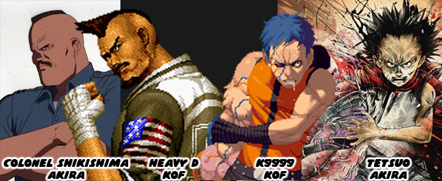
Manga and animé were very influential to the design of early fighting games. The team at Capcom were influenced by Buronson and Tetsuo Hara’s work on Hokuto No Ken / Fist of the North Star. The people at SNK were influenced by Katsuhiro Otomo’s science fiction masterpiece AKIRA. The people at SNK were so influenced by the book that it shaped the story of later KOF games. The entire plot revolving around clones and the paramilitary government organization N.E.S.T.S. was roughly pulled from the plot of AKIRA. Even the character K9999 from King of Fighters 2001 was eerily similar to Tetsuo, the antagonist in AKIRA. The likeness was so much so that publisher Kodansha took SNK to court and got them to remove any likeness of the character from future releases and official publications. I would argue that the imposing Heavy D, mohawk, square jaw and all was based on Colonel Shikishima from AKIRA as well. Thankfully SNK made him a dark-skinned character so the comparisons wouldn’t be as obvious. From that point forward the artists at SNK were taking very bold creative chances.


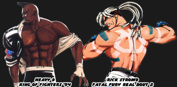
Heavy D started the trend of non-traditional boxers in the KOF universe. His street fashion, paired with his leather jacket and wild haircut made him look like an intimidating opponent. His was the type of look that audiences expected from SNK. It was their follow-up that was even more unique. One of the most unusual boxers in the SNK universe was Rick Strowd. He first appeared in Fatal Fury Real Bout 2 in 1998. I say he was unusual because of his appearance. He was as physically strong as any other character but that wasn’t unusual. He was actually a Native American character although he didn’t look like a typical one that we might have expected. Rick had pale skin, long white hair and bright paintings covering his body. His white pants and blue gloves were solid color choices, they matched the markings painted on his chest and back. He was not rooted in any actual native group, nor were his markings reflective of any tradition. The inverted skull painted on his back looked a bit too cartoonish for example. SNK was experimenting with different influences, different stylistic choices and different ways of presenting a traditional fighting art. They figured that they could shake things up by presenting a unique looking character and call him a Native. Their decision worked for the most part. From that point on the studio realized that boxing was not the only thing that American characters could represent.


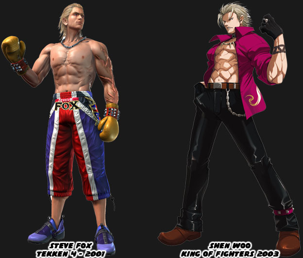
The other thing that the artists at SNK, and a few other Japanese studios, realized post Rick Strowd was that boxers did not all have to be big black guys. Two leaner blonde boxers made their marks after 2000. Namco introduced the fighting community to Steve Fox in Tekken 4. The British boxer had an athletic build and not too bulky. Most Tekken characters were nowhere near as swollen as the Capcom or SNK fighters. Fox had long slick blonde hair and most of his costumes in the series were street outfits. Even his “traditional” costume broke the mold. His boxing trunks were actually long training pants. His most unique element were the enormous scars covering his arm. He wasn’t sure how he got them or what their purpose was, making it an interesting side story for the character. Not to be outdone SNK dropped Shen Woo into KOF continuity in 2003. This blonde boxer was cut from the save cloth as Fox but his look and style were even more street. The Shanghai native was mostly a self-taught fighter, similar to Terry Bogard, and had gained a reputation as one of the most dangerous men in South China. Many of the tournament stars in the KOF series were young cool guys with street clothing so Woo fight right in. If the design had any failings it was that SNK had started relying on the street look too much. Prior to Woo the company had introduced a boxer that I would consider one of the best designs in the past 20 years. This character was named Rob Python from Buriki One.


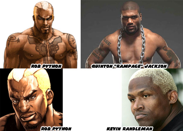
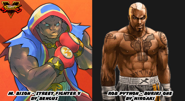
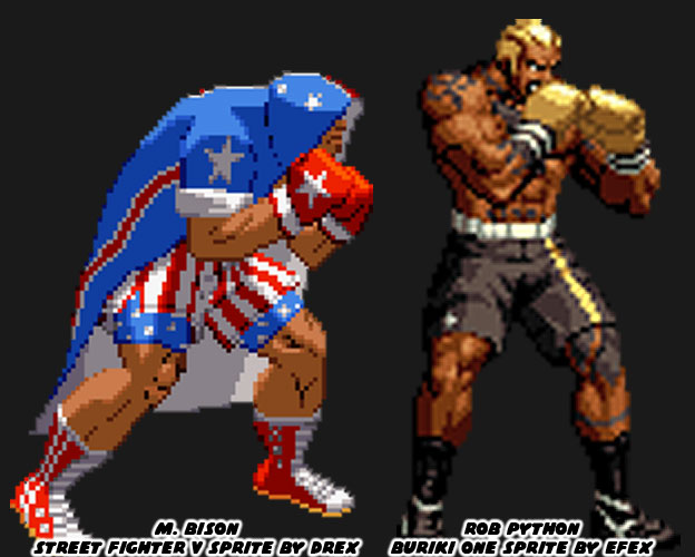
Python represented a break from tradition, he was reflective of the next-generation fighting black superstar. His look was inspired in part by actual MMA fighters Quinton “Rampage” Jackson and Kevin Randleman. They were wildly popular in Japanese tournaments. SNK knew that audiences had outgrown the clean-cut look of a young Tyson and the aging Foreman. They had been playing Neo Geo fighters for almost a decade and wanted new blood. The next boxer had to ooze personality and in the case of Python, he also had to ooze a sense of danger. He was among one of the most dangerous fighters in the Buriki One tournament and also the rival to Gai Tendo, the star of the game. Python was an understudy of Silber, whom I had mentioned previously on this series. Python’s tattoos were as much a part of his costume as his gloves or shorts were. No character before or after had ever looked as imposing. The enormous pair of Colt revolvers tattooed on his chest were meant to intimidate his opponents. It was assumed that he spent time in prison where he had learned of Silber. SNK, and in particular the talented artist Hiroaki, had changed the formula yet again. Python was not a fighting master hidden in plain sight, instead he was a killer masked as a boxer. It would take Capcom almost 17 years to reinvent the boxer by going full circle as well.


In 1991 M. Bison had pretty much set the standard that other boxers were compared against. There wasn’t a fighting game in the ‘90s that wasn’t compared to Street Fighter II. Every boxer was compared to Bison. His look had stagnated in the late ‘90s while SNK was committed to experimenting. Capcom finally conceded and created their own hidden master with Dudley in Street Fighter III (1997). The aristocratic boxer had a unique library of moves but long-time fans of Bison had a soft spot for tradition. Senior Capcom artist (and personal hero) Bengus was called in to work on the Street Fighter V (2016) designs. While he did not develop the original M. Bison, that was more likely AKIMAN and Shoei, Bengus was responsible for the new look. He wanted Bison to have the same big, brash personality but with an updated costume. The Capcom style of design was rooted in making traditional fighting archetypes. Their karate masters had to look like karate masters, their kung-fu masters had to look like kung-fu masters, and their boxers had to be boxers. Bengus went full-bore Americana with red white and blue trunks but then wrapped everything in a red, white and blue robe, with torn sleeves and gold jewelry to boot. The “Crazy Buffalo” now sported elements of the street, elements of real pro boxers and even cartoonish archetypes. He was still classic layered underneath modern accents.


This was not to take anything away from Rob Python and all of the work that SNK had done with boxers over the past 25+ years. Their fighters had been among the most unique, most colorful and most diverse ever assembled. I honestly wish that they would revisit their Buriki One cast for the future installments of the KOF series. With that said they still managed to break new ground. One of their most stylish boxers debuted in 2000, right on the heels of Python. The new fighter was a mysterious special agent named Vanessa. She had taken up boxing when her lover was killed. Like King she was a master hidden in plain site. Her pants and suspenders were a nice touch under her sleeveless shirt and tie. The look was very chic. It wasn’t the first time than SNK had explored the dangerous femme. Vice and Mature, the valets for early KOF sponsor Rugal Bernstein were assassins in disguise. Vanessa was a hero using a similar fashion aesthetic. The trio predated and were more than likely the inspiration behind Crimson Viper in Street Fighter IV.


The most recent boxer in KOF canon was a mix of traditional and modern. Nelson debuted in the King of Fighters XIV, also released in 2016. He was a dark-skinned Brazilian and up-and-coming phenom. The young fighter was involved in a hit and run leaving the gym one night. He lost an arm and his girlfriend was put into a coma. A secretive sponsor paid for his cybernetic replacement arm and saw him enter the KOF tournament. SNK embraced his back story and and incorporated the tire tread motif on his boxing gloves and workout gear. His scars were very bright and spread across his face and torso, giving him the look of someone with the skin disease vitiligo. While I think there may have been too many color choices and design elements placed on the character he worked within the series. Like Vanessa he was a progressive character. His appearance might have appealed to people with disabilities or those recovering from amputations. I would like to see how SNK builds on their library moving forward. Speaking of which, some of the more recent entries in the KOF universe were also a mixed bag of design choices. We’ll look at these in the next blog. As always if you enjoyed this blog and would like to sponsor me please visit my Patreon page and consider donating each month, even as little as $1 would help make better blogs and even podcasts!

 follow the Street Writer on Patreon!

Monday, October 2, 2017

Hiding the master in plain sight, the genius of SNK's character design... part 3

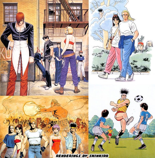
In previous blogs I established that Shinkiro had become one of the most influential fighting game artists of all time. The reason for this was obvious when comparing his work to other artists in the studio and abroad. He would render many of his subjects in realistic settings, with realistic clothing choices. They were often presented in casual settings, perhaps enjoying a cocktail, playing in the park or hanging out at the pool. Prior to that most character illustrations had the figures in fighting scenes and only in fighting scenes. Audiences were used to characters looking highly stylized, with exaggerated physiques. Guys were overly muscular and females were slim with large bouncy breasts. After all these were the types of physiques that manga and comic books expected the archetypes to have. Shinkiro changed all of that. You could look at his art and see people that very well could have existed. By looking at these figures you would necessarily be able to tell what martial arts form they represented. Again, he his that martial arts master in plain site.


Eventually all of the artists at SNK started to become attuned to what Shinkiro had brought to the genre. They understood that if they wanted to put a character into the Fatal Fury, Art of Fighting or King of Fighters, they they had to meet the elements that Shinkiro had established for the series. There would be no green-skinned Brazilian wild man or stretchy-limbed Indian for example. Those figures were not necessarily grounded in any sort of realism. The fighters did not have to be realistic, but they did have to have a sense of realism. The artist Hiroaki Hashimoto aka Hiroaki was an exceptional painter and considered an understudy of Shinkiro. He worked on a number of excellent pieces for the KOF series. In 1999 he was a lead on a new title called Buriki One. This game was set in the KOF universe but a bit in the future. There was a new tournament in town, inspired by the real world K-1 and Pride fighting championships in Japan. There was a call for representatives of the various martial arts. It was the closest that the team at SNK came to creating martial arts archetypes in the vein of the Street Fighter series. The final opponent was a new villain. Silber was very much an SNK answer to Gouki, he had traveled the globe defeating the masters of various arts and even a few wild animals.


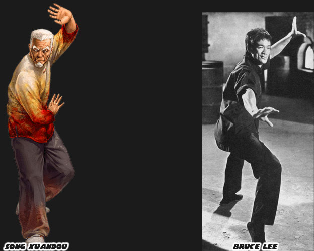
One of the competitors in the Buriki One tournament was an elderly Tai Chi master named Song Xuandou. It turned out that this was the only character that had a previous run in with Silber. Decades earlier, before MMA tournaments were being televised the only way for these fighters to find out who was the best was by actually visiting various dojos and exotic locations. There were no newspapers, no radio or film crews following these people. The fights that went down were the stuff of legend and only a handful of people actually saw them. This was how people like Mas Oyama earned a reputation. When Song was a young man he was lightning quick and very confident in his abilities. He took on Silber and lost. Although he was defeated it was a close battle. It could have been likened to the fight between Bruce Lee and Wong Jack Man. Song was one of the few people that could have claimed to have survived a fight with the powerful German. Silber was and remained a secretive figure in the world of SNK. It was entirely possible that he killed some of the people that he battled. Official character art for example featured him smashing in the face of a polar bear. When the designers of Buriki One called for a Chinese fighter to be put into the game Hiroaki gave audiences an elderly archetype. Nothing about the character seemed to stand out. But again, he was hiding the master in plain sight.


While Song no longer held the speed or flashy kicks of his youth, he retained most of his power. Song was modeled partly on Bruce Lee. This was a version from another timeline, say if he had remained in China and had stayed closer to the kung-fu traditions. This was why he didn’t move or fight like Marshall Law from the Tekken games. He was not just a carbon copy of the actor. Song had the vigor and even look of a youthful Lee in the ’60s. This was back when both he and Silber were getting started in their careers. Song had now distilled his techniques to a few deceptive moves. He could strike, trip and kick his opponents with ease. It was graceful watching him work in the tournament. You could have mistaken him for the old guy practicing Tai Chi in the park rather than a former martial arts superstar. Again this was the SNK school of design at their best, they hid the master in plain sight. It should be noted that not every SNK fighting game required this type of design. For example Shinkiro did a tremendous amount of promotional art for the Samurai Spirits / Shodown series. But he was not the only artist that influenced the fighters.


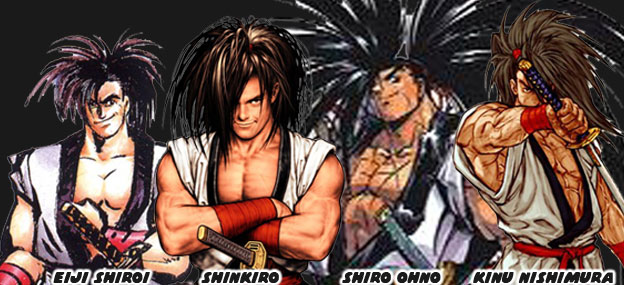
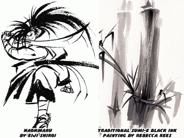
The game was set centuries ago, in feudal Japan. Gunpowder and steam were barely shaping the world, changing the course of the industrialized nations. Japan was insular during this period and held onto tradition longer than most other countries. SNK wanted to capture that era but not romanticize it. They wanted it to pop, to be vibrant, like an animé show. In order to do that the game had to be highly stylized. One of the artists that got picked up for the sequels was manga artist Shiro Ono. He had a very sharp style, with hard lines and exaggerated poses. At the same time the studio did not want the designs to be too outlandish. Shinkiro’s realistic style would have been in contrast with their goal. The artist that the company settled with was Jin Mera aka Eiji Shiroi. Her style was deceptively clean. No extra brush strokes in his renderings. The character designs were easy to read, her choice of color and style really stood out from her peers. In fact the thing that helped cement the look of the series were some paintings that she created using charcoal ink. The sumi-e style was traditional and went back centuries, if not thousands of years. Calligraphers and portrait artists used minimalism to create forms and figures.


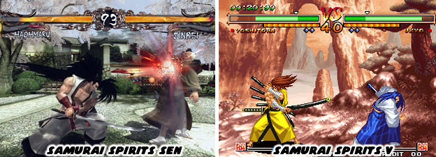
The solid black and white paintings that Ms. Shiroi created perfectly reflected the era that SNK was trying to capture. Eiji was a drawing teacher, her training and insight were perfect for this project. In the case of Samurai Spirits the masters of the various sword arts did not have to be hiding. They wore classic-looking costumes, some wore armor, and they all fought with traditional melee weapons. There were swords, daggers, cleavers, hammers and axes used by the various fighters. As the series grew these things began to include the occasional explosive and even a rifle. For the most part however combat was based on bladed weapons. The designs had to be clear and easy to read. A Chinese warlord for example had a different costume than a Japanese ronin. Even among the various Japanese sword masters there was a lot of diversity. Ms. Shiroi helped plan their look and assigned each person bright primary colors so that they all stood out. As the series aged SNK experimented with 3D and they discovered that the muted colors that were en vogue didn’t really work for Samurai Spirits. This was most apparent in Samurai Spirits Sen. Realism didn’t work very well for the fantastic swordsmen and women. So they returned to 2D shortly after with Samurai Spirits V.


Not every design that SNK created went over well. The studio had a lot of growing pains and made a lot of mistakes when they were trying to capture the fighting game crown. We’ll explore one of the most diverse lineups the company ever gave us in the next blog. As always if you enjoyed this blog and would like to sponsor me please visit my Patreon page and consider donating each month, even as little as $1 would help make better blogs and even podcasts!
 follow the Street Writer on Patreon!