Friday, April 21, 2017

Warzard, the great fantasy fighting games part 3...

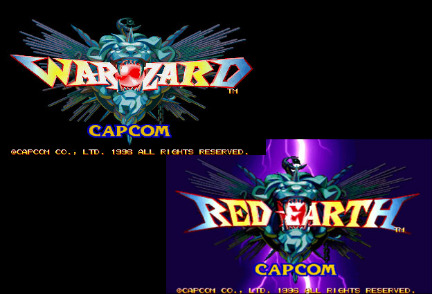
So far in this series we have looked at the pioneer fantasy fighting game and a fantasy fighting game that was never published. Today we will look at one of the greatest fantasy games ever made. Sadly this is a title that most in the game community have never heard of, let alone played. Warzard in Japan / Red Earth in the USA was released by Capcom in 1996. It featured one of the most colorful casts of playable characters and villains ever to appear in any fighter. It was the first title to be developed for the CPS-III system. The sprite-based engine was at the time the most powerful engine Capcom had ever created for arcade games. It was leagues more powerful than the CPS-II, which was what Super Street Fighter II had used.


Capcom had found tremendous success with their arcade unit in the '80s. They had published more than 2-dozen hits with the original CP System (CPS - arcade board), including 1941, Ghouls'n Ghosts, Strider, Final Fight, Street Fighter and Street Fighter II. The original CPS had a long shelf life and been used from 1988 to 1995. The CPS-II was an even bigger success, having more than 40 games published for it between 1993 and 2003. Based on the success of the fighting game genre Capcom thought that they should bank on new hardware to carry them for the next decade. In the mid '90s arcade games were moving to 3D graphics and even home consoles were migrating to 3D so sprite-based 2D engines were being dropped for the most part. The Tekken and Virtua Fighter series debuted after Street Fighter II and both looked a little rough around the edges. They were improving visually by leaps and bounds with each release and would soon look better than the rehashed graphics that Capcom was using. The CPS-III would be a return to form and a chance to show that sprites were still vital to the genre. Sadly it would become the swansong for hand-drawn graphics and Capcom's reliance on 2D technology. The hardware was much more expensive to work with than earlier CP Systems. Not to mention that the genre had a lot more competition that Capcom had anticipated. Development on the CPS-III would be cut short. The engine was only used for 6 games between 1996 and 1999. Three of those games were Street Fighter III and its sequels, two were for JoJo's Bizarre Adventure and one was for Warzard.
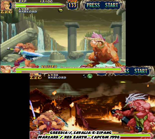

Warzard had some of the most brilliant graphics ever seen in an arcade game. The stages, animations, effects and design were light years ahead of anything the competition was working on or would ever release. It was obvious that the publisher had gambled on this game becoming the next big franchise. Expansions were planned if not outright sequels if it became as successful as Street Fighter II. It was apparent in every detail that made it into the game. An entire world was mapped out for the audience. They were given a tour of this wondrous fantasy world in every encounter. No two locations looked the same and that was a good thing. Warzard was layered with so much detail that players were encouraged to keep playing and explore the stories of each hero.
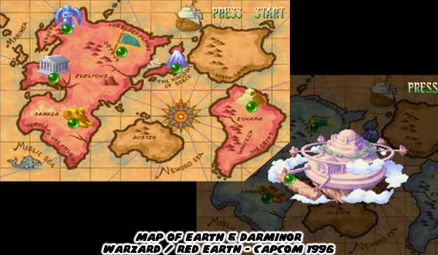

Players explored a world filled men and monsters. Technology was a mixed bag of progress and superstition; gunpowder existed alongside magic, demons consorted with nobles and humanity was at the brink of all out war. Most of the warriors fought with swords and shields but the most powerful relied on spells. Designing a visual language that was equal parts Western and Eastern fantasy required the talents of the senior designers at Capcom. They created a world where flying ships and floating islands appeared as the actual stages. I will be highlighting these people individually later on in the blog.
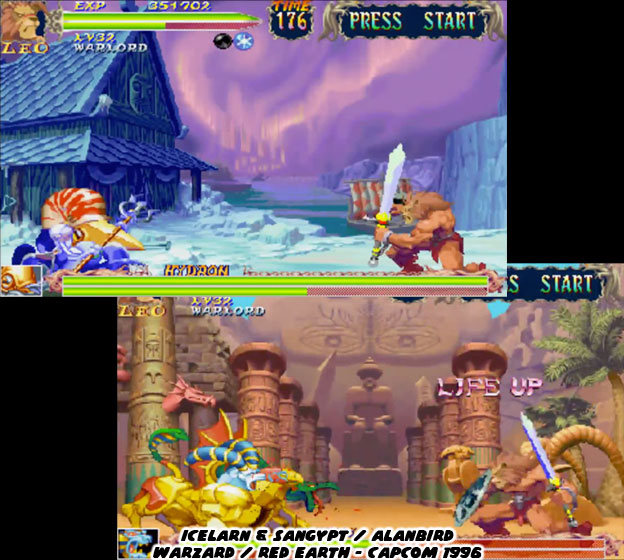

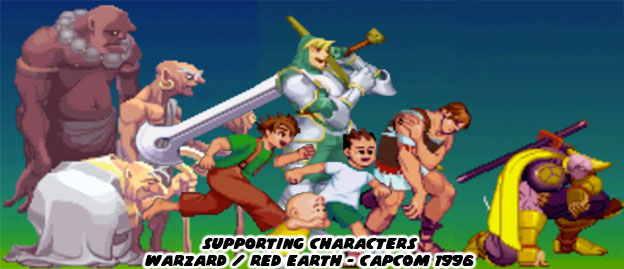
Every menu, on the level map, stage backgrounds and even in the title screen, were some of the most stylized graphics that had ever been seen. Capcom did not overlook any detail, even the supporting characters which may have turned up multiple times or even just one in the progression of the story had their own unique look and purpose.

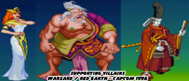
These designs also applied to the villains in the game, which also came with their own cast and back story.

The stars of the game were four playable characters; a lion-warrior named Leo, a ninja named Kenji / Mukuro, a sorceress named Tabasa / Tessa and a young martial arts master named Tao / Mai-Ling. They each had their own strengths and weaknesses. Leo was a lion-turned-warrior. He fought with a sword and shield yet could also perform grapple moves ala Mike Haggar or Zangief. Leo lacked strong magical attacks early on in the game. Kenji had brazenly fast attacks, he had curved blades along his forearm gauntlets, a straight sword and even a cannon with an enormous gunpowder discharge. Like Leo, he was equipped to take out even the largest monster with a weapon rather than magic. Tabasa was a sorceress and had some great magical attacks. She had a magical staff that floated and she could use as a projectile. She even had a few unique physical strikes as well. Tao was a martial arts master and fought with her bare hands. She was very powerful despite her size, perhaps she was a demigod. Her kicking attacks allowed her to set fire to her opponents and throw even the largest villain across the screen. It was as if she was the ancestor that Few Long and Chun-Li were descended from.
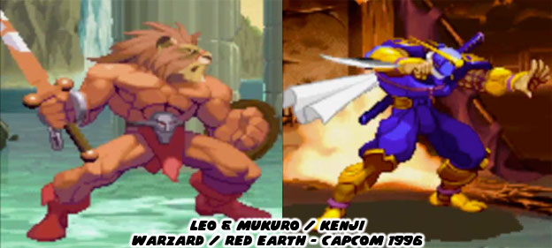
 

I know that it's hard to imagine a fighting game with only 4 playable characters. It was in fact half the number of playable characters than the original Street Fighter II. Yet the quality of the sprites was unsurpassed. The size of the new characters were much larger than ever before, with a wider color palette and many more frames of animation. The animation was very fluid, better even than that featured in Vampire/Darkstalkers. The sprites were superior to the older CPS-II games. All of the extra work required for completing each character meant that less and less time could be used on filling out a bigger cast. Capcom also made sure to use design elements exploited by rival studios. This game was the first and possibly only fighter by Capcom that featured a "fatality" for opponents. If Leo finished his opponent with a strong sword attack you could actually see the villain cut in half. This includes a cartoonish representation of their brains, spinal cord and guts. It was never as gruesome as a fatality in Mortal Kombat but it was nonetheless a surprise.
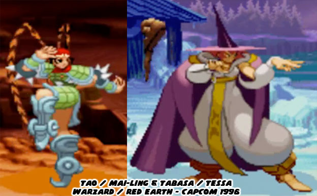

Like Street Fighter II there were multiple villains and boss characters making up the lack of playable characters. Unlike Street Fighter II the developers were not required to create human opponents. They could dream up just about any type of fantastic beast to fight with. Moreover, each villain reflected the cultural that they originated from.
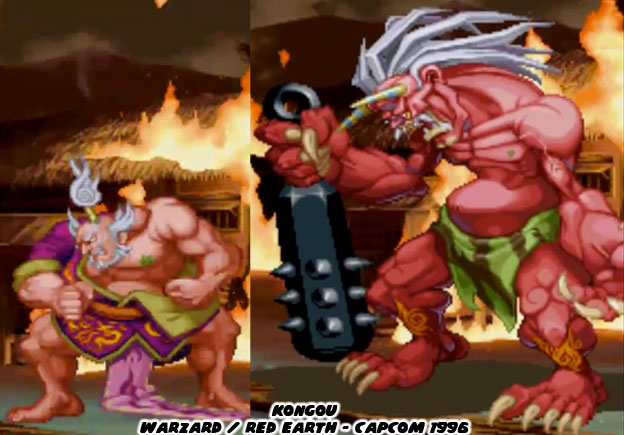

Take the demon Kongou for example. He was from the region of Zipang, a nod to feudal-era Japan. The stage he occupied looked very much like a traditional Japanese town, except of course that it was on fire. It was under attack from a rival army and their flying ships. Kongou was a warlord with a terrible secret. He turned into an enormous monster before the battle. With his spiked mace, red skin color and horns Kongou looked like a classic Japanese oni or demon from storytelling tradition.
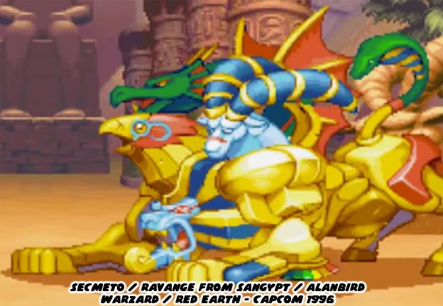

Look at the multi-headed Secmeto / Ravange. This four-legged creature was a mix of Egyptian Sphinx and Chimera from Green mythology. It hailed from Sangypt / Alanbird, a desert kingdom in this fantasy world. There hadn’t been any beast as colorful in any edition of Dungeons & Dragons yet it seemed so familiar to both Western and Eastern fantasy fans. The ability to project different poisons from each head made sense and the raw strength associated with the monster was impressive, but not as impressive as the gigantic monster from Greedia / Savalia.
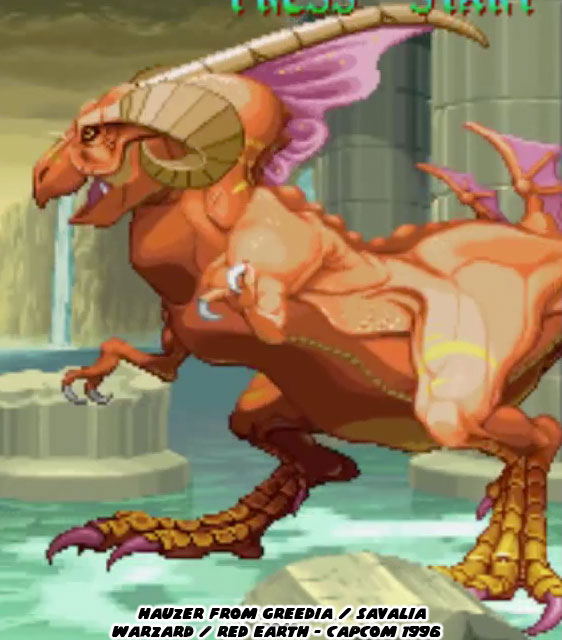

Hauzer was an enormous dinosaur-like monster from the home nation of Leo. It was a lost kingdom, one which had fallen into ruin many generations ago. Hauzer was a beast from antiquity, heralding a time before man ruled the Earth. The sprite created for Hauzer was one of the largest ever featured in any fighting game. He covered almost a third of the screen and his attacks could reach clear across the display. Capcom wanted to let audiences know that this game was compeltely unlike any fighting game before. Hauzer was a showcase for the CPS-III system. More impressive was that each villain was unique, with no sprites rehashed to create secondary characters.
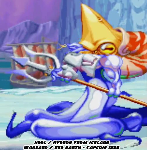
 

In the frozen north there was an aquatic baddie who moved unlike any other game character. Part walking octopus, part nautilus and armed with a trident Nool was by far one of the strangest fighters ever featured in any game. He was slippery and quite fast despite his square appearance. The figure was so unique that he was placed in Capcom Fighting Jam a few years later along with Hauzer.
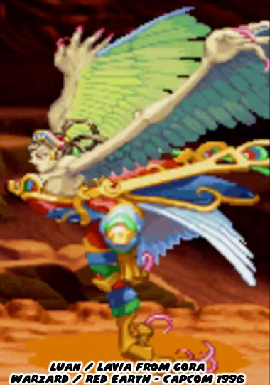

Luan was one of the two female villains in the game, Secmeto was summoned by a sorceress. Luan was a harpy but not the one you might remember from Greek tradition. Luan was not naked, she wore armor and had costume elements pulled from ancient China and Mongolia. She hailed from the same region as Tao, and thus shared many similar central-Asian traits. Capcom had gone above-and-beyond when it came to the color palette applied to each character. The stages were all breathtaking but seeing the quality of the animation and the size of these new sprites was light-years ahead of what other studios were doing.
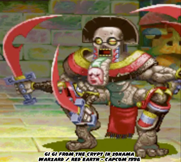
 

Of all the villains possibly the most unique was GiGi, an animated four-armed statue. It was made of stone and had cues pulled from Pre-Columbian Central America. There was no doubt that the team at Capcom had been inspired greatly by the statue of Kali featured in the film the Golden Voyage of Sinbad. GiGi actually had a left and right side, where its main colors and even sword went from red to blue depending on which way it faced the opponent. Mind you, this was before Gill debuted in Street Fighter III.
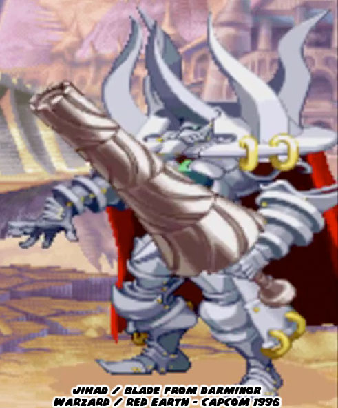
 

The sub-boss of the game was an animated suit of armor called Jihad / Blade. His lance, which looked like a spinning turret, could extend across the width of the screen. In addition to being genuinely hard he had both physical and magical attacks. He could freeze opponents in a mirror and then smash them into pieces. He could also expand his armor and unleash a blast of energy from his core, a magical crystal. Blade was in charge of all the other villains in the game and was the guardian of the floating island of Darminor.
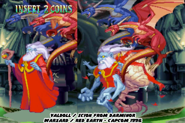
 

In the center of the floating island was a castle. The inner chamber had strange totems made of dark stone. Some sort of dark ceremony was taking place as the level progressed. The main villain of the game, a War-Wizard named Valdolll / Scion, was waiting for our heroes. The blue-skinned wizard wore a red robe, had long white hair and a beard. He fought with a magical staff and was flanked by two small dragons. He was immensely powerful even without the dragons at his side. When most people think of a fantasy villain a wizard doesn’t usually come to mind but this one was different. He didn’t walk but instead floated across the arena. If a player were able to defeat him once then he would resurrect himself into a more powerful form. His body turned into a grotesque shape. His head became larger, an enormous brain and spinal cord popped out of his back, multiple tiny arms sprang from his shoulders while his atrophied legs dangled from his torso. With his true form revealed it was obvious that the heroes of the game needed to destroy the monster before he could enslave the planet.
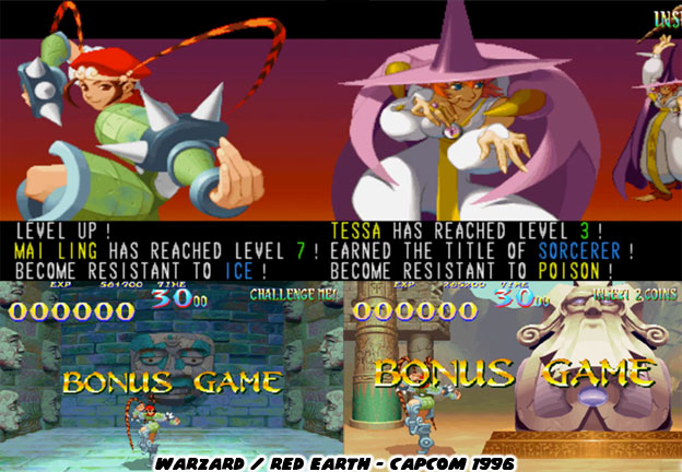

Capcom wanted audiences to understand that this was far from a traditional fighting game. It did have elements from the best fighters they had made up until that point. It needed to have the elements from the RPG titles audiences were used to. Aside from fantasy heroes and villains the game also allowed players to collect treasure from their rivals as well as in bonus stages. The characters also had a level system. The better they fought in each stage the faster they were rewarded with a new level. The levels allowed them to gain new attacks and stronger defenses.
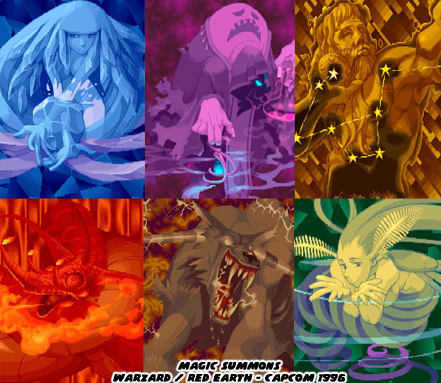
 

Audiences rightfully expected magic to be an internal part of the experience since this was a fantasy game. Golden Axe had started that tradition for brawlers many years earlier and Capcom was honoring the tradition. Players could collect magical orbs and summon powerful strikes. Using the orbs resulted in a brilliant background to be displayed, showing off the mystical or elemental gods being called upon. The graphics on the summons were some of the most beautiful pieces of art ever featured in a Capcom title.
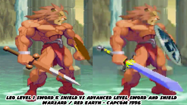

Not only did the attacks become more impressive as the game progressed but heroes such as Leo gained a new sword and shield as he leveled up. Imagine how difficult it would have been to show a Street Fighter’s costume getting better gear each time they fought. The amount of memory and programming talent required to do that would have been insane. Warzard would save each player’s progress locally and they would put in a button command so they could continue leveling up each time they started a new game.
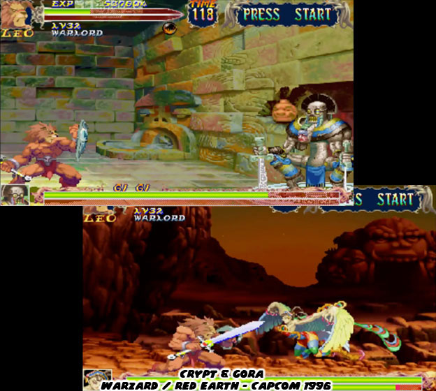

The locations of each encounter left audiences wanting more. These were not the typical backgrounds in a fighting game, the middle of a street with random pedestrians, some back alley or the top of a building. They were instead levels that told a story. Some were in wide open plains and others inside mysterious castles. Each civilization on this planet had had a history, they reflected an indigenous culture. The art team at Capcom was sure to present it with rich colors and layers of details.
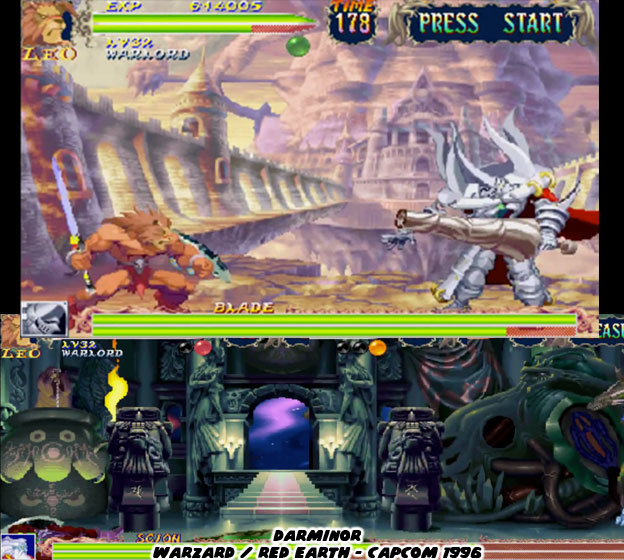
 

It wasn’t hard to imagine that Capcom had great plans for the world they had created. The places in Warzard were meant to be revisited. They were the types of locations that the greatest RPG developers had been crafting over the past decade. There was one advantage to them being placed in a fighting game. The fixed perspective meant that the artists had a greater liberty with color, texture and even scale and proportions that would have been difficult to recreate in 3D. The artists could make the stages appear like the pages of a fantasy storybook and not necessarily a real location.
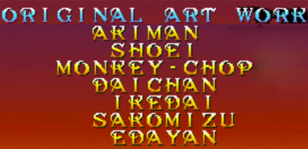
 

Chief among the background artists was Ikedai, whose design of Darminor looked like a watercolor painting come to live. Ikedai was one of the newer artists at Capcom, as was Sakomizu. The strong contrast of the Sakomizu illustrations, the bright colors and solid ink blacks had been seen earlier in the Strider 2 art. This style was a standout and was featured prominently on much of the official Wizard poster art. All of the senior Capcom artists working on the game would get highlighted in the credits.
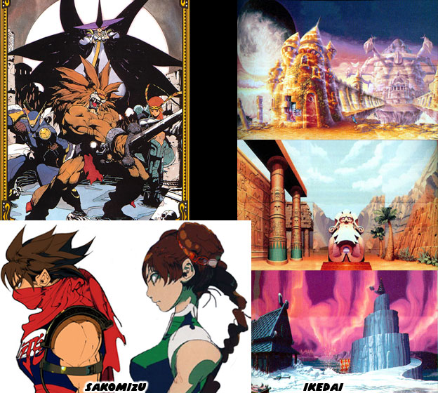

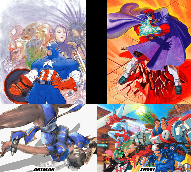
The credits featured a list of seven artists for creating the original art. They were a handful of the most influential designers of all time and were actually listed by seniority within the studio. I sometimes get asked how to tell them apart in my blogs. It is easier if you place a couple of examples side by side, so here’s a short summary for things to look at while studying the drawings. At the top of the Warzard credits were Akiman and Shoei. Their work defined the official, cabinet and sprite art on the CPS-I and CPS-II hits. The paintings of Shoei were done in paint and markers. His best worked was comparable to oil paintings. He captured the personality of the various fighters in Street Fighter canon and were very much the foundation for all the character models in Street Fighter II. Akiman should need no introduction, as a character designer he brought a lot to the table. He had a very strong manga style and created most of the early black and white Street Fighter II designs. His poster work saw much lighter color blends than any other artist on the team. Despite the lightness of his colors the figures still conveyed weight and movement. Of course if you remember one thing it’s that he created Chun-Li.

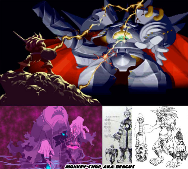
The third artist credited in Warzard was Bengus aka Gouda Cheese aka CRMK. In this game he was listed as Monkey Chop. His unique style was featured prominently on the development of the Street Fighter Alpha / Zero series and the Vampire / Darkstalker games. His proportions were very exaggerated. Zangief for example was so muscular that he was about as wide as he was tall. Dhalsim on the other hand was very thin and angular, almost alien-like in appearance. His work in these games also went on to influence countless artists and animators, not only in Japan but in the USA. Bengus’ preliminary pencil work might be colored by another Capcom artist or vice versa. His fingerprints were very much in Warzard, specifically in the opening animation and summons. Shoei and Akiman sketched out the concepts for the various monsters in the game, traditional demons and giants in armor, and Bengus went in right after to give them a completely fresh take.
 

Two of the younger members of the art team, Daichan and Edayan had cut their teeth working on the art for the Street Fighter Zero, Street Fighter EX and Rival Schools titles. The style of Bengus had certainly rubbed off on them, however fans of Capcom should take note at the preferred media that each worked in. Edayan filled his pieces with bold colors, a mix of anime influences and digital techniques were his calling card. He blended reflections and multiple sources of lighting seamlessly on the clothing and skin of his figures. The style of characters were very angular, their muscles were not as exaggerated as those of Bengus, yet not as flowing as those of Akiman. Instead the art was somewhere in between.
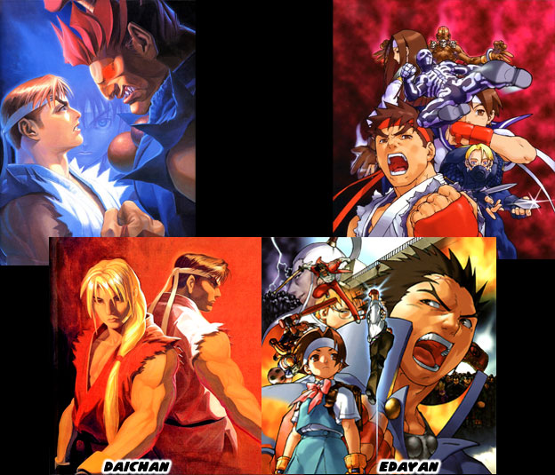
 

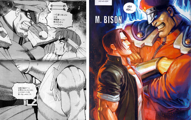
Daichan was an accomplished traditional and digital artist. He was great at painting on canvas. He did a number of large panels that were reproduced as arcade posters. His painting of Ryu and Gouki staring at each other from Street Fighter Zero 2 was legendary. It would be revisited in comics and would be copied by manga artists in Japan and China. Daichan and Edayan had art on the cabinet, in the official guide book as well as in the Capcom Secret File (an arcade flyer) for Warzard. Their strong sense of color most likely influenced the color choices on the costumes of the villains and even stages themselves.
 

The game was simply breathtaking. It was leaps and bounds above Super Street Fighter II. In fact it was far ahead of what the competition was doing. Other studios were fixated on adding more and more characters to their lineup, some of them with many of the same moves of other characters in the series, Capcom went the opposite direction and created a small number of memorable heroes and villains. This was of course in part to the time that it actually took to create higher-resolution sprites and higher-quality sprites as well. From a game play perspective it had a number of unique elements, the ability to save your progress and level up the main characters. Capcom was so certain that the game had a bright future that they even teased what changes were in store for a sequel.
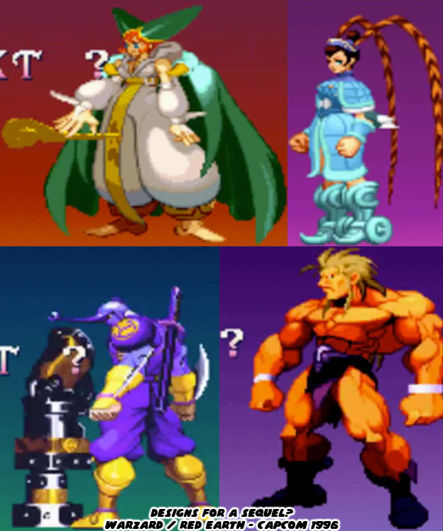
 

Leo was created by several shaman from a primitive tribe, a lion was chosen to defend them from Valdolll. The transformation into a man was halfway complete in the original game. Leo was meant to become a human and eventually a king to his people. Once peace had returned to the land Leo was turned back into a lion. It was a bittersweet ending for the character. The “true” version of Leo was teased, along with evolved versions of all the other characters. The armor of Kenji had changed slightly and looked more beetle-like. Tabasa had a double-horn hat and Tao had gained some more costume details that appeared pulled from the Chinese opera. What sorts of new moves would they have added? I doubt that Capcom would have simply brought back the same villains in a sequel. It wouldn't have made any sense if they did. Given the development time and cost to produce Warzard it stood to reason that Capcom had to kill the sequel. With Street Fighter III they could keep adding new characters, they could add new stages and new upgrades and keep existing characters around as well. Warzard would have to be redesigned with every sequel. It was not practical from a development standpoint however the bold experiment was something that the fighting game genre sorely needed. Warzard was a perfect example of using a fantasy theme within a fighting game. Neither Eastern nor Western in setting it built universally recognized heroes and villains. Do you think that this game deserves another chance? If so I'd like to hear about it. As always if you enjoyed this blog and would like to sponsor me please visit my Patreon page and consider donating each month, even as little as $1 would help make better blogs and even podcasts!

 follow the Street Writer on Patreon!

Wednesday, April 19, 2017

Dragon's Heaven, the great fantasy fighting games part 2...

The mid-'90s was the most revolutionary period for fighting games. Fantasy fighters made a grand entrance with Golden Axe The Duel, but the fantasy theme was only beginning. One of the most ambitious titles started development in 1995 and would be cancelled part way through production. Today we will be looking at an unfinished Neo Geo game that had the potential for greatness. NeoTurfMasta, an arcade enthusiast found some ultra-rare non functioning PCB’s. These were the circuit boards made by game publishers that could be swapped out in arcade cabinets. After some troubleshooting he got them working and took them to a few shows. It turned out that the boards were not just some random defunct arcade games, but instead titles that had never been released. It caused a buzz in the arcade and fighting game community.


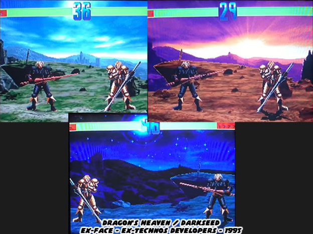
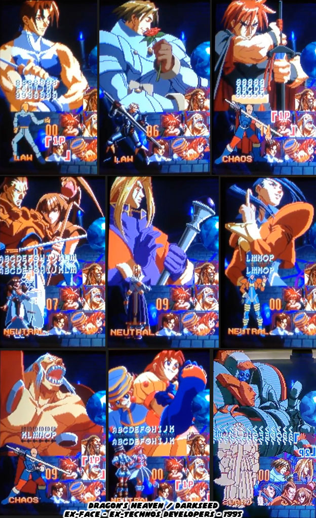
The board NeoTurfMasta showed off was for a cancelled SNK fighting game. It had a working title of Dragons Heaven or DarkSeed. The game was created by Kengo Asai. Kengo had worked on The Last Blade (1997), the spiritual successor to the Samurai Spirit / Shodown series. Prior to that he worked on Voltage Fighter Gowcaiser (1995), featuring the character designs of Masami Obari. Kengo did an interview with ITMedia about the game after it turned up. In that interview he mentioned a few interesting things about the title. The working title was Darkseed but the studio couldn’t get the rights to it so they started calling it Dragon’s Heaven. Around that time a number of Japanese studios, animation and manga artists as well, were into dark fantasy.


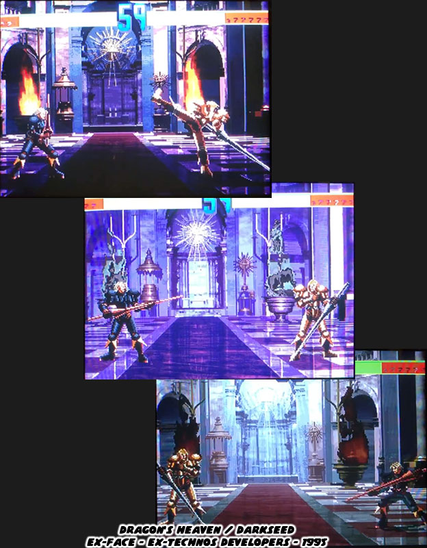
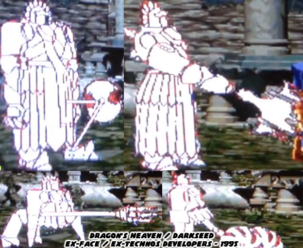
The team that was working on the game was made up of Ex-Face, Ex-Technos developers. They started work on the game while they were finishing development on Voltage Fighter Gowcaiser. The game had gone a good ways while in production for the two times that it was suspended due to budget issues. It was officially cancelled in 1996. The majority of the cast had been designed with almost all of the characters being playable if not having a series of moves and animations. Detailed stages had been created that took players around a unique fantasy world, one with heavy western influences.


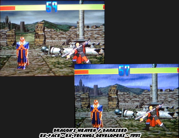
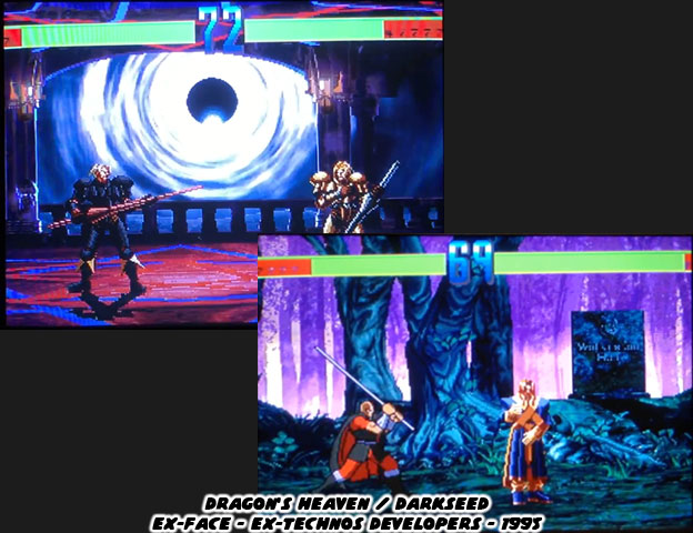
This game was weapons-based, again, like Samurai Spirits. The cast was not entirely made up of sword fighters. Instead of martial arts masters these characters ranged from rogue to cleric, from traditional knight to supernatural war machine. In essence they were classes, just like a fantasy role-playing game. The game was layered in some amazing details, the stages shifted between day and night. There were even weather elements such as rain programmed in the engine. It was an ambitious title that had features that no other fighting game before or since had.


The entire morning, noon and night level design was more than an aesthetic choice. Mr. Asai actually had plans for creating different move sets and abilities for the characters depending on their alignment. They could be Chaotic, Lawful or Neutral. Chaotic and Lawful had the strongest attacks but not necessarily strongest defenses against their polar rivals. Neutral versions were good all-around but did not excel in any one field. The time of the day actually had an affect on how strong their attacks were. Lawful was strongest in the morning and chaos at night. The benefit of being a neutral was that your moves and attacks were consistent regardless of the stage.


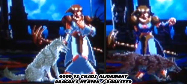
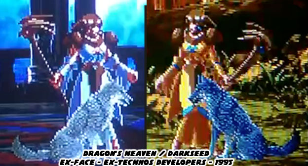
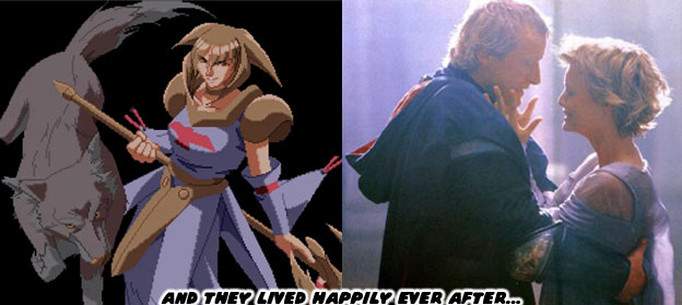
It wasn’t enough to simply call a character Lawful or Chaotic. The designers actually created unique sprites and animations for each class. For example take the character Tear and her companion Wolf. In the Good alignment the wolf is more passive, he is seated and waiting for a command. By contrast the Chaotic version is at the side of his master and growling. Even the stance of Tear changes from cautious to ready for battle. This is a stark contrast to most fighting games where the designers only worked on creating color pallet swaps for the cast.


Imagine having to design different sets of attacks and special moves for the same character depending on their alignment. It would have been a nightmare from a planning and programming perspective, let alone from a balance standpoint. It was nonetheless something ambitious that many game developers don’t even consider for modern fighting game remakes. But just so you know the designers did create pallet swaps for each alignment as well. This was an intense amount of work for the team trying to get a game out and stay competitive in the market.


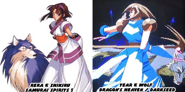
Tear and Wolf were the main characters in Dragon’s Heaven. The game appeared during a time when studios had experimented with having a wolf as a supporting character. Sega gave a wolf companion to their iconic ninja character Shinobi in the 1989 arcade sequel Shadow Dancer. A year later Studio Ghibli released the film Princess Mononoke, which again featured wolves in supporting roles. SNK had featured a large dog, Poppy, as the partner of the ninja Galford in Samurai Spirits / Shodown in 1993. Rera and her wolf Shikuru appeared in Samurai Spirits 5 in 2003. Rera was an evil (more like chaotic) version Nakoruru, born from her subconscious. This character had been hinted about in Samurai Shodown II back in 1994, a year before the publisher started work on Dragon’s Heaven.


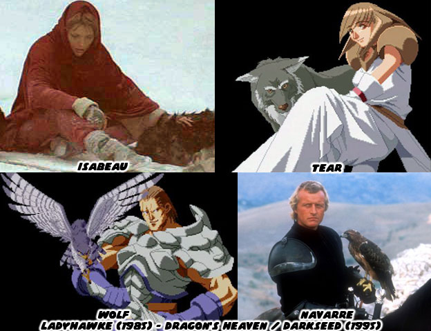
All of the maiden and wolf characters in other Japanese games and films were merely coincidence. The inspiration behind Mr. Obari’s game came from much earlier USA source. He remembered a film where the male and female characters could never be together because during the day the man was a human and the woman was a hawk. At night the man became a wolf and the hawk became a woman. Kengo did not recall the name of the film when he was interviewed, but it was the 1985 movie Ladyhawke.


Captain Navarre played by Rutger Hauer and Isabeau played Michelle Pfeiffer were the star-crossed lovers. An evil bishop was jealous of the two and cursed them to change into animals so that they might never be with each other as humans. SPOILER: Captain Navarre swore revenge and when the opportunity presented itself to assassinate the bishop and lift the curse, thanks to a well timed solar eclipse, he went for it. In hindsight Mr. Obari thinks that he could have come up with something better for his first original fighting game. That is a tough case to make considering all of the fresh game play elements he had introduced in this title. Aside from Tear and Wolf there was a very interesting heavy hitter in the planning stages known as Headcounter.


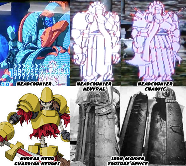
Headcounter had three classes to choose from just like the other characters. He was not some sort of armored knight but instead a skeleton trapped in an animated suit of armor. The look of Headcounter did predate the appearance of the Undead Hero from the 1996 Treasure game, Guardian Heroes, for the Sega Saturn console. What made this new fighter unique was how much his visual appearance changed in between the classes. In a neutral form his armor was smooth but in a chaotic form his armor turned spiky. This character was huge, about the size of an Iron Maiden. But this armor changed shape and transformed as if it were robotic. He “grew” spider legs and could turn his legs into saws and fists into maces at the end of chains. There was no doubt that the Pre-Columbian robot Huitzil / Phobos from the 1994 Capcom fighting game Darkstalkers / Vampire was the basis for Headcounter. Too bad he never to get a chance to shine.


Mr. Obari and his team got far along in the development process but not far enough so that some other developer could pick up and finish the title. Despite the number of stages, cut scenes and near-finished characters there was still plenty of work to do. They still had to finish the moves for the existing characters and create sprites and animations for the missing ones. They had to come up with a final boss, if not several final bosses and ending stories as well. This could have added another year in production plus several months polishing and balancing the mechanics. This was something that neither Technos nor SNK could afford. They needed game ready to go while fighting games were hot. 


What would have become of the cast? Would they have returned for a sequel? Was this meant to be a one-shot fighting game? Would this series have crossed over with any other game? While we may never know the full scope of what Mr. Obari had planned we should appreciate the work that went into his game. We should be grateful that NeoTurfMasta was able to get a board running so that we could appreciate "what might have been" 20 years later. In this way I'd like to think that the plans and dreams of Mr. Obari and his team can now live happily ever after. As always if you enjoyed this blog and would like to sponsor me please visit my Patreon page and consider donating each month, even as little as $1 would help make better blogs and even podcasts!
 follow the Street Writer on Patreon!

Monday, April 17, 2017

Golden Axe the Duel, the great fantasy fighting games part 1...

The fighting game genre is as broad and colorful as any adventure or action game that’s ever been made. Many people think that fighting games are simply about two martial arts masters going at each other. Long time fans of the genre know that there is much more to it than that. Fighting games took off at the start of the ‘90s and by the middle of the decade every major studio was experimenting with the format. Early on the developers tried to copy the framework set up by Capcom with Street Fighter II. The more successful companies experimented with control schemes, graphics and gameplay mechanics to try to stand out from the rest. Over the next decade there were fighting games about giant monsters, superheroes, robots and even serial killers. One of the rarely discussed themes in the fighting format goes back to the earliest types of games. Before there were video games there were tabletop games. Titles like Dungeons and Dragons took their inspiration from fantasy literature. Books like The Lord of the Rings and the Chronicles of Narnia, as well as the older faerie tales from the Brother’s Grimm and even the legend of Arthur and the Knights of the Round table all helped shape tabletop games. Pop culture was also colored by the heroes from ancient tradition. Comics, movies and cartoons based on fantasy characters made their way into the open. In the mid ‘90s when fighting game developers were looking for some new themes to explore they looked to to those fantasy titles. What they created was a series of unique titles that deserved a second look. This new series will highlight some of the most unique games in the fantasy genre.


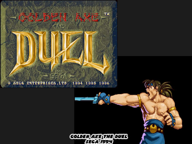
The first fantasy fighter of merit was Golden Axe The Duel. It was developed by Wow Entertainment and published by Sega in 1994. The game was important for many reasons. Sega, just like every major publisher at the time, wanted to create a hit fighting game. Virtua Fighter, released in 1993, was a moderate hit but it did not generate the buzz of Street Fighter II. AM2 developed Virtua Fighter and would focus on trying to represent realistic fighting styles in their 3D engine. It didn’t quite have all of the elements that made Street Fighter II work. By contrast Wow Entertainment thought that by creating a cast of stylized characters, and allowing magic and realism to co-exist in the fighting engine they would be able to capture lighting in a bottle. They came close to doing just that.


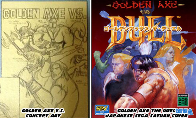
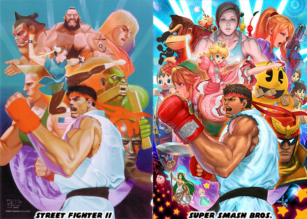
Sega was following the template laid out by Capcom very carefully. It was apparent in the earliest stages of the game design. The original poster sketch for The Duel looked very familiar. It would be changed by the time the game was released in the arcade and later the Saturn home console. In case you are not old enough to remember the original Street Fighter II poster from 1991, it featured Ryu in a side profile. Behind him were the rest of the World Warriors. The poster concept for The Duel featured Kain Blade in the same pose with the other characters around him. Capcom’s painting was such an iconic piece that Nintendo would reproduce it almost 25 years later to celebrate the inclusion of Ryu in the Smash Bros. game.


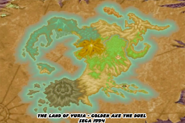
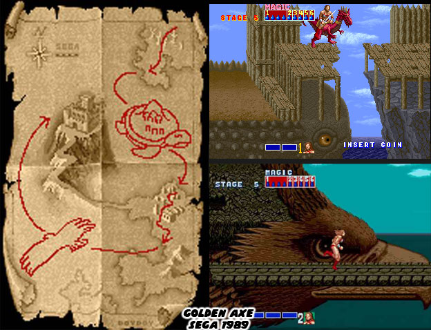
Every fantasy game that I bring up over the course of this series will have a few things in common. The fantasy elements in each game will have a decidedly western theme. Even though the majority of the games will be from Japan, they will be using mostly western images. This goes with literal dungeons and dragons, skulls, faeries, orcs, ogres, castles, swamps, basically anything that’s ever been referenced in a western fantasy world. In some cases the studio might mix in a few Eastern fantasy characters and demons but for the most part they will be reflecting the themes explored by western writers. For example in Golden Axe The Duel, the audience will be brought into the world of Yuria. Just about every fighting game in the early ‘90s featured some sort of map. The fantasy ones were no different.


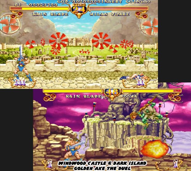
Some of the maps were animated, featuring floating castles, sea serpents and other mythical characters decorating the edges. Each stage featured in the various titles brought forward some unique locations. Golden Axe The Duel had some of the most memorable visuals of any fighter. Sega wanted to create a world with some consistent elements. This was not a strictly medieval world but something with steam elements to it as well. The more advanced kingdoms, such as that of Windwood, harnessed the power of the wind, whereas Dark Island were a twisted place where magic reigned supreme. Depending on where you were in the world there was often a mix of fantasy and realism.


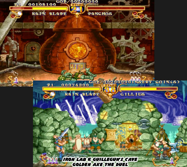
The industrious dwarfs lived in caves, drank heartily and mined for their resources, yet this didn’t mean that they had sole dominion over the metallurgical arts. The human fighter Panchos was also a steampunk inventor. His stage, set near a gigantic boiler, featured some mechanical creations, including a feminine robot that was ironing some clothes. These were whimsical details but they all added layers to the world Sega was trying to present. They helped frame the characters and show the the world of Yuria was just as interesting as any other fantasy video game world.


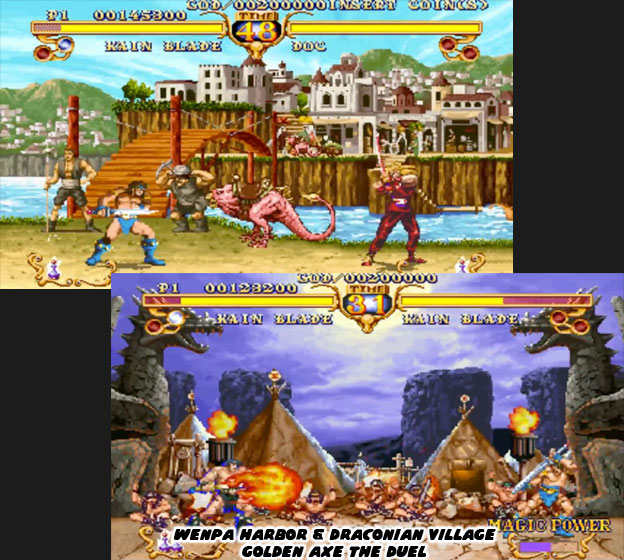
Some of the villages featured in The Duel were trading outposts. They were filled with many colorful characters and weird monsters. These things often called out to earlier games in the series. The towns ranged from open and welcoming to secluded and backwards. Any artist studying level design should take apart the stages featured in The Duel. They might learn a few things about storytelling through the environment.


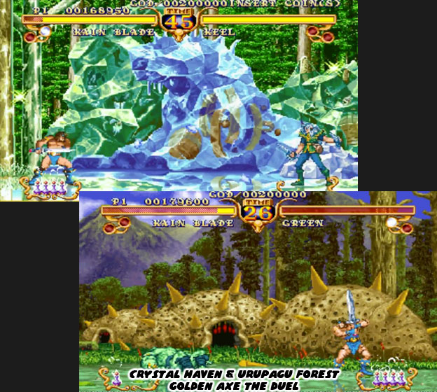
For example look at two of the most exotic places in the game, the Crystal Haven and the Urupagu Forest. There are no places like this on Earth, nor have places like this even been featured in most fantasy movies. Look at the colors used in the stages. The transparencies, lighting, and layers of detail. How long have these places been around? What magic or curse turned them into hideouts for the most desperate villains? How did the stages reinforce the theme applied to the character? The Crystal Haven was an oddity, there were inventions, ships and even people frozen in crystal. It was the stage for Keel, a mysterious Dark Elf that had mage control over water and ice and could even shape shift into liquid. Did he create the stage or did he discover some form of magic while exploring it? Urupagu Forest seemed equally exotic and just as dangerous. There was a cloud of swamp gas floating in the background, the settlement in the background seemed to be made of a giant husk covered in poisonous barbs. Its resident fighter was a savage man named Green who was also covered in poisonous barbs.


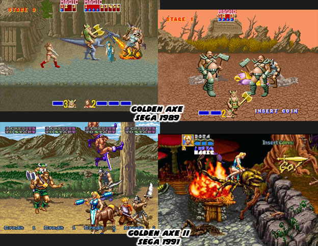
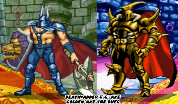
Golden Axe The Duel had an advantage over Virtua Fighter when it debuted. Sega had been in operation for decades and they had name recognition on their side. Although they did not create the first fighting games Golden Axe the Duel was part of a legacy almost as old as Street Fighter II. The Duel was borrowing characters and canon from one of the most influential brawlers of all time. Of course I am referring to the original Golden Axe. In 1989 the brawler, sometimes called the beat-em-up was growing by leaps and bounds. That year saw the introduction of three important games, Golden Axe, Nekketsu Kōha Kunio-kun (River City Ransom) and Final Fight. Of the three games Golden Axe was the only one based in a swords and sorcery world. It had influences, including audio cues pulled directly from the film Conan. The game featured three adventurers, Ax Battler, Gilius Thunderhead and Tyrus Flare. The three warriors were on the hunt of the giant known as Death Adder. The game was considered a godfather of the hack-and-slash sub-genre.


Golden Axe was one of the first brawlers to feature mounts as well as branching paths. Players could explore the world of Yuria, the tiny outposts, small villages, castle ruins and even find themselves riding atop a giant eagle or sea turtle. It was very much ahead of its time. The game was very popular in the arcade and would get released on multiple consoles and the PC. It would get a number of sequels that expanded on the canon established in the first game. Some of the sequels featured just one or two of the original characters yet all of the games were related in some way.


Sega hoped that the Golden Axe name would bring fighting audiences around. It worked for the arcades that did have the title. Despite pulling influences from Street Fighter, it was closer to Samurai Spirits/Shodown games from SNK in that the characters all fought with swords. The fighters all had unique special attacks using their specific fictional martial art. The “super” attacks were the results of using magic vials. The magic system had been established in the early brawlers and this simply carried the tradition over. Characters that were not wizards or spell-casters could still use magic, they did this by using bottles of magical potion that summoned dragons, monsters and even earthquakes. It was a unique gameplay mechanic that hadn’t been explored in any other fighting game.


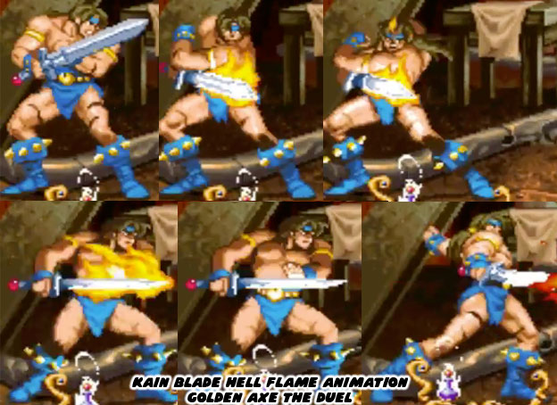
The game used a sprite-based graphics engine, as did the majority of fighting games of that era. Where Sega separated it from the crowd was in the scaling of the sprites and stages. There was some scaling technology used in the Samurai Spirits titles as well. The engine used for The Duel allowed for an extreme degree of scaling. It also allowed for transparencies and other effects to be rendered in layers on screen. This graphics engine was superior to the one that Capcom had used in Street Fighter II. The artists at WOW Entertainment tried to make the most out of the extensive color palette. They tried to preserve the design aesthetic of the series, based loosely on the fantasy paintings by Frank Frazetta. When Kain performed his flame attack for example the colors used on the sprite created the illusion of shadows, and reflections on his skin. It was a brilliant detail on the otherwise two dimensional character.


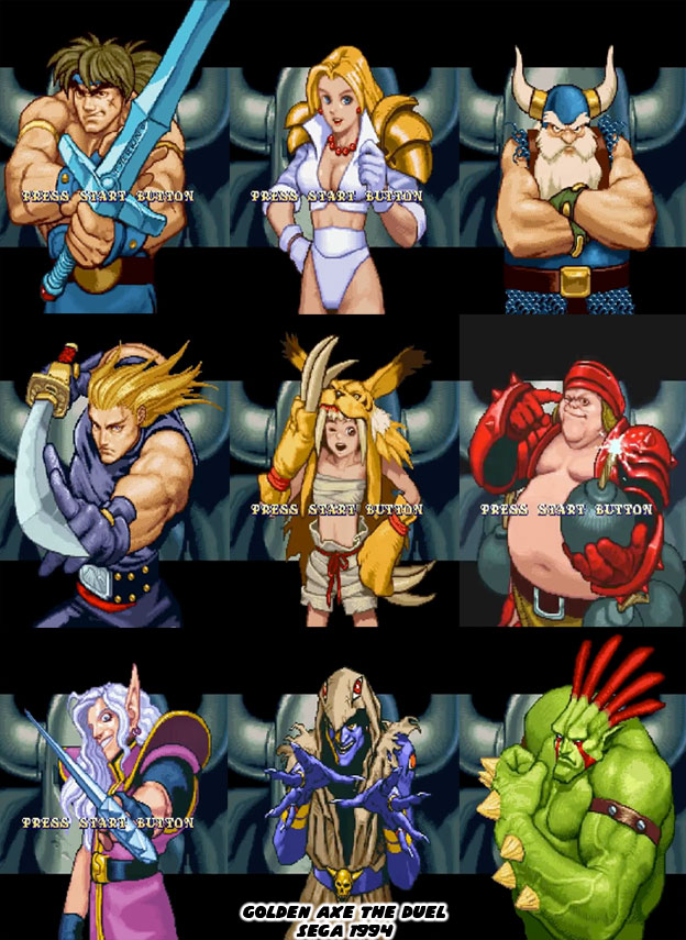
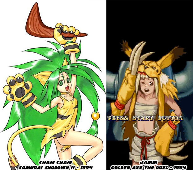
Despite the bold sprites the cast was filled with tropes. The first three characters mirrored the heroes from the original brawler. Which was fine but some of the other characters were a little bit questionable. The feral, jungle-girl character Jamm debuted at about the same time as Cham Cham from Samurai Shodown II. Few people could say they ever saw Jamm in a game but an entire generation remembers Cham Cham. The amazonian character was revisited again with Rila Estansia from Breakers, a Visco title from 1996. Again, not many fighting game fans remember these wild women, save for Cham Cham. 


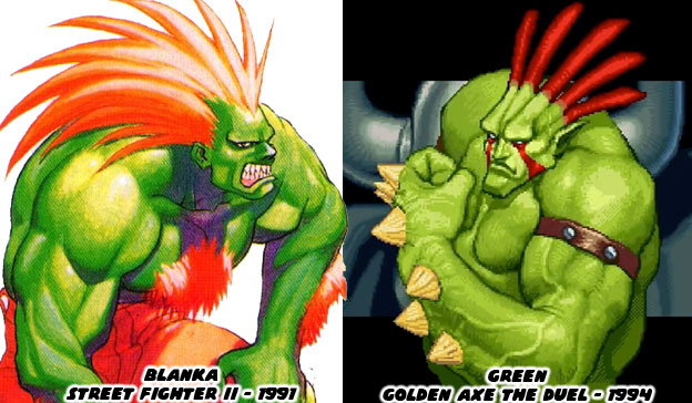
Golden Axe The Duel made a critical mistake. It broke one of the cardinal rules of fighting game design and stole the look of a character. This was obvious with Green, a wild man that wanted to become human and be with his own kind. In look and temperament he was almost a dead-ringer for Blanka, the Brazilian wild man from Street Fighter II. This blatant rip-off hurt the credibility of the publisher.


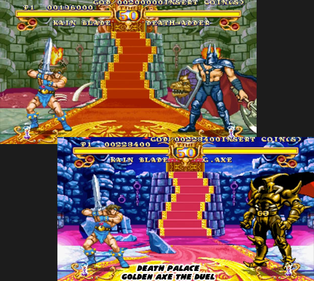
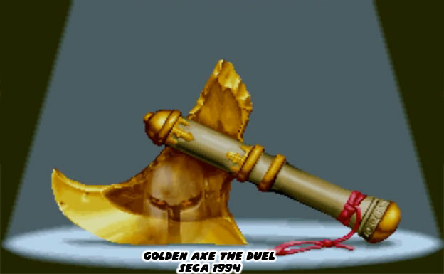
Sega tried to create a diverse cast with different moves and abilities to appeal to the fans of the genre. They even made the main villain of the original game, Death Adder into a boss character. They were acknowledging the Golden Axe legacy while creating a lineup that appealed to everyone. Where they really surprised audiences was with the true final villain in the game. Death Adder was a powerful opponent but he was subservient to the magical Golden Axe.


It turned out that the axe could manifest itself as a golden armored warrior. The magical creature was even bigger than the already gigantic Death Adder. Every character had their own reason for wanting the Golden Axe. Some craved its power, some feared it. Others wanted to seal it away or use it as an ingredient in a magical spell. Whatever the reason it pushed the plot of the game forward and helped add more dimension to the universe that Sega had created.


Sadly it would be the only fighter based on that universe. The majority of the characters, locations and canon featured in The Duel would not return in other versions of the franchise. Those that enjoy emulated fighting games should check it out and see how it stacks up to other fighting games from the era. Those that enjoy diverse themes and presentations might also get a kick out of this game.


Did you get a chance to play this in the arcade? Were you a fan of the Golden Axe series? I'd like to hear about it in the comments section. As always if you enjoyed this blog and would like to sponsor me please visit my Patreon page and consider donating each month, even as little as $1 would help make better blogs and even podcasts!
 follow the Street Writer on Patreon!

Sunday, January 8, 2017

The CoolRain Interview

This is a reprint of an interview I did in 2008, the reason that I am posting this again is because the artist will be showing at the LA Art Show during the second week of January 2017.

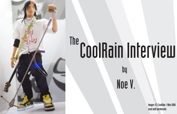
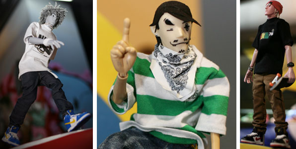
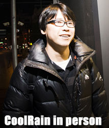
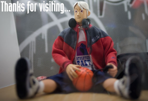
Lee Chan Woo is a South Korean figure artist better known as CoolRain. I first learned of him via Victor aka Crazytoyz 0709's web page and forum. When I first saw Coolrain's art I was reminded of Michael Lau, yet also saw some elements that made him unique. Like Lau his inspiration is part street culture and part reality. If Michael has his pulse on global street culture then CoolRain's figures are closer to home and more intimate.

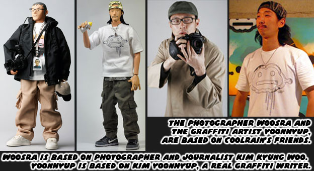
For example photographer and journalist Kim Kyung Woo is the inspiration for the figure Woosra. His other friends are b-boys and as such are also inspirations for these stylized figures. CoolRain has been active in the community since 2003. He cut his teeth recreating Lau's classic Gardeners before finding his own look. Now after building a following and client list that includes several large companies and having several gallery shows it is my honor to present his first English interview. 

Noe V.: Hello Coolrain, welcome to my 1UP blog. Before we get to questions about your figure art I think we should get to know a little more about you. Please tell us little bit about yourself. What are your hobbies? 

CoolRain: I like collecting figure and artbooks. Also fan of SF movie and animation.

NV: What were your favorite toys as a kid?


CR: I was fascinated with super-heroes such as superman, batman and so on.

NV: Were you into cartoons, comics or animation as a kid?

CR: Genres didn't matter. I liked cartoons, comics or animation all.

NV: Did you play sports?

CR: Yes, I liked to play Basketball. And there are many basketball players I loved. 

NV: Did you have any other hobbies like playing music or collecting things?

CR: I collect art book, illustration and movie book.

NV: Who were your favorite characters or which were your favorite shows?

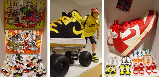
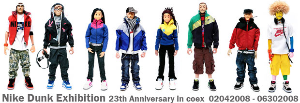
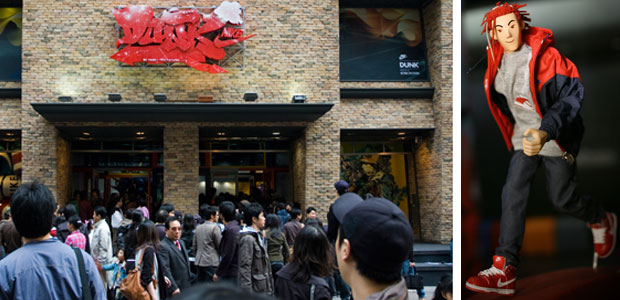
CR: I like my 1st design figure series "Monsterz Crew". I love Dunk. Of course my favorite shows are all related with sneakers, especially Nike dunk exhibitions.

NV: Are you also into computer or console videogames?

CR: I don't play videogame. But I make game. This is irony. But I like game images and animation.

NV: Which were your favorite games and why?

CR: I love Final Fantasy. I liked characters and images in it. 

NV: I understand that you are an artist and animator, which schools did you go to or are you self-taught?

CR: I have been self-taught. No teachers, only my curiosity was my teacher. At beginning, I couldn't find enough books, so I used to study watching Videos and books in English. Mostly I gathered a lot of information through movie-related books(creature art book).

NV: Can you say which company you work for or which projects you have worked on?

CR: Nike, KTF (Korean major mobile phone company), Motorola, Adidas, SAKUN (Korean street brand), Delitoys, etc. And some projects with making original character building (Figure style) and also works of CG in CF clips.

NV: You've been building a name in the figure art community for the past few years. Can you tell us how you got started in that?

CR: I started as 3d animator. My dream is still producing animation. That explains why I like main characters in animations. First I made characters with CG, that led me to think "I want to make them by hand." That's how I got started making figures. 

NV: Who were your influences within the figure art world as well as from outside the community?

CR: Before I made figures, I started to collect them. Those were design figures of Michael Lau, Eric So and lovely ones of Nightmare before Christmas of Tim Burton. Basically I like their works and colors. Besides that, I love the works of Otomo Katsuhiro, who is genius comic animator and also illustrator.

NV: Was it hard or easy to make the transition from 2D to figure art?

CR: In fact, 3d modeling and 2d sculpting are similar in some ways. So I didn't have much trouble to transite from 2d to 3d. Only difference is finishing part. Like the project with Park, Ji-sung(Manchester United Korean Player), modeling 3d real object was first experience. But it was not such a burden because I had some experiences with 3d works.

NV: What things did you have to learn along the way? Were there any parts that you took for granted or found difficult to do?

CR: To be a good figure artist, 2d and 3d is just a matter of technique or methods. But I found out that most important work for figure-making involves meeting with people, talk with them, understanding the world of their minds. It needs human- relation skills and manners too. You have to respect them and love them. Easy to say, but not simple works. If I understand them better and know their minds, the result came out much better always. 

NV: Did you ever consider creating traditional super hero figures, action figures, soldiers or space men or was street culture more natural to you?

CR: I am crazy for the super heroes, space suites for astronauts. Someday, I am going to make them someday. Space suites are my works in my dream all the time. 

NV: Some of your figures, the "Monsterz Crew" is based on a b-boy group. Do you or your friends breakdance?

CR: Of course, the models of Monster crew are the top-notch B-boys. Some of my friends are rappers, B-boys, and graffiti artists.

NV: I understand one of your friends, Kim Yoonhyup, is a graffiti artist, have you ever experimented with graffiti art?

CR: I like and admire their works and themselves. I try hard to experience them and see them work on their projects.

NV: Critics would say that you are copying from Michael Lau, with the use of Hip Hop themes and street clothes in your figures. Which isn't fair to say because other artists like Tim Tsui, Jason Siu, Pal Wong and Eric So have also followed similar trends. Have you ever had to defend your work from critics?

CR: Thanks for comparing my works with Michael Lau. ~ I respect Lau a lot. My work experience is just beginning. Of course basic materials for my works are the similar ones (leather or suede hair and sneaker). Also sometimes my works centers on similar concepts(Hip-Hop themes). My work and I are in constant progress and evolution. All of my hand-made methods are time consuming and challenging physically. That's why I love this way of work. Whenever I see the results, I feel some sort of catharsis.  As a figure artist, I am just beginner. I have a lot of things to do in the future. I usually don't pay attention to all the critics much. I just want to follow my curiosity and work with the styles that I want. My next theme could be urban culture or maybe totally new ones. I just enjoy what I am doing right now. I don't know how long could I pursue my career as a figure artist. It could be years or tens of years. I just love to make figures and hand-made sneakers.

NV: Have you had to defend your format from people that think figure art is just a passing trend or not as credible as a sculpture or canvas painting?

CR: That's not the issue I care about. I do collaborate with sculpture artists and painters for the shows or some specific projects together. For every artist, the difference is just tools they choose to express their idea and thoughts. My canvas or tool is the figure. With figures, I can do my best to express my ideas.

NV: What do you think defines art?

CR: Definition for art depends on every people's mindset. If someone can express something with any means, it's art, I think.

NV: Is there a difference between toy, craft, art or collectable?

CR: It depends on anyone's thought. For someone, it could be toy, craft, art, or collectable. It's relativistic concept.

NV: Do you feel that working with Nike and Stussy on high-profile projects has validated your place in the figure community?

CR: I don't know. From my childhood, I like Nike. And I like graphics of Stussy & Supreme. I was happy when I got contact from NIKE. Of course, those working experiences with NIKE and Stussy gave me new horizon for my work career as a full-time figure artist. 

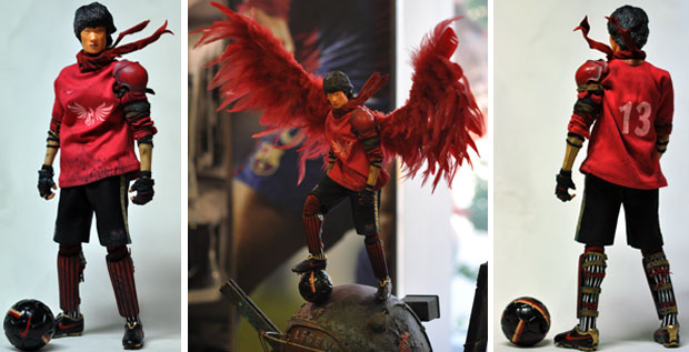
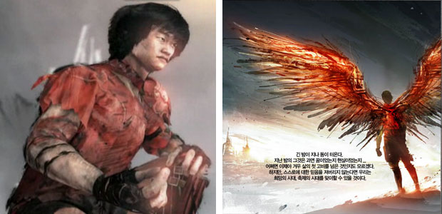
NV: The current Nike campaign in South Korea "Legend of the Phoenix" is built around footballer Ji-sung Park. Can you explain the importance of working on a campaign like that. Turning Ji-sung into a figure and even the symbolism behind the Phoenix?

CR: For the Legend of the Phoenix project, it was planned as congratulation for new release of Jisung Park product releases, the icon and captain of Korea National soccer team and also member of Manchester United team. Final products include 3D animation, graphic-noble and Figures. Each item has been made under the same theme added with each participating artist's own characteristics. It is the first of its kind total campaign in sports star marketing in Korea. Figure was made with only rough images of JS Park, the other forms of artworks are expressions of its kind for Warrior JS PARK. 

NV: How do you challenge yourself when creating art?

CR: To make 100% copy of something is one challenge. But the real challenge is how to put character's spirits in each figures. That's my challenge.

NV: What makes you stand out in the figure world?

CR: Stand out? I don't know well. From the start on, I just tried to express what I like. I like Figures and sneakers. I just like to make it perfect for me.

NV: Explain to us the process of making a figure. How does it begin? What are the stages?

CR: Making figures is not cool at all like nickname.~It's continuity of hard work with many processes. I get ideas of character image from my friends around me. I just pick their main characteristics and from there, I start express them with the scale of 6/1. In details, too many thing to do. Make head and hair pattern with leather, dye them. Work for the graphics for the clothes with computer. Make patterns for shoes. Logos, metal parts, if necessary. Another matching dyeing processes to match the colors of shoes, etc. So many details to do finish just one character.

NV: How many hours or days does it take to make the clothes, shoes, heads, accessories or details like tattoos and logos?

CR: In fact, it depends. Differences with each character. But for the example of hair, if I have to implant every hair, it takes 2-3days just for the hair work. In sneakers with patterns already done, it would take 6-8 hours. But ones with many patterns, 2-3days (In case of air Jordan series, sneakers with too many different detailed patterns). 

NV: How many figures do you make for a particular release, like P-Nix and Che? How long does it take you to make these sets?

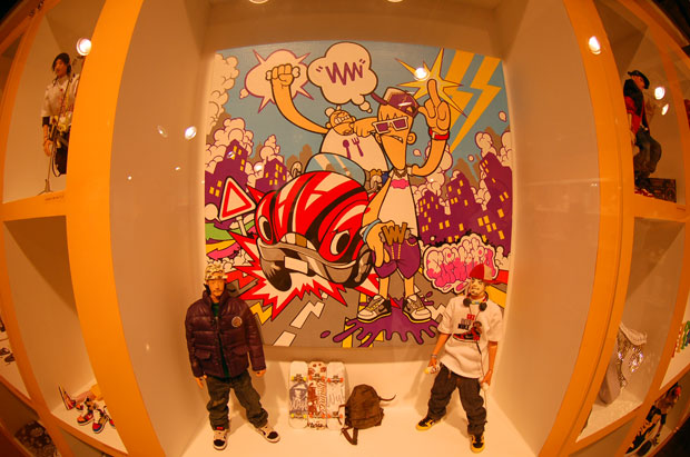
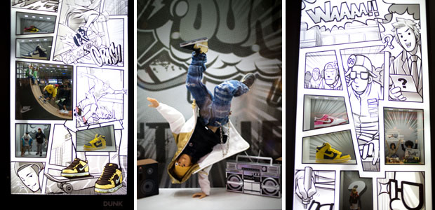
CR: For Monster crew, there are P-nix, Jutt, Che, Speedy finished right now. And next one to add will be Andy. Usually it would take 2- 3 months to finish one character, from idea to mailing to customers. It could take more if there are shows, Nike campaigns, or other extra activities at the same time. Early this year with the projects of Nike Dunk, I made 70 characters on display. For Dunk shoes, finished 100 pieces including the ones released in Korea for the S/S season. Total time for that, 6-7 months, long but worthwhile.

NV: The faces of your figures are very distinct and cartoonish. Are these influences from your work as an animator?

CR: Yes, that's correct. I like animation. That gave my figures a lot of influences. And for the comment, there are some simplified figure heads. They could be customized with simple drawings, like Bearbricks. 

NV: Have you thought about turning your figures into animations or have you already begun working on that?

CR: I love figures and also animations. I can make both of them together. (if I enough time). Actually through shows and exhibitions, I would like to introduce my figures to the people. When I have those shows, it would be a great chance to show animations with actual figure at the same time. I would give people more interests in figures and understanding, hopefully loves for my figures. I have plans in my mind; some of them are in progress little by little.

NV: Would you ever like to produce an animated show or even videogame featuring your characters? If so what types of games or adventures could you see your characters in?

CR: Of course that would be great. It's a work for character to give breath and reality. For Monster Crew, they are B-boyers. So I want them to be nice B-boy game. But before do into the animation processes, I would like to make figures that cover their life styles and progresses with them. I want to express not just fixed b-boying styles, but also their lives with b-boying.

NV: I understand that you are a family man. What do your kids think about your figures?

CR: How did you know... it's secret~ Even though I love figure, I am a daddy of a twin. They are cute babies. For them, figures are nothing but toys. They like playing with my figures and they are happy playing with them. I want to make figures that could be source for joy and smile for the people.

NV: What advice would you give artists that hope to transition from 2D to figure art? Are there any skills they should learn?

CR: Basically similar. So you don't have to hesitate or think it difficult. It's just small difference of methods. 2D or 3D, computer or hand-made is just difference of method. That's it. What's the most important factor is how much you try hard to give it full efforts to make it perfect to meet the standard you pursue for. Work, Work and Work hard. 


NV: Would you advise making friends in the community or finding a mentor to learn from?

CR: If I didn't find figure making, I couldn't make any relations with lots of people that I know until now, The common ground for us is "Love Figures." If you just follow your heart with ones that you like to do, then all the mentors and good friends come along automatically.

NV: How should an artist deal with criticism and how can they stay motivated when there are so many great artists in the world?

CR: The most important thing is to express what you like and what you want people to see. If you have interests in expressing anything as much as you like, you can accept any kinds of criticism with ease of minds. For any works that I do, I have to like and be satisfied with. Self-esteem is my standard for any kinds of my projects. I do work until I am fully satisfied with the results for myself.

NV: Are there any other words of wisdom you would like to leave the people of 1UP with?

CR: Love what you do right now, and just enjoy it. At present the most important thing to do is making figures. Just like that~~ enjoy your life!

NV: Thank you for your time and we look forward to seeing what you have in store for the rest of 2008 and beyond! If you'd like to see some more of CoolRain's work be sure to visit his blog. Please be sure and spread the word to your friends and editors about this artist. I have a feeling that the future is very bright for him! Thanks for visiting! 

As always if you enjoyed this blog and would like to sponsor me please visit my Patreon page and consider donating each month, even as little as $1 would help make better blogs and even podcasts!
follow the Street Writer on Patreon!