Showing posts with label designer. Show all posts

Monday, January 26, 2026

The Future is in Good Hands, the Brian Stupski Interview... A 1UP Classic from Apr 10, 2009

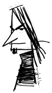
Brian Stupski is an impeccable artist. He is the last interview featured in my car series but far from being the least important. He is the designer behind Problem Child Kustoms (clever name!) a studio that has amassed a solid showing over the years. I first noticed his renderings in Rod and Custom. I didn't remember the name but I remembered the cars. Over time I would see the familiar style in different magazines, like all the great artists, a fingerprint that was unique in the world of auto art. I finally committed the name to memory and tracked down his website and blog. Thanks Google!

Brian has an eye for shapes and designs that perfectly compliment each of the project cars he's asked to render. As with all the great designers he lets enough of the original design cues through while adding subtle layers of changes to the car. Making the ride instantly recognizable but different in a way, more brutal and stylish. Studying his art makes me want to be a better illustrator. Brian is also one of the youngest designers I had the pleasure of speaking with for this series. Like the rest from my generation he still finds the time to play video games even though he's supposed to be focused on his career. He likes his sports, especially hockey and loved his cars. If Brian represents the future of custom design then all I can add is that the future is in good hands.

Noe V. Brian, thank you for the interview. We'll begin with the question I'm asking all my special guests. When did you first get bit by the car bug?

Brian Stupski: I was born into a "car crazy" family, so I suppose that I really never stood a chance of NOT being bit! My father was a mechanic, and my mother really enjoyed cars, to the point of being extremely involved in their car club, and even running the annual show a few times. I was even brought home from the hospital in a muscle car, a '66 Charger.

Noe: What were your favorite cars growing up, any favorites that the parents or family drove?

Brian: A '55 Chevy (my parents were big Tri-Five fans). I had a big thing for Chevelles, '68-'72 and first generation Camaros.

Noe: Did you have any heroes from racing or car culture?

Brian: My hero from racing is Tom (the Mongoose) McEwen. My other heroes would be Ed Roth, Charlie Smith, Thom Taylor, Steve Stanford and Gene Winfield.

Noe: What is your daily driver and what would be your dream ride? Brian:

My daily driver is a Buick Regal GS... My dream ride would be a '69 COPO Chevelle.


Noe: The Big 3 US auto makers are not doing very well right now. How do you feel about their situation?

Brian: In some ways, I can't but feel they brought this upon themselves by giving unions too much power. On the flip side, with people buying foreign-made products and the government backing foreign companies I feel they've been given an unfair shake.

Noe: Some argue that the car companies were hopelessly out of touch with the public, the designs of legacy cars bland and uninspired. If you could redesign a model or bring back a classic which would you choose and why?

Brian: I would bring back Oldsmobile. In doing so, I would concentrate on the premise of that make, which originally was technology and performance. Considering today's emphasis on technology and leaps in engineering performance, I think that it would enormously successful in the present.

Noe: How would the closing or the failure of the Big 3 effect future generations of designers and artists?

Brian: Beyond crashing what remains of our economy, it would require American designers to adopt the aesthetics and techniques currently utilized by foreign carmakers. Obviously, it would change the face of American car design which has always been a unique art form.

Noe: We can't focus on the negative only. Is this a chance for the auto makers to unleash new technology, legacy designs and green fuel to regain their status?

Brian: Most definitely, but you have to wonder how committed they would be to this change when it was brought about my force. I sincerely hope this is the turning of a new leaf and that the new designs in technology will create cars that can hopefully inspire future generations of hot rodders and car designers.

Noe: Let's (pardon the pun) switch gears and talk about your design background. How did you discover your talent for art?

Brian: I always drew as a kid. As soon as I could hold a pencil that's all I would do and it was almost always exclusively cars.


Noe: How did your family or teachers help encourage your talent?

Brian: My family was always very encouraging by giving me drawing supplies and asking me to draw. My art teachers encouraged me by exposing me to artists and designers with whom I shared a similar style. However, math and science teachers were not so receptive. I often heard that, "You'll never make a living drawing cars".

Noe: I've had the good fortune of interviewing legends and personal favorites Thom Taylor, Tom Daniel and George Trosley for this series. Growing up did you have any inspirations from the world of car design?

Brian: Guys like Tom Daniel, Larry Wood, Dave "Big" Deal, Dave Bell and Steve Austin were huge influences. I more or less knew I wanted to design custom cars the first time I saw a Harry Bradley drawing. Add to this my infatuation with CARtoons Magazine and Mort Drucker's incredible character art in MAD Magazine and my future was inevitable.

Noe: Which school(s) did you go to? How important was a formal education to your art and career?

Brian: I studied fine art at a small private college prior to moving on to Buffalo State college. My education and training in drawing, painting and print making gave me an understanding of classical techniques. I think that formal art training is tremendously important, especially with the availability of digital means. I had attended the Art Institute of Phoenix and studied animation and motion graphics prior to completing my formal education at Collins College, where I learned Adobe Photoshop and Illustrator. While I utilize digital techniques in most of my works, I feel that my fine art training adds an extra dimension to my work.

Noe: How did you get work creating renderings for the car magazines? Did you have a portfolio that you shopped around or did you make friends at conventions?

Brian: I started out creating art for local shop projects, as well as my employers. Eventually, I would send samples of my work to editors of magazines hoping for exposure. My first break came at the hands of Damon Lee, who at the time was the editor of Custom Rodder Magazine. From there, I was fortunate to build a reputation for quality work and built a portfolio based on referrals from prior clients.

Noe: Explain to us the relationship between a designer, builder, fabricator and client.

Brian: First and foremost, there needs to be open and honest communication at all phases of the project. It's very important to have all members of the team get along, both personally and professionally. The key is to be able to read your client's desires and tastes and be able to translate this into a design that not only coveys this vision, but can also be accomplished by your builder and fabricators.

Noe: Your work compliments traditional hot rod designs while also giving a nod to modern racers. We see the familiar big engine blower on some designs but incorporated on a car that's closer to the ground with larger wheels, big brakes and a profile more familiar to a street racer than a 1/4 mile monster. How do you bring the classic and modern worlds together?

Brian: I've always been a fan of artwork that features high contrast or some form of juxtaposed elements. Throughout my fine art training, I was often inspired by the Surrealists and Futurists (Dali, Braque et al,) and try to incorporate combinations of objects or situations that at first glance may seem unnatural but when viewed together make perfect visual sense. It's fun to blur the lines of traditional and modern and in doing so, forget any rules and just create a cool car. I think that if you carefully toe the line, you find ways to stretch the envelope, and can, more or less, drag in a traditional style to a big, modern wheel and so-on. The trick is to balance the two themes, and have respect for each.


Noe: Your company has been building a name for a few years. What are the things you look for when redesigning a classic car? What do you hope to accomplish? Is a television show or Hollywood wedding in your future?

Brian: When redesigning a car, especially a popular classic, I try to compliment the original design but still make a unique statement. Every change needs to serve a purpose. The fun is in making changes that may not be immediately recognizable. I especially enjoy it when a design inspires a double-take or when the changes flow well enough that they go unnoticed. I would love to pursue my other dream of writing comedy for film and television...but my wife may frown on me having a Hollywood wedding! I'm a fairly private person, but might really enjoy a stab at hosting a TV show about cars, design, and the lifestyle in general.

Noe: Who were some of your favorite clients or which were your favorite projects?

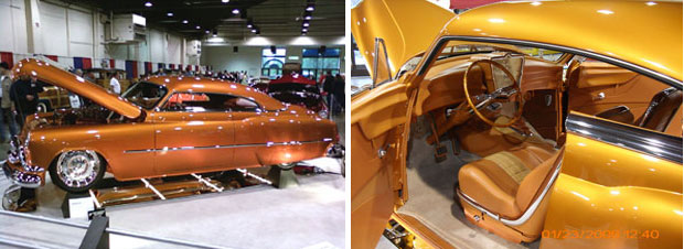
Brian: When the check clears, I love everyone equally. While I've been fortunate to work with some of the biggest names in the industry (Rad Rides By Troy, Recovery Room, ProRides, Chrome Shop Mafia) it's often the low-buck or personal projects of private clients that can prove both challenging and incredibly rewarding. I just finished an 1952 Buick project that will debut at the 2009 Grand National Roadster Show, which blurred the line between private builder and well-known shop, and was as close to "dream clients" as I've ever been. That will always remain a highlight of my career, as the team of owners, builder and myself as designer meshed throughout the process.
 

Noe: The mind-scrambling A-Tona is my favorite of your designs, which of your cars would you most like to see made into reality?

Brian: Thanks! Either the A-Tona because it's such an over-the-top cartoony hot rod or the Mahi-Mah-Tee, my personal take on the 1960's era show rod. While I'm commonly known for my more subtle designs, both of these vehicles represent my wilder side, and have a definite "in-your-face" nastiness and fun quality... They're really a metaphor for what this whole industry is about.

Noe: If you could pick a designer to work with, past or present, who would it be and why?

Brian: Larry Erickson or Harley Earl. Both are legendary...imagine working with both in one room. Between Harley's iconic designs in the '50's that defined GM to Larry's modern day reinterpretation of design at both GM and Ford. It would be design without bounds... of course, having coffee with legendary French coach builders like Figoni et Falashi wouldn't make for a bad morning, either!

Noe: Being a good artist does not a professional designer make. How important is it to know your history and cars before making a career out of design?

Brian: Tremendously important. If you don't know your history, how do you know where you're going? If you don't understand the logic behind the original design, improving upon it is almost impossible. Like anything, the more information you have the better decision you can make. Anyone can change something for the sake of changing it but someone in-tune with the raw materials before them can create a true work of art. My professional background is in the auto industry, and centered around parts and service... That hands-on training and experience has proven invaluable when designing a project, and affords me insight that someone trained in only drawing cars doesn't have. I can supply part numbers, references, and even estimate build times for components or modifications... It's proven to be a great added value for my clients.

Noe: How important is a solid foundation in art for developing the right techniques?

Brian: Knowing the traditional tools, how to use them and being trained in classical techniques gives you a better opportunity to express your vision. Once you master these, the world is wide open to break the rules and develop your own style. I've found that my education in painting and life drawing have had a profound influence on the way I apply my skills to the digital tools (using them more like traditional paintbrushes and pencils, versus pixels and vector shapes). Understanding the basics gives you a solid foundation to grow on, and really leaves a wide open path to find a unique style.

Noe: What advice would you give budding artists that are thinking about a career in professional design?

Brian: Study Dentistry instead - much more lucrative... Seriously, though, have fun with it, and accept that it won't always be fun, but know when to recognize when opportunities arise that ALLOW for that fun, and make the most of them.

Noe: What about learning the basics?

Brian: Devour all you can. Take life drawing classes, painting, any fine art classes. There's no substitute for formal training and practice... Draw every chance you get... Simply relying on the technology to draw for you is a waste of potential, and to become truly good at anything requires dedication and hard work.

Noe: What about building a portfolio?

Brian: Be as diverse as possible. Include works from all media. The broader your appeal, the more creative work you will attract, and the more influences and inspiration you can bring to the table with every piece you create.

Noe: How about schools?

Brian: Look for a school with a balanced program, of both traditional techniques as well as classes in modern technologies. Seek instructors who have varied interests and backgrounds so that you may incorporate their experiences into your own work, and above all when in school make it your number one priority.

Noe: Last but not least, what about originality?

Brian: Goes without saying, having an original style or technique will give you a distinct advantage. Simply copying someone else's style will subject you to a career filled with statements like, "Oh your work looks just like So and So's". Be prepared to improve your style and push it to evolve as others will very often copy your style.

Noe: I have to tie this interview in with videogames or my friends and readers might have a fit. Do you play videogames? What consoles?

Brian: PS2, Wii and my all-time favorite 3DO (does anyone else still love this thing?). I have a fascination for the more "old school" fighting games like Street Fighter, Way of the Warrior (reason alone to buy an old 3D0!), and sports games like Madden Football, and the NHL-sries from EA Sports... man, I love me some Hockey!


Noe: Do you have any favorite games, systems or gaming stories from growing up?

Brian: I love Super Mario Brothers and being a big hockey fan I really enjoy the EA Sports NHL franchise. Growing up we'd play the Atari 2600 almost non-stop, and bike rides to the local arcade strengthened my wrists for countless hours of drawing cars.

Noe: Would you like to design cars for a videogame some day?

Brian: Most definitely. I think the world is ready for a REAL hot rod inspired game, and I think it would be a blast to be a part of a project like that!

Noe: Are there any titles you look forward to playing, or any projects you would like to be involved in?

Brian: I would love to be involved in a "Top Gear" based game. Or more realistically, the Need for Speed series... As far as new games, I'm looking forward to playing Resident Evil 5, Mass Effect 2, Street Fighter IV, and God of War III.

Noe: A few of the artists I've interviewed had hobbies outside of gaming, they built models, R/C cars and racing carts. Are there any hobbies that you've never outgrown?

Brian: Model car building has always been a focus in my life, painting, building custom surf boards and model railroading. As well as playing with my thee boys and two dogs. Also, making obscene gestures at people in traffic is a fun diversion... To some, it's a simple gesture, to me, it can be art. Am I allowed to say that?

Noe: You are one of the youngest artists I am interviewing for this series. Your legacy in the car community is still being built. At the same time you represent the future of the culture. What lessons have you learned from the legends?

Brian: Having really good hair seems to be a common trait amongst the greats. I mean, man... Foose has inhuman hair, and Thom's is hair you immediately picture when you think of hot rod design... Seriously, developing a unique style and consistently presenting the work with a reverence to history is extremely important. Add to this, an ability to promote yourself and have your work sell itself, especially in today's web-centric society is a key to success and offers opportunity that our predecessors did not have... the key is to market your talents properly, and not under-sell... If you price your work too low at the start, you'll only make that hill harder to climb later.

Noe: Where do you see the future of hot rod and custom culture headed?

Brian: With the economy so shaky and people getting back-to-basics I see a return to the more traditional do-it-yourself style of hotrodding with an emphasis on superior quality. The popularity of hot rod-themed television shows, and the accessibility to top named builders will help to inspire this new level of quality.

Noe: What are the short term and long term goals for your studio?

Brian: Short term - to feed my family and keep a roof over our heads while creating top-notch work for our clients. For the future I'd like to expand the studio to encompass lifestyle-related products as well as a full line of hot rod and custom parts and accessories, perhaps one day expanding to many locations via franchise opportunities.


Noe: Do you want to give any shout outs or props to your co-workers or sponsors?

Brian: I've been fortunate to become friends with some of my heroes, one of these being Charlie Smith who has become not only a good friend but a mentor. I'm fortunate to have support of clients who not only share my vision but inspire me to push harder. It's incredible to work with skilled builders like Zane Cullen and Tim Strange who can take an idea from paper to reality and absolutely nail the design. I've been very fortunate to make friends who design hot rods for a living, such as my good friend Jimmy Smith. Also, the talented Dwayne Vance who recently bestowed the honor upon me or including me in a book which features many of my heroes... Working with manufacturers like Billet Specialties (hey, Scott!) has opened countless doors, and the always helpful Tim Bernsau and Kevin Lee at Rod and Custom Magazine have been tremendously influential in helping to get my work into the public eye.

Noe: That just about does it for questions, any words of wisdom for the people visiting on 1UP?

Brian: In the modern day, and considering our future economy, networking and partnering with those in your industry is a necessity for survival, now more than ever. Gone are the days of cut-throat competition. If you're fortunate to do something you love for a living show it by creating the highest quality work you're capable of and use your networking and partnering connections to push your work even further. I believe that those who choose to go it alone, or pick fights in the new economy will be left behind, and that partnering with other professionals to compliment your own skill set and work will pay off in huge ways. Above all, have fun with it.

Do you have any artists or designers that you admire? Tell me about it in the comments section. As always if you enjoyed this blog, and would like to sponsor me please visit my Patreon page and consider donating each month, even as little as $1 would help make better blogs and even podcasts!

follow the Street Writer on Patreon!

Monday, October 21, 2024

Generations of Hulk creators, part 4...

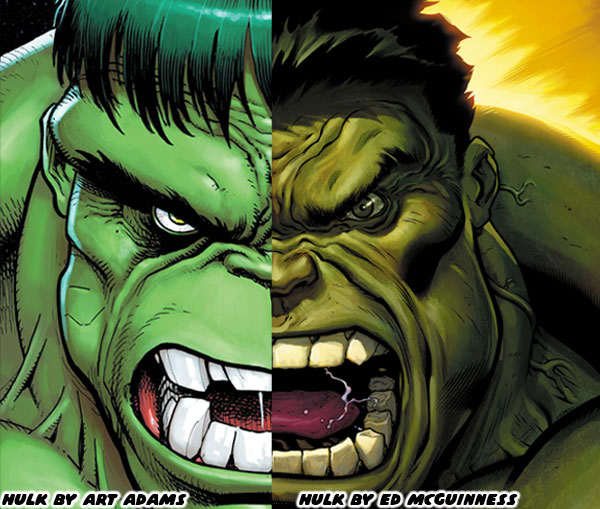
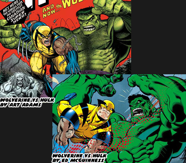
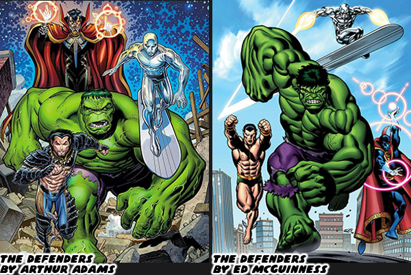
In the previous blog I talked about how John Byrne taught a generation of young artists how to draw powerful characters in comic books. Mr. Byrne drew both the Hulk for Marvel, and Superman for DC. Arguably the two strongest characters in comics history. He presented a version of the Hulk that wasn’t vascular, or swollen like a bodybuilder. Instead he was built like a monster. Proportionally larger, wider, and heavier than any typical human physique. It worked for the character, and was the style adopted by the heir apparent, a young Australian artist named Dale Keown. Dale would slowly add his own details to the character, making his muscles better defined, changing the shape of his head, and various proportions. In the end he created a template that would be copied by further generations of Hulk artists. Yet if I were to be fair he wasn’t necessarily the most influential of all the Hulk artists. That distinction more than likely belonged to Arthur “Art” Adams. He was highly regarded as the peak monster designer across all modern comic books. He had few peers capable of rendering unique, highly-detailed monsters. But that wasn’t the only thing he was known for.

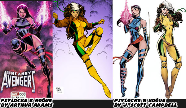
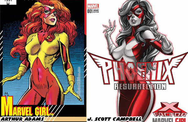
The comparison between John Byrne, and Dale Keown was not an original observation. I believe it was Wizard magazine in the early ‘90s that was doing an interview with someone in the industry. Their name sadly escaped me. The interviewer was talking about how the new crop of comic book artists were changing the industry. That idea was countered with the idea that the new generation were more refined version of the previous illustrators. The person said that John Byrne was a great Hulk artist, but if you look at Dale Keown you could tell that he was following directly in his footsteps. The difference was that Keown’s monster was more refined, and powerful. Keown was improving on the work of the master. He mentioned that wasn’t the only example he could give. He said that J. Scott Campbell, the person that created the highly popular Gen13, and Danger Girls was known for his sexy female leads. He mentioned that the shape of his women was a refined version of the girls that Art Adams drew.

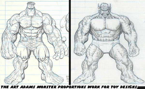
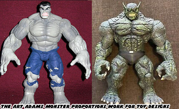
When I read the interview it blew my mind. The observations were spot on. As an artist I could tell that Keown, and Campbell were clearly influenced by the creators that came before them. The were not copying or poaching individual panels or illustrations of Byrne or Adams. They instead had their own distinct pencils, rendering techniques, proportion, and anatomy. Keown, and Campbell’s own unique style came through as if they were understudies to the greats. Campbell for example used less lines to define his figures, he gave his female characters thinner lips, and smaller feet, but the shape of the women he drew, their hips, and long legs were clearly influenced by Adams. The thing was that Adams was a great designer across the board. Not just with traditional men, and women, but also with monsters. This was something that Campbell was not known for. When Keown ended his run on the Pitt, and went into semi-retirement Adams continued to illustrate the occasional Hulk story. I was so happy whenever he did that. My brothers knew that I considered Keown the best Hulk artist ever, but Adams was a close second. Their two styles perfectly complimented the character in every way. Adams was such an accomplished draftsman that his designs were eventually used to create several action figures. This included the Hulk, and his equally massive rivals like the Abomination.

The comic book action figures that I grew up with in the ‘80s were very simplistic, and cartoonish. When Todd McFarlane started releasing his own comic book accurate Spawn action figures in the ‘90s he forced the industry to catch up. This meant that ToyBiz, Hasbro, and the other companies reached out to comic book artists to design entire toy lines. Adams worked within the scale of the particular series he was tasked to create. Whether he was designing monsters for 6-inch figures, or larger scales he made sure that they looked accurate when standing alongside the traditional figures. He would draw renders on comic book art boards, and submit them for review. He would do complete turn arounds of the characters. This was so that a sculptor working with a toy studio could recreate the design. He would include suggestions for different heads, and facial expressions as well. Depending on the project he would even create a costume, and accessories for the figures. Sometimes the sculptors would follow the designs to the letter, and other times they would change some elements, either to make sure the character could balance on its own, or to shave off some weight to make it less expensive to produce.

There was no doubt that Adams influenced countless generations of comic book artists with his work in comics, and now even toys. If Keown could be considered an evolved version of the Byrne style, then who could be considered an evolved version of the Adams style? Mr. Campbell already took up the mantle with his female designs, but what about the monsters? I would argue that at least two Hulk artists were heavily influenced by the icon. One of which was Ed McGuinness. Ed was so good at rendering the Hulk that I thought it was absurd he wasn’t given the keys to the Incredible Hulk in the late ‘90s after Keown had fallen into seclusion. McGuinness was anything but a copycat artist. He was evolving the format as all the greats had before him. He started by melding the classic proportions of Adams, with the unique physiology of game designers like BENGUS, and heavy inks which were distinctly his own.

Many comic book fans, myself included would testify that McGuinness was born to draw the Incredible Hulk. He did a couple of issues in 1998 featuring the Hulk being captured by the Circus of Crime. Right away his exaggerated cartoonish style really stood out. Then different artists took over the book. McGuinness never seemed to land on the radar of the editors at Marvel when the Hulk was concerned. He gained notoriety working on the Superman/Batman Public Enemies run for DC in 2003-2004. This was turned into an animated movie in 2009. His chiseled physiques instantly stood out among all the superhero books. They even ended up being recreated in toy form. Fans that saw his hyper-muscular figures knew that would be a perfect fit for the Hulk. When he found work at Marvel he drew on Deadpool, Spider-Man, Wolverine, the X-Men, and the Avengers. It seemed that the studio was willing to use him on every comic, except the one he was destined for. The fact that he couldn’t seem to land on a Hulk book was driving me crazy. Whether intentional, or accidental he kept being overlooked as Marvel cycled through different Hulk artists over the early 2000’s.

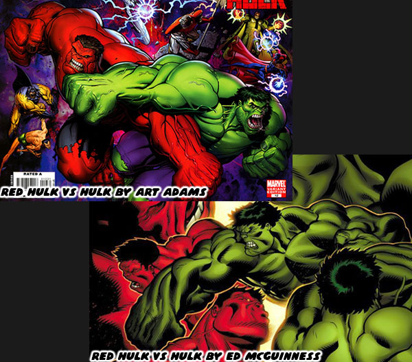
Eventually he got the call from the men at the top. It was announced that in 2008 he would finally be put on the Incredible Hulk. The comic book boards lit up online. I was overjoyed with the news. My brothers were happy for me because they knew I was a huge fan. I believed that McGuinness was the only person that could take the books to a new level. Unfortunately I lost all hope when I read where the first arc was going. Jeph Loeb was writing an entire storyline specifically for McGuinness. His plan was to create a murder mystery that would forever change the Marvel U. The “Hulk” was going to kill off the Abomination with a big gun, and turn Rick Jones in to the new Abomination with the nickname of A-Bomb. The actual murderer would be revealed as the Red Hulk. He was going to cut loose on the Hulk, and She-Hulk wipe the floor with Thor, and other cosmic level heroes. Betty Ross Banner would turn up later, and become the Red She-Hulk for… reasons. It made little sense then, and less sense on rereading the series. It was like a terrible practical joke being pulled on the artist, and fans of the series. It pained me to see the fantastic art of McGuinness get wasted on a clone character. His secret identity would later be revealed to be General Thaddeus “Thunderbolt” Ross.

The acts that the Red Hulk performed in the books seemed completely out of place. They were on the edge of being a satire of the books. The first issues where he debuted seemed like a self insert fanfic. None of the events seemed organic. None of the events were plausible for the established heroes, and villains. Even more alarming to me was that Arthur Adams had been called in to draw some of the covers, and illustrate some Red Hulk stories as well. It was a major push by Marvel to make the character relevant. It pained me that two of the best Hulk artists of the past 30+ years drawing an imitation character instead. The Red Hulk was eventually beaten by the classic Hulk, and later on by smaller teams of characters. The Red Hulk never matched the amazing feats that he debuted with. He never again held the same sense of awe, or prominence that Loeb had intended. After a while he was no longer considered a major villain, in fact he was turned into a hero, and lead a small strike force. This sort of villain turn had never been done with any of the Hulk’s other powerful opponents. Certainly not the Abomination, Leader, Juggernaut, Ravage, or the Madman.

In my opinion Jeph Loeb completely misunderstood the mythos of the Hulk. He did not use any of the formats that worked best for the character. He did not use the template of misunderstood monster, reluctant hero, wandering adventurer, or even psychological horror. Instead the post World War Hulk story was a reboot of the character. It felt like Mr. Loeb had the opportunity to flex his authority, and insert a “Mary Sue” that he would feature more than the title monster. Worse yet, he would be wasting the talents of Ed McGuinness. It was the main reason why I just stopped collecting the books. I sadly ended up missing some fantastic arcs written by other authors, and illustrated by new artists. Only recently would I start to catch up. I’ll talk more about it in the next blog. For now I’d like to know if you were a fan of the Red Hulk, or if you thought the series was handled well. Or were there any other comic arcs that left you cold. I’d like to read about it in the comments section. As always if you would like to sponsor me please visit my Patreon page and consider donating each month, even as little as $1 would help make better blogs and even podcasts!
follow the Street Writer on Patreon!

Monday, July 8, 2024

Bengus, the Vampire Savior - A 1UP classic from May 9, 2008

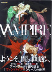
Friends, I shouldn't have to say one more word about Bengus, but I will. Only because I got my hands on concentrated awesomeness last weekend. If you like the Vampire / Darkstalkers series and you like Bengus, honestly, who doesn't? Then you have to get your hands on a copy of the Vampire Graphic File, ISBN978-4-86233-124-3.

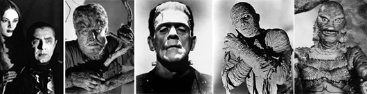
For those that aren't familiar with the game, it is to the classic monster genre what Street Fighter was to legendary fighters. Capcom decided to include as many classic archetypes in the game as they could. There was a succubus, a vampire, a wolfman, Frankenstein, mummy and even gill-man. However the ones featured in the game looked nothing like the classic Universal movie monsters. The Capcom doppelgangers were kung-fu werewolves, wrestling bigfoots and undead samurai. Crazy by anyones standards.

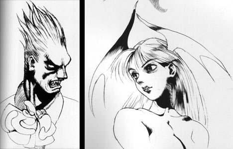
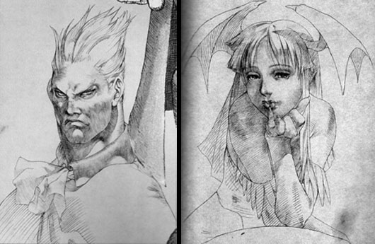
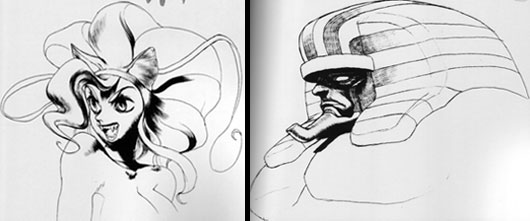
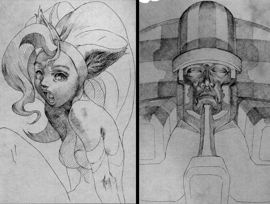
Bengus wrapped those archetypes around his head and came up with designs that were just as unique and memorable. They also included slight nods to their original inspirations. I'm only going to show a small sampling of the illustrations. Below are his pen illustrations of the original Vampire character art compared to his final portraits years later in Vampire Savior.

Notice how bold he was with his shadows in the original Dimitry and Morrigan art. Now look at how far he had refined his style by the time he was finishing his stint producing art.

The style was clearly Bengus and yet there was the sublime genius of DaVinci behind his technique. With nothing but one color Bengus simply shines. Look at the shadows and highlights of his figures. Look carefully at the subtleties of his crosshatching technique.

Even on the more fantastic characters like Felicia and Anakaris he managed to remain playful and iconic at the same time. Look carefully at the expressions on the characters for his original art and then his latter art.

Is Felicia meowing? She has depth and weight, shape and substance. The Anakaris piece is as epic as any classic movie poster. It is part Boris Karloff and part Alex Ross and yet something else entirely. Look at the way he created the illusion of multiple sources of lighting on the head of Anakaris!

MY GOD!

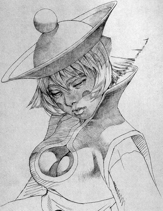
There isn't an artist working in videogames that has ever filled me with such awe. Not any of the greats at Sony Santa Monica or Incog Inc. Not anybody at Nintendo or even Sega. And just when you think that Falcoon, Hyung-tae Kim or the artists at Udon are getting close you go back and reference this art. That is when you realize that the other artists aren't even in his league. Bengus set a standard. Scratch that. Bengus is the standard. He breathed life into the characters featured in Street Fighter and Vampire. He put his stamp on history. If you ever doubt that he was anything more than a cartoonist just look at this illustration of Lei-Lei and then get back to me.

Have a great weekend and let me know what you are up to!

As always if you would like to sponsor me please visit my Patreon page and consider donating each month, even as little as $1 would help make better blogs and even podcasts!
follow the Street Writer on Patreon!

Monday, March 11, 2024

Michael Lau is Urban Vinyl - A 1UP classic from July 13, 2005

Those vinyl figures are everywhere today. When you go to a toy store you notice how they have influenced the design of current figures. You can't walk through a Tower Records without seeing the figures patterend after rock artists like Metallica and the Insane Clown Posse. Maybe it's an odd teddy bear, a robot duck or an oblong monster taking up shelf space.

Why is there a club dedicated to the figures at 1UP? How did 1UP's own SuperJenn get involved in her own collection? I don't know how other 1UPpers got started with their collection. I know where I was the moment that Urban Vinyl first hit on the old Action-Figure website.

I wasn't keeping a pulse on street culture. I wasn't seeking out the next big thing. Six years ago I was flipping through a Japanese magazine when I saw the first "gallery art" that spoke to me.

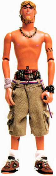
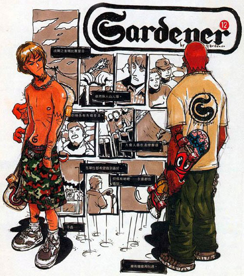
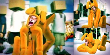
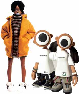
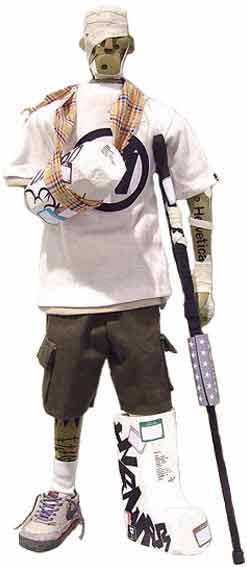
An artist out of Hong Kong named Michael Lau was exhibiting at PARCO in Japan. His medium was unique. Hand-crafted plastic and resin figures that captured a slice of street culture. It all started with Maxx.


I've heard people comment on the attitude, the clothes, the detail... I was impressed by the whole. These weren't just cool figures, they looked like people I knew, they spoke more about the culture I followed than any picture or article ever had. Michael had crafted 99 figures each one as impressive as the last. Each one telling a story.

I wanted to know more.

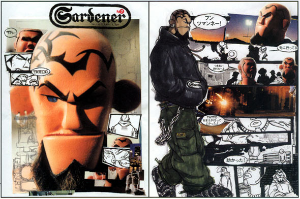
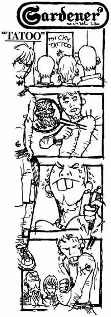
Like how Michael created a comic strip in the magazine East Touch.

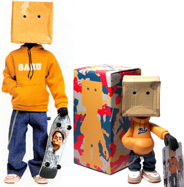
Eventually he modeled several 12" figures on the same characters he featured in the strips. These predated the 1/6 scale figures wearing street fashion that would explode in the 2000's.

His friends pushed Michael into doing something with his figures. Michael didn't realize there was anything to it. Eventually he began working on the original "Gardeners" all 99 figures at about the same time he began sculpting smaller figures and producing them in limited runs out of vinyl... the rest as they say is history.

Michael was too far ahead of the curve. Most of the news I found out about him was either in Chinese or Japanese. So I set about making a webpage for my friends in the hopes that they could help me track down his art.

People that saw Michael's work longed to have a 12" Gardener of their very own. Michael did appease the patrons by offering scaled-down 6" figures based on early Gardeners. It was these 6" figures that are directly responsible for the look, style and craze behind present urban vinyl art. Michael's ambition is to have figures made of the now 103-deep gallery figures.

The secret was out. My page was getting more visits from strangers than friends. Urban vinyl was slowly seeping into our culture.

But Michael is and always will be in a league of his own.

His designs are the most unique of all the figure artists. That's possibly because he was the first one out there and his style was not influenced by any other artist. His figures lend themselves to comic strips as easily as they do animation.

He has been approached time and time again by studios, producers and game publishers about licensing his characters. He has turned down 99.9% of these people (including EA) because they aren't willing to properly represent his art and his characters. He is more protective of his characters than most Hollywood parents are of their children. The man cannot be bought!

Nike has sponsored his last two gallery shows. At the same time he denied the request of an executive at Nike to buy an original 12" Gardener. Sure Michael could always sculpt a new figure but then again it's the principle of the art. Michael Lau don't mess around!


Michael had quickly found himself ranked among the elite artists with street roots. Futura2000, James Lavelle and Hardy Blechman were some of the friends and contemporaries that Michael had made. Michael used the exposure as did other artists to send a message to the leaders of the allied nations before they invaded Iraq. His 103rd Gardener figure was named No War.

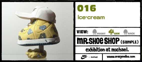
Every time Michael produces a new figure or gallery piece he tries to reinvent himself. At the same time he is always on top of the quickly evolving street world. Only Michael could make sneaker heads flip out over a Nike with an Ice Cream pattern.


If you remember my blog post a few weeks back, Ice Cream's are the hottest property on the sneaker scene. Created by N.E.R.D.'s Pharrell and Reebok. Michael turned the sneaker scene on end when he used the art on one of his Nike figures. "Can it be done?... Oops, it has!"

Michael Lau gives me a reason to collect. No other figure artist can claim that they have influenced my collection.

Michael Lau e-mailed to say thanks for creating the web page... That was crazy! Michael Lau is Urban Vinyl.

EDIT: I created a fan page dedicated to the Art of Michael Lau in the early 2000's. I let the domain expire in the mid 2010's because I no longer had time, or money to keep it going. Although it will no longer be getting updates I have restored it on my personal server for people that want to find out about the Urban Vinyl movementAs always if you would like to sponsor me please visit my Patreon page and consider donating each month, even as little as $1 would help make better blogs and even podcasts!
follow the Street Writer on Patreon!