In the previous blog I talked about how John Byrne taught a generation of young artists how to draw powerful characters in comic books. Mr. Byrne drew both the Hulk for Marvel, and Superman for DC. Arguably the two strongest characters in comics history. He presented a version of the Hulk that wasn’t vascular, or swollen like a bodybuilder. Instead he was built like a monster. Proportionally larger, wider, and heavier than any typical human physique. It worked for the character, and was the style adopted by the heir apparent, a young Australian artist named Dale Keown. Dale would slowly add his own details to the character, making his muscles better defined, changing the shape of his head, and various proportions. In the end he created a template that would be copied by further generations of Hulk artists. Yet if I were to be fair he wasn’t necessarily the most influential of all the Hulk artists. That distinction more than likely belonged to Arthur “Art” Adams. He was highly regarded as the peak monster designer across all modern comic books. He had few peers capable of rendering unique, highly-detailed monsters. But that wasn’t the only thing he was known for.
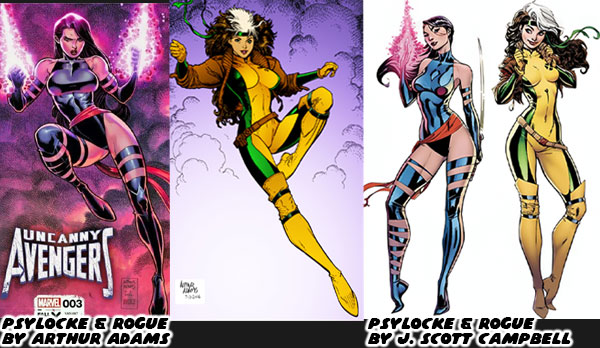
The comparison between John Byrne, and Dale Keown was not an original observation. I believe it was Wizard magazine in the early ‘90s that was doing an interview with someone in the industry. Their name sadly escaped me. The interviewer was talking about how the new crop of comic book artists were changing the industry. That idea was countered with the idea that the new generation were more refined version of the previous illustrators. The person said that John Byrne was a great Hulk artist, but if you look at Dale Keown you could tell that he was following directly in his footsteps. The difference was that Keown’s monster was more refined, and powerful. Keown was improving on the work of the master. He mentioned that wasn’t the only example he could give. He said that J. Scott Campbell, the person that created the highly popular Gen13, and Danger Girls was known for his sexy female leads. He mentioned that the shape of his women was a refined version of the girls that Art Adams drew.
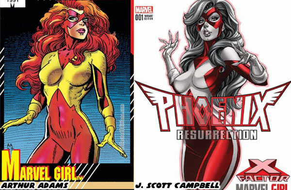
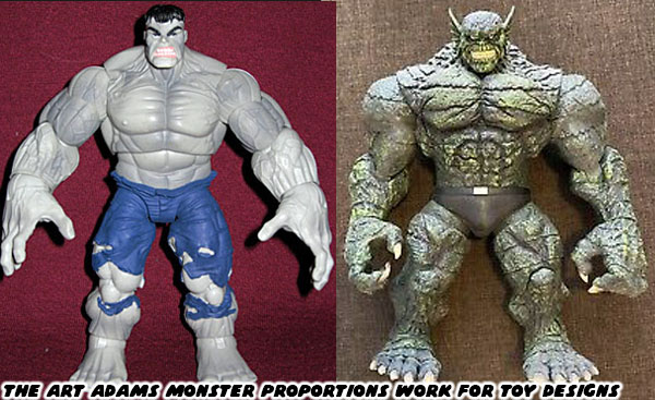
When I read the interview it blew my mind. The observations were spot on. As an artist I could tell that Keown, and Campbell were clearly influenced by the creators that came before them. The were not copying or poaching individual panels or illustrations of Byrne or Adams. They instead had their own distinct pencils, rendering techniques, proportion, and anatomy. Keown, and Campbell’s own unique style came through as if they were understudies to the greats. Campbell for example used less lines to define his figures, he gave his female characters thinner lips, and smaller feet, but the shape of the women he drew, their hips, and long legs were clearly influenced by Adams. The thing was that Adams was a great designer across the board. Not just with traditional men, and women, but also with monsters. This was something that Campbell was not known for. When Keown ended his run on the Pitt, and went into semi-retirement Adams continued to illustrate the occasional Hulk story. I was so happy whenever he did that. My brothers knew that I considered Keown the best Hulk artist ever, but Adams was a close second. Their two styles perfectly complimented the character in every way. Adams was such an accomplished draftsman that his designs were eventually used to create several action figures. This included the Hulk, and his equally massive rivals like the Abomination.
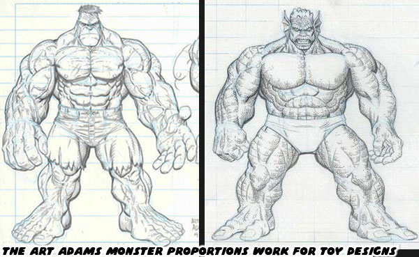
The comic book action figures that I grew up with in the ‘80s were very simplistic, and cartoonish. When Todd McFarlane started releasing his own comic book accurate Spawn action figures in the ‘90s he forced the industry to catch up. This meant that ToyBiz, Hasbro, and the other companies reached out to comic book artists to design entire toy lines. Adams worked within the scale of the particular series he was tasked to create. Whether he was designing monsters for 6-inch figures, or larger scales he made sure that they looked accurate when standing alongside the traditional figures. He would draw renders on comic book art boards, and submit them for review. He would do complete turn arounds of the characters. This was so that a sculptor working with a toy studio could recreate the design. He would include suggestions for different heads, and facial expressions as well. Depending on the project he would even create a costume, and accessories for the figures. Sometimes the sculptors would follow the designs to the letter, and other times they would change some elements, either to make sure the character could balance on its own, or to shave off some weight to make it less expensive to produce.
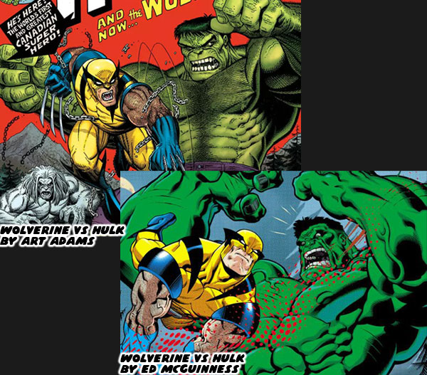
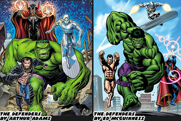
There was no doubt that Adams influenced countless generations of comic book artists with his work in comics, and now even toys. If Keown could be considered an evolved version of the Byrne style, then who could be considered an evolved version of the Adams style? Mr. Campbell already took up the mantle with his female designs, but what about the monsters? I would argue that at least two Hulk artists were heavily influenced by the icon. One of which was Ed McGuinness. Ed was so good at rendering the Hulk that I thought it was absurd he wasn’t given the keys to the Incredible Hulk in the late ‘90s after Keown had fallen into seclusion. McGuinness was anything but a copycat artist. He was evolving the format as all the greats had before him. He started by melding the classic proportions of Adams, with the unique physiology of game designers like BENGUS, and heavy inks which were distinctly his own.
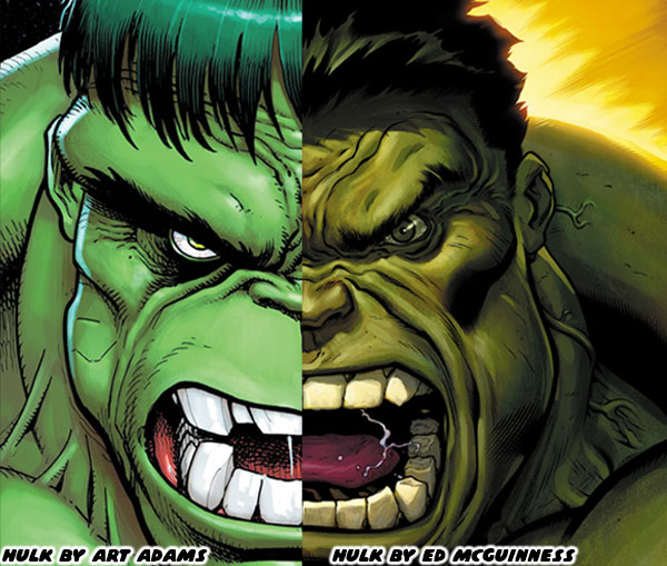
Many comic book fans, myself included would testify that McGuinness was born to draw the Incredible Hulk. He did a couple of issues in 1998 featuring the Hulk being captured by the Circus of Crime. Right away his exaggerated cartoonish style really stood out. Then different artists took over the book. McGuinness never seemed to land on the radar of the editors at Marvel when the Hulk was concerned. He gained notoriety working on the Superman/Batman Public Enemies run for DC in 2003-2004. This was turned into an animated movie in 2009. His chiseled physiques instantly stood out among all the superhero books. They even ended up being recreated in toy form. Fans that saw his hyper-muscular figures knew that would be a perfect fit for the Hulk. When he found work at Marvel he drew on Deadpool, Spider-Man, Wolverine, the X-Men, and the Avengers. It seemed that the studio was willing to use him on every comic, except the one he was destined for. The fact that he couldn’t seem to land on a Hulk book was driving me crazy. Whether intentional, or accidental he kept being overlooked as Marvel cycled through different Hulk artists over the early 2000’s.
Eventually he got the call from the men at the top. It was announced that in 2008 he would finally be put on the Incredible Hulk. The comic book boards lit up online. I was overjoyed with the news. My brothers were happy for me because they knew I was a huge fan. I believed that McGuinness was the only person that could take the books to a new level. Unfortunately I lost all hope when I read where the first arc was going. Jeph Loeb was writing an entire storyline specifically for McGuinness. His plan was to create a murder mystery that would forever change the Marvel U. The “Hulk” was going to kill off the Abomination with a big gun, and turn Rick Jones in to the new Abomination with the nickname of A-Bomb. The actual murderer would be revealed as the Red Hulk. He was going to cut loose on the Hulk, and She-Hulk wipe the floor with Thor, and other cosmic level heroes. Betty Ross Banner would turn up later, and become the Red She-Hulk for… reasons. It made little sense then, and less sense on rereading the series. It was like a terrible practical joke being pulled on the artist, and fans of the series. It pained me to see the fantastic art of McGuinness get wasted on a clone character. His secret identity would later be revealed to be General Thaddeus “Thunderbolt” Ross.
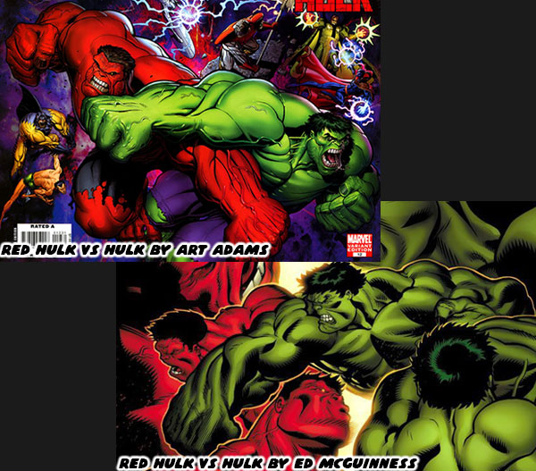
The acts that the Red Hulk performed in the books seemed completely out of place. They were on the edge of being a satire of the books. The first issues where he debuted seemed like a self insert fanfic. None of the events seemed organic. None of the events were plausible for the established heroes, and villains. Even more alarming to me was that Arthur Adams had been called in to draw some of the covers, and illustrate some Red Hulk stories as well. It was a major push by Marvel to make the character relevant. It pained me that two of the best Hulk artists of the past 30+ years drawing an imitation character instead. The Red Hulk was eventually beaten by the classic Hulk, and later on by smaller teams of characters. The Red Hulk never matched the amazing feats that he debuted with. He never again held the same sense of awe, or prominence that Loeb had intended. After a while he was no longer considered a major villain, in fact he was turned into a hero, and lead a small strike force. This sort of villain turn had never been done with any of the Hulk’s other powerful opponents. Certainly not the Abomination, Leader, Juggernaut, Ravage, or the Madman.
In my opinion Jeph Loeb completely misunderstood the mythos of the Hulk. He did not use any of the formats that worked best for the character. He did not use the template of misunderstood monster, reluctant hero, wandering adventurer, or even psychological horror. Instead the post World War Hulk story was a reboot of the character. It felt like Mr. Loeb had the opportunity to flex his authority, and insert a “Mary Sue” that he would feature more than the title monster. Worse yet, he would be wasting the talents of Ed McGuinness. It was the main reason why I just stopped collecting the books. I sadly ended up missing some fantastic arcs written by other authors, and illustrated by new artists. Only recently would I start to catch up. I’ll talk more about it in the next blog. For now I’d like to know if you were a fan of the Red Hulk, or if you thought the series was handled well. Or were there any other comic arcs that left you cold. I’d like to read about it in the comments section. As always if you would like to sponsor me
please visit my Patreon page and consider donating each month, even as little as $1 would help make better blogs and even podcasts!