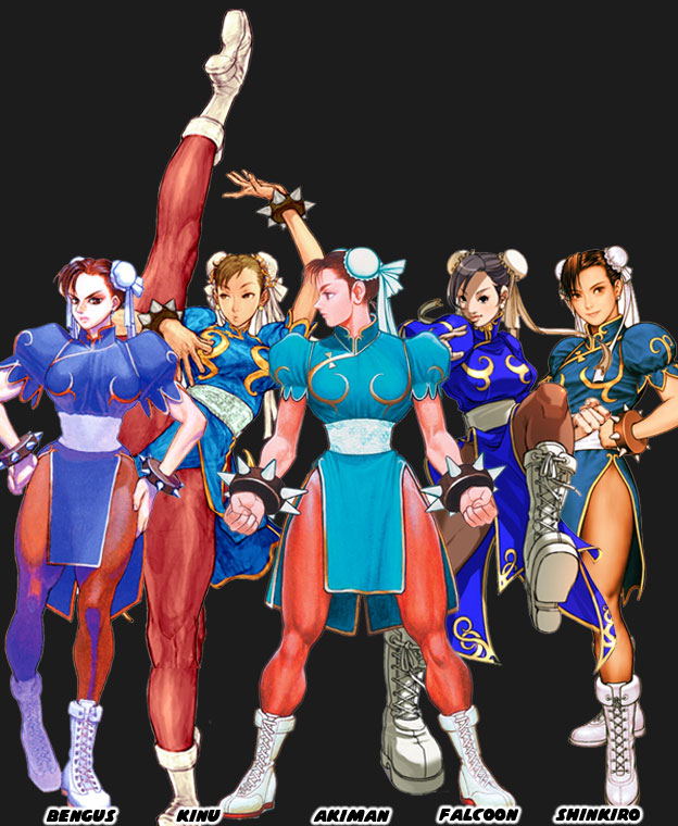
The costume was the same but the style varied widely from artist to artist. Perhaps one artist drew her make up and the other with none. Style also trickled down to the details. Things like how big the spikes on the bracelet should be, how tall her boots were, how slender Chun-Li’s waist was or how wide her thighs should be. All of these things depended on the artist. Once the artist finalized the designs they created turnarounds so they could see the character from all sides. These turnarounds were used for the official character guides. In this way every other artist and animator at the studio could be consistent. Back when fighting games were in 2D is was very easy to capture an artists’ individual style.
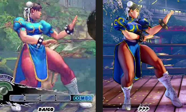
Once the game engines started going into 3D then things got much harder. The proportions used in 2D wouldn’t necessarily work in 3D without making the characters appear grossly disproportionate. This became more obvious as the entire Street Fighter cast was more swollen in SF IV. Suddenly Chun-Li looked like a tank. She was almost as wide as she was tall. This mass made sense for the burly Zangief but not for Chun-Li. Her increase in size didn’t really go with her lighting quick moves and it broke the player’s suspension of disbelief. This was especially obvious with the character Rufus, a man that was extremely fat yet moved as fast as Chun-Li. Capcom tried to pay more attention to aesthetics in Street Fighter V. They listened to the feedback that they got from the community and they slimmed down the cast. There was a difference in how Daigo Ikeno’s Chun-Li looked in SFIV and how the new version looked in SFV. Sorry but the name of the new lead artist escapes me. Capcom was moving in the right direction but I was surprised that they didn’t learn from the past a little bit sooner.
In the first wave of fighting games, during the early to mid-1990s, each studio had their own unique style. The games that were lost to time, titles like Fighters History and Martial Masters, copied the Street Fighter II aesthetic but failed to innovate the format. They didn’t do much in terms of new control schemes, moves or even character origins. Other studios like SNK and Midway learned that in order to stand out each game had to have a distinct visual style. All of the studios were using similar sprite technology but their aesthetics varied widely. Compare how different the lead characters were in Street Fighter II, Samurai Showdown, Voltage Fighter Gowcaizer and Mortal Kombat. The games were released within five years yet were vastly different in terms of aesthetics. Many fans simply commented on how great the graphics looked between games even if they were all built with comparable hardware and software.
As technology evolved so too did the techniques used to build a fighter. Midway and Atari experimented with stop motion figures to create the monsters featured in Mortal Kombad and Primal Rage respectively. Rare began creating sprites out of high-end CGI workstations for Killer Instinct. Aesthetically speaking all of these games were very diverse too. Then Sega planted the seeds for the future of the genre, and the industry itself. They used a polygon-based graphics engine. It didn’t have the detailed backgrounds or high speed game play of the 2D titles but it did have an entirely new aesthetic. Clean, simple shapes, creating actual 3D objects that had weight, dimension and shape.
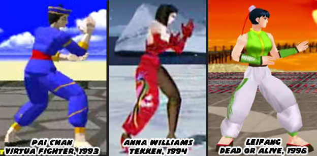
In the mid-90s other studios saw the potential of 3D engines. The technology could be applied in multiple formats and genres. Space shooters, racing games, RPGs, action titles and even platformers could all be done in 3D. When the studios began developing 3D fighting games it was as if they had reset the clock on aesthetics. Every studio was so focused on learning the new technology that they did not bother to push the envelope on aesthetics. The original 2D fighting games all stuck to the tropes. A karate master, a kung fu practitioner, a boxer and wrestler could all be guaranteed to appear in the early games. They were all drawn in a style that fell somewhere in between a Japanese animé or manga. The exact same tropes happened in 3D. There were some minor differences but think about how Chun-Li set the standard for the Chinese fighter. Pai Chan (and her father Lau Chan) was the first Chinese polygon star in Sega’s Virtua Fighter (1993). Her color scheme of blue with gold trim was very much based on Chun-Li. This set the template for the Chinese dress on Tekken’s Anna Williams (Namco 1994) and Dead or Alive’s Leifang (Tecmo 1996). The graphics were cutting edge at the time yet the aesthetics in the games were almost universal.
Think about how the majority of the fighting games today are built on the same graphics engine. Think about how the majority are using the same aesthetic. From Street Fighter IV to Injustice, every modern title was dark and gritty. It was as if the studios forgot everything they had learned in the ‘90s. How they forgot the importance of having a strong aesthetic. It stands to reason however, many of the new designers and developers were kids when the first fighting game boom happened. They are now programmers, artists and animators in their own right. They are recreating all the things they loved about their favorite games. This is where I present a challenge to them. Do not recreate what was great. Do not settle for what the graphics standards are now but instead carve out an entirely new path. Take a creative risk. Change up the format without erasing the original formula. Fighting games, and video games in general, are very much a visually based form of storytelling. Just because you are given the same tools as your contemporaries it doesn’t mean your games have to all look the same. Think about what makes an animé unique when compared to a CGI film. Think about the Transformer’s series of the ‘80s and the live action Transformers film of today. The reason that fans remembered the original was because of how unique it looked when compared to the western cartoons. Thirty years later when a western and eastern studio developed a 3D version of the franchise there was a striking difference between the aesthetic styles. One managed to capture the look of the animated series while the other looked like every other 3rd person shooter.
Be bold with your designs! Regardless of what surveys tell you simply know that the fans are there. They are waiting for something to change their perception. The market will follow those that take a chance. Street Fighter II was only the beginning of the revolution. Mortal Kombat, Samurai Shodown, Primal Rage, King of Fighters and Killer Instinct were some of the biggest risk takers. Their gambles didn’t always pay off but they gave audiences a reason to return. In doing so the market grew and grew. More people were playing fighting games because of the diversity in subjects and aesthetics. A good director knows when to push the envelope, when to challenge their designers. They know what things the audience expects and doesn’t. In the next blog we will look at the impact a good director and a strong aesthetic can have on the industry. As always if you enjoyed this blog and would like to sponsor me please visit my Patreon page and consider donating each month, even as little as $1 would help make better blogs and even podcasts!
No comments:
Post a Comment