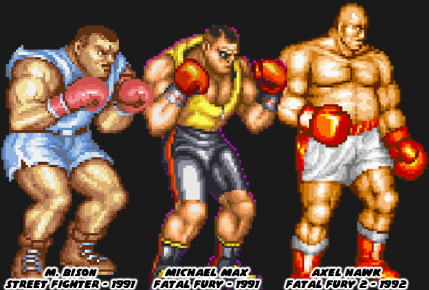
It was no coincidence that Street Fighter II's boxer M. Bison (Balrog in the USA) looked like pro boxer Mike Tyson. Capcom used the heavyweight champ as the template for their ring general earlier. Tyson had launched his professional career in 1985 and was featured in a version of Nintendo's Punch-Out!! He helped inspire the character Mike in the original Street Fighter as well. Tyson dominated the squared circle, at the age of 20 he became the youngest ever to win a heavyweight title. He earned a reputation for being destructive, and often knocked out opponents shortly after the opening bell. His supernatural fighting ability made him the perfect candidate for a fighting game. Of course Capcom didn't want to pay the boxer any royalties for using his likeness so they made a few changes, swapping out his name with another Shadowlaw general, and presented him in warmup gear. He was an easy fit into Street Fighter II and would even inspire a Fatal Fury boxer. Michael Max was literally cut from the same cloth as Bison, both having roughly the same size, shape, similar warmup gear and even haircut. Audiences felt this character was lacking, even if he had a unique tornado uppercut.
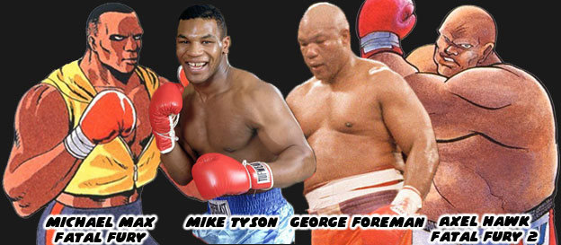
SNK's follow-up boxer had a more unique look. The bald and pudgy Axel Hawk was a friend and trainer for Michael Max. This fighter, featured in Fatal Fury 2, was taller and heavier than his protege. From a design standpoint it was strange to have a character that was older and fatter than the previous star. From a real-world influence however it made sense. George Foreman was a legendary heavyweight fighter that started his career in 1969 and stopped fighting at the end of the '70s. He became a preacher but returned to the ring in the late '80s. He got a title shot against Bernard Hopkins, a fighter 16 years younger than he was. Foreman recaptured the heavyweight championship at the age of 45, making him the oldest person ever to win the title. It was an underdog story that inspired long-time boxing fans. Chances were that SNK boss and boxing aficionado Eikichi Kawasaki suggested a version of Foreman for the sequel. Axel was a bit more rotund, especially in the official character art, than Foreman but they both had amazing power behind their strikes. Pop culture tended to color the SNK character designs more than any other studio. Aside from real-world fighters there were also decisions based on popular aesthetics. This was seen on another boxer in the SNK universe.
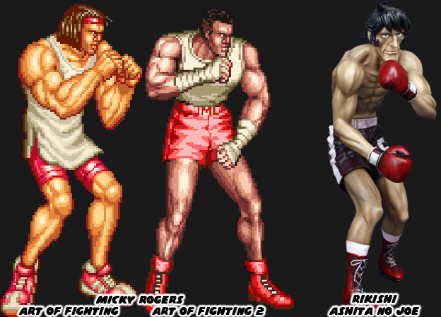
Micky Rogers was the boxing archetype introduced in the AoF series. The character sported braids in his first appearance and the look was changed slightly when he appeared again in a sequel. Visually the fighters in the AoF series were much different than the figures in FF. The artists working on the characters tried to make them more proportional to actual people. The reason for this was because of the larger sprites that AoF featured. If the character were drawn too muscular it would have looked awkward when they were scaled up. The fighters would have looked like cartoon characters in an otherwise realistic setting. Micky looked anemic compared to some of the other characters. He was lanky but well defined. It made sense given he was a boxer where speed was often more prized than power. The manga Ashita No Joe was a wildly popular boxing manga from Japan. The artist Tetsuya Chiba would draw his character with long, lean muscles. The action was easy to follow on the page because of his slender lines. This style of art that he popularized in 1968 would end up influencing countless other manga and anime shows about boxing. I believe that this design also found its way to SNK, given the Mr. Kawasaki was a boxing fan. Micky had almost the same build as characters like Joe or Rikishi, the champion fighters from the book.
SNK, like most major arcade publishers realized that in order to succeed they had to become global players. This meant that they had to include fighters from other countries, especially the USA. Capcom and a few other studios included fighters from the USA in their games but gave them the slightest connection to real western culture. Joe and Mike in the original Street Fighter looked very plain, wearing street clothes, they were somewhat forgettable. The studio punched up their efforts with Guile in SF II. If anything they were pandering quite heavily to each nation, easily to the point of parody. Look at Zangief and Dhalsim’s original endings. Even the American was over-the-top. He was a military fighter wearing camouflage pants, with an absurd haircut, that was all muscles, and sported USA flag tattoos. As a Mexican-American I can confess that I must run into people that look like Guile at least twice a day! SNK did a slightly better job with their US characters and realistic street fashion in both the FF and AoF games. They decided to really crank it up with each sequel. They payed close attention to the trends happening in tv and in movies. When the studio began work on the King of Fighters, which would bridge all of their fighting games together they began pandering heavily to the USA. They did this by making the US team captain a boxer, and by looking at pop culture for his design cues.
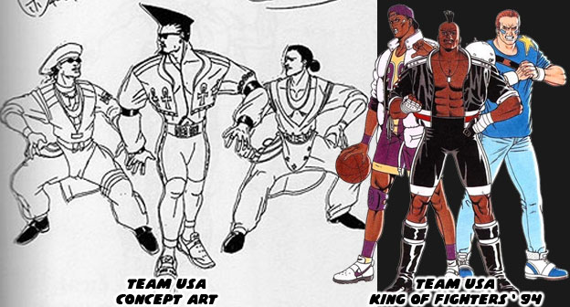
Decades ago fashion trends travelled much slower than they did today. The artists at SNK wanted international audiences to visually identify the US team because of how they looked, rather than what school of fighting they were representing. In order to do this they had to create archetypes that were wearing the most “Western” costumes. The people at SNK were using fashion cues from pop culture as the basis. The only problem was that street culture evolved rapidly. The look of the US fighters were reminiscent of dancers from the films Beat Street and music videos from Salt-N-Pepa and Queen Latifah. The spandex and leather outfits of the late ‘80s were quite outdated for a game dropping in 1994. Thankfully the studio revised the outfits and based the fighters more on sports icons. A hint of the street fashion remained but for the most part it worked given the character. Heavy D, the captain of the team (and a name pulled from a popular rapper) was a breath of fresh air. He was a boxer that completely rewrote the book on character design. In the next entry we’ll look at how SNK’s designs evolved post 1994. As always if you enjoyed this blog and would like to sponsor me please visit my Patreon page and consider donating each month, even as little as $1 would help make better blogs and even podcasts!
What, no Rick Strowd?
ReplyDeleteyou gotta wait...
DeleteHeavy D was by far the best design of the sports hero team. I wish he returned in more games and fleshed out more.
ReplyDelete