The Street Fighter II team was off to a rough start. Their character designs were falling flat and Capcom was trying their best to turn the project around in the quickly changing arcade market. They needed to get a new game out and one that set itself apart from Street Fighter and Final Fight. There was an influx of artists and designers working on the cast. They were looking for the elements that worked, the styles of fighting that needed representation and a way to balance the library of characters. Each artist brought a unique perspective with them along with their talents. Some of these artists were familiar with the various schools of fighting and even had some insight on pro wrestling and action films. Some of the artists were well read in science fiction and fantasy stories. Some of the artists enjoyed traveling and history. The collective was able to pick the designs apart and begin remaking them with a few unique touches. Sakurada Gashou and the Kenshiro-looking Ryu were out. If karate was going to be the star of the game then the fighter had to be become an icon, or exaggerated caricature depending on your point of view of what a karate master should look like. The updated Ryu had torn sleeves to show off his powerful arms, a red headband and red punching gloves to break up the all-white uniform.
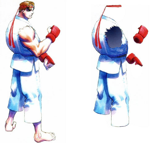
Capcom then brought back Ken. In was done in part to have a character that the Americans would gravitate to. The blonde hair and yellow punching gloves contrasted his all-red gi. To audiences this was just a pallet swap with different heads. Internally the art team made a distinction between the two characters. Ken had hemmed sleeves on his gi. He was careful about the way he presented himself. Ryu by comparison had torn sleeves and worn edges on his pants. He cared more about the fight than about trophies. They were both very simple designs and the unique touches were subtle, so subtle that many other studios missed the individual elements and couldn't create better karatekas in 25 years of trying.
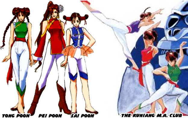
With the stars of the game figured out the studio then went after the Chinese figure, then called Zhi Li. They looked at her costume, her age and purpose. The were something lacking with the young female fighter. She looked too much like an anime or manga character. Artist Akiman said that it was a period of time where you couldn't get by without creating a Chinese Beauty. Zhi Li had a look that was borrowed from the Pooh sisters aka the Kuniang Martial Arts Club from the 1989 sci-fi action game Strider. The sisters had kicks that were almost as powerful as Strider Hiryu's cypher sword Zhi Li would never be believable as a serious fighter in a cast of adult men. The team decided to make her older, turn her into a woman. It worked for the Pooh Sisters and would probably work again.
As the plot of the game was being developed they realized that Chun-Li needed a reason to be in a fighting tournament. Simply being a female fighter may have worked in a movie but games required more effort. Games allowed the audience to see the same story but from different points of view, including those of villains. By making the Chinese girl older they knew that she would never be a damsel in distress. She was not a prize for the competitors, and this was a refreshing change of pace. In fact it was even better because her purpose for competing was to bring the organizer to justice. It was decided that she was actually an undercover cop. The team was elated with the possibilities. This could be something that they kept a secret from audiences until the ending of the game. They took apart the traditional Chinese wushu uniform that Chun-Li had and turned it into a costume. The character would wear makeup, put her hair up in buns and be very "girly" in the tournament. At the same time she would wear wrestling boots and weighted spiked bracelets so that she had a better chance of winning each fight.
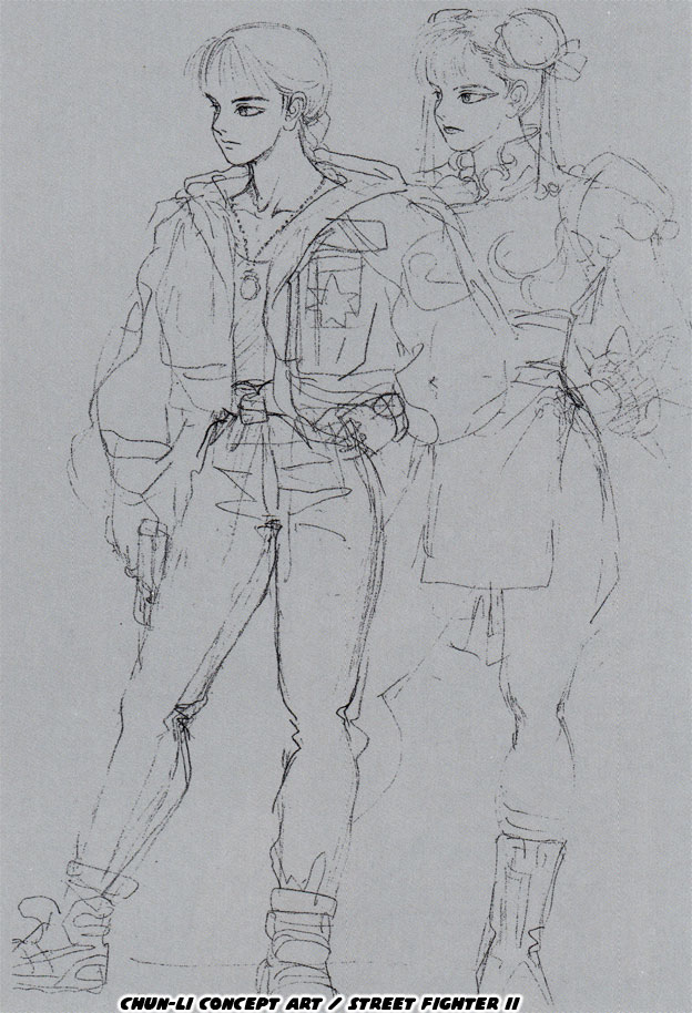
What the designer Akira "Akiman" Yasuda did to Chun-Li was a stroke of genius. It would become something that other designers would look to when they were stumped by a character redo. Unfortunately some artists misread the design. They did not catch how Chun-Li was matured to balance out the rest of the cast. They did not even bother to consider that there may have been a precedence set by actual Chinese martial arts practitioners that were women. Imagine that if Mas Oyama and Yoshiji Soeno inspired the development of Ryu then perhaps Wing Chun and the actresses in Hong Kong cinema might have helped shape Chun-Li as well. Instead the subsequent designers thought that it was important to give new characters some sort of "day job" in order to make them appealing. Since the fighters could not all be cops then people with all sorts of random backgrounds began turning in later versions of the series. Dee Jay was a musician, El Fuerte was a chef, Hakan loved oil, Rufus was fat, etc. The other artists, the ones that "got" what Akiman had done were able to turn around the more offensive characters.
Great Tiger was supposed to be an Indian mystic but his look was very bland. He was a dark-skinned character with a turban, he could have been pulled right out of any comic book. Not much else was known about this figure, what form of fighting he represented or what his abilities were. This was when the team looked to a few new points of reference. Where had they seen Indian fighters before and what made them special? Of course the Indian was well known in television and cartoon tropes. Who does not remember seeing a cartoon of an Indian lying on a bed of nails, or running swords through a basket with their apprentice inside? What about the classic Indian rope trick or the Madari better known as the snake charmers?
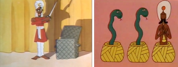
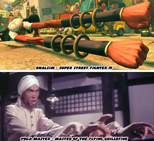
These were things that everyone had seen and was familiar with. Yet these things could have also been negative subconscious cues about a particular culture. India had introduced words like Guru and Yogi into Western language. Whether true or not these images of Indians colored pop culture the world over. In Hong Kong cinema there were two hit films by Jimmy Wang Yu. The One Armed Boxer and the Master of the Flying Guillotine. Actors in blackface portrayed the Indians as having unique powers. In the One Armed Boxer the Indian was impervious to weapons, he stabbed himself in the chest to prove it. He could also teleport around the room by standing on his hands. Magicians from India were part of folklore and many assumed that there was some truth to these legends. The second Indian character feature in the Wang Yu films was even more memorable. He had arms that stretched, creating a very unique challenge for the hero of the film. It was an impressive effect in the film, using prosthesis and a second person to create the illusion. This character, blackface and all, had a profound influence on the development of the Great Tiger.
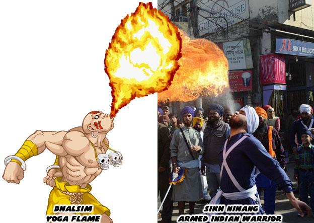
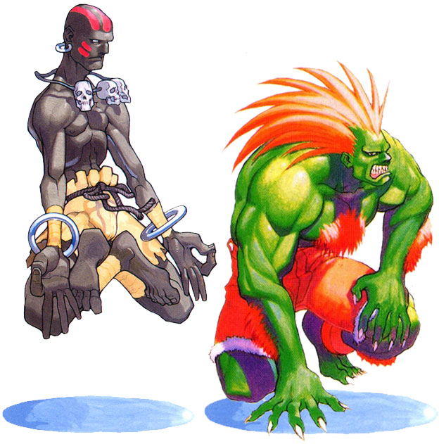
As Dhalsim began to emerge the designers wanted to know how else they could make him unique. Again they used the Indian mystic as a point of reference. In legend the magicians from India and Arabia were highly tolerant of fire. They could walk on hot coals and even breathe fire. These performers ended up in travelling caravans and helped create the myth that found its way to film and television centuries later. The best thing about Street Fighter was that there was a hint to truth to the icons. There was a caste of Sikh Warriors that were armed with weapons and trained in the art of war. During celebrations they would parade in uniform and sometimes put on a show for audiences, singing, dancing and breathing fire. It was an amazing visual. Imagine an animated version of a Sikh warrior in a battle against a karate master. There was real potential in trying to recreate these different arts for game playing audiences.
The team at Capcom began experimenting with the look and moves of the Great Tiger. They stripped away the turban and Sikh costume and made him appear very humble. In Sikh practice hair was a sacred, it was never exposed and was kept wrapped up. Dhalsim was supposed to appear more like a beggar. Literally someone that gave up his worldly possessions and even shaved himself bald to humble himself. A pair of ragged trunks and a rope belt became his new costume. Around his neck he wore three small skulls. It would be revealed that these were children from his village that had died. As a pacifist the only reason he entered the Street Fighter tournament to win the prize money to help his village. His backstory would be revealed at the end of the game. Like Chun-Li and Ryu the developers learned that it was important to know what each character was fighting for and why it made them interesting. At the same time that purpose was not pushed on audiences, like say a Mexican luchador showing up to battle with a frying pan because you know… cooking. The developers respected their characters and audience enough to let players discover what made them unique through the endings of the game.
The team then looked at Anabebe and realized that the character had to go. The artists knew however that Anabebe was too ugly and controversial a design. People in North (and Central and South) America would find the character highly offensive. At the same time a wild man was needed to break up the consistency of traditional forms of fighting. Just as they had done with Dhalsim the studio knew that they had to go to extreme lengths to make the character unique. They decided that the new character might be covered in long hair, making him appear more feral. Instead of giving him a skin tone they decided to paint him up in bright colors. The studio looked at the bright colors used by poisonous creatures, snakes and reptiles, to warn predators.
Again Akiman helped with the redesign. He remembered playing against planner Akira Nishitani and being frustrated. Nishitani was good at finding exploits in games and then using them against his opponents. The two would play Pro Wrestling on the Famicom (NES) when it came out in 1986. Nishitani would use a character called the Amazon, he was a green skinned wild man, that looked like a piranha. Anyhow he would use this character to bite the heads of opponents. It was impossible to break out of the hold. Akiman wanted players feel the frustration he did with Blanka's chomping attacks. So the beast man design was pulled from Pro Wrestling rather than black stereotypes.
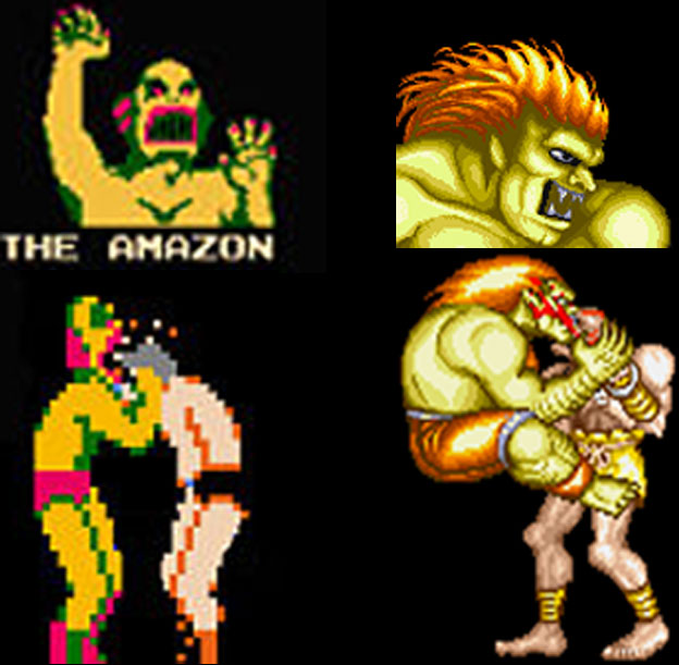
Blanka, shortened from Hamablanka, ended up being a bright neon green, almost lime with an equally bright orange hairdo. He was given sharp teeth and nails to make him appear like a beast. He ended up being not very far removed from the Amazon. On his ankles they left broken shackles, as if he were indeed an escaped wild man. It was the only carry-over from Anabebe's original design. What they abandoned thankfully was his original skin color and even ethnicity. In the end it worked out well for the character.
Both Dhalsim and Blanka started off as ugly if not outright racist caricatures of a culture. Both went on to represent the two most extreme character designs in the Street Fighter universe. They did by going beyond the stereotypical conventions and created figures that audiences had never seen before. Despite these extreme makeovers they were still acceptable in the lineup. In the game series and in canon they were sometimes partnered together. Despite looking very different the duo did a great job visually of balancing each other out. Because Capcom was able to pull away from their highly dubious origins the two became some of the most popular characters ever created. They were an example of how almost any design could be salvaged with enough insight and hard work.
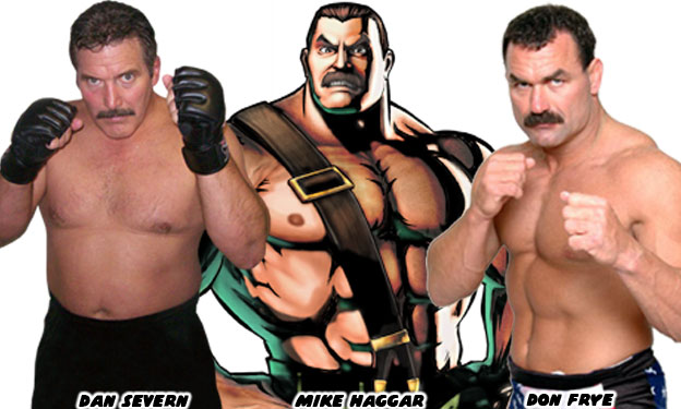
Some of the other characters that were in the planning stages were actually very close to their finished counterparts. The team cut down the wrestlers planned for Street Fighter II from two to one. The studio had found great success with the strong man / wrestler archetype in Final Fight. They had created a large brawler named Mike Haggar. His assortment of suplexes and piledrivers was impressive and never before seen in a brawler. The figure looked very much like MMA pioneers Dan Severn and Don Frye. The two represented the USA in international competitions and Severn had fought in Japan as early as 1982, making him a likely influence on the Capcom staff. By using Haggar as a template the planners could create new moves that were similar to but even more powerful.
The USA was getting two representatives, Ken and Guile, so the studio decided to give a different nation the wrestler. Mexico was cut out of the countries that would be represented when Capcom dropped the masked wrestler. They looked at the burly grapplers from the Eastern block countries. People like Ivan Poddubny and Stanislaus Zbyszko were legendary wrestlers and world champions that gave Europe a chapter in wrestling history. The team at Capcom decided to make the next character Russian. What needed saving was not the design as much as the name. The burly sailor on the table would have been named Vodka Gobalsky.
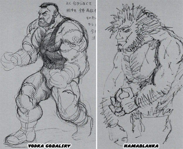
The teamed toned down the sailor image and instead focused on making him a wrestler. Thankfully some of the creators knew that names could be just as offensive as skin color. They came to this realization much faster than those working elsewhere.
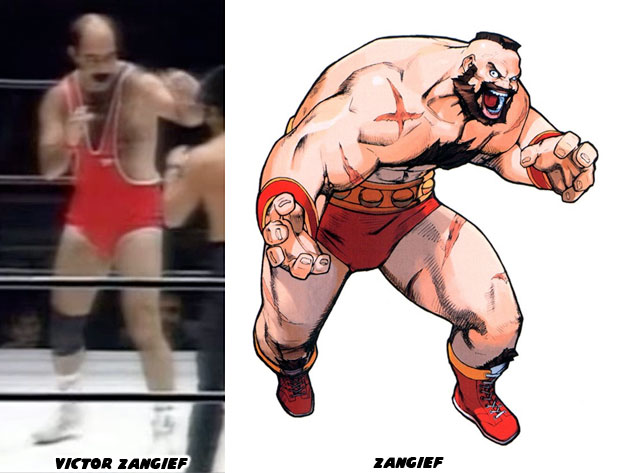
A few years earlier the people at Nintendo created a boxer named Vodka Drunkensky. The Punch Out!! series by Nintendo had some very stereotypical characters in the lineup, like the Japanese Piston Honda, the Italian Pizza Pasta and the Indian Great Tiger (how about that!). When audiences saw Vodka Drunkensky many thought they had gone too far. It was one thing to give a character an offensive name but to show him drinking in between rounds really took the cake! A few of the planners at Capcom remembered seeing a wrestler on Japanese TV named Victor Zangief. The last name seemed to work well for the character and would be much easier to pronounce than Poddubny and Zbyszko.
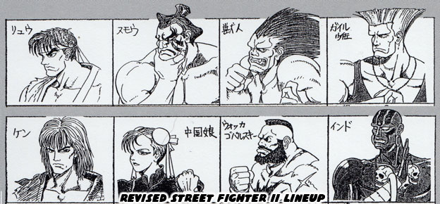
The final few spots in the roster were filled in by the team. Guile the soldier (whom Americans would naturally gravitate to) and E. Honda the sumo wrestler helped add a little more diversity to the cast. The different backgrounds and different fighting styles were a great compliment to the other forms. The revised lineup was much closer to the version that players would see in the arcade. The rest as they say was history...
So what happened to the designers after Street Fighter II. Why has it been so hard for Capcom to create a fighter that matched the legacy of the original World Warriors? We will explore these things in the next blog. As always if you enjoyed this blog and would like to sponsor me please visit my Patreon page and consider donating each month, even as little as $1 would help make better blogs and even podcasts!

Capcom then brought back Ken. In was done in part to have a character that the Americans would gravitate to. The blonde hair and yellow punching gloves contrasted his all-red gi. To audiences this was just a pallet swap with different heads. Internally the art team made a distinction between the two characters. Ken had hemmed sleeves on his gi. He was careful about the way he presented himself. Ryu by comparison had torn sleeves and worn edges on his pants. He cared more about the fight than about trophies. They were both very simple designs and the unique touches were subtle, so subtle that many other studios missed the individual elements and couldn't create better karatekas in 25 years of trying.
With the stars of the game figured out the studio then went after the Chinese figure, then called Zhi Li. They looked at her costume, her age and purpose. The were something lacking with the young female fighter. She looked too much like an anime or manga character. Artist Akiman said that it was a period of time where you couldn't get by without creating a Chinese Beauty. Zhi Li had a look that was borrowed from the Pooh sisters aka the Kuniang Martial Arts Club from the 1989 sci-fi action game Strider. The sisters had kicks that were almost as powerful as Strider Hiryu's cypher sword Zhi Li would never be believable as a serious fighter in a cast of adult men. The team decided to make her older, turn her into a woman. It worked for the Pooh Sisters and would probably work again.

As the plot of the game was being developed they realized that Chun-Li needed a reason to be in a fighting tournament. Simply being a female fighter may have worked in a movie but games required more effort. Games allowed the audience to see the same story but from different points of view, including those of villains. By making the Chinese girl older they knew that she would never be a damsel in distress. She was not a prize for the competitors, and this was a refreshing change of pace. In fact it was even better because her purpose for competing was to bring the organizer to justice. It was decided that she was actually an undercover cop. The team was elated with the possibilities. This could be something that they kept a secret from audiences until the ending of the game. They took apart the traditional Chinese wushu uniform that Chun-Li had and turned it into a costume. The character would wear makeup, put her hair up in buns and be very "girly" in the tournament. At the same time she would wear wrestling boots and weighted spiked bracelets so that she had a better chance of winning each fight.

What the designer Akira "Akiman" Yasuda did to Chun-Li was a stroke of genius. It would become something that other designers would look to when they were stumped by a character redo. Unfortunately some artists misread the design. They did not catch how Chun-Li was matured to balance out the rest of the cast. They did not even bother to consider that there may have been a precedence set by actual Chinese martial arts practitioners that were women. Imagine that if Mas Oyama and Yoshiji Soeno inspired the development of Ryu then perhaps Wing Chun and the actresses in Hong Kong cinema might have helped shape Chun-Li as well. Instead the subsequent designers thought that it was important to give new characters some sort of "day job" in order to make them appealing. Since the fighters could not all be cops then people with all sorts of random backgrounds began turning in later versions of the series. Dee Jay was a musician, El Fuerte was a chef, Hakan loved oil, Rufus was fat, etc. The other artists, the ones that "got" what Akiman had done were able to turn around the more offensive characters.
Great Tiger was supposed to be an Indian mystic but his look was very bland. He was a dark-skinned character with a turban, he could have been pulled right out of any comic book. Not much else was known about this figure, what form of fighting he represented or what his abilities were. This was when the team looked to a few new points of reference. Where had they seen Indian fighters before and what made them special? Of course the Indian was well known in television and cartoon tropes. Who does not remember seeing a cartoon of an Indian lying on a bed of nails, or running swords through a basket with their apprentice inside? What about the classic Indian rope trick or the Madari better known as the snake charmers?

These were things that everyone had seen and was familiar with. Yet these things could have also been negative subconscious cues about a particular culture. India had introduced words like Guru and Yogi into Western language. Whether true or not these images of Indians colored pop culture the world over. In Hong Kong cinema there were two hit films by Jimmy Wang Yu. The One Armed Boxer and the Master of the Flying Guillotine. Actors in blackface portrayed the Indians as having unique powers. In the One Armed Boxer the Indian was impervious to weapons, he stabbed himself in the chest to prove it. He could also teleport around the room by standing on his hands. Magicians from India were part of folklore and many assumed that there was some truth to these legends. The second Indian character feature in the Wang Yu films was even more memorable. He had arms that stretched, creating a very unique challenge for the hero of the film. It was an impressive effect in the film, using prosthesis and a second person to create the illusion. This character, blackface and all, had a profound influence on the development of the Great Tiger.

As Dhalsim began to emerge the designers wanted to know how else they could make him unique. Again they used the Indian mystic as a point of reference. In legend the magicians from India and Arabia were highly tolerant of fire. They could walk on hot coals and even breathe fire. These performers ended up in travelling caravans and helped create the myth that found its way to film and television centuries later. The best thing about Street Fighter was that there was a hint to truth to the icons. There was a caste of Sikh Warriors that were armed with weapons and trained in the art of war. During celebrations they would parade in uniform and sometimes put on a show for audiences, singing, dancing and breathing fire. It was an amazing visual. Imagine an animated version of a Sikh warrior in a battle against a karate master. There was real potential in trying to recreate these different arts for game playing audiences.
The team at Capcom began experimenting with the look and moves of the Great Tiger. They stripped away the turban and Sikh costume and made him appear very humble. In Sikh practice hair was a sacred, it was never exposed and was kept wrapped up. Dhalsim was supposed to appear more like a beggar. Literally someone that gave up his worldly possessions and even shaved himself bald to humble himself. A pair of ragged trunks and a rope belt became his new costume. Around his neck he wore three small skulls. It would be revealed that these were children from his village that had died. As a pacifist the only reason he entered the Street Fighter tournament to win the prize money to help his village. His backstory would be revealed at the end of the game. Like Chun-Li and Ryu the developers learned that it was important to know what each character was fighting for and why it made them interesting. At the same time that purpose was not pushed on audiences, like say a Mexican luchador showing up to battle with a frying pan because you know… cooking. The developers respected their characters and audience enough to let players discover what made them unique through the endings of the game.

The team then looked at Anabebe and realized that the character had to go. The artists knew however that Anabebe was too ugly and controversial a design. People in North (and Central and South) America would find the character highly offensive. At the same time a wild man was needed to break up the consistency of traditional forms of fighting. Just as they had done with Dhalsim the studio knew that they had to go to extreme lengths to make the character unique. They decided that the new character might be covered in long hair, making him appear more feral. Instead of giving him a skin tone they decided to paint him up in bright colors. The studio looked at the bright colors used by poisonous creatures, snakes and reptiles, to warn predators.
Again Akiman helped with the redesign. He remembered playing against planner Akira Nishitani and being frustrated. Nishitani was good at finding exploits in games and then using them against his opponents. The two would play Pro Wrestling on the Famicom (NES) when it came out in 1986. Nishitani would use a character called the Amazon, he was a green skinned wild man, that looked like a piranha. Anyhow he would use this character to bite the heads of opponents. It was impossible to break out of the hold. Akiman wanted players feel the frustration he did with Blanka's chomping attacks. So the beast man design was pulled from Pro Wrestling rather than black stereotypes.

Blanka, shortened from Hamablanka, ended up being a bright neon green, almost lime with an equally bright orange hairdo. He was given sharp teeth and nails to make him appear like a beast. He ended up being not very far removed from the Amazon. On his ankles they left broken shackles, as if he were indeed an escaped wild man. It was the only carry-over from Anabebe's original design. What they abandoned thankfully was his original skin color and even ethnicity. In the end it worked out well for the character.
Both Dhalsim and Blanka started off as ugly if not outright racist caricatures of a culture. Both went on to represent the two most extreme character designs in the Street Fighter universe. They did by going beyond the stereotypical conventions and created figures that audiences had never seen before. Despite these extreme makeovers they were still acceptable in the lineup. In the game series and in canon they were sometimes partnered together. Despite looking very different the duo did a great job visually of balancing each other out. Because Capcom was able to pull away from their highly dubious origins the two became some of the most popular characters ever created. They were an example of how almost any design could be salvaged with enough insight and hard work.

Some of the other characters that were in the planning stages were actually very close to their finished counterparts. The team cut down the wrestlers planned for Street Fighter II from two to one. The studio had found great success with the strong man / wrestler archetype in Final Fight. They had created a large brawler named Mike Haggar. His assortment of suplexes and piledrivers was impressive and never before seen in a brawler. The figure looked very much like MMA pioneers Dan Severn and Don Frye. The two represented the USA in international competitions and Severn had fought in Japan as early as 1982, making him a likely influence on the Capcom staff. By using Haggar as a template the planners could create new moves that were similar to but even more powerful.

The USA was getting two representatives, Ken and Guile, so the studio decided to give a different nation the wrestler. Mexico was cut out of the countries that would be represented when Capcom dropped the masked wrestler. They looked at the burly grapplers from the Eastern block countries. People like Ivan Poddubny and Stanislaus Zbyszko were legendary wrestlers and world champions that gave Europe a chapter in wrestling history. The team at Capcom decided to make the next character Russian. What needed saving was not the design as much as the name. The burly sailor on the table would have been named Vodka Gobalsky.

The teamed toned down the sailor image and instead focused on making him a wrestler. Thankfully some of the creators knew that names could be just as offensive as skin color. They came to this realization much faster than those working elsewhere.
A few years earlier the people at Nintendo created a boxer named Vodka Drunkensky. The Punch Out!! series by Nintendo had some very stereotypical characters in the lineup, like the Japanese Piston Honda, the Italian Pizza Pasta and the Indian Great Tiger (how about that!). When audiences saw Vodka Drunkensky many thought they had gone too far. It was one thing to give a character an offensive name but to show him drinking in between rounds really took the cake! A few of the planners at Capcom remembered seeing a wrestler on Japanese TV named Victor Zangief. The last name seemed to work well for the character and would be much easier to pronounce than Poddubny and Zbyszko.

The final few spots in the roster were filled in by the team. Guile the soldier (whom Americans would naturally gravitate to) and E. Honda the sumo wrestler helped add a little more diversity to the cast. The different backgrounds and different fighting styles were a great compliment to the other forms. The revised lineup was much closer to the version that players would see in the arcade. The rest as they say was history...

So what happened to the designers after Street Fighter II. Why has it been so hard for Capcom to create a fighter that matched the legacy of the original World Warriors? We will explore these things in the next blog. As always if you enjoyed this blog and would like to sponsor me please visit my Patreon page and consider donating each month, even as little as $1 would help make better blogs and even podcasts!
No comments:
Post a Comment