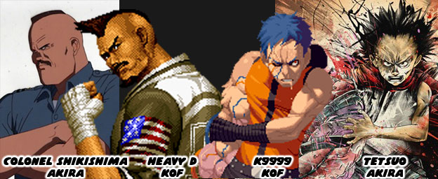
Manga and animé were very influential to the design of early fighting games. The team at Capcom were influenced by Buronson and Tetsuo Hara’s work on Hokuto No Ken / Fist of the North Star. The people at SNK were influenced by Katsuhiro Otomo’s science fiction masterpiece AKIRA. The people at SNK were so influenced by the book that it shaped the story of later KOF games. The entire plot revolving around clones and the paramilitary government organization N.E.S.T.S. was roughly pulled from the plot of AKIRA. Even the character K9999 from King of Fighters 2001 was eerily similar to Tetsuo, the antagonist in AKIRA. The likeness was so much so that publisher Kodansha took SNK to court and got them to remove any likeness of the character from future releases and official publications. I would argue that the imposing Heavy D, mohawk, square jaw and all was based on Colonel Shikishima from AKIRA as well. Thankfully SNK made him a dark-skinned character so the comparisons wouldn’t be as obvious. From that point forward the artists at SNK were taking very bold creative chances.
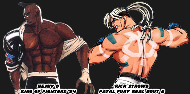
Heavy D started the trend of non-traditional boxers in the KOF universe. His street fashion, paired with his leather jacket and wild haircut made him look like an intimidating opponent. His was the type of look that audiences expected from SNK. It was their follow-up that was even more unique. One of the most unusual boxers in the SNK universe was Rick Strowd. He first appeared in Fatal Fury Real Bout 2 in 1998. I say he was unusual because of his appearance. He was as physically strong as any other character but that wasn’t unusual. He was actually a Native American character although he didn’t look like a typical one that we might have expected. Rick had pale skin, long white hair and bright paintings covering his body. His white pants and blue gloves were solid color choices, they matched the markings painted on his chest and back. He was not rooted in any actual native group, nor were his markings reflective of any tradition. The inverted skull painted on his back looked a bit too cartoonish for example. SNK was experimenting with different influences, different stylistic choices and different ways of presenting a traditional fighting art. They figured that they could shake things up by presenting a unique looking character and call him a Native. Their decision worked for the most part. From that point on the studio realized that boxing was not the only thing that American characters could represent.
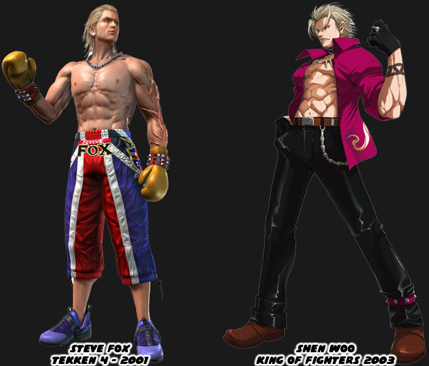
The other thing that the artists at SNK, and a few other Japanese studios, realized post Rick Strowd was that boxers did not all have to be big black guys. Two leaner blonde boxers made their marks after 2000. Namco introduced the fighting community to Steve Fox in Tekken 4. The British boxer had an athletic build and not too bulky. Most Tekken characters were nowhere near as swollen as the Capcom or SNK fighters. Fox had long slick blonde hair and most of his costumes in the series were street outfits. Even his “traditional” costume broke the mold. His boxing trunks were actually long training pants. His most unique element were the enormous scars covering his arm. He wasn’t sure how he got them or what their purpose was, making it an interesting side story for the character. Not to be outdone SNK dropped Shen Woo into KOF continuity in 2003. This blonde boxer was cut from the save cloth as Fox but his look and style were even more street. The Shanghai native was mostly a self-taught fighter, similar to Terry Bogard, and had gained a reputation as one of the most dangerous men in South China. Many of the tournament stars in the KOF series were young cool guys with street clothing so Woo fight right in. If the design had any failings it was that SNK had started relying on the street look too much. Prior to Woo the company had introduced a boxer that I would consider one of the best designs in the past 20 years. This character was named Rob Python from Buriki One.
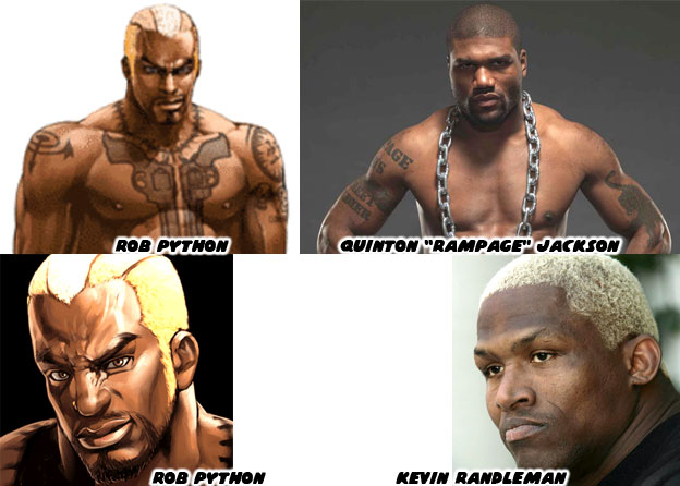
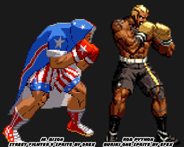
Python represented a break from tradition, he was reflective of the next-generation fighting black superstar. His look was inspired in part by actual MMA fighters Quinton “Rampage” Jackson and Kevin Randleman. They were wildly popular in Japanese tournaments. SNK knew that audiences had outgrown the clean-cut look of a young Tyson and the aging Foreman. They had been playing Neo Geo fighters for almost a decade and wanted new blood. The next boxer had to ooze personality and in the case of Python, he also had to ooze a sense of danger. He was among one of the most dangerous fighters in the Buriki One tournament and also the rival to Gai Tendo, the star of the game. Python was an understudy of Silber, whom I had mentioned previously on this series. Python’s tattoos were as much a part of his costume as his gloves or shorts were. No character before or after had ever looked as imposing. The enormous pair of Colt revolvers tattooed on his chest were meant to intimidate his opponents. It was assumed that he spent time in prison where he had learned of Silber. SNK, and in particular the talented artist Hiroaki, had changed the formula yet again. Python was not a fighting master hidden in plain sight, instead he was a killer masked as a boxer. It would take Capcom almost 17 years to reinvent the boxer by going full circle as well.
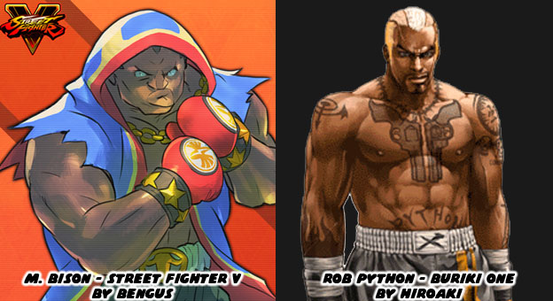
In 1991 M. Bison had pretty much set the standard that other boxers were compared against. There wasn’t a fighting game in the ‘90s that wasn’t compared to Street Fighter II. Every boxer was compared to Bison. His look had stagnated in the late ‘90s while SNK was committed to experimenting. Capcom finally conceded and created their own hidden master with Dudley in Street Fighter III (1997). The aristocratic boxer had a unique library of moves but long-time fans of Bison had a soft spot for tradition. Senior Capcom artist (and personal hero) Bengus was called in to work on the Street Fighter V (2016) designs. While he did not develop the original M. Bison, that was more likely AKIMAN and Shoei, Bengus was responsible for the new look. He wanted Bison to have the same big, brash personality but with an updated costume. The Capcom style of design was rooted in making traditional fighting archetypes. Their karate masters had to look like karate masters, their kung-fu masters had to look like kung-fu masters, and their boxers had to be boxers. Bengus went full-bore Americana with red white and blue trunks but then wrapped everything in a red, white and blue robe, with torn sleeves and gold jewelry to boot. The “Crazy Buffalo” now sported elements of the street, elements of real pro boxers and even cartoonish archetypes. He was still classic layered underneath modern accents.
This was not to take anything away from Rob Python and all of the work that SNK had done with boxers over the past 25+ years. Their fighters had been among the most unique, most colorful and most diverse ever assembled. I honestly wish that they would revisit their Buriki One cast for the future installments of the KOF series. With that said they still managed to break new ground. One of their most stylish boxers debuted in 2000, right on the heels of Python. The new fighter was a mysterious special agent named Vanessa. She had taken up boxing when her lover was killed. Like King she was a master hidden in plain site. Her pants and suspenders were a nice touch under her sleeveless shirt and tie. The look was very chic. It wasn’t the first time than SNK had explored the dangerous femme. Vice and Mature, the valets for early KOF sponsor Rugal Bernstein were assassins in disguise. Vanessa was a hero using a similar fashion aesthetic. The trio predated and were more than likely the inspiration behind Crimson Viper in Street Fighter IV.

The most recent boxer in KOF canon was a mix of traditional and modern. Nelson debuted in the King of Fighters XIV, also released in 2016. He was a dark-skinned Brazilian and up-and-coming phenom. The young fighter was involved in a hit and run leaving the gym one night. He lost an arm and his girlfriend was put into a coma. A secretive sponsor paid for his cybernetic replacement arm and saw him enter the KOF tournament. SNK embraced his back story and and incorporated the tire tread motif on his boxing gloves and workout gear. His scars were very bright and spread across his face and torso, giving him the look of someone with the skin disease vitiligo. While I think there may have been too many color choices and design elements placed on the character he worked within the series. Like Vanessa he was a progressive character. His appearance might have appealed to people with disabilities or those recovering from amputations. I would like to see how SNK builds on their library moving forward. Speaking of which, some of the more recent entries in the KOF universe were also a mixed bag of design choices. We’ll look at these in the next blog. As always if you enjoyed this blog and would like to sponsor me please visit my Patreon page and consider donating each month, even as little as $1 would help make better blogs and even podcasts!
No comments:
Post a Comment