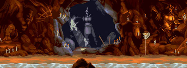
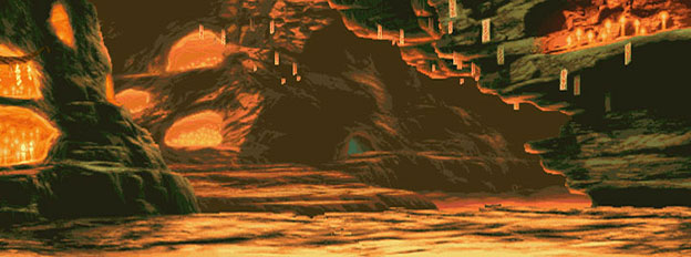
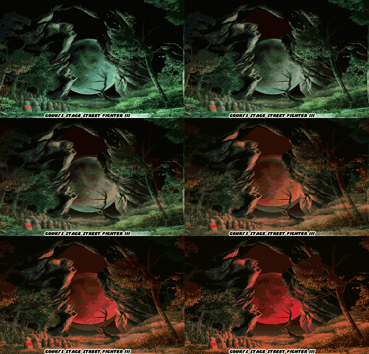
It was uncanny how a studio that had not released a fighting game in 17 years was able to fall right in and match the pace, style and presentation of the new fighting games. It stood to reason. Most of the team had created Street Fighter II. They set the precedence for modern fighting games. Yet go back and look at the video. Look at the stage design. Look at the character models. Look at the level of detail applied to their skin and costumes. Look at the moves they were assigned. Look at how special attacks were animated. Look at the effects applied to super moves. The world that ARIKA presented was much more visceral than anything they had previously done. It was much darker than the grim tournament presented in Fighting Layer. This was clearly a conscious decision. The studio looked at the trends and made sure that they were able to replicate what was going on in the industry. If audiences wanted dark and gritty then they were going to deliver. If they wanted to be immersed in worlds with tremendous atmosphere, evolving stages, including weather effects, then they were going to deliver on that as well.
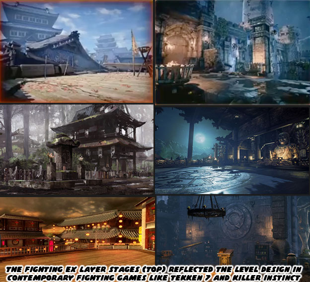
The game that ARIKA had demonstrated was a number of shades much darker than I had expected. It certainly hit the mark of the current crop of fighting games. But was that necessarily a good thing? Consider how many of the games today looked similar. The graphics engine, the moves, the effects and stages had become homogenized in less than 10 years. There was a reason for this when you look at the developers themselves. Street Fighter IV used the Taito Type X2 engine, it had been the backbone of a number of fighting games including Battle Fantasia, BlazBlue, The King of Fighters XII and XIII. A number of studios, including DIMPS and SNK were familiar with the hardware and what it was capable of. A few things changed in 2008 with the release of Street Fighter IV. Capcom had given up on the franchise until Yoshinori Ono pushed the company to develop a new game. Capcom didn’t want to risk it being a commercial success, especially in North America where a good chunk of their consumer base was. So the lead artist on this project, Daigo Ikeno, wanted to make the characters more appealing to American players. He looked at Western games, comics and movies. He saw how hyper-muscular they were. How gritty our graphics tended to be and began beefing up the Street Fighter characters because of this. Many fans the world over noticed how swollen the World Warriors had become. They weren’t as attractive in 3D but the game itself played like a traditional 2D title and that was good enough. Street Fighter IV was a smash hit and it relaunched interest in the genre. Other studios began developing their own fighting games, some even brought back long-extinct IP.
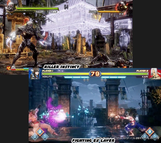
Fighting games were now being developed in Japan, China, North America and Europe. Despite the different regions and tastes the graphics for each game started to look eerily similar. Part of the reason for this was because many games were using identical graphics engines. The Unreal Engine 3 was used in the Western-produced Injustice: Gods Among Us (2013) and Mortal Kombat X (2015). The Unreal Engine 4 was the backbone for Tekken 7 (2015), Tekken 7: Fated Retribution (2017) and Street Fighter V (2016). Street Fighter X Tekken was a console exclusive and built on Playstation 3 and Microsoft 360 development kits, which used and adapted engine from Street Fighter IV. Microsoft purchased the rights to Killer Instinct, a title that was popular at the peak of the fighting game boom of the ‘90s. They resurrected the title in 2013 with the help of Double Helix Games. The game itself was built on the HEX engine. Regardless of who developed the games and on what engine, they all started to look eerily similar.
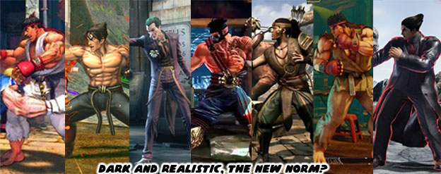
Within seven years the biggest franchise titles, Street Fighter, Tekken, Mortal Kombat and Killer Instinct had nearly identical graphics. Only the King of Fighter, Samurai Spirits / Showdown and Guilty Gear titles seemed immune to this homogenized design. When ARIKA showed off Fighting EX Layer they pretty much reflected this reality. I wondered if company boss Akira Nishitani was actually calling out how gritty realism and flashy graphics effects did nothing to make a game better. Balance, control, animation and character design were the cornerstones of great fighting games. Graphics evolved but no matter how pretty a game looked if it did not play well then it was doomed to fail. This was a distinction that I think many players cannot make. A good number of video game developers look to their fans via forums, surveys, and market research to shape their next games. When they ask a game player how important graphics are their audience might rank it first. This makes the studio think that building a game on a powerful graphics engine, like the Unreal 4 engine, would help insure a hit. I think what many audiences mean to say are the Aesthetics, the Style of the game is really the most important thing. This is not a new argument. Many writers and artists have written about it, some have even produced videos explaining the differences.
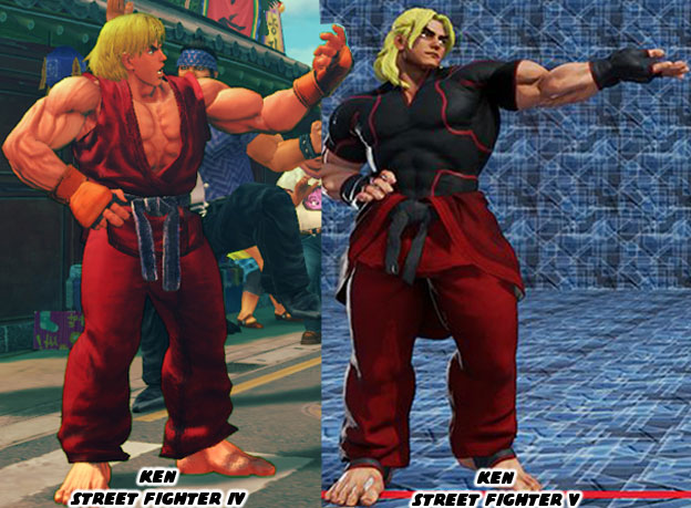
Street Fighter IV worked very hard to try and preserve the aesthetics of Street Fighter II. The exact cut of Ken and Ryu’s gi for example. Most people overlooked this detail but Ken actually had a gi where his sleeves and pant cuffs were hemmed. Ryu’s were torn by comparison in the official character art. This was a subtle difference that told audiences a little bit about the personality of each fighter. Street Fighter IV reproduced all of these tiny details yet placed them on 3D models that were far more swollen than they were ever drawn by the original Japanese artists. It was a bit of a mixed message for long-time fans. Here’s everything you remember and don’t. In Street Fighter V the graphics stayed similar but the studio modified the aesthetics. It was subtle for some characters and more obvious for others. Ken for example had a different top. His trademark gi was tied around his waist and he wore a black rash guard instead. His hair went from long and flowing to what many would call lumps of Play Doh. This wouldn’t be the first time the studio had changed the aesthetic for the characters. Every game in the series had a different lead artist. These people were responsible for setting the tone of the art. The size and proportions of each character were standardized. For the most part the characters kept their trademark appearance. Ken kept his hair and costume and for the most part even his stance. Different artists, like Shoei, Akin and Kinu left different fingerprints on how the cast appeared.
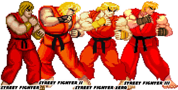
One of the most influential of these artists was Bengus. He had designed the characters for Street Fighter Alpha / Zero. These fighters were meant to be younger versions of the original World Warriors. He changed a few details on each person to make them stand out. He exaggerated the muscles, the size of the hands and feet so they were easier to track and draw. These exaggerations made the characters look lanky, like older teens that were on the verge of adulthood. Even tiny details like the size and shapes of the eyes and eyebrows were not overlooked. They looked more cartoonish but couldn’t necessarily be tied to any one anime or manga style. It was Bengus’ own unique style that audiences loved. His use of shape, proportion and presentation really took the industry by storm. No fighting game before had ever used an aesthetic so effectively. Bengus didn’t only change the approach that Capcom had to sprite creation, he influenced all the other developers as well. These changes didn’t happen overnight but instead little by little. A cartoon here, a comic book there, a fighting game down the road. Other artists and creators could not ignore his unique aesthetic and how audiences were attracted to them. Street Fighter Zero (SFZ) was released in 1995, the ripples of the Bengus style made it to SNK when they released Garou: Mark of the Wolves (MoTW) in 1999.
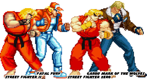
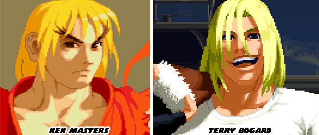
The proportions used on the SNK characters were not as pronounced but they were there. It was apparent when you compared how much the designs had changed from game to game. The sprites in both Street Fighter II and the original Fatal Fury were very comparable. Possibly because the director of Fatal Fury, Takashi Nishiyama, had designed the original Street Fighter. In the early days of fighting game development the artists focused on recreating easily identifiable fighters and their respective styles. A karate person, a kung fu person, a boxer and a wrestler. They were easy to plan for, create and animate. The first batch of fighters following Street Fighter II in 1991 looked very homogenized. Their styles, moves and appearance were very much like Capcom’s World Warriors. Eventually studios began experimenting with different styles to set their cast apart. When Street Fighter Zero debuted it created another paradigm for designers. The other studios began shaping their cast after Bengus. It wasn’t heavy-handed poaching either. Simple things like the way the art team at SNK drew eyes, faces and even hair had changed. For example, Bengus captured the shape of a hairline but he didn’t bother to put too much detail into it. Instead haircuts were represented by a few solid shapes. It worked well in 2D. Look carefully at the character profiles in both SFZ and MoTW. When Capcom tried to stylize the heads of the models in 3D then we ended up with the lumpy Play-doh hair.
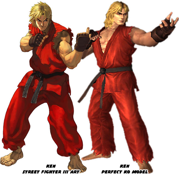
Capcom had learned how difficult it was to set their cast apart in the sea of sameness. It looked as if every studio was using the same engine. The aesthetic was universal. Everything was dark and gritty, it didn’t matter if we were looking at Superman, Necalli, Jago or Scorpion. They could have all fit in the same game. Even Fighting EX Layer had the sameness of the current batch of fighters. The question (which was actually a challenge) to the developers was what were they doing to distinguish their game from the rest? How could they convince players that they had something new when the graphics all looked the same? It was not impossible to create a 3D model that actually looked like the artist concept. It might have been difficult but not impossible to preserve a certain aesthetic. The best example I could give you of this was how Ken appeared In the South Korean fighting MMO Perfect K.O. Ken and Chun-Li were licensed from Capcom. The developers at Thingsoft arguably did a better job at preserving the Street Fighter III aesthetic, designed by Kinu Nishimura, than Capcom did in Street Fighter IV. Study the model they created carefully. Ken was muscular but not swollen. His proportions were not greatly exaggerated. Kinu scaled things back slightly from the Bengus school of design. The face, hair and features she designed were actually captured on this new model.
I do not think that North American fans would have been put off if the models In SF IV looked more like the Perfect K.O. ones. As long as the control, animation, balance and mechanics were preserved then it would have been just as successful if not more so. Yet the people at Capcom seemed to lack faith in their designs. They wanted to pander to Americans by making the cast swollen as the figures were in comic books and Western-produced titles. I think that is a shame for two reasons. Many US players became fans of Street Fighter because it was aesthetically different than any Western title before it. They loved the “Japanese graphics” when what they meant to say was they liked the Japanese style. It was also a shame that Capcom was choosing to follow the industry rather than set its pace. If all the studio did was follow trends then at some point they might make the next Street Fighter appeal to the South Korean or the Chinese market because of how fast they were growing. They would look at Chinese manhua or South Korean manhwa comic book artists and try to copy what they were doing. In essence they would be copying a country that was trying to copy the Japanese aesthetic. It was redundant and simply bad for business.
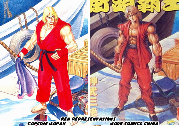
This issue was so important from a design standpoint that I would have to explore It a little further on the next entry. As always if you enjoyed this blog and would like to sponsor me please visit my Patreon page and consider donating each month, even as little as $1 would help make better blogs and even podcasts!