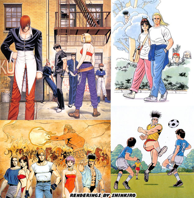
Eventually all of the artists at SNK started to become attuned to what Shinkiro had brought to the genre. They understood that if they wanted to put a character into the Fatal Fury, Art of Fighting or King of Fighters, they they had to meet the elements that Shinkiro had established for the series. There would be no green-skinned Brazilian wild man or stretchy-limbed Indian for example. Those figures were not necessarily grounded in any sort of realism. The fighters did not have to be realistic, but they did have to have a sense of realism. The artist Hiroaki Hashimoto aka Hiroaki was an exceptional painter and considered an understudy of Shinkiro. He worked on a number of excellent pieces for the KOF series. In 1999 he was a lead on a new title called Buriki One. This game was set in the KOF universe but a bit in the future. There was a new tournament in town, inspired by the real world K-1 and Pride fighting championships in Japan. There was a call for representatives of the various martial arts. It was the closest that the team at SNK came to creating martial arts archetypes in the vein of the Street Fighter series. The final opponent was a new villain. Silber was very much an SNK answer to Gouki, he had traveled the globe defeating the masters of various arts and even a few wild animals.
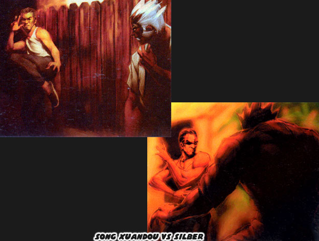
One of the competitors in the Buriki One tournament was an elderly Tai Chi master named Song Xuandou. It turned out that this was the only character that had a previous run in with Silber. Decades earlier, before MMA tournaments were being televised the only way for these fighters to find out who was the best was by actually visiting various dojos and exotic locations. There were no newspapers, no radio or film crews following these people. The fights that went down were the stuff of legend and only a handful of people actually saw them. This was how people like Mas Oyama earned a reputation. When Song was a young man he was lightning quick and very confident in his abilities. He took on Silber and lost. Although he was defeated it was a close battle. It could have been likened to the fight between Bruce Lee and Wong Jack Man. Song was one of the few people that could have claimed to have survived a fight with the powerful German. Silber was and remained a secretive figure in the world of SNK. It was entirely possible that he killed some of the people that he battled. Official character art for example featured him smashing in the face of a polar bear. When the designers of Buriki One called for a Chinese fighter to be put into the game Hiroaki gave audiences an elderly archetype. Nothing about the character seemed to stand out. But again, he was hiding the master in plain sight.
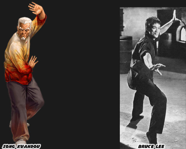
While Song no longer held the speed or flashy kicks of his youth, he retained most of his power. Song was modeled partly on Bruce Lee. This was a version from another timeline, say if he had remained in China and had stayed closer to the kung-fu traditions. This was why he didn’t move or fight like Marshall Law from the Tekken games. He was not just a carbon copy of the actor. Song had the vigor and even look of a youthful Lee in the ’60s. This was back when both he and Silber were getting started in their careers. Song had now distilled his techniques to a few deceptive moves. He could strike, trip and kick his opponents with ease. It was graceful watching him work in the tournament. You could have mistaken him for the old guy practicing Tai Chi in the park rather than a former martial arts superstar. Again this was the SNK school of design at their best, they hid the master in plain sight. It should be noted that not every SNK fighting game required this type of design. For example Shinkiro did a tremendous amount of promotional art for the Samurai Spirits / Shodown series. But he was not the only artist that influenced the fighters.
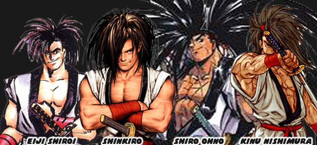
The game was set centuries ago, in feudal Japan. Gunpowder and steam were barely shaping the world, changing the course of the industrialized nations. Japan was insular during this period and held onto tradition longer than most other countries. SNK wanted to capture that era but not romanticize it. They wanted it to pop, to be vibrant, like an animé show. In order to do that the game had to be highly stylized. One of the artists that got picked up for the sequels was manga artist Shiro Ono. He had a very sharp style, with hard lines and exaggerated poses. At the same time the studio did not want the designs to be too outlandish. Shinkiro’s realistic style would have been in contrast with their goal. The artist that the company settled with was Jin Mera aka Eiji Shiroi. Her style was deceptively clean. No extra brush strokes in his renderings. The character designs were easy to read, her choice of color and style really stood out from her peers. In fact the thing that helped cement the look of the series were some paintings that she created using charcoal ink. The sumi-e style was traditional and went back centuries, if not thousands of years. Calligraphers and portrait artists used minimalism to create forms and figures.
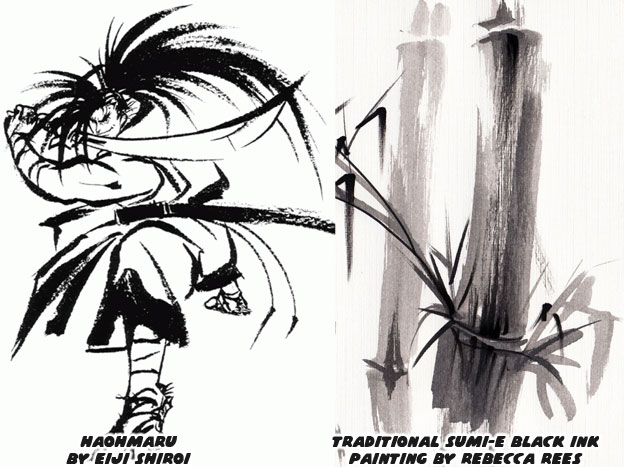
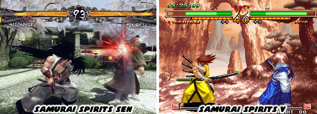
The solid black and white paintings that Ms. Shiroi created perfectly reflected the era that SNK was trying to capture. Eiji was a drawing teacher, her training and insight were perfect for this project. In the case of Samurai Spirits the masters of the various sword arts did not have to be hiding. They wore classic-looking costumes, some wore armor, and they all fought with traditional melee weapons. There were swords, daggers, cleavers, hammers and axes used by the various fighters. As the series grew these things began to include the occasional explosive and even a rifle. For the most part however combat was based on bladed weapons. The designs had to be clear and easy to read. A Chinese warlord for example had a different costume than a Japanese ronin. Even among the various Japanese sword masters there was a lot of diversity. Ms. Shiroi helped plan their look and assigned each person bright primary colors so that they all stood out. As the series aged SNK experimented with 3D and they discovered that the muted colors that were en vogue didn’t really work for Samurai Spirits. This was most apparent in Samurai Spirits Sen. Realism didn’t work very well for the fantastic swordsmen and women. So they returned to 2D shortly after with Samurai Spirits V.
Not every design that SNK created went over well. The studio had a lot of growing pains and made a lot of mistakes when they were trying to capture the fighting game crown. We’ll explore one of the most diverse lineups the company ever gave us in the next blog. As always if you enjoyed this blog and would like to sponsor me please visit my Patreon page and consider donating each month, even as little as $1 would help make better blogs and even podcasts!
No comments:
Post a Comment